10 Common Mistakes In Logo Design

Advertisement

With the power of the Web, and more eyes watching than ever, it’s important for a business to communicate its unique message clearly. The easiest way to recognize a company and distinguish it from others is by its logo. Below, we go through 10 common logo design mistakes that you should avoid if you want to create a successful and professional logo.

1. Designed By An Amateur


Avoid websites that promote ridiculously cheap logo packages. You get what you pay for.

A professional business should look professional. New business owners often invest a lot of time and money in property and equipment, but do not often match it by investing suitably in their logo.

Here are the most common reasons why many logos look amateurish:

  • The business owner wanted to save money by designing the logo quickly themselves.
  • A friend or relative who claims to know a little about graphic design does it as a favor.
  • The wrong people are commissioned. (Local printers are not likely proficient in logo design.)
  • The business outsourced the job via one of several design competition websites, which are mostly populated by amateur designers.
  • The job was given to an online company that offers really cheap logos.

All of the above can result in disastrous outcomes. If your logo looks amateurish, then so will your business. A business should know where to look when it wants a new logo. David Airey offers great insight on how to choose the right logo designer for your requirements.

Here are the advantages of hiring an established and professional logo designer:

  • Your logo will be unique and memorable.
  • You won’t run into any problems down the line with reproducing it.
  • Your logo will have a longer lifespan and won’t need to be redesigned in a couple of years.
  • Your logo will look professional.

2. Relies On Trends


Focusing on current logo trends is like putting a sell-by date on a logo.

Trends (whether swooshes, glows or bevels) come and go and ultimately turn into cliches. A well-designed logo should be timeless, and this can be achieved by ignoring the latest design tricks and gimmicks. The biggest cliche in logo design is the dreaded “corporate swoosh,” which is the ultimate way to play it safe. As a logo designer, your job is to create a unique identity for your client, so completely ignoring logo design trends is best.

Logolounge has a great section on its website in which it updates current logo design trends every year. Being aware as a designer of the latest crazes is important, mainly so that you can avoid them at all costs.

3. Uses Raster Images


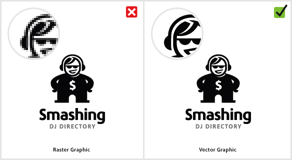
An example of how raster graphics can limit reproduction.

Standard practice when designing a logo is to use vector graphics software, such as Adobe Illustrator or Corel Draw. A vector graphic is made up of mathematically precise points, which ensures visual consistency across multiple sizes. The alternative, of course, is use to raster graphics software, such as Adobe Photoshop. A raster graphic — or bitmap, as it’s commonly called — consists of pixels.

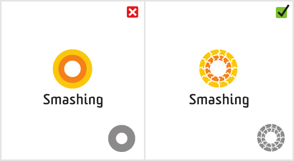
Using raster images for logos is not advisable because it can cause problems with reproduction. While Photoshop is capable of creating very large logos, you never know for sure how large you will have to reproduce your logo at some point. If you zoom in enough on a raster graphic, it will appear pixelated, making it unusable. Maintaining visual consistency by making sure the logo looks the same in all sizes is essential.

The main advantages of vector graphics for logo design are:

  • The logo can be scaled to any size without losing quality.
  • Editing the logo later on is much easier.
  • It can be adapted to other media more easily than a raster image.

4. Contains Stock Art


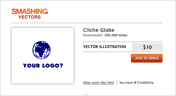
Using stock vector graphics in a logo puts your client at risk.

This mistake is often made by business owners who design their own logo or by amateur designers who are not clued in to the laws on copyright. Downloading stock vector imagery from websites such as VectorStock is not a crime, but it could possibly get you in trouble if you incorporate it in a logo.

A logo should be unique and original, and the licensing agreement should be exclusive to the client: using stock art breaks both of these rules. Chances are, if you are using a stock vector image, it is also being used by someone somewhere else in the world, so yours is no longer unique. You can pretty easily spot stock vectors in logos because they are usually familiar shapes, such as globes and silhouettes.

5. Designing For Yourself Rather Than The Client


Never impose your own personality onto a client’s work.

You can often spot this logo design sin a mile away; the cause is usually a designer’s enormous ego. If you have found a cool new font that you can’t wait to use in a design, well… don’t. Ask yourself if that font is truly appropriate for the business you’re designing for? For example, a great modern typographic font that you just love is not likely suited to a serious business such as a lawyer’s office.

Some designers also make the mistake of including a “trademark” in their work. While you should be proud of your work, imposing your personality onto a logo is wrong. Stay focused on the client’s requirements by sticking to the brief.

6. Overly Complex


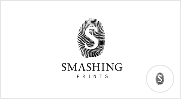
Highly detailed designs don’t scale well when printed or viewed in smaller sizes.

What better analogy for thumbnail images than fingerprints? You’ll notice the intricacies of your fingerprints only when looking at them really close up. As soon as you move away, those details are lost. The same holds true for highly detailed logo designs.

When printed in small sizes, a complex design will lose detail and in some cases will look like a smudge or, worse, a mistake. The more detail a logo has, the more information the viewer has to process. A logo should be memorable, and one of the best ways to make it memorable is to keep things simple. Look at the corporate identities of Nike, McDonald’s and Apple. Each company has a very simple icon that can easily be reproduced at any size.

7. Relies On Color For Its Effect


Without color, your great design may lose its identity.

This is a very common mistake. Some designers cannot wait to add color to a design, and some rely on it completely. Choosing color should be your last decision, so starting your work in black and white is best.

Every business owner will need to display their logo in only one color at one time or another, so the designer should test to see whether this would affect the logo’s identity. If you use color to help distinguish certain elements in the design, then the logo will look completely different in one tone.

8. Poor Choice Of Font


Font choice can make or break a logo.

When it comes to executing a logo, choosing the right font is the most important decision a designer can make. More often than not, a logo fails because of a poor font choice (our example shows the infamous Comic Sans).

Finding the perfect font for your design is all about matching the font to the style of the icon. But this can be tricky. If the match is too close, the icon and font will compete with each other for attention; if the complete opposite, then the viewer won’t know where to focus. The key is finding the right balance, somewhere in the middle. Every typeface has a personality. If the font you have chosen does not reflect the icon’s characteristics, then the whole message of the brand will misfire.

Bad fonts are often chosen simply because the decision isn’t taken seriously enough. Some designers simply throw in type as an afterthought. Professional font foundries, such as MyFonts and FontFont, offer much better typeface options than those over-used websites that offer free downloads.

9. Has Too Many Fonts


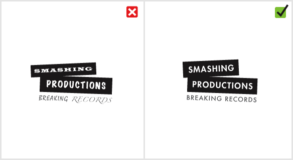
A logo works best with a maximum of two fonts.

Using too many fonts is like trying to show someone a whole photo album at once. Each typeface is different, and the viewer needs time to recognize it. Seeing too many at once causes confusion.

Using a maximum of two fonts of different weights is standard practice. Restricting the number of fonts to this number greatly improves the legibility of a logo design and improves brand recognition.

10. Copies Others

This is the biggest logo design mistake of all and, unfortunately, is becoming more and more common. As mentioned, the purpose of a logo is to represent a business. If it looks the same as someone else’s, it has failed in that regard. Copying others does no one any favors, neither the client nor the designer.

Gareth Hardy is a professional graphic designer and illustrator based in the United Kingdom. You can find Gareth at Down With Design or on a snowy mountain near you.

  1. 301

    I wouldn’t be so harsh against crowd sourcing sites, it’s a means to an end and like buying a second hand car, we all would love a brand new ‘shiny’ ones that hit web3 style etc. etc! It’s just not the reality, most business can’t afford current commercial design fees so look to source elsewhere, without that market to gain experience in commercial work, most designers would hardly get off the ground.

    I’ve been in the graphics industry for nearly 3 decades. If you think trends are things to be ignored you’ll probably never get to the top of your profession. Hitting the mark is about being ‘on trend’ or ‘of the moment.’ It’s the reason we study at college in the first place, to understand these moves within art/design and how to exploit them…

    +52
    • 302

      I agree with Hugo on this one, I’ve been working with a Dutch company to try and establish a better kind of design crowdsourcing platform here in the UK. I personally believe that crowdsourcing websites are an excellent way for new or unestablished designers to get a foot hold in the industry. Some of these designers get their first clients this way.
      I emailed a large logo design company recently to try and establish some sort of rapport and as you can imagine was met with a bombardment of abuse. I understand some designers feel threatened by crowdsourcing and feel that it devalues design and the process by which design solutions are developed.

      In my experience croudsourcing communities organically establish a financial equilibrium, whereby companies are compelled to offer a fair or even generous prize to the design community or else none of the good designers within the community will submit design solutions to the company’s project. So although a design will generally be procured for less company money through crowdsourcing, designers retain both their integrity and through a shared understanding of the value of design on the platform, promote the idea that good design is worth good money. You’ll find our project at crowdsite.co.uk, please leave your feedback.

      0
      • 303

        I’m with Hugo as well! I know there are loads of designers who feel that crowdsourcing is killing the industry, however, to get experience you need to work. I run the Spanish version of the website mentioned above, crowdsite.es, and I see our designers grow through feedback from clients and their pride in their work, especially when they make that first all important sale!

        0
  2. 304

    Playing chess against grand masters, simultaneously. Use the last move against the next one, and so on. The result is that with minimal or at all knowledge you can win against some of the big ones. The same “strategy”- cheap trick is applied extensive in logo design around the crowded contests. Swimming against trends makes somehow the difference, imho. It will pay off eventually. Where is the place to look for an exceptional designer? In college, they briefly walk me to latest trends (Web x.0), if they ever did it , instead they show me the ropes, aka Adobe CS.

    -7
  3. 305

    Hello,

    I loved to read this article i my self is the designer just want to add my views in this i say that:

    While this is a rather arbitrary subject as everyone will have personal preference, there are some tried and true criteria to meet in order to have an effective logo. One of the main ones is simplicity. Remember that a logo is meant to simply make your company memorable, you do not have to fit every aspect of your business into one small logo.

    Over the years, large marketing agencies have spent a great deal of money in researching how colors will affect ones subconscious. The ones you choose will vary depending on the type of business you are running. Colors such as green, blue and purple will typically instill a feeling of calm, peaceful harmony in the viewer. Brighter colors such as red or yellow and shades in between, will give a sense of bright cheerful optimism. Generally, a logo should have no more than 2 colors, and only one font if applicable. This will go a long way towards simplicity. Look at designs such as Fed-Ex or Microsoft and seem how they have created a timeless, simple logo with harmony in it’s colors, and nothing complex to strain the eye.

    And when we talk of price one should consider cheap logo design services which are offered online by many freelancers because they do really high quality graphics and very cheap price.

    Regards

    +8
    • 306

      Hello Aqeel,

      In the interest of maintaining some standard in the comments sections please allow the following remark. How come your first sentence is grammatically very different from the rest of your comment? I found the exact same passage on other websites, e.g. the 110designs-Blog (just google it and you will, too). The fact that your first sentence is very incorrect while the remainder of your comment is in flawless English lets me conclude that these are not your words.

      Nobody should have a problem with someone’s writing being a little off, but you should definitely not claim credit for someone else’s thoughts. That would be plagiarism.

      Regards

      +8
  4. 307

    I agree with most of the points on this list. My biggest peeve with the list is that you have the “Don’t use sites like this” under the “designed by an amateur” heading. Websites like LogoWorks and LogoDesignTeam suck for us freelance designers, but to say they are amateurs is both very elitist of you, and very wrong.

    Their designers are quite good. If you look at their portfolios much of their work is better than most professional designers that I’ve seen, as far as logos go.

    +31
    • 308

      Christina Wilkinson

      January 15th, 2012 7:44 pm

      Saying that amateur designer logos are sometimes better than someone who has been doing them for years is very naive.

      First of all this comment is based on a visual only; not research of the company and how their brand affects their clientele and their marketing. Or a better way to put it is that technology that is able to make something pretty does not have priority over technique and getting from point A to point B.

      I know tons of teens who can design beautiful logos, but it doesn’t mean the logo works for the client as it should.

      Meaningless = Bad end results

      -27
      • 309

        I’ve worked in the design industry for 15 years – 11 of those years in agency work – and can whole-heartedly say that the “they don’t do the research” defense is complete rubbish. How much research is required for a logo for a dog groomer? How much for a chip shop? How about a single product plastics factory? Not much. These are the businesses that are using contest sites. Not billion-dollar companies. Single-franchise start-ups that most agencies don’t waste time on (giving the bulk of the work to the intern, throwing together logos in-between meetings with long-term clients, etc.)

        I will admit – I participate in contest site when I’m not working with clients for my freelance business. I was skeptical at first. Some logos aren’t very effective and are geared more towards the client’s taste than their customers’; however, those clients would never seek out a “professional” anyway – so it’s better for them to use a contest site or “cheap” logo service than nothing at all. Many of the designers on these sites are like me – freelancers just looking for new business and engage in some challenge.

        sidenote: You can’t cite Nike’s logo as a good logo example in the same article that you shoot-down cheap/amateur work if you consider the history of Nike’s logo at all. Nike, Apple, McDonald’s don’t have great logos – they have HUGE advertising dollars created by sound products that have made their logos well-known.

        +25
  5. 310

    I am new to designing and article like this is certainly very helpful.
    Thanks.

    +4
  6. 311

    Love this article! It is so hard when you’re new to designing to understand these simple pitfalls. You are overwhelmed and excited and you just want to GO! An article like this is simple and so easy to follow. Going to forward it onto my students. Cheers

    0
  7. 312

    Just thought you’d like to know, in case you didn’t already:

    http://www.globalsiteplans.com/environmental-design/7-logo-design-mistakes/

    +4
  8. 313

    Great article Gareth!

    -1
  9. 314

    yossi berger

    May 9th, 2011 1:55 pm

    THX GARETH!!!
    i am going to write an hebrew article based on your article for the israel commercial clients
    (hope you dont mind)
    any how thx for the examples
    yossi

    -5
  10. 315

    Really helpful info, thanks.

    The articles on Smashing Mag always seem to be much better informed than your run-of-the-mill blog pages. I find myself coming back here all the time.

    I would love to get into logo design and so resources like this are invaluable, thanks for sharing!

    Patrick

    0
  11. 316

    The ideas are good but just because someone is “professional” doesn’t make them good in any profession. There are talented amatuers in all fields. I’ve seen some professional stuff that made me wonder what they were thinking. My dad was a commercial artist so I grew up with some of this stuff.

    +7
  12. 317

    I think another good addition to this article, since cost is mentioned initially, is the AIGA and professional stance on spec work, such as logo contests. Being a budding designer myself, I was desperate for any paying scrap of work, at first. But I have come to learn that you really must price yourself fairly, or you will not be respected by the client. They want cheap, but trust moderately expensive. But logo contests are an excuse for a client to try to milk FREE WORK from designers, and choose one. You don;t have all plumbers fix your toilet for free, then pay the one who did it the quickest. Check out AIGA’s site for more on spec work.

    +2
    • 318

      Actually the example is quite wrong in my opinion. A plumber can’t sell the repairs he just did to another person, while a designer can. There are a lot of stock logo sites on which you can sell your non-winning logos.

      Apart from that I agree. And this is brilliant and so true: “They want cheap, but trust moderately expensive.”

      0
  13. 319

    why are you all such pompous pricks?

    -2
    • 320

      Could not agree with you more anon. This is a good article for someone who is an amateur and wants to learn, but half the people making so many critical comments on here I would be willing to bet they are no better at designing logos themselves so have a bit of modesty and reel it in. I believe an amateur designer is still capable of designing a great logo and people should not have such a dismissive attitude. The professionals don’t always get it right either, 2012 logo anyone!!!

      +12
  14. 321

    Well now lads like. This article is very true. Also Anon2. If anyone is going to get it right it will be the professionals. Amateur work is obvious. You should keep your pompous pricks to yourself. Not being smart here. Why are you all browsing this website for more things to disagree with? If you don’t have positive or nice things to say. Then don’t speak at all.

    -9
  15. 322

    This article is really true. Like what a good tip. Thanks

    -2
  16. 323

    So we should ignore trends, but your Smashing Magazine logo is orange, which is very trendy in last few years. How do we really ignore trends?

    0
    • 324

      So let’s say a trend changes next year and your logo looks outdated when it should have represented your business for many, many years to come-what do you do then? Change it every “two seconds”?? In that case you miss the basic purpose of logo in general.
      There are ways to make logos making them work for a long time. Amateur or professional, if you lack true knowledge of what you are supposed to do and why you are doing it the outcome won’t work well in majority of cases. Picking color orange because it’s trendy is shallow and pointless. On the other hand, picking color orange because orange is perceived as energetic, enthusiastic etc. is a great point if that’s what your e.g. business is known for.

      0
  17. 325

    Muhammad Ayub Ghouri

    July 12th, 2011 1:11 am

    Very Nice and helpful post, I am working since 1992 and I understand that type of mistakes are common in new designers and also some of lazy designers who don’t understand what is custom logo design, they always try to find more vectors and vectors to fit in upcoming task and save the time and their creativity which they actually don’t have.

    I wait a year and just hear there is a software called Photoshop that can edit photos with multiple effects many more and there was no layers concept on the initial versions of Photoshop. ha ha ha its true! So my start was obviously vector (as I don’t have other choice).

    Making a logo on Photoshop is the biggest mistake as you can do anything on Illustrator with more flexibility (in some cases when the logo needs some fx and you are not experienced with these tips on Illustrator).

    0
  18. 326

    hey! awesome article! I got some more inspirational logos at:

    eyedeyeah.com/?p=86

    -3
  19. 327

    Hello,

    My name is Maria Jose Franco, Publishers Relations at Adfunky.

    Adfunky is an adnetwork with headquarters in New York, United States, and sales offices
    in different Latin American countries, which allows us to effectively monetize the inventory of the region.
     We also work with agencies and direct clients around the world, so we can manage all your traffic.

    I wish I could talk to you and tell you a little more about Adfunky. There are several advertisers who may be interested in
    displaying their ads on your site. You can send me an e-mail and I will explain our business and send information to get started.

    My contacts are together with the signature.

    Regards, 
    María José Franco M
    Publisher Relations
    Ad Funky
    +54-11-48576333
    Skype – adfunkymariajose

    -15
  20. 328

    nyc tip for .for begineers visit gulmiresunga.blogspot.com/2011/08/how-to-design-logo-for-beginners.html to learn about designing blog

    -9
  21. 329

    This was really helpful. thanks for the tips.

    -2
  22. 330

    Speaking of too similar…

    webylife.com/design/top-10-brand-logo-mistakes/

    -2
  23. 331

    this artical is really amazing.thanks to auther.

    -3
  24. 332

    Great…… I agree on every point…..

    +1
  25. 333

    all excellent points, great article

    -1
  26. 334

    This was a great reminder a good designer should always push the envelope. Your only as good as your last job/design

    +1
  27. 335

    I think this article is very good. The points are all worthy. However, the critics seem to be amateurs themselves.

    If one is to be good at anything in life—design, engineering, teaching, or even being a professional blogger—then one needs a grasp on the English language and the spelling thereof! I can’t say that strongly enough. Ugh! It is my pet peeve that there are people in this world that do not spell check their typos, do not have the ability to spell, and/or do not have basic English grammar abilities.

    I am NOT referring to foreigners whose native tongue is not English. They get a hall pass on this. It’s great that they are taking the time to learn a second language. And anyone who does that should be commended.

    But for the rest of you, please, be an adult and educate yourself on the tool we all use to communicate—words.

    +8
  28. 336

    Exactly how does a logo fail? Will you stop visiting the local coffee shop that makes excellent mochas because they designed the logo themselves and it’s too plain or too complicated? Will you not eat at the local rib joint because it looks like a hillbilly sign? Will you withdraw your savings because the local bank redesigned its logo to what you interpret to be too amateurish? Logos don’t fail, except in the sense that those with the EYE FOR IT notice it…and no on else. 3 out of 600 people notice or care. Just like a drywaller notices how absolutely horrible the drywall and ceilings look in the most expensive hotel, yet it still remains a 5-star getaway….get my drift?

    +8
    • 337

      At some point it’s true, but generally, good designers know how to design for people who are not acquainted with the visual art. They study human perception through visuals to say the least. There’s a lot of work that needs to be considered to get a good logo that reflects companies visions. Just imagine a guy looking for a job won’t come to an interview with his pajamas on. :)

      +4
  29. 338

    It’s a really useful post. I found great information here! Thanks a lot.

    0
  30. 339

    Steve Jobs hired someone to do logo is it? He design by himself…So did Bill Gates…Enzo Ferrari as well….An Entrepreneur creates idea from his observation and he add value to his creation by his own creativity. So, he does not need any other design company for his idea….They are making money out of you…They are trying to bring an opinion that u ain’t creative enough to do a design for your own business…How inane can that be?

    +2
    • 340

      Let’s not forget, that when Ferrari was founded ( 1929 ) there were no computers to do the designs on. If you correct someone please do some research.

      0
  31. 341

    I recall you yourself, Smash Magazine, holding a contest for your own new logo design and your new logo breaks the “trendy” and gradient “rules”. Your logo is not distinct and appears like a piece of stock clip-art. While I do agree with most of your “rules” in this article, I suggest you take a long look at your own practices Smash, before you sit high on the holier than thou design process criticism throne. Rules are made to be broken.

    +8
  32. 342

    thanks 4 this…all positive inputs are truly appreciated…

    +3
  33. 343

    Rules are indeed made to be broken….what happens when you print a vector logo? a good raster logo at 300 dpi will look just as good….when do we use black and white in this day and age? Everyone seems to want to future proof their designs so they can be printed on pin heads or boeings….not always necessary and can be limiting…..if a logo is only ever going to be seen on the web wouldn’t an animated one be better? If the purpose is to get attention then maybe it would?

    +1
    • 344

      I agree, but hope that designing for your specific client is just understood. There is no “future-proofing” a logo. I mean, bell bottom jeans came back, who knew!?!? lol

      +1
  34. 345

    Thanks for sharing this great post!!!!!!!!

    0
  35. 346

    Simplicity is the key when it comes to designing a logo. The thing that should be given the most importance is trying to make sure that the logo is a memorable one and is easily recognized.

    Paul Hyden
    110designs.com

    +2
  36. 347

    I found this to be a very enlightening article for the beginner. Everything in the article is true. However, I found it narrow minded and rather generic. If that was the intent, then you certainly accomplished your goal. Please don’t take this as a bad comment, simply an honest one. I would HIGHLY reccomend this to business owners, but never to a designer. It is the artists job to create eye-catching designs to entice their prospective client. IMO. Bring the client in, slowly show them the bells and whistles you can add. Get them excited! Then email them a link to this article and ask that they read it over. While they are doing that, design 3 mock-ups. One basic, one edgy that follows the guidelines of this article and the last one just explodeing with filters, fonts and effects. When your newly educated client comes back they will feel good about choosing the slightly edgey design that still uses this articles’ guidelines. Nothing makes a business owner feel better about a sale then it being their idea. IOW, this article is a wonderfull tool but do not let it stiffle your creativity all together.

    +8
  37. 348

    thanks for your tips

    0
  38. 349

    Thanx For your Tips And how can I Find the Right Font type for my designs I do a lot of logo but dosent looks good and What can i do for the color Matching.

    0
  39. 350

    Love this article. 100% spot on

    0
  40. 351

    Very helpful article for me.. Loved it

    Thanks!!

    0
  41. 352

    Oh you such a rock star in logo design, Its a awesome tutorial ever seen. I am impressed. It will help me a lot.

    +1
  42. 353

    I’m not agree with “The business outsourced the job via one of several design competition websites, which are mostly populated by amateur designers”. also with “The job was given to an online company that offers really cheap logos”.
    Every person had their own reason to make their logo company. I’m not sure if very…very expensive logo are made by very….very professional designer. And cheap logo always look unprofessional
    Much of several design competition websites and online company that offer low pricing provided briliant logo design.

    Finally, it’s all about art, absolutely flexible price for it. There is no any legal standard to compare.

    Regard.

    -1
  43. 354

    franceschi_rene

    July 19th, 2012 1:12 pm

    Very good article !!!

    +1
  44. 355

    Your number #7 is just plain wrong…the bad example look better than the one oyu say is the right way, yet the one you made is too complicated and those fine white spacing between the re-cycle loop is to thin to print well in fine print…

    you may wish to re-do that one

    -3
  45. 356

    Hi,

    That’s a great post, but I have some thinking.

    Many amateur want to become a Professional to. But its need a long way to be it. So, anything wrong with following any design contests for getting many experience? Are the professional designers have their talent since their born?

    Thanks.

    +1
  46. 357

    Arc & Co. Design Collective

    February 19th, 2013 9:41 pm

    Thanks for the great article. We had tons of clients who came to us and told us ” my brother’s nephew can design a logo”. However, there are also tons of clients that fully understand how important it is to spend the time and money to look for professionals.

    If they are serious about their business, they will want to make the right decision. As a boutique agency, we always take extra time to explain to the client what Design Thinking is and why it is important.

    If one wants to be a respected designer, definitely don’t have a price sheet on the website. It’s not just about Cheapening Design, it’s also about creating a chance to meet the client face to face. Because your ” Product ” is not just the logo you are about to deliver, it’s also about ” you ” and “your brand”.

    +1
  47. 358

    This is very useful. I am very helped by its. thanks very much.

    0
  48. 359

    I don’t believe in any of these rules.

    One simple reason:

    Multiple award winning logo: City of Melbourne. Created by Landor Associates.

    Relies on both color and trend.

    0
  49. 360

    I think it is funny that Gareth Hardy defines 10 common mistakes regarding logo design and then commits several of them, or at least his company does, himself. It only took me less than a minute to view their portfolio and pick out several mistakes with logos they’ve designed. I say if it looks professional and identifies your company, who cares how you got it or how much it costs? These types of articles are typical of overpaid graphics designers who like to pump their chest about how much they know and subsequently how much they think their work is worth.

    0

  1. 1

    I wouldn’t be so harsh against crowd sourcing sites, it’s a means to an end and like buying a second hand car, we all would love a brand new ‘shiny’ ones that hit web3 style etc. etc! It’s just not the reality, most business can’t afford current commercial design fees so look to source elsewhere, without that market to gain experience in commercial work, most designers would hardly get off the ground.

    I’ve been in the graphics industry for nearly 3 decades. If you think trends are things to be ignored you’ll probably never get to the top of your profession. Hitting the mark is about being ‘on trend’ or ‘of the moment.’ It’s the reason we study at college in the first place, to understand these moves within art/design and how to exploit them…

    +52
  2. 2

    I agree with most of the points on this list. My biggest peeve with the list is that you have the “Don’t use sites like this” under the “designed by an amateur” heading. Websites like LogoWorks and LogoDesignTeam suck for us freelance designers, but to say they are amateurs is both very elitist of you, and very wrong.

    Their designers are quite good. If you look at their portfolios much of their work is better than most professional designers that I’ve seen, as far as logos go.

    +31
  3. 3

    I’ve worked in the design industry for 15 years – 11 of those years in agency work – and can whole-heartedly say that the “they don’t do the research” defense is complete rubbish. How much research is required for a logo for a dog groomer? How much for a chip shop? How about a single product plastics factory? Not much. These are the businesses that are using contest sites. Not billion-dollar companies. Single-franchise start-ups that most agencies don’t waste time on (giving the bulk of the work to the intern, throwing together logos in-between meetings with long-term clients, etc.)

    I will admit – I participate in contest site when I’m not working with clients for my freelance business. I was skeptical at first. Some logos aren’t very effective and are geared more towards the client’s taste than their customers’; however, those clients would never seek out a “professional” anyway – so it’s better for them to use a contest site or “cheap” logo service than nothing at all. Many of the designers on these sites are like me – freelancers just looking for new business and engage in some challenge.

    sidenote: You can’t cite Nike’s logo as a good logo example in the same article that you shoot-down cheap/amateur work if you consider the history of Nike’s logo at all. Nike, Apple, McDonald’s don’t have great logos – they have HUGE advertising dollars created by sound products that have made their logos well-known.

    +25
  4. 4

    sorry bob,
    u always spoiling the image of this site, shut the f** up and get out and never show off here after otherwise i will squeeze your ba**s.

    +19
  5. 5

    Actually I think ANY kind of involvement in design is beneficial. I know those online/competitive sites are a shark-pit, but if you’re surfin’ Google too much, your time is better served joining in and polishing your technique. Sure. You may never win but you’ll have some nice pieces for your book. Which is one of the things Gareth missed.

    Always practice, logo design, even if you have no jobs, it’s a good idea to play with letter shapes and forms to become more familiar with shape interplay

    +17
  6. 6

    so if it was amateur junk, and u are so proficient, you lost your chance to win. some time ago you were amateur as well.

    +12
  7. 7

    Could not agree with you more anon. This is a good article for someone who is an amateur and wants to learn, but half the people making so many critical comments on here I would be willing to bet they are no better at designing logos themselves so have a bit of modesty and reel it in. I believe an amateur designer is still capable of designing a great logo and people should not have such a dismissive attitude. The professionals don’t always get it right either, 2012 logo anyone!!!

    +12
  8. 8

    Barb, I think Philip made the right decision. Most contest holders don’t understand what makes a good logo, and so they often choose amateur designs which they later regret. There’s also the psychological fact that too many choices lead to bad decision-making; this phenomenon is described in several books, most notably: The Paradox of Choice by Barry Schwartz.

    When a professional enters an amateur contest, it more than likely: a) wastes his time, b) doesn’t challenge him to grow and get better, and c) makes his own work look amateurish via association.

    In fact, having hosted my own logo contest and watched many others, I can say the only time a professional designer should enter an amateur contest is if at least two of the following four situations apply: a) the designer has been asked to enter, b) the designer is bored, c) the designer feels inspired by a particular contest’s brief, or d) the designer feels the contest holder has taste and will recognize talent through the numbing din of amateur entries.

    +9
  9. 9

    Exactly how does a logo fail? Will you stop visiting the local coffee shop that makes excellent mochas because they designed the logo themselves and it’s too plain or too complicated? Will you not eat at the local rib joint because it looks like a hillbilly sign? Will you withdraw your savings because the local bank redesigned its logo to what you interpret to be too amateurish? Logos don’t fail, except in the sense that those with the EYE FOR IT notice it…and no on else. 3 out of 600 people notice or care. Just like a drywaller notices how absolutely horrible the drywall and ceilings look in the most expensive hotel, yet it still remains a 5-star getaway….get my drift?

    +8
  10. 10

    Ray VanDerLinden

    May 19th, 2010 9:14 am

    It is actually more important for the logo to be presented as a 1 color flat image than it is a full color multi-dimensional image. If your logo does not break down well. Epic design fail!

    +8
  11. 11

    Hello,

    I loved to read this article i my self is the designer just want to add my views in this i say that:

    While this is a rather arbitrary subject as everyone will have personal preference, there are some tried and true criteria to meet in order to have an effective logo. One of the main ones is simplicity. Remember that a logo is meant to simply make your company memorable, you do not have to fit every aspect of your business into one small logo.

    Over the years, large marketing agencies have spent a great deal of money in researching how colors will affect ones subconscious. The ones you choose will vary depending on the type of business you are running. Colors such as green, blue and purple will typically instill a feeling of calm, peaceful harmony in the viewer. Brighter colors such as red or yellow and shades in between, will give a sense of bright cheerful optimism. Generally, a logo should have no more than 2 colors, and only one font if applicable. This will go a long way towards simplicity. Look at designs such as Fed-Ex or Microsoft and seem how they have created a timeless, simple logo with harmony in it’s colors, and nothing complex to strain the eye.

    And when we talk of price one should consider cheap logo design services which are offered online by many freelancers because they do really high quality graphics and very cheap price.

    Regards

    +8
  12. 12

    I think this article is very good. The points are all worthy. However, the critics seem to be amateurs themselves.

    If one is to be good at anything in life—design, engineering, teaching, or even being a professional blogger—then one needs a grasp on the English language and the spelling thereof! I can’t say that strongly enough. Ugh! It is my pet peeve that there are people in this world that do not spell check their typos, do not have the ability to spell, and/or do not have basic English grammar abilities.

    I am NOT referring to foreigners whose native tongue is not English. They get a hall pass on this. It’s great that they are taking the time to learn a second language. And anyone who does that should be commended.

    But for the rest of you, please, be an adult and educate yourself on the tool we all use to communicate—words.

    +8
  13. 13

    I recall you yourself, Smash Magazine, holding a contest for your own new logo design and your new logo breaks the “trendy” and gradient “rules”. Your logo is not distinct and appears like a piece of stock clip-art. While I do agree with most of your “rules” in this article, I suggest you take a long look at your own practices Smash, before you sit high on the holier than thou design process criticism throne. Rules are made to be broken.

    +8
  14. 14

    I found this to be a very enlightening article for the beginner. Everything in the article is true. However, I found it narrow minded and rather generic. If that was the intent, then you certainly accomplished your goal. Please don’t take this as a bad comment, simply an honest one. I would HIGHLY reccomend this to business owners, but never to a designer. It is the artists job to create eye-catching designs to entice their prospective client. IMO. Bring the client in, slowly show them the bells and whistles you can add. Get them excited! Then email them a link to this article and ask that they read it over. While they are doing that, design 3 mock-ups. One basic, one edgy that follows the guidelines of this article and the last one just explodeing with filters, fonts and effects. When your newly educated client comes back they will feel good about choosing the slightly edgey design that still uses this articles’ guidelines. Nothing makes a business owner feel better about a sale then it being their idea. IOW, this article is a wonderfull tool but do not let it stiffle your creativity all together.

    +8
  15. 15

    Hello Aqeel,

    In the interest of maintaining some standard in the comments sections please allow the following remark. How come your first sentence is grammatically very different from the rest of your comment? I found the exact same passage on other websites, e.g. the 110designs-Blog (just google it and you will, too). The fact that your first sentence is very incorrect while the remainder of your comment is in flawless English lets me conclude that these are not your words.

    Nobody should have a problem with someone’s writing being a little off, but you should definitely not claim credit for someone else’s thoughts. That would be plagiarism.

    Regards

    +8
  16. 16

    The ideas are good but just because someone is “professional” doesn’t make them good in any profession. There are talented amatuers in all fields. I’ve seen some professional stuff that made me wonder what they were thinking. My dad was a commercial artist so I grew up with some of this stuff.

    +7
  17. 17

    I found myself nodding and agreeing with everything in this article! I joined a logo competition site as I had abit of time to kill and was bored, but it was just absolutely FULL of amateur junk I did not want to be associated with. Every possible mistake had been posted as entry!

    Very agreeable article

    regards

    philip

    +6
  18. 18

    Alex E. Schneider

    June 25th, 2009 5:59 pm

    Everything about this list is bad, because:

    1. Logo’s acquire meaning not through their design, but through a company’s actions. If you need a logo, you can start with a simple black dot. What helps your business is your brain and how you act, not your logo. Your logo represents nothing, if you don’t.

    2. Logo’s should not be made for anyone else but yourself. If it is your business to make logos for others, you are in the business of pretending that you care or understand what someone else represents. You don’t. You just want a stupid design award for your design work (and are probably willing to pay a jury for it). Start realizing that revenue is the real reward. Why don’t you design for yourself and trade products or services? Are you so confident in your skills?

    3. The first point of this list is a fabrication, written to appeal to designers who sell logo design, and not written to inspire any understanding about logo design. “amateurish” and “professional” are words without meaning. Hallelujah.

    4. A logo should reflect a purpose (note that I didn’t write: “have a purpose”), which means that its conception should be attached to something you have already done. If you allow an agency to make up scenarios, you are just paying for creativity, and diluting your identity.

    5. Theorizing logo design is as futile as theorizing about naming. The name Michael Jackson carries meaning not because someone put that name together.

    6. Each of the points in the list can be refuted by real-life examples. If you are a logo designer, find those examples. That could give you all the reasons not to design for others, but only for yourself. The world will not get better if everyone wants to tell everyone else how to run aspects of a business. Are you satisfied by living in a meta-economy?

    The purpose of life is to trade, not to creep into the lives of others and pretend that you can paint success into a logo.

    +5
  19. 19

    Indeed, these are rules I can agree with whole-heartedly. Now, if only I could get my CLIENTS to believe them… *headdesk*

    +5
  20. 20

    I am new to designing and article like this is certainly very helpful.
    Thanks.

    +4
  21. 21

    Just thought you’d like to know, in case you didn’t already:

    http://www.globalsiteplans.com/environmental-design/7-logo-design-mistakes/

    +4
  22. 22

    At some point it’s true, but generally, good designers know how to design for people who are not acquainted with the visual art. They study human perception through visuals to say the least. There’s a lot of work that needs to be considered to get a good logo that reflects companies visions. Just imagine a guy looking for a job won’t come to an interview with his pajamas on. :)

    +4
  23. 23

    Watch how you phrase #1; beginning designers need to get work in order to build their portfolio and become “established and professional.” If nobody hires them, the logo designer will be a dying breed!

    +3
  24. 24

    Article is alright, another list of “rules”. If you follow them, again, you are not thinking outside the box. It is ok sometimes to break the rules, but no doubt all technical requirements should be always followed (resolution, outlined fonts, spot colors etc…., … or not, it depends on project).

    Style wise – it always depends.

    For example:

    9. Has Too Many Fonts
    logo for font online store – why wouldn’t they include couple of fonts just for fun to show variety of fonts they offer?

    7. Relies On Color For Its Effect
    what if the logo is for printing services company?

    Every rule has an exception.

    Every business should concentrate on their services better than logo itself. Every one would agree the logo is good if business is successful.

    +3
  25. 25

    VictoriaAnn Design

    February 8th, 2010 6:20 am

    Logos designed in Photoshop is one of my pet peeves. Also on this list should be ‘not providing the client with suitable files’. This comes up when a client later requests a brochure design or similar for professional print then proceed to send over a 150×60 gif because it’s all they have, designed in Photoshop!!

    Love the images used in your article especially the stock art one – that made me chuckle!

    +3
  26. 26

    Good article. A coworker breaks almost all of these rules with each design he does -if it’s not just a straight tracing ripoff of something he found online. Copyright lawyers would have a field-day with his work.

    +3
  27. 27

    thanks 4 this…all positive inputs are truly appreciated…

    +3
  28. 28

    Excellent article. Thanks for sharing.

    Now-a-days I shiver at the idea of a company putting their identity in the hands of some teen who thinks they can design because they’ve messed around in photoshop a bunch.

    But I can sympathize with that teen because I was once one. I remember designing a construction company’s logo when I was 17. I really didn’t know what I was doing but I thought it was so exciting and fun.

    +2
  29. 29

    funnily enough smashing magazine already broke rule number one, if not rule number two and so on already.
    Smashing magazine didn’t only get non professionals to make the logo, they relied on people from their own community, most of the people in this community are trying to LEARN. its like getting a kid to build your house.
    and don’t tell me that the shininess haven’t been a trend for the last 3 years.

    +2
  30. 30

    Michael [linefeed]

    June 25th, 2009 4:21 pm

    There is no such thing as a ‘professional’ logo designer.

    +2

Leave a Comment

Yay! You've decided to leave a comment. That's fantastic! Please keep in mind that comments are moderated and rel="nofollow" is in use. So, please do not use a spammy keyword or a domain as your name, or it will be deleted. Let's have a personal and meaningful conversation instead. Thanks for dropping by!

↑ Back to top