Clever JPG Optimization Techniques

Email Newsletter
Weekly tips on front-end & UX.
Trusted by 182,000+ folks.

 Custom Web Forms for Angular, React, & Vue. Your backend.

 Celebrating 10 million developers
In this article, we’ll show you a different approach to image optimization, based on how image data is stored in different formats. Let’s start with the JPG format and a simple technique called the eight-pixel grid.
You may also want to take a look at the following related posts:
- Clever PNG Optimization Techniques
- PNG Optimization Guide: More Clever Techniques
- Efficient Image Resizing With ImageMagick
- Guide To Using WebP Images Today: A Case Study
Eight-Pixel Grid
As you already know, a JPG image consists of a series of 8×8 pixel blocks, which can be especially visible if you set the JPEG “Quality” parameter too low. How does this help us with image optimization? Consider the following example:
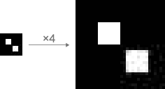
32×32 pixels, Quality: 10 (in Photoshop), 396 bytes.
Both white squares are the same size: 8×8 pixels. Although the Quality is set low, the lower-right corner looks fuzzy (as you might expect) and the upper-left corner looks nice and clean. How did that happen? To answer this, we need to look at this image under a grid:

As you can see, the upper-left square is aligned into an eight-pixel grid, which ensures that the square looks sharp.
When saved, the image is divided into blocks of 8×8 pixels, and each block is optimized independently. Because the lower-right square does not match the grid cell, the optimizer looks for color indexes averaged between black and white (in JPEG, each 8×8 block is encoded as a sine wave). This explains the fuzz. Many advanced utilities for JPEG optimization have this feature, which is called selective optimization and results in co-efficients of different quality in different image regions and more saved bytes.
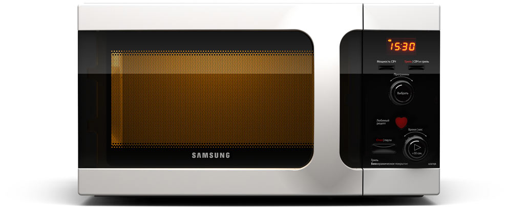
This technique is especially useful for saving rectangular objects. Let’s see how it works with a more practical image:
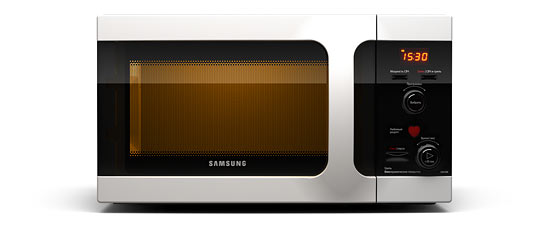
13.51 KB.
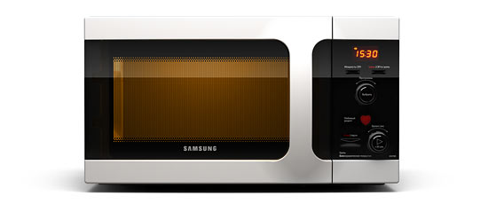
12.65 KB.
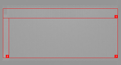
In the first example, the microwave oven is randomly positioned. Before saving the second file, we align the image with the eight-pixel grid. Quality settings are the same for both: 55. Let’s take a closer look (the red lines mark the grid):
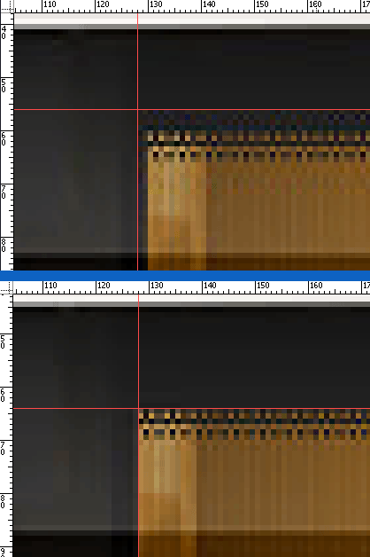
As you can see, we’ve saved 1 KB of image data simply by positioning the image correctly. Also, we made the image a little “cleaner,” too.
Color Optimization
This technique is rather complicated and works only for certain kinds of images. But we’ll go over it anyway, if only to learn the theory.
First, we need to know which color model is being used for the JPEG format. Most image formats are in the RGB color model, but JPEG can also be in YCbCr, which is widely used for television.
YCbCr is similar to the HSV model in the sense that YCbCr and HSV both separate lightness for which human visual system is very sensitive from chroma (HSV should be familiar to most designers). It has three components: hue, saturation and value. The most important one for our purposes here is value, also known as lightness (optimizers tend to compress color channels but keep the value as high as possible because the human is most sensitive to it). Photoshop has a Lab color mode, which helps us better prepare the image for compression using the JPEG optimizer.
Let’s stick with the microwave oven as our example. There is a fine net over the door, which is a perfect sample for our color optimization. After a simple compression, at a Quality of 55, the file weighs 64.39 KB.
990×405 pixels, Quality: 55 (in Photoshop), 64.39 KB.
Larger version.
Open the larger version of the image in Photoshop, and turn on Lab Color mode: Image >> Mode >> Lab Color.
Lab mode is almost, but not quite, the same as HSV and YCbCr. The lightness channel contains information about the image’s lightness. The A channel shows how much red or green there is. And the B channel handles blue and yellow. Despite these differences, this mode allows us to get rid of redundant color information.
Switch to the Channels palette and look at the A and B channels. We can clearly see the texture of the net, and there seems to be three blocks of differing intensities of lightness.
We are going to be making some color changes, so keeping an original copy open in a separate window will probably help. Our goal is to smooth the grainy texture in these sections in both color channels. This will give the optimizer much simpler data to work with. You may be wondering why we are optimizing this particular area of the image (the oven door window). Simple: this area is made up of alternating black and orange pixels. Black is zero lightness, and this information is stored in the lightness channel. So, if we make this area completely orange in the color channels, we won’t lose anything because the lightness channel will determine which pixels should be dark, and the difference between fully black and dark orange will not be noticeable on such a texture.
Switch to the A channel, select each block separately and apply a Median filter (Filter >> Noise >> Median). The radius should be as small as possible (i.e. until the texture disappears) so as not to distort the glare too much. Aim for 4 in the first block, 2 in the second and 4 in the third. At this point, the door will look like this:

The saturation is low, so we’ll need to fix this. To see all color changes instantly, duplicate the currently active window: Window >> Arrange >> New Window. In the new window, click on the Lab channel to see the image. As a result, your working space should look like this:
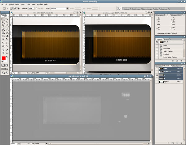
The original is on the right, the duplicate on the left and the workplace at the bottom.
Select all three blocks in the A channel in the workplace, and call up the Levels window (Ctrl+L or Image >> Adjustments >> Levels). Move the middle slider to the left so that the color of the oven’s inside in the duplicate copy matches that of the original (I got a value of 1.08 for the middle slider). Do the same with the B channel and see how it looks:

990×405 pixels, Quality: 55 (in Photoshop), 59.29 KB
Large version
As you can see, we removed 5 KB from the image (it was 64.39 KB). Although the description of this technique looks big and scary, it only takes about a minute to perform: switch to the Lab color model, select different regions of color channels and use the Median filter on them, then do some saturation correction. As mentioned, this technique is more useful for the theory behind it, but I use it to fine-tune large advertising images that have to look clean and sharp.
Common JPG Optimization Tips
We’ll finish here by offering some useful optimization tips.
Every time you select the image compression quality, be deliberate in your choice of the program you use for optimization. JPEG standards are strict: they only determine how an image is transformed when reduced file size. But the developer decides what exactly the optimizer does.
For example, some marketers promote their software as offering the best optimization, allowing you to save files at a small size with high Quality settings, while portraying Photoshop as making files twice as heavy. Do not get taken in. Each program has its own Quality scale, and various values determine additional optimization algorithms.
The only criterion by which to compare optimization performance is the quality to size ratio. If you save an image with a 55 to 60 Quality in Photoshop, it will look like and have the same size as files made with other software at, say, 80 Quality.
Never save images at 100 quality. This is not the highest possible quality, but rather only a mathematical optimization limit. You will end up with an unreasonably heavy file. Saving an image with a Quality of 95 is more than enough to prevent loss.
Keep in mind that when you set the Quality to under 50 in Photoshop, it runs an additional optimization algorithm called color down-sampling, which averages out the color in the neighboring eight-pixel blocks:

48×48 pixels, Quality: 50 (in Photoshop), 530 bytes.

48×48 pixels, Quality: 51 (in Photoshop), 484 bytes.
So, if the image has small, high-contrast details in the image, setting the Quality to at least 51 in Photoshop is better.


