Web Form Validation: Best Practices and Tutorials

Email Newsletter
Weekly tips on front-end & UX.
Trusted by 182,000+ folks.
 Register for Free

 Celebrating 10 million developers

 Custom Web Forms for Angular, React, & Vue. Your backend.
The goal of web form validation is to ensure that the user provided necessary and properly formatted information needed to successfully complete an operation. In this article we will go beyond the validation itself and explore different validation and error feedback techniques, methods and approaches.
Further Reading on SmashingMag:
- Form-Field Validation: The Errors-Only Approach
- Useful Ideas And Guidelines For Good Web Form Design
- Web Form Design: Showcases And Solutions
- Improve The User Experience By Tracking Errors
Validation methods
User’s input can be validated on the server and on the client (web browser). Thus we have server-side and client-side validation. We’ll discuss pros and cons of each.
Server-side validation
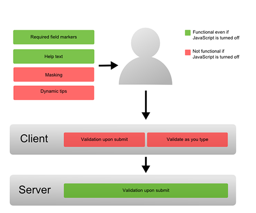
In the server-side validation, information is being sent to the server and validated using one of server-side languages. If the validation fails, the response is then sent back to the client, page that contains the web form is refreshed and a feedback is shown. This method is secure because it will work even if JavaScript is turned off in the browser and it can’t be easily bypassed by malicious users. On the other hand, users will have to fill in the information without getting a response until they submit the form. This results in a slow response from the server.
The exception is validation using Ajax. Ajax calls to the server can validate as you type and provide immediate feedback. Validation in this context refers to validating rules such as username availability. You can read more about validation with Ajax in this excellent tutorial on jQueryForDesigners.
Client-side validation
Server-side validation is enough to have a successful and secure form validation. For better user experience, however, you might consider using client-side validation. This type of validation is done on the client using script languages such as JavaScript. By using script languages user’s input can be validated as they type. This means a more responsive, visually rich validation.
With client-side validation, form never gets submitted if validation fails. Validation is being handled in JavaScript methods that you create (or within frameworks/plugins) and users get immediate feedback if validation fails.
Main drawback of client-side validation is that it relies on JavaScript. If users turn JavaScript off, they can easily bypass the validation. This is why validation should always be implemented on both the client and server. By combining server-side and client-side methods we can get the best of the two: fast response, more secure validation and better user experience.
What to validate
There are several different types of validation you can perform: required fields, correct format and confirmation fields.
Required information
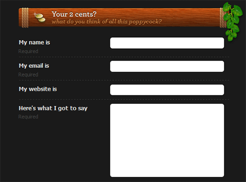
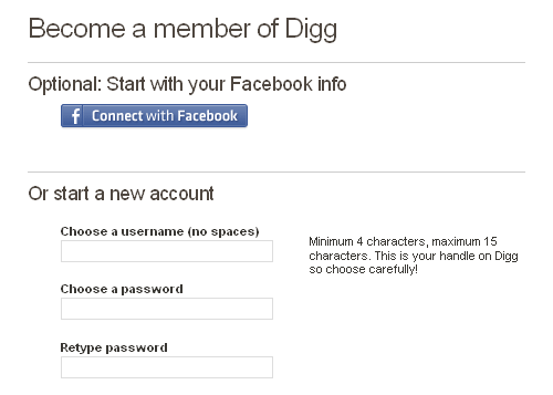
The first and most obvious information that should be validated is required information – information without which operation cannot be completed successfully. Thus, validation has to ensure that the user provided all the necessary details in the web form and it has to fail if at least one of the fields is not provided. Required fields should be clearly marked in order to inform users about what information has to be provided up front.
A common way to mark required fields is with an asterisk (*). However, not all users know the meaning of an asterisk sign. Beginners or older users are very likely to have only a general idea of what an asterisk might mean. This is the reason why it is a good practice to either put a note on the top of the form that indicates that all fields marked with an asterisk are required or to use required field markers. In case that all fields are required there is no need to place asterisks or markers in the form. A simple message that all fields are required is enough.
Last year, we conducted an survey on Web form design. According to that survey “designers tend to remove all unnecessary details and distractions which don’t help the user to complete the form”. More detailed analysis showed a trend of using very few mandatory fields – more than 50% of forms used at most 5 mandatory fields, while optional fields were often avoided. This can be useful to you when deciding on required fields.
Correct format
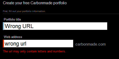
Apart from ensuring that users provide necessary information, validation has to ensure that users provide information in the correct format. This applies to various cases such as email address, URL, dates, phone numbers and others. If the information is not in the correct format, users should be informed and correct format should be suggested. Probably the easiest way to validate the “correct” formatting is to use regular expressions.
Please notice that it is often a good idea to not impose a strict input pattern on the users; it’s better to actually permit users to enter text in a variety of formats and syntaxes, and make the application interpret it intelligently. The user just wants to get something done, not think about “correct” formats and complex UIs. Let the user type whatever he needs, and if it’s reasonable, make the software do the right thing with it. This design pattern is also often called forgiving format UI design pattern.
To learn more about regular expressions be sure to read Essential Guide To Regular Expressions: Tools and Tutorials or if you already know the basics: Crucial Concepts Behind Advanced Regular Expressions. We’ll discuss some other format techniques later in the article.
Confirmation fields
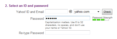
When dealing with data that is important to the system, it is a good practice to let the users confirm their input using additional confirmation fields. This way users can be certain that they provided correct information. A typical case when confirmation field is used is for passwords, but it can be used in other cases like an email address.
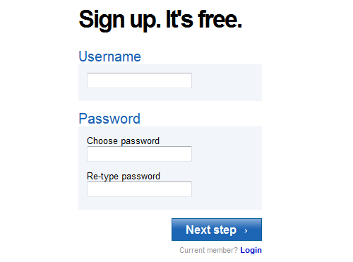
A confirmation field should be placed next (or below) the target field. It has to clearly describe the purpose of the field such as “Confirm your password”. If two values do not match, the user should be informed. As an option, you can use a success indicator if values DO match.
The second part of our survey shows interesting information about confirmation fields. Email confirmation was mandatory in only 18% of sites, while password confirmation was mandatory in 72% of web sites. Surprisingly, large websites such as Facebook, LinkedIn, Stumbleupon and Twitter don’t require password confirmation.
Validation feedback
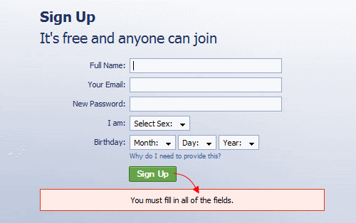
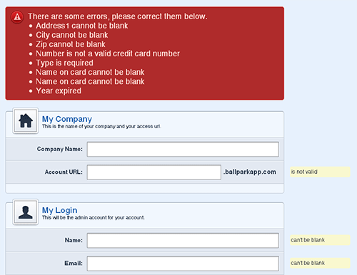
If validation fails, the system should let the users know it by providing a clear and unambiguous message (usually one or two sentences) and ways to correct errors. Since users need to notice an error message immediately, it is a good practice to position it at the top of a web form, before all the other fields. This will also allow screen readers to easily access the message.
The message should be shown preferably in red since this is the color that people usually associate with errors and it should contain an appropriate icon in order to get more attention. Icon should be globally recognizable, such as a red circle with white cross. This will also help people with visual impairments identify the meaning of the message. In addition to this, users should be informed about which input fields need to be checked.
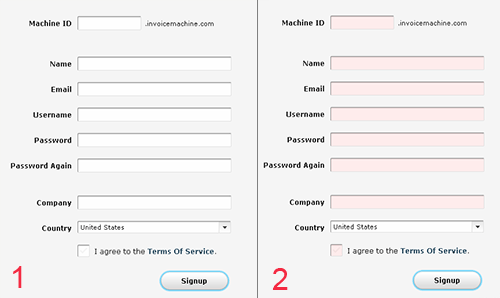
Apart from the error message and a list of invalid fields, the system should clearly mark fields that are invalid. This can be done in one of the following ways (or any combination of them):
- By providing red inline messages or markers next to every invalid field
- By changing the background color or border color of invalid fields (to red)
- By changing the color of field labels
- By providing error tips (balloons) next to each field
If you provide error tips or help, be short and informative. For example, if date is in an incorrect, format provide users with details on how to format it properly: “The date should be in the dd-mm-yyyy-format”. It is sometimes also a good idea to have these hints as the initial value of your input fields. Thus, the user will first read the hint inside the input box and when he/she will start typing the data, the hint will disappear.
Validation upon submit
The “classic” way to perform validation is when the user submits his data via the “submit”-button. The validation is executed and if any errors are found, feedback is returned and displayed to the user. This way users will be able to fill the form without any interruptions. But, that could be a disadvantage as well. Users will be able to fix the errors only after they try to submit the form and get the response back from the server. This technique is typical for server-side validation, but can also be done on the client side.
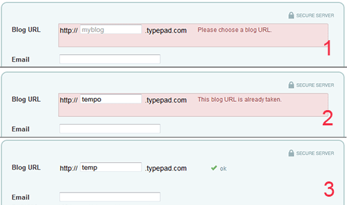
Real-time validation (or instant validation)
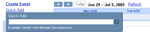
In contrast to the previous technique, real-time-validation alerts users while they are filling in the form. That doesn’t necessarily mean that the validation is performed on every single key press but rather when a field loses focus. This way users will get immediate feedback about their input, e.g. if a username is available or if a date is in the correct format. Obviously, instant validation occurs during typing in an input field or after the input field loses focus. Usually, it is complemented with a text message, tip or a status icon.
Instant validation should be implemented carefully and in appropriate cases because it might be distracting if overused or misused.
What to avoid?
There are two things you should really try to avoid when designing form validation. First, single error pages are bad practice. Singe error page means that users are redirected from the Web form they filled to a page that shows some feedback. In this case, users are forced to browse back in order to fix errors. When they browse back they will have to memorize the information you provided in the error message. The same applies to feedback messages in popup windows. Not only are popups annoying, but once they are closed all the feedback is lost.
An interesting finding in the second part of SM survey is that “30% of the forms displayed only an error-message at the top of the form (no input fields were highlighted)” while “29% had highlighted input fields with corresponding messages next to the input field (no error-messages were provided at the top of the page)”. Only 25% used both error-messages and input fields.
Probably the most surprising facts are that 14% of sites still use JavaScript popup for showing validation feedback, while Ajax validation is present only on 22% of sites. This shows big variations in validation feedback.
Better safe than sorry
Apart from the pure validation, there are several techniques that can help users make fewer mistakes. Although not all of these techniques can be considered validation, they do help by guiding users and preventing them from making mistakes.
Help hints
If a web form requires complex information to be filled in, help hints can significantly help users in the process of filling in the correct information. By guiding them how to fill particular information, you let them fill the form faster and avoid potential validation errors. Help hints are usually shown as simple text next to or above the input field. The design of help hints should differ from the design of form labels. It is usually shown in smaller, grayed text. The advantage of help information is that it is always visible to the user even if JavaScript is turned off.
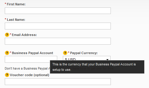
Help indicators (tooltips)
In contrast to help hints, tooltips initially hide information and make it visible “on demand”. They are usually triggered by an icon with a question mark. Help information is shown by hovering over the help icon or clicking on it. Once the mouse is moved away from the icon, the tooltip disappears. Help indicators can reduce clutter, especially if help text is too long.
Dynamic tips
Similar to the previous case, dynamic tips are initially not visible to users. Once the user enters a particular input field, related tip is shown. This way tips are emphasized and clutter in the form is reduced. Tips should be shown in such a way that they don’t cover other information on the form. They are usually shown next to input fields, but you should always try to place them on the right side of the fields since that is less distracting.
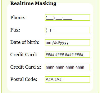
Masking and reformatting user’s input
Apart from validating user’s input and assisting users, web applications can also take part in providing correct data by formatting user’s input. This can be done by masking input fields in order to force users to enter information in an appropriate format. Mask is an expression that controls what users can enter in an input field. Masking can be implemented easily with one of the following plugins:
In some cases users might fill partially correct information or correct information but in different format. In those cases web application can provide a mechanism to correct and rewrite the user’s input. Some of the possible scenarios when you might consider rewriting user’s input are:
- if, for instance, a user enters URL without “https://” prefix, the system can just add this string to the beginning of URL.
- if a user provides data in the dd-mm-yyyy-format, but the required format is yyyy-mm-dd, the system can rewrite the date so it is well-formed
- if a user provides credit card number without dashes, the system can add dashes to appropriate positions in the credit card number
These ideas are just some of the cases when this technique can be used. However, auto-formatting should be used carefully and – if not used properly – can be confusing to users. Also, not all user’s input is predictable. If, for example, user enters “www.smashingmagazine” and omits the extension, the system can’t assume that the extension is “.com”, but should rather raise a validation error.
In this context it’s again worth mentioning the “forgiving format” design pattern. Instead of restricting user’s input to a specific format you can allow users to provide various formats and let the system parse it. In many cases this would require a lot of server processing; back-end would be responsible for parsing the input, extracting information and converting it to appropriate formats for further processing.
According to our survey. 67% of sites use help text and tips, 10% of which use dynamic tips. Surprisingly, only 26% of tips are positioned on the right side of the fields, while in other cases tips are positioned above, below and even on the left side of input fields.
Are you human?
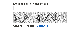
Web form validation wouldn’t be complete without mentioning Captcha. Captcha is a significant part of validation as it is responsible for finding out if the user of a system is a human or a bot. In its simplest form, captcha consists of an image showing text, numbers or an expression and a field that expects content of the image as input. The earliest captcha generated images with numbers (e.g. “8356”) and that number was expected to be entered by the user. If correct number wasn’t entered (or not entered at all), the form couldn’t be submitted. In fact, today most spam bots are able to recognize the text embedded in a simple captcha-image, so it’s a good idea to pose some question that only humans could answer correctly, e.g. “What color does the Sun have?” with correct answer “yellow” in all its variations (“YELLOW”, “yellow”, “Yellow” etc.).
You may also want to consider the technique called Honeypot Captcha where the idea is to create hidden form elements and check on the server side that they remain blank. Another option is to create a form field with a label that says, “Leave this field blank” and then is marked as a required field (thank you, Shawn McCool).
The kind of captcha presented above caused a major problem in accessibility. Blind, visually impaired or dyslexic users have difficulties or are even impossible to complete the web form with Captchas. As the Web evolved, so did captchas and today there are implementations that have audio support for users with disabilities.
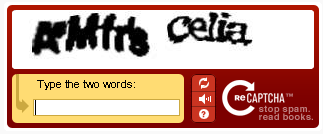
Still most users hate captchas (and there is a good reason for hating them!). Of course, people just don’t like filling in forms. If they can’t do it fast and effortlessly, there is a high probability that they won’t do it at all. This is where a captcha doesn’t help at all: it can take too much time for users to read (if text is messy) which happens oft in practice. Remember, Captcha helps site owners, not their users. Therefore it’s always a good idea to avoid using Captchas if you can avoid them. To read more about Captchas and accessibility, read Inaccessibility of CAPTCHA.
Useful resources
Here are some of the frameworks, plugins and tutorials that might help you easily implement validation in your forms.
- LiveValidation A small, open source JavaScript validation library. It enables real-time, rich client validation which can be implemented easily. The best way to see its capabilities is to check out the example page.
- Validanguage A validation framework that enables rich client-side validation.
- JavaScript Form Validation A JavaScript validation framework for creating inline validation. You can configure it through JavaScript code or by using XML configuration file.
- UniForm An attempt to standardize form markup (xhtml) and CSS. It can help you style error messages, help text, indicators and so on.
- jQuery Validation plugin One of the most popular validation plugins. As expected from jQuery plugin, it enables validation in one line of code, but you can also customise it. It has only 14 kb and is compatible with jQuery 1.3.2.
- jForm Another jQuery plugin that lets you implement validation easily. Not only that it performs validation but also has the support for live tips. It is still in development phase but is worth checking.
- Dynamic JavaScript Form Validation Provides easy validation and attractive error messages.
- jQuery Form Validator Another great jQuery validation plugin that performs live validation. It is fully customisable and supports localisation as well.
- Form field hints with CSS and JavaScript A useful tutorial on how to create help tips using CSS and JavaScript. Demo and source are included.
- PHP Contact Form with jQuery Validation This tutorial shows how to implement the validation of a contact form using PHP and JavaScript.
- How to Validate Forms on both sides using PHP and jQuery Shows how to implement both client-side and server-side validation using PHP.
- Adding Form Validation to WordPress Comments using jQuery An interesting tutorial for all Wordpress users.
Conclusion
You saw different methods and techniques that you can use to implement validation in your forms. Although there are many possibilities, you should carefully plan validation for each project. Not all techniques provide a solution for everything. Some of them are very helpful and easy to implement, but some lack usability and simplicity. If you are new to web form design here is a short list of what to consider in Web form validation design). That might be enough for you to start.
Rules of thumbs in web form validation design
- Never omit server-side validation.
- Don’t provide confusing validation feedback. It should clearly communicate the errors and ways to fix them.
- Don’t let users think about what information is required, always clearly mark required fields.
- Never provide validation feedback on a single page or in a popup alert.
- Don’t use dynamic effects as compensation for a badly designed form. Fancy effects won’t hide a poorly designed web form.
- If you use Captcha, don’t forget to provide audio support and enable users to “reload” the Captcha.
- Don’t forget to inform users when the form was completed successfully. It is as important as a good validation feedback.


