Free Typographic XHTML/CSS-Layouts For Your Designs

Email Newsletter
Weekly tips on front-end & UX.
Trusted by 182,000+ folks.
 Custom Web Forms for Angular, React, & Vue. Your backend.


 Celebrating 10 million developers
The response was overwhelming and we really had a hard time going through the designs, analyzing them and deciding which templates deserve the awards. Unfortunately, many templates were just copies of the current designer’s blog and some weren’t related to typography at all. So in the end many templates didn’t make it to this post.
However, we did receive a number of brilliant typographic templates that we are happy to release for free download and personal and commerical use as the gift for the web design community. We hope that these templates will help you to improve the quality of typography in your future designs!
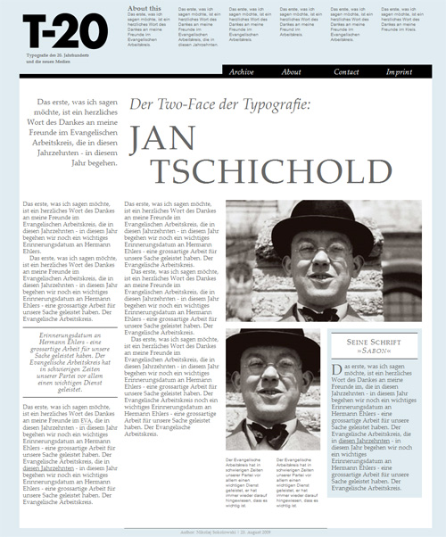
Winner (1st place): T-20
T-20 [ preview | download ]
“The Layout is following the rules of Grid-Based-Design and aesthetical and readable type. I also tried to make everything only with CSS. The Images have to be replaced - blank PSD-Files in different fitting sizes are also attached. I know you won’t take this but it was a good chance to try out some things I always wanted to make - and I will go on with this.” Designed by Nikolaj Sokolowski from Bremen/Germany.
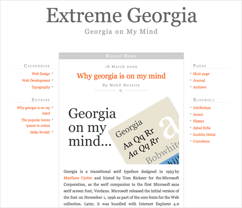
Winner (2nd place): Extreme Georgia
Extreme Georgia [ preview | download ]
“I hand-in a single-page template for blogs. The title for this work is Extreme Georgia. It is 100% Georgia-based, and I am aware that it is a bit old-school. However, the design itselft reflect back the concept that I want to bring, which is, content is the king. I took into account the colors, whitespaces, line-height, font-size and also the content width for this design.
It might look plain, but it can be customized easily, let’s say, the color of the links, background image can be added later, and also the background colors. My work is heavily influenced by many designers, such as Jason Santa Maria, Jon Tangerine, Tim Van Damme, Khoi Vinh, and especially, the Georgia font which was designed by Matthew Carter. Without them, I wonder where could I be now in web design industry.” Designed by Mohd Huzairy Mohd Rezuan from Kuala Lumpur, Malaysia.
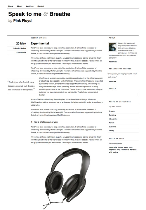
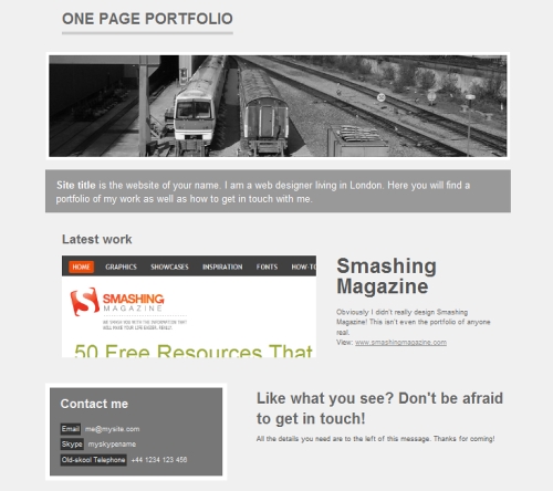
Winner (3rd place): Experimental
Experimental [ preview 1 preview 2 | download ]
“A minimal blog theme inspired in the Swiss Style of Design: It features Arial/Helvetica, grids, a generous use of whitespace for better readability and a strong focus in typography. The idea was to design an universal Wordpress theme that’s focused on content and images, with an invisible, yet sleek design. Authors can modify the header as they wish, including images or playing with typography as in the example. this layout was coded using EMs, so it doesn’t break when you make text size changes in your browser. It’s an elastic design.” Designed by Rodrigo Galindez from Argentina.
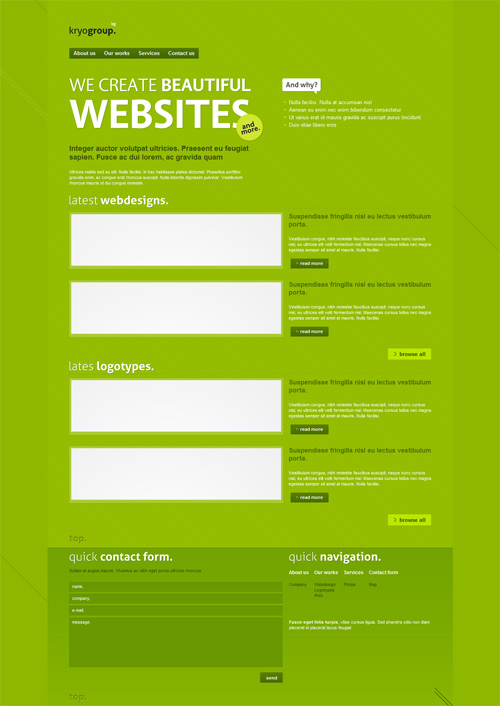
Greenie Theme
Greenie Theme [ preview | download ]
“Greenie Theme is suitable for portfolio site, but can be used elsewhere where client needs to show his works. I used big typographic claim for catch users attention and other typo elements. Like its name, theme used fresh green color for main content page, and for background.” Designed by Ondrej Lechan from Slovakia.
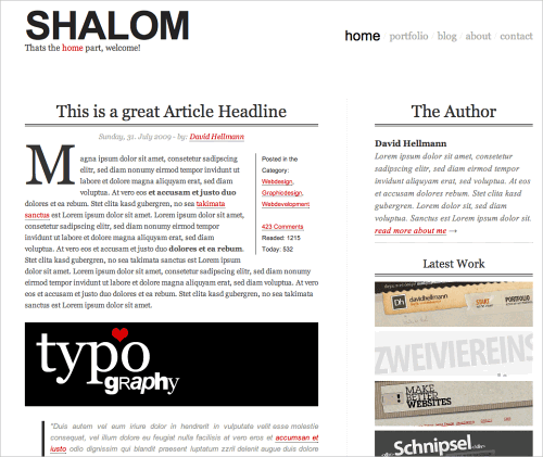
Shalom Typo
Shalom Typo [ preview | download ]
Designed by David Hellmann from Cologne, Germany.
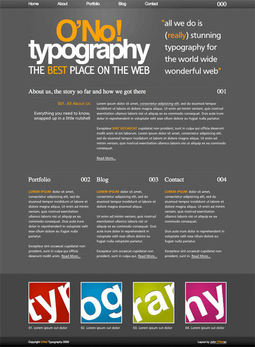
O’No! Typography
O’No! Typography [ preview | download ]
“The idea behind the layout was to create something very simple, but very detailed and adaptable. Cufon is the driving force behind most of the type itself, even the body text, which means that it looks fantastic in all browsers - even ones which don’t usually bother to anti-alias. The adaptable-ness of the theme comes from the way in which the css classes are constructed. They’re designed to work together to form different boxes of text.
For example, the class=“box small left” would create a box spanning 1 column, with a background image to support the heading tag, and float to the left. A variation would be class=“big right” - which would create a box spanning 2 columns with no background image, float to the right, and eliminate any extra margins. This means that it’s really easy to adapt and change the layout to suit your needs, a few examples of which are included!” Designed by John O’Nolan from United Kingdom.
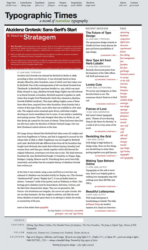
Typographic Times
Typographic Times [ preview | download ]
“This was mostly motivated by my desire to play around a bit with @font-face, which I don’t usually get to do. I stumbled upon a lovely imitation of Bembo at Font Squirrel and based a lot of the design off its italic (though it works fine with Georgia as well). I knew I wanted to try to do something very clean and restrained, and decided on a news blog–typography themed, of course–and went from there. I took inspiration from a number of places, most strongly from typographica.org (for the general page structure) and https://weblog.cynosura.eu (for the top navigation).” Designed by Evan Hensleigh from United States.
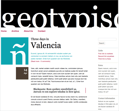
Geotypisch
Geotypisch [ preview | download ]
“Pure CSS and XHTML, no images, no JavaScript. Fonts used are Georgia and Arial. This template contains 2 example posts, one with comments, a comment form and a sidebar. Boxes are build using the 16 column 960 grid system. ” Designed by Otto Coster from Netherlands.
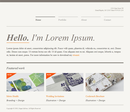
Megan
Megan [ preview | download ]
“The basic idea behind this site design was to create a visually stimulating layout with typography. Because the site is to be used as a template I chose to layout the type in Times New Roman. I feel that as of lately I see the web-based font Georgia being used a lot and Times New Roman seemed to be a little more unique and has a lighter, more sophisticated feel. Also, keeping in mind that the design was for a template, I decided to make the background and type a neutral color and then accented it with a bold red/orange color.
I thought this way people could switch up their bold color to whatever they would like for easy customization. Another common theme carried out throughout the site design is the horizontal line element. This element is used in the navigation, to help break up blocks of information, and to underline words or links. Overall the idea was to create a template with an overall typographic foundation that could be easily customizable and I believe this design successfully does that.” Designed by Megan Sullivan from Grand Rapids, Michigan, USA.
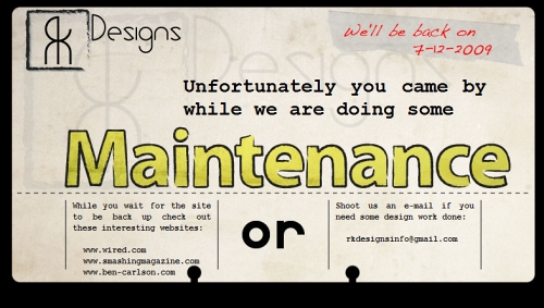
Maintenance
Maintenance [ preview | download ]
“Maintenance pages are never something that a person wants to see. By adding more elements (such as a timeline, alternate entertainment, and contact information), the page will be more interesting to view and thus make someone more likely to come back when the site is back. The idea of making it look like a card made it seem more like a noticed posted on an office door by a secretary that was using whatever was lying around.” Designed by Ryan King from United States.
WP Typo
WP Typo [ preview | download ]
“WP Typo is purely typographic, no images used whatsoever. There isn’t any grand ideology here, it’s just a simple and hopefully nice looking theme for sites where writing is the focus.” Designed by Chris Coyier from United States.
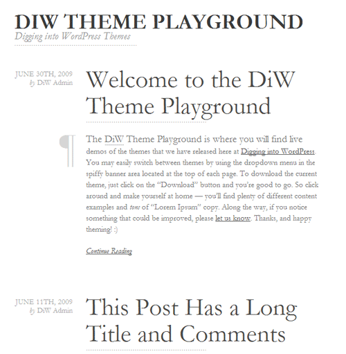
theARTofTYPE
theARTofTYPE Typography Blog Template [ preview | download ]
“A Very Light Blog Template. ” Designed by Jan Harold Diaz from Philippines.
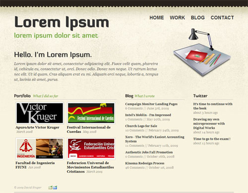
David Kruger
David Kruger [ preview | download ]
Designed by David Kruger from Paraguay.
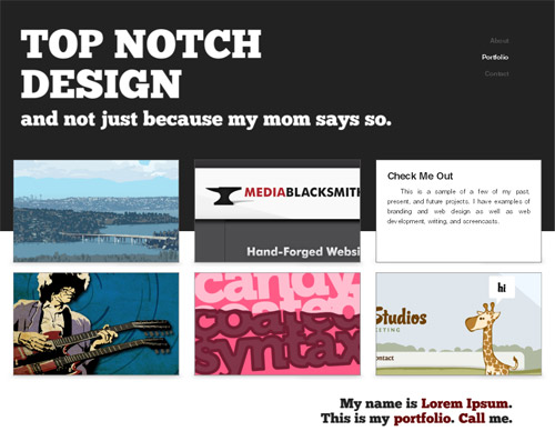
Top Notch
Top Notch [ preview | download ]
“I designed “Top Notch” as a template that would allow the end user feel like they were a part of a conversation.” Designed by Garth Braithwaite from US.
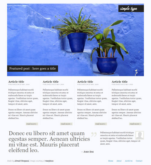
Simple Type
Simple type [ preview | download ]
“A minimalistic & typographic layout, based on a 960 pixels grid system.” Designed by Ahmed Chergaoui from Agadir, Morocco.
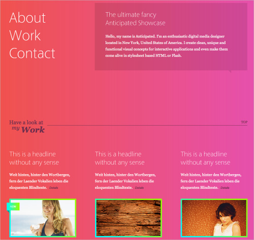
Anticipated
Anticipated [ preview | download ]
“A simple typographic portfolio template. ” Designed by Markus Müller from Stuttgart, Germany.
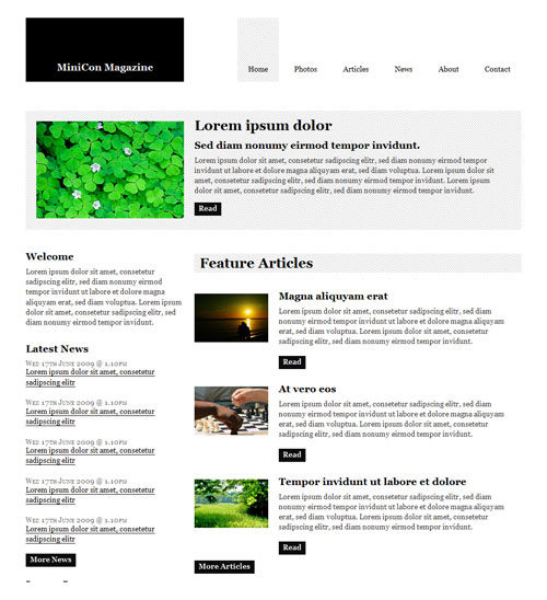
MiniCon
MiniCon [ preview | download ]
“Half minimalism and half contrasting colours, suited mainly for magazine type website but could be used for many other things too of course. My main inspirations were various WordPress themes and typography websites from smashing magazine’s collection of 100 wordpress themes for 2009 and minimalsites.com. It uses the 960 grid system CSS framework, Cufon text replacement and JQuery. The photos are from various free stock websites.” Designed by Joe Brightwell from New Zealand.
The theme
Theme [ preview | download ]
Designed by Leo DINH from Vietnam.
Typo E-mag
Typo E-mag [ preview | download ]
“A nice typographic template, looks like a blog’s main page. Main features are: nice color scheme, nice typography, nice sidebar (some people like to say “widget ready”) and nice footer. I know that there are missing comments numbers, but who on the Earth does need comments? Main colors are #fff, #cfcfcf, #c40000, #666, and #444. Hope you like it. Yeah, and it’s my first template.” Designed by Matej Grabovský from Czech Republic.
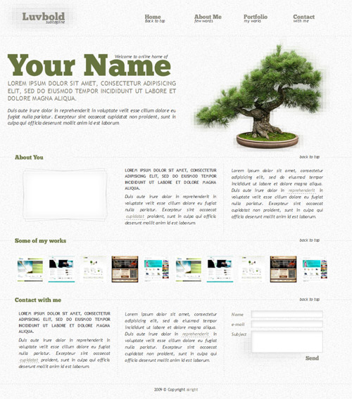
Luvbold
Luvbold [ preview | download ]
“Simple and clean layout with bold and characteristic fonts.” Designed by Wojtek Konieczny from Poland.
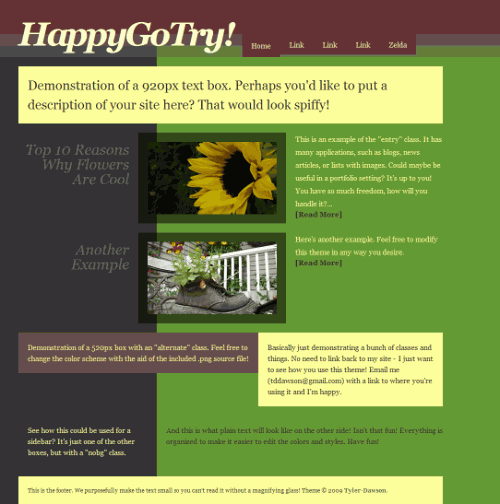
Happy Go Try
happy-go-try [ preview | download | release post of the WordPress theme (thanks, Alex Denning) ]
“This theme is designed to be light-weight and flexible. It is based on a modified grid system. I believe it has potential for a number of types of websites. I’ve included the source .png file to make it easier for you to modify the color scheme as you see fit. No link-backs to my site are necessary, although I’d GREATLY appreciate if you’d email me a link to theme in action if you use it! Since it’s designed to be flexible, feel free to modify it to your needs and let me know how it works out!
I wanted to make my template light-weight and flexible. Standard HTML typography is used extensively to make it easy to edit, quick to load, and optimal for SEO. It’s based off of a modified grid to allow many different uses. In addition, I have included a rough fireworks source file to make it easier for users to change the color scheme. The name, happy-go-try, is an anagram of “typography” and is supposed to represent the light-weight, light-hearted approach I took with this simple, but flexible design.” Designed by Tyler Dawson from Iowa City, IA, USA.
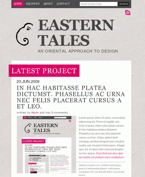
Eastern Tales
Eastern Tales [ preview | download ]
“I wanted a simple theme that would rely less on graphics, and more on color layout and type to let the content stand out. I chose the paper background to create texture. After choosing one from cgtexture.com, the texture reminded me of a paper made from elephant dung [called Elli Poo I think].
So then I thought of a line drawing motif for the generic logo. [hoping it would look letterpress..] The motif is another way of drawing ganesha, the elephant god. I hand drew ganesha using wacom graphire in Gimp app, on Mac OS X. I also hand drew the twitter bird directly on the tablet. I hand coded the files using text wrangler.
I kept the colors to a minimum [pink/black/white] to keep attention on the text. “ Designed by Lakshmi Mareddy from India, presently in the US.
Paivi K
Template Paivi_k [ preview | download ]
“The idea of the template was to design a simple but powerful look for my personal blog. I usually tend to provoke a bit in my blog (with a sence of humour), maybe sometimes not being so nice to things and people that I critizise. Therefore the blog’s name became “The ugly colors of me” - which indicades into the content: “the not so pretty thoughts of me “. The layout color theme also derives from the same reasons and therefore strengthen the impact. ” Designed by Päivi Karjalainen from Finland.
Better Web Readability
Better Web Readability [ preview | download ]
Designed by Vladimir Carrer from Verona, Italy.
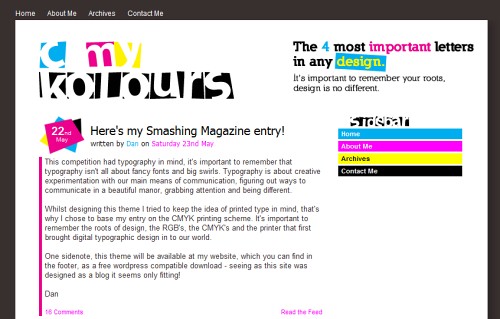
CMYKolours
CMYKolours [ preview | download ]
“CMYKolours is a blog based website layout founded on the CMYK colour scheme, I feel it stands out for numerous reasons, I love trying to experiment with both creative typography and colour palettes. In this layout I feel I have achieved both. On a sidenote, this template will be available for free download on my blog as a wordpress skin.” Designed by Dan Walker from UK.
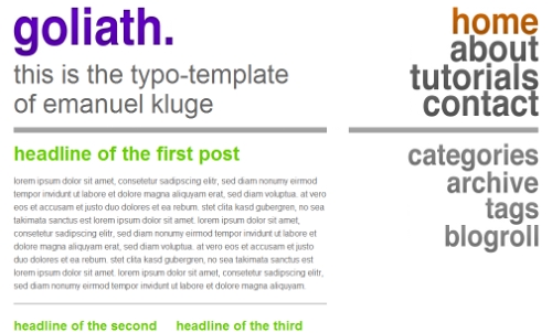
Goliath
Goliath [ preview | download ]
“A two-column blog-template with lots of white-space and big letters.” Designed by Emanuel Kluge.
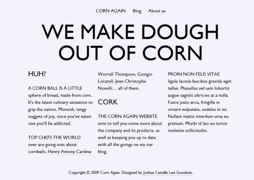
Cornballs
Cornballs [ preview | download ]
“This is a simple, lazy design, sort of inspired by the famous Keep Calm and Carry On poster. It makes use of one exciting CSS3 features documented in a recent Smashing Magazine’s article about CSS columns. This is a special treat for users of Gecko and WebKit browsers, and don’t worry because it looks perfectly decent in browsers which don’t support this feature – IE6 is not going to go “pop”. Aligned to both a horizontal and vertical grid, each row of the latter being 24 pixels high. “ Designed by Joshua Goodwin from England.
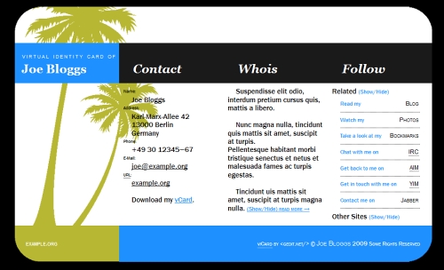
viCard
viCard [ preview | download ]
“viCard (Virtual Identity Card) is based on the idea presenting your (business) card in the web by answering three simple questions: who are you? how to contact you? how to follow you? You can share your contact information and your recent activity on Flickr, Twitter or Delicious. Integrated hCard, vCard, screen-, print- and mobile/handheld-friendly. Valid HTML 4.01 Strict and CSS 2.1.” Designed by Simon Gattner from Berlin, Germany.
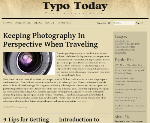
Typo Today
Typo Today [ preview | download ]
“The idea of this theme is newspaper layout. This theme is designed for blog or portfolio.” Designed by Edwin Lunandy from Orlando, FL.
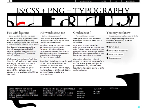
JavaScript Tricks
JavaScript Tricks [ preview | download ]
“I’ve decided to try my design skills that I’ve collected while working on that 2 positions and create practically my first comp for you contest. So, the main idea is about usign JS, PNG and aesthetic of ligatures and shapes that can be created with spaces/negative spaces of letter forms. Usign Cufon and some of JS functions together with CSS absolute positioning I make random compositions of such a forms with some other features. I’m trying to show that design should be transcend, something more than just sum of technologies and resources that were used. Hope my message will be clear. Fonts used for Cufon: Cardo98, Lacuna.“Designed by Siarhei Mardovich from Belarus.
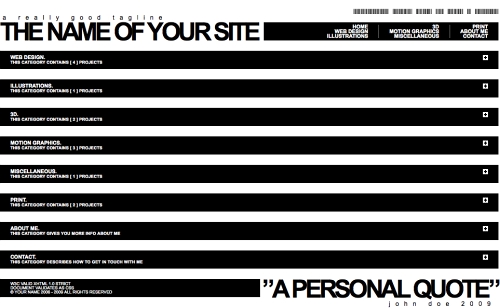
Contrast
Contrast [ preview | download ]
“My aim as a designer is to keep it clean and simple but with a twist. Unnecessary mouse clicks is the worst and objects which doesn’t add anything goes right out of the window, so for me, designing this template has been a real challenge. To keep it simple but still change focus, from the actual content on to the shell of the web site. Therefore, I had to break some of my own ground rules.
01. One extra mouse click: In order to view the actual content you have to click at least two times, one to expand the category and one to go to the project page. I choose to do it this way because I wanted the user to get a overview when he/she enters the site and to give each project it’s own page to make permalinking easier and to give the project the right amount of focus.
Because the task was to focus on the typographic I choose to add some unnecessary typographic details, this to make the site feel more complete. Because of the focus on typography and the above mentioned unnecessary details and my Swedish design heritage I choose to tone down the colours and stick to just black and white. I’ve exclusively used arial as the font, in different sizes, upper and lower case, and in different kering. This because I wanted to stick with a web safe font, and this where also a challenge, to make a web safe font become interesting, to make it stand out.
I choose to make a wordpress template just because I think wordpress is a very powerful tool to use these days. The target group for the template is someone who wants a portfolio or a smaller company that wants to showcase their work. Theme made for Smashing Magazine Typographic Layout Design Contest.” Designed by Paul Linder from Sweden.
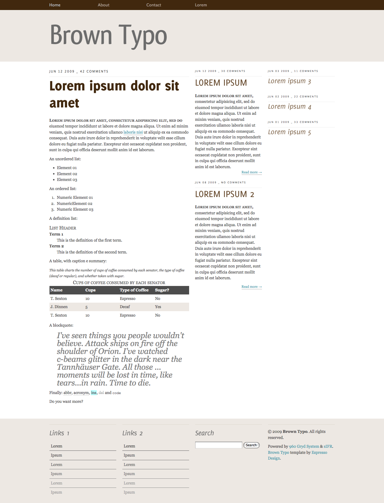
Brown Typo
Brown Typo [ preview | download ]
“Do you love brown? Brown Typo is based on simplicity and brown.” Designed by Vincenzo Milone from Italy.
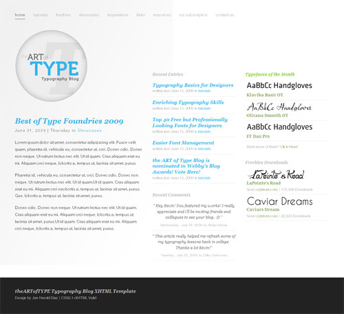
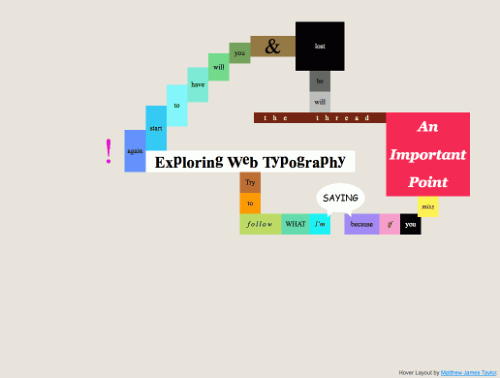
Exploring Web Typography
Exploring Web Typography [ preview | download ]
Designed by Matthew Taylor.
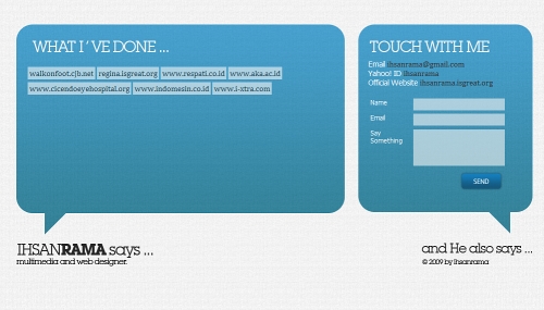
Ihsanrama
Ihsanrama [ preview | download ]
“My design is just want people hear what I am saying. So I called that “Ihsanrama says”.
You know.. just like in the movie Die Hard 3 there is man name Simon, always said : “Simon says…”.” Designed by Ihsan Satria Rama from Indonesia.
Blue Inc
Blue Inc [ preview | download ]
“My template is called “Blue Inc” because it was designed for use on a corporate website and the dominant color used is blue. It is a grid based design, but, as I didn”t want to take the time to decipher someone else’s grid system and since I figured the template should be completely original, I wrote my own grid system with perfect vertical rhythm.” Designed by Kyle Wall from United States of America.
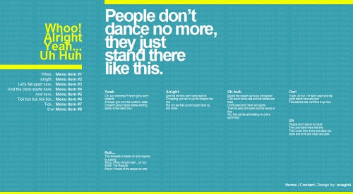
Whoo!
Whoo! [ preview | download ]
“The template has as content the lyrics to The Rapture’s “Whoo! Alright yeah… uh huh”, so it’s a fun and light design.” Designed by Victor Abadio from Brazil.
Worldlines
Worldlines [ preview | download ]
“Worldlines is a concept design for a News website. Mostly today’s news is treated differently from that of yesterday. Whereas in reality, most news stories span across days. The format we have designed gives the user a sense of where today and today’s stories, stand with respect to those of yesterday and so on, and at a glance.
The layout is designed so that it can be scanned and preview quickly. The color-coding and top navigation give the user control over what categories s/he wants to preview. The news items will be ordered according to importance and the stories published previously can be viewed by navigating to the particular date using the navigation at the bottom. And of course typography was our main focus area.” Designed by Harshad Kulkarni, Sarang Norway and Sandesh Halarnkar from Bangalore, India.

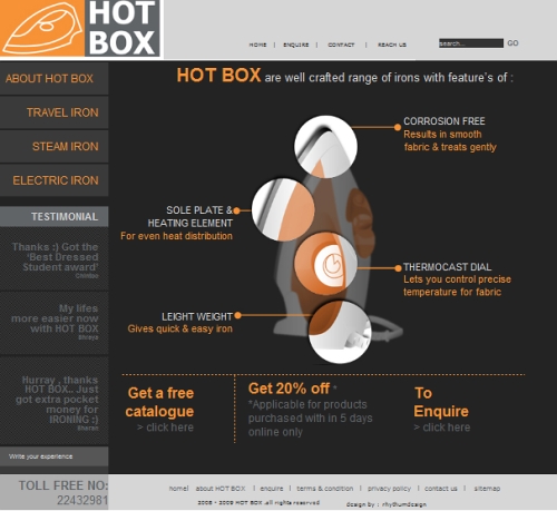
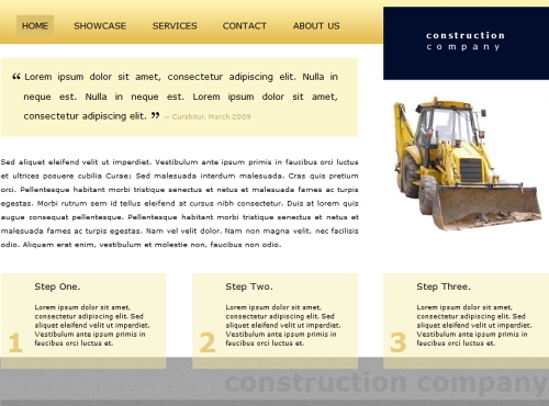
Hot box
Hot box [ preview | download ]
“I have named my product (iron box) - ‘HOT BOX’. I chose iron box as my product ,as it has its own charcter (smooth ironing,wrinkle free clothes,crisp fabric etc.) & and which is seen by all daily.As I also did some research on Iron Boxes,very facinating. I just love the variation in grays & they are great for product site,. As it has the character (gray color ) strong presentation feel. The typo used is simple Arial font.Product on the page is dipicted with the features of the product, which is the main high light of the site.” Designed by Smitha Patwardhan from Bangalore, India.
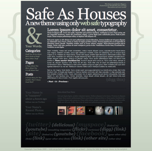
Safe As Houses
Safe As Houses [ preview | download ]
“As you can see my inspiration was to create a simple, adaptable template using only web safe fonts as I think there is a lot than can be done with them structurally and within css without always having to use other replacement techniques. I had hoped to port it into a wordpress theme (and still plan to) but didn’t have time before this deadline.
I should also point out that although the XML file does produce validation errors these are from the Twitter and Flickr scripts (both are from the official sites) in the footer and not the template itself..” Designed by Susan Pierce Sloan.
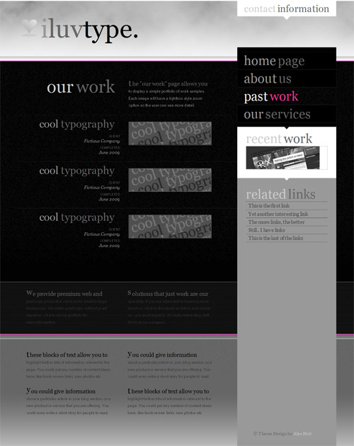
ILuvType
ILuvType [ preview | download ]
“ILuvType is a clean, typographic heavy theme that uses simple device fonts as a design element to create a clean, easy on the eyes, high contrast reading environment. The theme includes 4 page templates and a series of 5 different highlight colour schemes. The theme validates as HTML5 - it uses a small amount of Javascript and Jquery to achieve the necessary effects.” Designed by Alex Holt from United Kingdom.
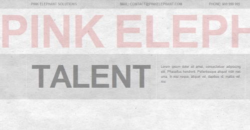
Pink Elephant
Pink Elephant [ preview | download ]
“This template is all about keeping the layout simple and functional while obtaining an aesthetic and rather original look. My primary source of inspiration was 24ways.org, and resources used includes an article on CSS-tricks about RGBa browser support. ” Designed by Bjørn Friese from Denmark.
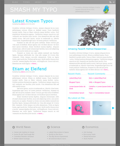
Smash My Typo
Smash My Typo [ preview | download ]
“My goal was to create a blog page with lots of text but still having a good amount of white space. I was aiming for some kind of media blog directed to young adults. First I wanted to create an ajax interface dynamically fetching news from rss feeds and videos from vimeo. But as I saw the contest just a few days before deadline, I realized there was not enough time. I am planning on creating the javascript files later as an addon to the theme.
The text in the blog posts are done like in print for books; Justified text with the first paragraph not being indented, but the rest of the paragraphs has text-indentation. This is done instead of separating the text with line-spacing. The reader does not get interupted by recurring gaps in the text and gets a smooth reading as when reading books.
I have a lot of Ideas of how to improve this template, but there is just no time. Creation Time: Design 9h, CSS 9h, Total 18h.” Designed by Alexander Dahlberg from Sweden.
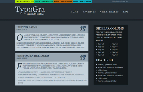
TypoGra
TypoGra [ preview | download ]
“TypoGra is more of a standard blog layout. I tried keeping everything as simplistic as possible (there are 2 images in total).” Designed by Gary Simon from USA - Ohio.
Goldrenrod
Goldrenrod [ preview | download ]
“A special typographic template for businesses.
My immediate thought upon hearing about this contest was how well a typographic website design could work for a small business. I’ve found from my experience that small business websites are usually text heavy but not really graphic oriented and don’t have a need of bells and whistles like login systems, e-commerce, forums, etc. With that in mind, my goal was to create an interesting yet simple website design a small business could use while relying on text to really do the selling.
I also wanted the design to be easily modifiable to allow for just about any type of business, so the only really distinct elements are the logo, the image on the front page and the slight texture on the footer. In addition, I thought that many companies could use a place to show off their work, especially if they’re service oriented- hence, the showcase section. I hope you like it!” Designed by Lindsey Devlin from USA.
An Ordered Aesthetic
An Ordered Aesthetic [ preview | download ]
“This is a very clean, typographic, and minimal template based on the “960 grid”. I wanted to create a functional theme where everything had a purpose. In doing so, the end result was an orderly, uncluttered, thus eye-pleasing design.
I wanted to create a functional theme where everything had a purpose. In doing so, the end result was an orderly, uncluttered, thus eye-pleasing design. Also, I included an alternate stylesheet in the CSS folder for a darker version of the theme. I like the lighter version much more, but it is there if anyone wants to use it. “ Designed by Greg Ponchak from USA.
Dynamic-Fresh
Dynamic-Fresh [ preview | download ]
“I wanted to create a very simple layout using only Helvetica as a typeface and a simple greyscale colour scheme. This would be good for anyone wanting to show off their work with pride and in a stylish but minimalistic way.” Designed by Matthew Kempster from Milton Keynes, England (United Kingdom).
Thank you!
Congratulations to the winners of the contest – Nikolaj Sokolowski (Bremen, Germany), Mohd Huzairy Mohd Rezuan (Kuala Lumpur, Malaysia) and Rodrigo Galindez (Argentina) have already been contacted. We express sincere gratitude for all the great work of the designers who were featured in this post or submitted their work for this contest. We really appreciate your efforts and your good intentions! Thank you very much and please join in next time – more contests are coming soon!


