50 New CSS Techniques For Your Next Web Design

Email Newsletter
Weekly tips on front-end & UX.
Trusted by 182,000+ folks.
 Celebrating 10 million developers

 Custom Web Forms for Angular, React, & Vue. Your backend.

One of the best parts of CSS is that it’s so simple once you know the basics. Where tables used to make incredibly complex and sometimes impossible-to-decipher code, CSS keeps things clean and simple. Add a few comments to keep everything organized and it becomes an absolute dream to work with.
Below are 50 fresh CSS tricks, techniques and tutorials that will help you to improve the quality of your next web design. Be sure to check out our previous articles:
- Powerful CSS-Techniques For Effective Coding
- 50 New Useful CSS Techniques, Tutorials and Tools
- 53 CSS-Techniques You Couldn’t Live Without
- Responsive Web Design Techniques, Tools and Design Strategies
1. Security and Performance
While CSS is often thought of as merely a styling language, there are ways you can use it to add security to your site. There are also ways you can optimize your CSS to improve page load times. Both are discussed below.
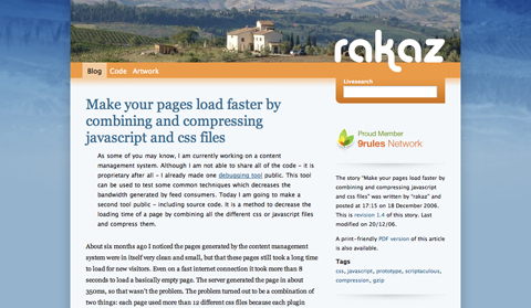
Make your pages load faster by combining and compressing javascript and css files
This tutorial shows you how to create a PHP script to compress and combine multiple CSS and/or JavaScript files with gzip when they’re called for by a browser. It speeds up the page load times while making it possible to still edit the individual CSS or JavaScript files without having to combine and re-compress everything each times.
Informal testing showed that a group of JavaScript files were reduced from 168Kb (and 1905 ms to transfer) to 37Kb (and 400 ms). There wasn’t any data available for the effect it had on CSS files, but I’d guess it’s probably pretty similar.
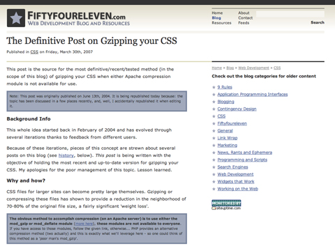
The Definitive Post on Gzipping Your CSS
This post covers the best and most recent methods for using GZIP to compress your CSS. It currently covers two different methods, both equally effective. One involves adding a bit of PHP to your CSS file (and renaming the file with a PHP extension instead of CSS) while the other method involves using the same PHP code with some additions but in a separate file.
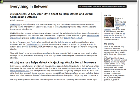
Clickjane.css: A CSS User Style Sheet to Help Detect and Avoid Clickjacking Attacks
This post covers how to use clickjane.css to prevent clickjacking, a class of security vulnerabilities kind of like phishing scams and more formally referred to as user interface redressing. It’s cross-browser compatible but, admittedly, probably only covers a small range of potential clickjacking vulnerabilities. It’s still a good place to start, though.
5 Step Style Sheet Weight Loss Program
This post shows five different ways to trim the size of your style sheets. Techniques range from learning how to group selectors to using CSS shorthand. Each technique is thoroughly explained and includes related resources.
2. Page Layout
This is what CSS was built for. The options are almost endless, especially as CSS3 becomes the new standard.
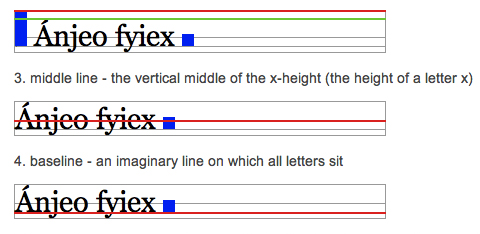
Aligning Inline Images with the Vertical-Align Property
The default vertical alignment for inline images in text sometimes looks not-so-great. This tutorial shows you how to better align inline images with your site’s type. It goes over the different types of vertical alignment and what they mean in relation to type.
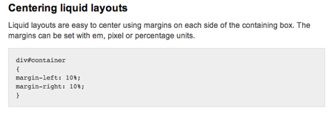
CSS Centering
This post includes instructions for centering liquid layouts with CSS. It’s very simple and straight-forward and works in virtually all browsers. Basically, it just uses left and right margins combined with some additional code to make it cross-browser compatible.
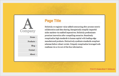
Making Your Footer Stay Put with CSS
Keeping footers at the bottom of your pages can be a real hassle with CSS, depending on how the rest of your page is set up. This tutorial shows exactly how to keep your footer where it should be—below the rest of your content! It’s a very thorough post, with complete, step-by-step instructions.
Vertical Centering with CSS
This post covers five excellent ways to center your content vertically. It includes the good and bad for each method along with complete instructions for implementing them. The methods range from using divs that act like tables to using absolute positions.
Handy Tips for Creating a Print CSS Stylesheet
This post is filled with great tips for creating better print stylesheets. It includes instructions for everything from including link destinations after the link text to splitting comments onto a new page. Pick and choose from the techniques offered or copy the whole stylesheet.
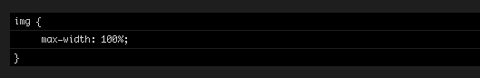
Fluid Images
Fluid layouts are great. They generally look and function just fine until you start introducing fixed-width elements within them—like images. This post shows how to make your images fluid, too. And it works for most embedded video. And while the basic technique includes just one CSS property, there is a workaround necessary to make it work on Windows machines.
Flexible Equal Height Columns
This tutorial shows how to create completely versatile equal height columns using valid and semantic markup. It’s cross-browser compatible and works with both fixed, fluid, and even elastic designs. It’s a very complete tutorial but not at all complicated.
CSS Columns with Borders
This is a technique for creating equal-height columns with CSS that have borders. It uses a series of nested divs to achieve the effect instead of images. The end result is fantastic.
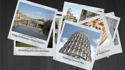
Creating a Polaroid Photo Viewer with CSS3 and jQuery
The photo gallery created with this technique is absolutely awesome. The HTML and CSS aren’t super-complicated, and everything is explained really well. While CSS3 isn’t supported by every browser, this does appear to degrade gracefully, making it perfectly fine to use as long as you don’t mind some visitors not getting the full effect.
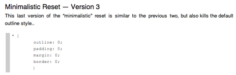
A Killer Collection of Global CSS Reset Styles
An incredibly complete collection of global resets, this post covers pretty much every reset you could possibly need. Some are short and sweet, consisting of only a couple of properties, while others are very complete and reset everything you might consider resetting.
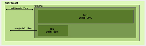
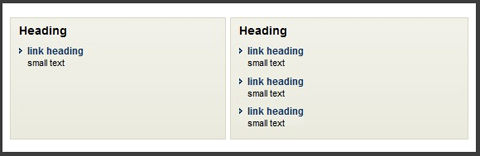
Making Module Layout Systems
This tutorial gives complete instructions for creating modular layout systems using CSS. This makes it practical to use different grid-based divs as needed for individual content elements. The end result provides tons of flexibility for dealing with everything from images to text while keeping everything uniform and balanced.
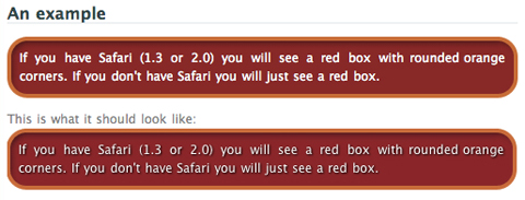
Multiple Backgrounds (CSS3)
This tutorial shows how to implement multiple backgrounds using CSS3. It’s currently only supported by Safari, but the tutorial includes tricks to make it work in non-supported browsers. Currently, it doesn’t validate, but once the CSS3 standard is completed it’s likely it will.
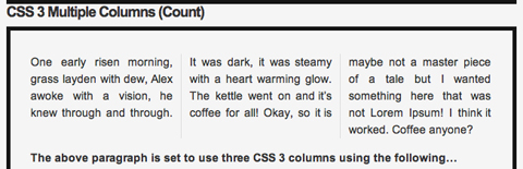
CSS3 Multiple Columns
Here’s a tutorial for creating multi-column layouts with CSS3. The CSS is pretty simple and straight-forward, much easier than most current solutions to multi-column layouts. Unfortunately, this only works with Firefox, Safari and Chrome at the moment.
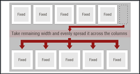
Smart Columns with CSS and jQuery
This tutorial shows how to create smart columns inside liquid layouts using a combination of CSS and jQuery. Basically, it fits as many columns into the base column size as possible and then distributes any leftover white space among the columns there. A very elegant solution if you want to allow for a variable number of columns without ending up with a bunch of leftover white space in your design.
CSS Hack for Chrome, Safari and Internet Explorer
This tutorial shows how to apply different style sheets based on the browser your visitors are using (at least in IE5-8, Google Chrome, and Safari 1-4). A very valuable technique if you want to use styles only supported in certain browsers without making your site look bad in unsupported browsers.
3. Menu and Navigation Customizations
Menu and navigation styles can really set your site apart if done well. Just remember, menus need to remain usable and functional no matter how they look.
Overlap That Menu!
Have you ever wanted to create menu items that overlap? This relatively-simple tutorial shows you how to do just that using unique classes for your menu items. It also tells how to reorder the navigation items using the z-index. It’s a nice effect that isn’t difficult to achieve.
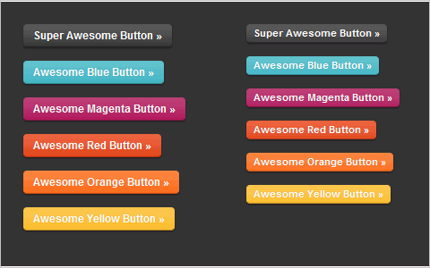
Super Awesome Buttons with CSS3 and RGBA
With a little CSS3 magic, you can created a scalable set of sexy buttons with nearly half the CSS it would have taken with hex colors. Give it a go in your next project and see how it can help add that extra polish you want without huge impact on your code.
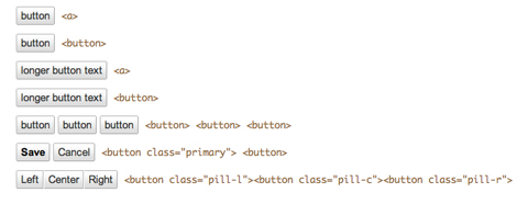
Custom Buttons 3.0
This page shows a variety of rounded-corner (1px radius) buttons that don’t use images (other than for the optional background gradient). Just look at the source code for the page to see how it’s done.
Centered Tabs with CSS
This tutorial provides an alternative to the sliding doors method of creating tabs in CSS that allows tabs to be centered instead of only right- or left-aligned. It’s a multi-step tutorial but isn’t complicated.
Styling the Button Element with CSS Sliding Doors
An updated tutorial on sliding doors buttons that now includes creating them with CSS image sprites. It’s also been simplified to work with a single block of CSS in all the major browsers (including IE 6-8). The markup is simple and straight-forward and the end result is perfect.
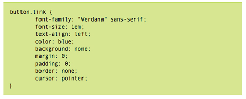
Styling Buttons to Look Like Links
Sometimes you have to use a button (like with forms), but realize your design would look so much better with just a simple text link. This tutorial gives a complete overview of how to make your buttons look like text links using CSS.
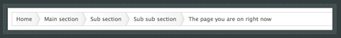
Simple, Scalable CSS Based Breadcrumbs
Breadcrumbs can be a great addition to your site’s navigation and can really improve your site’s usability. This tutorial shows you how to create breadcrumbs with CSS. The code used is simple (the HTML portion is just an unordered list) and there are only six CSS styles defined.
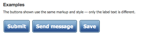
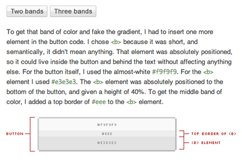
Recreating the Button
This article covers how to make a button that look very similar to regular HTML input buttons but can handle multiple types of interaction (like dropdowns or toggle functions). These buttons were originally developed at Google and are skinnable with just a few lines of CSS. The buttons created are entirely CSS-based, including the gradient background.
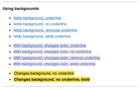
List of 10+ Usability-Conscious Link Styles
This page offers a good overview of different effects you can use for links, including color and underline, backgrounds, and animations. It’s a good starting place if you’re trying to figure out exactly how your links should look and act to make them more user-friendly.
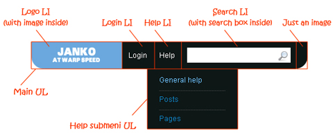
Create Vimeo-Like Top Navigation
Here’s a tutorial to create a drop-down top navigation bar similar to the one Vimeo.com uses. It’s all done with images, CSS and HTML and isn’t particularly difficult, though it is a bit complex. It’s explained really well, with images illustrating the structure and very well-written CSS.
Beautifully Horizontal Centered Menus/Tabs/List
This tutorial explains how to create cross-browser compatible, centered menus or other items in CSS with no hacks and no JavaScript It’s compatible with liquid layouts, too. Not only does it give the code to achieve the effect, but it also fully explains exactly how and why it works.
4. Typography
Here’s a tutorial for creating multi-column layouts with CSS3. The CSS is pretty simple and straight-forward, much easier than most current solutions to multi-column layouts. Unfortunately, this only works with Firefox, Safari and Chrome at the moment.
Smart Columns with CSS and jQuery
This tutorial shows how to create smart columns inside liquid layouts using a combination of CSS and jQuery. Basically, it fits as many columns into the base column size as possible and then distributes any leftover white space among the columns there. A very elegant solution if you want to allow for a variable number of columns without ending up with a bunch of leftover white space in your design.
CSS Hack for Chrome, Safari and Internet Explorer
This tutorial shows how to apply different style sheets based on the browser your visitors are using (at least in IE5-8, Google Chrome, and Safari 1-4). A very valuable technique if you want to use styles only supported in certain browsers without making your site look bad in unsupported browsers.
3. Menu and Navigation Customizations
Menu and navigation styles can really set your site apart if done well. Just remember, menus need to remain usable and functional no matter how they look.
Overlap That Menu!
Have you ever wanted to create menu items that overlap? This relatively-simple tutorial shows you how to do just that using unique classes for your menu items. It also tells how to reorder the navigation items using the z-index. It’s a nice effect that isn’t difficult to achieve.
Super Awesome Buttons with CSS3 and RGBA
With a little CSS3 magic, you can created a scalable set of sexy buttons with nearly half the CSS it would have taken with hex colors. Give it a go in your next project and see how it can help add that extra polish you want without huge impact on your code.
Custom Buttons 3.0
This page shows a variety of rounded-corner (1px radius) buttons that don’t use images (other than for the optional background gradient). Just look at the source code for the page to see how it’s done.
Centered Tabs with CSS
This tutorial provides an alternative to the sliding doors method of creating tabs in CSS that allows tabs to be centered instead of only right- or left-aligned. It’s a multi-step tutorial but isn’t complicated.
Styling the Button Element with CSS Sliding Doors
An updated tutorial on sliding doors buttons that now includes creating them with CSS image sprites. It’s also been simplified to work with a single block of CSS in all the major browsers (including IE 6-8). The markup is simple and straight-forward and the end result is perfect.
Styling Buttons to Look Like Links
Sometimes you have to use a button (like with forms), but realize your design would look so much better with just a simple text link. This tutorial gives a complete overview of how to make your buttons look like text links using CSS.
Simple, Scalable CSS Based Breadcrumbs
Breadcrumbs can be a great addition to your site’s navigation and can really improve your site’s usability. This tutorial shows you how to create breadcrumbs with CSS. The code used is simple (the HTML portion is just an unordered list) and there are only six CSS styles defined.
Recreating the Button
This article covers how to make a button that look very similar to regular HTML input buttons but can handle multiple types of interaction (like dropdowns or toggle functions). These buttons were originally developed at Google and are skinnable with just a few lines of CSS. The buttons created are entirely CSS-based, including the gradient background.
List of 10+ Usability-Conscious Link Styles
This page offers a good overview of different effects you can use for links, including color and underline, backgrounds, and animations. It’s a good starting place if you’re trying to figure out exactly how your links should look and act to make them more user-friendly.
Create Vimeo-Like Top Navigation
Here’s a tutorial to create a drop-down top navigation bar similar to the one Vimeo.com uses. It’s all done with images, CSS and HTML and isn’t particularly difficult, though it is a bit complex. It’s explained really well, with images illustrating the structure and very well-written CSS.
Beautifully Horizontal Centered Menus/Tabs/List
This tutorial explains how to create cross-browser compatible, centered menus or other items in CSS with no hacks and no JavaScript It’s compatible with liquid layouts, too. Not only does it give the code to achieve the effect, but it also fully explains exactly how and why it works.
4. Typography
Here are a few tutorials and tricks for creating advanced typographic styles using CSS. There’s everything from line-wrap functions to faux anti-aliasing to adding gradients and shadows.
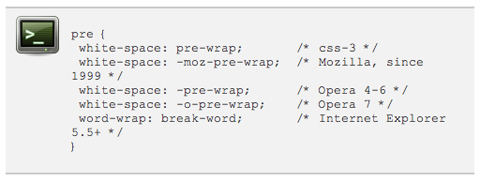
Wrapping Text Inside Pre Tags
This tutorial shows how to wrap text within pre html tags. It’s useful for displaying code on your site, especially when lines of code are quite long and end up breaking your site’s layout (especially in IE). It’s a relatively simple and there are a few different options presented.
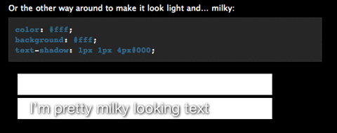
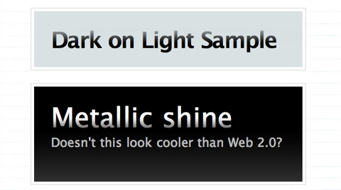
Make Cool and Clever Text Effects with CSS Text-Shadow
Creating text effects without the use of images is a big advantage in terms of both file size and the time required for maintenance. This tutorial shows how to take advantage of the text-shadow property in CSS to style your text. While this effect doesn’t work in IE, it does in most other browsers. And it looks incredibly cool if done well (I’m a big fan of the “milky text” example).
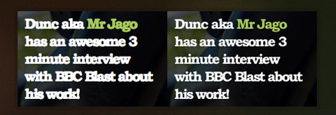
Safari’s Text-Shadowing Anti-Aliasing CSS Hack
This tutorial shows how to use the text-shadow CSS property to create an anti-aliasing effect on your text. It only works in browsers that support text-shadow (so not IE), but the look is pretty awesome. It can definitely make text more readable, just don’t overdo it or you end up with text that’s blurry.
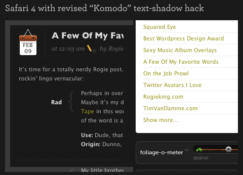
Safari’s Text-Shadowing Anti-Aliasing CSS Hack Revision
This is a revised version of the technique above to create a slightly different anti-aliasing effect, especially useful for light text on dark backgrounds. It uses an extremely transparent black background to force Safari to render the text more legibly.
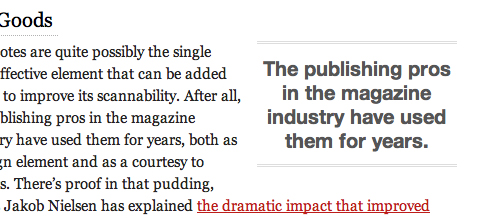
Snazzy Pullquotes for Your Blog
If you have a blog or other site that’s text-heavy, using pull quotes to highlight important bits can look really awesome while also making your content more scannable. This tutorial shows how to format those pull quotes with CSS. It shows how to create both left and right aligned pull quotes while also preserving your regular blockquote style.
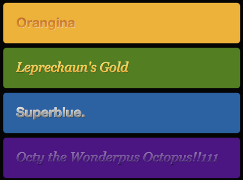
Codename Rainbows
Here’s a technique for creating two-color gradients for text using a combination of JavaScript and CSS. It also works to apply shadows and highlights to text. The possibilities for the use of this technique are pretty endless. Of course, this is also one of those things where a little bit goes a long way (ie, limit gradients to your headers, titles, and other text you want to stand out—not your site’s body copy).
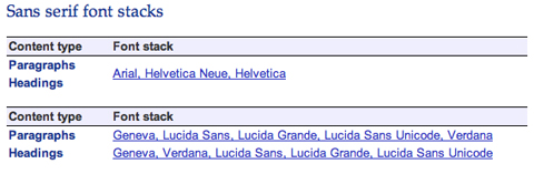
Build Better CSS Font Stacks
This article gives some great guidelines for creating better CSS font stacks. It includes information on the most common font stacks currently used and then goes on to cover Tuck’s Definitive Font Stacks and Ford’s Better Font Stacks. It’s a great resource when you’re determining a site’s typography, with the information presented in a very scannable, well-organized format.
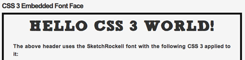
CSS3 Embedding a Font Face
Here’s a great tutorial on how to embed fonts using CSS3. While it’s still not widely supported, this technique makes it much easier to embed special fonts into a site without having to resort to images.
CSS Gradient Text Effect
This little trick makes it easy to create gradient text by applying a 1 pixel gradient PNG to it. It’s a quick and easy way to create gradient text pretty much anywhere on your site. There’s even a fix to make it work in IE6 included.
5. Other Cool Techniques, Tips, and Tricks
Below are a ton of other techniques and tricks you can use to really make your CSS stand out.
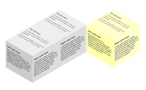
3D Cube Using CSS Transformations
This is probably one of the coolest CSS techniques I’ve seen. This tutorial shows how to build a 3D cube with text or other content on each side of the cube. It does it entirely with CSS; there’s no canvas, SVG, imagery, or JavaScript. There’s even instructions for creating multiple shaded cubes on a single page. The only real drawback is that it’s only supported in recent WebKit and Gecko browsers.
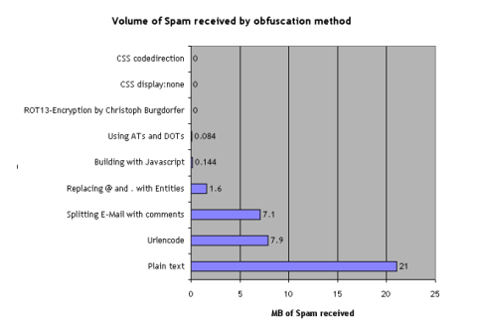
Nine Ways to Obfuscate E-mail addresses compared
This article gives two different methods for obfuscating email addresses with CSS. One involves using the display:none attribute while the other involves reversing the code. Both supposedly cut the amount of spam received to zero.
Forms Markup and CSS - Revisited
Here is a CSS template for form styling. The markup of the form is based on the Accessible Forms Markup from Derek Featherstone. The template is semantically correct, flexible and accessible.
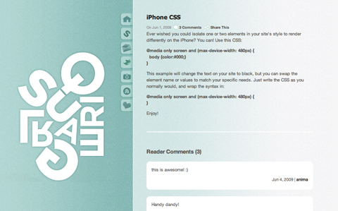
iPhone CSS
A very short and simple tutorial on how to make certain elements of you CSS render differently on the iPhone. It’s surprisingly simple and easy to implement.
Improving Your Process: Faster Front End Development
While this post offers plenty of information on things other than CSS, it also offers some great advice for improving your efficiency with CSS: mainly, write your CSS in blocks. This technique is usually done progressively as you get used to coding in this manner. The steps are simple, though, and it’s sure to make you a much faster designer.
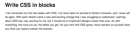
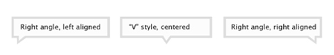
Image-Free CSS Tooltip Pointers - A Use for Polygonal CSS?
This tutorial explains how to create triangles (to be used for pointers) using CSS, without the need for any images. The end result is great, though it only works for single-color images. The CSS used is incredibly simple while still being really versatile. You can create a triangle of almost any size using just a single div.
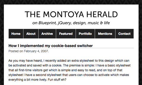
How I Implemented My Cookie-Based Switcher
While not strictly a CSS trick, this post shows how to create a cookie-based CSS theme switcher for WordPress. It allows users to choose to use a different theme when they visit the blog while allowing new users to see a nice, simple, easy-to-read theme that puts the primary focus on the content.
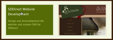
CSS Swap Hover Effect
This great technique will replace any image with another image when you hover over it. The tutorial shows it applied to a portfolio site, but the possibilities are endless. It’s very slick and cross-browser compatible (though IE6 does require a bit of a workaround, as usual).
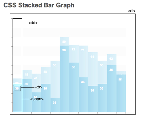
CSS Stacked Bar Graphs
Here’s a tutorial for creating stacked bar graphs using CSS and some images. It’s a pretty in-depth process, but the result looks fantastic.
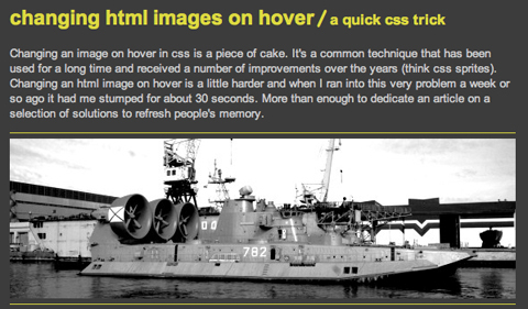
Changing HTML Images on Hover / A Quick CSS Trick
Here’s a quick and easy CSS technique for swapping out images on hover. It’s pure CSS, no JavaScript required. The biggest issue this technique solves is that when the page is printed, the base image is the only one that shows up.
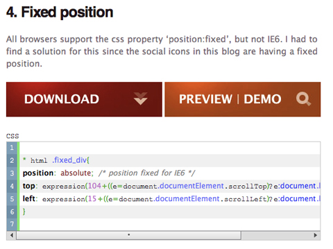
10 Properties that Were Impossible to Implement in IE6
This collection of CSS tricks shows how to implement a number of styles that were supposedly impossible in Internet Explorer 6. It includes tricks for opacity, fixed positions, and text shadow, among others.
10 Challenging But Awesome CSS Techniques
Sometimes the coolest things just take a bit more effort. This collection of tutorials covers ten different CSS techniques that aren’t exactly easy to achieve, but the end results are well worth the extra effort. Techniques include pull quotes, dynamic variables, and style changes based on the time of day or even the weather, among other awesome examples.