iPhone Apps Design Mistakes: Over-Blown Visuals

Advertisement

The development of iPhone applications has recently become a hot topic in the design community; everybody tries to come up with some creative idea, port it into a stylish iPhone-alike application and sell it to thousands of users through the iPhone app store. However, many of these applications are poorly designed and therefore miss the chance of providing users with a truly useful product that users would find worth recommending to friends and colleagues.

We want to take a closer look at the design of iPhone applications and showcase some good and bad examples, best practices as well as useful ideas and recommendations for your next iPhone app design. This article is a first post of a new series related to the design of iPhone applications. Please let us know if you are interested in the follow-ups to this article in the poll and in the comments below. How should it look like? What should we improve? Please also feel free to suggest more iPhone app design mistakes in the comments to this post!

Are iPhone apps really not good enough?

“It’s only 99 cents. Who cares if it sucks? I’m still trying it.” How many times have you said something like that to yourself before downloading the next promising iPhone app? How many screen-fulls of those apps do you have on your iPhone? 4? 6? 10? And how many of them do you actually use?

On average, only 3% of people who have downloaded an app use it after 30 days. Why? Because the majority of iPhone apps don’t make any sense to users. The situation is similar to that of PC software a couple of decades ago. Have we not learned from our mistakes?

iPhone applications nowadays are designed by developers who seem to care only about their app’s implementation. When an app goes live, its beautiful code or visual design often fail to address real customers’ needs. The result: thousands of useless applications in the App Store that people download and use once and then never again. These applications often don’t make sense to customers because of a poor interaction design.

Free applications usage over time
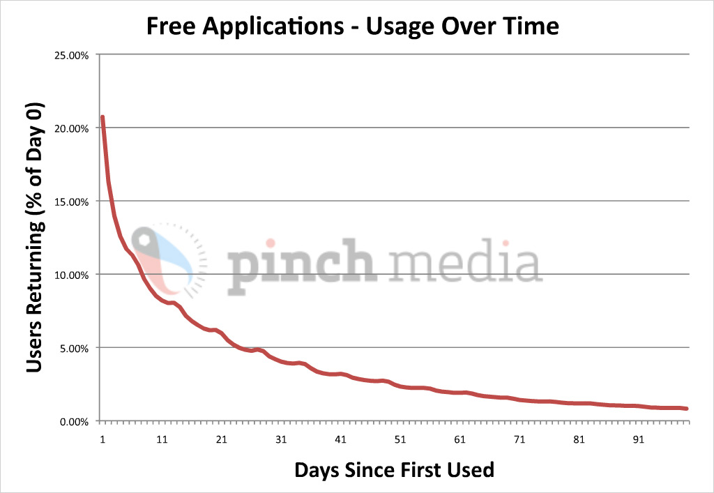
Free applications usage over time: Percentage of users returning versus number of days since first used. On second day, 20% returning users; on the 30th day, only 3%. By Pinch Media. Larger image.

Paid applications usage over time
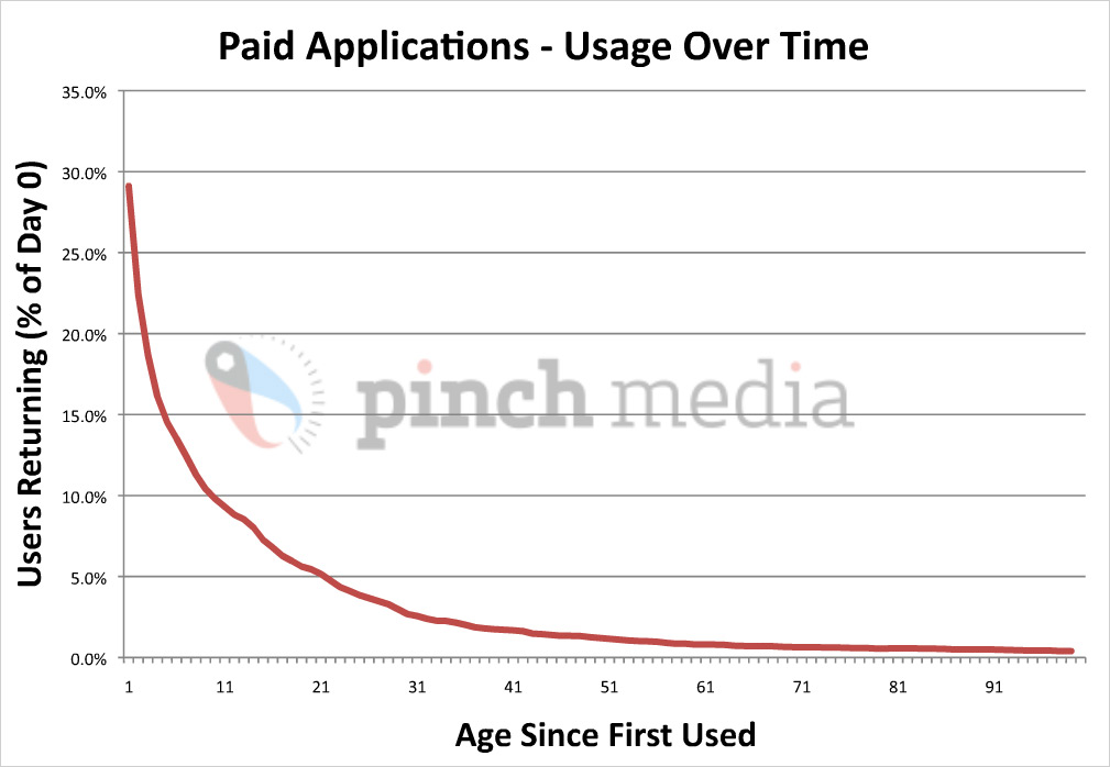
Paid applications usage over time: Percentage of users returning versus number of days since first used. It’s not really different from the graph above. Paid applications generally retain their users longer than free applications, although the drop-off is still pretty steep. By Pinch Media. Larger image.

Applications usage over time
Users stop using the average applications pretty quickly. Long-term audiences are generally 1% of total downloads. By Pinch Media. Larger image.

500 million iPhone Apps downloads breakdown
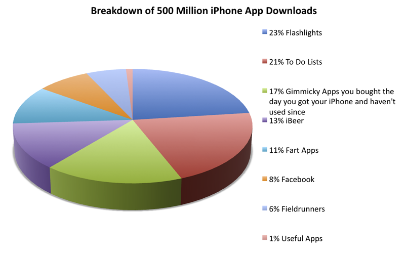
Hilarious 500 million downloads breakdown, by Gizmodo. Larger version (Copyright: Gizmodo)

It shouldn’t be this way. Developers should be writing applications that people love so much that they would pay $9.99 or even $99.99 for each of them. There’s no programming technique that teaches you how to do this. But there is something else, and it’s called interactive design.

Five Most Frequent iPhone Design Mistakes

Many applications share the same design problems that prevent customers from fully enjoying them. Recently, I conducted a review of 100 apps from the App Store and identified the five most frequent iPhone design and usability mistakes, which are:

  1. Over-blown visuals.
  2. Neglecting technological limitations, such as slow Internet connection, slow processors and single-threaded OS architectures.
  3. Confusing navigation (flow, layout and taxonomy).
  4. Confusing the iPhone with a computer. Neglecting to use new iPhone interactions (fingers instead of the mouse; multi-touch gestures; turn, tilt and rotate) and technological features such as phone functions, built-in GPS and accelerometer.
  5. Disregard of context. A lack of understanding of how, when, where and why the mobile device is being used.

Let’s start with the first one in this article and proceed with the next ones in the follow-ups to this article.

Mistake #1. Over-Blown Visuals

Probably the oldest, yet extremely popular design problem is overdesign. Designers of iPhone applications often tend to disregard common design and usability conventions by offering users slick and shiny user interface designs that go way beyond their standard look and also way beyond their claimed functionality.

Why make things look, feel and work complicated and why do designers like to re-invent the wheel? The answer is simple: they want the application to be different; look different and stand out from the crowd. Unfortunately, a different look isn’t necessarily helpful for application’s usability and functionality.

So how does an over-design in iPhone applications look like? To better understand it, let’s look at an example:

Overdesigned iPhone app example
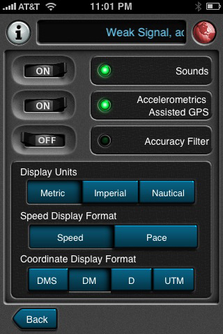
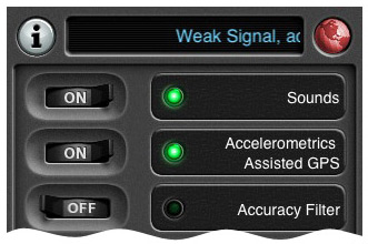
Motion X GPS settings.

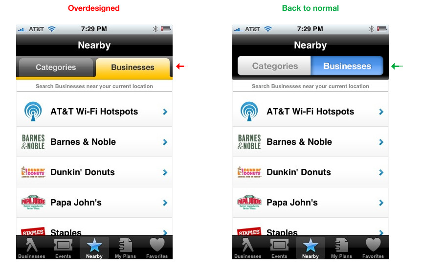
What do you think is wrong with the design in this first screenshot? Some of you may say, “Well, nothing is really wrong with it. It’s beautiful.” I agree, it’s pretty slick. But, there’s a catch: while beautiful, it is also inconsistent with other apps. It’s different. Let’s compare this screen to the settings screens of other iPhone applications:

Overdesigned iPhone app example

Overdesigned iPhone app example

Overdesigned iPhone app example
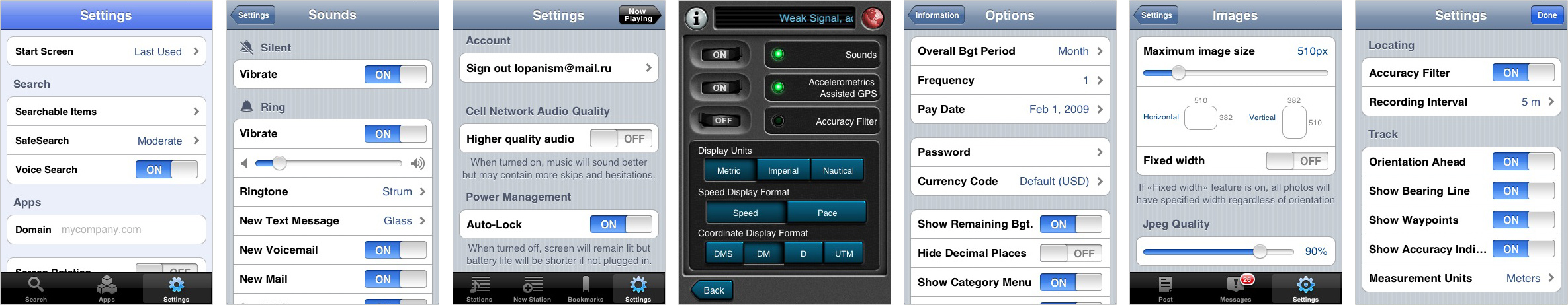
Motion X GPS settings screen, compared to the settings screens of other apps. (Click to enlarge.)

Noticed the difference? Being inconsistent with other products makes yours worse for two reasons:

  1. Going against convention makes your application less intuitive. Over-styled controls look different and require users to re-learn how they work.
  2. It’s a waste of time and money. The resources you have spent to make your app look different, but not necessarily better, could have been used much more effectively.

Breaking Convention Makes Your App Less Intuitive

The more familiar the parts of your app are, the more intuitive the app will be for whoever uses it. If we recognize the parts, we will be able to learn how to use the whole faster. It’s like reading: knowing the alphabet and meanings of words allows us to “decode” books we haven’t seen before.

Here’s an example from the real world. Try to make the stop sign more “beautiful” and people will inevitably start dying:

Overdesigned iPhone app example

Overdesigned iPhone app example
“Sign B, 2, ‘STOP,’ shall be used to notify drivers that, at the intersection where the sign is placed, they shall stop before entering the intersection and give way to vehicles on the road they are approaching.” Article 10 of 2006 road signs convention.

In his paper Intuitive Equals Familiar (Communications of the ACM. 37:9, September 1994, page 17), Jeff Raskin, an American human-computer interface expert best known for starting the Macintosh project for Apple Computer in the late 1970s, writes:

“The impression that the phrase ‘this interface feature is intuitive’ leaves is that the interface works the way the user does, that normal human ‘intuition’ suffices to use it, that neither training nor rational thought is necessary, and that it will feel ‘natural.’”

However,

“… it is clear that a user interface feature is ‘intuitive’ insofar as it resembles or is identical to something the user has already learned. In short, “intuitive” in this context is an almost exact synonym of ‘familiar.’”

Drastically re-designing every user interface element will make your application less intuitive, which will lead to more user mistakes and a longer learning curve. Eventually, you will lose customers because of it.

What About Branding?

Is there place for branding in applications that are strictly following general design guidelines and usability conventions? Definitely! It is possible to strike a balance between having a unique look but not over-designing. Here’s one example:

Overdesigned iPhone app example

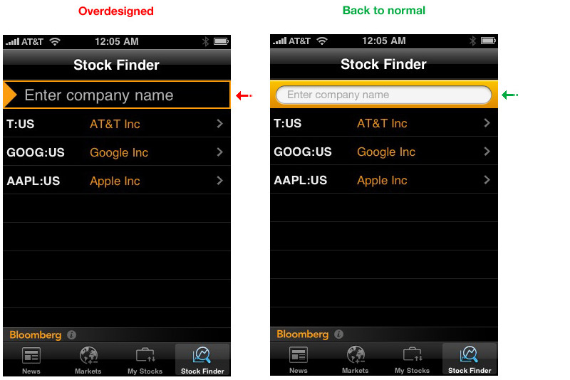
Let’s take a look at an example of overdesigning by Bloomberg. Here, we have an over-designed text input field at the top. You can barely recognize this as a field when you first look at it. The version on the right hand side is much better. A standard input field makes the screen’s purpose much clearer, while remaining consistent with the application’s style and branding.

Bloomberg
Larger version.

Here is another example by iFitness. Users are supposed to enter their weight day by day on this screen. But you have to flip through the months and days with a horizontal swipe to find the right one, and then you have to enter your weight digit by digit using five separate scroll fields. And then you have to press the very modest “Record” button, which you miss at first anyway and only find the hard way: after you have lost data. Much better:

iFitness
Larger version.

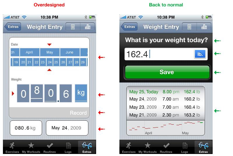
99.9% of users will want to enter today’s weight. This redesigned interface has one-quarter of the controls. The screen space that has been saved can now be used to present useful information, such as weight statistics. Date and time can be recorded automatically, and the selection of the metric or imperial system of measurement, which is not terribly important, has been demoted to a settings screen.

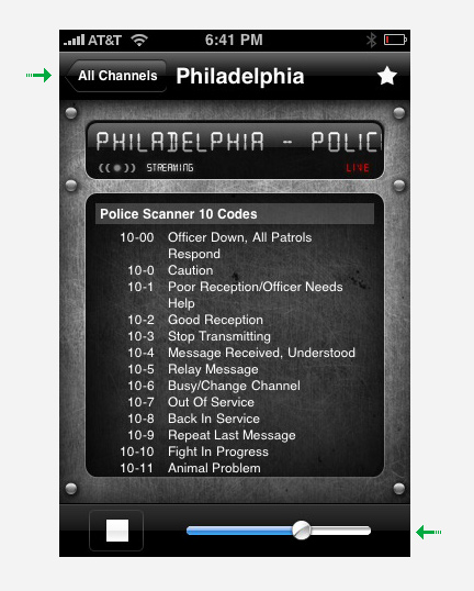
The Yellow Pages app uses tabs, which work well on the Web, but standard toggle controls are more familiar to iPhone users.

Yellow Pages
Larger version.

Waste of Time and Money

Apple has already done an excellent job of creating standardized controls. Losing some of that functionality is almost guaranteed if you try to reinvent the wheel.

Back to our earlier example:

If we take a closer look, we’ll see that one-third of the screen space we would have had is now lost because of over-designing.

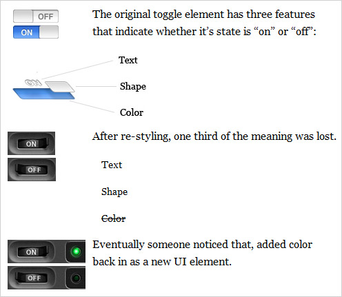
iPhone OS 3.0 introduced accessibility features. One of the modes is White on Black. Here’s what happens to our controls after inverting colors:

In the original control, color, shape and text survived color inversion. However in re-designed one, 2/3 of original meaning is lost. Now there is only text.

In sum, this redesign has given us twice as many UI elements, taking up twice as much real estate. The catch is, even if you haven’t made the controls worse, you still haven’t added much value and you have lost time and money in the process.

That Time and Money Could Have Been Spent On…

Design is all about solving problems. Sometimes, when people don’t know exactly what problem they are solving, they wander in the design process, and the result is over-designed. To avoid that, you must have a clear picture of the problem you need to solve.

One of the best ways to get that picture is to talk to your users (both current and potential). Only when you know your customers’ needs will you be able to build an application they’ll love.

Don’t overdesign. Be sure your house has a solid foundation before you decorate it. You will be rewarded with more loyal customers and higher download rates surprisingly quickly.

(Hopefully) coming soon: #2 iPhone’s Technological Limitations. What Apple hasn’t told you.

Would you like to read a follow-up to this article?

Please let us know if you are interested in the follow-ups for this article in this poll and in the comments below. Did you like this post? What would you like to change? What should we improve? Please also feel free to suggest more iPhone app design mistakes in the comments to this post!

Alexander Komarov is a Russian designer (currently residing in Philadelphia), who has been working in the field of Web- and Mobile Interaction- design and user experience for over 7 years. He runs a nimble interaction design studio that specializes in mobile interaction design and strategy. He helps his clients break through the wall that separates them from their customers and stand out in the competitive world of modern technology.

  1. 101

    Jeff Murray

    May 10th, 2010 8:19 am

    Great article, well presented and sooooo right! :)

    0
  2. 102

    David

    May 27th, 2010 10:03 am

    Overall great, however I somewhat disagree about the folder tabs vs. UISegmentedController in the Yellow Pages example. This is a case where the iPhone metaphor is the anomaly and is less obvious to users (based on my experiences watching test users interact with my software). Unlike most of the other examples in this article, folder tabs don’t add complexity while reducing information. In fact, I feel they _add_ a dimension of information by being visually connected to the display they are modifying, rather than just being positioned nearby. Apple screwed up in this case; I assume it’s because the folder tab approach does require some careful positioning of graphic elements. But maybe they could have done something similar to scope buttons in UISearchDisplayController?

    0
    • 103

      Mike Mayo

      August 31st, 2011 8:18 am

      +1. The UISegmentedControl is intended to filter a single data set, which is inherently different than tabs, which are meant to toggle views.

      For proper use of the segmented control, look at the Recents tab in the Phone app. You can choose “All” calls or filter the results to see the “Missed” ones. But it’s only one set of data: your phone calls.

      Great article though!

      0
  3. 104

    Gustavo

    July 1st, 2010 10:11 am

    So basically you are saying that you want every app on the store to have apple’s standart look. Because the controls they created are universal and beautiful.
    You will never get sick of all apps looking like your settings list.
    Because people are not looking for new experiences with the iPhone. They want what is easy, quick and common.

    Just like everyone should wear blue jeans and white shirts and get the same haircut, because, think about it, things would me much easier for the hairdresser! He would not have to re-learn how to get a hair done. Cheaper for him AND for his customer!

    You really got to be joking if you call yourself a designer. Fortunately Apple has already done your job for you, mister ;D.

    -3
  4. 105

    tinabeans

    July 15th, 2010 11:37 am

    This article makes some thoughtful points, but three things that bug me about it (and about Smashing in general):

    1) Irresponsible use of visualizations
    What’s with the abundance of introductory charts showing points only tangentially related to the topic at hand? Other than to make the article look well-researched, they don’t help many any sort of useful point. Instead, all they do is imply the existence of a (completely specious) relationship between app usage over time and the way the app’s controls look.

    2) Filler
    I’d like to point out the caption under the “WHOA” sign: “Sign B, 2, ‘STOP,’ shall be used to notify drivers that, at the intersection where the sign is placed, they shall stop before entering the intersection and give way to vehicles on the road they are approaching.” Article 10 of 2006 road signs convention.” Thanks for telling us what a stop sign is.

    3) Oversimplification – The author has conveniently managed to boil down an entire discipline – interaction design – to simply the efficient allocation of screen real estate, saving clients money, and avoiding the use of eye-candy.

    4) And this is more of a personal pet peeve… stop using and abusing the words “beautiful,” “stunning,” and the like. The aurora borealis is beautiful. A GPS interface is not.

    +1
  5. 106

    Franco

    August 2nd, 2010 12:06 pm

    Wow, very cool article. Well done and written with professionality. Some companies, like this one: http://maxdoro.nl/services/Mobiele%20applicaties.aspx, are really investing a lot in new and more stable applications for iPhones and other Apple products, but I guess there is still a long way to go.

    Greets

    +1
  6. 107

    loic tortelier

    November 24th, 2010 3:05 am

    Sorry for my bad English, I’m french :P
    Good article! The relevance of design iphone is important because a design that do not cool it with the phone is iphone iphone will neglect the spirit. I do not defend the iphone because I’m on android but I defend against the design well done and the importance of the concordance of styles.
    If we design iphone, so far as to do a iphone;). So this article is important.
    soon for the design or webdesign iphone and more here. or in my website : http://www.f4-design.fr , in french, :P

    0
  7. 108

    Mufeed Ahmad

    March 7th, 2011 3:44 am

    Very Helpful… thanks for sharing these things….:)

    +1
  8. 109

    Allyson

    May 27th, 2011 7:54 pm

    This article is stupid. It’s about over-done apps yet I have yet to have the full article load on my ipad (in safari or skyfire) OR on my MacBook (in safari or firefox). Maybe someone should write this douchebag an article on over-blown web articles.

    OR maybe people who can’t even handle “designing” a fucking simple ass online article shouldn’t cast stones at those who actually are capable of creating functioning iOS applications.

    -5
  9. 110

    Lakshmi

    July 12th, 2011 8:48 pm

    Good article

    +1
  10. 111

    Andy Fraser

    August 10th, 2011 10:20 am

    Great article!

    Currently researching costs associated with application development and also a strong individual/company that could be recommended for construction.

    I appreciate any input.

    0
  11. 112

    JochenR

    August 30th, 2011 8:27 pm

    Thanks for this article. ‘has some flaws it complains about, but ok, you made the point clear: Not many programmers understand designing – or law, or machines or politics… They should be quiet and listen to what the experts have to say and learn. That’s how you improve in life.
    What I like on this page is you show screen shots – but not in original iphone/ipod touch size. I find the iphone screens too small and when you show a larger image you don’t see what you would see on a real iPhone screen. – the iphone screen cannot be enlarged! (the 3-finger zoom function is not a lot helpful, I find (It just enhances the unsharpness like a real spyglass).
    Programmers should be forced to program with the eyestraining screen of an iphone (2*3) , then this super tiny texts would less come up – and there would less discussion about it.
    The programmers are often young with still good near-sight and no experience, not even car driving. Often you see “screen in screen screens” making it even smaller.
    The original iPhone apps show it: They all have decent big fonts, no need for super tiny, white on black texts, which the iphone screen not can even handle. There is no need to make things smaller.

    0
  12. 113

    SongLeeK

    August 31st, 2011 6:30 am

    This is worst design advice.

    This wants to make everything like Soviet Union.

    Uniformity and flatness and un originality are simply boring.

    Wrong path. I hope that all those who compete with my App follow this deranged advice!!!!

    0
    • 114

      cameljobs

      August 31st, 2011 8:17 am

      Songleeking, you know nothing about UX or patterns. I suggest reading articles about proper UX design before posting.

      There is nothing wrong with individualizing your app, but it’s another thing to have no idea about real design while building your app. That’s why programmers typically fail (see article) as they program, they aren’t designers. Judging by your response, you are a developer and not a designer.

      this is really no different than the mid-90s when everyone started building webpages. Everyone used animated gifs and repeating backgrounds. It was years later that good design practices came in to being. With iOS, any monkey can make an app and have it published by Apple. It’s a different ballgame if you can actually make something compelling, needed and looks good.

      +1
  13. 115

    Wouter

    August 31st, 2011 7:57 am

    You are absolutely right, but have too much faith in people’s intelligence by assuming that they would rate functionality higher than looks when shopping for an application (or anything else, for that matter).

    0
  14. 116

    cameljobs

    August 31st, 2011 8:11 am

    Great to see how stupid Apple users are and will download anything just because it’s only 99 cents. It’s really no wonder why developers have so many downloads. It’s not they are putting out good apps. It’s because the price is right in the eyes of the consumer. Any clown will buy a pile of crap for 99 cents if it has an apple logo on it (see appleTV and mac mini ‘server’). yes, I have an ipad2 and use due diligence before buying any app. 99 cents here.. 4.99 app there.. it ultimately adds up. I’d rather use that money to buy some coffee, and not that crappy burnt Starbucks that many Apple fans love, judging by how many snooty people with Mac Books are at Starbucks these days. Great article. I hope the sheep and their developers are listening.

    0
  15. 117

    Anthony Burokas

    August 31st, 2011 10:25 am

    I agree that overdesign is bad.
    However, the underlying assumption is that Apple’s current implementation is correct.
    Overlooking the fact that they will change the look of iOS at their whim, and nothing is perfect, I was surprised by your Yellow Pages section where you said the toggle works better than the apps. I heartily disagree.

    “Blue” may mean on, but usually, also, brighter objects are the active objects rather than darker items. So with Apple’s two toggle buttons, it’s actually quite unclear which refers to the content below. Push, pull, but neither actually takes ownership of the content below the buttons. They seem like an unrelated setting.

    With the tabs, (and very similar to tabs in web browsers) the active tab is physically connected to the content, and takes ownership of it through a clear and direct connection. Or, to refer to part of your article: “it is clear that a user interface feature is ‘intuitive’ insofar as it resembles or is identical to something the user has already learned.” The tab feels like a folder and it “holds” the content below it like the contents within a folder.

    Apple may use tabs in a future iOS interface change and then we’ll say “gosh! how intuitive it is.” :) Or they could stay the same. Or, like many aspects of OS-X they could screw up the interface majorly over time- for the sake of over blown visuals.

    +2
  16. 118

    Hendrik

    September 25th, 2011 7:35 am

    Cool! Let’s make everything look the same…

    0
  17. 119

    Ans

    January 30th, 2012 2:17 pm

    A nice article; What I felt is you are emphasizing on using default controles rather one’s own designs; The point is good that using custom designs, a control lost its self descriptivity;

    +1

  1. 1

    Tom

    July 21st, 2009 4:12 pm

    Over-designed is a description that sits uneasily with me. It reminds me of those that described Mozart’s music as having “too many notes”.

    It’s inconsistent with other iPhone app designs… different. Oh no! We can’t have that! If we’re talking familiarity with interface elements, it’s a couple of years of iPhone apps versus, in this case, what.. 70 years of plastic push-buttons and toggle switches? Looking at this app in more detail, it seems to want to mimic to feel of rugged piece of outdoor equipment, all buttons and dials. It’s a stylistic choice. It’s self-consistent throughout and consistent with it’s theme.

    ‘Rochelle Dancel’ above said: “it is an absolute waste of time and money if you create something very beautiful that no one can use (in this case, anyway!).” Really? No one can use this? It looks fairly simple to me. I can wrap my brain around something that isn’t default grey and blue, and so can most people – most real people, ie. non-ux designers and the ux designers who happen to apply common sense to the seemingly increasingly indoctrinated belief in the idiocy of all end users. Too often, different is automatically wrong and dangerously so, not just… different. Dismissing this bad example of the point, ie. an interface that is, despite it’s evil differentness, actually pretty simple and visually intuitive, without thought of it’s own design context is narrowminded.

    Forget the word over-designed. How about dogma. How about another word: homogeneity. And another: over-simplification. And a phrase: lacking imagination. One last word: boring.

    +18
  2. 2

    Xipe

    July 21st, 2009 2:40 pm

    Yes, only 3% uses Motion X GPS after 30 days because of its visuals, not because it’s marginally useful to begin with.

    I kind of see where the article is coming from, but I don’t see alot of it really applicable to success in this marketspace – Motion X will do as badly with a simpler design, and the Yellow Pages will do just as well with tabs instead of making it look like a native app.

    E.g. content, content, content. Most apps probably only have 3% original users after 30 days because they weren’t much to use to begin with.

    I’d blame the general quality of apps and ideas before I’d delve further. I’d even go as far as to say that the app store and its monetary promises brings the worst out of many developers.

    +4
  3. 3

    Gary

    July 22nd, 2009 5:44 pm

    It’s not a date picker it’s just a scrollable list.

    I actually said “your “Back to normal” version of iFitness’s UI uses a non-standard picker”, which is true. There’s no way to accomplish what you’ve designed using UIPickerView or UIDatePicker, so you’d have to build it using custom parts. You’ve also made it look partially like a UIPickerView, but not quite. You’ve broken all the rules you’re trying to get people to adhere too—you’ve created a custom element for something that’s well catered for by UIKit already.

    99.9% of users will want to enter today’s weight.

    …if you’d stuck to the UIDatePicker, you could have actually let the user edit any day. So while I agree that iFitness’s UI leaves a lot to be desired, your solution seems almost as bad.

    On average, only 3% of people who have downloaded an app use it after 30 days. Why? Because the majority of iPhone apps don’t make any sense to users.

    I don’t believe your claim is true and you don’t provide any evidence to back it up. It’s not because the apps don’t make any sense to users, I believe it’s generally because apps have a single purpose that’s not overly compelling, or because the app is of poor quality overall.

    Keep in mind that there’s also quite a few event-specific apps. Those apps have a limited life span.

    There’s also many apps that buck the trend. I have several apps that have a permanent place on my iPhone and are used daily. We’ve found that a lot of our users do the same with our apps.

    iPhone applications nowadays are designed by developers who seem to care only about their app’s implementation. When an app goes live, its beautiful code or visual design often fail to address real customers’ needs.

    A HUGE generalisation that you state as fact, with no evidence to back up your claim.

    With such a large range of developers on the platform, and an even greater range in application quality, I don’t see how your claim could ever been seen as valid or accurate.

    Disguising common controls — no.

    You have used UISwitch as your example in this article. Traditionally this would have been represented as a check box on desktop applications and websites. So there’s only a very, very limited history of using a switch and the history is mostly limited to the iPhone.

    Users are far more familiar with a check box.

    You really couldn’t have chosen a worse example.

    Over-blown visuals

    You keep referencing “overdesign” and “Over-blown visuals” in your article. What you fail to see is that spending time on the style, colour and custom UI elements is related, but not mutually exclusive to good UI practices and workflow. You can have both.

    If you’d like, I’ll continue. As I said earlier, I don’t really want to be nasty about the article. I think I get what you’re trying to say, but you’ve picked some very, very bad examples and you show a lack of understanding of the iPhone’s SDK and mobile app development in general.

    I appreciate your time on this and I don’t want to cause you any harm or distress.

    +4
  4. 4

    Gary

    July 21st, 2009 11:01 pm

    Awful article.

    You’re confusing style choices with workflow. They go hand in hand, but are not the same thing. The essence of the article seems to be to not use custom buttons and UI widgets, because you’ll waste too much time and money developing them and users won’t like them, or they’ll be confused.

    You really couldn’t be more wrong.

    iPhone users love well designed apps that use custom elements. They also love well designed apps that use standard elements too, but if you think creating a custom UI is a bad choice, then you clearly haven’t been watching the App Store charts very closely.

    As others have mentioned, Apple break away from their own vanilla UI elements all the time. That’s a good thing. The iPhone would be a very unexciting device if the entire experience was white boxes over a blue pinstripe background.

    Also worth noting: your “Back to normal” version of iFitness’s UI uses a non-standard picker. Why is this important? Because it would be a very difficult element to replicate (a “Waste of Time and Money” in your words). So one of your examples on how to “fix” something would create the exact situation you’re warning against.

    I don’t mean to offend, but I don’t think the author has been involved in designing many iPhone apps, if any. There’s several other glaring issues with the article, but in the spirit of being nice, I won’t pick them apart.

    +3
  5. 5

    Martin Polley

    July 22nd, 2009 1:10 am

    @Tom: Good point. But there’s a difference between being different just for the sake of being different and being different as a result of trying to be better. Or as Dieter Rams put it:

    Things which are different in order simply to be different are seldom better, but that which is made to be better is almost always different.”

    +3
  6. 6

    Jay

    July 26th, 2009 12:12 pm

    You mouth-breathers need to look at things subjectively from time to time instead of agreeing with everything someone on Smashing posts. What a bunch of useless comments “good article”, “wow great article”, “Very helpful.” /mini-rant
    matt (July 23rd, 2009, 4:24 pm)

    You can agree with the whole article, parts of the article, none of the article or do not have a fully formed opinion as you may not have given it much thought.

    But you can’t deny that its sparked great debate and very informative viewpoints from all angles….which in my opinion justify it as “good”, “great” and yes…. “helpful”.

    +2
  7. 7

    Adam

    July 21st, 2009 2:36 pm

    Great tips, thank you!

    +2
  8. 8

    Konstantin

    July 21st, 2009 3:17 pm

    From my experience I can say that there’re many iPhone devs out there right now (me including), who wish some help from designers. Because only few devs can design. What a great world it would be if we could work hand in hand. What a great apps would come out… :-)

    +2
  9. 9

    Michael Ward

    July 22nd, 2009 5:24 am

    Why do people rebutt an argunment by taking some of its points then extending them to rediculous lengths?

    The point here is quite simple:

    a) Native controls are easy for people to understand. They’re well designed and act like other native controls. This means that people don’t need to learn how to use the control, therefore they can get straight to learning how to use the app. If a native can do what you need then why use anything else?

    b) Sometimes an app does need to use a non-native control. Why? Because it needs functionality that isn’t provided by the default control and can’t be retro-fitted. Or maybe the app demands a custom look and feel.

    To sum up: Consider very carefully if you should use non-native controls. A lot of work has gone in to the native controls, they provide a lot of functionality and will always match-up with the behaviour of other native controls – are the benefits of your custom controls worth the extra effor for you and your users?

    +2
  10. 10

    Anthony Burokas

    August 31st, 2011 10:25 am

    I agree that overdesign is bad.
    However, the underlying assumption is that Apple’s current implementation is correct.
    Overlooking the fact that they will change the look of iOS at their whim, and nothing is perfect, I was surprised by your Yellow Pages section where you said the toggle works better than the apps. I heartily disagree.

    “Blue” may mean on, but usually, also, brighter objects are the active objects rather than darker items. So with Apple’s two toggle buttons, it’s actually quite unclear which refers to the content below. Push, pull, but neither actually takes ownership of the content below the buttons. They seem like an unrelated setting.

    With the tabs, (and very similar to tabs in web browsers) the active tab is physically connected to the content, and takes ownership of it through a clear and direct connection. Or, to refer to part of your article: “it is clear that a user interface feature is ‘intuitive’ insofar as it resembles or is identical to something the user has already learned.” The tab feels like a folder and it “holds” the content below it like the contents within a folder.

    Apple may use tabs in a future iOS interface change and then we’ll say “gosh! how intuitive it is.” :) Or they could stay the same. Or, like many aspects of OS-X they could screw up the interface majorly over time- for the sake of over blown visuals.

    +2
  11. 11

    ptarmigan

    July 21st, 2009 11:11 pm

    I strongly disagree.
    If you wanna go with the sheeps, make everything like the masses do and your work will never be noticed.
    It’s the difference what makes you special not winning a lookalike contest.

    +1
  12. 12

    Will Ayers

    July 21st, 2009 2:34 pm

    Wow, very nice article as usual. Have not seen this type of article yet. Maybe this will help with all of the over designed iPhone apps.

    +1
  13. 13

    Lexi

    July 21st, 2009 3:09 pm

    Nice article. Highlights the importance of usability in control design.. something that’s often overlooked in the web design world.

    +1
  14. 14

    Andy Fuchs

    July 22nd, 2009 2:06 am

    I agree with Antony – I also dislike ‘overdesigned’ interfaces. But in most of the cases the author here doesn’t mean ‘overdesigned’, but ‘other than normal’. I feel fine, if developers use their custom controls and a unique look and feel. Having all iPhone apps looking the same would be *really* boring…

    The STOP-sign is a bad example, because this is an international convention – an ON/OFF-toggle is not (nor are other controls)!

    If Apple would have followed these design tips, we would have never gotten an iPhone, but another nitty-gritty colored MP3-player with telephony option and default keyboard…

    Conclusion: Overdesigning is wrong – Boring too ;-)

    +1
  15. 15

    Mike Seaby

    July 22nd, 2009 2:53 am

    A prime example of “overdesign” is Tapbots Convertbot – gorgeous design but overcomplicated and the usability is awful. I see the iPhone as a tool that you should be able to pick up and use an app without having to read the instructions, not having to decipher (admittedly pretty) alternative interfaces & mystery icons. Twiterrific being a case in point.

    More articles like this please SmashingMag!

    +1
  16. 16

    Joel Smith

    July 23rd, 2009 10:43 am

    This boils down to one problem and that is Respecting the Environment in which you are Designing.

    A certain level of empathy is needed on behalf of the designer to understand what environment (and paradigm of thought) in which the end-user is interacting with the product. Keeping that respect and empathy would tell you to keep a consistent flow with that environment. In this case, using familiar elements the user is used to interacting with.

    Now, some people might see that as ‘No Personality,’ and those people are typically the ones who suck that worst at design. This is where real creativity is exercised to reach that intersection of creative design and an ultimately usable interface.

    +1
  17. 17

    David Millar

    July 25th, 2009 12:54 pm

    Loved the article – especially the before and after screen captures. The only disagreement I had was that I think the Yellow Pages app looks fine – the tabs aren’t really a big deal to me.

    I’d love to see a follow-up – possibly with a step-by-step redesign/mockup of the Motion X GPS GUI, and maybe some mention of iPhone/iPod Touch oriented web applications.

    As for rahady’s comment above, I fail to see how sticking out like a sore thumb can be good as far as navigating using the app. And one look at CoolIris shows that it’s an excellently designed app which follows a lot of the design elements in standard iPod Touch and iPhone apps. Maybe your opinion is way different from others, but I think you might be a bit biased for some unknown reason. (Plus it takes several clicks and a password to buy apps.)

    +1
  18. 18

    Alex Komarov

    July 21st, 2009 7:54 pm

    First of all, thanks to everyone who left their opinions, I really appreciate your input!
    I am gonna try to address some of the comments.
    To: Xipe
    I couldn’t agree more with you, the general quality of the app as well as the idea are the key factors. The only thing is: that’s pretty much all we can say. It’s like saying “it’s important for the car to run fast and look cool”: we get it, we agree with it, but such statements are not very specific and, we can’t actually learn much from understanding these basic facts.
    I strongly believe that careful analysis of how engine works how wheels spin and how gears shift can yield much more results which can be actually transformed into design decisions then just stating: “We need better cars.”
    That’s why I started writing these articles, hope they help. =)

    To: Mark S.
    I think it’s ok to use all kinds of weird controls in games because the game itself is usually a big not standard and not very intuitive user interface — that’s what makes game fun to play. If you would try to make game “user friendly” — Mario would just go straight to the princesses palace — there wouldn’t be any obstacles and enemies and the game would end in less then 1 minute. Ha-ha =)

    To Helen: Thanks for your comment. The fact that iPhone
    has nothing to offer for creative people like designers, coders etc means that the quality of iPhone apps sucks at the moment. (Hopefully not for long.) That’s exactly my point — applications can now be used just for fun because most of them are no use at all.

    +1
  19. 19

    David

    July 21st, 2009 7:56 pm

    The article’s main crux seems to be that design needs to be considered but that usability carries more weight than design. This is a great point; however, the app you used did not support that point. The app you used as an example of bad practice is more logically arranged than most of the “similar” apps you used. If I had an iPhone, I would have found your example app’s interface more logical than some of the other samples.

    Actually, as a non-iPhone user, the only app pictured above which seems more user-friendly to me than that target app is the one pictured under the U.S. stop sign.

    Also, I would point out that if every app has the same color scheme and appearance that that would actually hinder smooth user interface. If each app has a slightly different look, then users can identify it at a glance. If all the interfaces look the same, users who open an app and come back will hve to re-figure out what they were going to do.

    Your article makes some interesting and valid points; however, I am not sold on the presiding thesis.

    +1
  20. 20

    nico

    July 22nd, 2009 1:26 am

    “Try to make the stop sign more “beautiful” and people will inevitably start dying”
    true, really.

    +1
  21. 21

    Tim

    July 22nd, 2009 2:08 am

    Could it be that the declining use of apps over time has more to do with the fact that the iPhone is ultimately an expensive toy, that exists not so much to fulfill a “need” as to satisfy our never-ceasing technolust?

    How many owners of an iPhone ponder the “business case” for having one before they buy? In my experience most people who have an iPhone have merely succombed to the fetish of the shiny gadget.

    +1
  22. 22

    Jason

    July 22nd, 2009 7:23 am

    There are a few problems with the app store and none of them have to do with usability.

    * “Top Sellers” are calculated by units sold, not revenue. So, there is a benefit to reducing prices to price tier 1. (i.e. 99 cents in US) Lower prices, means its harder to make money with each title, which encourages simple/joke/novelty apps that don’t have a long life-span.
    * Users cannot “try before they buy”. That means that the icon, description, screenshots and reviews are the only tools that developers have to sell their apps. Using default controls looks boring (and lazy) and are not a way to create an amazing screenshot.

    Usability is a nice-to-have feature – not essential. If the app is a stupid idea or poorly implemented, then a nice interface is not going to help. If the app is amazing, then most people can live with a crappy interface.

    +1
  23. 23

    Nils Rasmusson

    July 22nd, 2009 7:51 pm

    Although I agree that over styling and breaking convention has its downsides, I disagree that the app in this example is overdone. Is it actually difficult for anybody to understand how to flip the on/off switch? Or how to press a button that is not depressed? It’s all pretty clear if you ask me. I have used lots of apps on my iPod touch and the ones that aren’t well designed are those that expect you be able to touch a tiny area on the screen or areas with poor contrast. Convention is fine but let’s not confine ourselves to it for the sake of convention. I say kudos to the designer of the skin of this “bad example” app. Well done.

    +1
  24. 24

    Kelvin

    July 22nd, 2009 10:59 pm

    Following these tips will lead to boring and bland apps, suitable for someplace like TemplateMonster. No offense, but this author does not understand the App Store market. Case in point: Convertbot does not follow any Apple UI design guidelines yet is hugely popular and well regarded for its innovative style.

    Please, Smashing Magazine, app developers could use with some design help but from authors who understand this unique and emerging marketplace.

    +1
  25. 25

    jiggamegga

    March 19th, 2010 9:47 am

    @Mark S

    If you read Apple’s Human Interface Guidelines they talk about 3 types of Application Styles. The last one they describe is Immersive Applications which includes games. For these types of apps it is appropriate to “reinvent the wheel” and go for a full-on custom designed experience.

    Here’s a link to the section of the guide: http://developer.apple.com/iphone/library/documentation/UserExperience/Conceptual/MobileHIG/DevelopingSoftware/DevelopingSoftware.html#//apple_ref/doc/uid/TP40006556-CH5-SW1

    Scroll down to the headline Three Application Styles.

    +1
  26. 26

    tinabeans

    July 15th, 2010 11:37 am

    This article makes some thoughtful points, but three things that bug me about it (and about Smashing in general):

    1) Irresponsible use of visualizations
    What’s with the abundance of introductory charts showing points only tangentially related to the topic at hand? Other than to make the article look well-researched, they don’t help many any sort of useful point. Instead, all they do is imply the existence of a (completely specious) relationship between app usage over time and the way the app’s controls look.

    2) Filler
    I’d like to point out the caption under the “WHOA” sign: “Sign B, 2, ‘STOP,’ shall be used to notify drivers that, at the intersection where the sign is placed, they shall stop before entering the intersection and give way to vehicles on the road they are approaching.” Article 10 of 2006 road signs convention.” Thanks for telling us what a stop sign is.

    3) Oversimplification – The author has conveniently managed to boil down an entire discipline – interaction design – to simply the efficient allocation of screen real estate, saving clients money, and avoiding the use of eye-candy.

    4) And this is more of a personal pet peeve… stop using and abusing the words “beautiful,” “stunning,” and the like. The aurora borealis is beautiful. A GPS interface is not.

    +1
  27. 27

    Franco

    August 2nd, 2010 12:06 pm

    Wow, very cool article. Well done and written with professionality. Some companies, like this one: http://maxdoro.nl/services/Mobiele%20applicaties.aspx, are really investing a lot in new and more stable applications for iPhones and other Apple products, but I guess there is still a long way to go.

    Greets

    +1
  28. 28

    Mufeed Ahmad

    March 7th, 2011 3:44 am

    Very Helpful… thanks for sharing these things….:)

    +1
  29. 29

    Lakshmi

    July 12th, 2011 8:48 pm

    Good article

    +1
  30. 30

    cameljobs

    August 31st, 2011 8:17 am

    Songleeking, you know nothing about UX or patterns. I suggest reading articles about proper UX design before posting.

    There is nothing wrong with individualizing your app, but it’s another thing to have no idea about real design while building your app. That’s why programmers typically fail (see article) as they program, they aren’t designers. Judging by your response, you are a developer and not a designer.

    this is really no different than the mid-90s when everyone started building webpages. Everyone used animated gifs and repeating backgrounds. It was years later that good design practices came in to being. With iOS, any monkey can make an app and have it published by Apple. It’s a different ballgame if you can actually make something compelling, needed and looks good.

    +1

Leave a Comment

Yay! You've decided to leave a comment. That's fantastic! Please keep in mind that comments are moderated and rel="nofollow" is in use. So, please do not use a spammy keyword or a domain as your name, or it will be deleted. Let's have a personal and meaningful conversation instead. Thanks for dropping by!

↑ Back to top