The Definitive Guide to Using Negative Margins

Email Newsletter
Weekly tips on front-end & UX.
Trusted by 182,000+ folks.
 Register for Free

 Celebrating 10 million developers
 Custom Web Forms for Angular, React, & Vue. Your backend.

Since the recommendation of CSS2 back in 1998, the use of tables has slowly faded into the background and into the history books. Because of this, CSS layouts have since then been synonymous with coding elegance.
Out of all the CSS concepts designers have ever used, an award probably needs to be given to the use of Negative Margins as being the most least talked about method of positioning. It’s like an online taboo—everyone’s doing it, yet no one wants to talk about it.
You may also want to check out the following Smashing Magazine articles:
- Equal Height Column Layouts with Borders and Negative Margins in CSS
- Absolute Horizontal And Vertical Centering In CSS
- The Mystery Of The CSS Float Property
- Mastering CSS Principles: A Comprehensive Guide
1. Setting the record straight
We all use margins in our CSS, but when it comes to negative margins, our relationship somehow manages to take a turn for the worse. The use of negative margins in web design is so divided that while some of us absolutely love it, there are also those who simply think it’s the work of the devil.
A negative margin looks like this:
#content {margin-left:-100px;}Negative margins are usually applied in small doses but as you’ll see later on, it’s capable of so much more. A few things to note about negative margins are:
- They are extremely valid CSS. I’m not kidding on this one. W3C even says that, “_Negative values for margin properties are allowed…_” ‘Nuff said. Check out the article for more details.
- Negative margins are not a hack. This is especially true. It’s because of not understanding negative margins properly that it got its hackish image. It only becomes a hack if you use it to fix an error you made elsewhere.
- It goes with the flow. It does not break the flow of the page if applied to elements without floats. So if you use a negative margin to nudge an element upwards, all succeeding elements will be nudged as well.
- It is highly compatible. Negative margins are wholly supported across all modern browsers (and IE6 in most cases).
- It reacts differently when floats are applied. Negative margins are not your everyday CSS so they should be applied with care.
- Dreamweaver doesn’t understand it Negative margins don’t show up in the Design View of DW. Why are you even checking your site in Design View anyway?
2. Working with negative margins
Negative margins are very powerful when used correctly. There are 2 types of scenarios where negative margins take center stage.
Negative Margins on Static Elements
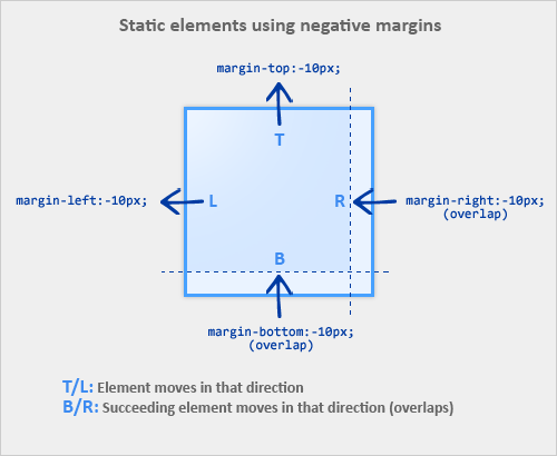
A static element is an element with no float applied. The image below illustrates how static elements react to negative margins.
When a static element is given a negative margin on the top/left, it pulls the element in that specified direction. For example:
/* Moves the element 10px upwards */

#mydiv1 {margin-top:-10px;}
But if you apply it to the bottom/right, it doesn’t move the element down/right as you might think. Instead, it pulls any succeeding element into the main element, overlapping it.
/*
* All elements succeeding #mydiv1 move up by
* 10px, while #mydiv1 doesn’t even move an inch.
*/

#mydiv1 {margin-bottom:-10px;}
If no width is applied, adding Negative Margins to its left/right pulls the element in both directions increasing its width. It’s here that the margin acts like a padding.
Negative Margins on Floated Elements
Consider this as our actual markup:
HTML
<div id=“mydiv1”>First</div>
<div id=“mydiv2”>Second</div>
If a negative margin is applied opposite a float, it creates a void leading to the overlapping of content. This is great for liquid layouts where one column has a width of 100% while the other has a definite width, like 100px.
/* A negative margin is applied opposite the float */
#mydiv1 {float:left; margin-right:-100px;}
If both elements are floated left and
margin-right:-20pxis applied to#mydiv1, #mydiv2treats#mydiv1as if it were 20px smaller in width than it actually is (thus, overlapping it). What’s interesting is that the contents of#mydiv1don’t react at all and continue to retain its current width.If the negative margin is equal to the actual width, then it overlaps it entirely. This is because margins, padding, borders, and width add up to the total width of an element. So if a negative margin is equal to the rest of the dimensions then the element’s width effectively becomes
0px.
3. Effective Techniques
Since we now know that applying a negative margin is valid CSS2 code, using it provides for some very interesting CSS techniques:
Making a singleinto a 3-column list
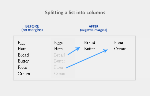
If you have a list of items which are just too long to display vertically, why not divide them into columns instead? Negative margins let you do this without having to add any floats or additional tags. It’s amazing how it easily lets you divide the list below into 3 separate columns, like so:
HTML
<ul>
   <li class=“col1”>Eggs</li>
   <li class=“col1”>Ham<li>
   <li class=“col2 top”>Bread<li>
   <li class=“col2”>Butter<li>
   <li class=“col3 top”>Flour<li>
   <li class=“col3”>Cream</li>
</ul>
CSS
ul {list-style:none;}
li {line-height:1.3em;}
.col2 {margin-left:100px;}
.col3 {margin-left:200px;}
.top {margin-top:-2.6em;} /* the clincher */
By adding margin-top:-2.6em (twice the line-height of <li>) to .top, all elements move up in perfect alignment. Using a negative margin is more appropriate than applying relative positioning since you only have to apply it to the first of the new columns instead of to each <li> tag. Cool, huh?
Overlap for added emphasis
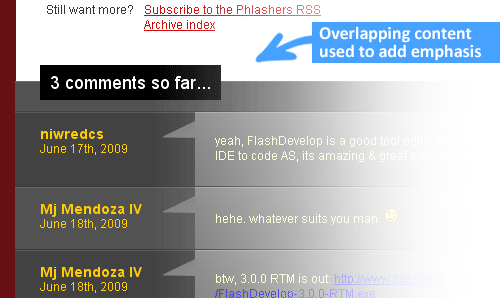
Overlapping elements on purpose is also a good design metaphor. It adds emphasis to specific elements since the overlapping effect creates the illusion of depth. A good example would be the comments section of Phlashers.com, which uses an overlapping technique to draw attention to the number of comments a post has. Combine this with the z-index property and a little creativity and you’ve got it made.
Smashing 3D text effects

Here’s a neat trick. Create Safari-like text, which are slightly beveled by creating 2 versions of your text in 2 different colors. Then use negative margins to overlap one over the other with a discrepancy of around 1 or 2 pixels and you’ve got selectable, robot-friendly beveled text! No need for huge jpegs or gifs which devour bandwidth like fat pigs.
Simple 2-column Layouts
Negative margins are also a great way to create simple 2-column liquid layouts where the sidebar has a preset width and the content has a liquid width of 100%
HTML
<div id=“content”> <p>Main content in here</p> </div>
<div id=“sidebar”> <p>I’m the Sidebar! </p> </div>
CSS
#content {width:100%; float:left; margin-right:-200px;}
#sidebar {width:200px; float:left;}
And there you have a simple 2-column layout record time. It works flawlessly in IE6 too! Now, to prevent #sidebar from overlapping the text inside #content, simply add
/* Prevent text from being overlapped */

#content p {margin-right:210px;}

/* It’s 200px + 10px, the 10px being an additional margin.*/
When used properly, negative margins can also provide what’s called a Flexible Document Structure which absolutely kicks tables in the face. Flexible Document Structure is an accessibility and SEO technique which allows you to arrange your markup in almost any order depending on your intentions. Tom Wright wrote an interesting article which discusses possible applications of negative margins in multicolumn layouts.
Nudging elements into place
This is the most common (and simplest) usage for negative margins. If you’re inserting a 10th div in a sea of 9 other divs and somehow it just won’t align properly, use negative margins to nudge that 10th div into place instead of having to edit the other 9.
4. Bugfixes
Text and Link problems
Using negative margins with floats sometimes pisses off older browsers. Some symptoms include:
- Making links unclickable
- Text becomes difficult to select
- Tabbing any links disappears when you lose focus
Solution: Just add position:relative and it works!
My picture got cut-off
If you have the bad luck of using IE6 in the office, sometimes content will suddenly be cut-off when overlapping and floats are concerned.
Solution: Again, just add position:relative to the floated element and everything goes back to normal.
5. Conclusion
Negative margins have a place in modern web design because of its ability to position elements without any additional markup. With more users switching to more updated browsers (IE8 included), the future looks very bright for sites which rely on this technique.
If you have any unique experiences with negative margins, let me know by posting a comment.
6. Resources
More info on negative margins.
- Search This, The Positive Side of Negative Margins
- Severn Solutions, CSS Negative Margins Algebra
- A List Apart, Creating Liquid Layouts with Negative Margins
- W3.org, Margin Properties
- Branbell, Using Negative Margins
- devarticles, Swapping Column Positions in Web Page Layouts with Negative Margins
- Simplebits, Exceptionally Negative
- brunildo, Horizontal Negative Margins
- Ben Nadel, Negative CSS Margins Are Not Cool


