Designing “Read More” And “Continue Reading” Links

Email Newsletter
Weekly tips on front-end & UX.
Trusted by 182,000+ folks.
 Register for Free

 Custom Web Forms for Angular, React, & Vue. Your backend.

 Celebrating 10 million developers
Every website has its own way of asking readers to click on an article link. Some websites have very prominent links, others are a bit subtler. Either way, website and user interface designers have thought up some very creative and innovative ways of inviting readers to read on. In this showcase, we will present 45 websites that have excellent “Read more” and “Continue reading” links in their design. Hopefully, these websites will serve as inspiration for your future projects or at least remind you not to ignore this important design element.
You may want to take a look at the following related posts:
- The Definitive Guide To Styling Web Links
- Why Your Links Should Never Say “Click Here”
- Should Links Open In New Windows?
- A Short Story About “Back To Top” Links
Best Practices
Before we present the showcase, let’s understand why “Read more” links are so important. They are important for several reasons, most importantly because they allow designers to compress content on the home page. By compressing content, you fit more content in less space. This means that readers can scan headlines more quickly and that you can fit more information above the fold.
Also, “Read more” links allow website administrators to more easily track the most popular content. Designers who put entire articles on the home page may make it difficult for website administrators to track the most popular articles and understand what users want to see.
The third and probably most practical reason for having “Read more” links on a website is money. Websites that monetize traffic understand that the more their readers click on links, the more likely they will look at and click on advertisements. “Read more” links can double or even triple the number of page views a website receives, making it more attractive to advertisers.
Now that we understand why “Read more” links are so important, let’s investigate some best practices for implementation.
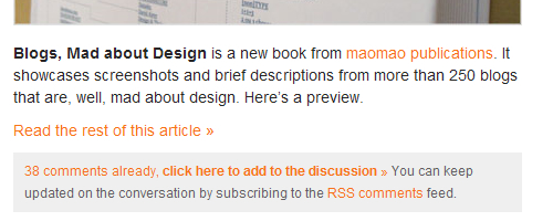
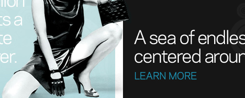
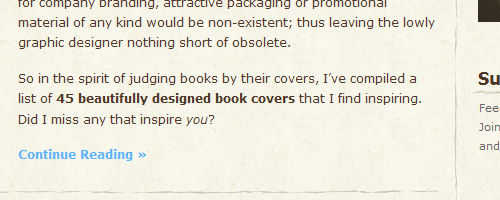
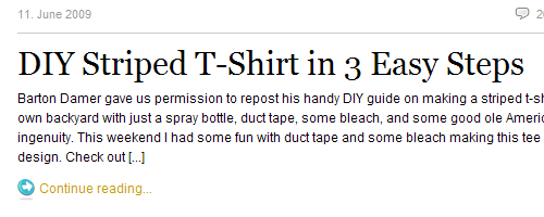
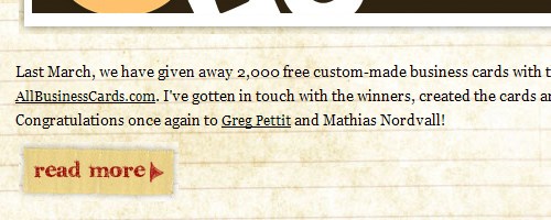
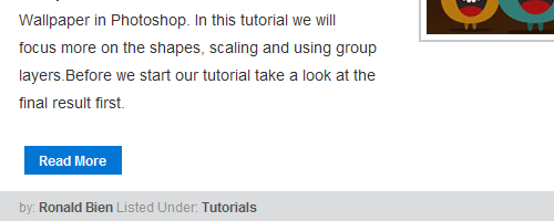
1. Make Text Links Stand Out
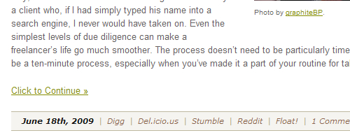
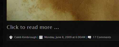
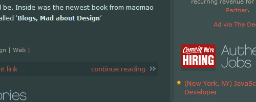
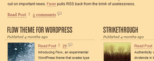
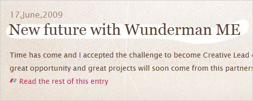
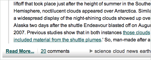
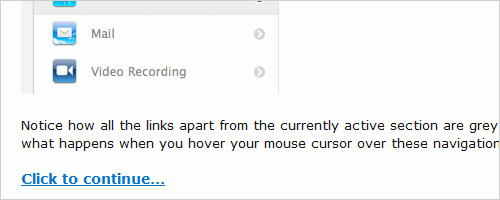
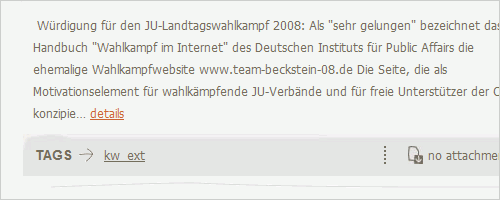
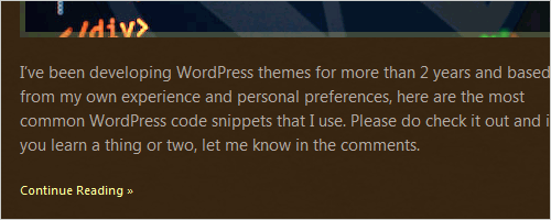
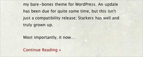
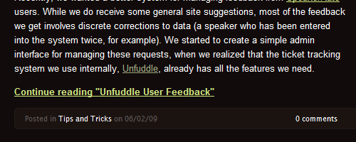
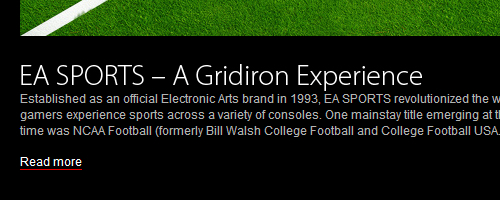
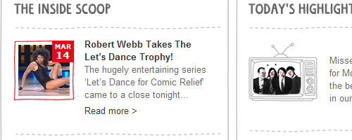
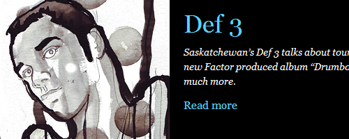
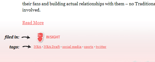
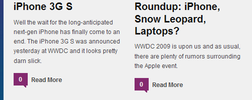
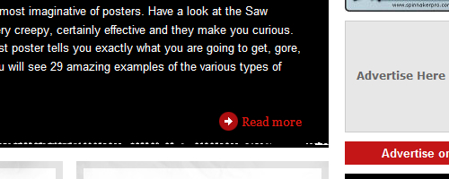
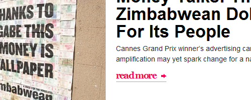
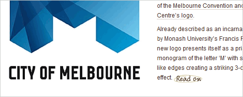
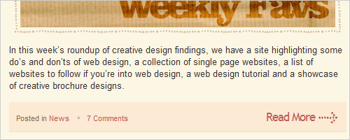
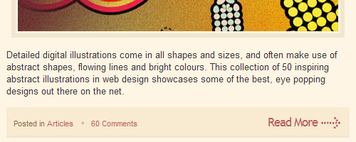
By far the most popular method of presenting “Read more” links is with simple text. This is usually done with a link that is underlined, bolded, brightly colored and sometimes marked with a > sign. Making text links on your website easily distinguishable from generic links is important and sometimes overlooked by designers.
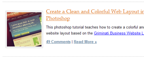
Tutorial9
PSDTuts
Smashing Apps

CSS Tricks
David Airey
Freelance Switch
Lost and Taken
Veerle’s Blog
Rob Goodlatte
Douglas Menezes
slashdot
UsabilityPost
Kupferwerk
Dino Latoga
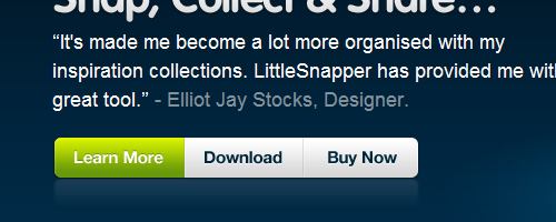
Elliot Jay Stocks
SixRevisions
Viget
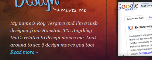
Design Moves Me
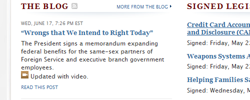
The White House
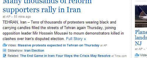
Yahoo News
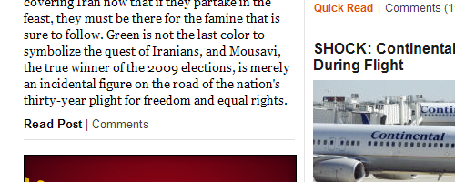
Huffington Post
F-I
Red Nose Day
UGSMAG
Carrot Blog
Take the Walk
Fantesca

Concentric Studio
Well Medicated
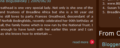
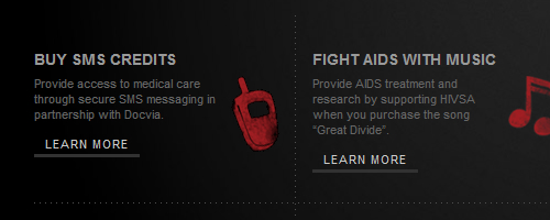
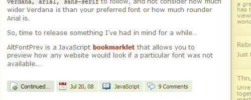
2. Use Icons
When text alone won’t do, consider adding an icon to your design. Icons are great tools in user interface design and can really help draw attention to a particular part of the layout.
GoMediaZine
Macalicious
The Potato
Sam Rayner
Design Reviver
The World Wide Blogger Bake Off
An Idea
Blog Full Bliss
Koodoz
Spoongraphics
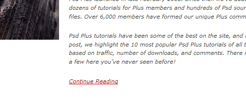
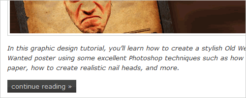
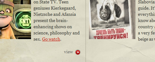
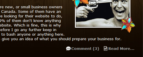
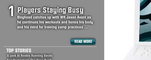
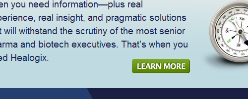
3. Use Buttons
If you really want your “Read more” link to stand out, use a button. Some websites have images or CSS-styled text. Just keep in mind that too many buttons can overwhelm the audience, so use them in moderation.
Real Mac Software
Philadelphia Eagles
Dawg House Design Studio
Naldz Graphics
Spoon Graphics
Healogix
Take the Walk
Fantesca
Concentric Studio
Well Medicated
2. Use Icons
When text alone won’t do, consider adding an icon to your design. Icons are great tools in user interface design and can really help draw attention to a particular part of the layout.
GoMediaZine
Macalicious
The Potato
Sam Rayner
Design Reviver
The World Wide Blogger Bake Off
An Idea
Blog Full Bliss
Koodoz
Spoongraphics
3. Use Buttons
If you really want your “Read more” link to stand out, use a button. Some websites have images or CSS-styled text. Just keep in mind that too many buttons can overwhelm the audience, so use them in moderation.
Real Mac Software
Philadelphia Eagles
Dawg House Design Studio
Naldz Graphics
Spoon Graphics
Healogix
Trends
Seeing what everyone else is doing before you start designing a website is always important. You may want to know in order to conform to the current trend, or you may just want to buck the trend. Either way, putting your finger in the air from time to time to see which way the wind is blowing is valuable.
While researching material for this article, we discovered several interesting trends*:
- Text-only links were used more than any other type of “Read More” link by a ratio of almost 2 to 1.
- Most websites used the wording “Read More” or some variation of it.
- Text-only links or text combined with an icon were used mostly on blogs, while buttons were used primarily on commercial websites.
- These observations are not scientific and reflect only the websites showcased in this article, not the Internet in general.
Conclusion
Hopefully, this article has given you some insight into how best to display your “Read more” text. Clearly, you can entice readers to click on links in several ways, and some methods work better than others. In observing other websites, we found that many of them prefer to keep their links simple. Some websites have brightly colored links or bolded text, others have icons or even buttons to make their links stand out. Either way, designers prefer to keep their “Read more” text brief, with only one-third of them using some variation of the word “Continue.” There could be several reasons for this, the most likely being that the words “Continue reading” just have too many characters.
We also found that blogs were more likely to use text links, while commercial websites were more likely to use buttons. The reason for this isn’t exactly clear, but owners of commercial websites may feel buttons attract users more to their products, while publishers of text-heavy blogs prefer to keep things simple, so as not to overwhelm readers.
In the end, you are limited only by your creativity and imagination. Do whatever works best for the website you are working on, and the design will likely work because of it.


