30 Fresh and Inspirational Portfolios With A Twist

Email Newsletter
Weekly tips on front-end & UX.
Trusted by 182,000+ folks.
 Custom Web Forms for Angular, React, & Vue. Your backend.
 Celebrating 10 million developers


Please notice that you certainly need more than a nice “look” to make the design stand out; in particular, usability and accessibility are issues that need to be carefully considered when creating your next portfolio design.
You might be interested in the following related posts:
- My (Simple) Workflow To Design And Develop A Portfolio Website
- Portfolio Web Design Showcases
- 10 Steps To The Perfect Portfolio Website
Flash Based-Designs
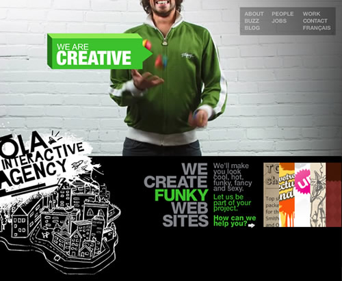
Ola Interactive Agency A fun and straightforward website, with small videos running in the back to illustrate some of the company values, like creativity, speed and coolness! There’s a speaker on the left to kill the music.
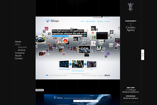
Your Majesty Nice and clean website with more than one way to explore the portfolio, excellent branding, and a smooth dark color scheme.
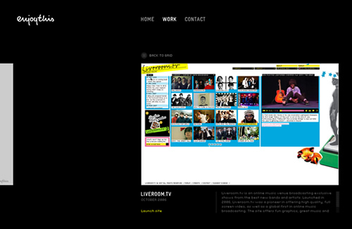
EnjoyThis The minimal design and a sleek touch of Flash are the strong points of this one. Browsing trough the works seems so natural.
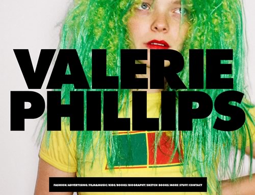
Valerie Phillips This is huge. Literally!
Ben Thomas A simple and effective left aligned website, with a stylish motion effect that works great with the dynamic visuals in the portfolio.
Studio Output This one is for the average portfolio what Vimeo is for YouTube: a minimal yet powerful alternative, an almost buttonless experience.
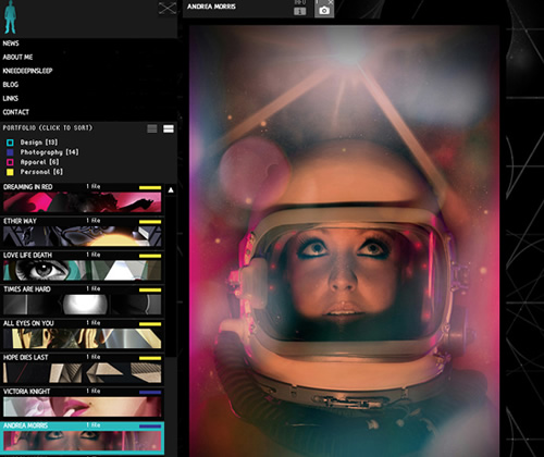
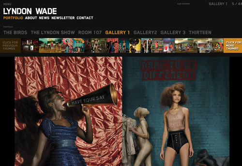
Lyndon Wade A classic dark styled background with a thumbnail menu and awesome transition effects are all you need for a killer portfolio. Oh, and some pictures from one of the top 15 photographers in America.
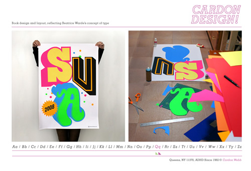
Cardon Design A simple and innovative way to show the portfolio, in a dictionary way. Great works also!
Kenjiro Harigai One of the most complex websites in our selection, it features a visual menu with a lens effect, a text menu with the names of the works, and some amazing motion effects.
I Shot Him This one is all about the story: with just a few vintage illustrations and some creative lines they really deliver “a design novelty”.
Unique browsing system
Websites that let you scan the portfolio trough original and fresh techniques.
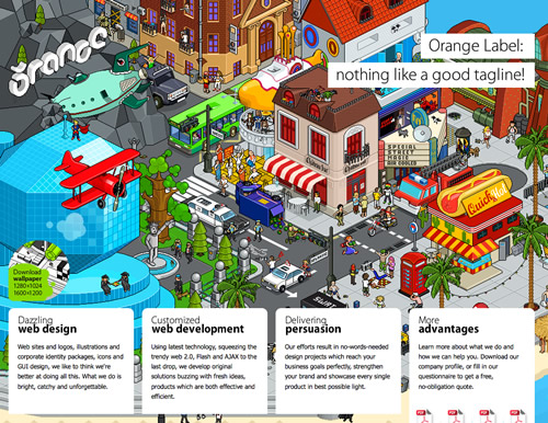
Orange Label This is a one-page journey, a dive in the studio’s achievements, beginning with a strong graphic & profile, then some works and finally a feedback form.
Counter Fill Exploring this portfolio is like falling from the roof of a tall building and stopping by a few times to look on the window. Click to see why.
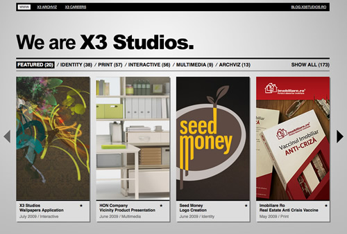
X3 Studios The excellent use of AJAX makes browsing this website such a smooth experience that you get the feeling you never left the homepage. Which is true!
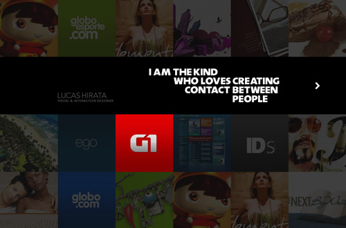
Lucas Hirata Very good use of thumbnails and light.
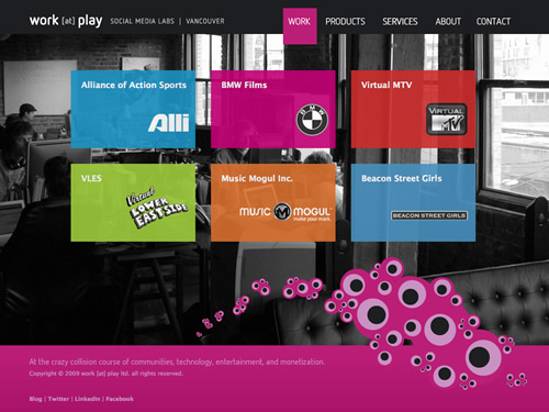
Work at Play Maybe the most dynamic non-Flash website of the selection. Great uses of colors, transparency and AJAX.
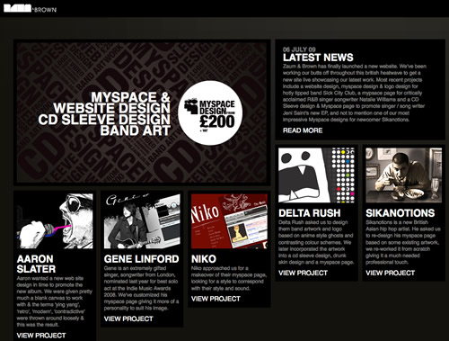
Zaum & Brown Finally a grid based portfolio with a fluid layout. Don’t know if Brown comes from the color of the background, but that certainly works well also.
Creative People The background is so important here! This amazing photo manipulation steals the show but introduce us properly in the studio atmosphere.

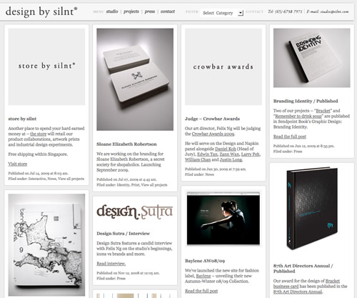
Design by Slint This prolific studio from Singapore also has a grid-based fluid portfolio, where they show the works in a blog style way.
Dave Hill The best proof that great photography doesn’t really need sophisticated design to stand out. Elegant and smooth.

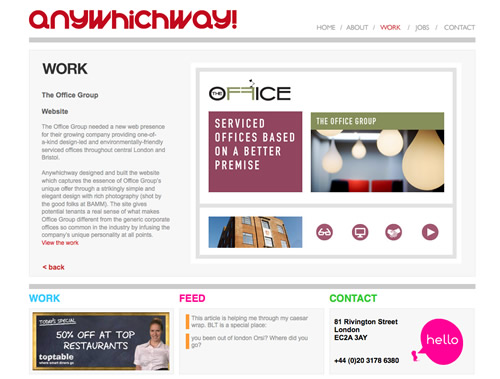
Any Which Way Nothing fancy seems to be happening here at the first sight, but this website has a great navigation system: a mirror-like menu that stands as a fantastic alternative for the way over-used “carousel”.
Special elements
Portfolios that use at least one remarkable element (widget, color scheme, game) to create an immersive adventure.
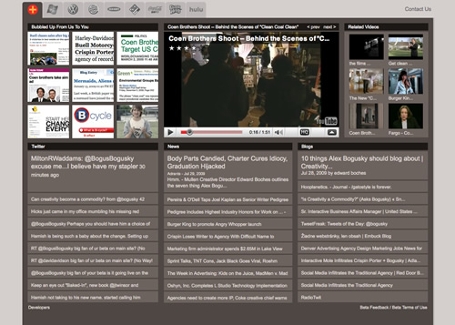
Crispin Porter + Boguski Basically this website aggregates a YouTube video for a given campaign, the live news feed about it, Twitter bits, and blog pieces. It sure is the most social-ready portfolio of the selection.
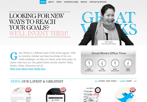
Great Works An excellent example of three colors website: sleek, smooth, and effective!
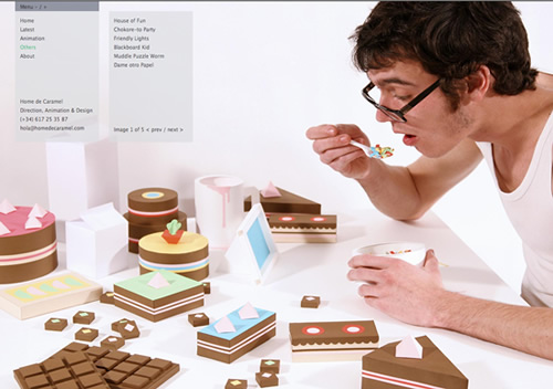
Home de Caramel Another fullscreener, Home de Caramel features a double menu, just a few words and huge images. Makes sense.
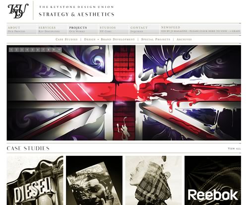
Trust The KDU The vintage design and the sepia tone of the photos work extremely well together and make a great portfolio.
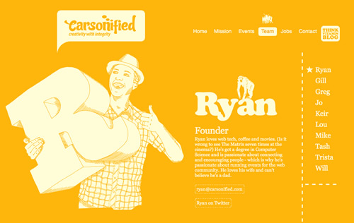
Carsonified Strong colors and striking, simple illustrations make from the new Carsonified website an instant classic.
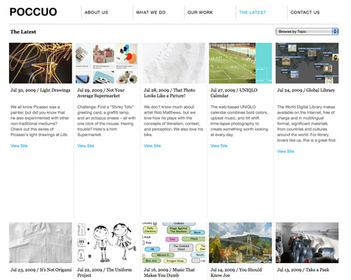
Poccuo Very clean and dynamic website with a powerful Twitter integration and a nice simple way to show the creative work.
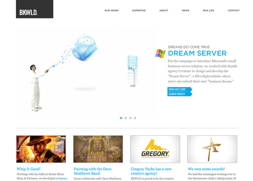
BKWLD Clean design + Good navigation + Great works = Winner Portfolio
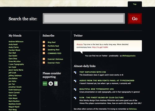
Elliot Jay Stocks Another classic, the portfolio of Elliot teaches us the importance of a huge footer, actually as big as the body. Break the barriers, think big!
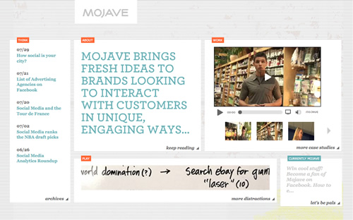
Mojave Interactive Social media is very important business for Mojave, so they have compiled a few different channels in the homepage.
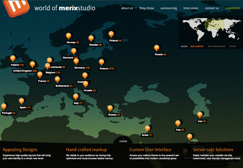
Merix Studio Full intreactivity map with clients and resources, amazing idea!