Vital Tips For Effective Logo Design

Email Newsletter
Weekly tips on front-end & UX.
Trusted by 182,000+ folks.
This article has been kindly supported by our dear friends at GS-JJ who care for quality, service, and customer satisfaction. GS-JJ is affiliated to one of the largest manufacturers of promotional gifts merchandise in China. They have been in the manufacturing of promotional gifts merchandise for over 20 years, in small or large quantities to some of the biggest distributors, and high-end customers in America and around the world. They will help you through the entire order fulfillment process, from pins to lanyards, patches to key chains, stickers to challenge coins, neon signs to cufflinks, and much more. Thank you!
In this article, we’ll get down to the nitty gritty of what makes an effective logo design and we’ll also guide you through the principles and best practices of how to create an iconic brand identity.
What Is A Logo?
To understand what a logo is, we first must understand what the main purpose of logos is. The design process must aim to make the logo immediately recognizable, inspiring trust, admiration, loyalty and an implied superiority. The logo is one aspect of a company’s commercial brand or economic entity, and its shapes, colors, fonts, and images usually are strikingly different from other logos in the same market niche. Logos are used to identify.
Paul Rand, one of the world’s greatest designers states that “a logo is a flag, a signature, an escutcheon, a street sign. A logo does not sell (directly), it identifies. A logo is rarely a description of a business. A logo derives meaning from the quality of the thing it symbolizes, not the other way around. A logo is less important than the product it signifies; what it represents is more important than what it looks like. The subject matter of a logo can be almost anything.”
For more on Paul Rand, consider reading the book Design, Form & Chaos.
What Makes A Good Logo?
A good logo is distinctive, appropriate, practical, graphic and simple in form, and it conveys the owner’s intended message. A concept or “meaning” is usually behind an effective logo, and it communicates the intended message. A logo should be able to be printed at any size and, in most cases, be effective without color. A great logo essentially boils down to two things: great concept and great execution.
Logo Design Process
“Some wonder what’s so difficult about creating a good logo. They’re small, they look easy to do, so no problem, right? When you only see the result of a designer’s efforts, the logo creation can look like it was a simple task. But it’s not. A logo takes thought and creativity, and many elements combine to make a good one.” (via Harrison Mcleod)
When creating a logo, follow a process that ensures the final design meets the needs of the clients. Below, we have listed the typical process that professional logo designers follow. With practice, you will no doubt develop your own.
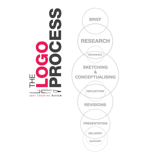
Design brief. Conduct a questionnaire or interview with the client to get the design brief.
Research. Conduct research on the industry itself, its history and competitors. Problem-solve first, design later.
Reference. Conduct research on logo designs that have been successful and on current styles and trends that may relate to the design brief. Follow trends not for their own sake but rather to be aware of them: longevity in logo design is key.
Sketching and conceptualizing. Develop the logo design concept(s) around the brief and your research. This is the single most important part of the design process. Get creative and be inspired. As Dainis Graveris has written once, “sketching isn’t time-consuming and is a really good way to put ideas in your head right on paper. After that, it’s always easier to actually design it on the computer. Sketching helps to evolve your imagination: once you understand it, you will always start from just white paper.
Image by Panoramas. Reflection. Take breaks throughout the design process. This helps your ideas mature, renews your enthusiasm and allows you to solicit feedback. It also gives you a fresh perspective on your work.

- Simple
- Memorable
- Timeless
- Versatile
- Appropriate
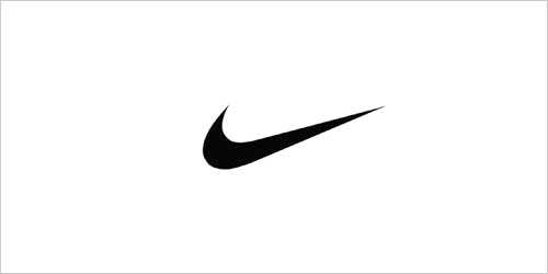
While in college in the mid-'70s, an instructor introduced me to the K.I.S.S. Principle of design, which translates as: Keep It Simple, Stupid. It does convey a very important design consideration. Simple logos are often easily recognized, incredibly memorable and the most effective in conveying the requirements of the client. A refined and distilled identity will also catch the attention of a viewer zipping by signage at 70 miles per hour, on packaging on the crowded shelves of a store, or in any other vehicle used for advertising, marketing and promotion. Remember, the basis of the hugely effective international branding for the world’s largest shoe manufacturer is a very simple graphic swoosh. — Jeff FisherOn that note, you may find the history of the Nike logo quite interesting. ### 2. Memorable
Surprising to many, the subject matter of a logo is of relatively little importance, and even appropriateness of content does not always play a significant role. This does not imply that appropriateness is undesirable. It merely indicates that a one-to-one relationship between a symbol and what it symbolized is very often impossible to achieve and, under certain conditions, objectionable. Ultimately, the only mandate in the design of logos, it seems, is that they be distinctive, memorable, and clear. — Paul Rand### 3. Timeless
Leave trends to the fashion industry. Trends come and go, and when you’re talking about changing a pair of jeans or buying a new dress, that’s fine, but where your brand identity is concerned, longevity is key. Don’t follow the pack. Stand out. — David Airey### 4. Versatile

- In one color?
- In reverse color (i.e. light logo on dark background)?
- The size of a postage stamp?
- As large as a billboard?
I like to work first in black and white to ensure that the logo will look good in its simplest form. Color is very subjective and emotional. This can distract from the overall design - say if you saw your logo in all red, that color may be the first thing that you respond to and not the composition of the design elements. I will not even consider submitting color suggestions to a client for review until they have signed off on a final black and white logo. — Patrick WinfieldFamiliarize yourself with the commercial printing process so that you do not encounter printing problems down the line. Know the difference between the CMYK, Pantone and RGB color systems. ### 5. Appropriate
A logo doesn’t need to say what a company does. Restaurant logos don’t need to show food, dentist logos don’t need to show teeth, furniture store logos don’t need to show furniture. Just because it’s relevant, doesn’t mean you can’t do better. The Mercedes logo isn’t a car. The Virgin Atlantic logo isn’t an airplane. The Apple logo isn’t a computer. Etc. — David Airey
Should a logo be self-explanatory? It is only by association with a product, a service, a business, or a corporation that a logo takes on any real meaning. It derives its meaning and usefulness from the quality of that which it symbolizes. If a company is second rate, the logo will eventually be perceived as second rate. It is foolhardy to believe that a logo will do its job immediately, before an audience has been properly conditioned. — Paul Rand## How Much Does A Logo Cost?
- Experience and proven success Do they have a proven track record? How experienced are they?
- Testimonials Do they have positive testimonials from previous clients? Ensure you check the validity of testimonials. A quick email to the company should suffice.
- Their design process Do they follow a logo design process?
- Awards won and published work Have they won any awards for their work? Is their work published in any books or magazines? How recognized are they in the industry?
- Strength of portfolio How strong is their portfolio? Have they got 100+ mediocre logo designs or 10 to 30 excellent ones? What is the ratio of real to fake logo designs?
- Timeframe How long would they take to complete your logo? A typical logo design process takes 4 to 15 days, but many can go for months on end. Think of how long your logo design will be used for: would you want it to be designed (much less researched) in less than 24 hours?
- Price The cost of the service usually reflects what you will receive. In most cases, you get what you pay for... but price is not the only indication.
- Affiliations Are they affiliated with any design associations or publications? This is a good indication of how dedicated they are to their craft, though it is not essential.
- Professionalism and communication How do they present themselves? Do they respond to your emails quickly? How do they communicate? Do they work with a contract (to protect both them and you)?
- Questions asked How many questions does the designer ask about your business? Questions should revolve around your company's history, target market, goals, etc.