Typographic Design Patterns And Best Practices

Email Newsletter
Weekly tips on front-end & UX.
Trusted by 200,000+ folks.


 Flexible CMS. Headless & API 1st
 Register!
To find typographic design patterns that are common in modern Web design and to resolve some common typographic issues, we conducted extensive research on 50 popular websites on which typography matters more than usual (or at least should matter more than usual). We’ve chosen popular newspapers, magazines and blogs as well as various typography-related websites.
We’ve carefully analyzed their typography and style sheets and searched for similarities and differences. We have also put together a spreadsheet of the study that displays the websites’ various values (for example, the ratio between the line height and line length).
Ultimately, we identified 13 general typographic problems and issues related to typographic design and tried to find answers to them through our research:
- How popular are serif and sans-serif typefaces in body copy and headlines?
- Which fonts are used most frequently?
- What is the average font size?
- What is the average ratio between the font size of headlines and body copy?
- What is the average line height of body copy?
- What is the average ratio between line height and font size in body copy?
- What is the average ratio between line height and line length in body copy?
- What is the average amount of spacing between paragraphs?
- What is the average ratio of paragraph spacing to line height in body copy?
- How are links styled?
- How many characters per line are common in body copy?
- How often are links underlined?
- How often is font replacement (sIFR, etc.) used?
We ended up with solid data, which we evaluated and prepared for this article. Based on the statistics, we have identified several “rules of thumb” for working with type. Please note that these rules can often, but not always, be considered best practice.
1. Serif vs. Sans-serif
Whether designers should use serif or sans-serif fonts for body copy is one of the most discussed and unresolved questions about typesetting on the Web. Some designers prefer to give their headlines serifs (which are short, decorative lines at the end of letter strokes) to give them more appeal. The main reason to choose a serif font for your headlines is that, at a large size, serif fonts are easy to read and look great. The contrast between a serif font for headlines and a sans-serif font for body copy can be interesting, too.
Some designers prefer serif fonts for body copy because they believe the lines at the end of letter strokes help guide readers from one letter to the next, making scanning and reading more comfortable.
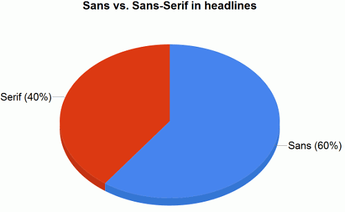
According to our study, sans-serif fonts are still more popular than serif fonts for headlines, although they seem to have dropped in popularity in recent years.
- 60% of websites use sans-serif typefaces for headlines, mostly Arial, Verdana, Lucida Grande and Helvetica. Among them: CNN, ArsTechnica, Slate, BBC and NewScientist.
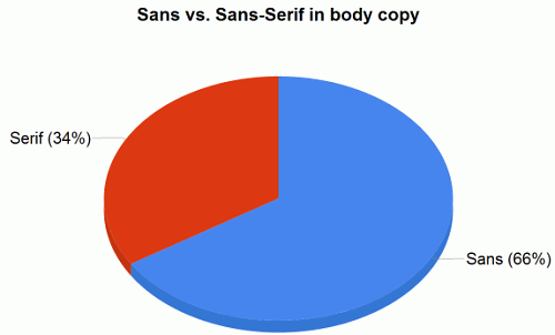
- Only 34% of websites use a serif typeface for body copy. Among them: New York Times, Typographica, Time, AIGA and Newsweek.
- The most popular serif typefaces for headlines are Georgia (28%) and Baskerville (4%).
- The most popular serif typefaces for body copy are Georgia (32%) and Times New Roman (4%).
- The most popular sans-serif typefaces for headlines are Arial (28%), Helvetica (20%) and Verdana (8%).
- The most popular sans-serif typefaces for body copy are Arial (28%), Verdana (20%) and Lucida Grande (10%).
Two thirds of the websites we surveyed used sans-serif fonts for body copy. The main reason is probably because, despite the growing popularity of advanced font replacement techniques, such as Cufón, most designers stick to the core Web fonts, which essentially give them only two viable options: Georgia and Times New Roman. And because of the stigma attached to Times New Roman (that it often makes a modern website look outdated), they’re left with only Georgia. Sans-serif fonts offer a wider variety of options for the Web.
2. Which Typeface Is Most Popular?
Surprisingly, despite the growing popularity of font replacement techniques and growing availability of new pre-installed fonts (e.g. Windows Vista and Mac fonts), designs in our study mainly used the traditional, core Web fonts, the only exceptions being Lucida Grande (which comes installed only on Macs), Helvetica and Baskerville.
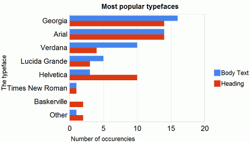
As one would expect, Arial, Georgia and Verdana are used for the majority of body copy today. In our study, around 80% of websites used one of these three fonts. For the remaining 20%, designers’ favorite Helvetica is a popular choice, as is Lucida Grande.
With options such as Verdana and Arial available as fall-backs, a designer really has no reason not to specify other non-standard fonts to achieve the best effect. You can learn more about advanced CSS font stacks in Nathan Ford’s article Better CSS Font Stacks and CodeStyle’s Build Better CSS Font Stacks.
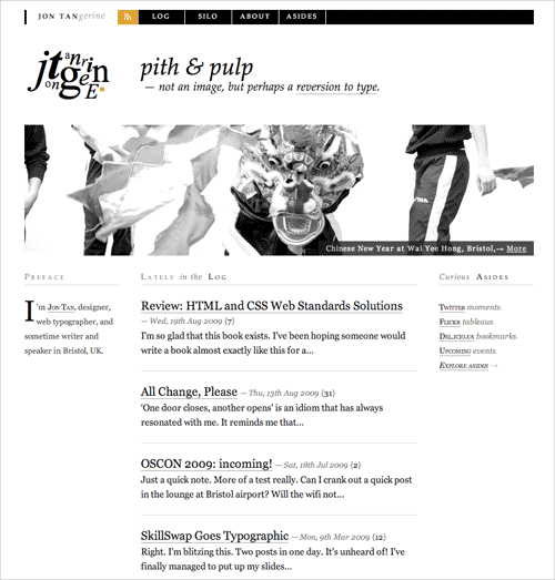
Jon Tan used serif typeface Baskerville for headlines and serif typeface Georgia for body copy.
Verdana is used minimally for headlines. Only 10 websites use it for body copy to begin with, and only four use it for headlines. The main reason is that Verdana puts a lot of spacing between letters, which makes it not as tidy to read at a large size. If you are going to use it for headlines, you may want to take advantage of the CSS letter-spacing property. Georgia and Arial are most popular fonts for headings.
Finally, we note that “alternative” fonts are used much more for headlines than for body copy. Designers seem more willing to experiment with their headings than with the main body. If you want to bring some typographic variation into your next design, headings may be the easiest place to start.
3. Light Or Dark Background?
We were curious to learn the extent to which designers were willing to experiment with dark background colors. We looked out for any typography-oriented websites that had a dark color scheme and were surprised to find not a single one.
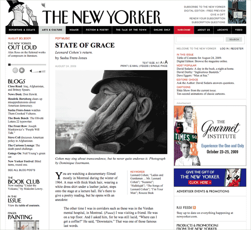
The New Yorker has a light color scheme, with Times New Roman used for headlines and body copy.
Pure white background for body copy won by a landslide. However, many of the designs avoid the high contrast of pure white on pure black; text color is often made a bit lighter than pure black. Designers clearly focus on legibility and avoid experimenting with background colors. The contrast of black on white is easy to read and is, at least among these websites, the status quo.
4. Average Font Size For Headlines
Of course, the choice of headline font size depends on the font used in the design. In any case, in our study by far the most popular font sizes ranged from 18 to 29 pixels, with 18 to 20 pixels and 24 to 26 pixels being the most popular choices.
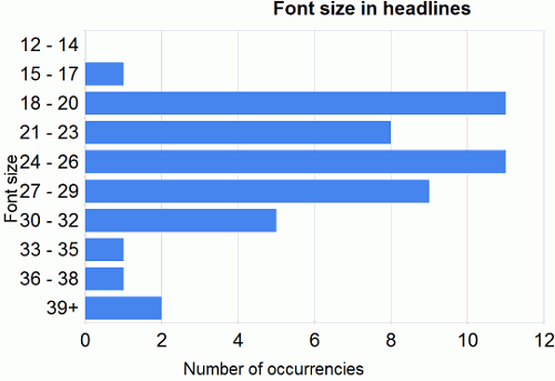
Our study didn’t yield any clear winners. The average font size for headings is 25.6 pixels. But note that any size between 18 and 29 pixels could be effective; it depends, after all, on how your headings fit the overall design of your website. Still, you could try experimenting with larger sizes, because displays are always getting larger, as are display resolutions.
An obvious outlier is Wilson Miner (screenshot below), who uses a massive font size of 48 pixels for his headlines. His website is a special case, though, because all of his posts have extremely short titles, only a few words.
5. Average Font Size For Body Copy
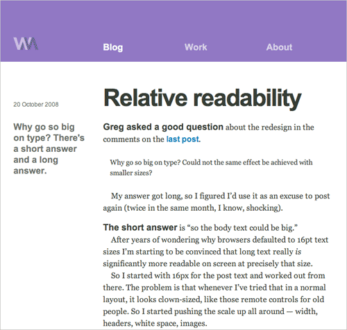
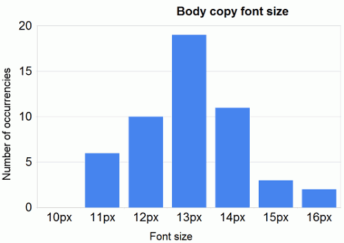
Do you remember about seven years ago when Web designs had tiny, barely readable elements, and body copy was set to 8 pixels in Tahoma? Small font sizes are out, and more and more modern designers are turning to large font sizes. From our sample size, we saw a clear tendency towards sizes between 12 and 14 pixels. The most popular font size (38%) is 13 pixels, with 14 pixels slightly more popular than 12 pixels. Overall, the average font size for body copy is 13 pixels.
We noted (as one would expect) more and more attention being paid to the smallest typographic details. Dashes, quotes, footnotes, author names, introductory text and paragraphs have been carefully set, with optimal legibility in mind. Type setting is usually very consistent, with a lot of white space, leading and padding.
Typographica uses a large font size for the introductory paragraphs of its articles, and then reverts to a normal size for the rest of text.
Heading To Body Font-Size Ratio
To better understand the relationship between heading and body font size, we divided each website’s heading font size by its body font size. We took the average of these ratios and derived a rule of thumb for you to work with:
Heading font size ÷ Body copy font size = 1.96
The overall value, then, is 1.96. This means that when you have chosen a font size for your body copy, you may want to multiply it by 2 to get your heading font size. This, of course, depends on your style; the rule of thumb won’t necessarily give you the optimal size for your particular design. Another option is to use a traditional scale (6, 7, 8, 9, 10, 11, 12, 14, 16, 18, 21, 24, 36, 48, 60, 72) or the Fibonacci sequence (e.g. 16 – 24 – 40 – 64 – 104) to get natural typographic results.
6. Optimal Line Height For Body Copy
Leading (or line height) will always depend on your chosen font size and measure (or line length). In general, the longer the measure, the longer the leading should be. Therefore, presenting a chart of the most popular choices for leading in pixels wouldn’t make sense here. More appropriate would be for you to use a relative unit, such as an em or percentage value, that determines the relation between leading and measure and between leading and font size.
According to our study:
- line height (pixels) ÷ body copy font size (pixels) = 1.48. Note that 1.5 is a value that is commonly recommended in classic typographic books, so our study backs up this rule of thumb. Very few websites use anything less than that. The number of websites that go above 1.48 decreases as you get further from this value.
- line length (pixels) ÷ line height (pixels) = 27.8. The average line length is 538.64 pixels (excluding margins and paddings) which is pretty large, considering that many websites still use 12 to 13 pixels for their body copy font size.
- space between paragraphs (pixels) ÷ line height (pixels) = 0.754. We were surprised by this result. It turns out that paragraph spacing (i.e. the space between the last line of one paragraph and the first line of the next) rarely equals the leading (which would be the main characteristic of perfect vertical rhythm). More often, paragraph spacing is just 75% of the paragraph leading. The reason may be that leading usually includes the space taken up by descenders, and because most characters do not have descenders, additional white space is created under the line.
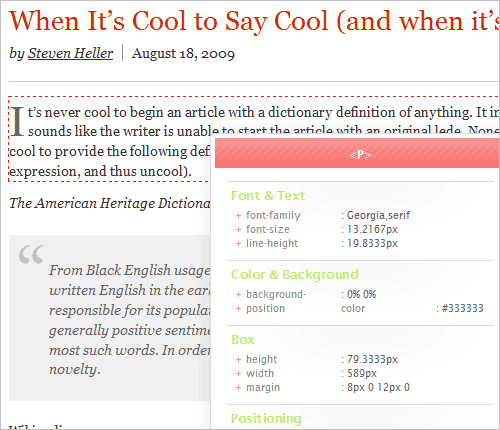
AIGA is a perfect example of optimal leading. Its font size is 13.21 pixels (converted from ems) and its line height is 19.833 pixels (conversion from ems). In fact, 19.8333 ÷ 13.2167 = 1.5011.
So, once you have decided on your body copy font size, multiplying this value by 1.5 will give you the optimal line height. Once you’ve got that, you can multiply this new value by 27.8 to get your optimal line length. Note that the layout will also need gutters, margins and padding to let the body copy breathe.

The New Scientist has 20 pixels of spacing between paragraphs.
7. How Many Characters Per Line?
According to a classic rule of Web typography, 55 to 75 is an optimal number of characters per line. Surprisingly, our study shows that most websites have a higher number. We counted how many characters could fit on one line using the design’s default font size. The result, which is an average of 88.74 characters per line (maximum), is extremely high. Of course, this maximal number is different from the average number of characters per line, which in general ranges between 75 and 85 characters per line. Still, the range is way above the conventional range – quite peculiar.
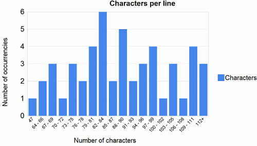
Between 73 and 90 characters per line is a popular choice among designers, yet we also found outliers: Monocle (47 characters per line) and Boxes and Arrows (125 characters per line). To get a more exact reading for each website, you would need to take an average character count from multiple lines.
Other Findings
- 46% of websites underlined the links in their body copy, while the others highlighted only with color or a bold font weight.
- 6% of websites used some kind of image replacement for headings or body copy (e.g. Monocle, New Yorker, Newsweek).
- 96% of websites do not justify text.
- Websites gave their text a left padding of on average 11.7 pixels (counting from the left content area border).
Conclusion
The study shows a clear set of common practices and guidelines for setting type in Web design. Note, though, that these findings are not scientific and should serve only as rough guidelines:
- Either serif or sans-serif fonts are fine for body copy and headings, but sans-serif fonts are still more popular for both.
- Common choices for headlines are Georgia, Arial and Helvetica.
- Common choices for body copy are Georgia, Arial, Verdana and Lucida Grande.
- The most popular font size for headings is a range between 18 and 29 pixels.
- The most popular font size for body copy is a range between 12 and 14 pixels.
- Header font size ÷ Body copy font size = 1.96.
- Line height (pixels) ÷ body copy font size (pixels) = 1.48.
- Line length (pixels) ÷ line height (pixels) = 27.8.
- Space between paragraphs (pixels) ÷ line height (pixels) = 0.754.
- The optimal number of characters per line is between 55 and 75, but between 75 and 85 characters per line is more popular,
- Body text is left-aligned, image replacement is rarely used and links are either underlined or highlighted with bold or color.
Of course these “rules” aren’t set in stone. Rather, they are a set of rough guidelines that you can use as a basis for setting typography. Every website is unique, and you may want to modify your choices at each stage of your design to suit your layout. You can also take a look at the spreadsheet of the study and export its data for further analysis.
Further Reading
- Typographic Design Patterns And Current Practices 2013 Study
- The Perfect Paragraph
- When Typography Speaks Louder Than Words
- Why Subtle Typographic Choices Make All The Difference
- Photoshop-Inspired Techniques with 100% CSS


