TV Show Web Designs: Trends and Examples

Email Newsletter
Weekly tips on front-end & UX.
Trusted by 182,000+ folks.
 Register for Free


 Celebrating 10 million developers
 Custom Web Forms for Angular, React, & Vue. Your backend.
Looking at websites from major industries that involve various forms of media can be interesting practice. In the past we have showcased websites from movies and from musicians on the Billboard charts, and today we’ll feature the websites of more than 50 TV shows. The websites of TV shows are intended to generate interest in the show to improve ratings, and to provide information about the show (and sometimes past episodes) for those people who are already fans of the show. To accomplish this they attempt to create an attractive, interactive website that appeals to visitors.
Trends in TV Show Websites:
As you browse through the sites that are featured in this showcase, here are some of the trends that you may notice:
1. On the Network’s Domain Many, but not all, websites of TV shows are located on the networks domain. This helps to unify the websites of the various shows on the network and can even help visitors of the site to remember what network a particular show is on.
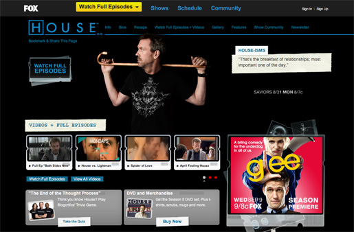
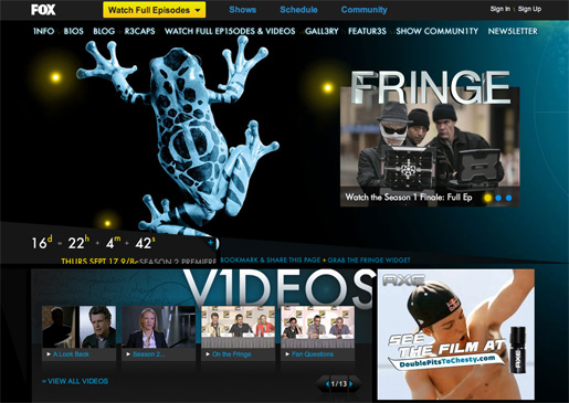
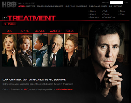
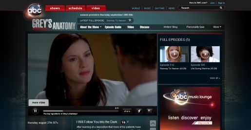
2. Similarities of Sites from the Same Network Like other types of networks of websites, TV networks tend to use similar layouts or design styles for the sites of their various shows. While things like pictures, color schemes, background images and other details will change, the basic layout will often be the same as the sites of other shows. It’s also common for the network’s sites to have a standard navigation menu or header that will also link to the other sites on the network.
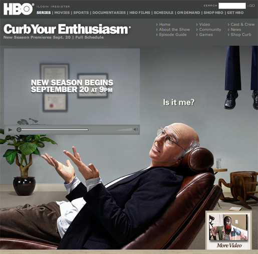
3. Video Not surprisingly, video is very common on the websites of TV shows. Most sites include trailers and/or episodes that can be watched online.
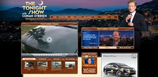
4. Vibrant TV show websites tend to include a lot of color, big backgrounds, and vibrant images and photos. In an entertainment-driven industry, making the sites visually appealing and attention-grabbing is the typical approach.
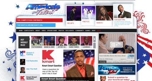
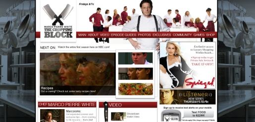
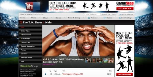
Showcase of TV Show Websites
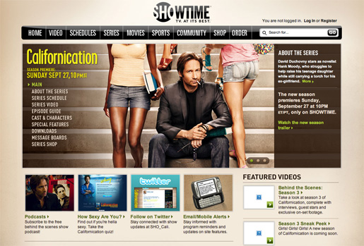
Californication
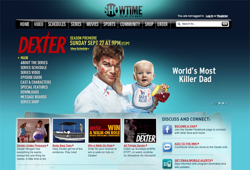
Dexter
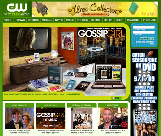
Gossip Girl
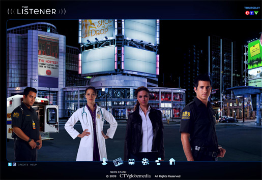
Listener
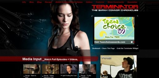
Terminator
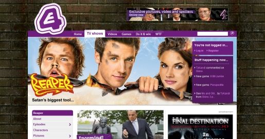
Reaper
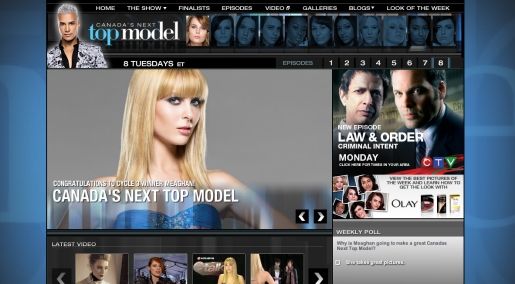
Canada’s Next Top Model
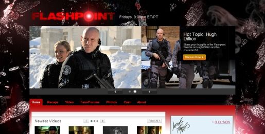
Flashpoint
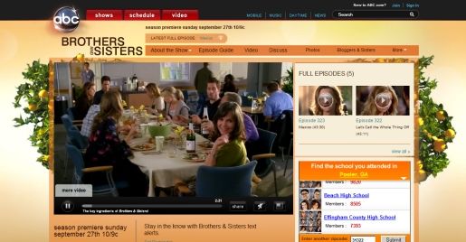
Brothers and Sisters
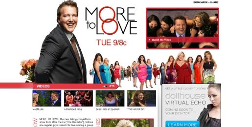
More to Love
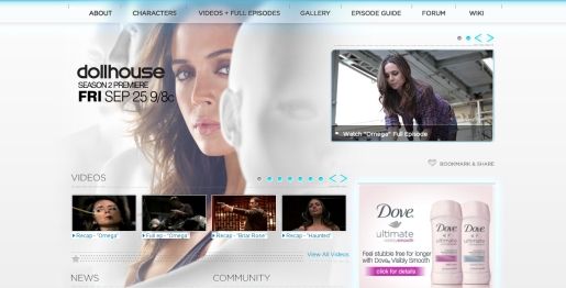
Dollhouse

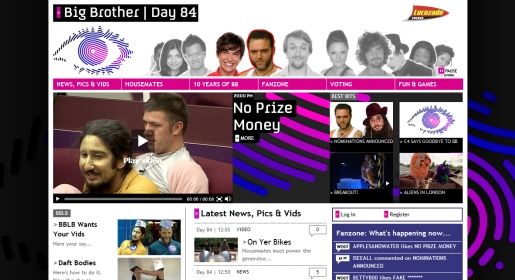
Big Brother
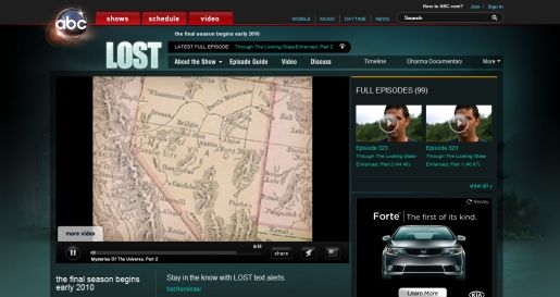
Lost
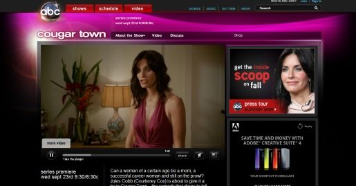
Cougar Town
Harper’s Island

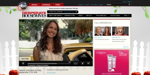
Desperate Housewives
Reaper
Canada’s Next Top Model
Flashpoint
Brothers and Sisters
More to Love
Dollhouse
Big Brother
Lost
Cougar Town
Harper’s Island
Desperate Housewives