CSS Background – Everything You Need To Know

Email Newsletter
Weekly tips on front-end & UX.
Trusted by 182,000+ folks.
 Register for Free
 Celebrating 10 million developers


 Custom Web Forms for Angular, React, & Vue. Your backend.
background-attachment. We’ll show some common tricks that can be done with the background as well as what’s in store for backgrounds in CSS 3 (including four new background properties!).The CSS Background is one of the fundamentals that you simply need to know. We will cover the basics of using CSS backgrounds, including properties such as background-attachment. We’ll show some common tricks that can be done with the background as well as what’s in store for background in CSS 3 (including four new background properties!).
You may also want to check out the following Smashing Magazine articles:
- Simple Responsive Images With CSS Background Images
- [Ask SM] Transparent Background, Positioning Problem
- Backgrounds In Web Design: Examples And Best Practices
- CSS: Innovative Techniques and Practical Solutions
Working With Background in CSS 2
Overview
We have five main background properties to use in CSS 2. They are as follows:
background-color: specifies the solid color to fill the background with.background-image: calls an image for the background.background-position: specifies where to place the image in the element’s background.background-repeat: determines whether the image is tiled.background-attachment: determines whether the image scrolls with the page.
These properties can all be merged into one short-hand property: background. One important thing to note is that the background accounts for the contents of the element, including the padding and border. It does not include an element’s margin. This works as it should in Firefox, Safari and Opera, and now in IE8. But in IE7 and IE6 the background does not include the border, as illustrated below.
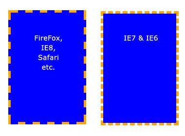
Background does not extend to the borders in IE7 and IE6.
Basic Properties
Background color
The background-color property fills the background with a solid color. There are a number of ways to specify the color. The follow commands all have the same output:
background-color: blue;
background-color: rgb(0, 0, 255);
background-color: #0000ff;
The background-color property can also be set to transparent, which makes any elements underneath it visible instead.
Background image
The background-image property allows you to specify an image to be displayed in the background. This can be used in conjunction with background-color, so if your image is not tiled, then any space that the image doesn’t cover will be set to the background color. Again, the code is very simple. Just remember that the path is relative to the style sheet. So, in the following snippet, the image is in the same directory as the style sheet:
background-image: url(image.jpg);But if the image was in a sub-folder named images, then it would be:
background-image: url(images/image.jpg);Background repeat By default, when you set an image, the image is repeated both horizontally and vertically until the entire element is filled. This may be what you want, but sometimes you want an image to be displayed only once or to be tiled in only one direction. The possible values (and their results) are as follows:
background-repeat: repeat;  /* The default value. Will tile the image in both directions. */
background-repeat: no-repeat;   /* No tiling. The image will be used only once. */
background-repeat: repeat-x;  /* Tiles horizontally (i.e. along the x-axis) */
background-repeat: repeat-y;  /* Tiles vertically (i.e. along the y-axis) */
background-repeat: inherit; /* Uses the same background-repeat property of the element's parent. */
Background position
The background-position property controls where a background image is located in an element. The trick with background-position is that you are actually specifying where the top-left corner of the image will be positioned, relative to the top-left corner of the element.
In the examples below, we have set a background image and are using the background-position property to control it. We have also set background-repeat to no-repeat. The measurements are all in pixels. The first digit is the x-axis position (horizontal) and the second is the y-axis position (vertical).
/* Example 1: default. */
background-position: 0 0; /* i.e. Top-left corner of element. */

/* Example 2: move the image to the right. */
background-position: 75px 0;

/* Example 3: move the image to the left. */
background-position: -75px 0;

/* Example 4: move the image down. */
background-position: 0 100px;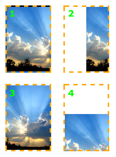
The image can be set to any position you like.
The background-position property also works with other values, keywords and percentages, which can be useful, especially when an element’s size is not set in pixels.
The keywords are self-explanatory. For the x-axis:
- left
- center
- right
And for the y-axis:
- top
- center
- bottom
Their order is exactly like that of the pixels values, x-axis value first, and y-axis value second, as so:
background-position: top right;Percentage values are similar. The thing to remember here is that when you specify a percentage, the browser sets the part of the image at that percentage to align with that percentage of the element. This makes more sense in an example. Let’s say you specify the following:
background-position: 100% 50%;This goes 100% of the way across the image (i.e. the very right-hand edge) and 100% of the way across the element (remember, the starting point is always the top-left corner), and the two line up there. It then goes 50% of the way down the image and 50% of the way down the element to line up there. The result is that the image is aligned to the right of the element and exactly half-way down it.
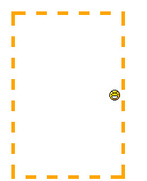
The smiley face is aligned as it would be if it was set to right center.
Background attachment
The background-attachment property determines what happens to an image when the user scrolls the page. The three available properties are scroll, fixed and inherit. Inherit simply tells the element to follow the background-attachment property of its parent.
To understand background-attachment properly, we need to first think of how the page and view port interact. The view port is the section of your browser that displays the Web page (think of it like your browser but without all the toolbars). The view port is set in its position and never moves.
When you scroll down a Web page, the view port does not move. Instead, the content of the page scrolls upward. This makes it seem as if the view port is scrolling down the page. Now, when we set background-attachment:scroll;, we are telling the background that when the element scrolls, the background must scroll with it. In simpler terms, the background sticks to the element. This is the default setting for background-attachment.
Let’s see an example to make it clearer:
background-image: url(test-image.jpg);

background-position: 0 0;
background-repeat: no-repeat;
background-attachment: scroll;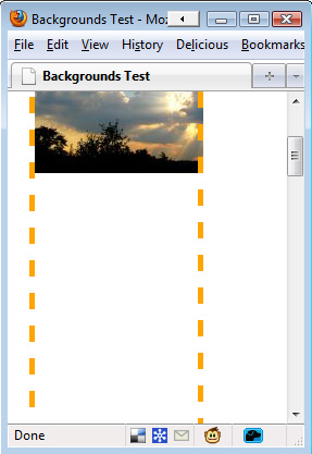
As we scroll down the page, the background scrolls up until it disappears.
But when we set the background-attachment to fixed, we are telling the browser that when the user scrolls down the page, the background should stay fixed where it is — i.e. not scroll with the content.
Let’s illustrate this with another example:
background-image: url(test-image.jpg);
background-position: 0 100%;
background-repeat: no-repeat;
background-attachment: fixed;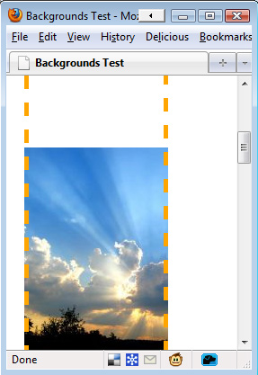
We have scrolled down the page here, but the image remains visible.
The important thing to note however is that the background image only appears in areas where its parent element reaches. Even though the image is positioned relative to the view port, it will not appear if it’s parent element is not visible. This can be shown with another example. In this one, we have aligned the image to the bottom-left of the view port. But only the area of the image inside the element is visible.
background-image: url(test-image.jpg);
background-position: 0 100%;
background-repeat: no-repeat;
background-attachment: fixed;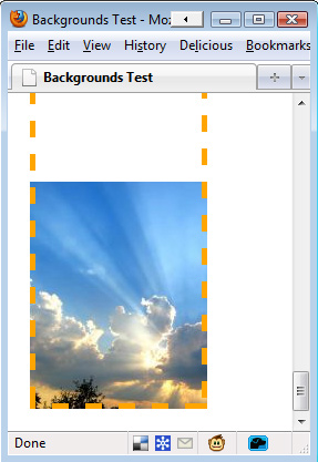
Part of the image has been cut off because it begins outside of the element.
The Background Shorthand Property Instead of writing out all of these rules each time, we can combine them into a single rule. It takes the following format:
background: <color> <image> <position> <attachment> <repeat>For example, the following rules…
background-color: transparent;
background-image: url(image.jpg);
background-position: 50% 0 ;
background-attachment: scroll;
background-repeat: repeat-y;
… could be combined into the following single line:
background: transparent url(image.jpg) 50% 0 scroll repeat-y;And you don’t have to specify every value. If you leave a property out, its default value is used instead. For example, the line above has the same output as:
background: url(image.jpg) 50% 0 repeat-y;Common Uses Of Backgrounds
Aside from their obvious use of making elements more attractive, backgrounds can be used for other purposes.
Faux Columns
When using the CSS property of float to position layout elements, ensuring that two (or more) columns are the same length can be difficult. If the lengths are different, then the background of one of the columns will be shorter than the background of the other, spoiling your design.
Faux columns is a very simple background trick that was first written up on A List Apart. The idea is simple: instead of applying a separate background for each column, apply one background image to the parent element of the columns with that image containing the designs for each column.
Text Replacement
Our choice of fonts on the Web is very limited. We could get custom fonts by using tools such as sIFR, but they require users to have JavaScript enabled. An easier solution that works on any browser is to create an image of the text in the font you want and use it as the background instead. This way, the text still appears in the markup for search engines and screen readers, but browsers will show your preferred font.
For example, your HTML markup could look like this:
<h3 class="blogroll">Blogroll</h3>If we have a 200 by 75 pixel image of this text in a nicer font, then we could display that instead using the CSS as follows:
h3.blogroll {
  width: 200px;
  height: 75px; /* So that the element will show the whole image. */
  background:url(blogroll-text.jpg) 0 0 no-repeat;  /* Sets the background image */
  text-indent: -9999px; /* Hides the regular text by moving it 9999 pixels to the left */
  }
Easier Bullet Points
Bullet in an unordered list can look clunky. Instead of dealing with all of the different list-style properties, we can simply hide the bullets and replace them with a background image. Because the image can be anything you like, the bullets will look much nicer.
Here, we turn a regular unordered list into one with sleek bullets:
ul {
  list-style: none; /* Removes default bullets. */
  }

ul li {
  padding-left: 40px; /* Indents list items, leaving room for background image on the left. */
  background: url(bulletpoint.jpg) 0 0 no-repeat;
  }
Backgrounds in CSS 3
CSS 3 has many changes in store for backgrounds. The most obvious is the option for multiple background images, but it also comes with four new properties as well as adjustments to current properties.
Multiple Background Images
In CSS 3, you will be able to use more than one image for the background of an element. The code is the same as CSS 2, except you would separate images with a comma. The first declared image is positioned at the top of the element, with subsequent images “layered” beneath it, like so:
background-image: url(top-image.jpg), url(middle-image.jpg), url(bottom-image.jpg);New Property: Background Clip
This brings us back to the issue discussed at the beginning of this article, about backgrounds being shown beneath the border. This is described as the “background painting area.”
The background-clip property was created to give you more control over where backgrounds are displayed. The possible values are:
background-clip: border-box;backgrounds displayed beneath the border.background-clip: padding-box;backgrounds displayed beneath the padding, not the border.background-clip: content-box;backgrounds displayed only beneath content, not border or padding.background-clip: no-clip;the default value, same as border-box.
New Property: Background Origin
This is used in conjunction with background-position. You can have the background-position calculated from the border, padding or content boxes (like background-clip).
background-origin: border-box;background-position is calculated from the border.background-origin: padding-box;background-position is calculated from the padding box.background-origin: content-box;background-position is calculated from the content.
A good explanation of the differences between background-clip and background-origin is available on CSS3.info.
New Property: Background Size
The background-size property is used to resize your background image. There are a number of possible values:
background-size: contain;scales down image to fit element (maintaining pixel aspect ratio).background-size: cover;expands image to fill element (maintaining pixel aspect ratio).background-size: 100px 100px;scales image to the sizes indicated.background-size: 50% 100%;scales image to the sizes indicated. Percentages are relative to the size of containing element.
You can read up on some examples of special cases on the CSS 3 specifications website.
New Property: Background Break
In CSS 3, elements can be split into separate boxes (e.g. to make an inline element span across several lines). The background-break property controls how the background is shown across the different boxes.
The possible values are:
Background-break: continuous;: the default value. Treats the boxes as if no space is between them (i.e. as if they are all in one box, with the background image applied to that).Background-break: bounding-box;: takes the space between boxes into account.Background-break: each-box;: treats each box in the element separately and re-draws the background individually for each one.
Changes to Background Color
The background-color property has a slight enhancement in CSS 3. In addition to specifying the background color, you can specify a “fall-back color” that is used if the bottom-layer background image of the element cannot be used.
This is done by adding a forward slash before the fall-back color, like so
background-color: green / blue;In this example, the background color would be green. However, if the bottom-most background image cannot be used, then blue would be shown instead of green. If you do not specify a color before the slash, then it is assumed to be transparent.
Changes to Background Repeat
When an image is repeated in CSS 2, it is often cut off at the end of the element. CSS 3 introduces two new properties to fix this:
space: an equal amount of space is applied between the image tiles until they fill the element.round: the image is scaled down until the tiles fit the element.
An example of background-repeat: space; is available on the CSS 3 specifications website.
Changes to Background Attachment
The background-attachment has a new possible value: local. This comes into play with elements that can scroll (i.e. are set to overflow: scroll;). When background-attachment is set to scroll, the background image will not scroll when the element’s content is scrolled.
With background-attachment:local now, the background scrolls when the element’s content is scrolled.
Conclusion On CSS Background
To sum up, there is a lot to know about backgrounds in CSS. But once you wrap your head around it, the techniques and naming conventions all make good sense and it quickly becomes second nature.
If you’re new to CSS, just keep practicing and you’ll get the hang of backgrounds fast enough. If you’re a seasoned pro, I hope you’re looking forward to CSS 3 as much as I am!
 (al)
(al)

