Horizontal Navigation Menus: Trends, Patterns And Best Practices

Email Newsletter
Weekly tips on front-end & UX.
Trusted by 182,000+ folks.
 Register for Free
 Celebrating 10 million developers
 Custom Web Forms for Angular, React, & Vue. Your backend.


Notably, CNN discovered those limitations before switching from vertical to horizontal a few years back.
There are, however, many styles of horizontal navigation in modern Web design. Some offer usability advantages for certain types of websites, while others are aesthetically better.
Be sure to check out our previous articles:
- Showcase Of Modern Navigation Design Trends
- Web Design Navigation Menus – Articles And A Beautiful Showcase
- Breadcrumbs In Web Design: Examples And Best Practices
In this article, we will focus on a variety of techniques and best practices to improve the usability of horizontal navigation bars, and we will note less effective styles. We’ll also look at several trends that developers can choose from when working on the navigation design for their next project.
Use Familiar Names For Links
Let’s start off with a usability tip that applies to any navigation bar. When a user visits a new website, one of their primary points of focus will be the navigation bar. If that element has been well designed, the user will look to it first for help with their task. Almost every website has certain sections that are “expected” by users, such as “About us,” “Services,” “Products,” and “Contact us.”
Because of the nature of the Web, users get frustrated if they cannot immediately find the content they are looking for, even if the delay is momentary. So, the “About” link should be labeled “About” or “About us.” The “Services” link should be labeled “Services” or “Our services.” Being creative in this case detracts from usability.
Except in the most unusual circumstances, don’t call your “About” page “Company info.” Don’t call your “Services” page “What we do.” And don’t call your “Contact” page “How to reach us.” Users instantly look for recognizable terms when searching for content, and so avoiding any design or content that would slow them down ensures for them a positive experience.
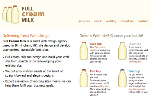
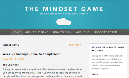
Clearly Distinguish Primary And Secondary Sections
Once you figure out what parts of your website are “primary” and what parts are “secondary,” you can establish a visual hierarchy that enhances usability.
Primary links (e.g. “About,” “Services,” etc.) should be clearly distinguishable from secondary page links, which are usually accessible from every page and located near the primary links. The designer’s job is to clearly indicate the difference so that users understand which parts of the website have the most important information.
Consider the following example:
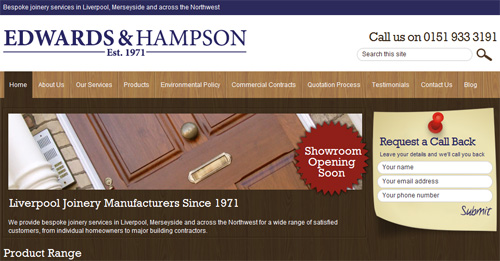
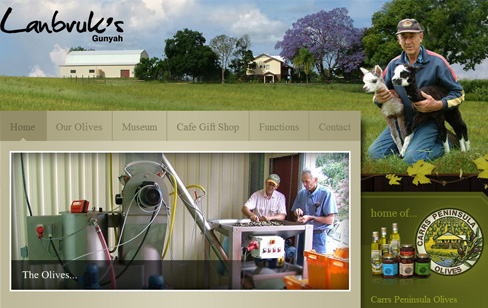
Edwards & Hampson’s website has a nice clear horizontal bar that serves as the user’s primary means of navigating pages. While it includes the standard links (“About us,” “Our services,” “Products”), the bar has a number of other links that are not as “primary” but are important enough to include in a prominent area.
A similar example:
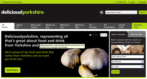
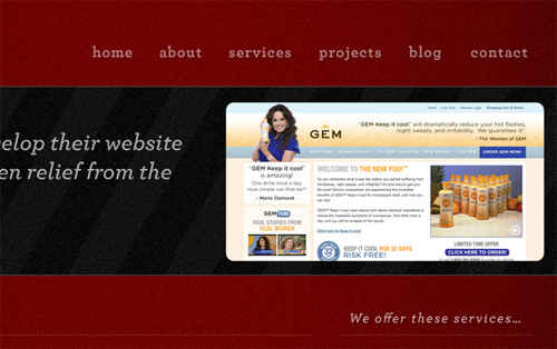
The Deliciouslyorkshire website links to primary sections (“Home,” “About,” “News and events”) next to what seem to be secondary sections (“Recipes,” “Promotions,” “Useful links”). Both types of links have the same tabbed style, with no indication of hierarchy.
If, in fact, some of these links are less important, then designing the section to reflect this hierarchy would have been wise. Of course, these companies may have compelling reasons for designing their navigation in this way, so these are not necessarily bad examples; they serve merely as case studies to illustrate the importance of a visual hierarchy in navigation bars.
Conversely, here are two examples of websites that show this visual distinction but still keep secondary links easily accessible:
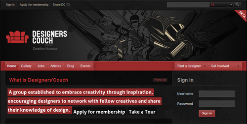 Designers Couch
Designer’s Couch has primary navigation links along the main bar (“Home,” “Gallery,” “Jobs,” etc.) and then secondary links on the same bar to the right but kept visually distinct (“Find a designer,” “Get involved”).
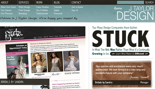
J Taylor Design makes a similar distinction by placing secondary links below the main navigation bar and using a different color, font, and size. In these examples, the user has no trouble distinguishing between primary and secondary sections. Yet, the secondary links are not buried on the page or in drop-down menus. They’re still easy to access.
Put “Action” Links On Right
If you’re building an e-commerce website or one that has shopping cart functionality, user registration or log-in, then putting links to those sections on the right side of the horizontal navigation bar (or somewhere else on the right, near the top) is best.
Here are a few examples of websites that visually separate “action” links, while keeping them in the main navigation bar:
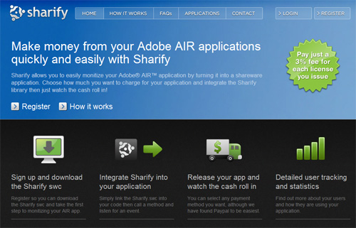
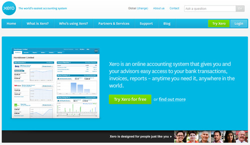
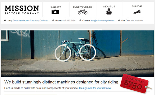
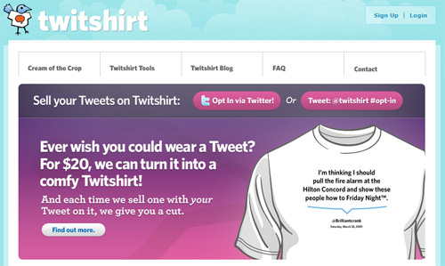
Sharify and Xero, above, put their “action” links on the same navigation bar as their primary links. But they maintain the hierarchy by pushing the secondary links to the far right.
Users expect to see these action links on the right side of the bar, so reversing the pattern would impair usability.
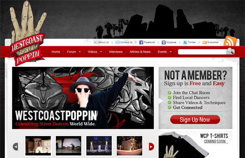
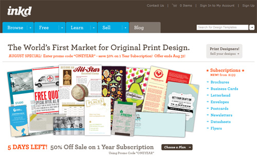
Include A Search Box
Another common practice that improves usability is to include a search box on the right, as part of the navigation bar. The search box is like the functions mentioned earlier because it requires some sort of unique action from the user.
Users are accustomed to seeing this action-oriented functionality – including the search box – on the right side of the page, so allow sufficient room in this part of your design for a search bar, inside the main navigation bar if possible.
The J Taylor Design website above puts its search box on the right side of the navigation bar, as do these:
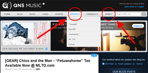
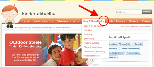
Avoid “Surprise” Drop-Down Menus
Drop-down menus in horizontal bars are quite prevalent in modern design because they simplify cluttered layouts. Visually indicating whether a navigation link will reveal a drop-down menu when the user mouses over it is best practice. This is best accomplished with a simple downward-pointing triangle.
Below are some good examples of horizontal menus that visually indicate drop-down menus within them:
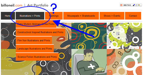
Unfortunately, many websites do not feature this simple yet effective marker. Below are a few examples of “surprise” drop-down menus:

Various Trends And Styles
Finally, here is a showcase of horizontal navigation bars, to give you an overview of the different styles on the Web and how they fit their layouts.
These examples do not necessarily represent best practices but are worth considering when designing your own horizontal navigation bar.
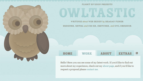
Tabbed Horizontal Navigation
Horizontal Navigation Without Bar
Horizontal Navigation Below Primary Page Header
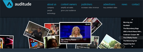
Horizontal Navigation with Icons and Text
Horizontal Navigation with Numbered Links

Glocal Ventures
Horizontal Navigation with Left-Aligned Link Text
Grouped Links Under Horizontal Navigation

Semi-Transparent Horizontal Navigation Bar
Wetaskiwin Regional Public Schools
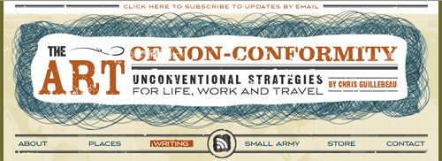
Descriptive Text Under Horizontal Navigation Links

Liquid-Width Horizontal Bar with Centered Links

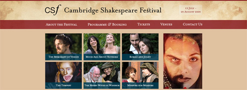
Cambridge Shakespeare Festival
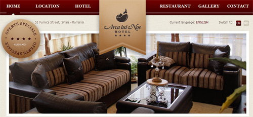
Horizontal Links Divided by Graphic
Horizontal Navigation at Bottom
Conclusion
The practices recommended in this article do not apply to every context and may not be right for every design, niche or industry. But they do highlight the need to give users a better experience and avoid potentially confusing navigational setups.
Web users usually behave based on learned habits. Creating a layout or pattern that unnecessarily disrupts those habits will only weaken your website’s conversion rates.
So, before you design a horizontal navigation menu, consider link names, section hierarchy and any other factors that could affect usability. In doing so, you will create a smooth user experience that allows visitors to find the information they want quickly and efficiently.
Further Reading
- 20 Stunning Examples of Horizontal Navigation Menus
- Horizontal Navigation Bar Example
- User Sets: Horizontal Navigation
- Horizontal Drop-Down Menu Design Pattern
- The Challenges of Moving to Horizontal Navigation
 (al)
(al)

