CSS Ideas And Wishlist: Debates and Solutions

Email Newsletter
Weekly tips on front-end & UX.
Trusted by 182,000+ folks.
 Register for Free
 Celebrating 10 million developers
 Custom Web Forms for Angular, React, & Vue. Your backend.


CSS will get a number of new changes. Among them are alternative syntaxes, CSS programming concepts and the ability to allow more common design techniques without using images. In this article, we’ll go over some current solutions, what we’d like to see in the future and the pros and cons of them all.
1. Why Should We Go Beyond Basic CSS?
The first to ask is “Why?” Why use these alternative tools and methods to develop CSS code? Why take the time to learn them, especially when no one syntax method, CSS programming concept or technique will replace CSS as it is today?
Well, here’s a better question: “Why not?” While CSS will probably not be replaced by any one method, many of these techniques are similar, and their general concept is becoming increasingly popular. For example, many of these new methods allow us to more easily implement rounded corners. With this kind of demand from the community, CSS 3 has now made it easy to create rounded corners. In time, with full support and forward-looking attitudes, these new ideas may become standard, allowing us more options as Web professionals.
And let’s state the obvious: using alternative options like these can save time and be more efficient than using traditional CSS methods, even if they can take some time to learn at first.
As new methods arrive, the division between Web developer and Web designer shrinks. One day, knowing one trade may not be enough. These tools are moving the process along by giving designers easier ways to code and giving developers easier ways to design.
A New Era for Web Developers
Traditionally, Web developers have been the gurus of coding. PHP, JavaScript, Ruby and the like are the languages that developers deal with regularly. Recently, though, we’ve seen coders call themselves “Web developers” when they just convert PSD to XHTML and CSS. How can this be, and are they misrepresenting themselves?
Of course not. In recent years, the science of CSS and the need for semantic XHTML has become much more complex and allow, in some instances, for more programming-related concepts. The first few items in this article will be specific to CSS’ advances in programming concepts and how these changes can be both detrimental and beneficial.
Whether you are familiar with these methods or not, we invite you to practice these new techniques and share your experiences, because many of these methods are still very experimental.
A Web Designer’s Dream
Programmers aren’t the only ones who get more options from the new CSS methods. Designers get more options, too, including easier options for layout and common Photoshop effects. Taking the time to learn a new CSS library or technique is clearly well worth the trouble if it allows you to achieve the most common Photoshop techniques with few to no graphics.
In the early days of the Web, designers were limited to certain layouts and design styles merely because of the Web’s limitations. With the future of CSS, the only thing that will hold back Web designers is their own imagination.
Let’s take a closer look at what we have to work with right now and what’s in store for us in the future.
2. CSS Variables
Developers can easily see the benefit of using variables to code their Web apps, so seeing the benefit of variables in CSS is just as easy. Are they needed though? Before we answer a tough question like this, let’s go over what they are and how both designers and developers can use them.
Similar to a programming language, CSS variables can be used to define style sheet-wide values with one descriptive word. This one word can then be used repeatedly throughout the style sheet to use the value assigned to it. The point of variables is to save time and, in most cases, create more efficient code. An example of the idea in practice is below. You can take a closer look at this method on BrajeShwar.com.
@variables {
  oColor: #fefedb;
  oBgColor: #ccc;
  oMargin: 1em;
  oPadding: 1em;
}

@variables print { /* applies only to print */
  oColor: #000;
  oBgColor: #fff;
  oMargin: 2em;
  oPdding: 2em;
}

div#post div.entry {
  border: 1px solid #666;
  font: normal 1em/1.6em "Lucida Grande", Lucida, Verdana, sans-serif;
  margin: var(oMargin);
  padding: var(oPadding);
  color: var(oColor);
  background-color: var(oBgColor);
}
At first glance, the above doesn’t seem any easier. What’s the point of typing out color: var(oColor); instead of just entering color: #fefedb;? That’s true… until you get into a larger style sheet. With hex values for colors all over the place, CSS developers often find themselves scrolling throughout a style sheet, copying and pasting color codes and other style attributes.
If we plan to have one shade of, say, blue throughout a design, using a variable for it would be useful. We may want the same shade of blue for hyperlinks and the footer background. Rather than search through our huge style sheet for the exact hex value of that shade of blue, we know that we defined a variable called colorBlue with that hex value. We can then just use the variable in its place to save time.
We can almost get back to the simpler days of HTML colors (e.g. color=“blue”), without sacrificing Web standards.
The Cons of CSS Variables
However, with all good things comes the bad. CSS variables has many critics as well:
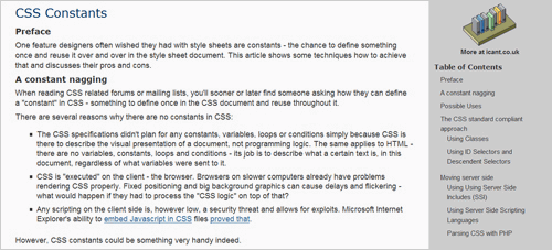
“Adding any form of macros or additional scopes and indirections, including symbolic constants, is not just redundant, but changes CSS in ways that make it unsuitable for its intended audience. Given that there is currently no alternative to CSS, these things must not be added.” – Why “variables” in CSS are harmful
This quote is from an essay hosted on the W3 website. Although it is saying the exact opposite of what this article supports, the author makes some valid points, and we designers and developers should think closely about the pros and cons before using CSS variables and other advanced techniques. While the essay above focuses primarily on CSS variables, it does go a bit into other advanced ideas in CSS that we’ll discuss later in this article.
“The other implementation is written in PHP. It proves that it is not necessary to add constants to CSS. Just like the existence of the WebKit implementation cannot be taken as proof that constants in CSS are useful, so the PHP implementation cannot prove that either. But the PHP implementation has the benefit of letting authors determine the usefulness for themselves, without modifying CSS on the Web.”
Many solutions for using variables for style sheets are indeed in PHP, and the author makes an excellent point on how some of these methods can provide solutions for developers who would still like to use constants, while preserving CSS as it is today. Could this be a better option than all other CSS variable solutions?
“Thus there is a cost to user-defined names: memory (when writing the code) and understanding (when reading). That cost is offset by the cost of the alternative: long functions. How is that for CSS?”
Another argument states that CSS variables could be pointless or even harmful to efficiency. Could these variables actually make our CSS slower and file sizes larger? Incorrectly used, yes. A common fear among opposers of CSS variables and other programming techniques is that designers and developers will start using CSS’ new power to make things easier on their end but then stop bothering with CSS code efficiency.
Point taken, but there are many cases in which CSS variables make style sheets easier to use and equally or more efficient. In such cases, using CSS variables may be smarter.
“CSS is fairly easy to learn to read, even if some of its effects can be quite subtle. When there is a page you like, you can look at its style sheet and see how it’s done.”
Even if we take care of efficiency issues, there is also the point that CSS will become similar to a programming language in its difficulty, both in creating and understanding CSS code.
We looked at just one insightful essay on why CSS variables may not be such a good idea. For more reading, check out the articles below:
- Why CSS Needs No Variables A wonderfully written article on alternative methods to CSS variables and why CSS variables are not worth the fight.
- CSS Variables Considered Harmful? Another look at the issues discussed above but from another developer’s perspective. Some excellent points are made in the post itself and the comments.
- Why “Variables” in CSS Are Harmful Here is the essay we looked at above, in case you want to take a closer look.
Despite the movement to stop CSS variables altogether, many designers and developers are still strongly for them. If you’re leaning to that side, keep in mind these points as you venture over:
- Always be efficient. Know when to use CSS variables and when just to use selectors.
- Name constants with a descriptive title for easier reading, especially if the CSS code is going to be changed.
- Will the style sheet be reused? If so, then maybe CSS variables are not appropriate.
Walkthroughs for CSS Variables
Below are some tutorials, walkthroughs and other articles containing insight on CSS variables so that those of you who want to implement CSS variables can do it correctly.
CSS Variables with Server-Side Includes
This example and walkthrough goes through a way to create the effect of CSS variables with programming languages. It explains how this can become a standards-compliant approach and even how specified CSS style sheets can be generated dynamically with server-side programming languages and a smart use of CSS variables.
Variables in CSS via PHP
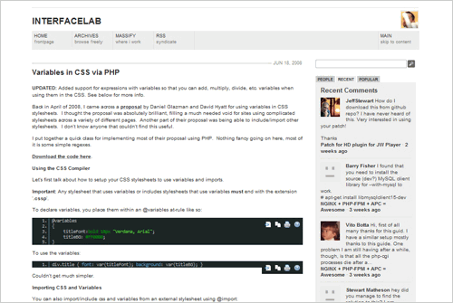
Another PHP solution, but with a premade class. All that is needed is simply to create the desired CSS variables. After the PHP class is downloaded and set up properly within the relevant HTML and CSS files, implementing these CSS variables is probably one of the easiest methods.
Dynamic CSS A.K.A. CSS Variables
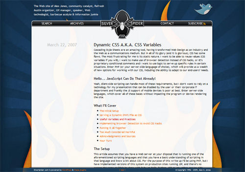
Yet another implementation of CSS variables with PHP. This walkthrough also has a unique section on browser detection.
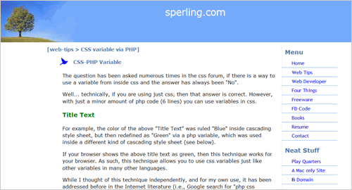
A very simple example of using PHP in CSS to create variables. The tutorial states that this takes only six lines of PHP code in its simplest form.
Implement CSS Variables with PHP and .htaccess
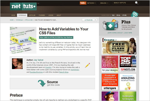
Here is a NetTuts+ tutorial on implementing CSS variables that is similar to the above techniques, but this time with the .htaccess file. A smart approach to CSS variables.
CSS Variables with Rack Middleware
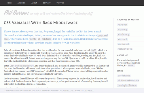
Here is another premade script that does the work for you. This developer realizes the benefits of CSS variables but doesn’t like all of the extras that come with alternative CSS tools. So, he made a script that would automatically create just CSS variables, making it easy and efficient.
A Look into WordPress CSS Variables
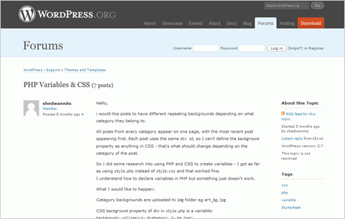
Not an article or tutorial, this is a discussion on the WordPress forum about strategies to implement CSS variables in WordPress. The discussion focuses on one specific issue, which is a general problem nonetheless. The solutions presented in this thread address many problems of CSS variables and WordPress.
3. Conditional CSS
Conditional options in CSS have a variety of benefits but can also bring the same deficiencies as CSS variables in that they alter the state of CSS as it is. Many of the cons have to do with efficiency, confusion and, in some cases, added HTTP requests (because it deals with a type of server-side programming language).
Nonetheless, let’s look into more of the benefits of conditional CSS statements. Just keep in mind the cons that come with them, and always be thinking of new ideas to overcome them. So far, the tools and solutions that give developers and designers conditional statements in CSS have come to be relatively well accepted. This is because CSS conditionals seem to solve bigger problems in CSS, and the lack of efficiency seems minor by comparison.
Let’s not forget the original CSS conditional. The problem with the traditional CSS conditional for IE, however, is that it has no else or else if. Although the use may be limited, an if/else statement for CSS could allow designers and developers to specify styles for other types of conditions: browsers, for example.
One popular tool for calling styles according to browser type is Conditional-CSS.com. While many other solutions are out there for conditionals as well as this particular problem, this tool can do most of the work automatically, with minimal confusion.
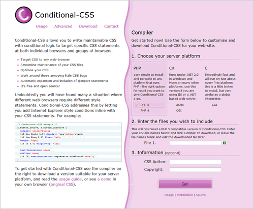
Conditional-CSS allows the user to customize a Web script in their choice of language (PHP, C# or C), and it compiles the code along with an uploaded style sheet to create CSS conditionals based on browser type. With this tool, those nasty IE bugs become easier to handle, and other browser bugs and unsupported features can be handled more gracefully. Using this method, you no longer has to create a separate style sheet for IE (or any browser for that matter), instead using old-fashioned CSS conditionals.
For a closer look at how one can use the syntax of this tool, here is the sample code from the Conditional-CSS website:
/* Conditional-CSS example */
a.button_active, a.button_unactive {
display: inline-block;
[if lte Gecko 1.8] display: -moz-inline-stack;
[if lte Konq 3.1] float: left;
height: 30px;
[if IE 5.0] margin-top: -1px;

text-decoration: none;
outline: none;
[if IE] text-decoration: expression(hideFocus='true');
}
As you can see, the code is easy to read, write and handle. This is a smart solution to a common problem in Web development. However, as with CSS variables, there is the risk that developers will use this method to overpower CSS’ basic functionality.
The solution is intended primarily for common IE bugs, although it provides more flexibility. As with any extension of CSS, use it responsibly, which means using it only when necessary. Rely on traditional methods to fix most IE problems. Because IE6 is the most troublesome, check out this article on Sitepoint: 10 Fixes That Solve IE6 Problems.
Customized Native CSS Conditionals
What we discussed above is a great reason why developers would use conditional statements in CSS. But many of us would like even more control. For example, instead of being limited to browser type, many of us who work with fluid layouts would like to be able to create conditionals based on browser width:
if($browser_window >= 600px && $browser_window < 1280px){
  p{width: 600px;}
}

else if($browser_window < 600px){
  p{width: 90%;}
}

else{
  p{width: 800px;}
}
Similar to what we saw with Conditional-CSS, the solution is to attach a more advanced language, whether PHP, Ruby, JavaScript or another of your choice.
Dynamic Resolution Dependent Layouts is a great example of how to use an if/else statement for this problem. In addition, we can use the same idea to create customized conditionals in CSS using JavaScript.
The idea here is to use separate style sheets altogether, and then use a JavaScript (or a script in your preferred language) to call the correct style sheet. There are no conditional statements in the CSS at all; rather, the website just simulates them. And a default option is available if JavaScript is turned off. Also, using multiple style sheets will have no negative consequences because the JavaScript will be calling only one in the end, based on the conditional statement. This means there will be only one HTTP request, so it will not slow down the Web page.
Here is the first part of the example code:
<link rel="stylesheet" type="text/css" href="css/default.css"
  title="default"/>

<link rel="alternate stylesheet" type="text/css" href="css/thin.css"
  title="thin"/>

<link rel="alternate stylesheet" type="text/css" href="css/wide.css"
  title="wide"/>

<link rel="alternate stylesheet" type="text/css" href="css/wider.css"
  title="wider"/>
By specifying the title attribute, we can use this in our JavaScript file:
function dynamicLayout(){
    var browserWidth = getBrowserWidth();

//Load Thin CSS Rules
if (browserWidth = 750) && (browserWidth  950){
    changeLayout("wider");
}
}
Be sure to check out the full article and script for more detail. This is a good example of how HTML, CSS and JavaScript can be used together to create dynamic CSS and, more specifically, if/else statements to manipulate CSS. One will need to customize the method, however, to get the desired effect.
4. A Better Syntax
Advanced users of CSS know that CSS’ current syntax has some flaws. Although it is well-structured and easy to read for the most part, it is fast becoming outdated as new Web designs call for creative layouts and new Web pages need enhanced functionality. This is what some of these new ideas attempt to address.
Some solutions are nested selectors, nested declaration blocks and smarter shortcuts. We define these below.
Nested Selectors
A forum post over at Webmaster World discusses a specific problem that could be solved with nested selectors. The inquirer wants to override page-specific properties, which can be done easily with the following code, of course:
p.intro {width: 400px;}
.alert {color: red;}

#pageid p.intro {width: 200px;}
#pageid .alert {color: blue;}
For longer style sheets, though, this method can get so confusing and repetitious that they become difficult to read. A better solution would be to use a nested-like structure that would make the code more organized and efficient:
p.intro {width: 400px;}
.alert {color: red;}

#pageid{
  p.intro {width: 200px;}
  .alert {text-align: blue;}
}
This way, #pageid would have to be called only once, and the original uses of p.intro and .alert could be used as a default, while more specific IDs could use the same classes with different values. The overall result would be more efficient and legible.
Unfortunately, the only solution to the problem involved separate style sheets. The problem with nested CSS selectors is that the problems they address are various, and essentially all can be solved with current CSS child classes.
One solution would be to use an alternative “CSS language” that includes nested selectors as part of its custom syntax. A list of these alternative tools is at the bottom of this article, along with further description.
Nested Declaration Blocks
Another issue is our inability to nest entire declaration blocks. The article “What I want from CSS3: nested declaration blocks” offers a smart outlook on the benefit of nested declaration blocks.
Two code examples from the article are copied below. The first represents the way things are done now, which is quite inefficient in most circumstances:
#content ul{
  list-style:square;
    margin:0 2em;
}
#content li{
  list-style:square;
  padding:2px 5px;
  line-height:1.3em;
}
#content a:link{
  [...]
}
#content a:visited{
  [...]
}
#content a:active{
  [...]
}
#content a:hover{
  [...]
}
#nav ul{
  list-style:none;
  margin:0;
}
#nav li{
  list-style:none;
  padding:2px 5px;
  line-height:1.3em;
}
#nav a:link{
  [...]
}
#nav a:visited{
  [...]
}
#nav a:active{
  [...]
}
#content a:hover{
  [...]
}
A much more sensible approach would be:
#content {
    ul{
   list-style:square;
   margin:0 2em;
  }
    li{
   list-style:square;
   padding:2px 5px;
   line-height:1.3em;
    }
    a{
   :link{[...]}
   :visited{[...]}
   :active{[...]}
   :hover{[...]}
    }
}

#nav {
    ul{
   list-style:none;
   margin:0;
  }
    li{
   list-style:none;
   padding:2px 5px;
   line-height:1.3em;
    }
    a{
   :link{[...]}
   :visited{[...]}
   :active{[...]}
   :hover{[...]}
    }
}
Many people would like to be able to use this new method at least for syntax related to links, because they are something we all deal with in every style sheet. Styling lists would also be a great use of this syntax, perhaps similar to how they are nested semantically in HTML markup. If CSS could mimic this nesting ability, style sheets would be much more efficient.
There is no implementation of this kind so far in CSS 3, but as with nested selectors, similar techniques can be achieved with various CSS extension tools, which we explore below.
Smarter Shortcuts
A much-wanted feature in future versions of CSS is to be able to use alternative and smarter shortcuts to shorten CSS code. Some of these are already being implemented in alternative CSS languages, but the new CSS 3 has no sign of this. With greater support, perhaps basic CSS could become smart enough to handle these shortcuts in another 10 or so years, when CSS 4 is introduced.
To see the benefit anyway, let’s look at a few examples in which smarter shortcuts would be beneficial.
When many elements from a certain class or ID share the same properties, things can get a bit repetitious:
#navigation h1, #navigation h2, #navigation h3{
  font-family: Verdana, Tahoma, sans-serif;
  letter-spacing: -1px;
}
Smarter syntax would tighten things up, saving both time and space in the style sheet:
#navigation [h1,h2,h3]{
  font-family: Verdana, Tahoma, sans-serif;
  letter-spacing: -1px;
}
As most of us know, styling links in CSS can be a huge hassle. Nesting these elements, as shown above, is a great solution, but a smarter syntax for dealing with pseudo-classes would also be good:
a:link, a:active, a:visited
{
  font: bold 10pt Verdana, Tahoma, sans-serif;
  color: #444444;
}

a:hover
{
  color:#000;
}

  #navigation a:link, #navigation a:visited,
  {
    font: normal 10pt Verdana, Tahoma, sans-serif;
    color: #000;
  }

  #navigation a:active, #navigation a:hover
  {
    font-size: 14pt;
  }
Having all these pseudo-classes in the way is rather inefficient. Grouping them would be much smarter:
a[:link, :active, :visited] {
  font: bold 10pt Verdana, Tahoma, sans-serif;
  color: #444444;
}

a:hover{ color:#000; }

  #navigation a[:link, :visited] {
    font: normal 10pt Verdana, Tahoma, sans-serif;
    color: #000;
  }

  #navigation a[:active, :hover] {
    font-size: 14pt;
  }
While the solution in the example above saves only a little space, that extra space can do wonders in a larger style sheet. And most will agree that this is a much easier way to read and understand style sheets.
The general goal for any situation like this is to be able to share elements, pseudo-classes and any other type of extension with o one declared class or ID, rather than repeating the class or ID name repeatedly.
5. Simple Mathematical Functions
Most of us have come across a piece of CSS code for which we thought, “This would be much easier if I could just subtract X number of pixels,” or “This solution would be easier if I could just add X% onto this DIV.”
Without this simple math for CSS, most of us have found workarounds to many of these problems. But by implementing simple mathematical functions in CSS, we can eliminate extra code and make our thought process easier.
A rough example could be something like below:
.element {
  width: 100%-150px;
}
Example of the Centered Layout
This technique would benefit fluid layouts or layouts that need to be aligned relative to the user’s screen size. It would also help layouts that have centering, either vertically or horizontally.
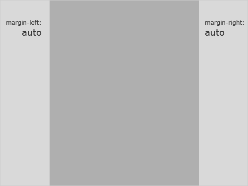
Take the very basic example above of a horizontally centered layout. Simply using auto for both the left and right margins creates a centered layout for the end user, no matter how wide their screen is. But what if, for whatever reason, you want that centered wrapper shifted 200 pixels to the left? The wrapper has to be shifted 200 pixels relative to the center of the user’s screen, not just your own.
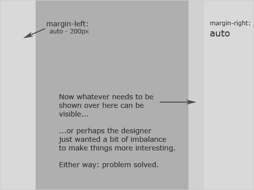
Right now there is no solution for this. Most designers faced with this issue either just float everything to the left and use absolute positioning to finish the job. But those who have larger resolutions will see excess white space to the right of the screen. Not a bad solution, because everything is still in place, readable and efficient, but having the power to create a layout that accommodates all users would be better.
The second solution is to center the layout but adjust the elements around it. This could mean repositioning some elements on the background image or adding “artificial” transparent spacing to align the wrapper.
This is just one example, but simple math could solve many problems in CSS. An article over on KilianValkof.com titled “Random CSS Thought: Math in CSS” presents just this idea and specific examples of how this could be helpful.
Is It Right?
As with many new ideas for CSS related to programming, a debate arises over whether we should do it at all. Implementing an idea like this in future versions of CSS would no doubt help out many developers and designers, but is it going too far?
The concern may not be that the CSS would become more inefficient or complicated but rather that, as we have heard with most complaints against proposals to expand CSS, it moves away from CSS’ original purpose, which is to style.
p.intro {width: 400px;}
.alert {color: red;}

#pageid{
  p.intro {width: 200px;}
  .alert {text-align: blue;}
}
This way, #pageid would have to be called only once, and the original uses of p.intro and .alert could be used as a default, while more specific IDs could use the same classes with different values. The overall result would be more efficient and legible.
Unfortunately, the only solution to the problem involved separate style sheets. The problem with nested CSS selectors is that the problems they address are various, and essentially all can be solved with current CSS child classes.
One solution would be to use an alternative “CSS language” that includes nested selectors as part of its custom syntax. A list of these alternative tools is at the bottom of this article, along with further description.
Nested Declaration Blocks
Another issue is our inability to nest entire declaration blocks. The article “What I want from CSS3: nested declaration blocks” offers a smart outlook on the benefit of nested declaration blocks.
Two code examples from the article are copied below. The first represents the way things are done now, which is quite inefficient in most circumstances:
#content ul{
  list-style:square;
    margin:0 2em;
}
#content li{
  list-style:square;
  padding:2px 5px;
  line-height:1.3em;
}
#content a:link{
  [...]
}
#content a:visited{
  [...]
}
#content a:active{
  [...]
}
#content a:hover{
  [...]
}
#nav ul{
  list-style:none;
  margin:0;
}
#nav li{
  list-style:none;
  padding:2px 5px;
  line-height:1.3em;
}
#nav a:link{
  [...]
}
#nav a:visited{
  [...]
}
#nav a:active{
  [...]
}
#content a:hover{
  [...]
}
A much more sensible approach would be:
#content {
    ul{
   list-style:square;
   margin:0 2em;
  }
    li{
   list-style:square;
   padding:2px 5px;
   line-height:1.3em;
    }
    a{
   :link{[...]}
   :visited{[...]}
   :active{[...]}
   :hover{[...]}
    }
}

#nav {
    ul{
   list-style:none;
   margin:0;
  }
    li{
   list-style:none;
   padding:2px 5px;
   line-height:1.3em;
    }
    a{
   :link{[...]}
   :visited{[...]}
   :active{[...]}
   :hover{[...]}
    }
}
Many people would like to be able to use this new method at least for syntax related to links, because they are something we all deal with in every style sheet. Styling lists would also be a great use of this syntax, perhaps similar to how they are nested semantically in HTML markup. If CSS could mimic this nesting ability, style sheets would be much more efficient.
There is no implementation of this kind so far in CSS 3, but as with nested selectors, similar techniques can be achieved with various CSS extension tools, which we explore below.
Smarter Shortcuts
A much-wanted feature in future versions of CSS is to be able to use alternative and smarter shortcuts to shorten CSS code. Some of these are already being implemented in alternative CSS languages, but the new CSS 3 has no sign of this. With greater support, perhaps basic CSS could become smart enough to handle these shortcuts in another 10 or so years, when CSS 4 is introduced.
To see the benefit anyway, let’s look at a few examples in which smarter shortcuts would be beneficial.
When many elements from a certain class or ID share the same properties, things can get a bit repetitious:
#navigation h1, #navigation h2, #navigation h3{
  font-family: Verdana, Tahoma, sans-serif;
  letter-spacing: -1px;
}
Smarter syntax would tighten things up, saving both time and space in the style sheet:
#navigation [h1,h2,h3]{
  font-family: Verdana, Tahoma, sans-serif;
  letter-spacing: -1px;
}
As most of us know, styling links in CSS can be a huge hassle. Nesting these elements, as shown above, is a great solution, but a smarter syntax for dealing with pseudo-classes would also be good:
a:link, a:active, a:visited
{
  font: bold 10pt Verdana, Tahoma, sans-serif;
  color: #444444;
}

a:hover
{
  color:#000;
}

  #navigation a:link, #navigation a:visited,
  {
    font: normal 10pt Verdana, Tahoma, sans-serif;
    color: #000;
  }

  #navigation a:active, #navigation a:hover
  {
    font-size: 14pt;
  }
Having all these pseudo-classes in the way is rather inefficient. Grouping them would be much smarter:
a[:link, :active, :visited] {
  font: bold 10pt Verdana, Tahoma, sans-serif;
  color: #444444;
}

a:hover{ color:#000; }

  #navigation a[:link, :visited] {
    font: normal 10pt Verdana, Tahoma, sans-serif;
    color: #000;
  }

  #navigation a[:active, :hover] {
    font-size: 14pt;
  }
While the solution in the example above saves only a little space, that extra space can do wonders in a larger style sheet. And most will agree that this is a much easier way to read and understand style sheets.
The general goal for any situation like this is to be able to share elements, pseudo-classes and any other type of extension with o one declared class or ID, rather than repeating the class or ID name repeatedly.
5. Simple Mathematical Functions
Most of us have come across a piece of CSS code for which we thought, “This would be much easier if I could just subtract X number of pixels,” or “This solution would be easier if I could just add X% onto this DIV.”
Without this simple math for CSS, most of us have found workarounds to many of these problems. But by implementing simple mathematical functions in CSS, we can eliminate extra code and make our thought process easier.
A rough example could be something like below:
.element {
  width: 100%-150px;
}
Example of the Centered Layout
This technique would benefit fluid layouts or layouts that need to be aligned relative to the user’s screen size. It would also help layouts that have centering, either vertically or horizontally.
Take the very basic example above of a horizontally centered layout. Simply using auto for both the left and right margins creates a centered layout for the end user, no matter how wide their screen is. But what if, for whatever reason, you want that centered wrapper shifted 200 pixels to the left? The wrapper has to be shifted 200 pixels relative to the center of the user’s screen, not just your own.
Right now there is no solution for this. Most designers faced with this issue either just float everything to the left and use absolute positioning to finish the job. But those who have larger resolutions will see excess white space to the right of the screen. Not a bad solution, because everything is still in place, readable and efficient, but having the power to create a layout that accommodates all users would be better.
The second solution is to center the layout but adjust the elements around it. This could mean repositioning some elements on the background image or adding “artificial” transparent spacing to align the wrapper.
This is just one example, but simple math could solve many problems in CSS. An article over on KilianValkof.com titled “Random CSS Thought: Math in CSS” presents just this idea and specific examples of how this could be helpful.
Is It Right?
As with many new ideas for CSS related to programming, a debate arises over whether we should do it at all. Implementing an idea like this in future versions of CSS would no doubt help out many developers and designers, but is it going too far?
The concern may not be that the CSS would become more inefficient or complicated but rather that, as we have heard with most complaints against proposals to expand CSS, it moves away from CSS’ original purpose, which is to style.
But wouldn’t we be using these techniques to improve styling? Techniques such as these could give designers more possibilities for layouts, transporting us to the future of Web design more quickly. So is simple math another way to style with CSS or yet another programming concept that purists have to put up with?
7. Object-Oriented CSS
Object-oriented CSS sounds scary, especially for those that aren’t too keen on programming stuff. With a closer look, though, we will see that some object-oriented CSS can be a fantastic solution.
Why use object-oriented CSS? As the Object-Oriented CSS website explains in its introduction:
OOCSS allows you to write fast, maintainable, standards-based front end code. It adds much needed predictability to CSS so that even beginners can participate in writing beautiful websites.
Here is a video from the same website that introduces what it is and how it can help designers and developers:
This is by far one of the most advanced solutions we could implement for CSS. Some of the tools and solutions discussed above touch on object-oriented concepts, but this approach is geared 100% to an object-oriented programming language.
This could be the most controversial advancement of CSS, because of the programming-related difficulties noted above. It is not an issue right now, of course, because developers can choose to use or not use the platform. But if it were included in CSS as a standard one day, it could change the way we think of CSS altogether.
8. Design-Related CSS Solutions
CSS was originally meant for styling after all, right? Let’s step back from the programming-related concepts, and turn again to the design element of CSS. Aside from functionality in coding, some of the ideas floating around relate to functionality in design. Let’s look at a few below, some of which already have solutions.
Advanced Hyphenation Techniques
With increasing attention paid to typography in the last few years, hyphenation has become a priority for many people. Well-designed websites hyphenate the text in areas where it is important to the layout so that the text does not have to be constantly altered. This improves alignment and better organizes the overall design.
Without tools, though, bodies of content are left with jagged edges and sometimes strange spacing. This is understandable, given the history of typography, but as we move into the future, we will probably want to standardize hyphenation and, more importantly, make it easier to implement.
Wouldn’t it be nice if we could do something like this?
p {
  font: 8pt Verdana, Tahoma, sans-serif;
  text-align: hyphenate;
}
No need to make it more complicated, either for future authors of CSS or for us as designers and developers. Because we identify a Web page’s language at the top of an XHTML document, it would be easy for the CSS to identify the language in which to hyphenate.
Unfortunately, there are no purely CSS-based solutions quite yet, but let’s keep hoping. While we wait for an easier implementation, we have plenty of hyphenation tools in more advanced programming languages:
- Hyphenator.js JavaScript that implements client-side hyphenation of HTML documents
- Python-Hyphenator Pure Python module to hyphenate text
- Hyphenator WordPress Plugin Hyphenator automatically inserts separators in the content, so that text at the end of a line is wrapped with a dash if needed.
- Hyphenate Text in Photoshop “The settings you choose for hyphenation and justification affect the horizontal spacing of lines and the aesthetic appeal of type on your pages.”
Native Support of Fonts
The ability to embed fonts on a Web page has been a dream of many designers for years. @font-face is the CSS declaration that allows us to do this, but it is not widely supported by Web browsers, especially Internet Explorer. When CSS 2 first came out, the W3C actually recommended support for @font-face, but it was soon deprecated due to lack of support by CSS 2.1.
Now the demand has returned with a stronger push. Even though some current browsers don’t support it and older browser versions are still being used, most modern browsers do now support @font-face. If it is one day fully implemented, all we would have to do is this:
@font-face {
  font-family: "Robson Celtic";
  src: url("https://site/fonts/rob-celt.ttf")
}
With this code, a designer would be able to fully use “Robson Celtic” even if it is not a standard Web font. However, having a backup is always a good idea, for users with older or unsupported browsers. In this case, we could use Arial:
body {
  font-family: "Robson Celtic", Arial, sans-serif;
}
The example is from “Re-introducing @font-face CSS rules,” a great resource for learning about @font-face and its future implementation.
There is talk of implementing @font-face in CSS 3, despite there being less than 100% browser support. This would be a huge gain for CSS 3. For more about the font module in CSS 3, take a look at the working draft.

As we wait for full browser support for @font-face and an official okay from CSS 3’s developers, an alternative does the exact same thing. sIFR is a JavaScript and Flash-based tool that allow designers to embed any font on a Web page, as long as the user has JavaScript and Flash enabled. Of course, JavaScript and Flash are not enabled on every browser, but support for these two technologies is wider than that of @font-face at the moment, so it is a handy solution.
Photoshop Styles
Websites often need many images to get just the right amount of polish. But dealing with many small images can be a hassle, not to mention that they slow down the website. This is why CSS 3 developers and others are fighting to make CSS able to handle the most common Web design styles that require images, without actually using images.
Rounded Corners
Every single rounded corner on the Web today means another HTTP request and one more thing to slow down the Internet. Yet rounded corners are one of the most popular and effective ways of “polishing” a Web design. Most of us now know that CSS 3’s new border-radius property allows for pure CSS-based rounded corners.
If you are using a Mozilla/Firefox browser or Safari 3 to read this article, you should see a nicely rounded box, with a nicely rounded border.
<div style="-moz-border-radius: 10px; -webkit-border-radius: 10px;>
If you are using a Mozilla/Firefox browser or Safari 3 to read this article, you should see a nicely rounded box, with a nicely rounded border.
</div>
If getting rounded corners is as easy as that, all we can hope for is better browser support. Read more on CSS 3’s rounded corners and their current reach on the Internet here: Border-radius: create rounded corners with CSS!
Text Shadows There is no solid solution for putting shadows under text at the moment (although there are many proposals), but at least we have this:
Users of Webkit (Safari 3+), Opera 9.5, Firefox 3.1 (pre-Alpha), Konqueror and iCab should see a gray drop-shadow behind this paragraph.
<p style="text-shadow: 2px 2px 2px #000;">
  Users of Webkit (Safari 3+), Opera 9.5, Firefox 3.1 (pre-Alpha),
  Konqueror and iCab should see a gray drop-shadow behind this paragraph.
</p>
There is not a lot of support for this quite yet, but it has been implemented and will hopefully see more browser support in future. Many designers and Web professionals realize that text shadows may not be quite so great for usability. As you can see, the text above is hardly readable, and the text-shadow property would not be suitable for main content. But for titles and larger bits of text, it could be a great way to add polish without using images, as we saw with rounded corners.
Better Transparency CSS 3 also has a new opacity property, which is supported by many of the browsers versions that support text shadows and rounded corners. You can find some great examples of what the new opacity property offers on CSS 3 Opacity. And the article “Making Your Backgrounds Transparent with CSS 3 Opacity” talks about how it can be implemented.
Layer Blending and Simple Filters No one is proposing this for CSS 3, but Photoshop-inspired features such as layer blending and simple filters could one day be added. This is a sensitive topic because many believe that putting too many features in CSS will defeat the purpose of graphics programs.
The features we’re discussing here would not be intended to replace graphics programs, but would simply improve the design and speed of websites.
A Universal Rendering Engine
We can always hope, right? A universal rendering engine is definitely at the top of every Web designer and developer’s wish list. With it, we wouldn’t have to check one page design across 20 different browsers, because we would know that a single rendering engine is interpreting the code for everyone. Best of all, it would make way for all or some of the features discussed in this article, which now work in only a few select browsers.
Having one rendering engine for all browsers seems far off. Each browser type brings with it a different corporate identity and philosophy of how the Web should be displayed. Perhaps with the rise in W3 and its widely supported standardized system, all browser makers would be happy to conform first and then work on a single rendering engine.
9. CSS Extension Tools
CSS extension tools extend CSS syntax in a variety of ways. While many designers and developers prefer the simplicity of traditional CSS, learning a new way to code in CSS has its benefits. With these tools, we get functionality such as CSS variables, conditional statements, object-oriented principles and alternative CSS syntax, which is often easier and more efficient.
HSS is a tool that extends CSS’ basic functionality with easy CSS variables, nested selectors, nested blocks and more. In addition, it aims for CSS validity, thus minimizing concern about standards-compliance.
This CSS tool also has added dynamic functionality such as variables, selectors and better support for app-relative URLS. This one seems to aim for efficiency, with a white space compressor included.
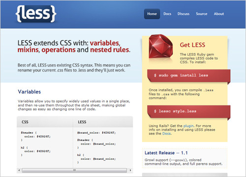
This tool stands out because it is compatible with pre-existing style sheets. Designers and developers can add the features as needed and would only need to change the extension of the CSS file from .css to .less. This is a Ruby-based platform; it is lightweight and easy to use, and it provides all common CSS extensions.
CleverCSS
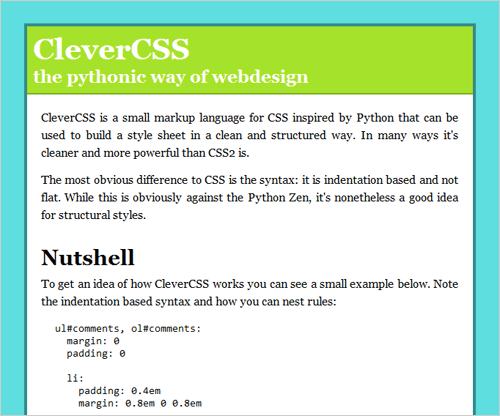
CleverCSS is a lighter version of some of the tools above but still allows for more advanced programming-inspired CSS techniques. The syntax is similar to Python’s, so Python developers will find it easy to adjust. The tool focuses on syntax efficiency but offers much more.
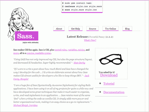
Sass is a stylish approach to an otherwise boring method of styling. This extension tool allows for nested rules, variables, mixins and more, and it gets anyone started quickly with a tutorial and full documentation.
If Sass looks interesting, also consider Compass:
“Compass is a style sheet authoring tool that uses the Sass style sheet language to make your style sheets smaller and your website easier to maintain. Compass provides ports of the best of breed CSS frameworks that you can use without forcing you to use their presentational class names. It’s a new way of thinking about style sheets that must be seen in action!”
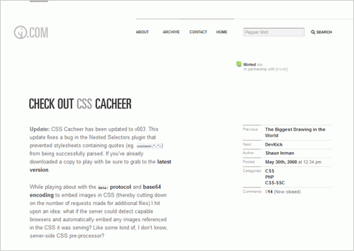
CSS-SSPP is a CSS extension language, and CSS Cacheer is an extension of it. It allows all of the basic extensions, such as variables, constants and nested selectors, but it has more functionality and is easier on the browser’s cache.
Moonfall
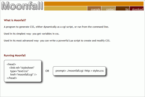
Moonfall is a simple program for generating CSS and comes with added functionality. It creates very basic style sheets and allows for more advanced techniques.
CSS Scaffold
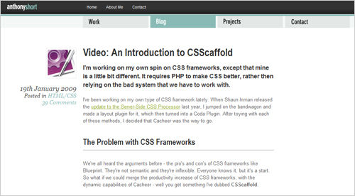
Another PHP-based CSS framework, this one very flexible. It is yet another alternative to achieving the CSS tricks discussed in this article.
10. Conclusion
Whether we support the techniques discussed here, many of us hope that CSS continues to advance. Many believe that CSS as it is allows us to style Web pages just fine and oppose adding more complex tools that would make it resemble a traditional programming language. But with widespread usage of CSS, websites have become much more dependent on it and require more capabilities from it.
So which side of the argument will win? Which of these ideas will one day become standard in CSS? It’s definitely hard to tell now, and it is even more difficult to decide whether we should implement these ideas at all or leave most of it to other languages and techniques. What we can do now, though, is test out different ideas and solutions. Only then will we be able to decide for ourselves whether changing the face of CSS is the right course to take.
Further Resources
You may also be interested in these references:
- Smart CSS Ain’t Always Sexy CSS This article argues that we must go back and practice CSS in accordance with its original purpose, rather than spice it up with new methods (including some of the ones above).
- An article discussing “the politics” behind the future of CSS.
- CSS: If Not Now, When? A short article on browser support for CSS, now and in the future.
Related posts
Also consider our previous articles:
- Mastering CSS, Part 1: Styling Design Elements In this article you’ll find fresh tips and techniques for creating and styling design elements with CSS. They’re a good place to start if you’re new to CSS but are valuable even if you’re a veteran designer.
- Mastering CSS, Part 2: Advanced Techniques and Tools A collection of advanced CSS techniques, tutorials and strategies, some of which reflect the futuristic approach of CSS featured in this article.
- Push Your Web Design Into The Future With CSS3 A closer look at the next version of CSS: CSS 3. This is a review of ready-to-use CSS techniques in CSS 3, as well as an overview of some other considerations.
 (al)
(al)

