Smashing Magazine - we smash you with the information that will make your life easier. really.
Data Visualization and Infographics Resources
Data visualizations and infographics can make complex datasets easier to understand and comprehend. By creating a graphical represenatation of data and statistics, complicated concepts and information can make more sense in less time.
Many visualizations focus on representing a specific set of data or statistical information. Others focus on less-concrete topics, providing a visual representation of abstract concepts. Generally speaking, the first type appear more like graphs or charts and the latter are often more creative and imaginative.
But visualizations and infographics can be used poorly, too. Putting in too much information (or not enough), using improper formats for the information provided, and other failures are common. Below are more than 25 useful resources for infographics and data visualization. Most are galleries of effective graphics though some also provide how-to information for information designers.
Also consider our previous articles:
- Data Visualizations and Infographics which lists examples and types of infographics and data visualizations.
- Data Visualization: Modern Approaches showcases modern examples of data visualization and infographics.
1. Data Visualization Sites
Here are some blogs and website that provide great information for information designers, including how-to articles, visualization showcases and galleries, and other resources. Some even include tools for creating your own visualizations.
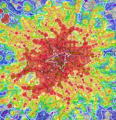
Strange Maps
Strange Maps features only map-based graphics, both modern and historical. The commentary accompanying the maps is what really makes the site interesting, especially on the historic maps.
Wall Stats
Wall Stats includes original infographics depicting discretionary spending in the United States. The graphics are also available in poster form. They also provide coverage of other infographics about political and economic topics.
Visual Complexity
Visual Complexity – This site showcases infographics and data visualizations from a wide variety of sources and has nearly 700 projects included. Graphics are categorized to make finding specific projects easier and plenty of information is included about each image.
Cool Infographics
Cool Infographics is an awesome blog that chronicles infographics and data visualizations from all over the web. They cover almost every topic you could think of. Posts are tagged to make it easier to find the specific kinds of graphics you’re looking for.
Data Mining
Data Mining is a blog that covers data visualization, social media and data mining. They aggregate tons of infographics from other sites, including National Geographic and The Economist.
Edward Tufte
This site presents a wide variety of infographics from multiple sources interspersed with other images. The commentary about the graphics is what sets it apart, and there are some incredibly interesting images included.
Infographics News
Infographics News is dedicated primarily to news infographics. They also cover news related to data visualization and unusual infographics.
Information Aesthetics
Information Aesthetics is a blog that details beautiful infographics and data visualizations from all over the web. Grahpics featured include political, financial and econimic, and other visualizations, dating as far back as December 2004.
Chart Porn
Chart Porn features charts and graphs from all over the web, all beautifully designed and covering a wide variety of topics. Posts are categorized by topic and source to make it easier to find specific charts.
Behance Network
The Behance Network has tags for Information Architecture and specifically for infographics. They have dozens of graphics in either category from a selection of graphic artists.
Good Magazine
Good Magazine presents some of the most interesting original infographics out there. They’ve created infographics on everything from water issues to the growth of food stamps to Obama’s effect on voter turnout.
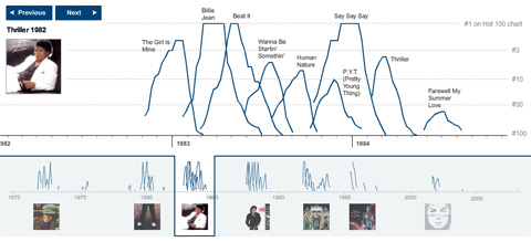
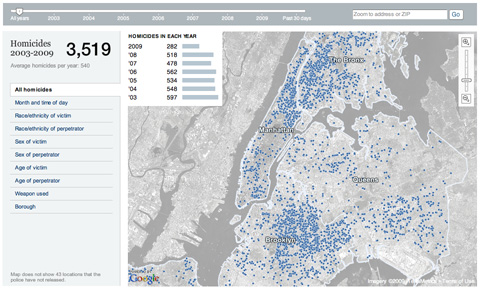
Matthew Ericson
The blog of infographic designer Matthew Ericson that includes visualizations created by others as well as himself. Recently featured visualizations include a map of murders in New York City and an industrial production data visualization.
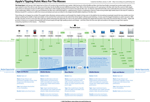
NiXLOG Infographics
NiXLOG has a great infographics section that includes an aggregation of infographics from all over the web. There’s also an original infographic of the evolution of Apple computers and their adoption by consumers.
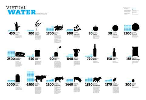
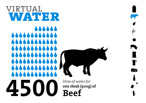
Virtual Water
Virtual Water is a specialized blog covering the usage of the virtual water content infographic poster and the information it contains. They provide the info from the poster as well as links to publications that have used it (in whole or in part) and other infographic-related content.
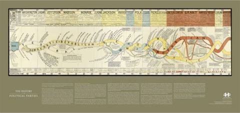
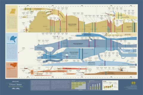
History Shots
History Shots is a commercial site that sells infographic and visualization products (posters, notecards, etc.) for a variety of topics. Most of their images focus on historic events, time periods and subjects and you can browse based on political, military, sports, or general graphics. It’s an incredibly interesting site and you can zoom into the graphics shown to read them onscreen.
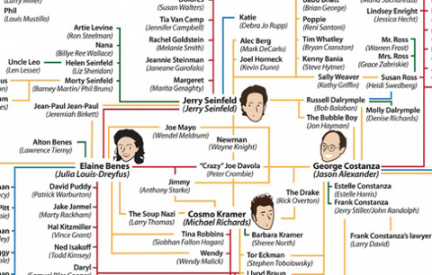
Flowing Data
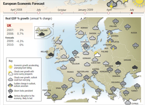
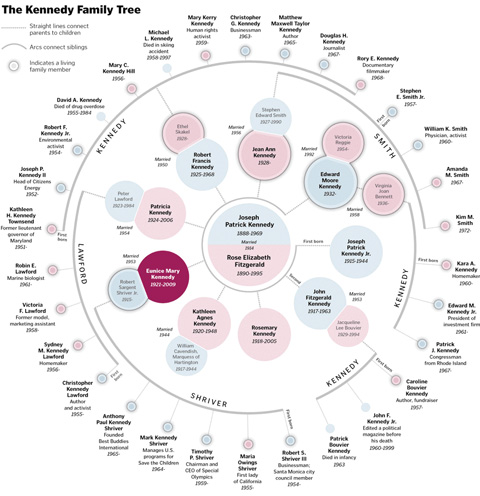
Flowing Data offers up some amazing infographics and visualizations, with their own dedicated category. They’ve covered the best beer in the U.S., wine personality profiles, the Kennedy family tree, and the religious geography of the United States, among tons of other awesome graphics.
Many Eyes
Many Eyes is a data visualization site that offers tools for creating your own visualizations as well as for browsing infographics created by others. There are already thousands of visualizations included on the site.
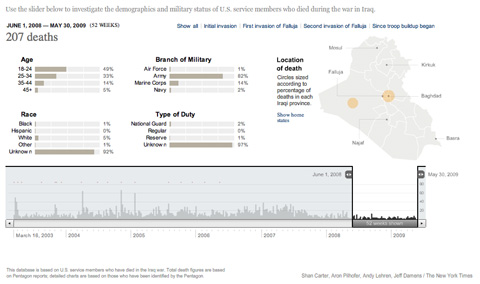
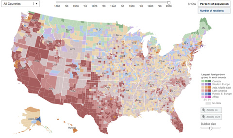
The New York Times
While you’ll have to search around a bit to find the best infographics on The New York Times site, it’s definitely worth the effort. They have some of the best infographics in the business representing and breaking down really complex data sets so their average reader can easily understand what’s actually going on.
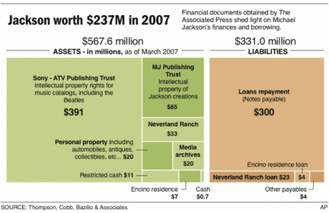
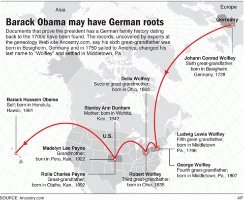
Nicolasrapp.com
nicolasrapp.com is an information design blog that covers primarily the infographics and data visualizations the author creates for The Associated Press.
DataViz
DataViz showcases images of beautiful data visualizations from all over the web. No commentary is included, but the images really speak for themselves.
iGraphics Explained
iGraphics Explained – This blog aims to shed some light on the world of infographics and data visualizations by explaining their effectiveness and how they were done. They showcase some beautiful graphics from sources all over the internet, so it’s a great place to go for inspiration and to see what kinds of graphics work and which kinds don’t.
Simple Complexity
Simple Complexity – This site showcases data visualizations that take complex data sets and display them in an easier-to-understand format that can help make sense of their true meaning. They showcase infographics from all over the net, as well as posting some how-to articles on creating better infographics.
Well-formed Data
Well-formed Data – This blog covers interface design, infographics and data visualizations, and statistics in general. The commentary accompanying the graphics is especially interesting, often delving deeper into the topics the visualizations cover.
Information is Beautiful
Information Is Beautiful – This blog celebrates beautiful information design, infographics, and data visualizations. They cover a wide variety of topics, create their own visualizations, and showcase those designed by others.
3. Flickr Pools for Infographics
Flickr pools can be a great source of information and inspiration. The ones featured below are dedicated to infographics and data visualizations, and most include examples from all over the world and a variety of different eras. They’re an excellent place to go to get ideas or see what infographics trends are around the globe.
Infografia | Infographics – A pool with more than 700 infographic images, posted by 120+ members.
Infografistas.com / Infographics News – This pool has nearly 350 items posted, all data visualizations and infographics from a huge variety of sources.
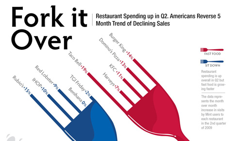
Visual Information – A pool with nearly 650 items posted. There are visualizations for everything from restaurant spending to library maps.
The Info Graphics Pool – This seems to be the largest Flickr pool dedicated to infographics and data visualizations, with more than 700 members and 1800+ items included.
Cameron Chapman is a professional Web and graphic designer with over 6 years of experience. She writes for a number of blogs, including her own, Cameron Chapman On Writing. She’s also the author of Internet Famous: A Practical Guide to Becoming an Online Celebrity.
- 51 Comments
- 1
- 2September 11th, 2009 1:50 am
Great article – love the maps at the top :)
Given me some nice idea… *daydreams*
- 3September 11th, 2009 1:55 am
Great list! may I suggest datavisualization.ch as a further resource. Our website documents research findings in the field of data visualization.
- 4September 11th, 2009 2:05 am
Nice list.
If you’re into data visualization, you should check out Digup.tv. They do amazingly well done video interviews with the biggest actors of the data representation world scene.
- 5September 11th, 2009 2:09 am
I’ve been needing some infographic inspiration – well timed post SM!
- 6September 11th, 2009 2:09 am
Wow, great stuff. Cameron Chapman does it again. The virtual water poster is hanging on the wall of my office, most of the other graphics I haven’t seen before. Thank you!
- 7September 11th, 2009 2:12 am
Fantastic article. Great visuals.
Stay tuned for more happy days …
- 8September 11th, 2009 2:48 am
Awesome this article is awesome, I like info graphics even if not everybody know how to do it, I am one of those but I try to learn and make nice inforgraphic like things every time. Thanks guys for the resources
- 9September 11th, 2009 3:02 am
Dam Inspiring. I love it..
Thanks Smash… - 10September 11th, 2009 4:06 am
Nice, love it!
- 11September 11th, 2009 4:12 am
awesome resource. Can’t wait to find a customer to mimic these for.
- 12September 11th, 2009 5:27 am
Holy…!!!
Way to start my Friday morning off right. This epic article reminds me of some of your articles of yore. Back in the day when I first started reading here.
Great work! I want to buy posters of some of this work.
- 13September 11th, 2009 5:37 am
Bonjour,
I’d like to ask questions which may be very stupid for most of common geek people ; )
- HOW TO CREATE DATA VISUALIZATION?
- WHICH SOFTWARES WITH? HOW IS THIS MADE?Thanks for your kind patience.
- 14September 11th, 2009 6:02 am
Really useful. I love the infographics and its power to show information and make the science something more close and easy to understand for everybody.
- 15September 11th, 2009 6:09 am
Thanks for an great post, lot’s of inspiration to be found here.
Didier, one can use the visual programming-lingo called Processing, a very powerful tool in creating infographics.
Also you could use a combination of Excel, Illustrator, Photoshop and various 3D packages.Here you have a nice tutorial for Illustrator:
http://www.digitalartsonline.co.uk/tutorials/index.cfm?featureID=1823And here you got online software helping you in visualising data:
http://manyeyes.alphaworks.ibm.com/manyeyes/
and
New York Times VizLab based on the IBM’s manyeyes:
http://vizlab.nytimes.com/Here you also got some nice infographics-resources:
http://www.nixlog.com/infographics/And you should also check out the book “The Visual Display of Quantitative Information.” by Edward Tufte.
http://www.edwardtufte.com/tufte/books_vdqi - 16September 11th, 2009 6:19 am
@didier: Your question is very stupid, mostly for non-geek people. Even MS Paint can be used to create beautiful data visualization.
- 17September 11th, 2009 7:00 am
Great examples! Also I love the Rokysopps Video, full of same graphics
- 18September 11th, 2009 7:04 am
@didier
>HOW TO CREATE DATA VISUALIZATION?
Understand the data, decide what you want to emphasize, express it visually>WHICH SOFTWARES WITH? HOW IS THIS MADE?
Theoretically, any software that is capable of displaying objects will fit. In practice, people often use design-specific software like Photoshop, Illustrator, Flash, etc… - 19September 11th, 2009 7:21 am
Great post. Thanks SM!
- 20September 11th, 2009 7:22 am
Great Post, nice source for inspiration. I love info graphics!
- 21September 11th, 2009 7:31 am
I love the topic of infographics but I do not yet know much about it, you should do more artilces on infographics, they’re handy on both web designs and print designs.
- 22September 11th, 2009 7:35 am
hi, nice list. i don’t think this is a shameless plug because these people are interested in data viz, but we’re doing a project visualising young people in Britain, with the data all available for people to grab and play around with. we won’t put the link in, but if you’re interested you can do a search for voicebox vinspired. we have a robot. i’ll get back to wasting time by looking through this list :)
- 23September 11th, 2009 7:54 am
Great list Cameron. Thanks for including my Cool Infographics blog in it!
- 24September 11th, 2009 9:11 am
This stuff is Great. I remember doing a lot of these in school, but not to this extent. I do believe I will have to create a couple for my company.
Very cool.
- 25September 11th, 2009 10:51 am
This is an amazing collection. Our graphic design studio has been seeking out info graphics which I have found scattered around the web and books. Thanks for collecting such a great sample of work!
- 26September 11th, 2009 2:54 pm
Love it! The only graphic that bugged me was the ‘TV shows watched by aliens’. Great concept, very funny, but typically Amerocentric!
- 27
- 28September 11th, 2009 3:36 pm
My favorite NYT graphic is the scrolling words. They’ve got one for the economy, and the one running on the 2009 US presidential election day was sheer genius.
- 29September 11th, 2009 7:58 pm
Love all the info… but it seems crazy that WIRED mag isn’t on here somewhere. They have some of the richest and most creative, but functional displays of information.
Cheers :)
- 30September 12th, 2009 9:47 am
Great collection!
You may visit for further resources about data visualization. - 31September 12th, 2009 12:02 pm
Some great resources. thanks!
- 32September 12th, 2009 12:32 pm
we all should stand up and clap to our screens. another “one of the best posts ever” from smashingmag
- 33September 12th, 2009 1:50 pm
cool cool!
- 34September 12th, 2009 9:03 pm
Wow!!! Excellent stuff. Love those graphical representation.
- 35September 12th, 2009 10:34 pm
Nice Infographics here. Inspiration for my next infographic project.
- 36September 13th, 2009 5:04 am
Very useful and refreshing, will find a way to incorporate that into my work.
Thanks - 37September 13th, 2009 3:10 pm
Two names everyone should read into on this topic.
Prof. E. Tufte.
Stephen Few. - 38September 13th, 2009 11:59 pm
Nice list, very inspirational.. But you missed one very important resource:
As seen on the TED videos of Hans Rosling. You need to check it out.
- 39September 14th, 2009 12:49 am
Please look also at http://www.golden-section-graphics.com!
Best wishes, Jan
- 40September 14th, 2009 5:28 am
Really quite creative and some are bit weird too but i like last one ( combined, urban, extra-urban ) most as its good for me i will replace them ( 3 categories ) with Google, Yahoo and Bing to anylyse as a seo from where and how much traffic i am getting so that i can improve them and at the same time i can show results more visually and creatively.
- 41September 14th, 2009 6:09 am
Very cool post!
- 42September 14th, 2009 6:30 am
Excelent!!! just what i was looking for.
- 43September 15th, 2009 3:28 am
http://www.flickr.com/photos/ffranchi/collections/72157620676924153/
you forgot this guy!
- 44September 16th, 2009 7:20 am
I’ve been a longtime fan of Ben Fry’s (benfry.com) work in data visualization. Some of his interactive pieces are absolutely mind blowing. Utterly amazing stuff.
- 45September 18th, 2009 1:08 am
Have you thought of a 3D visualization of tremendous information, attaching electronic files in data cones and flying through around?
Do miss Topicscape:
http://www.topicscape.com - 46September 18th, 2009 4:02 am
nicenicenice
- 47September 22nd, 2009 3:57 am
Great post, Just wondering about the 2nd chapter. There is chapter “1. Data Visualization Sites” and there is chapter “3. Flickr Pools for Infographics”. But there`s no chapter “2…”. hmm… it’s kind of ironic that this happens on this specific post…
Anyhow – keep up the great work. - 48September 22nd, 2009 6:11 am
You should include InfiView (Ajax Framework for Data Visualization) – you Connect InfiView with real time data (of any size, even infinite), and present anything from social and geo-location to diagrams and maps, in a web browser. (check it out: infiview.com
- 49October 12th, 2009 11:03 am
Fantastic resource of some really amzazing work by some really talented people.
- 50October 14th, 2009 6:14 am
Hi,
Nice article. There is a great book about infographics available called “Mapping, an illustrated guide to navigational systems”. Definately worth checking out for inspiration! - 51November 15th, 2009 6:01 pm
Hey great info-graphics collection. You missed a new one called http://ChartsBin.com which launched 2 days before this post.
- 00
There are no trackbacks at this time. If you are interested in leaving a trackback, please use this URL.
Leave a Comment
Make sure you enter the * required information where indicated. Please also rate the article as it will help us decide future content and posts. Comments are moderated – and rel="nofollow" is in use. Please no link dropping, no keywords or domains as names; do not spam, and do not advertise!
Interact
Popular
- 100 Wordpress Themes
- Photoshop Tutorials
- Fantastic Wallpapers
- 40+ Excellent Freefonts
- Dual-Screen Wallpapers
- Wordpress Themes for 2009
- Illustrator Tutorials
- Incredible Free Icon Sets
- High-Quality Free Fonts
- 30 Scripts For Galleries
- Photoshop Text Effects
- Useful Icon Sets
- Web Design Trends
- iPhone Wallpapers
- Before Launching a Website
- CSS Layouts And Templates
- Photoshop Actions
- Stunning Pictures and Photos
- Fantastic HDR Pictures
- Logo Design Tutorials
- Free Design Templates
- 10 Mistakes In Logo Design
- Photoshop Custom Shapes
- 40 Creative Design Layouts
- 8 Layout Solutions
- 53 CSS Techniques
- Photography Techniques
- Black & White Photography
- Styling Design Elements
- CSS-Based Forms
- 50 jQuery Techniques
- 50 Portfolio Websites
- 50 CSS Techniques
- Creative Logo Designs
- Desktop Wallpapers
- 25 Open Source Mac Apps
- 50 Free Icon Sets
- The Big Showcase Of Online T-Shirt Stores - http://bit.ly/5Tq8uA
- @ilmv oh ok then ;)
- @ilmv no, the SM Book will not be out of date :) We made sure it contains universal design, usability and marketing principles.
- Apple ad bombing Windows 7 on Google - http://bit.ly/28ctPq
- Atatonic - a fresh CSS framework - http://bit.ly/4oOV2w (via @umutm)
- @HrvojeKC yes, that's an interesting idea. Maybe when the waiting is over, we'll write a detailed post about it.


You should have included Röyksopp’s “Remind me” music video, but I guess you already have it in a post somewhere in the archives. :’3
Video if you don’t know what I’m typing about:
http://www.dailymotion.com/video/xjmp1_royksopp-remind-me_music