Portfolio Design Study: Design Patterns and Current Practices

Email Newsletter
Weekly tips on front-end & UX.
Trusted by 182,000+ folks.
 Register for Free
 Custom Web Forms for Angular, React, & Vue. Your backend.


 Celebrating 10 million developers
Following the requests of our readers, we have carefully selected 55 design agencies and Web development agencies, analyzed their portfolio websites and identified popular design patterns. The main goal of the study was to provide freelancers and design agencies with useful pointers for designing their own portfolio.
We have brainstormed on the most important design issues and asked designers across the globe what design decisions they often have to make when designing a portfolio website. We also asked designers what questions they would like answered or analyzed in our case study. In the end, we came up with a bag of 40 solid portfolio-related questions — sorted, grouped and ranked according to importance. Finally, we searched for a good mix of established design agencies and well-designed portfolio websites of small and large agencies.
You may also want to check out the following Smashing Magazine articles:
- My (Simple) Workflow To Design And Develop A Portfolio Website
- Portfolio Web Design Showcases
- 30 Fresh and Inspirational Portfolios With A Twist
- 10 Steps To The Perfect Portfolio Website
Finally, we created a questionnaire with these 40 questions and went through the websites of all of these design agencies, noticing design patterns and filling out our quite lengthy forms. Overall, the study took over 75 hours to prepare.
This post presents the initial results of our big portfolio design study. Below, we discuss the visual design, structure, layout and navigation of portfolio websites. We also get into the design details of every single section, including the about, clients, services, portfolio, workflow and contact pages. Of course, you do not necessarily have to follow the findings presented here; rather, use them to get a general idea of what other portfolios look like, and then come up with something of your own that is usable, distinctive and memorable. We would like to thank Mark Nutter for helping us gather data for this study.
1. Light vs. Dark Design
A general question that comes up often is whether to design a visually appealing dark website (that is, use big bold typography and vivid colors to give the user a colorful and memorable experience) or a softer lighter website (one that has a simple structure and clean typography).
Surprisingly, according to our studies:
- 82% of portfolio websites have a light design with neutral calm colors. The backgrounds of these websites may be a light shade of gray or yellow, rather than pure white (e.g. Happycog, SimpleBits, 80⁄20 and Concentric Studio).
- 29% of portfolio websites have very vibrant, striking colors (e.g. 45royale, Hicksdesign, Duoh, Frexy and Odopod)
- Dark websites are much more likely to have big typography and strong visuals (e.g. OrderedList, Blue Flavor, and pod1).
Of course, picking a dark or light design depends strongly on your personal approach and individual goals for your portfolio. Saying that the “trend” strong favors light designs would be inaccurate because each type serving its purpose in its particular context.
2. How Many Columns?
Interestingly, many of the portfolio websites we researched tend to vary the number of columns between sections. Client and about pages usually have two columns, while front pages often have three to four columns and present the most important sections of the website in a compact overview. In fact, we see pages getting more and more columns: every sixth portfolio website we saw has at least one page with four columns.
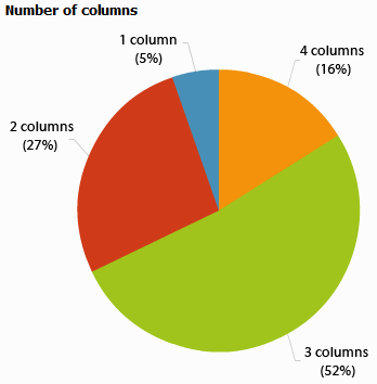
According to our study, few websites risk experimenting with so-called out-of-the-box layouts, or navigation like JavaScript scrolling or other kinds of original layouts. Most portfolios have traditional block-style layouts, with two to three clearly separated columns and a simple, convenient navigation menu.
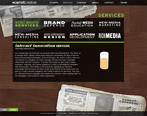
carrot creative has an original one-page layout with JavaScript-scrolling navigation, which is unusual and memorable but not necessarily intuitive.
Also, most portfolio websites consist of multiple, detailed pages, with relatively deep sub-sections. Minimalist one-page portfolios are rarely encountered: only 5.4% of the portfolio websites we saw have simple and minimalist designs (namely, Neutron Creations, Fish Marketing and 80⁄20).
3. Introductory Block On Top?
Portfolio websites commonly have a large introductory block in the header of the page, essentially a short friendly statement about what the agency offers and what advantages a customer will gain by using its services. The block will usually blend vivid imagery with big typography. It conveys both the company’s overall image and the personal tone of the agency’s staff, making it equally professional and friendly. Such blocks usually appear immediately below the logo on the front page.
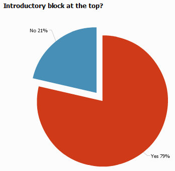
According to our study, 79% of portfolio websites have some kind of an introductory block in their upper region. We noticed, though, that some portfolios forgo an introductory block in favor of showcasing their recent projects (concentric studio, HUGE inc. and Wishingline being examples). For such designs, a small “About us” block is placed somewhere else on the page, often below the fold.
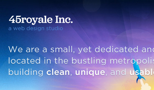
45royale Inc. has friendly introductory text on its front page. It communicates that the website belongs to a Web design studio that is located in Canton, Georgia and that creates clean, unique and usable websites and Web applications.
4. Layout Alignment
Back in ‘90s, website layouts were traditionally left-aligned, with either vertical navigation in the left sidebar or horizontal navigation near the head. With growing adoption of wide-screen displays, this has changed. More and more designers are horizontally centering their layouts so that the passive white space around the page balances the layout. We did notice a trend towards more original, even right-aligned, layouts at the beginning of the year, but not a single portfolio in our current survey has a right-aligned layout.
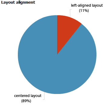
According to our study,
- no portfolio layouts are right-aligned,
- 89% of portfolio layouts are horizontally centered,
- the rest have either original adaptive layouts (Method and Carrot Creative), a vivid background image that fills the remaining screen space (Duoh) or just left it empty (e.g. Ideo, maybe.for.you and Area17) – of course, you will see the remaining screen space only if your display has a wide-screen resoluton.
5. Navigation Alignment
Where to put the main navigation in the layout? The question isn’t trivial and often leads to a debate among designers. Surprisingly, our study revealed that most portfolio designers place the main navigation in the upper-right corner of the layout. In fact:
- 80% of portfolios have large horizontal navigation,
- 51% of websites have horizontal navigation with right-aligned elements (e.g. Concentric Studio, Mark Boulton Design)
- 16.4% have horizontal navigation with left-aligned elements (e.g. BarbarianGroup),
- 11% have full-width horizontal navigation with large clickable elements (e.g. buffalo, SimpleBits).
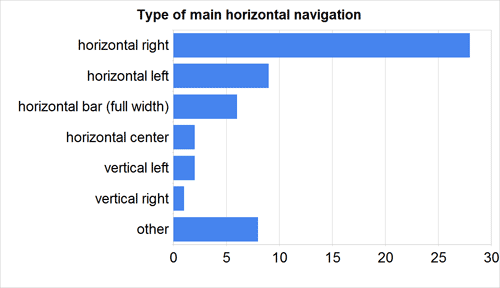
Vertical navigation is rarely used, and other approaches (such as horizontal navigation at the bottom of the page) are found on unconventional out-of-the-box layouts, though still uncommon.
Area17 has a left-aligned layout with left-aligned navigation. Each navigation element is a fairly large clickable block element.
6. Search Box Design
While many portfolio websites are quite small, presenting visitors with only some general information about the studio and its design process, some portfolios go the length and present a variety of case studies, a blog and detailed information about its every major project. In general, if a website contains a lot of information, search functionality would very likely benefit some visitors to the website. As it turns out, very few companies integrate search functionality into their website.
- 89% of the portfolio websites we studied have no search functionality,
- Only 11% of websites have a search box, usually a simple, clean one. Most of the owners of these portfolios have a blog that they update regularly (including pod1, OmniTI, fortyseven media, Ideo, Viget).
7. Flash Elements
Flash, which is an established technique for rich interactive design, seems to be losing popularity among Web designers — at least among designers of portfolio websites. The reason is probably that certain Flash effects can be replaced by advanced JavaScript techniques, which are often available from popular JavaScript libraries as easy-to-use plug-ins.
Slideshows, animation effects and transition effects can now be created with JavaScript solutions that are lightweight, quicker and much easier. Rich Flash animation and video effects are being replaced with simpler, subtler JavaScript techniques. Flash is still sometimes used, though — for instance, for dynamic text replacement.

BKWLD is one of the few portfolios in our study that uses Flash heavily throughout the website.
In our study, only 3.7% of portfolio websites used Flash heavily (notably, Lift Interactive, Bkwld, and others, but mainly for slideshows and presentations). The reason is very probably because we did not include any interactive motion design agencies, Flash design studios or video production studios in our study.
8. Where To Put Contact Information?
One important objective of our study was to understand how designers generally convey information about contact options. Do visitors have to click on a “Contact us” button to get in touch with a design agency? Or is contact information placed prominently at the top of the page? Or do most designers put contact information in the footer – the place where most users are expecting it anyway?
The websites we analyzed put contact information in almost every area of the page: top, right, left, bottom, even the middle of the page. But we also noticed some interesting patterns. Note that we were interested in a) where the link to the “Contact us” page is and b) where the actual contact information is positioned.
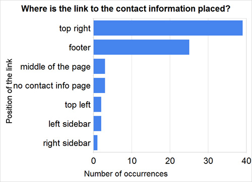
It turns out that:
- Only 12.7% of websites display a phone number in the header of the page (e.g. Things That Are Brown, Headscape, Clearleft and Concentric Studio),
- Only 9.1% of websites display their email address in the header of the page (e.g. buffalo, Kyan media),
- A postal address usually isn’t displayed at all (54.5%) or else is placed in the footer (40%) or upper area of the website (5.4%),
- A “contact” link usually appears in the upper-right corner (71%) and/or the footer (45.4%),
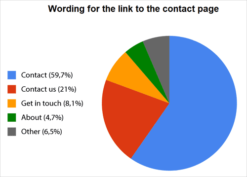
- “Contact” (59.7%) and “Contact us” (21%) are most popular wordings for the link to the contact page.
9. “About Us” Page
The about page is used on portfolio websites to present the members of the team, explain the philosophy of the agency and prove the company’s expertise and professionalism. The page gives the design studio a personal touch and — if designed properly — elicits the trust of potential customers.
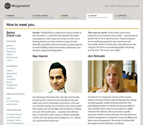
Weightshift.com’s “About us” page shows team members and describes who they are.
An about page is clearly a must for portfolios: 89% of those we analyzed included a link to the page in their main navigation (exceptions include 31three and Huge Inc and others).
The level of detail you use to describe your agency is up to you. 59.1% of about pages we surveyed have no sub-pages and offer visitors a brief, compact overview. Photos of team members, their personal information, and information about the design process are very common on such pages. The tone of the main copy is usually informal, friendly and sometimes even funny. The most popular wordings for the link to the about page is “About” (43.6%), “About us” (27.3%) and “Who we are” (7.2%).
10. Client Page
One of the surest signs of professionalism and a good reputation in the industry is a solid list of clients with whom your company has worked. Of course, the more prominent the companies in the list, the more likely potential customers will turn their attention to you. In our experience, many customers seek out a client list, case studies, and testimonials when searching for a design agency. So we were surprised to find only a few agencies that have a standalone page listing their clients.
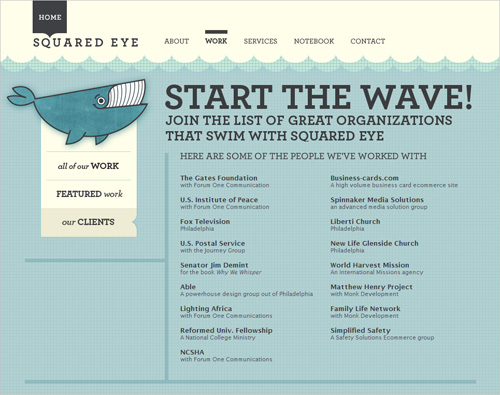
The client list on Squared Eye lists every important client this company has worked with. With names such as the Gates Foundation, the US Institute of Peace, Fox Television and the US Postal Service, the company certainly seems trustworthy.
Of the portfolios we analyzed, only 47.2% have a client page (either as a standalone page or part of a portfolio page). In most cases, clients are represented by their logos, which are often linked to detailed case studies that discuss the work done by the agency and client testimonials. The most popular wording for the link to this page is “Our clients” (46.1%), “Clients” (39.6%) or “Client list” (15.4%).
11. Services Page
Given that visitors usually come to such websites because they are looking for services, validating their search with clear introductory text on the front page or with a standalone services page is reasonable. Potential clients usually have a pretty good understanding of what they are looking for (motion design, print design, Web design, CD/DVD jacket design, etc.), so putting your major offerings on the services page is a good idea.
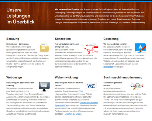
Signalfeuer’s services page explains what the company offers very concisely. Icons and small illustrations are used to good effect.
67.2% of the portfolios we looked at have a standalone services page of some kind. The rest put their information on the about page or the front page. The services pages sometimes have sub-pages (35.1%), but in most cases the single page is quite long and detailed.
Linking your portfolio page to your services page is definitely a good idea because it bridges theory and practice and shows exactly what your agency is capable of. The most popular wording for links to such pages is “Services” or “Our Services” (75.7%), followed by “What we do” (10.8%).
12. Portfolio Page
Potential customers obviously want to see what a design agency is capable of. Does its style match theirs? What aesthetic does it communicate for visual design, typography and usability? Do its designs feel intuitive and look pleasant? These are the questions potential customers want answered when they become interested in a design agency. So, a solid showcase of previous work could close the deal and convince the customer to contact the agency.
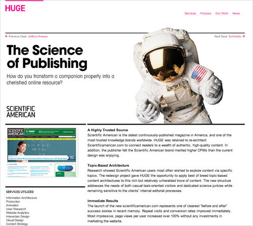
Huge Inc’s case study: an example of one of dozens of fairly detailed case studies.
In general, be selective with the work you showcase, and let the visitor order and filter the projects by style, industry and year. Also provide some information about the project, or even conduct a detailed case study, with testimonials and insight into your workflow. Unfortunately, few portfolios do that.
According to our study:
- 7.2% of websites don’t have a portfolio at all,
- 12.7% have only logos or screenshots, without any description or case study,
- 16.4% briefly describe each project next to a logo and/or screenshot,
- 63.6% have a very detailed page for every project, including case studies, testimonials, slideshows of screenshots, drafts and sketches (see Bright Creative and 45royale).
Surprisingly, the most popular wording for the link to the portfolio page is “Work” or “Our work” (47.2%), followed by “Portfolio” (27.2%).
13. Workflow Page
Actually, the workflow page works rather well as a sub-section of the about page, rather than as a standalone page. However, some designers want to make their explanation of their workflow more prominent. While 74.5% of websites do not have a workflow page at all, the rest go to rather great lengths to explain to potential customers how their process works and what expectations both parties should have.
45royale’s process: the company explains how its process works and how customers will be involved throughout the design process.
Giving potential customers a better understanding of how they will be involved throughout the design process is certainly a good idea. The most popular wordings for the link to this page are “How we work” or “Working with us” (42.8%), “Process” or “Our process” (35.7%), and “Approach” (7.1%).
14. Contact Page
If everything goes right, and your portfolio has earned the visitor’s interest, then the contact page will be their final destination. Do everything you can to make it as easy as possible for them to contact you. Make sure the customers provides all necessary information by presenting a simple, clean Web form that can accommodate the essential information about their project. You could also provide your phone number, postal address and email address: the more, the better. Driving directions, social profile buttons and vCards are a good idea, too.
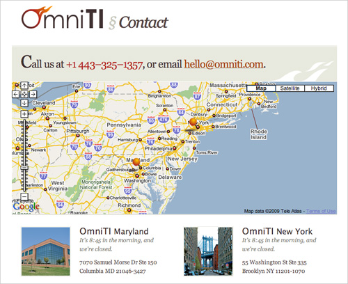
Omniti’s contact page has driving directions, an office address, personal contact information, vCards, telephone numbers and working hours. It also tells the visitor whether the office is closed right now. An example of a good contact page.
According to our study:
- 9% of websites don’t have a contact page (instead, contact information is included in the footer of each page),
- Driving directions (often with an interactive Google map) are given on 45.4% of portfolio websites (!),
- 83.6% provide a phone number and email address on the contact page,
- 76.7% provide a postal address on the contact page,
- 69% of websites have a contact Web form,
- 14.5% offer a vCard for downloading, usually next to the email address,
- Links to social networking websites such as Facebook, Twitter and LinkedIn are often used (14.5%).
15. Specials And Extras
We also noticed a few distinctive elements that some design agencies offer potential customers. One popular approach is to offer some kind of project or proposal request form, which prospective clients are expected to fill out with their project’s main details when submitting a request (e.g. Mark Boulton Design, stuff and nonsense, 45royale, Duoh and Clearleft)
Also, some design agencies offer a project planner (including buffalo, Happy Cog and 45royale) or help customers estimate costs (such as OnWired) or offer a more detailed pricing guide (like Blue Flavor).
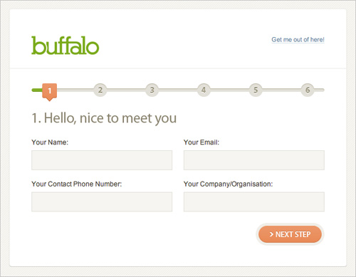
Buffalo’s online project planner guides potential customers smoothly through the project worksheet, making it easier for them to fill in data and avoid mistakes or missing information.
Among the other interesting things we noticed were a chat window on the contact page (e.g. Agami Creative, a “Stress-o-meter” that displays the company’s current availability (e.g. Bright Creative), a quote calculator, and a “Capabilities and Credentials” presentation (usually in PDF).
16. Other Findings
We also found out that:
- None of the portfolio websites have an FAQ page,
- 76.3% of websites have at least one blog. And many portfolios have two or more blogs,
- 14.55% have a newsletter or mailing list (e.g. bkwld, area17, buffalo, Viget and 45royale),
- 9% provide a detailed site map (e.g. Ideo, OmniTI, pod1, Erskine Design and Wishing Line).
Summary
- 82% of the portfolio websites we analyzed have a light design, with neutral, calm colors,
- 79% have traditional “block” layouts, with two to three columns clearly separated and a simple, conveniently located navigation menu,
- 79% of websites have some kind of introductory block in their upper area,
- 89% have horizontally centered layouts,
- 80% have large horizontal navigation,
- 51% have horizontal navigation with right-aligned elements,
- 89% do not have search functionality,
- Only 3.7% use Flash heavily throughout the website,
- A contact link appears in the upper-right corner 71% of the time, and/or in the footer 45.4% of the time,
- 89% have the link to the “about us”-page in the main navigation,
- Only 47.2% have a client page,
- 67.2% of portfolios have some form of standalone services page,
- 63.6% have a detailed page for every project, including case studies, testimonials, slideshows with screenshots, drafts and sketches,
- 74.5% of websites have no workflow page,
- The contact page should contain driving directions, a phone number, email address, postal address, vCard and online form.
Related Posts
You may be interested in the following related posts:
- Web Form Design Patterns: Sign-Up Forms
- Web Form Design Patterns: Sign-Up Forms, Part 2
- A Small Design Study Of Big Blogs
- A Small Study Of Big Blogs: Further Findings
- Typographic Design Patterns and Best Practices


