Smashing Magazine - we smash you with the information that will make your life easier. really.
Effective Twitter Backgrounds: Examples and Current Practices
Smashing Magazine has been on Twitter for about a year now (@smashingmag), and it turned out to be a great medium to communicate with our audience, build connections, discuss design-related topics and give away some nice prizes. However, even a year later, we still don’t have a Twitter background page and now is a good time to change that. So because we decided to create our own Twitter page, we wanted to first find out how other designers do it and what tips and techniques they use to create a truly outstanding, beautiful Twitter page.
Your profile page is the only place on Twitter where you get opportunity to showcase your visual brand and possibly communicate additional information that can last longer than a tweet. You can customize your profile page by changing background, text and link colors. It’s as simple as changing the skin, but ability to change background image has allowed designers to create really unique profile pages.
Primary focus of this article is to explore various techniques to create unique, memorable and effective Twitter profile pages. However, before proceeding to the list, it is important to briefly discuss the structure of the Twitter profile page.
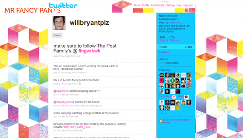
Twitter Profile Page
Most important thing to note is that the main content block in the layout of a Twitter profile page has the fixed width of 765 pixels, and it is always centered. This is good, because it makes it possible for you to show your background image using the extra space created on the both sides of the block when displayed at higher resolutions.


Other things that you should keep in mind:
- timeline background is always white
- menu bar background is always white
- footer bar background is always white
- logo is always the Twitter logo
- picture can be changed
- you can change text color, link color, sidebar background color and sidebar border color
- you can change background image and background color
- you can also tile background image
- the background image start position is always top left corner
Note that if you are only interested in designing a nice profile page, you can easily do that by incorporating a stunning background image and customizing text, link and sidebar colors accordingly. But if your intentions are to be unique, incorporate brand identity and communicate additional information, then you will need to be little bit more creative with your background image.
Tips & Techniques
Following is a list of profile pages, illustrating various tips & techniques that you can incorporate in your own backgrounds. Please note that most of these profile pages incorporate more than one technique, and you should also consider mixing multiple techniques according to your own requirements.
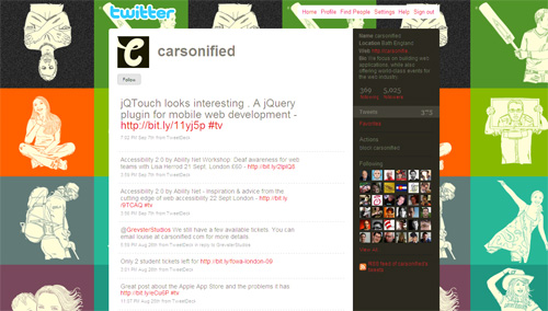
Merge Background With Timeline / Sidebar
This is probably the least used technique among all tips and techniques discussed here. By merging your background graphics with timeline and/or sidebar, you can create a unique layout with a very distinctive look and form.
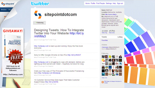
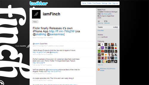
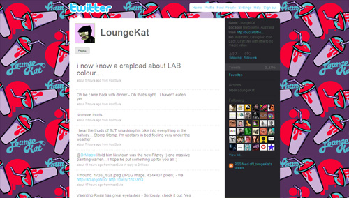
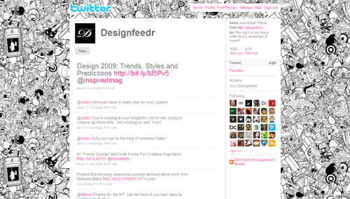
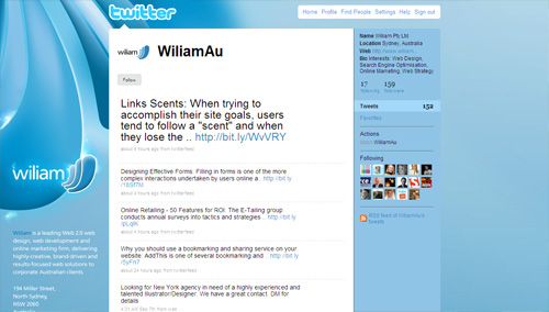
Mix Tiled Pattern With Other Graphics
Twitter allows you to integrate one background image that can be either tiled or not. But you can create unique look for your profile page by creating a background image that has both.
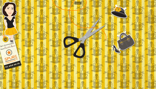
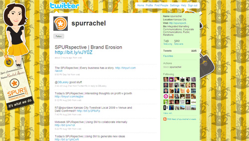
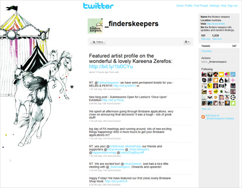
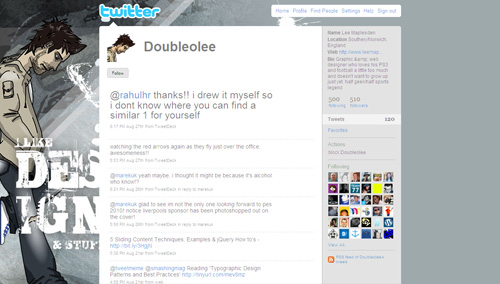
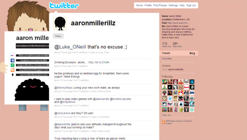
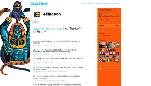
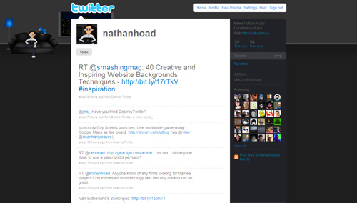
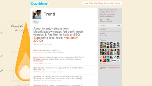
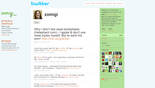
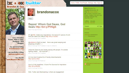
Reveal More With Your Pictures
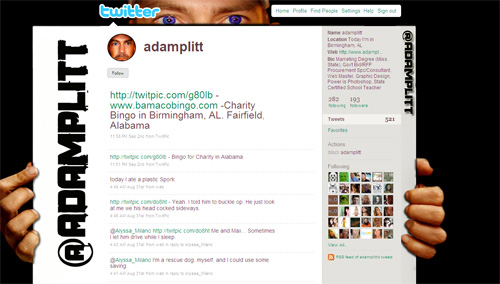
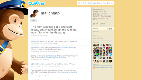
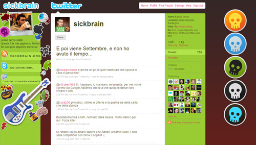
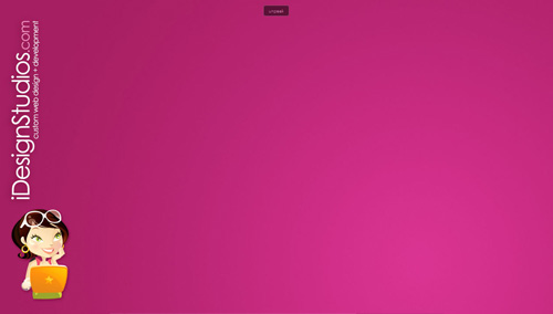
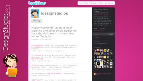
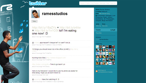
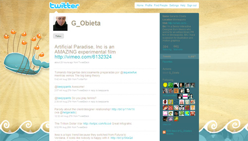
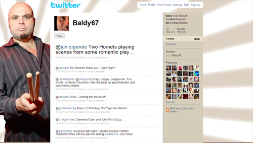
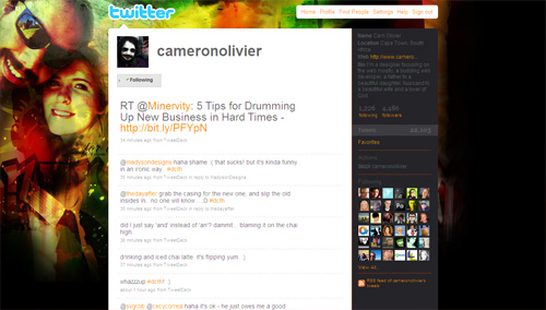
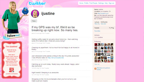
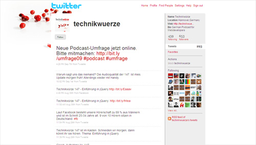
Your profile picture (it can be an avatar, logo or photo) is your main identity on Twitter; it will be displayed next to every tweet that you send out to your followers. For instance, you can use a background image that is somehow related to your profile picture and thus convey more information about yourself or your brand. In other words, you can use this classic approach of creating design around your logo or brand identity to communicate information in a more effective way.
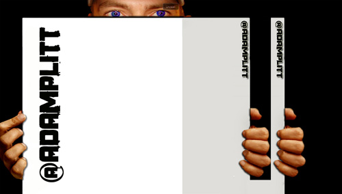
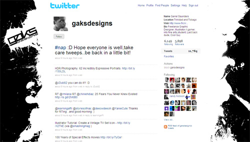
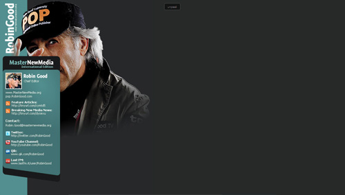
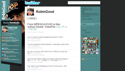
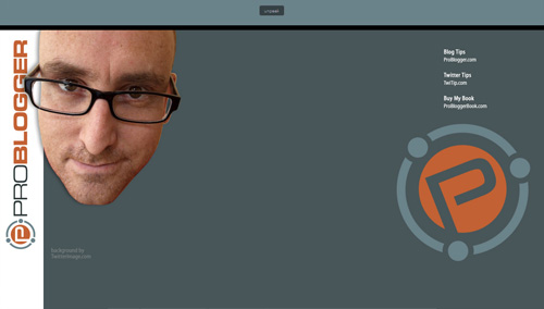
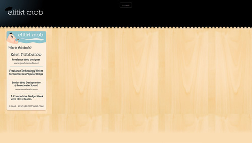
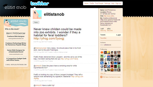
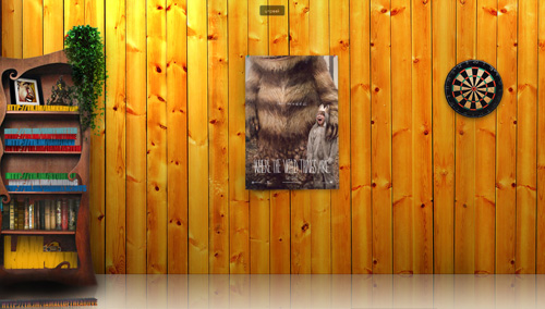
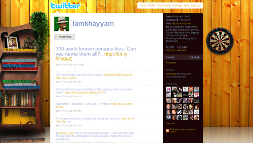
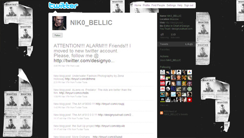
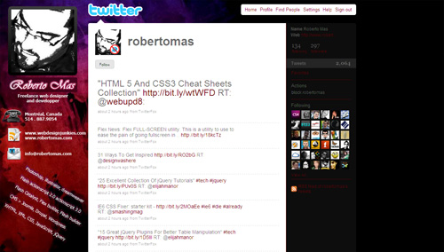
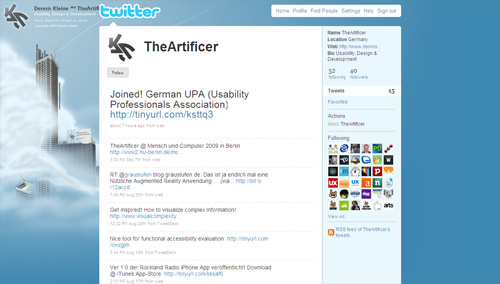
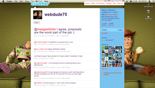
Reveal More With The Page Peel Effect
If you have an established visual identity, you can use page peel effect to show users who is actualy behind the Twitter profile. This technique provides you with a freedom to design the rest of the background as you wish, because you may no longer need to worry about integrating brand visuals and its colors.
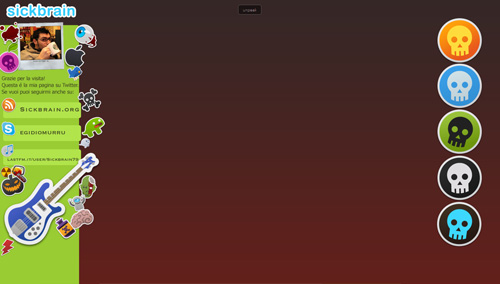
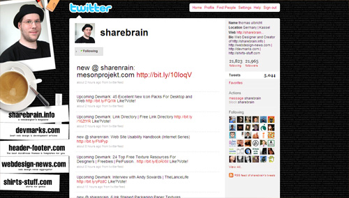
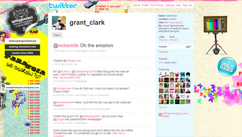
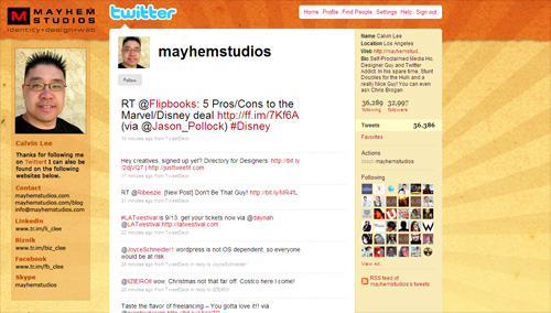
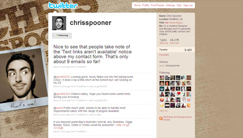
Add Personalized Sidebar To Your Profile
The following profiles illustrate a specific use of the first technique by adding sidebars to the layout. You can add such panels to effectively highlight additional information that you want to communicate.
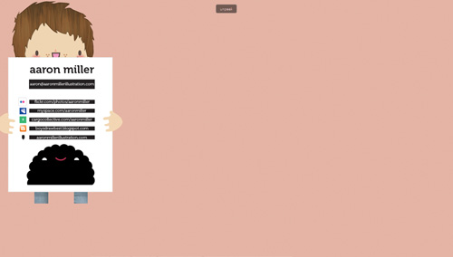
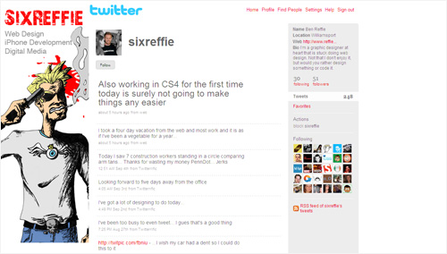
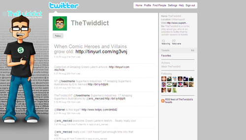
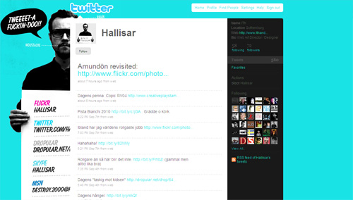
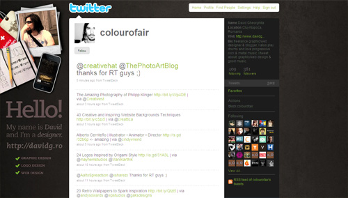
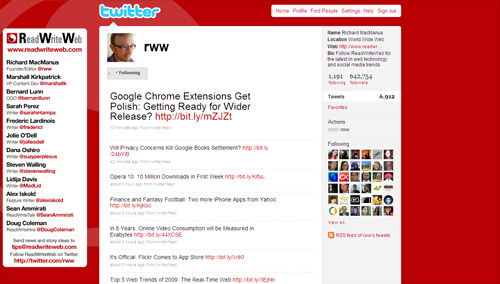
Show Yourself
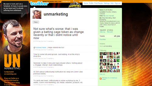
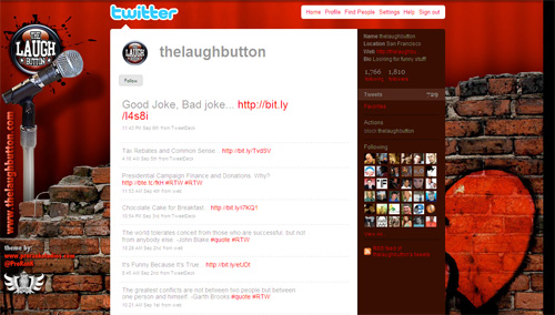
In social media world, you are the brand. With Twitter, being one of the major players in social media, showing yourself on the profile page can be very effective way of strengthening your brand and community around your website.
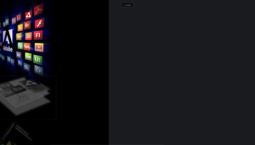
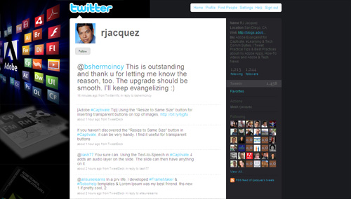
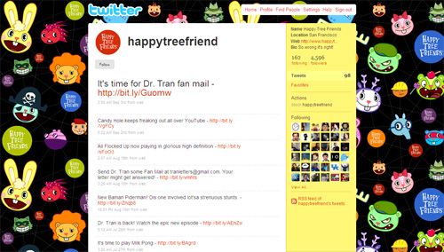
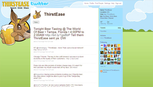
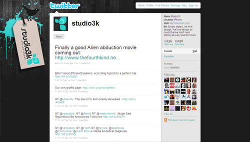
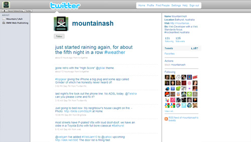
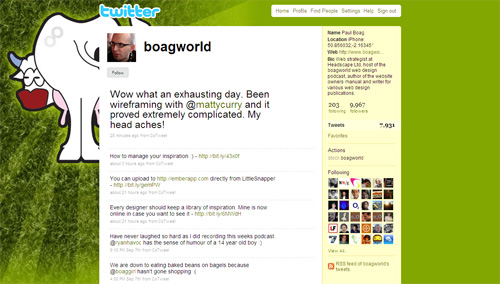
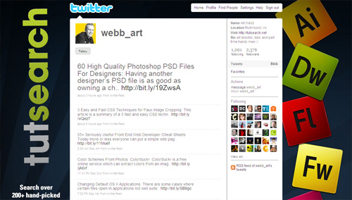
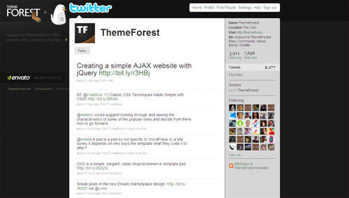
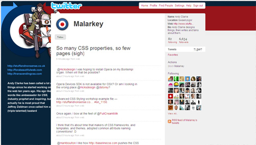
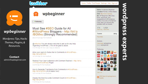
Use Icons and Logos
Following profiles illustrate simple, yet very effective technique to communicate association with or involvement in certain community, service, skill, etc by showcasing relevant icons or logos.
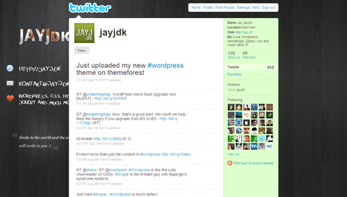
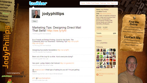
Add a Header Bar
Adding a header bar could be used for creating unique look for your profile page, but it can also be used to separate Twitter logo and top menu (which contain links to user’s profile) from the rest of your page.
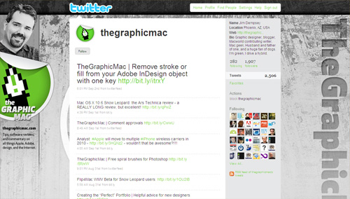
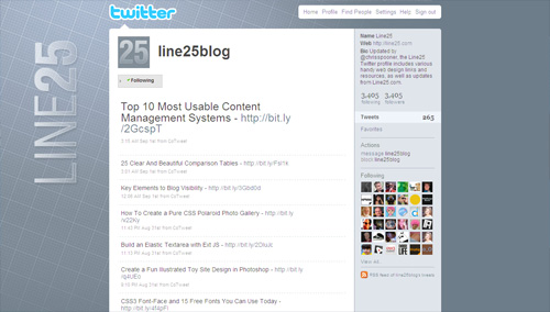
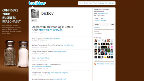
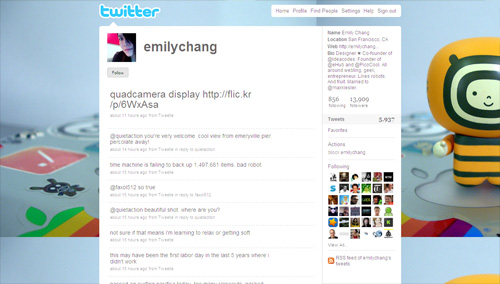
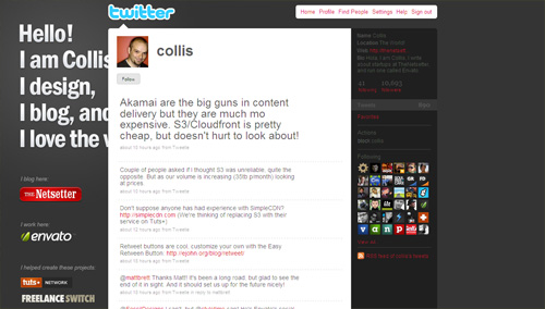
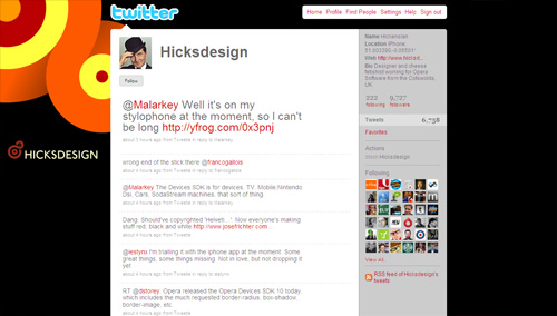
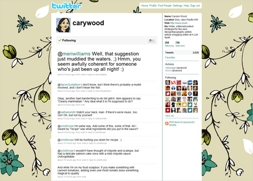
Less is More
Andre Gide once said that “Art is a collaboration between God and the artist, and the less the artist does the better”. Here are few illustrations of how minimalism can be used to its full effect:
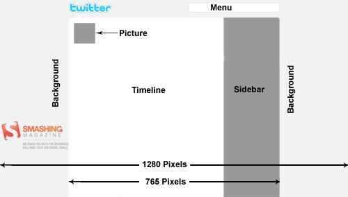
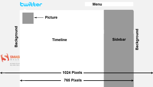
Accommodate the 1024px Width
If you care how your profile page will appear on 1024px wide screens, you will need to work near the top and left borders of your background image. Here is an example of how a nice visual design can be used properly for various screen resolutions:
Here is another interesting technique to ensure that your profile page has a very similar look on both 1024 and 1280px wide resolutions:
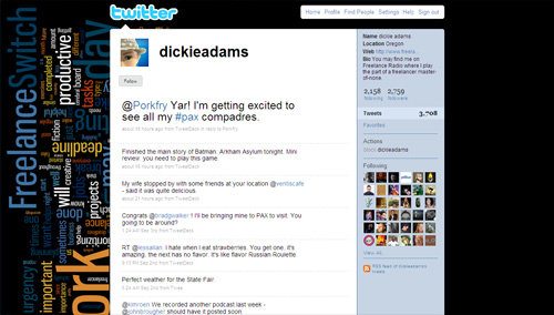
Use Typography
Use of typography in Twitter backgrounds is not very common; however if used creatively, you can create unique, very effective profile pages to communicate additional information.
Put Information In a Memorable Way
Composition is the plan, placement or arrangement of the elements. You can arrange elements on your background in a unique and memorable, showcasing information that is important to you and your readers. This techniques allows you to create an environment, show your personality and provide additional information.
Do Whatever You Want To Do
The more original, creative and distinctive your background image is, the more likely it is to be memorable and strengthen your online presence. Experiment with beautiful, personalized illustrations, background images and typography. Make sure that your background image has a personal voice, doesn’t look generic and has an unusual twist. Your first time visitors will appreciate it.
Gallery
Now that we discussed a couple of techniques for the design of Twitter backgrounds, here is a collection of some well-designed profile pages to tame your appetite for Twitter profile page inspiration.
Tools
- Twitter Background Template: Free Twitter Background template in PSD format from “Fuel Your Creativity”, includes guides that match up with different resolutions from 800×600 to 1900×1200.
- Peekr: A bookmarklet that you can drag to your browser’s toolbar and click on to see a twitter user’s entire background graphic and then click again to get things back to normal.
- Twitter Background Checker: Lets you check how your Twitter profile looks in smaller or higher resolutions.
- ClickableNow: Add Clickable Links to your Twitter background image.
Additional Resources
- Twitter Background Design How-To and Best Practices
- Design a Unique Twitter Background
- 4 Ways to Optimize Your Twitter Background
- Resource Kit To Create, Customize & Find Twitter Backgrounds
Related posts
Saud Khan is a software/web developer and consultant with over 12 years of professional experience. He is also founder of W3Avenue, an online publication providing advice & resources for rapid web development. You can also follow him on Twitter. http://twitter.com/w3avenue
- 134 Comments
- 1
- 2September 18th, 2009 5:56 am
Thanks For all the tools, guides, and Inspiration! Maybe my background can make the next list @madesigns
- 3September 18th, 2009 6:21 am
Designers should also remember that many people use screen resolutions with a height greater than the 900 or so that is standard on a 19″ widescreen. Many use 1024 height (for example, 1280 x 1024) or taller. @adamplitt’s background looks cool but on a 1024-tall window it is cut off at the bottom. The best thing to do is make your background image fade into your background color.
- 4September 18th, 2009 6:23 am
I think this eclectic background is cool.
@Jacob_DeGrade - 5September 18th, 2009 6:27 am
I still fail to find Twitter fun or usefull or whatever… :/
- 6September 18th, 2009 6:38 am
helpful. thank you. not many people actually view twitter from the homepage now do they? well its a lot less before.
- 7September 18th, 2009 6:40 am
Thanks for the mention. @webb_art
- 8September 18th, 2009 6:42 am
Thanks for the tips. I need to revisit my messy background.
- 9September 18th, 2009 6:44 am
People need to remember to create their twitter backgrounds for various screen resolutions. Lots of these backgrounds look great in the screenshots, but they look awful on my monitor (1900×1280).
- 10September 18th, 2009 6:45 am
Great Article, it’d be great to make the round two of this list.
@aubreyjohnson
- 11September 18th, 2009 6:45 am
Great works =]
- 12September 18th, 2009 6:45 am
Cool post, I like to think mine is also pretty good and at the level of being exposed, check it here: http://twitter.com/h1brd
- 13September 18th, 2009 6:48 am
Some nice examples – The first one’s a good idea but it resizes pretty poorly. Us mac kinds don’t normally conform to standard screen sizes.
- 14September 18th, 2009 6:50 am
Hey hey … thx for the mention! :)
- 15September 18th, 2009 6:53 am
They should support more background options (CSS)
Centered positioning of the background would be nice to have?! - 16
- 17September 18th, 2009 6:56 am
Great stuff. While I find Twitter too narcissistic to justify a personal page, our news station has one, and we incorporate ti into the show as a way for viewers to interact with stories. The anchors can read responses right from the laptops on their desks.
- 18September 18th, 2009 6:58 am
Unfortunately all this works with a certain screen resolution.
- 19September 18th, 2009 7:00 am
Thanks for the mention! I have to agree with an earlier comment though, I hardly ever use my actual Twitter homepage to update, although I still enjoy looking at other peoples’ backgrounds and content through the Twitter site.
@grant_clark
- 20September 18th, 2009 7:11 am
I agree with a lot of the commenters here that you need to take screen resolution as a main factor. while @adamplitts looks good, it only looks good when your screen is at the exact res that it was built for. It would make it a lot better to do one like that if twitter were to give us the option of making our background image centered along with the rest of the site.
While backgrounds won’t necessarily look the same from a netbook to a 24 inch screen with a 1920×1200 screen size, I think it is important that we take them all into consideration when making the designs for this. I am not saying I am perfect at this, but it is all something we need to consider…
- 21September 18th, 2009 7:35 am
This was an excellent roundup. Thanks for including our site @wpbeginner
You did miss out a few other great backgrounds like @bkmacdaddy or my personal one @syedbalkhi , and @realmtnboy
All to all an excellent roundup :)
- 22September 18th, 2009 7:40 am
I like my twitter layout. It’s the jizz. @omgitslittlet
- 23September 18th, 2009 7:43 am
Great list. I’ve always thought my background was good (@CantonDog), but now I’m thinking I should be a bit more creative. This is good inspiration. Thanks.
- 24September 18th, 2009 7:50 am
Great list!
I also run a site with a gallery of Twitter backgrounds if others are looking for inspiration. http://www.twitter-gallery.com - 25September 18th, 2009 7:50 am
@Aaron Besson
@h1brd
Both nice designs but same issues with screen size, they don’t reach the bottom of the screen. - 26September 18th, 2009 7:58 am
Excellent. Really useful information all in the one place. Just what I need. thanks
- 27September 18th, 2009 8:00 am
They may not have the most followers but they sure have the most effective marketing or branding I can see. Mine is simple but I love the comfortable and cozy feeling I get when I see it @jonharules
- 28September 18th, 2009 8:06 am
http://planetozh.com/blog/2009/03/pixel-perfect-background-photoshop-template-for-twitter/ is a great template for twitter background
- 29September 18th, 2009 8:06 am
@helgita89 :)
- 30September 18th, 2009 8:15 am
Wow!!!..What an inspiring post!!…Thanks!
- 31September 18th, 2009 8:31 am
What about @sciencebase His is pretty neat, narrow sidebar, nothing hidden behind the main screens etc…
- 32September 18th, 2009 8:34 am
Great article and some wonderfull designs. At Douro Azul, a Portuguese cruising company, we did the study you show at the beginning of the article to creat our twitter profile background. There’s a lot of trial and error untill you get the perfect balance. Also, when you represent a brand you have to guarantee that your twitter profile page is alligned with your overall corporate image. I think our design team did ok. You should check it at twitter.com/DouroAzul
Btw, @adamplitt has, imho, the best and more creative background.
- 33September 18th, 2009 8:50 am
Thank you for the mention @gaksdesigns
Much appreciated! - 34September 18th, 2009 8:51 am
great collection! those are some amazing backgrounds. I think i need an update… @printedproof
- 35September 18th, 2009 8:52 am
Great article. Cool to see how limitations and constraints can help creativity really take off. (Oftentimes much easier to get some initial boundaries than hearing from a client “Just do whatever you want”). I really like the fuller, more complicated designs on here, but went with clean and simple for mine – @aptdesign
- 36September 18th, 2009 8:53 am
I thought it was a confusing article. I expected a list of best practices, and then was given a list of a bunch of things to add….followed by “less is more”….followed by “do whatever you want to do”.
Design is about communication. And when ‘best practices’ cause communication to be lost on potential clients and customers, I think there’s a disconnect from best practice. I’ve been struggling with the best way to do this, myself, was excited about seeing this article.
Was a great showcase of art. Could revisit the best practices idea again in the future.
- 37September 18th, 2009 8:56 am
nice and informative post…
- 38September 18th, 2009 8:58 am
Thank you for not including a whole ton of social media douchebag backgrounds. I cannot stand the people who put way, way, way too much contact info and “fake” (non-clickable) janky non-links in their background graphics.
- 39September 18th, 2009 9:20 am
I always wondered when SmashingMagazine would give into the Twitter background crap…
- 40September 18th, 2009 9:49 am
Sadly, like many others I see the problem as being the centering.
The variable widths that people keep their browsers really can damn your view. Twitter would be doing a service if we could pick alignments. Like ‘X px from left’, aligned left, or centered.
Then we would REALLY be able to theme.
- 41September 18th, 2009 10:07 am
cool! super cool post!
- 42September 18th, 2009 10:15 am
Excellent! Thank you.
- 43September 18th, 2009 10:27 am
BUUU :(
They doesn’t work in widescreen resolution. Twitter content ALWAYS work based in center alignment.
Most of this examples doesn’t look so good as S.M. is showing.Smashing Magazine, I’ll continue reading your post, ILOVE YOU. :)
- 44September 18th, 2009 11:30 am
Nice to see Tyler Stewart of Barenaked Ladies on the list.
- 45
- 46September 18th, 2009 2:03 pm
Thanks for including mine. This is a wonderful and inspiring list.
- 47September 18th, 2009 2:24 pm
I think you the twitter background should match the product / service / person it is trying to depict. Sitepoint was great! . Check our classifieds revolution at
Localads Twitter - 48September 18th, 2009 3:13 pm
Why, why, why? I’m not in this list? Whyyyy!!! (crying out of load)
I change my Twitter every hour just for Smashing Magazine! BoooOOuuUh!!! They still ignore me even if the CEO is my cousin! http://twitter.com/10dier – Whyyyyyyyyyyy.
Life is so cruel with me!!!(I know, I should take a rest ; )
- 49September 18th, 2009 3:20 pm
Wow. Thanks for the mention! The best part of my background is only visible to a discriminating eye or someone who has a big up massive display.
Here’s a link to see the full meal deal:
http://j.mp/1HDNPcOnce again, thanks for the mention and can’t tell you how important it is to leave Easter Eggs for people. It’s always fun and the only interactive part that you could possibly implement into your background.
And remember, it’s ok to believe… you are beautiful :)
- 50September 18th, 2009 4:19 pm
Great roundup! I love twitter and peekr is sooo cool!
- 51September 18th, 2009 4:50 pm
Man, if I see wood and a coffee cup in a background graphic, i’m going to barf. It’s lame and over.
- 52September 18th, 2009 4:52 pm
“HUGE” went really lame and obvious with this background. I would expect more from a large agency like that. The rest are all drivel and totally not original.
- 53September 18th, 2009 5:09 pm
Thanks for mentioning me in the list, and for all the other great backgrounds. Some really talented people out there!
- 54
- 55September 18th, 2009 5:26 pm
nice one! gonna design for my twitter too :)
- 56September 18th, 2009 7:09 pm
Thanks for all the attention…. positive and negative. I wanted to make my idea work on all resolutions but it is simply impossible. Therefore, I chose to maximize the number of viewers with screen resolutions that would correctly display my background. The majority of twitters (and surfers in general) utilize the most common screen resolution, which is 1024 and 1280 in width. I know that there will still be loads of visitors who won’t see it correctly, but the idea, imho, was just too cool to pass.
Change your resolution to 1024 x 768 and you will be viewing the web like the majority of other users… otherwise, you might just miss out on something pretty dedgum awesome. I know, I know… this resolution isn’t visually the best, but it is the most common. I use two monitors and extend my desktop for a more efficient working/relaxing environment. This way I can set each monitor to display different resolutions.
Thanks again…
be unique. be yourself. be a be a.
- 57September 18th, 2009 7:25 pm
Thanks alot of adding mine with the rest! Great collections!
- 58
- 59
- 60September 18th, 2009 8:35 pm
Thanks~ it’s really inspiring post~
- 61September 18th, 2009 9:11 pm
Good info. Yall check out my custom page. @Frank_Whyte
- 62September 18th, 2009 10:50 pm
Love it! Might have to use some of these techniques! Cheers and thanks for a great read.
Matt
- 63September 18th, 2009 11:35 pm
I probably should read through the comments above to see if others are talking about this… but… HOLY CRAP!!! So many of those twitter pages look terrible if your browser isn’t set to maximum width!
Twitter doesn’t center page backgrounds even though content on the page is centered. Here’s a perfect example of bad design:
http://twitter.com/adamplittOn my screen, I see THREE sets of fingers. One on the left and two on the right. Talk about not paying attention to details.
- 64September 19th, 2009 1:08 am
Hi ! Really inspiring and actual info for background-designers.
How about 1280+ resolution like 1600×1200, 1920×200 and may be even 2560×1600 ?
p.s. Just finished working on @zoknowsgaming background – is it deserve to be in your list ?
@romarto - 65September 19th, 2009 1:19 am
awesome examples, thanks for including mine!
- 66
- 67September 19th, 2009 3:45 am
wow, i love this post :P
thanks for your great collections :) - 68September 19th, 2009 6:07 am
these design teqnics should / could also be applied to youtube. Im going to do so in a new project.
- 69September 19th, 2009 7:22 am
Good article and a great collection of screenshots.
I did my twitter background a while ago, any feedback?
@shazboy - 70September 19th, 2009 10:31 am
Wow, lots of shameless plugs and spam in the comments ( tubebutler, really?)
Either way, until Twitter supports CSS, centering is next to impossible to do, there will always be a black band around the background. Some of these look good, others look like utter shite on 1920×1200.
- 71September 19th, 2009 10:36 am
Thanks for the mention and including me with some of best awesome designs :)
- 72September 19th, 2009 11:38 am
Awesome! Now I don’t have to spend any time being creative!
- 73September 19th, 2009 11:55 am
Great and inspirational post. I will remake my twitter page someday, right now it looks kinda simple, but still nice. Go check it out http://twitter.com/gatisstrods
- 74September 19th, 2009 12:30 pm
what I still it amazing the amount narcissism that is out there, and how Twitter just fuels so many! Why would I want to follow the every “important thought” you have? Why do you feel the need to tell everyone your every thought… and why do I have to look at your ugly mugs now too! How many of these self-involved idiots out there thought “ooh I gotta setup up a portrait session with someone so I can have some fresh pics for my twitter background”… They say in fashion, each decade comes around again… I’d say the 70’s “Me Decade” is coming back… and in greater numbers!
- 75September 19th, 2009 3:23 pm
@Allen
AMEN to that.
- 76
- 77September 20th, 2009 1:36 am
thanks for including me in such a great list of background designs, I’m honored!
- 78September 20th, 2009 2:44 am
awesome
- 79September 20th, 2009 3:09 am
Another great article! Love you guys!!
- 80
- 81September 20th, 2009 4:44 am
I love it! Updated my twitter today!
- 82September 20th, 2009 5:13 am
this is amazing! i edited my bg before so it’s aligned axactly in my twitter feed wallbut it doesn’t show the same way in our widescreen pc. so how do i get to have my bg exact;y the way i want it to appear? i don’t know the right measurements.
i had an idea before like the one with the hand gripping the page (but not that one) and i don’t know if i’m wasting my time making it look properly on my laptop when it doesn’t look properly in a desktop pc. help me!
- 83September 20th, 2009 7:41 am
It’s fairly simple to configure your background to work with most screen resolutions.
Mine is set up, so you can read all the details I want the visitor to see on good ‘ol 1024×768, 1280×1024 and higher.
The trick is in the placement of your important information and graphics.
You need to place your website URLs or whatever important details you want more than once, in different postitions, so that the relevant one will show up on the corresponding screen resolution.
Some of those backgrounds by the way are really boring. Did they make the list more because they’ve got loads of followers?
- 84September 20th, 2009 10:32 am
Too many of those are too busy and they only look good on a few or, worse…only one resolution.
- 85
- 86September 20th, 2009 5:46 pm
I created a pattern, if you want to take a look :) http://twitter.com/jeremylv
- 87September 20th, 2009 6:01 pm
Thanks! Check out the BG I made, maybe you’ll include mine next time: @acm55
- 88September 20th, 2009 7:37 pm
These are all great! I wish I had seen this before I redid my background. I’m quite pleased with mine though. It could have been a contender for this post. Maybe. I dont know, what do you think?
- 89September 20th, 2009 11:29 pm
Nice collection ; )
Ok, so my twitter – http://www.twitter.com/brainwarestudio
yo
- 90September 21st, 2009 1:06 am
twitterism.
made this background some moths ago in an affect of stylism with all my designism i could raise with playism!
http://twitter.com/theimo - 91September 21st, 2009 1:39 am
Cool article :)
- 92
- 93September 21st, 2009 5:02 am
Check our out, @morganwebdesign ! what do you think?
- 94September 21st, 2009 5:57 am
The belief that one should design a page for maximized wide screen users is a bit, how do I say, exclusive? Absurd? Try looking at these pages in 1024×768 sometime. They look absurd.
- 95September 21st, 2009 8:10 am
Some pretty neat designs!
- 96September 21st, 2009 9:10 am
Regarding http://twitter.com/elitistsnob ’s background : What tool would you use to create that “border” between two parts of the image ?
- 97September 21st, 2009 10:31 am
Very cool backgrounds!
- 98September 21st, 2009 12:04 pm
Awesome selection!!
I wont be original but I’ll showcase some too :P
@BaZookaPL
@fredaudet
@cstyves - 99September 21st, 2009 1:50 pm
Am I the only person in existence who refuses to let their browser take up their whole screen? I always have other things going on and like to keep it relatively unobtrusive – about 1k pixels wide – even though I have a widescreen monitor.
That’s the thing that bugs me about left-sidebar Twitter backgrounds. The words/images always get cut off to the point that the background ends up looking unprofessional.
And your average client/casual user isn’t going to know that you had no control over that. They’re going to think that you didn’t know what you were doing. Hell, that’s what I think every time I open a Twitter page to see a witty sidebar all cut off and looking stupid.
I personally see no point in creating elaborate left sidebars. In my opinion, current best practice for Twitter backgrounds would be:
- no text
- abstract imagery preferred
- imagery that makes sense whether you see 10 pixels of it or the beautiful 200 pixel creation of your dreams (the one you imagine your viewers are seeing) - 100September 21st, 2009 2:16 pm
Thanks so much for the mention! (On Twitter, I’m @carywood.) I must tell you, though, that my background was actually designed by @natalie who sells very reasonably priced backgrounds at http://twitterpatterns.com. The one I use isn’t there; I purchased it ages ago.
One I love that I don’t see here is Grace Smith’s. @gracesmith. Love the chalkboard, the info, what you see if you expand your browser width, etc. Great combination of form and function, in my opinion.
- 101September 21st, 2009 11:14 pm
Another good one of the dutch company Onstuimig:
- 102September 22nd, 2009 4:16 am
Great article!!
@timeforfit - 103September 22nd, 2009 5:41 am
cool colection
- 104September 22nd, 2009 10:19 am
I can recall seeing some of these examples. None the less great show of creativity. Thanks!
- 105September 22nd, 2009 11:36 am
I read this article and was inspired to create a background for my employer’s twitter page.
http://twitter.com/lids4hats. Designed by @EllisGary - 106September 22nd, 2009 3:22 pm
Thank you very much for the mention, really appreciate it!
Sincerely,
RJ Jacquez @rjacquez
- 107September 22nd, 2009 5:34 pm
Amy, anyone who views the web in a browser that’s scaled or setup in any unorthodox way has no right to complain about how pages then appear to them. *sigh*
- 108September 22nd, 2009 8:27 pm
Wonderful Post
- 109
- 110September 23rd, 2009 5:47 am
Did i do mine right twitter.com@innerclick
- 111September 23rd, 2009 6:06 am
I like Right mobile phone as its simple and effective and I like their colours :)
- 112September 23rd, 2009 6:30 am
@innerclick Looks fine to me.
- 113
- 114September 23rd, 2009 2:18 pm
Great post, there are some cool twitter background designs here. ;-)
Some of them however don’t display properly on larger sized monitors. Check out this post to see how to create a twitter background the right way. Create a twitter background the right way
- 115September 24th, 2009 11:47 am
Great article! It helped me re-do my background. @joelmoney
- 116September 24th, 2009 2:47 pm
Great article…the rising popularity of twitter will make your twitter backdrop just as important as the home page of your website. Check out the Twitter design package that Logoworks is offering – http://bit.ly/OZD3j
- 117September 24th, 2009 6:37 pm
Wow, that is so helpful! Thanks for a great article.
- 118September 25th, 2009 3:32 am
nice collections of twitter background.
this page is a great example to show a twitter profile over different screen resoultions.
- 119September 25th, 2009 12:53 pm
You did not mention Twitter and Beyond at twitterandbeyond.com, the company that handled our Titter background for us. We tried to create our own in Photoshop, which turned out to be a hilarious waste of effort. I am surprised more businesses don’t take advantage of this and use it like one would use a billboard on the side of the freeway. It’s another way to get your message out there. Some of these backgrounds are so cool!
- 120September 30th, 2009 9:30 am
Could it be that I was the only one who thought about designing the following-tail? See http://twitter.com/ysfr for a proof of concept.
- 121October 1st, 2009 3:29 am
great list…very creative backgrounds…
- 122October 1st, 2009 4:07 am
@pausedesign
my custom made background - 123October 1st, 2009 5:57 am
Great list! I made my brand new background about a month ago:@m4rcosx
What do you think about it?
- 124October 1st, 2009 8:07 am
Great article! The gallery is very inspiring. I’m working on mine now look for me on twitter joshhatcher
- 125October 3rd, 2009 12:23 pm
lol, how can you be an elitist snob with massive spelling/grammar errors :) loved the post though!
@stellarjae
- 126October 6th, 2009 10:48 am
Well….I can say that it’s great to see people wanting to customize their Twitter pages and it allows for creativity. I would imagine that custom backgrounds are more preferred so that no one has a background that someone else might have but would probably be more for the business twitterite but for the individual personal pages, it’s not related to “branding”. Anyway, now I am thinking perhaps I should start the Twitter design process…albeit, to get creative.
- 127October 8th, 2009 12:26 pm
Thank you all for your comments and sharing links to your profile pages. I have written a new article based on screen resolution issue that we face when designing a background for twitter profile page:
Simple Feature That Will Really Make Twitter Designer Friendly – http://bit.ly/8pleW
- 128October 9th, 2009 9:46 am
I am pretty proud of mine @utahluxury
- 129October 10th, 2009 12:20 am
The pixel dimensions seem to have changed since this article was written because many of the examples above no longer appear streamlined. Many are a bit off now.
- 130October 13th, 2009 3:02 pm
@adamplitt has worse background ever! I guess he never heard about TESTING
- 131October 14th, 2009 10:39 am
Dear twitter… please allow us to center the f##king background.
Love, Tim.
- 132October 14th, 2009 3:46 pm
The width is 763px not 765.
- 133October 22nd, 2009 5:01 am
What about http://twitter.com/AnthonyNolan
That is quite a nice background – and they are a charity rather than a personal/portfolio twitter so it is nice to see them doing something cool
- 134October 26th, 2009 11:11 am
Very interested by this post some weeks ago, I made a .png “template” to personalize my twitter background.
If this can help you I share it with the world on my little blog here : http://bit.ly/1dAvpJ :)(it’s like other template but include the barre above and belove the time line for precise adjustment)
- 00
There are no trackbacks at this time. If you are interested in leaving a trackback, please use this URL.
Leave a Comment
Make sure you enter the * required information where indicated. Please also rate the article as it will help us decide future content and posts. Comments are moderated – and rel="nofollow" is in use. Please no link dropping, no keywords or domains as names; do not spam, and do not advertise!
Interact
Popular
- 100 Wordpress Themes
- Photoshop Tutorials
- Fantastic Wallpapers
- 40+ Excellent Freefonts
- Dual-Screen Wallpapers
- Wordpress Themes for 2009
- Illustrator Tutorials
- Incredible Free Icon Sets
- High-Quality Free Fonts
- 30 Scripts For Galleries
- Photoshop Text Effects
- Useful Icon Sets
- Web Design Trends
- iPhone Wallpapers
- Before Launching a Website
- CSS Layouts And Templates
- Photoshop Actions
- Stunning Pictures and Photos
- Fantastic HDR Pictures
- Logo Design Tutorials
- Free Design Templates
- 10 Mistakes In Logo Design
- Photoshop Custom Shapes
- 40 Creative Design Layouts
- 8 Layout Solutions
- 53 CSS Techniques
- Photography Techniques
- Black & White Photography
- Styling Design Elements
- CSS-Based Forms
- 50 jQuery Techniques
- 50 Portfolio Websites
- 50 CSS Techniques
- Creative Logo Designs
- Desktop Wallpapers
- 25 Open Source Mac Apps
- 50 Free Icon Sets
- The Big Showcase Of Online T-Shirt Stores - http://bit.ly/5Tq8uA
- @ilmv oh ok then ;)
- @ilmv no, the SM Book will not be out of date :) We made sure it contains universal design, usability and marketing principles.
- Apple ad bombing Windows 7 on Google - http://bit.ly/28ctPq
- Atatonic - a fresh CSS framework - http://bit.ly/4oOV2w (via @umutm)
- @HrvojeKC yes, that's an interesting idea. Maybe when the waiting is over, we'll write a detailed post about it.


Great article. I have to create mine soon. :)