Urban Art Tutorial in Photoshop and Illustrator

Email Newsletter
Weekly tips on front-end & UX.
Trusted by 182,000+ folks.
 Register for Free
 Custom Web Forms for Angular, React, & Vue. Your backend.


 Celebrating 10 million developers
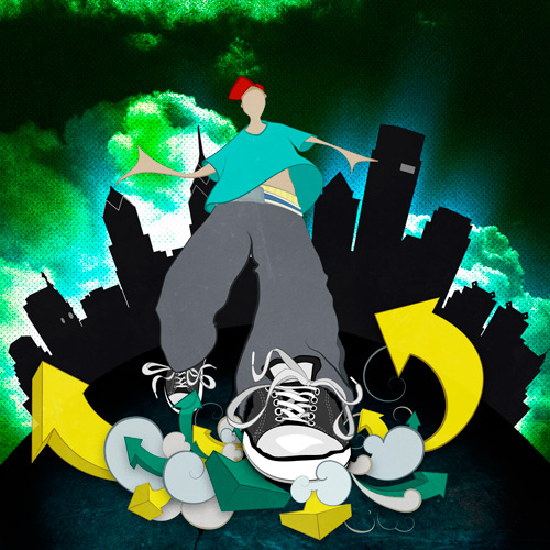
As we go through constructing this image, I encourage you to experiment with the skills you learn, applying them to your own style.
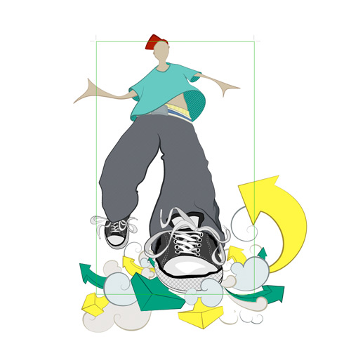
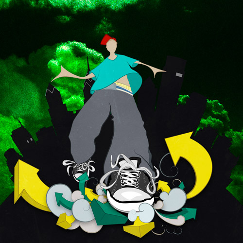
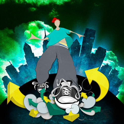
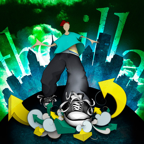
Final Preview
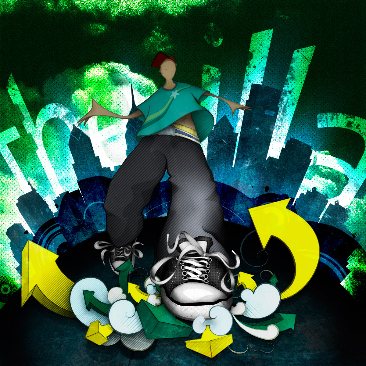
Illustration: Final
As we go through constructing this image, I encourage you to experiment with the skills you learn, applying them to your own style.
Part I, Illustrator: Lines And Flats
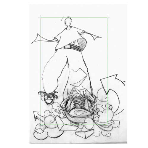
Pencils Sharp! We Start With the Sketch.
Though a short one, this step is without a doubt the most important in this tutorial. With a strong sketch and concept, you have a much better chance of producing a first-rate result! That said, let’s begin fleshing out the rough details of our illustration.
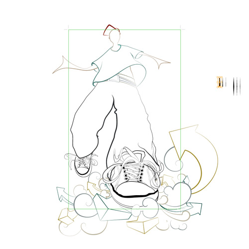
Converting Your Sketch to Lines
You can use Illustrator’s LiveTrace Tool; or, as I’ve done, begin tracing out the line work yourself with the pen tool. I favor the latter because it gives me more control of individual pieces of line work and color blocks going forward.
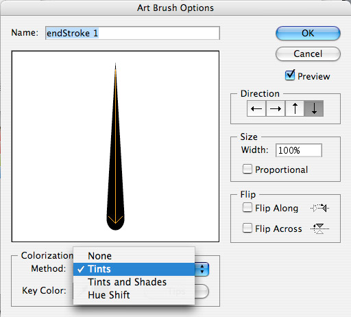
Once your line work is in place, make some custom brushes by doing the following:
Method 1 Scan in your own brush strokes using ink, markers, crayons or – you guessed it – paint brushes. Adjust the levels as described in the LiveTrace Tool link.
Select your new brush shape. In the brush panel, select the option Create New Brush…, select Art Brush, select Tints in the method drop-down, and make sure the direction of the arrow is correct.
Method 2 Alternatively, you could create some simple shapes as brushes if you want to maintain a smooth vector, as shown here. Once you have created your shape, simply follow the steps above. I prefer to make a number of brushes of varying widths so that I can quickly and easily apply them to my line work.
Method 3 A final option is to explore Illustrator’s Brush Library through the Brushes Panel or check some online resources to see if one is available that suits your needs!
Fill in Your Flats
Select each of our shapes, and begin applying your stroke and flat colors to them. Try to select colors you’re satisfied with, but don’t sweat it too much because we can modify them later.
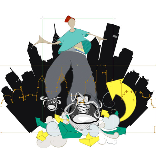
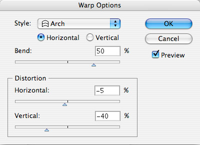
Now bring in our background, in this case, the Philadelphia skyline (my city of residence and the birthplace of modern graffiti). As you did with the character sketch, trace the skyline shape and choose its fill. Leave the stroke empty because we don’t want it for the skyline. Finally, apply a Warp Effect, with Arch settings as follows:
Bringing Your Vector Work into Photoshop
As long as you’ve done a good job of organizing your shapes and layers into folders, this will be a relatively painless process.
Open a new file in Photoshop that is 1200 by 1200 pixels and 72 DPI. Grab all of your artwork in Illustrator and copy and paste it in Photoshop. When the paste options appear, select Smart Object (make sure the ratios are 100% each). Now, grab your main elements in Illustrator, copying and pasting each in Photoshop using the rules covered above. Line them up to match your underlying artwork, and once everything is in place, delete the original master file.
We go through these pains so that we can easily update all of our elements, whether the flats or the line weight, or even if we want to add new elements, as I have done with the yellow arrow on the left, which balances the image.
Part II, Photoshop: The Environment
I knew the vibe I was going for with this illustration when I initially sketched out the character. But aside from the skyline, the rest of the background has to be fully thought out. So we’ll tackle this first to bring it in line with our character.
Note: When working on the layers, I apply each new layer as a clipping mask (Alt + Left-click between the two layers), so that the layer applies only to the element I’m working on at the time.
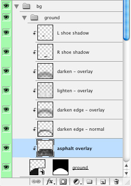
First, the Sky.
Let’s make the background fill #081104. Now, download some large cloud images or create your own clouds. For my purposes, I took a cloud image and added a noise filter with the following settings:
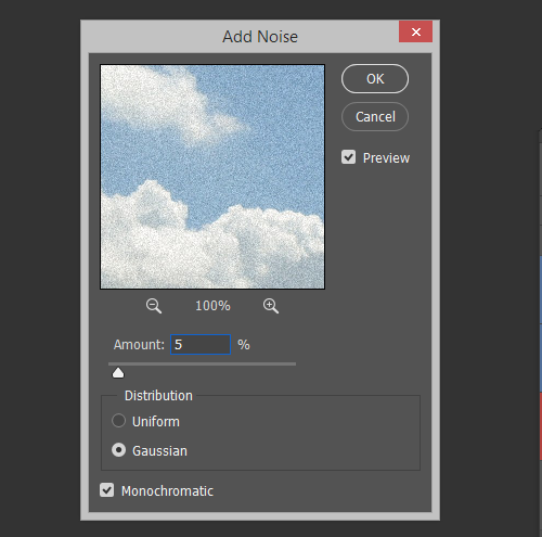
In this first cloud image, I switched the Blend Mode to Vivid Light to get some interesting highlights, but it wasn’t quite enough. So I added a second cloud image on top of the first, applied the same noise filter and switched its Blend Mode to Color Dodge.
I don’t want the background to be too light, but I want it to “pop” in the skyline. So let’s add a glow behind the buildings. Command/⌘ + Left-click on your skyline layer to get the shape path, Shift + F6 to bring up the Feather Option; I chose a value of 35px. With White as your Swatch color, press Alt + Backspace to fill it. Change the Blend Mode to Luminosity, and lower the Opacity to 20%. Duplicate this layer and change the Blend Mode to Overlay while increasing the Opacity to 60%.
Choose the Smudge Tool, with a radius of about 100 to 150px and 40% strength, and smudge outward to add some randomness to each layer. Finally, as before, use the Add Noise filter to add in extra grit to maintain the feel.
The final two steps for the sky are simply to add a vignette around the edges with a large black brush: roughly 300-400px, 40% opacity and 40% flow. If it gets too dark, bring down the layer’s opacity. The final top layer for the sky is a spot pattern, which is applied over top with an Overlay Blend Mode.
Next, the Foreground.
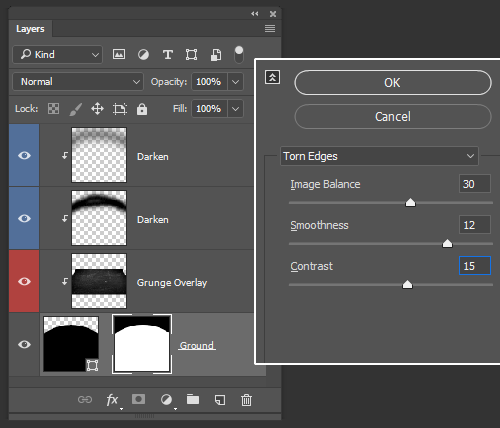
I’m going for a loose depiction of asphalt, so let’s first get rid of the uber-clean vector edge by using the Torn Edges filter on the raster mask with the following settings:
The next step is to select a gravel or asphalt texture and apply it to your foreground; change the Blend Mode to Overlay and lower the Opacity to 50%. Adjust the Contrast Levels, using Image >> Adjustments >> Levels, until you have a texture you’re satisfied with.
Even though this illustration is fairly abstract, I’d like to maintain a loose perspective with my texture through the Free Transform tool (Command/⌘ + T), skewing the perspective to get a rough match.
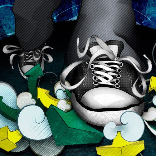
Next, take a large brush with a black swatch color, around 250px, with the same opacity and flow settings as before. Add some deep shadow along the edges to frame the character’s feet. Switch the Swatch Color to White and add a highlight where the feet are; change the layer’s Blend Mode to Overlay, and adjust the layer opacity until you are satisfied with the output. Be liberal with the number of layers and variety of Blend Modes you use to get deep, rich shadows and highlights.
Finally, add two deep shadows under the feet to ground the character to your newly finished foreground!
Adding Interest to the Skyline.
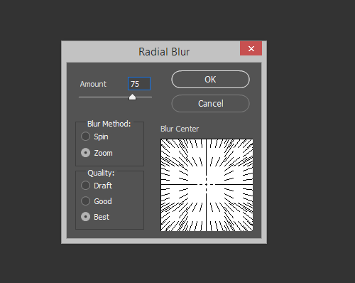
We want to make the skyline pop out of the foreground more while maintaining the high level of detail we see coming out. The first step is to add a glow to the center, originating where the foreground and skyline meet. To do this, select the Brush tool, with a White Swatch Color, 40 to 60px large, set to Dissolve mode. Make a couple of strokes, following the curve of the foreground. Now, select the Radial Blur filter and apply the following settings:
Create another layer, and bump the size of your Dissolve Brush up to about 100px. Paint circularly out from the center to give an extra grain glow; adjust the layer opacity if it is too intense.
Next, we’ll add a rising sun layer to the skyline by creating a vertically oriented vector rectangle, duplicated a dozen times horizontally in a row. Space them out evenly by selecting all of your layers and using your Distribute tool (or Layers >> Distribute >> Horizontal Centers). Press Command/⌘+T to Free Transform, hold Command/⌘ on the bottom-left anchor, and begin to drag it in while also holding Alt + Shift to skew the end points evenly. Make each book-end rectangle match the angle of the skyline’s end buildings. Set the Blend Mode to Overlay and the Opacity to 20%.
Finally, select another grunge texture (in my case, a blue brushed metal), and set the Blend Mode to Overlay, over top all of the other layers.
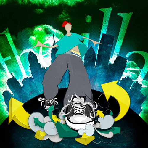
The Final Background Layer: the Text.
First step: figure out what word or phrase you want. Mine is an homage to the Philadelphia hip hop group The Roots (“the illa” refers to the Illadelph Halflife).
Now convert each word to a shape layer.
Starting with “the,” apply a Free Transform (Command/⌘ + T), and skew the perspective until you have an exaggerated angle that fits the illustration. Do the same with the “illa” shape on the other side. Change both layers’ Blend Modes to Overlay, and duplicate each to double the Overlay effects.
Finally, apply a mask to this group’s folder, like this:
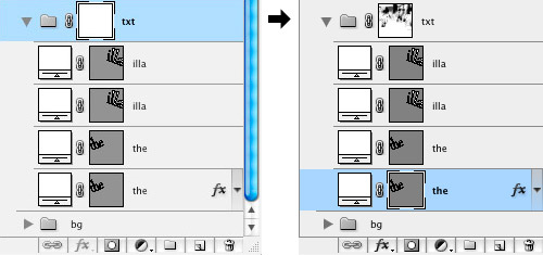
Take your brush tool and, using a variety of grunge and splatter brushes, mask chunks of your text until you have an interesting textured mask that fits your background. Pay special attention to the corners of the text: sharp corners do not generally suit a grungy effect like this.
Part III, Photoshop: The Character
Patterns and Halftones
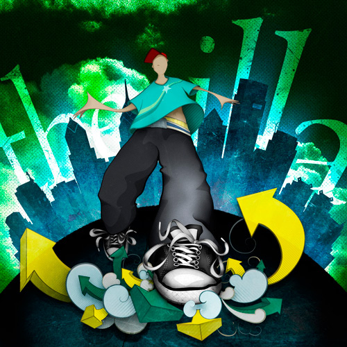
I began adding some hatching to my original sketch, so I will continue that by adding patterns and halftones throughout. In addition to the patterns, I’ve decided to step back into my Smart Object files and add some vector shadow shapes to the legs, shoes and face, as you can see here:
Shadows and Highlights
The next step is to add the shadows and highlights throughout using the Brush tool. Although this process has been condensed into one step, this will undoubtedly be the most time-consuming one in the process. But it is certainly worthwhile because it lends a sense of varied depth and detail that makes the illustration a finished piece. During this process, as mentioned, I tend to use different Blend Modes to create the desired depth; I use Multiply, Color Burn, Overlay, Soft Light and Lighten the most.
Dirt and Grunge Details
First, using our splatter and dirt brushes, let’s add some stains and scratches to the pair of Chucks our character is wearing; after all, there is no such thing as a clean pair of Chucks. Next, we’ll add the asphalt texture from the foreground onto our smoke and arrows layer. Change the texture’s Blend Mode to Overlay and drop the opacity down to 50%. See the shadows and detail pop out?!
The tee-shirt still lacks detail, so let’s switch back to that Smart Object layer and add a design to it.
Finally, the last step is something I do quite often and which, depending on how accurately you have followed your original sketch, you may want to pick up as well. And that is simply to take the original sketch, line it up with the illustration and lay it over the whole thing. Change the Blend Mode to Color Burn, drop the opacity to 15%, and you’re done!
Conclusion
Here are some useful links and resources, some of which we referred to throughout the article. This same sketch could have gone in any number of exciting directions had you followed the tips in these resources, or created your own techniques or relied on happy accidents along the way.
Resources
- Beautiful Photoshop Illustrations By Artists Around The World
- Photoshop Techniques And Professional Tutorials
- 40 Excellent Adobe Illustrator Tutorials
- Tribute To Graffiti: 50 Beautiful Street Artworks
- SM: 10 Killer Photoshop Combo Moves (save some time!)
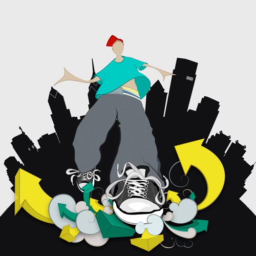
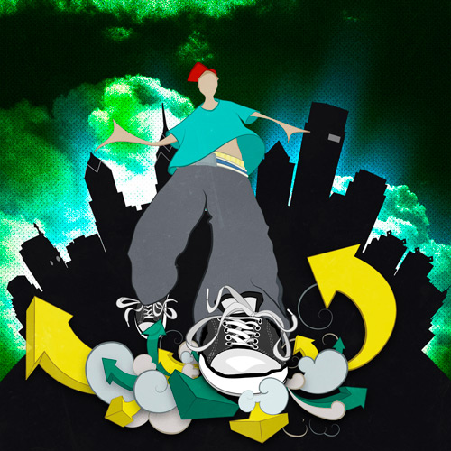
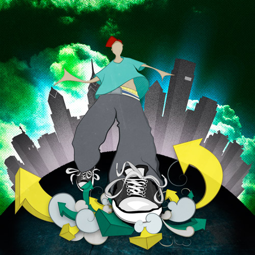
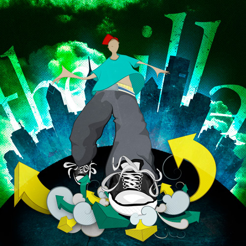
Final Illustration
After some final tweaks and additional layers, here is the final illustration:
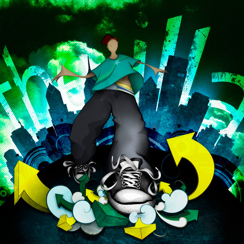
Illustration: Final


