Guide to CSS Font Stacks: Techniques and Resources

Email Newsletter
Weekly tips on front-end & UX.
Trusted by 182,000+ folks.
 Custom Web Forms for Angular, React, & Vue. Your backend.
 Celebrating 10 million developers


CSS Font stacks are one of those things that elude a lot of designers. Many stick to the basic stacks Dreamweaver auto-recommends or go even more basic by just specifying a single web-safe font.
But doing either of those things means you’re missing out on some great typography options. Font stacks can make it possible to show at least some of your visitors your site’s typography exactly the way you intend without showing everyone else a default font. Read on for more information on using and creating effective font stacks with CSS.
You might be interested in the following related posts:
- 16 Pixels: For Body Copy. Anything Less Is A Costly Mistake
- The @Font-Face Rule And Useful Web Font Tricks
- Avoiding Faux Weights And Styles With Google Web Fonts
- Review of Popular Web Font Embedding Services
Creating Your Own Font Stacks
There are a huge variety of font stacks recommended. It seems every designer has their own favorites, what they consider to be the “ultimate” font stack. While there is no definitive font stack out there, there are a few things to keep in mind when using or creating your own stacks.
First of all, make sure you always include a generic font family at the end of your font stacks. This way, if for some strange reason the person visiting your site has virtually no fonts installed, at least they won’t end up looking at everything in Courier New. Second, there’s a basic formula to creating a good font stack: ‘Preferred Font’, ‘Next best thing’, ‘Something common and sorta close’, ‘Similar Web-safe’, ‘Generic font’. There’s nothing wrong with having more than one font for any of those, but try to keep your font stack reasonably short (six to ten fonts is a pretty good maximum number).
Third, make sure you pay attention to the scale of the fonts in your stack. One common thing I see in font stacks is the inclusion of Verdana and Arial or Helvetica in the same stack. Verdana is a very wide font; Arial is relatively narrow. In effect, this can make your site’s typography appear very differently to different visitors. The same goes for Times New Roman (narrow) and Georgia (wide). Considering both Arial/Helvetica and Verdana are considered web-safe (same goes for Times/Times New Roman and Georgia), it doesn’t make much sense to include both.
Common Font Stacks
A lot of designers out there have taken a crack at creating ideal font stacks. While I have yet to see an “ultimate” font stack, there are plenty of really great ones out there to choose from if you don’t want to take the time create your own custom stacks. Here are some of the good ones we’ve seen.
Better CSS Font Stacks
Unit Interactive published an article last summer with a collection of “better” CSS font stacks. The list is extensive, with font stacks that should satisfy just about anyone. Fonts are listed out according to whether they’re appropriate for headlines or body content.
Here are some listed for body text:
- Baskerville, ‘Times New Roman’, Times, serif
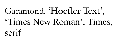
- Garamond, ‘Hoefler Text’, ‘Times New Roman’, Times, serif
- Geneva, ‘Lucida Sans’, ‘Lucida Grande’, ‘Lucida Sans Unicode’, Verdana, sans-serif
- GillSans, Calibri, Trebuchet, sans-serif
For headlines:
- Georgia, Times, ‘Times New Roman’, serif
- Palatino, ‘Palatino Linotype’, ‘Hoefler Text’, Times, ‘Times New Roman’, serif
- Tahoma, Verdana, Geneva
- Trebuchet, Tahoma, Arial, sans-serif

And a few that are balanced for either body or headline text:
- Impact, Haettenschweiler, ‘Arial Narrow Bold’, sans-serif
- Cambria, Georgia, Times, ‘Times New Roman’, serif
- ‘Copperplate Light’, ‘Copperplate Gothic Light’, serif
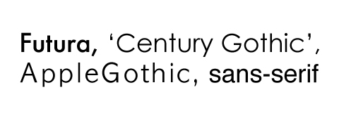
- Futura, ‘Century Gothic’, AppleGothic, sans-serif
8 Definitive Web Font Stacks
This article from Sitepoint written by Michael Tuck lists eight font stacks that are supposed to be the ultimate stacks for any application. It’s based on a basic formula of: ‘exact font’, ‘nearest alternative’, ‘platform-wide alternative(s)’, ‘universal (cross-platform) choice(s)’, generic. My biggest issues with some of these font stacks is their length; is it really necessary to include 17 different fonts in a single font stack? I don’t think so…
The font stacks:
- The Times New Roman-based serif stack: Cambria, ‘Hoefler Text’, Utopia, ‘Liberation Serif’, ‘Nimbus Roman No9 L Regular’, Times, ‘Times New Roman’, serif
- A Modern Georgia-based serif stack: Constantia, ‘Lucida Bright’, Lucidabright, ‘Lucida Serif’, Lucida, ‘DejaVu Serif’, ‘Bitstream Vera Serif’, ‘Liberation Serif’, Georgia, serif
- A more traditional Garamond-based serif stack: ‘Palatino Linotype’, Palatino, Palladio, ‘URW Palladio L’, ‘Book Antiqua’, Baskerville, ‘Bookman Old Style’, ‘Bitstream Charter’, ‘Nimbus Roman No9 L’, Garamond, ‘Apple Garamond’, ‘ITC Garamond Narrow’, ‘New Century Schoolbook’, ‘Century Schoolbook’, ‘Century Schoolbook L’, Georgia, serif
- The Helvetica/Arial-based sans serif stack: Frutiger, ‘Frutiger Linotype’, Univers, Calibri, ‘Gill Sans’, ‘Gill Sans MT’, ‘Myriad Pro’, Myriad, ‘DejaVu Sans Condensed’, ‘Liberation Sans’, ‘Nimbus Sans L’, Tahoma, Geneva, ‘Helvetica Neue’, Helvetica, Arial, sans-serif
- The Verdana-based sans serif stack: Corbel, ‘Lucida Grande’, ‘Lucida Sans Unicode’, ‘DejaVu Sans’, ‘Bitstream Vera Sans’, ‘Liberation Sans’, Verdana, ‘Verdana Ref’, sans-serif
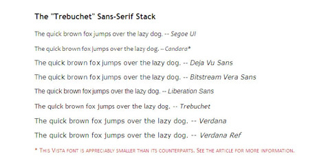
- The Trebuchet-based sans serif stack: ‘Segoe UI’, Candara, ‘Bitstream Vera Sans’, ‘DejaVu Sans’, ‘Bitsream Vera Sans’, ‘Trebuchet MS’, Verdana, ‘Verdana Ref’, sans-serif
- The heavier “Impact” sans serif stack: Impact, Haettenschweiler, ‘Franklin Gothic Bold’, Charcoal, ‘Helvetica Inserat’, ‘Bitstream Vera Sans Bold’, ‘Arial Black’, sans-serif
- The Monospace stack: Consolas, ‘Andale Mono WT’, ‘Andale Mono’, ‘Lucida Console’, ‘Lucida Sans Typewriter’, ‘DejaVu Sans Mono’, ‘Bitstream Vera Sans Mono’, ‘Liberation Mono’, ‘Nimbus Mono L’, Monaco, ‘Courier New’, Courier, monospace
The Myth of ‘Web-Safe’ Fonts
The Myth of ‘Web-Safe’ Fonts from Safalra.com offers up five simple, straightforward font stacks for web typography. These stacks are pretty bare-bones as far as most recommended font stacks go, but they’re perfectly adequate for many applications, as well as being a good starting point for building your own stacks.
- The ‘wide’ sans serif stack: Verdana, Geneva, sans-serif
- The ‘narrow’ sans serif stack: Tahoma, Arial, Helvetica, sans-serif
- The ‘wide” serif stack: Georgia, Utopia, Palatino, ‘Palatino Linotype’, serif
- The ‘narrow’ serif stack: ‘Times New Roman’, Times, serif
- The monospace stack: ‘Courier New’, Courier, monospace

Tools
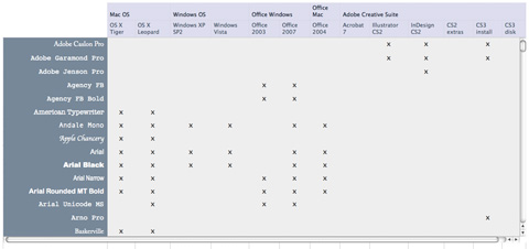
Font Matrix
Font Matrix is a font comparison tool that lists fonts bundled with Windows XP, Windows Vista, Mac OS X Tiger, Mac OS X Leopard, Microsoft Office (2003, 2007 and 2004 for Mac) and the Adobe Creative Suite. The chart shows which software bundles and operating systems come with which fonts, so you can get a good idea of how common a particular font might be. This is an incredibly valuable tool for those looking to create their own custom font stacks.
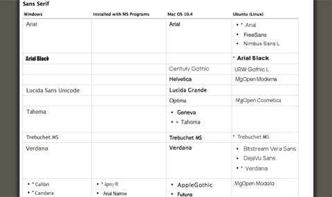
Complete Guide to Pre-Installed Fonts in Linux, Mac and Windows
Here’s another chart that shows the fonts commonly installed on Linux, Mac and Windows machines, grouped together by family and similarity. It’s another really valuable tool for font stack creators.
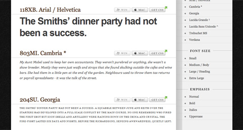
Typechart
Typechart shows you web-safe and common fonts and suggests different sizes and styles for headings, paragraphs, and other typographic elements. There are a ton of different browsing options, and you can preview the way fonts will look on both Windows and Mac machines before downloading the CSS. The only drawback to Typechart is that it only includes a handful of fonts: Arial/Helvetica, Cambria, Georgia, Lucida Grande, Lucida Sans Unicode, Trebuchet MS, and Verdana.
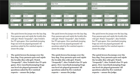
Typetester
Typetester lets you try out up to three fonts side-by-side. This can be a great way to test font stacks to see what the differences will be as the stacks degrade. You can use any font on your system, though it does categorize fonts by web safe, Windows default, and Mac default, making it easier to create stacks without other reference materials.
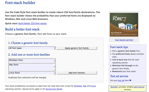
Font Stack Builder
Code Style offers the Font Stack Builder for creating font stacks based on font family, and whether the fonts are generally installed on Windows, Mac or Linux machines. You can add as many fonts as you want and it will show you a grid with how common those fonts are on different kinds of machines.
Articles
There are hundreds of articles out there about font stacks. Some have been mentioned above, but there are plenty of others that deserve some recognition. Here are a few:
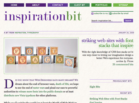
Striking Web Sites with Font Stacks that Inspire This article covers twenty different websites with excellent font stacks. Basic web-safe and common fonts are covered along with more creative font stacks. It’s a great resource for getting some inspiration before creating your own stacks.
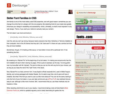
Better Font Families in CSS This article from Devlounge gives a very brief overview of the author’s favored font stacks, as well as a few tips for creating your own stacks.
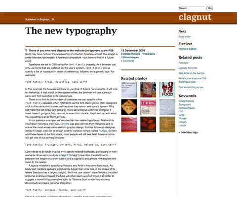
The New Typography This article gives a great overview of creating font stacks and good web typography. There are plenty of tips mentioned, including which fonts to avoid using in the same font stacks and why.
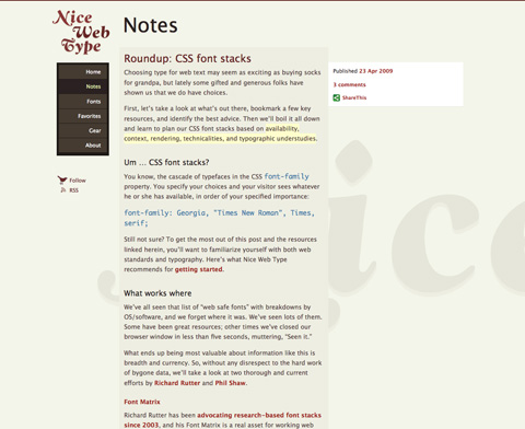
Roundup: CSS Font Stacks This article is a great introduction to CSS font stacks and how to use them effectively. It includes some tools, tips, and other information about creating your own font stacks or choosing which ones to use.
Excellent Font Stack Examples
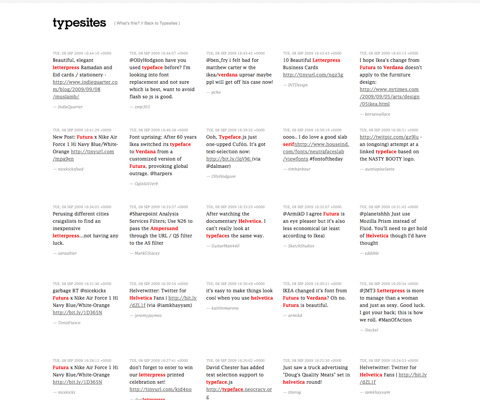
Here’s a handful of sites that have excellent font stacks and great typography in general. You can find more examples at Typesites.
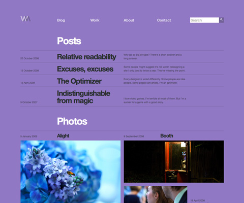
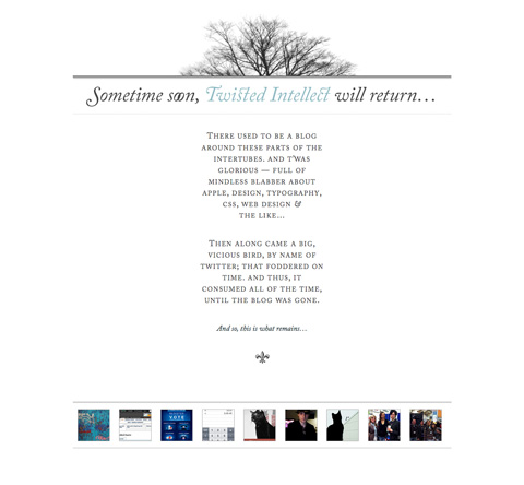
Font stack: “Helvetica Neue”, Helvetica, Arial, sans-serif
Font stack: “Lucida Fax”, Georgia, Helvetica, Arial, sans-serif
Font stack: Baskerville, Palatino, ‘Palatino Linotype’, Georgia, Serif
Font stack: “Lucida Grande”, Geneva, Helvetica, sans-serif (used for some of the headings and meta information)
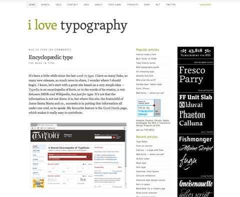
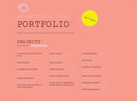
Font stack: “Adobe Caslon Pro”, “Hoefler Text”, Georgia, Garamond, Times, serif (pretty nice stack for what is primarily a holding page!)
Font stack: “Courier new”, Courier, “Andale Mono”
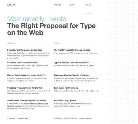
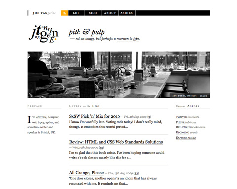
Font stack: Gotham, “Helvetica Neue”, Helvetica, Arial, sans-serif;

Font stack: Arial, sans-serif
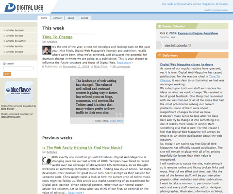
Font stack: “Lucida Grande”, Tahoma, Verdana, sans-serif
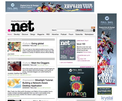
Font stack: Helvetica, Arial, sans-serif
Font stack:“Arial black”, arial, sans-serif
Font stack:Arial, Helvetica, sans-serif
Font stack: Arial, “Helvetica Neue”, Helvetica, sans-serif
Font stack:“Myriad Pro”, Helvetica, Arial, sans-serif
Font stack: “Lucida Grande”, Arial, Verdana, Helvetica, sans-serif
Font stack: Georgia, “Times New Roman”, Times, serif


