Smashing Magazine - we smash you with the information that will make your life easier. really.
10 Useful Usability Findings and Guidelines
Everyone would agree that usability is an important aspect of Web design. Whether you’re working on a portfolio website, online store or Web app, making your pages easy and enjoyable for your visitors to use is key. Many studies have been done over the years on various aspects of Web and interface design, and the findings are valuable in helping us improve our work. Here are 10 useful usability findings and guidelines that may help you improve the user experience on your websites.
1. Form Labels Work Best Above The Field
A study by UX Matters found that the ideal position for labels in forms is above the fields. On many forms, labels are put to the left of the fields, creating a two-column layout; while this looks good, it’s not the easiest layout to use. Why is that? Because forms are generally vertically oriented; i.e. users fill the form from top to bottom. Users scan the form downwards as they go along. And following the label to the field below is easier than finding the field to the right of the label.

Tumblr features a simple and elegant sign-up form that adheres to UX Matter’s recommendation.
Positioning labels on the left also poses another problem: do you left-align or right-align the labels? Left-aligning makes the form scannable but disconnects the labels from the fields, making it difficult to see which label applies to which field. Right-aligning does the reverses: it makes for a good-looking but less scannable form. Labels above fields work best in most circumstances. The study also found that labels should not be bold, although this recommendation is not conclusive.
2. Users Focus On Faces
People instinctively notice other people right away when they come into view. On Web pages, we tend to focus on people’s faces and eyes, which gives marketers a good technique for attracting attention. But our attraction to people’s faces and eyes is only the beginning; it turns out we actually glance in the direction the person in the image is looking in.

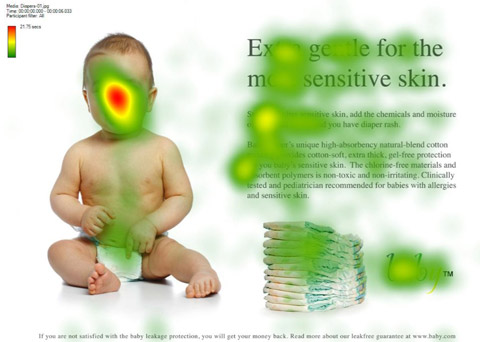
Eye-tracking heat map of a baby looking directly at us, from the UsableWorld study.

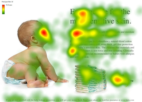
And now the baby is looking at the content. Notice the increase in people looking at the headline and text.
Here’s an eye-tracking study that demonstrates this. We’re instinctively drawn to faces, but if that face is looking somewhere other than at us, we’ll also look in that direction. Take advantage of this phenomenon by drawing your users’ attention to the most important parts of your page or ad.
3. Quality Of Design Is An Indicator Of Credibility
Various studies have been conducted to find out just what influences people’s perception of a website’s credibility:
- Stanford-Makovsy Web Credibility Study 2002: Investigating What Makes Web Sites Credible Today
- What Makes A Web Site Credible? A Report on a Large Quantitative Study
- The Elements of Computer Credibility
- Elements that Affect Web Credibility: Early Results from a Self-Report Study (Proceedings of ACM CHI 2000 Conference on Human Factors in Computing Systems, v.2, New York: ACM Press)

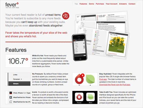
We don’t know if Fever app is any good, but the sleek user interface and website make a great first impression.
One interesting finding of these studies is that users really do judge a book by its cover… or rather, a website by its design. Elements such as layout, consistency, typography, color and style all affect how users perceive your website and what kind of image you project. Your website should project not only a good image but also the right one for your audience.
Other factors that influence credibility are: the quality of the website’s content, amount of errors, rate of updates, ease of use and trustworthiness of authors.
4. Most Users Do Not Scroll
Jakob Nielsen’s study on how much users scroll (in Prioritizing Web Usability) revealed that only 23% of visitors scroll on their first visit to a website. This means that 77% of visitors won’t scroll; they’ll just view the content above the fold (i.e. the area of the page that is visible on the screen without scrolling down). What’s more, the percentage of users who scroll decreases with subsequent visits, with only 16% scrolling on their second visit. This data highlights just how important it is to place your key content on a prominent position, especially on landing pages.
This doesn’t mean you should cram everything in the upper area of the page, just that you should make the best use of that area. Crowding it with content will just make the content inaccessible; when the user sees too much information, they don’t know where to begin looking.

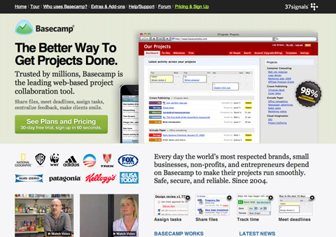
Basecamp makes great use of space. Above the fold (768 pixels high), it shows a large screenshot, tagline, value proposition, call to action, client list, videos and short feature list with images.
This is most important for the home page, where most new visitors will land. So provide the core essentials there:
- Name of the website,
- Value proposition of the website (i.e. what benefit users will get from using it),
- Navigation for the main sections of the website that are relevant to the user.
However, users’ habits have significantly changed since then. Recent studies prove that users are quite comfortable with scrolling and in some situations they are willing to scroll to the bottom of the page. Many users are more comfortable with scrolling than with a pagination, and for many users the most important information of the page isn’t necessarily placed “above the fold” (which is because of the variety of available display resolutions a quite outdated, deprecated term). So it is a good idea to divide your layout into sections for easy scanning, separating them with a lot of white space.
For further information please take a look at the articles Unfolding the fold (Clicktale), Paging VS Scrolling (Wichita University – SURL), Blasting the Myth of the Fold (Boxes and Arrows). (thanks, Fred Leuck).
5. Blue Is The Best Color For Links
While giving your website a unique design is great, when it comes to usability, doing what everyone else is doing is best. Follow conventions, because when people visit a new website, the first place they look for things are in the places where they found them on most other websites; they tap into their experience to make sense of this new content. This is known as usage patterns. People expect certain things to be the same, such as link colors, the location of the website’s logo, the behavior of tabbed navigation and so on.

Google keeps all links on its websites blue for a reason: the color is familiar to most users, which makes it easy to locate.
What color should your links be? The first consideration is contrast: links have to be dark (or light) enough to contrast with the background color. Secondly, they should stand out from the color of the rest of the text; so, no black links with black text. And finally, research shows (Van Schaik and Ling) that if usability if your priority, sticking to blue for links is best. The browser’s default link color is blue, so people expect it. Choosing a different color is by no means a problem, but it may affect the speed with which users find it.
6. The Ideal Search Box Is 27-Characters Wide
What’s the ideal width of a search box? Is there such a thing? Jakob Nielsen performed a usability study on the length of search queries in website search boxes (Prioritizing Web Usability). It turns out that most of today’s search boxes are too short. The problem with short boxes is that even though you can type out a long query, only a portion of the text will be visible at a time, making it difficult to review or edit what you’ve typed.
The study found that the average search box is 18-characters wide. The data showed that 27% of queries were too long to fit into it. Extending the box to 27 characters would accommodate 90% of queries. Remember, you can set widths using ems, not just pixels and points. One em is the width and height of one “m” character (using whatever font size a website is set to). So, use this measure to scale the width of the text input field to 27-characters wide.

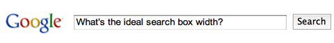
Google’s search box is wide enough to accommodate long sentences.

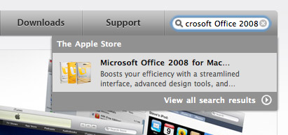
Apple’s search box is a little too short, cutting off the query, “Microsoft Office 2008.”
In general, search boxes are better too wide than too short, so that users can quickly review, verify and submit the query. This guideline is very simple but unfortunately too often dismissed or ignored. Some padding in the input field can also improve the design and user experience.
7. White Space Improves Comprehension
Most designers know the value of white space, which is the empty space between paragraphs, pictures, buttons and other items on the page. White space de-clutters a page by giving items room to breathe. We can also group items together by decreasing the space between them and increasing the space between them and other items on the page. This is important for showing relationships between items (e.g. showing that this button applies to this set of items) and building a hierarchy of elements on the page.

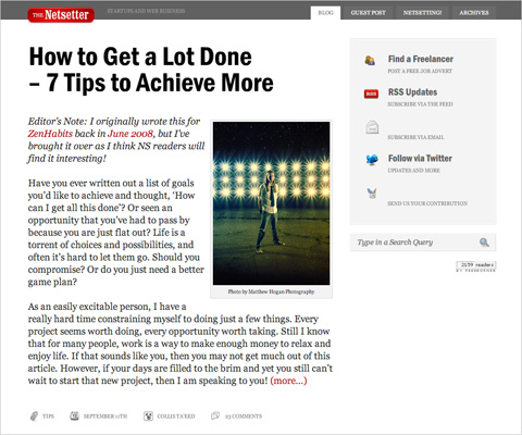
Notice the big content margin, padding and paragraph spacing on The Netsetter. All that space makes the content easy and comfortable to read.
White space also makes content more readable. A study (Lin, 2004) found that good use of white space between paragraphs and in the left and right margins increases comprehension by almost 20%. Readers find it easier to focus on and process generously spaced content.
In fact, according to Chaperro, Shaikh and Baker, the layout on a Web page (including white space, headers, indentation and figures) may not measurably influence performance but does influence user satisfaction and experience.
8. Effective User Testing Doesn’t Have To Be Extensive
Jakob Nielsen’s study on the ideal number of test subjects in usability tests found that tests with just five users would reveal about 85% of all problems with your website, whereas 15 users would find pretty much all problems.

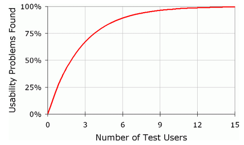
Source: Jakob Nielsen’s AlertBox
The biggest issues are usually discovered by the first one or two users, and the following testers confirm these issues and discover the remaining minor issues. Only two test users would likely find half the problems on your website. This means that testing doesn’t have to be extensive or expensive to yield good results. The biggest gains are achieved when going from 0 test users to 1, so don’t be afraid of doing too little: any testing is better than none.
9. Informative Product Pages Help You Stand Out
If your website has product pages, people shopping online will definitely look through them. But many product pages lack sufficient information, even for visitors doing a quick scan. This is a serious problem, because product information helps people make purchasing decision. Research shows that poor product information accounts for around 8% of usability problems and even 10% of user failure (i.e. the user gives up and leaves the website) (Prioritizing Web Usability).

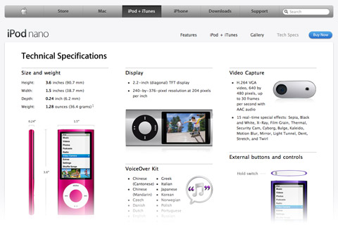
Apple provides separate “Tech Specs” pages for its products, which keeps complicated details away from the simpler marketing pages, yet provides easy access when they’re needed.
Provide detailed information about your products, but don’t fall into the trap of bombarding users with too much text. Make the information easy to digest. Make the page scannable by breaking up the text into smaller segments and using plenty of sub-headings. Add plenty of images for your products, and use the right language: don’t use jargon that your visitors might not understand.
10. Most Users Are Blind To Advertising
Jakob Nielsen reports in his AlertBox entry that most users are essentially blind to ad banners. If they’re looking for a snippet of information on a page or are engrossed in content, they won’t be distracted by the ads on the side.
The implication of this is not only that users will avoid ads but that they’ll avoid anything that looks like an ad, even if it’s not an ad. Some heavily styled navigation items may look like banners, so be careful with these elements.

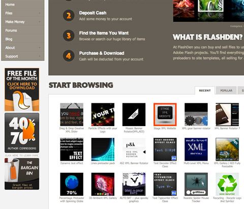
The square banners on the left sidebar of FlashDen are actually not ads: they’re content links. They do look uncomfortably close to ad banners and so may be overlooked by some users.
That said, ads that look like content will get people looking and clicking. This may generate more ad revenue but comes at the cost of your users’ trust, as they click on things they thought were genuine content. Before you go down that path, consider the trade-off: short-term revenue versus long-term trust.
Bonus: Findings From Our Case-Studies
In recent years, Smashing Magazine’s editorial team has conducted a number of case studies in an attempt to identify common design solutions and practices. So far, we have analyzed Web forms, blogs, typography and portfolios; and more case studies will be published next month. We have found some interesting patterns that could serve as guidelines for your next design.
Here, we’ll review some of the practices and design patterns that we discovered in our case studies in this brief, compact overview, for your convenience.
According to our typography study:
- Line height (in pixels) ÷ body copy font size (in pixels) = 1.48
1.5 is commonly recommended in classic typographic books, so our study backs up this rule of thumb. Very few websites use anything less than this. And the number of websites that go over 1.48 decreases as you get further from this value. - Line length (pixels) ÷ line height (pixels) = 27.8
The average line length is 538.64 pixels (excluding margins and padding), which is pretty large considering that many websites still have body copy that is 12 to 13 pixels in font size. - Space between paragraphs (pixels) ÷ line height (pixels) = 0.754
It turns out that paragraph spacing (i.e. the space between the last line of one paragraph and the first line of the next) rarely equals the leading (which would be the main characteristic of perfect vertical rhythm). More often, paragraph spacing is just 75% of paragraph leading. The reason may be that leading usually includes the space taken up by descenders; and because most characters do not have descenders, additional white space is created under the line. - Optimal number of characters per line is 55 to 75
According to classic typographic books, the optimal number of characters per line is between 55 and 75, but between 75 and 85 characters per line is more popular in practice.
According to our blog design study:
- Layouts usually have a fixed width (pixel-based) (92%) and are usually centered (94%). The width of fixed layouts varies between 951 and 1000 pixels (56%).
- The home page shows excerpts of 10 to 20 posts (62%).
- 58% of a website’s overall layout is used to display the main content.
According to our Web form design study:
- The registration link is titled “sign up” (40%) and is placed in the upper-right corner.
- Sign-up forms have simple layouts, to avoid distracting users (61%).
- Titles of input fields are bolded (62%), and fields are vertically arranged more than they are horizontally arranged (86%).
- Designers tend to include few mandatory fields and few optional fields.
- Email confirmation is not given (82%), but password confirmation is (72%).
- The “Submit” button is either left-aligned (56%) or centered (26%).
According to our portfolio design study:
- 89% of layouts are horizontally centered, and most of them have a large horizontal navigation menu.
- 47.2% of portfolios have a client page, and 67.2% have some form of standalone services page.
- 63.6% have a detailed page for every project, including case studies, testimonials, slideshows with screenshots, drafts and sketches.
- Contact pages contain driving directions, phone number, email address, postal address, vCard and online form,
Other Resources
- 15 Valuable Usability PDFs You’ve Never Heard Of
- 15 Important Research Findings You Should Know
- 10 Additional Research Findings You Should Know
- Introduction To Good Usability
- 11 Striking Findings From an Eye-Tracking Study
- 25 Incredibly Useful Usability Cheat Sheets And Checklists
- 10 Usability Findings To Increase Sales And Customer Loyalty
- Web form design guidelines: an eye-tracking study
Have any thoughts on what we’ve covered, or know of other useful usability findings? Please leave a comment below. (al)
Dmitry Fadeyev is the founder of the Usability Post blog, where you can read his thoughts on good design and usability.
- 175 Comments
- 1
- 2
September 24th, 2009 12:29 amReally nice article and very useful, some of the ideas I will look into and implement
Cheers SM
- 3
September 24th, 2009 12:31 amJust great post and very useful.
One quetsion:
Since most users don´t scroll I wonder why there aren´t more liquid layouts…Best regards
- 4
September 24th, 2009 12:35 amNothing really new, but still really interesting !
Always useful to remember those usability guidelines. Thank you for the article !
- 5
September 24th, 2009 12:58 amreally helpful…thank u guys
- 6
September 24th, 2009 12:59 amQuality article, really useful thanx alot will deffo bookmark!!
- 7
September 24th, 2009 1:15 amThe UX matters article Label Placement in Forms is from 2006. Isn’t there another updated study?
- 8
September 24th, 2009 1:18 amFound this when *everyone* was twittering about it :)
Nice article. I like the Bonus part where you’ve shown how to apply real numbers to UI design – I find those sort of things really help to justify why you’ve picked the layout you have. It stops it looking like a consultant’s personal opinion…it’s a formula to follow that will be apparent on successful sites too – great :) I shall add that to my notes ….
- 9
September 24th, 2009 1:20 amHoly shit this is helpfull! I’ll sure bookmark this and use it as reference.
- 10
September 24th, 2009 1:23 amGreat article. Thanks.
- 11
September 24th, 2009 1:23 amThanks for this! It’s very well written and comprehensive, I’m a regular reader of alertbox but there is too much content there for me to recommend others to read it all. These are quick tips I can send to people I work with, just scanning down the page and reading the titles is informative!
Usability is easy when you put it like that :)
- 12
September 24th, 2009 1:23 amThis is a very useful post. Everyone in web design should definitely take a look.
- 13
September 24th, 2009 1:32 amDmitry, you’re the best. Great content and useful information in your articles!
- 14
September 24th, 2009 1:36 amHmm 77% of users dotn scroll is from research published in 2000..!!!
habits have changed, also the example shown has a clear line accross the page where the fold woudl occur, if you want your users to scroll you need to provide visual (i.e. vertical) prompts that more content lies further down so text / images that spans the ‘fold’ or other graphical cues.
I’ve wathced many eyetracking sessions and more often than not users do scroll.
otherwise a great post
- 15
September 24th, 2009 1:45 amNice overview of some really important findings and guidelines. Concerning the studies: it can be dangerous to take every result for granted from a study.Nice article though!
- 16
September 24th, 2009 1:46 amNeatly said… thanks
- 17
September 24th, 2009 1:49 amHmmm, good article, but compare the first item (Form Labels Work Best…) on a long form (15 – 20+ items) with Users Do Not Scroll :-s
Still, a darn good read :-)
- 18
September 24th, 2009 1:52 amGreat! This is really helpful for the develop of my own site. So I’ve a lot to do.. In my test page i’m trying to apply your suggestions…
- 19
September 24th, 2009 2:11 amThe thinking represented here about scrolling and the fold is a bit outdated and somewhat misleading.
The data shows that users will readily scroll, and that rather than getting hung up on the idea of a fold (which in any case will vary widely according to the user), designers should concentrate on producing a clear hierarchy of information supported by a usable and logical navigation.
The term ‘fold’ is a throwback to newspaper layout – and we all know where they’re heading.
- 20
September 24th, 2009 2:16 amThank you for this useful article
“Most Users Do Not Scroll” ???
Nowadays, it’s not absolutely true !! Recent studies show just the opposite…
Check these: Unfolding the fold (Clicktale), Paging VS Scrolling (Wichita University – SURL), Blasting the Myth of the Fold (Boxes and Arrows) - 21
September 24th, 2009 2:18 amI see interesting trend of reinventing the “hot water” from some time. The best practices are already written in the books (concerning typography) and yet web designers tend to:
1. Completely ignore them, if ever read them
2. Reinvent them – slowly and painfullyI think it is time for web design to be taken much more serious by users, developers and designers. This is not the simple HTML that was 10 years ago.
- 22
September 24th, 2009 2:20 amVery cool article, but I agree with Fred and John. Users do scroll. When publishing usability testing, especially as related to technology, I think the cut-off needs to be 3 years or so before it’s no longer relevant. People HATED the iphone keyboard initially, now I seldom read any complaints about it. Point being, people are adapting to technology at an exponential rate.
- 23
September 24th, 2009 2:25 amNice overview on usability findings…. thanks for sharing. Anyway… last link in Other Resources called “Web form design guidelines: an eye-tracking study” leads to “Not found” page.
- 24
September 24th, 2009 2:29 amReally interesting read – i’m thinking about making a simple calculator to do all of the math mentioned above.
- 25
September 24th, 2009 2:45 amUseful! Thanks!
- 26
September 24th, 2009 2:51 amI disagree with the blanket statement that most users don’t scroll. I’ve found that users scroll when they want to scroll. Maybe the more accurate statement is most users don’t think they need to scroll.
- 27
September 24th, 2009 2:52 amNo scrolling allowed? Not so true anymore, per Jakob Nielsen’s himself!
http://www.useit.com/alertbox/9712a.html (”changes in web usability since 1994 – and that article dates back 1997 !!)
- 28
September 24th, 2009 2:55 amNice article Dmitry, thanks.
Do you have any links for the two studies you mention under the white space section? (Lin and Chaperro, Shaikh and Baker.) I’d be interested to read them.
- 29
September 24th, 2009 2:56 amBest article for a long time.
- 30
September 24th, 2009 3:03 amI enjoyed this articles very informative!
- 31
September 24th, 2009 3:14 am“Most Users Do Not Scroll”? The majority of the a short poll on the Webstandardblog prefers scrolling, not a pagination. Therefore I can’t share this opinion.
- 32
September 24th, 2009 3:16 amOther than the articles that Fred listed, does anyone know of any stats or findings that can provide info on the fact that all users do scroll now in opposed to the year 2000. It would really help.
Great article!
- 33
September 24th, 2009 3:25 amVery interesting. Thanks alot!
- 34
September 24th, 2009 3:25 am“Most Users Are Blind To Advertising”
I’m working on this with my upcoming fan-tas-tic theme ;)
- 35
September 24th, 2009 3:42 amNice articals!
Thanks alot :) - 36
September 24th, 2009 3:43 amExcellent article, sadly most marketing dept. (in charge of he budget) knows nothing about this and will force unnecessary and wrong changes…
- 37
September 24th, 2009 3:50 amgreat article. Thanks heaps!
- 38
September 24th, 2009 3:52 amA good article! back to basics
- 39
September 24th, 2009 3:53 amthats just priceless, thank you!
- 40
September 24th, 2009 3:56 amnot agree with “Form Labels Work Best Above The Field” this is against accessibility and it can increase page length.
- 41
September 24th, 2009 4:05 amVery usefull, thanks a lot!
- 42
September 24th, 2009 4:16 amGreat article! Have made a mountain of notes to drum into my head now, and alot more to look further into! Thanks SM :) Dugg, stumbled and tweeted!
- 43
September 24th, 2009 4:18 amJared Spool described a “5-second” test for a page with a very focused purpose (not home page), where you show the page for only 5 seconds and then ask the user what they remember. Fascinating.
- 44
September 24th, 2009 4:28 amYour site is great truly useful stuff on it as well like this article.
keep it up - 45
September 24th, 2009 4:39 amYou guys don’t stop do you. Great piece after great piece!!.
- 46
September 24th, 2009 4:43 amGreat list.
We’re currently doing some research on usability testing research it would be great if you could have a look and give some feedback – chance to win $300.
Thanks.
- 47
September 24th, 2009 4:44 amGreat post, very useful!
Thank you! - 48
September 24th, 2009 4:51 amawesome article!
- 49
September 24th, 2009 5:01 amCould anyone tell me that showing a (good!) image of a trainer on his website increases the credibility of this trainer or that it makes no difference.
If someone did some research on this matter, please inform me. I would be very grateful! - 50
September 24th, 2009 5:04 amAs others have already pointed out the information you presented regarding scrolling is outdated. The “studies” that were done regarding form labels are not statistically valid.
I am not saying it’s all bad but I hope no one follows this advice blindly.
- 51
September 24th, 2009 5:10 amAlready knew quite a few, but the baby face example and not scrolling visitors kinda blew me away. Must. Keep. In. Mind..
- 52
September 24th, 2009 5:11 amI simply love this usability article! Great findings. It seems many long time web developers and web masters might have missed these points!. Cant wait to stumbled it!.. :)
- 53
September 24th, 2009 5:16 amBest post in a long time!!!
- 54
September 24th, 2009 5:18 amIf most people don’t scroll, how did everyone here post a comment? I’ve never, not once, seen someone confused by scrolling, no matter how young or old.
- 55
September 24th, 2009 5:31 amVery helpful post. Especially hints about usable forms.
- 56
September 24th, 2009 5:41 amReally need to update the scrolling recommendation. People do scroll, as pointed out in the links in comment 20. Perpetuating that myth that every important thing needs to be above the fold is only going to make designs more cluttered in the long run.
- 57
September 24th, 2009 5:51 amAmazing post! The best I’ve ever seen. Wonder if the smash’s design book (that I already pre-ordered) has this kind of approach…
- 58
September 24th, 2009 5:58 am>> Sean
Totally agree!
I think that “Most Users Don’t Read Comments” could be true :) - 60
September 24th, 2009 6:02 amYes ! Thanks
- 61

- 62
September 24th, 2009 6:37 amVery Good ! But so to be visible, is it necessary to be in top and on the left or top and on the right?
- 63
September 24th, 2009 6:42 amAwesome Article! It was so informative and I will definitely save this info and keep it in mind when designing sites.
- 64
September 24th, 2009 7:00 am@Rocco Darn it! I was kind of excited about the “users don’t scroll” study. Now that I have read the study that you linked to, I don’t know what to believe!
This is like the eggs are good for you vs. Eggs are bad for you debate. Every year or so a new study comes out contradicting the last studies findings.
For now, I will take the authors advice and keep important content above the fold as much as possible.
- 65
September 24th, 2009 7:01 amBefore you follow the guideline about placement of labels in forms, read my article on usabilitynews.com: “Label Placement in Forms”.
And remember that users don’t bail out of forms because they don’t like where the labels are placed – they bail out because they don’t like the questions they are being asked, because they consider the questions are intrusive, or because they don’t know the answers.
best
Caroline Jarrett
Author: “Forms that work: Designing web forms for usability” - 66
September 24th, 2009 7:18 amYes, yes, yes! Great post. Good stuff indeed.
- 67
September 24th, 2009 7:21 amGood article! It’s always nice to see current standards in web usability. I believe users are more willing to scroll now then they were years ago, yet it’s still a good idea to keep your primary content above the fold if at all possible.
- 68
September 24th, 2009 7:35 amYet another excellent resource. All very useful points. I like lists like this as they help designers win battles against managers who don’t have a clue!
- 69
September 24th, 2009 7:55 amIt’s worth noting that ‘the fold’ on 768 is several fewer pixels high than that – around 530 on my netbook (which displays @ 1024). Check out Twitter’s login page, which seemed absurdly small on my high-res workhorse laptop – the design is about 780 x 530 and fits perfectly in my netbook’s Firefox.
Love the eyetracking info. Hilarious that users (humans!) look in the direction the character onscreen is looking!
- 70
September 24th, 2009 8:31 amGreat article! I’m looking forward to sharing it with some others. You could have called it, “Usability for Designers,” and it also works great as a basic-usability-for-beginners article. Very clear, lots of illustrations.
If you are targeting a beginning audience, you might include best practices with the case studies statistics. It won’t help a beginner to know that most sites out there align the submit button to the left or center, but it will help them to know that aligning it to the left has the best usability. (You do this already in your bullet point on the number of characters to have in a line — and, in so doing, show that most sites get it wrong!)
Anyway, great job! Thank you for taking the time to put this together.
- 71
September 24th, 2009 8:33 amVery handy!! thanks!
- 72
September 24th, 2009 8:38 amGreat article, one thing about apple’s search box thou: I think that you picked a wrong website for this part as Apple’s search box has an ‘auto-suggest’. If it was only to show that the box is to small it’s fine.
Just a small point, yet again a great article :)
- 73
September 24th, 2009 8:56 amVery Informative. Thumbs up!
- 74
September 24th, 2009 9:04 amAnyone designing or developing forms should have Luke W’s book:
Web Form Design: Filling in the Blanks
by Luke Wroblewski
Published May, 2008 by Rosenfeld MediaIt clearly walks you through form design, best practices, different options, and the eye tracking studies- all from current studies.
His site also has practical instruction for form design, button placement and other usability considerations: http://www.lukew.com/ff/
- 75
September 24th, 2009 9:06 amOverall a good article, though incorrect about the scrolling.
The baby face looking in a direction is also an impractical novelty act. Is the suggestion to regularly use faces looking at your ads or other important pieces? I would hope not. I know I’d get irritated seeing random faces looking in random directions. - 76
September 24th, 2009 10:09 amAn extremely useful article!
- 77
September 24th, 2009 10:14 amLove the baby eye concept. Just amazing that we can figure these things out.
- 78
September 24th, 2009 10:23 amThanks for this one. This is the most useful article I’ve read in a while. Keep up the good work.
Cheers!
- 79
September 24th, 2009 12:21 pm>One em is the width and height of one “m” character
Incorrect. One em is equal to the type size. So, one em in 12-point type is 12 points. This does not necessarily correspond to the width (and certainly not the height) of an “m” character.
- 80
September 24th, 2009 12:29 pmGood read. Excuse me while I go hack up the site I just finished and move the labels above the fields.
- 81
September 24th, 2009 12:46 pmas usual you guys rock //…
- 82
September 24th, 2009 12:53 pmAbout that scrolling… a user review we did recently found that users didn’t scroll on the site homepage but did on all other content pages. Since hearing that I’ve noticed my own behaviour and I’m inclined to do the same. Also I suspect there are different behaviours for blogs and social networking style sites where people expect to see a stream versus a “traditional” website homepage.
- 83
September 24th, 2009 1:04 pmThis is a great roundup that saves us a lot of clicking around when we have to explain design choices. Thank you for a usable article for usability folks!
xoJR
- 84
September 24th, 2009 2:35 pmTLDR comments, so forgive me if this has already shown up, but another primary reason for vertically stacking form field labels rather than aligning them horizontally is localization. If you’re creating tools for an international audience, keep in mind that the field label you’re using in English can potentially be much longer in German. Vertically stacking labels and fields mitigates this issue.
Great collection of studies!
- 85
September 24th, 2009 2:36 pmWonderful, bookmarking it!
- 86
September 24th, 2009 3:00 pmI have never commented on one of your post before, but being a webs designer, this is a great article. Most useful thing Ive read yet. (and i read every day)
- 87
September 24th, 2009 3:25 pmOutstanding article, surely among your best. Many thanks.
- 88
September 24th, 2009 4:07 pmThanks so much for this. It’s much more concise than many other usability study findings, and this will be a great sort of “Cliff’s Notes” for clients who don’t want to read a bunch of boring, technical stuff. Bonus points, as usual, for visual aids!
- 89
September 24th, 2009 4:29 pmGreatly useful and informative article! Thank you for your research.
- 90
September 24th, 2009 4:38 pmGreat article. A collection of some basic information that I have recently overlooked in my designs. Back to basics is right!
- 91
September 24th, 2009 4:38 pmI was enjoying this post until I read the words “Jakob Nielsen”, then I threw up in my mouth.
- 92
September 24th, 2009 5:42 pmThe scroll wheel on all mice probably helps the “users now scroll argument”
- 93
September 24th, 2009 6:18 pmIf I have a picture of a baby looking at the ads at the side of the page, will people *then* look at the ads?
- 94
September 24th, 2009 6:25 pmhoho..great,
thanks! - 95
September 24th, 2009 6:44 pmGreat post. I am really digging into the usability around drop-downs. Of course Jakob N recommends against using them, but it just seems inconclusive…especially since drop-downs and drop-ups are such a common convention in computers alone.
- 96
September 24th, 2009 8:47 pmYawn. These findings are not particularly interesting, and the author’s interpretation is suspect. You’d learn twice as much from any of Nielsen’s articles so I suggest you go to the source. A lot of these confuse trends with heuristics and neither of those are really laws so look at what your site is doing rather than following these blindly.
- 97
September 24th, 2009 8:49 pmThank you for this post. It’s the kind I like: concisely written, with just enough examples to illustrate the points. I also appreciate the recap of your past findings. My only complaint is that I think your description of ems is rather obsolete and not entirely accurate. :)
- 98
September 24th, 2009 8:59 pmthis is very interesting stuff. It will help lots of people. Thanks man.
- 99
September 24th, 2009 9:33 pmNice Article ! Good to see a usability post.
I just dont agree with the “Blue is best color for links” point, rest all thanks for sharing ! - 100
September 24th, 2009 9:43 pmexcellent article .. if all the ppl in the web industry go through this .. even quickly .. we wouldnt have junk site online
- 101
September 24th, 2009 9:51 pmAwesome article!
Three cheers for “Dmitry Fadeyev” :) - 102
September 24th, 2009 9:56 pmSeems like I made some mistakes. It’s very helpful.
- 103
September 24th, 2009 10:46 pmAwesome article. Keep adding such stuffs.
Thanks
- 104
September 24th, 2009 10:59 pmNice one – I couldn’t agree more on most of the topics. I love the info on how users follow faces as this can be a very valuable tool to use.
Thanks Smashing Magazine!
- 105
September 24th, 2009 11:00 pmVery valuable article, every designer should read this!!! Thanks SM for sharing it.
- 106
September 24th, 2009 11:22 pmExcellent Post!
Quite arguable in terms of whether a Homepage design should fit without any scroll. Although, more importantly – it’s to do with the minimum resolution you design for. For instance, where I’m from – we design for 1024×768; hence the maximum height is 600px.
On the other hand, in other parts of the world 1280×800 / 1280×1024 could be regarded as minimum – which in turn gives you a good amount of height to design for.
So, it’s a lot to do with the resolution you’re designing for as compared to designing without scroll – besides, clients always want to show as much as possible on Homepages. Hence, we try and focus on the most important factors within the no-scroll area (ideally navigation and a banner), whilst the scroll area would consist of secondary factors (other content blurbs, etc.)
Great article otherwise! :)
- 107
September 24th, 2009 11:38 pmIt always is nice to learn something about internet design
And these 10 tips are very nice
so thank to you :) - 108
September 25th, 2009 12:32 amTop tips, great article! Love this kind of thing!
Andy
- 109
September 25th, 2009 1:35 amReally nice and educating… Let’s made new Pixmac homepage then ;-)
- 110
September 25th, 2009 1:52 amI like how this article talks about the best bits of the content being above the fold, whereas this page has nothing but ads above the fold!
- 111
September 25th, 2009 2:25 amVery useful findings for IT people and designers!
- 112
September 25th, 2009 2:39 amNice article, thanks!
- 113
September 25th, 2009 2:45 amGreat stuff thanks. I like.
It seems that blog readers wanting to post a comment, DO SCROLL! - 114
September 25th, 2009 4:24 amAmazing !! so much useful information ! Thanks a lot
And japie up here is right ! we do scroll ! haha - 115
September 25th, 2009 5:27 amThanks Dmitri for sharing. very illustrative and interesting article
- 116
September 25th, 2009 6:42 amI think it would be worth noting that these are trends as a few others have noted in the comments…. and they are trends all pulled from 2006.
The user evolves just as the design does.
Hoa and Jacob both noted in conferences I’ve been to with them that things do change.
An example would be that before users could not handle multi-tier menu systems but now they tend to be able to work with a double – tier… not a triple…
As far as forms I think it’s great from a speed perspective to do the vertical stacking of label to text field but if the form is longer then the three fields suggested other things need to be considered such as the length of the overall form.
20 fields would be 40 lines long vs. 20 lines long if you used fishbone (label on left and right aligned to the text field) … longer forms could lead to user ‘fatigue’.
I guess I would suggest not taking these suggestions as laws but rather points to start at and go from there.
Just some thoughts,
Tudor - 117
September 25th, 2009 7:02 amFor interesting counterpoints and discussion of the research presented here, you should check out the thread on the IxDA forums.
- 118
September 25th, 2009 7:05 amThanks! This is a gem. It’s good to have documented back up explaining what designers do instinctively.
- 119
September 25th, 2009 8:55 amThanks for work guys !
Very informative (Like always :) - 120
September 25th, 2009 9:01 amfantastic article!
- 121

- 122

- 123
September 25th, 2009 1:10 pma very useful and informative article! these are things that we all see everyday, but never give a lot of thought to.
- 124
September 25th, 2009 1:39 pmYeah really useful thanks – more please.
- 125
September 25th, 2009 6:26 pmVery useful indeed! thanks a lot
- 126
September 25th, 2009 6:40 pmI am dubious about the claim about form labels. For a single column of fields or a small number of fields this may be true but for large forms, it makes scanning labels difficult because the user’s eye has to stumble over all the boxes. Look at Tufte’s writing which points to de-cluttering visuals. This practice creates a lot of clutter.
- 127
September 25th, 2009 6:42 pmwow! what a great article, including those statistic rate!
it really helps!thanks for sharing this!
- 128
September 25th, 2009 6:44 pmNow I feel like an expert in web design!
- 129
September 25th, 2009 8:53 pmThanks for the statistics. Web designers should read this. Web designs shouldn’t just look good, it should WORK too.
- 130
September 26th, 2009 2:41 amThe sources to the section “Quality Of Design Is An Indicator Of Credibility” are from 2002, 2001 and 1999(!) respectively. Sure, quality never goes out of fashion, but a 10 year old study? That’s aeons when it comes to the web.
- 131
September 26th, 2009 8:16 amI seem to digg everything from smashing magazine?!?
- 132
September 26th, 2009 11:55 amWhat rolls down stairs
alone or in pairs,
and over your neighbors dog? - 133
September 27th, 2009 1:13 amThere are often “good” articles on Smashing, but this one was great. The value of good statistical analysis is often over-looked, and even more often not applied, but this was a fantastic article for combining a quick-reference of current user preferences. It’s nice to have a default answer based on more than hear-say or “gut feeling”.
- 134
September 27th, 2009 5:22 amI find it interesting/confusing that the way articles are separated on the home page is very similar to the way subsections of the articles are separated on the article page.(10 Useful Usability Findings) I was looking for a “read more” at the end of the first section on the article page because of the similarities. Numbering the sections 1-10 since the article is 10 Useful Findings would make a big difference.
- 135
September 28th, 2009 10:55 amAnother great post! Absolutely the kind of wisdom and advice that I like to see… incredibly helpful for an after market Jeep parts manufacturer like ourselves where we are dealing with a different kind of product and one that is not purchased on the first visit to the website because of the price point.
Thank you!
- 136
September 28th, 2009 11:02 amNice! Thanks for listing them!
One small sidenode: the link to your twitter profile doesn’t work. I suspect that you’ve forgotten to suffix “http://”.
- 137
September 28th, 2009 12:18 pmJust wanted to say thank you for a great, great site! One remark: Maybe you should split or otherwise separete out the photo-articles, they have less to do with the core subjects on your site.
Einar - 138
September 28th, 2009 1:13 pmI echo comment #28. You did a great job of citing sources in all but 2 cases. Van Schaik and Ling have published together at least 4 times. I’ll probably end up snagging them all if I can get my hands on them, but I’d like to be able to get straight to the punch, so to speak. The only “Lin, 2004″ paper I can find on the ACM Portal that comes close to fitting a study on white space and reading comprehension is specific to online learning in the Chinese language. Those findings may not apply to English. But just because that’s currently my best lead doesn’t mean I think that’s the study you’re citing.
I’m about to launch a redesign for a community college website and the more peer reviewed, published evidence I can collect to back up the design decisions I have made the better equipped I will be to defend my position (should the need arise, so far what feedback I’ve wrangled out of people has been positive). I can cite blogs and sites like this one and A List Apart all day long, but academia isn’t quite ready to accept you guys as reputable sources just yet. ;)
- 139
September 28th, 2009 3:07 pmI sincerely hope anyone involved in designing a Web site reads and applies these suggestions. I would add that product descriptions should leave no questions unanswered: people do not buy until they are confident they have all the information they need. Products must include size, color, options. Many ecommerce sites fail sorely at providing these details.
The only thing I didn’t see in your post was the importance of upgrading the quality of the search function on most e-commerce sites. Most default search functions fall flat on any complex search. Try searching by brand and model or brand and size or color and name and you’ll quickly see what I mean. Many unrelated results are almost as bad as no results. Most visitors will only search once and if your site doesn’t show them what they want they will assume you don’t have it and move on. Most will NOT look around.
Better usability equals increased revenue. Improve it and conversions WILL go up. Ignore it at your peril because conversions are more important than traffic.
- 140
September 28th, 2009 4:50 pmI can’t believe there are so many comments defending scrolling. Whether or not a user will scroll is completely dependent on which information mode they are in – serendipitous browsing will make a user less likely to bother with scrolling than a user who has their sights locked on a specific target and is hunting it down methodically.
I really dislike sites that make me scroll down and read closely to see if they have any useful information for me. Make content scannable and I will happily scroll – at speed. Which raises another point: if you bury your best stuff in long documents, you might get users to scroll down some of the way, but if they have a mouse with a scroll wheel, they are likely to be scrolling at quite a speed, and possibly skimming over your key points. This page (like most smashingpage articles) is a good example of using meaningful headings to help the user scroll and skip to sections that are relevant, possibly the only saving grace of a long page.
- 141
September 28th, 2009 7:18 pmDmitry’s twiiter link is broken.
- 142
September 29th, 2009 12:11 amI scrolled to the bottom to post this comment.
- 143
September 29th, 2009 3:46 amNice one. But the find a usable comment form if you want me to reply next time!!
- 144
September 29th, 2009 4:50 amExcellent article. It is aways nice to get a condensed set of ideas – particularly if you are not deep into usability – but want to learn nuggets from time to time – thanks.
I do wish that folks would understand that there are really two very different reactions to scrolling depending on the web site. If I am reading an interesting blog post or perhaps the technical specifications of a product – I am happy to scroll and do so all the time. If on the other hand, I am entering grades for 300 students and need to scroll on every grade to find the “Save Grade” button – that is a terrible usability problem.
Any gross percentage of “will users scroll” “or scrolling is good/bad” is far more a function of he nature of the sites they are looking at rather than the “innate” tendency or willingness to scroll or not scroll.
- 145
September 29th, 2009 5:03 amWonderful compilation! Thanks for documenting this.
- 146
September 29th, 2009 8:14 amThere seems to be a bit of animosity over #4 Most Users Do Not Scroll. I think the title doesn’t match the content of this point and could read: Users Do Not Scroll on Most Pages, which I feel is still generally true. Sure users scroll when they *desire* to, but I feel the import point is: consider what it will take to lure the user into viewing all of your content below the fold. Place the key messages above the fold and design them in a way that keeps a visitor interested. And if you’re balking because *everything* on a busy page is key, then you need to do more homework and find out what is truly key to your visitor.
- 147
September 29th, 2009 9:26 amJust wanted to say that for Product Pages, the lack of useful tech info has caused me to give up on the Apple page numerous times, and remains a large part of why I have never bought a Mac – it takes too long to get to the info you want, so I give up.
My two cents.
- 148
September 30th, 2009 11:20 amAnyone keeping up-to-snuff on the way users are evolving or reading blogs from prominent developers and researchers can play devil’s advocate for a good portion of these. If you’ve got a website that needs to be designed for an audience who has never used the web or are behind the times software-wise, sure, these are just basic things that you should know from the get-go. Web development 101.
Also, Grimmash, what are you talking about?
http://www.apple.com/imac/ > http://www.apple.com/imac/features.html / http://www.apple.com/imac/specs.html - 149
September 30th, 2009 12:44 pmVery useful! Thank you.
- 150
September 30th, 2009 1:37 pmGreat article! Thx
- 151
October 1st, 2009 6:23 amBonus Points: Also notice the F pattern on the right of the baby photos. It’s how people read, in an F pattern.
- 152
October 1st, 2009 12:48 pmVery interesting tips
- 153
October 1st, 2009 6:45 pmThis thing about userd do not scroll
I know you r saying there was research and stuff…but i belive many user do scroll
specially the ones used to blog reading - 154
October 2nd, 2009 9:06 amJust had to type something as well to show my appreciation. Great post.
- 155
October 2nd, 2009 12:19 pmIs the baby dead? [great article]
- 156
October 3rd, 2009 8:51 pmI can concur, referencing other studies, that these are valued findings. Some seem to be new findings. And very insightful and logical.
Thanks for this. - 157
October 4th, 2009 4:01 pmI stumbled across this, and it’s a very useful collection of data in one post. Thanks!
- 158
October 5th, 2009 2:12 pmThx.
But seriously – Jakob Nielsen is so overrated. Check his site out and see for yourself. Usability there? Don’t think so…
- 159
October 5th, 2009 2:45 pmJakob Nielsen really, REALLY doesn’t know what he’s on about. It’s the sort of stuff that Google loves, ie: data driven design. It doesn’t matter how it looks or works, as long as it matches whatever bullsh*t user survey is kicking about at the time.
THERE IS NO FOLD.
- 160
October 6th, 2009 1:37 amI put in an order for a custom logo for a startup yesterday, and I just sent the designer a link to this article saying he should make sure the drawed figure should look in the direction of the signup info! Just to let you know that you are having impact with your writing, THANKS!
- 161
October 6th, 2009 12:56 pmNeed to be careful in assumptions that come from very small-scale ’studies.’
If a small ’study’ is better than none, let me tell you about my 3 uncles who each smoked a pack of cigs a day and lived into their 90’s–and Winston Churchill too. So go forth and smoke all you want! (joking) - 162
October 6th, 2009 2:13 pmJust had to type something as well to show my appreciation. Great post.
^.^ - 163
October 6th, 2009 6:27 pmI appreciate this article…..but dont agree with the scrolling idea, in fact, I’m scrolling to leave you a reply
- 164
October 6th, 2009 8:37 pmGreat Info :)
- 165
October 7th, 2009 1:11 pmOops, I scrolled.
- 166
October 8th, 2009 11:35 amInteresting to me that search engines also follow the guideline that the most important content is in the upper and upper-left section of each webpage. (As indicated by the heat map above) Designers should consider this along with content creators and navigational architectures.
MetroplexInteractive – Website Design, Social Media, SEO, Marketing
- 167
October 9th, 2009 1:07 ama spelling mistake in guideline No.5: ” if usability ‘is’ your priority” u made it ‘if’. good article :)
- 168
October 14th, 2009 2:25 amIt’s a pity you posted “Form Labels Work Best Above The Field”.
Thousands of designers are doing so based on a small test done with a small form with a few subjects.
The test demonstrates, at most, that the time to switch sight from label to input is shorter in 1-column forms. A few milliseconds.
But a form is affected by many other factors in addition to this one.
See for example http://www.ixda.org/discuss.php?post=41873#41873 where renowned expert Caroline Jarrett rants about designers that accept blithely the result of such tests.
Labels on top woth fine for login forms, for example. Moreover, if you write “foo” and “bar” instead of the regular labels it would work anyway.
Also, labels on top must be smaller for this to work, much smaller. Users 50+ years old will not read as fast as the 8 very young merds that participated in the test.
There is no magic single solution for every design situation, as you pretend with this posting. - 169

- 170
October 16th, 2009 6:55 amUsability das unbeliebte Thema bei meinen Kunden, Man sieht nicht wirklich was und kann sich auch nicht erklären, dass das Klicks bringen soll. Ist aber so. Ich finde, dass hier noch sehr viel Arbeit für Agenturen zu leisten ist.
- 171
October 16th, 2009 8:07 amThanks for this wonderful article, I already applied in one of the pages.
Poonam - 172
October 22nd, 2009 1:58 pmwell done. great. thank you!
- 173
October 23rd, 2009 4:11 amSo simple and so interesting. Thanks :)
- 174
November 24th, 2009 6:56 pmA very nice collection of ‘usability’ points though I must point out several severe gliches in your understanding – usability is about “grip” not “traction”. Consider your points 3, 4 and 7. If usability is our concern… 7 is irrelevant and 3 contradicts 9. To take my point, a logo in the top left corner is negligible, while centred on the page it becomes focused – this is usability, it is not design. Considering the implications – the mind seeks logic not beauty and unfortunately many researchers (JN included) fail to differentiate or worse indulge the herd instinct over logicality; resulting in subjective analysis of subjective material. Juan Lanus’ comment regarding forms correctly highlights this point – forms are logic based… to which I would suggest the best solution in forms is to include the field title within the text field (these days scripts allow us to do so).
Usability is inexorably tied to logic and structure… easily taken as a crutch by inept designers and dogmatic clients. Lets keep the presentation layer as clean as possible through the logical procession of data.
Thanks for a consistently great website – full of these topical gems.
- 175
December 8th, 2009 7:18 am10 Useful Usability Findings and Guidelines:
#11
Make your web page work in IE6?:-)
- 00
There are no trackbacks at this time. If you are interested in leaving a trackback, please use this URL.
Leave a Comment
Make sure you enter the * required information where indicated. Please also rate the article as it will help us decide future content and posts. Comments are moderated – and rel="nofollow" is in use. Please no link dropping, no keywords or domains as names; do not spam, and do not advertise!
Interact
Popular
- 100 Wordpress Themes
- Photoshop Tutorials
- Fantastic Wallpapers
- 40+ Excellent Freefonts
- Dual-Screen Wallpapers
- Wordpress Themes for 2009
- Illustrator Tutorials
- Incredible Free Icon Sets
- High-Quality Free Fonts
- 30 Scripts For Galleries
- Photoshop Text Effects
- Useful Icon Sets
- Web Design Trends
- iPhone Wallpapers
- Before Launching a Website
- CSS Layouts And Templates
- Photoshop Actions
- Stunning Pictures and Photos
- Fantastic HDR Pictures
- Logo Design Tutorials
- Free Design Templates
- 10 Mistakes In Logo Design
- Photoshop Custom Shapes
- 40 Creative Design Layouts
- 8 Layout Solutions
- 53 CSS Techniques
- Photography Techniques
- Black & White Photography
- Styling Design Elements
- CSS-Based Forms
- 50 jQuery Techniques
- 50 Portfolio Websites
- 50 CSS Techniques
- Creative Logo Designs
- Desktop Wallpapers
- 25 Open Source Mac Apps
- 50 Free Icon Sets
- @csull thanks for your interest! You can find some feedback by following the hashtags #smbook and #smashingbook!
- 25 Awesome Gift Ideas for Designers & Developers - http://bit.ly/8zD0D7
- @mitchinator but I would highly recommend buying it ;)
- @mitchinator thanks for the consideration! You can find out what people think about it using the hashtag #smbook
- 8 Tips for Account Registration - http://bit.ly/4F2fdc
- @wigwampi hopefully ;-) We'd love to hear what you think about it! :)


Fabulous. Thanks!