Smashing Magazine - we smash you with the information that will make your life easier. really.

15 Common Mistakes in E-Commerce Design

Advertisement

15 Common Mistakes in E-Commerce Design and How to Avoid Them (via @smashingmag) -

Selling online can open up huge new markets for many businesses. When your store can be open 24/7 and you can reach a global market without the costs of mailings and call centers, it can be a huge boon to your business. But there are plenty of things to consider when designing an ecommerce site. It’s not as simple as throwing up some shopping cart software and plopping products into a database.

There are tons of mistakes that online retailers make every day, all of them avoidable with a little careful planning. And even if you’re already committing some of these mistakes, most of them are easy enough to fix. Avoiding them will greatly improve the experience of your customers.

Below are 15 of the most common mistakes that e-commerce sites make, as well as advice on how to avoid or fix them. Take the advice under consideration before embarking on a new e-commerce project or when thinking over your current ecommerce site, and make efforts to follow the recommendations outlined here.

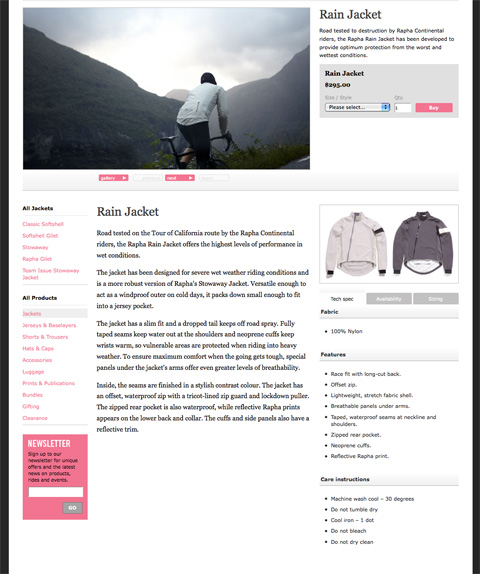
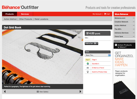
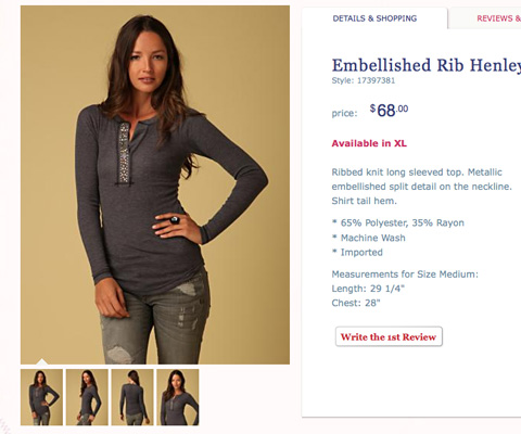
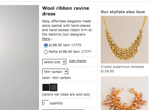
1. A lack of detailed product information

When you’re shopping in a brick-and-mortar store, you have the advantage of being able to pick up an item, feel it, look at it from every angle, and read any information on the packaging or labels. Shopping online removes that interaction. Ecommerce sites need to do the best they can to improve upon the in-store shopping experience.

How often have we gone to an online store and found their descriptions to be completely lacking? And if a customer is left wondering about the specifics of a product, they’re more likely to go look for the information elsewhere. And unless your site’s price is significantly lower than your competitors’, they’ll likely just buy from the other site.

What To Do About It

Provide as much product information as you can. Sizes, materials, weight, dimensions, and any other pertinent information depending on what the product is. For example, in an online clothing store, you might include the fabric type, sizes and colors available, a size chart (usually linked from multiple products), the weight or thickness of the item, the cut and fit of the item, care instructions, and comments about the brand or designer. Using descriptive words rather than simply technical terms can have a greater impact on the consumer.

Examples

Raphajacket in 15 Common Mistakes in E-Commerce Design

20x200midwife in 15 Common Mistakes in E-Commerce Design

Patagoniafishingjacket in 15 Common Mistakes in E-Commerce Design

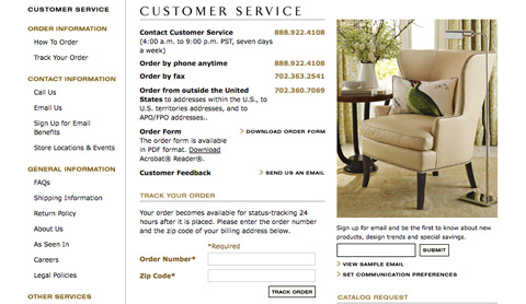
2. Hiding Contact Information

Consumers want to know that they’re dealing with a real company when they hand over their credit card information. They want to know that if they have a problem they’ll be able to talk to a real person and get the help they need. If your site doesn’t provide any contact information, or hides it so the consumer can’t find it easily, they’re less likely to trust your site, and therefore less likely to do business with you.

What To Do About It

Put your contact information in an easy-to-find place on every page of your website. The most obvious places to put your contact information are either in your header, the top of your sidebar, or in your footer. Provide multiple means of contact if possible. A contact form, email address, phone number, and mailing address all add to the level of customer trust. Remember, too, that the more expensive or technical the product you’re selling, the more likely a consumer is going to want more contact information.

Examples

Zapposcontact in 15 Common Mistakes in E-Commerce Design

Wshomecontact in 15 Common Mistakes in E-Commerce Design

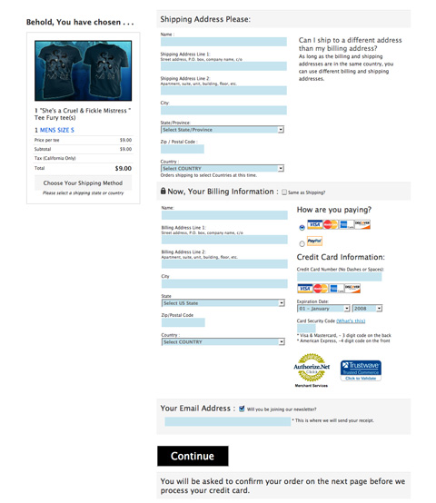
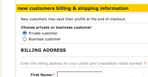
3. A Long or Confusing Checkout Process

This is one of the most damaging mistakes an ecommerce site can make. You have to make it as easy as possible for your customers to hand over their credit card information and complete their order. The more steps you put between them placing an item in their cart and actually paying for it, the more opportunities you give them to leave your site without completing their purchase.

The ideal checkout process includes a single page for consumers to check their order and enter their billing and shipping information, and a confirmation page before they submit their order. Anything more than that is only an obstacle to completing the checkout process.

What To Do About It

Follow the ideal model as closely as you can. If you have to include other pages, try to make them as quick and easy to fill out as possible. Combine pages if you can, and use two-column layouts for certain sections (like putting billing and shipping information next to each other) to make pages appear shorter.

Examples

Teefurycart in 15 Common Mistakes in E-Commerce Design

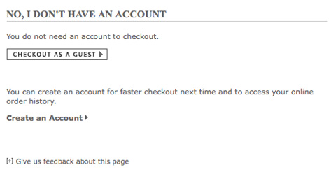
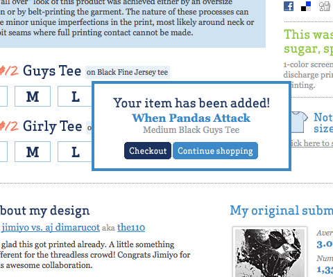
4. Requiring an Account to Order

This ties in directly to the previous item. If you require a customer to sign up for an account before they can place an order, it’s another obstacle you’ve placed in their path. Which is more important to you: getting the order or capturing customer information? Remember that the second option may mean losing some customers.

What To Do About It

There’s an easy fix for this. Instead of requiring a customer to sign up for an account before they order, offer them the option at the end of their ordering process. Give them the option to save their account information to make placing future orders easier or to track the status of their current order. Many customers will opt to save their information, and you won’t be driving away customers before they’ve completed their order.

Examples

Ikeacheckout in 15 Common Mistakes in E-Commerce Design

Potterybarncheckout in 15 Common Mistakes in E-Commerce Design

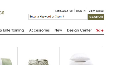
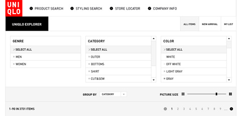
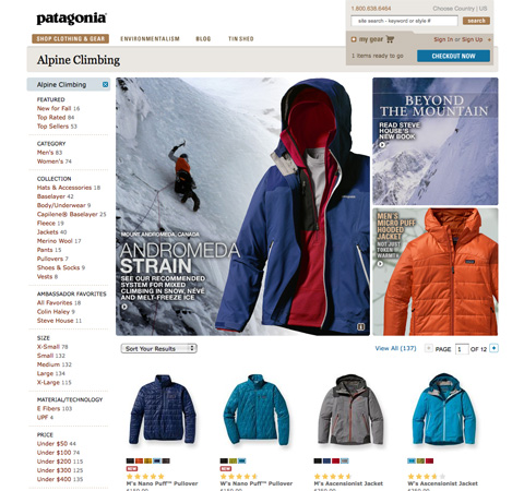
5. An Inadequate Site Search Engine

If a customer knows exactly what they’re looking for, many will opt to use a search engine instead of sifting through categories and filters. You need to make sure that the search feature on your site works well, and preferably has filters for letting customers refine their results.

How often have you searched for a product on a large ecommerce site and been returned with hundreds of applicable results? While the variety of options can be nice, if half of those results are nothing like what you’re looking for, it’s more an inconvenience than anything else. Including a way for customers to filter their search results by category or feature eliminates this problem.

What To Do About It

Make sure the ecommerce software you’re using has a good built-in search engine, or look for plugins to extend its functionality. Ideally, an ecommerce search engine should let users search by keyword and then refine results based on the categories your site includes. Let users sort their search results based on standard criteria (most popular, highest or lowest price, newest item, etc.) as well as eliminating items that don’t fit within a certain category.

Examples

Designbyhumanssearch in 15 Common Mistakes in E-Commerce Design

Uniqlosearch in 15 Common Mistakes in E-Commerce Design

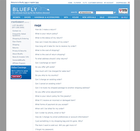
6. Poor Customer Service Options

This is similar to the hiding contact information bit above. You need to make it easy for customers to get in touch with you if they have a problem or question. Make it clear what the best way to contact you is if they have a technical question, a sales question, or they want to return an item. Offering a help request form for customers to fill out can instill more confidence than just an email address.

What To Do About It

Use a ticketing system for customer service inquiries, especially if you don’t have a phone number available. Make sure that you post a FAQ that covers common questions customers might have, like what your return policy is or what to do if they need to order parts or replacement items.

Examples

Ikeacustomerservice in 15 Common Mistakes in E-Commerce Design

Wshomecustomerservice in 15 Common Mistakes in E-Commerce Design

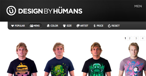
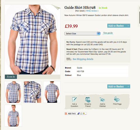
7. Tiny Product Images

Since consumers can’t physically handle the products you’re selling before placing an order on your website, you need to do as much as you can to recreate and improve upon that experience. Tiny product images don’t effectively do this.

What To Do About It

Either provide large images right on the product page or allow users to click on an image to zoom in. You want users to be able to view the image as large as is practical on an average monitor. This means an image that enlarges to 1024×768 pixels is a good size to aim for.

Examples

Behanceimages in 15 Common Mistakes in E-Commerce Design

Bridge55images in 15 Common Mistakes in E-Commerce Design

Jcrewzoom in 15 Common Mistakes in E-Commerce Design

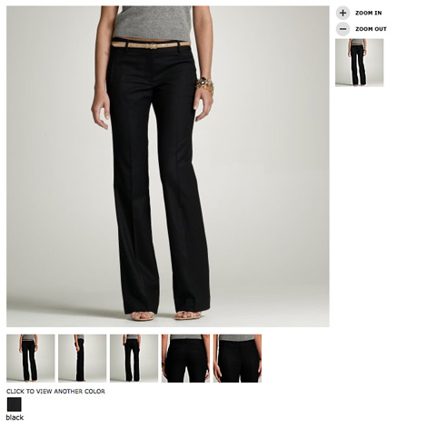
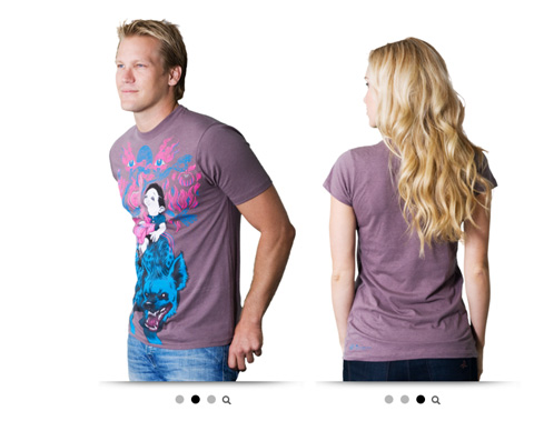
8. Only One Product Image

Unless your product is delivered digitally (and even sometimes if it is), you’ll want to provide multiple images from different angles. An image in each color, of the front, back, and sides, and even detailed shots of specific features can all go a long way toward making a consumer more likely to buy from you.

What To Do About It

This one’s simple: include more images. Four or five images of each product are ideal, offering enough views to allow a consumer to feel comfortable that they know exactly what they’re getting.

Examples

Designbyhumansimage in 15 Common Mistakes in E-Commerce Design

Freepeopleimages in 15 Common Mistakes in E-Commerce Design

Moopostcards in 15 Common Mistakes in E-Commerce Design

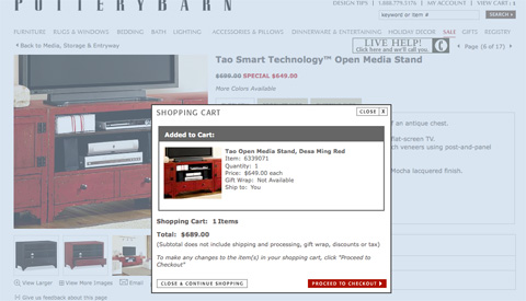
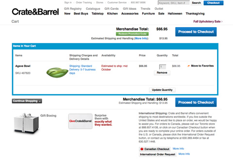
9. A Poor Shopping Cart Design

Your shopping cart is an incredibly important part of your ecommerce website. It needs to allow users to add multiple products, to revise the quantities or other options about those products, and it needs to remain transparent at the same time. Not exactly the easiest thing to do, right?

What To Do About It

Make sure your cart lets a user add an item and then return to the last page they were on. Even better: allow them to add an item to their cart without ever leaving the page they’re on (by using a mini cart). Let your customers edit the quantities of items in their cart or remove an item from their cart. And let them preview what shipping charges will be before they start the checkout process.

Examples

Potterybarncart in 15 Common Mistakes in E-Commerce Design

Crateandbarrelcart in 15 Common Mistakes in E-Commerce Design

Threadlesscart in 15 Common Mistakes in E-Commerce Design

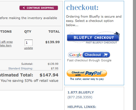
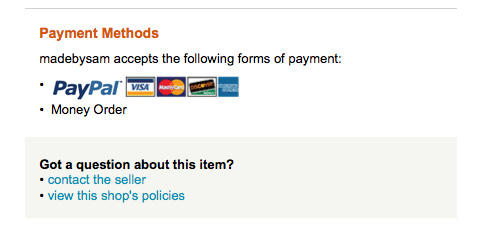
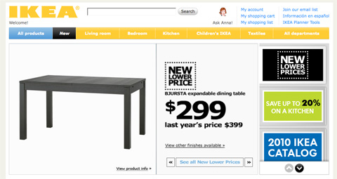
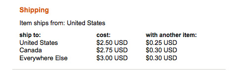
10. Lack of Payment Options

There are plenty of sites out there that only allow users to pay with Visa or MasterCard, or to only pay with a PayPal account. There’s no reason for this anymore. What about the person who has an AmEx and doesn’t have or want a PayPal account? What about the person who doesn’t have a credit card and wants to pay straight from their bank account? You need to provide as many payment solutions as is practical to optimize the number of orders you get.

What To Do About It

Use a payment service that lets customers pay with each major credit card, and preferably also with an electronic check. Adding a PayPal checkout option increases the choices your customers have, making them more likely to purchase from you. Considering different consumers have different preferences when it comes to making online payments, catering to as many as you can means you’ve expanded your customer base.

Examples

Blueflycheckout in 15 Common Mistakes in E-Commerce Design

Madebysampayments in 15 Common Mistakes in E-Commerce Design

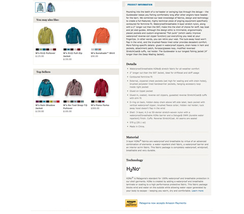
11. Not Including Related Products

You’ve probably noticed when you go to a brick and mortar store that they group similar products together, or otherwise make it easy for you to find products that are related to you. They’ll put a battery display in the electronics section, or include cell phone cases near the cell phones. The same can be done on your website, and can increase add-on sales for you business.

What To Do About It

Use an ecommerce platform that lets you include related products on product description pages. A platform that will let you manually choose related products can also give you a big advantage, since you may see relations that a software program doesn’t (such as coordinating clothing pieces to create an outfit).

Examples

Saksrelatedproducts in 15 Common Mistakes in E-Commerce Design

Wethefreerelatedproducts in 15 Common Mistakes in E-Commerce Design

Jcrewrelatedproducts in 15 Common Mistakes in E-Commerce Design

12. Confusing Navigation

There’s nothing worse than trying to find a product on a site with confusing navigation. Or even worse, an online store that doesn’t use categories or otherwise separate their merchandise to make it easier to find a specific type of product. The same goes for sites that have categories with no products in them or with only one or two items. Why even bother with a category?

What To Do About It

Think through your categories and navigation elements carefully before you start putting products in your catalog. Make sure that every category has at least a few products in it, or else group smaller categories together (or include them in larger, similar categories). Make it easy for customers to look through different categories, get to their shopping cart, and otherwise move around your site.

Examples

Instaboxnav in 15 Common Mistakes in E-Commerce Design

Wshomenav in 15 Common Mistakes in E-Commerce Design

Ikeanav in 15 Common Mistakes in E-Commerce Design

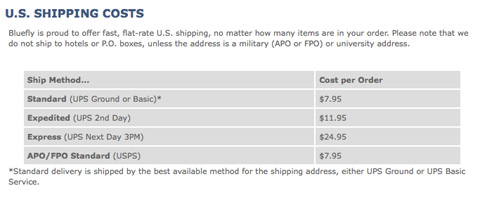
13. Not Including Shipping Rates

There’s no good reason not to include accurate shipping rates on your site. I’ve abandoned purchases on numerous occasions because it said something like “We’ll email you with an accurate shipping quote for approval before processing your order.” When shopping online, I want to be able to complete my order all at one time, without having to wait around for an email to decide whether the shipping charges are too high. Include your rates on your site, no matter what.

What To Do About It

Most major shipping companies and the USPS offer shipping calculators on their website, and there are plugins or widgets available for most major shopping cart systems to figure shipping charges on your site. Use one. If you can’t use one for some reason, then use a flat shipping rate that’s high enough to cover whatever it is you need to ship. For particularly heavy or large items, you can always include a freight surcharge in the price (just be sure to indicate that’s where the additional cost is going).

Examples

Blueflyshipping in 15 Common Mistakes in E-Commerce Design

Zapposshipping in 15 Common Mistakes in E-Commerce Design

Helenesdreamsshipping in 15 Common Mistakes in E-Commerce Design

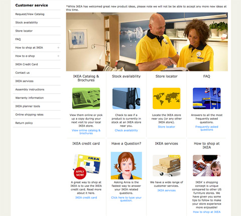
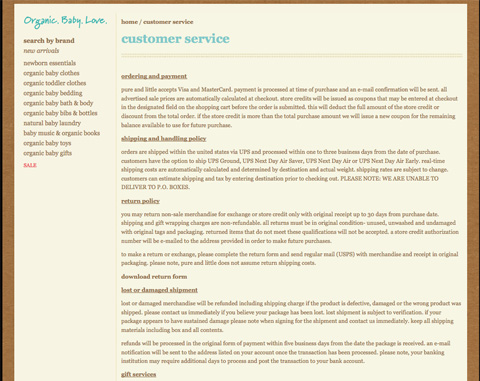
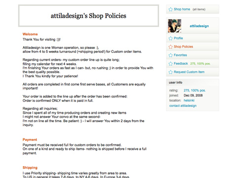
14. Not Including Store Policies

Before a customer buys from you, they’ll likely want to know what your shipping policies, return policies, and other store rules are. And there’s no reason not to post this information in a FAQ or somewhere else on your site. Making your store policies clear upfront can save a lot of headaches later on from customers who are unhappy with an order they’ve placed.

What To Do About It

Use an FAQ or store policies section on your site to spell out exactly what your rules are for different kinds of customer interaction. It’s something that can save you tons of problems down the road.

Examples

Pureandlittlepolicies in 15 Common Mistakes in E-Commerce Design

Blueflyfaq in 15 Common Mistakes in E-Commerce Design

Attiladesignpolicies in 15 Common Mistakes in E-Commerce Design

15. Not Putting Focus on the Products

The goal of an ecommerce site is to sell products (or, at least, that’s what the goal should be). If your site puts more focus on bells and whistles or the design itself, it’s not achieving that primary goal. Make sure your site displays your products first, and everything else second.

What To Do About It

Think about how products are displayed in brick and mortar stores. While an in-store or window display may show a lot more than just the products for sale, they all contribute to showcasing the products in their most flattering light. Do the same with your website. Make sure that every design element present is doing something to showcase your products in their best possible light.

Examples

Studiobonsai in 15 Common Mistakes in E-Commerce Design

Patagoniacategory in 15 Common Mistakes in E-Commerce Design

Potterybarn in 15 Common Mistakes in E-Commerce Design

Further Resources

Cameron Chapman is a professional Web and graphic designer with over 6 years of experience. She writes for a number of blogs, including her own, Cameron Chapman On Writing. She’s also the author of Internet Famous: A Practical Guide to Becoming an Online Celebrity.

Post Rating
1 Star2 Stars3 Stars4 Stars5 Stars (2 votes, average: 4.00 out of 5)
Loading ... Loading ...

Tags: ,

Advertising
  1. 1
    Armig Esfahani
    October 8th, 2009 5:09 am

    Great post.. these mistakes are really so common.. Specially in Middle East :)

  2. 2
    mdzo
    October 8th, 2009 5:10 am

    very useful… thanks!

  3. 3
    lauragua
    October 8th, 2009 5:17 am

    The most annoying by far is n.4: Requiring an Account to Order.
    - I’m already buying it is not enough for you? -
    ;-)

  4. 4
    Gonzalo
    October 8th, 2009 6:05 am

    Great post, thank you for sharing with us your knowledge…

  5. 5
    bs.kishore
    October 8th, 2009 6:12 am

    Great post…very relevant info.

  6. 6
    Quakeulf
    October 8th, 2009 6:17 am

    The most important thing omitted from this article is:

    WHERE DO THEY SHIP TO?

    So many times when I see something I want to order from the internet I have to look through a whole lot of text only to discover they can only send to Canada and Mexico. Why isn’t this more visible? If it was they’d probably get a shitload more customers, me among them. Amazon is a BIG offender of this.

    PLEASE MAKE IT EASY TO UNDERSTAND WHERE YOU, THE COMPANY, SHIP TO.

    Thank you so much for your time.

    Signed,
    Frustrated customer

  7. 7
    Samer Forzley
    October 8th, 2009 6:18 am

    Great post, great content for those in eCommerce. Every one of these adds a little bit. Site conversion can always be improved, i think the average for eCommerce now is still in the 2% range. Interesting to note too that eCommerce while it continues to grow even in the tough economy.

    Payment options also help bring new customers, its a proven fact, not all customers are the same and people want to pay their own way. (full disclosure, I work for eBillme http://www.eBillme.com where you can pay with cash, without signing up or giving up any financial information).

    Other services such as http://www.bazzarvoice.com has proven to be successful in helping conversion as they allow for reviews. Services like BBBonline, HackerSafe, etc… all help

    As well, don’t forget basic stuff like, a clear return policy, clear service grantees.

  8. 8
    azizbaba
    October 8th, 2009 6:20 am

    That’s another amazing work! Thanks.

  9. 9
    Joe
    October 8th, 2009 6:22 am

    Great idea. Too bad that most e-comm system budgets don’t allow for the majority of these suggestions. Major brands can afford to implement some of these major e-comm improvements, but most small-biz isn’t going to have that luxury.

  10. 10
    Baggy75
    October 8th, 2009 6:22 am

    Good article on an interesting yet often misunderstood area of web design.

    Also you managed to get E-Commerce Design as a trending topic on Twitter, mostly from re-tweets of this article, me thinks. Simples.

  11. 11
    Vincent RABAH
    October 8th, 2009 6:26 am

    Thank’s for this excellent tutorial !! I will take care of all your advises for my up-coming e-commerce site :)

  12. 12
    Phil
    October 8th, 2009 6:34 am

    Yeah, big up! If you ever bought something online (and let’s be honest, who hasn’t), you’ll prolly recognise some of these problems.

  13. 13
    Matt Andrews
    October 8th, 2009 6:34 am

    One issue I have with the ‘don’t make them register’ point – if I offer to give the user an account after they’ve completed a purchase, how can I secure this process? Eg, I could sign them up automatically after they’ve entered an email address, then mail them a password, but what if they make up an address, or worse, use the address of an existing customer? How do I know for sure if it’s an existing member too lazy to log in, or a malicious user?

  14. 14
    Francis
    October 8th, 2009 6:40 am

    Thanks, I am in the process of designing an E-Store, very useful, as usual!

  15. 15
    John G.
    October 8th, 2009 6:41 am

    Yes, I’ve run into most of these problems after using a myriad of ecommerce systems over the years. It’s amazing still how many site require you to login or create an account before you can buy, and how many platforms don’t offer an alternative.

    Have these people never shopped on line before? I’ve yet to come across the “perfect” platform yet, though. The search continues…

  16. 16
    Michel Hendriks
    October 8th, 2009 6:43 am

    @Matt
    One way to handle this is to check if the provided e-mail address is in your database already. If it is, then just don’t offer them an account. If an existing member is too lazy to log in you won’t have a problem, and malicious users will gain nothing.

    @John
    The platform is not the problem most of the time. Docdata commerce (my employer) has its own platform, and some customers just want consumers to create an account. For other customers we’ve implemented optional account creation after the checkout. The platform supports both.

  17. 17
    Mike
    October 8th, 2009 6:48 am

    Its fine and dandy, but these are big company ecommerces small business simply don’t have the man power you need at least 100 employees. Jobs include web designers to customize the website, Web Programmers to create the database structure then after that you need data administrators to enter the data, graphic designers to edit the graphics and photos, photographers to take the pictures. You can have marketers but they are unnecessary right now. Then you still need Web Programmers to maintain the amount of databases required to handle the amount of people so it doesn’t crash and so on. Easy put if your company isn’t making 1 million dollars this won’t work.

    What you need is plan old consumer confidence.

    Plus you are missing a big issue
    1. Customer Service, Customer Service, Customer Service. Ya like online support? Otherwise everything else is pointless.

    That is embarrassing.

  18. 18
    JayDubYah
    October 8th, 2009 6:54 am

    These aren’t mistakes on a FEW sites…this seems to be “SOP” industry wide.
    Thanks for the post!

  19. 19
    AJ
    October 8th, 2009 7:03 am

    Great article, its sad how often these mistakes are made in E-Commerce. I’ve been trying to point these things out to the place where I work for some time now.

  20. 20
    Wib
    October 8th, 2009 7:08 am

    Ironically, Items #4 and #10 are the reasons why I can’t pre-order the Smashing Book.

  21. 21
    Edison Leon
    October 8th, 2009 7:15 am

    Very good article, keep it coming, I’m hungry for more on e-commerce knowledge

  22. 22
    Bonkers
    October 8th, 2009 7:18 am

    I have just launched a new e-commerce site and top marks to our design and code team for passing this test – great article – thanks!

  23. 23
    Polanck
    October 8th, 2009 7:34 am

    Very useful. Thanks!!

  24. 24
    Sean
    October 8th, 2009 7:37 am

    Excellent article, some things I would never have considered in here. However, you can checkout using PayPal (at least in some situations) without having an account, I believe.

  25. 25
    Joe Barstow
    October 8th, 2009 7:39 am

    Alright so its on the table! great thank you for bringing up these valuable points. While I feel that most of this should be second nature to more seasoned designers, its not to beginners and more importantly the higher-ups who get the say-so on how the ‘real-estate’ (blech) is used.

    In short – A great article! — Especially to show your boss who wants to cram monetization methods into every pixel :)

    fyi misspelling under point # 2. search for “hadn”

  26. 26
    Murray
    October 8th, 2009 7:45 am

    Great post to forward to people looking to get into eCommerce.

    Although all of this would seem like common knowledge, I’m astounded by how many eCommerce stores completely miss the point.

    I find myself to be very picky when it comes to even the smallest details. I don’t know why but I don’t even bother with completing a transaction if the shopping cart uses multiple pages. One page checkout remove the hassle of second guessing, streamlined, and will easily increase revenue.

    Although this post is focused on the actual design, incorporating customer service features helps a ton. Live help features, through chat, will really help people that may seem a bit wary about buying a product. They’re able to talk directly with someone, get help ordering, find their shipping, and more. I think a lot of people still long for the person to person contact when shopping, so using live chat bridges this gap.

    Also one thing to consider. Always test different variants. Just because the design looks flawless, changing the color of a button, orientation of pictures, headlines an other copy can show you great little spikes of conversion. Split testing is really easy so you may as well do it.

  27. 27
    David Brown
    October 8th, 2009 7:46 am

    Next time, please summarize the 15 points as headlines preceding the paragraphs!

    As it stands now, the main things I see on the page are “What to do about it” and “examples,” which makes reading/scanning/processing the information difficult. We may not all have the time to cherry pick the ideas out of your paragraphs. Having meaningful headlines will also help your SEO!

  28. 28
    James
    October 8th, 2009 8:30 am

    You have a spelling mistake…

    “Consumers want to know that they’re dealing with a real company when they hand over their credit card inforamtion.”

    Also, it’s extremely important to have a phone number available. There are so many people that would rather call a number to get the information they need – or even just to find out if the company is actually legit.

  29. 29
    investigation
    October 8th, 2009 8:38 am

    …There’s something funny going on with Smashing Magazine’s retweet counts.

    Neither TweetMeme, ReTweetist or Retweet.com indicate that the number of times these articles have been retweeted is any more than ~300 …yet you guys indicate that the true number is several times more…

    Anyone else think this is fishy?

  30. 30
    Nox
    October 8th, 2009 9:01 am

    I think it would be a good idea to offer registration in the checkout process so once the customer is in the form-filling mode he could do only a few more clicks and be registered as well

  31. 31
    Mark
    October 8th, 2009 9:30 am

    Not a bad article at all, and valuable for the most par. But when I read the words “there’s no good reason” to do (or not to do) something…that’s oversimplifying things.

    There are TONS of good reasons some of these things cannot be done, namely: Technological restrictions, the nature of your products, established business policies, legal restrictions, lack of resources, lack of people, lack of money, and the list goes on.

  32. 32
    Carla
    October 8th, 2009 10:00 am

    Integration and customization is so important and then it works like MAGIC! It really is a beautiful thing. Seifert Technologies provide e-commerce solutions with MainStreet Commerce, BusinessFlow it’s the complete commerce solution across all sales channels.

  33. 33
    Brandy
    October 8th, 2009 10:04 am

    Choosing a trusted partner can really save you your sanity while going through the setup process. Seifert Technologies serves businesses all over the U.S. because they customize and integrate for businesses.

  34. 34
    Josh Tummel
    October 8th, 2009 10:50 am

    Good article, but 2 spelling fails in this sentence:
    “Consumers want to know that they’re dealing with a real company when they hadn over their credit card inforamtion.”

  35. 35
    Brendan Regan
    October 8th, 2009 11:56 am

    I’m a huge Smashing fan, but I have to call you on your oversimplification of the “ideal checkout process” in #3. Your general point is well-taken, but to advise that every site should have what is commonly called a “one-page” checkout is dangerous advice. It works for a lot of sites, but every site is different, yes? I’ve had clients switch from multi-page to one-page checkouts, have staggering drops in conversion rate, and switch back within 24 hours, so this is something that shouldn’t be done just because everyone is doing it.

  36. 36
    Floris Fiedeldij Dop
    October 8th, 2009 12:02 pm

    Keep these sort of articles coming, this is what makes SM for me. Any beginning freelancer in the world of the widest webs can read up and get a glimpse of what good design is, good layout, good approach to development, etc.
    kudos

  37. 37
    David A
    October 8th, 2009 12:36 pm

    One of your best articles, and that’s coming from a longtime reader.

  38. 38
    Heather Feimster
    October 8th, 2009 12:37 pm

    Good roundup of ecommerce tips, tools and industry standards here. While I agree with the few on here who pointed out that some of these don’t work for every online store, they are a good set of standards to strive for.

    In the future, I’d like to see some more information about non-traditional online stores. For example, stores that offer non-tangible (downloadable, even) items or stores that offer “renting” as an option (like furniture or textbooks). It would be interesting to see other kinds of trends in these different kind of online stores.

    Definitely going to refer to this for the eCommerce site we’re currently developing!

  39. 39
    Josh Minnich
    October 8th, 2009 1:04 pm

    I don’t see how you can bash Threadless for poor shopping cart design. Poor shopping cart design should be more about if the “cart” is not doing what it should be; and that’s not keeping track of items the customer has added. Instead Threadless takes a great approach to online shopping and that’s allowing customers who may come to the site for one item, and wish to checkout right away. The solution also doubles as letting users know the “cart” has the item you have picked and you can continue shopping without worrying if your item is actually there. How much would that suck if you added 10 shirts and only 6 of them actually were there when you went to checkout?

  40. 40
    Robin Robbins
    October 8th, 2009 1:13 pm

    Nice article, but so true is your own experience. I spent too long on my iPhone trying to buy something, I got aggravated but kept on because I was too hungry to not complete the steps. BUT man I was in a bad mood when I was finished. Shopping Carts should be almost non-existent until you want to check out. It also provides a kind of out of site out of mind, buy the whole thing kind of flow. When I don’t see my cart with every add, I tend to keep adding things… Then when I check out its like OH MY did I just buy all that… :)
    Oh and btw, spell check is a good thing…

  41. 41
    Joe Barstow
    October 8th, 2009 1:33 pm

    seriously now… are you planning on spell check?!

    (SM) Sorry, we did correct these 3 mistakes now.

  42. 42
    Amanda
    October 8th, 2009 1:41 pm

    This is fantastic, and the policies provided here can be applied in one way or another from the multi-million dollar chain to the single artist business etsy store seller, which is a point many comments here are missing. This is one of the best articles I’ve read in a long time, thank you!

  43. 43
    Ziller
    October 8th, 2009 1:53 pm

    Who cares about spelling mistakes. We are web marketers not English teachers. It is a good article and points our many true factors.

  44. 44
    developer
    October 8th, 2009 2:06 pm

    Nice, but don’t forget to spell check ;-)

  45. 45
    Max Quattromani
    October 8th, 2009 3:56 pm

    Great post, very useful. I will be looking at my own work with a keener eye with this newfound knowledge.

  46. 46
    Alice
    October 9th, 2009 12:01 am

    quoting_Joe Barstow (October 8th, 2009, 1:33 pm)

    seriously now… are you planning on spell check?!

    I thought it was a stupid game on psycology of the perception!

    anyway, thanks for the article, very useful.
    Alice

  47. 47
    Martin
    October 9th, 2009 2:58 am

    Requiring an account is not a mistake.

  48. 48
    Greg
    October 9th, 2009 4:23 am

    you’re a mistake

  49. 49
    Bo
    October 9th, 2009 4:54 am

    Very very useful article. My current project is a webshop and after reading this I understand some things need to be improved. Thank you.

  50. 50
    Hilmy
    October 9th, 2009 5:15 am

    Very interesting dissection of the issue. However getting a perfect solution for ecommerce sometimes means “get some loose some” game. As the system greatly depends on shopping cart and payment gateways, our choice of a “good” ecommerce solution becoming so limited in the end. Getting a customized solution that satisfies all our requirements may not be economically sound for most..

  51. 51
    Francisco
    October 9th, 2009 12:17 pm

    Very nice tutorial. Thanks.

  52. 52
    memobr
    October 9th, 2009 1:04 pm

    brilliant fantastic…

  53. 53
    Chris
    October 10th, 2009 2:02 am

    Nice guys… thanks a lot, directly checked our actual project… look good though

  54. 54
    creativebrain
    October 10th, 2009 5:24 am

    Wow… I really design e-commerce site right now. I think my site have mistake a lot and should I rebuild my site….? -___-”
    so wasting my time

  55. 55
    Adrian
    October 10th, 2009 12:58 pm

    Great post. The One Page Checkout for Magento just released is developed with all this in mind. http://www.silverthemes.com/premium-magento-addons/magento-one-step-checkout.html

  56. 56
    Mark
    October 10th, 2009 1:50 pm

    A great way to get all the shipping rates for fairly cheap, is to use rocketshipit. It supports PHP and many other languages are on the way.

  57. 57
    Josh
    October 10th, 2009 9:04 pm

    I am really on the fence about search. Some sites this is actually a bloat feature.

  58. 58
    Dila
    October 10th, 2009 11:24 pm

    Thanks. Useful tips

  59. 59
    hammu
    October 11th, 2009 12:31 am

    very useful tips and an eye opener

  60. 60
    Jesse
    October 11th, 2009 10:48 am

    “If you require a customer to sign up for an account before they can place an order, it’s another obstacle you’ve placed in their path…. offer them the option at the end of their ordering process. Give them the option to save their account information to make placing future orders easier or to track the status of their current order. Many customers will opt to save their information, and you won’t be driving away customers before they’ve completed their order.”

    I (and others I know) resent being required to register to buy something. Some sites require a full registration and credit card posting before even deigning to tell you about shipping. I wonder what drives these people to throw potential customers away?

  61. 61
    edac2
    October 11th, 2009 3:44 pm

    Number 4, requiring an account to order, is the biggest problem I’ve found with getting almost anything from Microsoft.

  62. 62
    pigglywiggly
    October 11th, 2009 9:33 pm

    I follow SmashMag .. and in addition to the design articles, i find these very informative. Some of my friends have small business, and have been asking me to make them easy to manage e-commerce sites for their businesses. But after testing a lot of solutions, I am not sure which ones handle most of the issues you point out above, atleast not without a great deal of customisation. Wordpress has a nifty wp-e-commerce plugin, but not a lot of themes or documentation to get all this working. Any suggestions for a good integrated product + shopping cart application? That allows for managing different product types/categories/brands/tags, and allowing multiple product image upload, and related product specification?

  63. 63
    Gray
    October 12th, 2009 3:45 am

    Fantastic article… Just what I needed and will definitely check out the additional reading resources on this subject. Again, SmashingMagazine you smashed it!

  64. 64
    Gosia
    October 12th, 2009 6:36 am

    Very useful post!

  65. 65
    Arash
    October 12th, 2009 8:44 am

    Nice post! But I really want to have some ‘bad example’ beside these example too.

  66. 66
    Sergio Pereira
    October 12th, 2009 11:05 am

    I thought the post was interesting but focused mostly at the pre-sales portion of the transaction. There are more important problems (like contact and support that you mentioned) that could cause a customer to skip you or never get back to you. Things like keeping the customer up-to-date through all the fulfillment process, never omit the tracking information, allow me to check my orders/invoices even if I did not create an account, etc.

  67. 67
    Niubi
    October 13th, 2009 1:13 am

    Excellent article with some really useful points, thanks for posting it! For me, I find a search engine – or at the very least, a superior search-by- browsing method is essential. If I can’t find what I want within a couple of minutes, I’m out of there. Sites like http://www.dubli.com didn’t have this feature, but now they do, and it really has improved my browsing experience by 100%. Also agreed with the account – if I need an account, let me know ASAP! Not when I’m just about to buy something.

  68. 68
    Insidedaweb
    October 13th, 2009 2:25 am

    hello,

    Please find a french translation of your so interresting article about the e-commerce mistakes.

    Thanks again,

  69. 69
    Wozza
    October 14th, 2009 6:12 am

    Re. “A Long or Confusing Checkout Process” – the conclusion that 1 page checkout is best is one of those perceived wisdom things (a la the 3 Click Rule) and not necessarily borne out by experience – in fact in this study of the top 100 online retailers (slide 10) single page checkouts had the worst conversion rate of all by a long way!

  70. 70
    David Kitchenam
    October 15th, 2009 12:12 pm

    Great post on e-commerce issues. Not every design team can cover all the bases and limitations are often the cause of a tight brief from the client.

  71. 71
    site
    October 16th, 2009 6:30 am

    Which ecommerce software do you recommend?

  72. 72
    Mark @ Alchemy United
    October 20th, 2009 12:13 pm

    Good stuff.

    But next time can the examples all be from the same 2 or 3 sites? I think it would be helpful to see good examples of these various priorities all working in concert properly.

    Thanks again!

  1. 00

    There are no trackbacks at this time. If you are interested in leaving a trackback, please use this URL.

Leave a Comment

Make sure you enter the * required information where indicated. Please also rate the article as it will help us decide future content and posts. Comments are moderated – and rel="nofollow" is in use. Please no link dropping, no keywords or domains as names; do not spam, and do not advertise!


Advertisement Advertise with us!
Join in Smashing Forum
Post your job