iPhone App Design Trends

Email Newsletter
Weekly tips on front-end & UX.
Trusted by 182,000+ folks.
 Register for Free


 Custom Web Forms for Angular, React, & Vue. Your backend.
 Celebrating 10 million developers
However, some designers invest a lot of time and efforts into creating usable and original user interfaces (yes, there are usable and creative UIs).
Further Reading on SmashingMag:
- How To Create Your First iPhone App
- Web Development For The iPhone And iPad: Getting Started
- Thinking Like An App Designer
- A Guide To iOS App Development For Web Designers
This article explores the ways in which designers use graphical elements and screen interactions to create iPhone-applications that are easy on the eyes and mind. The aim of this article is to display common trends and design approaches in iPhone app design – please notice that they are not necessarily optimal ones from the design or usability point of view.
1. Mirroring Native iPhone UI Elements
“Tell them what you’re gonna tell them, tell them, and then tell them what you told them.” Creating a whole new OS within your app can be fun, but when you’re dealing with the mobile medium, people just want to get stuff done. Getting stuff done means that the designer has to get into the flow of the OS and create an app that requires zero explanation for the end user to operate. Mirroring the layout and UI elements that the user is already familiar with saves time and energy. So it seems quite convenient to use this approach when designing iPhone-applications.
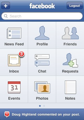
Facebook (iTunes Link) In the new Facebook 3.0, you’ll find a grid layout that users can swipe left and right to access more categories. Because it mirrors Apple’s native UI, users do not have to “learn” how to use it all over again. A similar approach exists in Web design: users expect to see a logo in the top left, navigation along the top, etc. Facebook has taken this concept mobile, using large buttons that are easily distinguishable and tap-able.
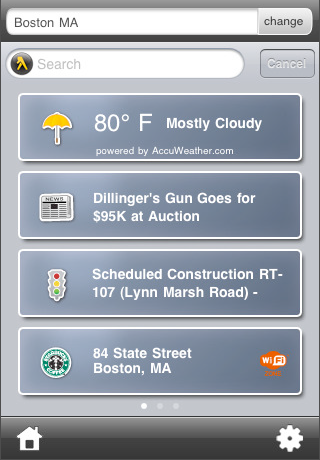
Where (iTunes link) Where has a similar concept, allowing users to swipe left and right to access more data.
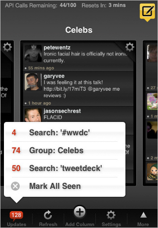
Tweetdeck [iTunes link] Tweetdeck is a good example of user interface design on many levels. Notice how the design highlights recent updates. The application could display the updates in a new window, with a categorized or tabbed list. But it doesn’t. Instead, a more familiar dialogue menu is displayed — it serves as a springboard to jump to a specific category or to clear the messages altogether.
2. Simplifying The Interface
Simplifying user interfaces may sound like a mechanical task, but what lies beneath the surface of user interface design? The answer is simple: users. And what do users want? What makes them all warm and fuzzy? How do you deliver what they want so that they don’t even notice how they are consuming information?
Facebook’s first release did a great job of fitting a lot of core functionality into a small space. The problem, of course, is in laying out all that data and creating an intuitive interface. Compare 3.0 with the first release, and you’ll see how they took a “springboard” approach to streamlining the interface, keeping it intuitive and maintaining functionality.
Flickr [iTunes link] Flickr is another example of how to achieve a good balance between functionality, visual design and the small display area on mobile devices. Think about it: what is at the core of Flickr? Photos. Its users probably do not want to look at big clunky navigational elements; instead, they are looking for pictures. Flickr has managed to fit all of its core functionality without heading down the highway to navigational hell. In fact, most elements in the navigation are handled by interacting with the photos themselves. Simple and smart.
3. Hardware-ish Look
Many utilities are breaking out of the conventional iPhone UI to take advantage of the device’s unique ability to respond to finger gestures. Many of these have hardware-ish interfaces that users are familiar with but come with perpetually shiny exteriors and clicks and pops that maintain their newness from the first to one-thousandth click. Next up, though: an app that gets dirtier the more you play with it.
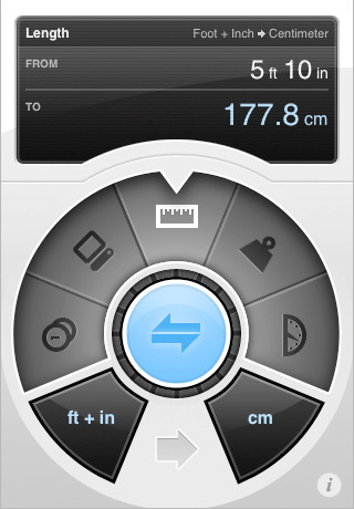
Convertbot (iTunes link) Convertbot reminds us of the proportion wheel we all used in grade school, except it’s more distinctive, original and creative.
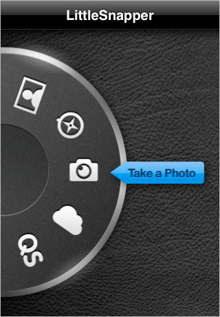
Little Snapper (iTunes Link) Little Snapper mimics the wheel that you turn on a typical digital SLR.
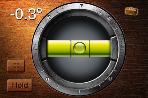
iHandy Level (iTunes Link) iHandy Level simulates the look and functionality of a real, well-used leveler.
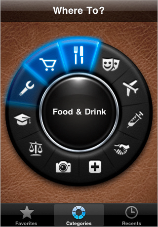
Where To? [iTunes Link] This application looks like it belongs in a Mercedes. Plush leather, matte-finish tactile buttons: quality craftsmanship. We can just imagine how each button press feels solid, requiring the perfect amount of pressure.
4. Rich, Padded And Pretty List Views
You know that you are a geek designer when you get excited about the latest trends in list view design. And what do people do when they encounter a list view? Of course, they skim. And how do we make it easier for people to decide what interests them? That’s right: more visual cues!
Essentially, users are asking for a snapshot of what’s next, and then decide if they want more information. One way to do this is with big pretty buttons. Large and in charge, elegantly designed big buttons give the user a lot of information through their color, icons and typography.
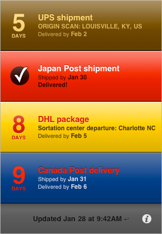
Delivery Status Touch (iTunes Link) Check out how Delivery Status uses appropriate colors on its big buttons to identify each brand. And it uses typography well to establish a hierarchy of information.
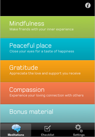
Be Happy Now (iTunes Link) Be Happy Now’s big buttons convey the “be happy” mantra through a mellow color scheme and light, calm and clear typeface.
Next Read [iTunes link] The Next Read application allows friends to share books. Here all books about a particular topic are presented, including the title, cover image, review rating and number of people who have recommended it. Notice the padding and a lot of white space for each navigation option; this makes the areas easily clickable and easier to navigate.
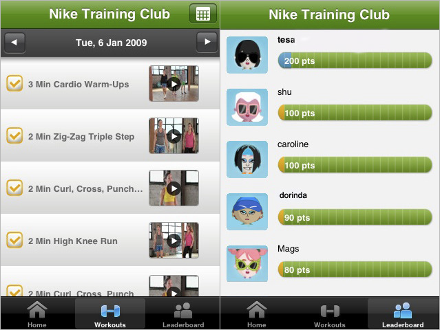
Nike [iTunes link] Nike’s workout application for women includes a nice visual treatment and illustrations that match the brand. It breaks out of the traditional UI just enough to communicate the brand without making it difficult for users to understand the interface and how to use it.
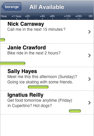
Borange [iTunes link] Borange is a “social availability” application that helps you coordinate meetings with friends. The list view presents a lot of information: friends you want to hang out with, the meeting location and a nice visualization of friends who are available.
5. Layered Interface
Several applications take advantage of the iPhone’s capabilities by layering the interface and making some elements stationary and others vertically or horizontally scrollable. This approach has several benefits:
- It reduces the number of traditional navigation elements that are necessary (i.e. fewer buttons help to avoid a cluttered interface).
- It gives users a faster route to the information they want.
- More screen space is available for information.
Tweetie (iTunes Link) Tweetie uses layers to organize information specific to each of your Twitter friends. Just look at all of the information packed into this one screen!
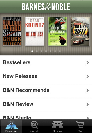
Barnes & Noble [iTunes link] Barnes & Noble has a layered interface that allows you to quickly slide through new releases at the top or dive into more categories below.
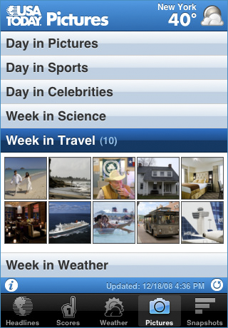
USA Today [iTunes link] USA Today takes a slightly different approach to layering the interface in its “Pictures” section: it uses sliding panels to display blocks of information. While the interface may look cluttered at the first glance, one can easily get around it. The interesting part is that within each panel you can slide thumbnails left and right to view more images.
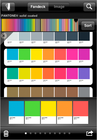
myPantone [iTunes link] Would we expect any less from Pantone? The color picker shown above is a layered interface that lets you pick from a range of colors, sort and scroll as well as open and close detail screens, all without too driving you crazy.
6. Icons For The List View
Icons aren’t just for springboard-loving folks. On small screens, icons can give a huge boost to an application’s usability and navigation. Let’s now take a look at some examples of applications that use icons to their advantage.
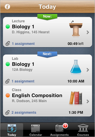
iStudiez (iTunes Link) This application uses various educational metaphors as icons to clearly communicate the purpose of the application. Excellent visual cues tell the student what’s happening today at a glance.
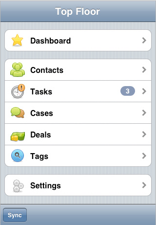
Top Floor (iTunes Link) Top Floor uses simple and easily recognizable icons to quickly guide users to their category of choice.
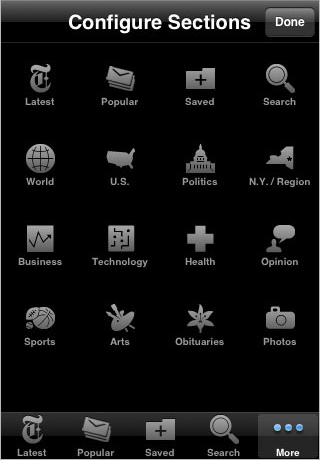
New York Times Isn’t it great when applications just let you do whatever you want to do? For an app with as much information as the New York Times’, users are bound to have their favorite sections. Well, guess what? The New York Times cares: it lets you customize the tab bar’s navigation to include only your favorite sections of the paper. Drag an icon down the tab bar and you are set. The downside of the design is, of course, its lack of visual appeal.
Filemaker [iTunes link] Here is another example of beautiful icons that aren’t obscure or confusing. Designers should never use icons just for the sake of having icons. As designers, we want icons that illustrate what users are actually going to get when they choose a particular path. Nicely done, Filemaker.
7. Illustrations in use
Applications that rely on graphics not found in the standard user interfaces are increasing in popularity, as developers try to set their apps apart from the crowd. Sometimes it works, but often it doesn’t. The more unconventional a design is, the more likely it is to have usability problems. Please always conduct usability testing before releasing a product with a “creative” user interface.
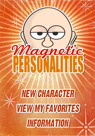
Magnetic Personalities (iTunes link) An excellent example of how buttons don’t have to look like standard buttons.
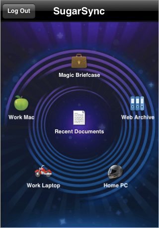
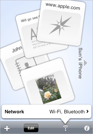
SugarSync [iTunes link] This interface could have easily followed the traditional list-view route. Instead, the designers played with the concept of “connectivity” to create a visual treatment that communicates the purpose of the app. It is unusual and requires some time to get used to.
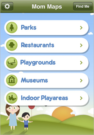
Mom Maps [iTunes link] Another example of how illustrations do a great job of pulling together the whole concept of an application.
8. Using Gestures
Classic linear navigation may look boring: a button that links to other buttons, which leads you to a list of something, which leads you to such-and-such an interaction. Not really spectacular. The possibilities for creative interaction in utility apps are huge and largely untapped (no pun intended).
Mover (iTunes link) Mover exemplifies how to use gestures for sharing contacts, photos and bookmarks. Open two devices, and flick the shared files from one handset to the other.
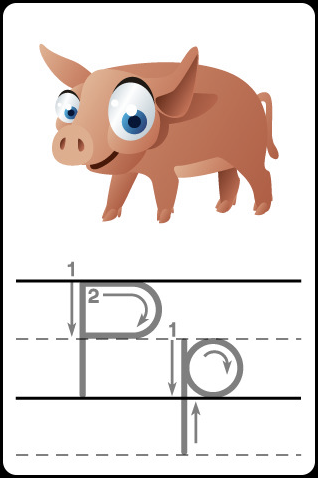
ABC Animals [iTunes link] This application teaches while it entertains. Being able to trace a letter with your finger is another example of how the iPhone responds to touch and movement.
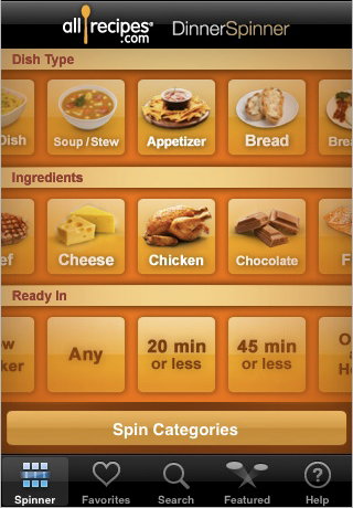
All Recipes [iTunes link] This applications allows you to mix in various elements to create your next meal using gestures.
Something is missing?
We missed some common design approach or trend? Please let us know in the comments to this post!
 (al)
(al)

