Setting Up Photoshop For Web, App and iPhone Development

Email Newsletter
Weekly tips on front-end & UX.
Trusted by 182,000+ folks.
 Custom Web Forms for Angular, React, & Vue. Your backend.


 Celebrating 10 million developers
Most people who have designed websites or apps in Photoshop will, at one point or another, have had issues trying to match colors in images to colors generated by HTML, CSS or code. This article aims to solve those problems once and for all. [Updated February/28/2017]
Further Reading on SmashingMag:
- A Better Way To Design For Retina In Photoshop
- Introduction To Photoshop Scripting
- A-Z of Free Photoshop Plugins and Filters
Color Management to Match Colors Across Multiple Devices
In the print world, color management typically involves calibrating your entire workflow, from scanner or digital camera to computer display to hard proofs to the final press output. This can be quite a tall order, especially when the devices use different color spaces — matching RGB and CMYK devices is notoriously hard.
When designing or editing for TV, calibrating the main editing display and using a broadcast monitor are common; these show real-time proof of how the image will look on a typical TV in a viewer’s home. In such a scenario, color management offers many benefits and is highly recommended.
When building Web and application interfaces, the situation is a little different. The final output is the same device that you’re using to create the artwork: a computer display (putting aside for now differences in gamma between Windows, OS X prior to 10.6 and the iPhone, which we’ll cover later.)
There is a catch, though. Even though you’re creating the Web or app interface on the same device that the final product will be shown on, the colors will have various sources: images (typically PNG, GIF and JPEG), style markup (CSS) and code (JavaScript, HTML, Objective-C, etc). Getting them all to match can be tricky.
The Goal
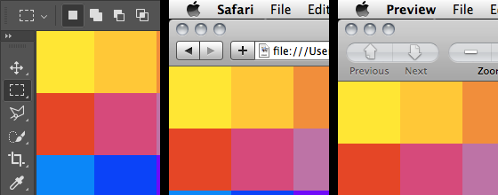
When designing websites or app interfaces, we want to perfectly match the colors that are displayed on screen in Photoshop and that are saved in files with what’s displayed in other applications, including Firefox, Safari and the iPhone Simulator. Not only do we want the colors to look the same, but we want the actual values saved in the files to perfectly match the colors we have defined in Photoshop. Colors should not shift or appear to shift in any way, under any circumstance.
Why Is This So Difficult?
Photoshop applies its color management to images displayed within its windows and to the files it saves. This is a bad thing if you’re working exclusively with RGB images for Web or on-screen user interfaces. With the default Photoshop settings, #FF0000 will actually display as #FB0018, and #BB95FF will display as #BA98FD. The differences are subtle but definitely there.
How Does Photoshop Differ From OS X And Windows?
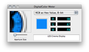 OS X’s color management is applied to the entire display at the very end of the processing chain, after the main buffer in video ram. This means that although color management is applied, the software utilities that measure color on screen (like /Utilities/DigitalColor Meter) will report the same values that you have saved in the file or entered as your code. I believe the color management in Windows Vista and Windows 7 (Windows Color System) works in a similar fashion.
Photoshop’s color management is applied only to the image portion of its windows and to the files it saves. This color correction happens as Photoshop draws the image on screen, so software utilities that measure color on screen often report different colors from the ones you have specified. It’s worth noting that OS X’s color management is applied on top of Photoshop’s.
The best solution I’ve found is to disable Photoshop’s color management for RGB documents as much as possible. Doing so forces the RGB colors that are on screen and saved to the file to match the actual color value. If you need to calibrate your monitor for Web and app design work, then you would best be served by changing it at the OS level.
Disabling color management used to be quite easy in Photoshop CS2 and all versions prior, but it now requires a little more skill.
Disabling Photoshop’s RGB Color Management
These instructions are for Photoshop CC on Mac and Windows. Setting up other versions is very similar.
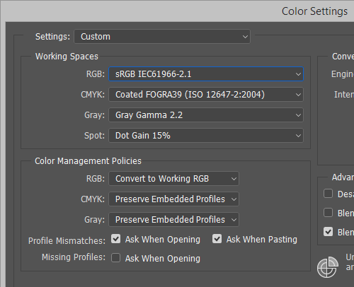
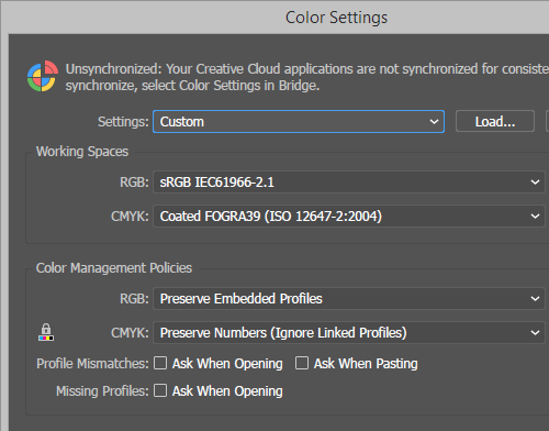
Step 1: Go to Edit → Color Settings and set the working space for RGB to Monitor RGB.
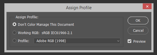
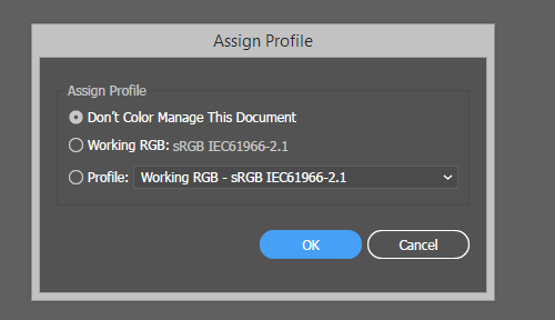
Step 2: Open a document and go to Edit → Assign Profile, then set it to Don’t Color Manage This Document. This must be done for every single document you work on.
Step 3: Ensure View → Proof Colors is turned off.
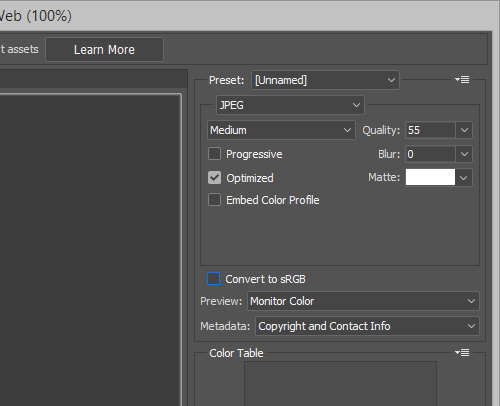
Step 4: When saving files with Save for Web & Devices, ensure that Convert to sRGB is turned off. If you’re saving a JPEG file, then also turn off Embed Color Profile (you may want this turned on for certain photos, but chances are you’ll want it off for interface elements and icons).
Difference Between “Assign Profile” And “Convert To Profile”
Now would be a good time to mention the difference between Assign Profile and Convert to Profile, so that you know which to use when.
Each Photoshop document contains a color profile that’s separate from the actual color data stored for each pixel. Assign Profile simply changes the profile in the document, without affecting any of the color data. It’s a non-destructive action: you can assign a new color profile to your documents as often as you like without doing any damage. Assigning a new profile may change the way your document appears on screen, but the data contained in the file will remain unaltered.
Convert to Profile is quite different. Not only does it assign a color profile to the document, but it tries to keep your image looking the same on screen. It does this by processing the color data contained in the file for each pixel. Converting to a new profile will more likely preserve a document’s color on screen, but the data contained in the file will be permanently altered. Use with caution.
If you’re copying layers from one Photoshop document to another, you will want to ensure that the documents have been assigned the same color profile.
Illustrator Is The Same As Photoshop
If you would like images saved in Illustrator or imported from Illustrator to Photoshop to match as well, then follow the steps below. These instructions are for Illustrator CS4 on Mac and Windows. Setting up Illustrator CS3 is very similar.
Step 1: Go to Edit → Color Settings, and set the working space for RGB to Monitor RGB.
Step 2: Open the document and go to Edit → Assign Profile. Then set it to Don’t Color Manage This Document. This must be done for every single document you work on.
Step 3: Ensure that View → Proof Colors is turned off.
Step 4: When saving files with Save for Web & Devices, ensure that Convert to sRGB is turned off. If you’re saving a JPEG file, then also turn off Embed Color Profile (again, you may want this turned on for certain photos, but chances are you’ll want it off for interface elements and icons).
Gamma Differences
Windows has used a gamma of 2.2 since its introduction. OS X has used a gamma of 1.8 for all versions except Snow Leopard (the latest release), which uses 2.2. What does this mean? Prior to Snow Leopard, Web pages looked darker on Windows. Thankfully, both operating systems are now in sync, so a Web page should look very similar on a Mac and PC that use the same monitor.
Information about the iPhone’s gamma is a little hard to come by; I couldn’t ascertain whether it is 1.8 or 2.2. This is another reason to test your interface on an iPhone.
Final Check For iPhone UI
Your iPhone or iPod’s screen and calibration will likely be different from your Mac or PC’s screen and calibration. I often import full-screen images of the UI into iPhoto and sync them with an iPhone to see exactly how the final interface will look on the device (on Windows, you can sync photos using iTunes). This gives you another chance to make adjustments before slicing up images or committing anything to code.

This article explains how to handle the problem that while testing some landscape iPhone app interface mocks, they seem blurrier than they appear in Photoshop.
On Mac, moving colors between Photoshop and code can be made easier with Developer Picker, Hex Color Picker and Colors (all free).
Conclusion
Now, you’re able to move bitmap and vector images between Photoshop and Illustrator without any color shifts at all, and using any method. You’re also able to grab a color using the color picker in Photoshop, and then use the same HEX color value in your CSS, HTML, JavaScript, Flash or Objective-C code, and it will match your images perfectly. I hope this article has helped. If you have any questions, feel free to ask in the comments below.
Related posts
You may be interesting in the following related posts:
- 20 Time-Saving Tips to Improve Designer’s Workflow
- Clever PNG Optimization Techniques
- PNG Optimization Guide: More Clever Techniques
- Clever JPEG Optimization Techniques


