Call to Action Buttons: Examples and Best Practices

Email Newsletter
Weekly tips on front-end & UX.
Trusted by 182,000+ folks.
 Register for Free
 Custom Web Forms for Angular, React, & Vue. Your backend.


 Celebrating 10 million developers
How can we create effective call to action buttons that grab the user’s attention and entice them to click? We’ll try to answer this question in this post by sharing some effective design techniques and exploring some examples.
You may want to take a look at the following related posts:
- Stop Designing Pages And Start Designing Flows
- Designing CSS Buttons: Techniques and Resources
- A Quick Guide For Designing Better Buttons
- Elements Of A Viral Launch Page
Best Practices for Effective Call to Action Buttons
Designing call to action buttons into web interfaces requires some forethought and planning; it has to be part of your prototyping and information architecture processes in order for them to work well. In this section, we’ll discuss some design techniques for call to action buttons.
Draw user attention with size
In web pages, the size of an element relative to its surrounding elements indicates its importance: the larger the element is, the more important it is. Decide how vital certain site actions are, and size your call to action buttons accordingly.
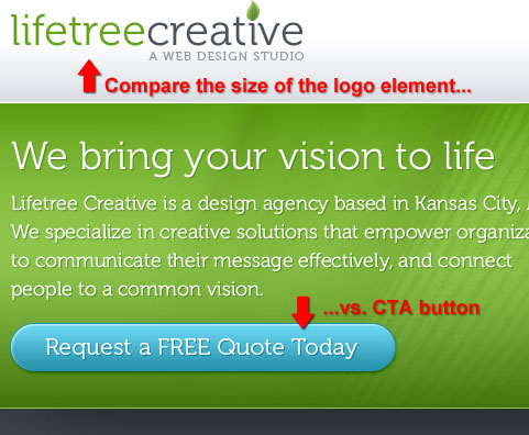
Size of call to action button versus surrounding elements
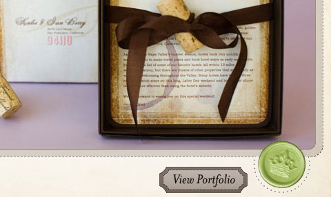
Lifetree Creative exhibits this idea of size to indicate importance with their call to action button. Compare the size of their button with the company logo. To grab the user’s attention, the call to action button is roughly 20% larger (in width) than the logo. Even though the logo is placed higher on the web page, your eyes are drawn to the call to action button because of its larger size in relation to surrounding elements.
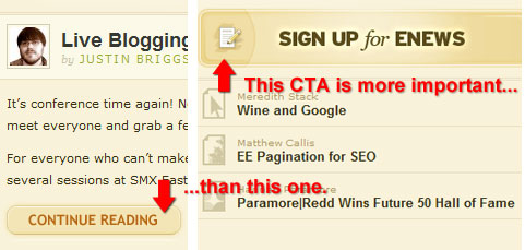
Size of call to action button versus less important call to actions
A web page may have multiple calls for action. To indicate the relative importance of a call to action with respect to other actions, you can vary their sizes. Here is an example of this concept on the paramore|redd website where the call to action button that asks the user to sign up for their newsletter is significantly larger than the continue reading call to action, indicating that on this web page, they would rather you take the action of subscribing versus reading the blog posts.
Draw user attention with prominent positioning
The placement of call to action buttons on a web page is critical to drawing the eyes of visitors. Placement in prominent locations such as the top section of a web page can lead to higher landing page conversions because users will likely notice the call to action button and take action.
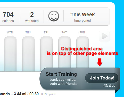
Placement in a distinguished area
Putting a call to action button on a distinguished area is one way of making it stand out in a web layout. You can see this idea in action on the dailymile website where the call to action button looks to be on a higher plane (on top of) other site elements such as the bar graph graphic.
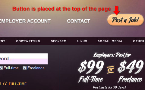
Placement at the top of the web page
To illustrate this concept, take a look at the “Post a Job!” call to action button located at the very top right corner of the Your Web Job website. By putting the call to action in a very prominent area, it is more likely that the user will notice it or remember it later, after they have looked at the site’s content. For example, if a job poster wanted to explore the site before taking the action of posting a job, the “Post a Job!” call to action will be ready for them regardless of which page leads them to a conversion, and they’ll be more likely to remember where they can easily take this action because of its prominent placement.
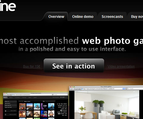
Placement at the center of a layout
Locating a call to action button in the middle of a web layout with no (or significantly smaller and deemphasized) flanking elements can be an effective way of drawing attention and enticing an action. In the case of PicsEngine, even though the call to action button doesn’t have a high color contrast with its background and surrounding page elements, it still manages to draw attention simply by its centered placement.
Use whitespace to detach call to actions from other elements
The use of whitespace (or dead space) around a call to action button is an effective way of making it stand out in areas where there are many elements.
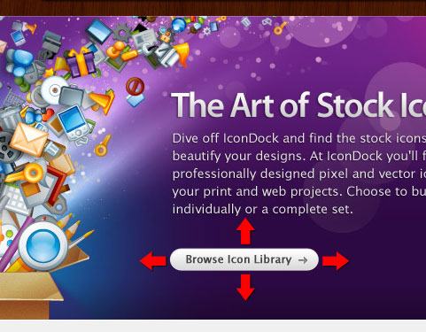
Whitespace used to distinguish a call to action button
IconDock shows just how effective sufficient whitespace is. Even with a small and plainly-designed call to action button, it still stands out because of the space in between its adjacent elements.
Vary the amount of whitespace to indicate a logical connection
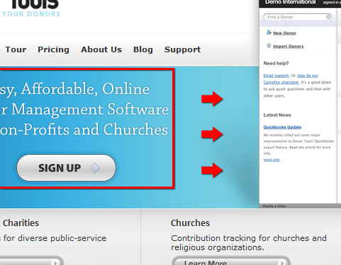
The more whitespace there is in between a call to action button versus a surrounding element, the less connected they are. Therefore, if you have other elements that can help convince users to take action, reduce the whitespace in between those elements and the CTA.
For example, Donor Tools has text above their “Sign Up” call to action that tells the user the benefits of signing up. On its right is a browser screenshot that is there for aesthetics and not necessarily for prompting the user to click on the “Sign Up” call to action button. By reducing the whitespace in between the text and call to action button, you group these two elements visually. The whitespace in between the browser screenshot and an image ensures that the eyes are not distracted from the call for action.
Use highly contrasting colors
Deciding what colors to use for call to action buttons is very important. Use colors in your call to action buttons that have a high contrast relative to surrounding elements and the background because it is critical to ensure that the user notices your call to action.
Color contrast versus surrounding elements
Notepod exemplifies how color contrast between a call to action and its surrounding elements can be effective in drawing user attention directly to it. The surrounding elements are all black, while the call to action button is a bright blue color.

Background/foreground color contrast
Valley Creek Church sets its bright yellow “Learn More” call to action button above a grayscale image. Even with a simple call to action button design on top of a complex element (a photo in this case), it still stands out because of the color choice.

Offer secondary alternative actions
A web page can have multiple calls for actions. Sometimes it’s necessary to offer a secondary action in order to convince the user to later take your desired primary call for action. For example, before the user signs up for a web service, some users may need further information to be prompted to take the action of signing up; secondary actions may be calling them to take a product tour or to visit a web page with more information about the product.
Displaying secondary actions beside the primary action
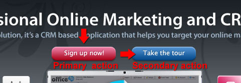
OfficeVP displays two call to action buttons beside each other — centered and located at the top of the web layout. By differentiating the color, users can see that they have two distinct routes: they can either sign up directly (primary action), or if they wish to learn more before committing, they can take the secondary action of taking a tour first.
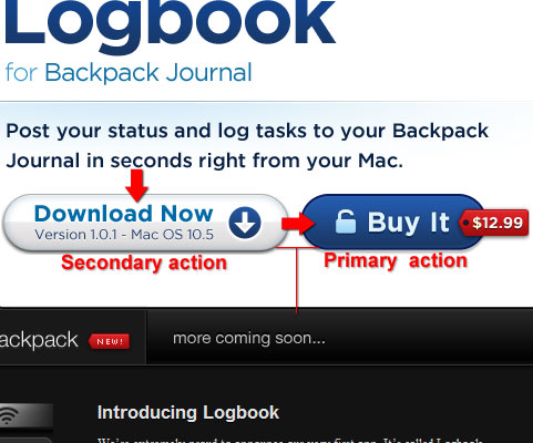
Transmissions also shows this notion of having a secondary action next to the desired primary action. In this case, the primary action is for the user to purchase the application. If they want to try it before purchasing, then the secondary desired action is to download the application first. Notice that the primary action is indicated by making it more prominent than the secondary action, having a higher color contrast to its background than the secondary call to action button. Thus, you effectively draw the eyes from left to right.
Also, note the use of reduced whitespace between the two call to action buttons relative to other elements in the area, effectively grouping the buttons together.
Displaying secondary actions below the primary action
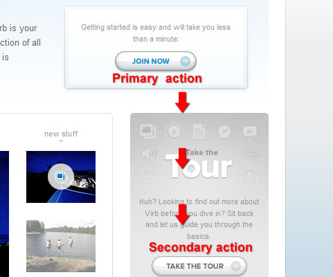
Alternatively, you may wish to display the secondary action below the primary action. This may be necessary if you need to have greater visual separation of your calls for action. Virb shows this situation where the “Join Now” call to action is placed above the secondary action of taking the product tour. Notice that the secondary action is further separated from the primary action by using a more muted color for its default state.
Convey a sense of urgency
Phrasing of the action by using bold, confident, and commanding words can alter the user’s perception in such a way as to convince them that they shouldn’t wait any longer to take action and that waiting to take action would result in a penalty or a missed opportunity.
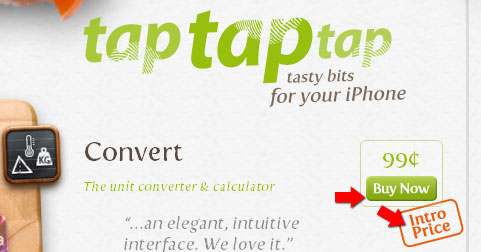
tap tap tap demonstrates this idea of adding urgency to a call for action. The “Buy Now” call to action button has the text “Intro price”, subtly suggesting that the longer the user waits to take action, the higher is the risk of having to pay more later on when the introductory price will have passed.
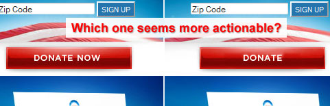
Oftentimes, suggestions to perform an action can be effective in creating a sense of urgency. Using words such as “now”, “immediately” and “right now” can convey such urgency. Take the Organizing for America (BarackObama.com) example of appealing to website visitors to “DONATE NOW”. If instead it simply said “Donate”, the sense of urgency would disappear and users may be less likely to take action.
Tell users that taking action is easy
Often, a user’s hesitation to take action stems from thinking that an action will be difficult, costly, or time consuming. By taking care of these concerns, your call to action buttons can lead to more conversions.
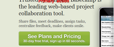
For example, on Basecamp, the call to action button explicitly defines the time it would take the user to sign up and tells users that signing up is costless (free). This approach weakens two primary users’ concerns when it comes to taking action online: paying (which also requires them to take additional actions such as getting their credit card) and time constraints.
In the example of Tea Round App, they tell that user that they won’t be getting spam emails by taking the action of signing up for their email service, which is a cause for concern whenever giving your email to a third-party service.

Tell users what to expect
Most web users are hesitant to take things they’re presented on the web at face value. By experience, their trust has been burnt before by links that promise free service only to find out that they’d have to put in their credit card numbers to get what they want. To increase click conversion and to build trust, anticipate users’ scepticism and tell them what they will gain by taking the action you’ve presented to them. When designing a call to action button, think of all the potential questions users will have, and make sure that you answer them in time.
Mozilla Firefox tells users what exactly to expect by clicking on their call to action button. The call to action button tells you that you’ll be getting Firefox 3.5, that it’s free, and (for those needing greater specificity) that the exact version is 3.5.3 for the Windows operating system, that the language is English, and that you should expect a 7.7MB download.

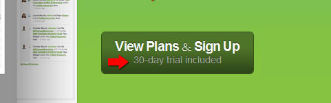
Onehub anticipates the question of whether the user (upon taking action) needs to pay up front or whether they can take the product for a test drive by telling the user that if they take the action of signing up, they’ll have a 30-day trial free of charge.
Design Showcase of Call to Action Buttons
Now that we’ve covered some best practices for designing call to action buttons, let’s look at some exemplary implementations of call to action buttons on websites. We’ll tie in these designs with the techniques and best practices from above and explore how they aid in accomplishing good design practice.
Campaign Monitor This set of call to action buttons presents two potential user actions: “Try it for free” and “View features”. For users who know about Campaign Monitor already and want to try it now, they can take the primary desired action, while others who’d like to explore before making the time commitment can take the secondary action of viewing the features of the web application.

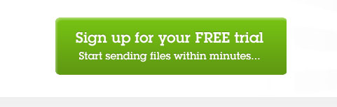
Fileshare HQ This call to action button tells users what to expect (“start sharing files in minutes”).
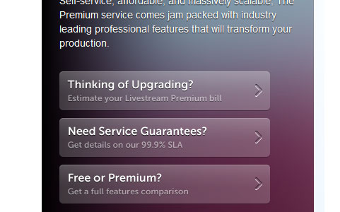
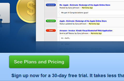
Livestream.com This set of call to action buttons uses vertically-arranged grouping to indicate the desired order of importance of the actions being presented to the user. The desired primary action is to get an estimate, followed by getting details about the service, and lastly, to compare and contrast between different plans.
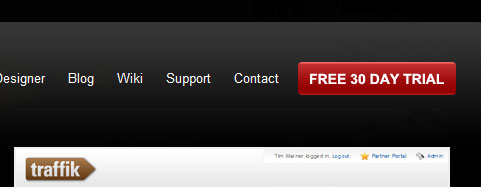
Traffik CMS This call to action button is placed in a prominent location at the very top of the web page and is highlighted relatively to the surrounding elements by size and color use.
Hambo Design This call to action button tells the user what to expect: by getting a quote, there are no strings attached. It anticipates the question of “how much will a quote cost me if I were to invest my time in going through this process?”
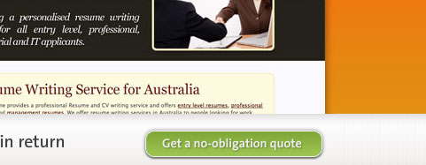
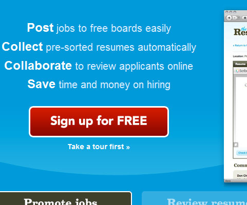
The Resumator You can see many best practices in action on this call to action button implementation. First, it uses whitespace, size, and color to clearly separate it from other page elements. Then, to create a logical grouping with elements that can help convince the user to take action, it has less whitespace with the feature text above it, and the secondary action of “Take a tour first” below it.
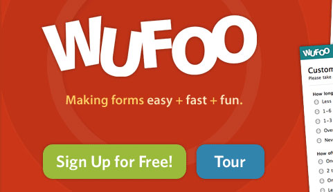
Wufoo Wufoo offers two actions that the user can take in a horizontally arranged fashion with the primary desired action on the left. The buttons are large and very hard to miss, yet they are not obtrusive when looking at the overall design.
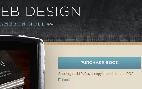
Mobile Web Design This call to action button is placed in a prominent location; it has large size and a distinctive color with respect to surrounding elements. To provide additional context on what it means to “Purchase the book”, the call to action button is followed by text explaining cost and available format (traditional book or PDF).
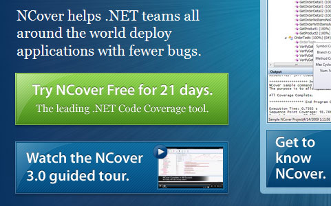
NCover These call to action buttons are stacked. The primary desired action is on top of the blue secondary desired action. The user is drawn to the button because of the size, and using a blue hue for the secondary desired action mutes it relative to the primary desired action. Notice the use of whitespace to create a logical grouping of the three related elements that can help make the sale: the text that tells users what NCover does, the sign up call to action, and the tour call to action. In contrast, notice the increased margin between this group and the element on the right.
Xero This set of call to actions exhibits the use of providing users a secondary action. On the right of the primary desired action, there is a text link that calls for the user to “find out more”. For users not willing to sign up right away, the design may have increased the likelihood that the user will “find out more” before signing up.

Tao Effect - Espionage Here is a set of call to action buttons that provides users with three options: Download, Buy Now, or Upgrade. In this case, the primary desired action is to download the application, followed by the two equally-prioritized actions of Buy Now, or Upgrade. This distinction is made by varying the colors of the call to action buttons, with the primary action more prominent than the two secondary actions.

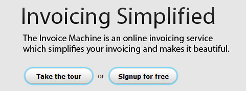
The Invoice Machine Here you can see two call to action buttons that are highlighted with a blue border. Because they’re both styled the same way, we can assume they have equal importance. Perhaps the company determined that it is unlikely that the user will take the action of signing up before seeing what they have to offer, or perhaps they’ve determined that the product tour will help them convert viewers to members more effectively.
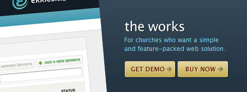
Ekklesia 360 This set of call to action buttons showcases the use of icons to denote a sense of moving forward (indicated by the arrows pointing to the right). They use a high-contrast color against the dark blue background to make the call to actions prominent in the page design.
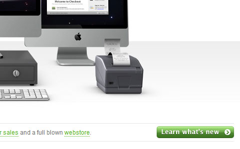
Checkout By using a very prominent color for their call to action button relative to the overall design, even though the image above it is significantly larger than the button size, it still manages to attract the user’s attention.
spinen Using direct and clear language tells users what to expect when they take action: in this case, clicking on the call to action button will let them find out more about the product.

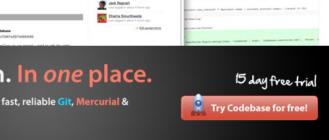
Codebase This call to action button tells users what they can get by taking action: a free 15-day trial. It manages to draw the user’s attention by using a high-contrast color, an icon on the left, and plenty of whitespace.
GoodBarry In this call to action, you can see how whitespace, size, and smart color decisions are effective in making a call to action very noticeable. Emphasizing that the action will be “FREE” conveys to users what to expect.
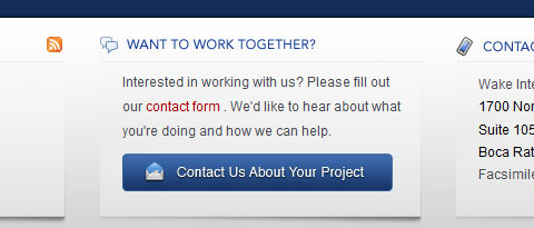
Wake Interactive Here, the color of the call to action button relative to its surrounding elements makes it pop out even with the small amount of whitespace surrounding it.
OH! Media This call to action button really stands out of the page because of its position, the whitespace surrounding it, and – most importantly – the color choice. Looking at the page, the eyes are drawn directly to the call to action.
Pixelcrayons Check out how whitespace can greatly improve the amount of attention that this call to action button draws.
Ballpark The size of this call to action button is effectively attracting the user’s attention. Its clear and direct language tells the user exactly what to expect when taking the action.
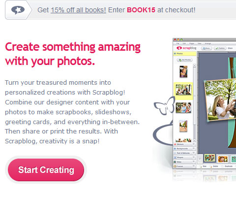
Scrapblog You can see the effects of using a prominent color, sufficient whitespace, and size relative to surrounding elements to attract users’ attention. Straightforward language conveys a sense of easiness, claiming that you can “start” right away by taking action.
13 Creative This call to action button shows how by using an unconventional design, you can still draw attention even if surrounding elements are proportionally larger.
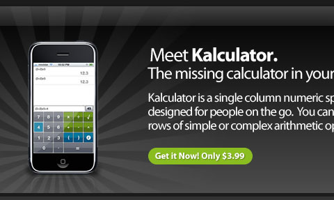
Kalculator This call to action tells users exactly what to expect: by clicking on this call to action, they should anticipate shelling out $3.99. Using the word “only” hints that this is quite a good deal, which can help make the sale.
Web Design Beach Below is a set of call to action buttons with two distinct colors. The more prominent one, “get a quote” suggests that it is the desired primary action.
The Highland Fling This call to action button manages to call attention to itself by plenty of whitespace, prominent positioning, and the use of an icon to distinguish itself. By using the word “now”, it conveys a sense of urgency and a need to act immediately.
Commercial IQ The size and prominent positioning of this call to action button draws users’ attention. A magnifying glass icon adds context to the purpose of the action. Adding the text “Free to search” anticipates the question the user may have about the cost of the action.

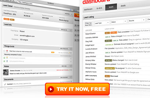
dashboard Here, you can see the use of a high contrasting color to make the call to action stand out, even among significantly larger page elements.
Additional Resources on Call to Action Buttons
If you’d like to read more about Call to Action buttons, here are some relevant resources and articles on other sites.
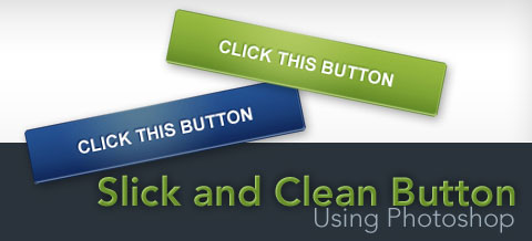
How to Create a Slick and Clean Button in Photoshop This tutorial on Six Revisions, written by me, will show you how to make large and noticeable call to action buttons step by step.
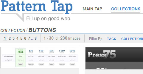
Inspirational Buttons in web design - Pattern Tap If you need some inspiration on good button designs, check out this Pattern Tap collection.
10 techniques for an effective ‘call to action’ Paul Boag discusses some techniques for making good call to action buttons.
Good Call-To-Action Buttons UX Booth has a good piece on what a good call to action button consists of.
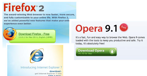
Firefox Shows How a Strong Call to Action Can Boost Landing Page Performance Read about how a good call to action button can improve conversions. You’ll find a comparison between the call to action buttons used by Firefox, Opera, and Internet Explorer.
Web Design Trends: Call To Action Buttons Lee Munroe puts together a showcase of call to action buttons, along with a discussion on current design trends.