Modern CSS Layouts: The Essential Characteristics

Email Newsletter
Weekly tips on front-end & UX.
Trusted by 182,000+ folks.


 Celebrating 10 million developers
 Custom Web Forms for Angular, React, & Vue. Your backend.
Now is an exciting time to be creating CSS layouts. After years of what felt like the same old techniques for the same old browsers, we’re finally seeing browsers implement CSS 3, HTML 5 and other technologies that give us cool new tools and tricks for our designs.
But all of this change can be stressful, too. How do you keep up with all of the new techniques and make sure your Web pages look great on the increasing number of browsers and devices out there? In part 1 of this article, you’ll learn the five essential characteristics of successful modern CSS websites. In part 2 of this article, you’ll learn about the techniques and tools that you need to achieve these characteristics.
Be sure to check out the following articles:
- Modern CSS Layouts, Part 2: The Essential Techniques
- Responsive Web Design: What It Is And How To Use It
- Flexbox Is As Easy As Pie – Designing CSS Layouts
- Mastering CSS Principles: A Comprehensive Guide
We won’t talk about design trends and styles that characterize modern CSS-based layouts. These styles are always changing. Instead, we’ll focus on the broad underlying concepts that you need to know to create the most successful CSS layouts using the latest techniques. For instance, separating content and presentation is still a fundamental concept of CSS Web pages. But other characteristics of modern CSS Web pages are new or more important than ever. A modern CSS-based website is: progressively enhanced, adaptive to diverse users, modular, efficient and typographically rich.
- Progressively enhanced,
- Adaptive to diverse users,
- Modular,
- Efficient,
- Typographically rich.
Progressive Enhancement
Progressive enhancement means creating a solid page with appropriate markup for content and adding advanced styling (and perhaps scripting) to the page for browsers that can handle it. It results in web pages that are usable by all browsers but that do not look identical in all browsers. Users of newer, more advanced browsers get to see more cool visual effects and nice usability enhancements.
The idea of allowing a design to look different in different browsers is not new. CSS gurus have been preaching this for years because font availability and rendering, color tone, pixel calculations and other technical factors have always varied between browsers and platforms. Most Web designers avoid “pixel perfection” and have accepted the idea of their designs looking slightly different in different browsers. But progressive enhancement, which has grown in popularity over the past few years, takes it a step further. Designs that are progressively enhanced may look more than slightly different in different browsers; they might look very different.
For example, the tweetCC website has a number of CSS 3 properties that add attractive visual touches, like drop-shadows behind text, multiple columns of text and different-colored background “images” (without there having to be actually different images). These effects are seen to various extents in different browsers, with old browsers like IE 6 looking the “plainest.” However, even in IE 6, the text is perfectly readable, and the design is perfectly usable.
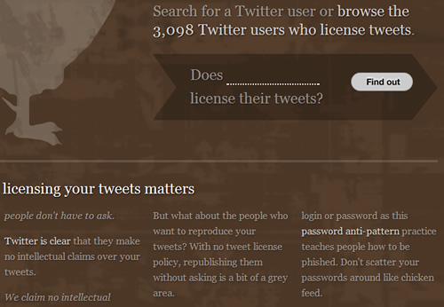
tweetCC in Safari.
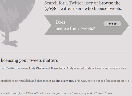
tweetCC in IE 6.
In CSS 3-capable browsers like Safari (top), the tweetCC website shows a number of visual effects that you can’t see in IE 6 (bottom).
These significant differences between browsers are perfectly okay, not only because that is the built-in nature of the Web, but because progressive enhancement brings the following benefits:
- More robust pages. Rather than use the graceful degradation method to create a fully functional page and then work backwards to make it function in less-capable browsers, you focus first on creating a solid “base” page that works everywhere.
- Happier users. You start building the page making sure the basic functionality and styling is the same for everyone. People with old browsers, mobile devices and assistive technology are happy because the pages are clean and reliable and work well. People with the latest and greatest browsers are happy because they get a rich, polished experience.
- Reduced development time. You don’t have to spend hours trying to get everything to look perfect and identical in all browsers. Nor do you have to spend much time reverse-engineering your pages to work in older browsers after you have completed the fully functional and styled versions (as is the case with the graceful degradation method).
- Reduced maintenance time. If a new browser or new technology comes out, you can add new features to what you already have, without altering and possibly breaking your existing features. You have only one base version of the page or code to update, rather than multiple versions (which is the case with graceful degradation).
- More fun. It’s just plain fun to be able to use cool and creative new techniques on your Web pages, and not have to wait years for old browsers to die off.
Learn more about progressive enhancement:
- Progressive Enhancement: What It Is, And How To Use It?
- Progressive Enhancement on Wikipedia
- Progressive Enhancement: Paving the Way for Future Web Design
Adaptive to Diverse Users
Modern CSS-based Web pages have to accommodate the diverse range of browsers, devices, screen resolutions, font sizes, assistive technologies and other factors that users bring to the table. This concept is also not new but is growing in importance as Web users become increasingly diverse. For instance, a few years ago, you could count on almost all of your users having one of three screen resolutions. Now, users could be viewing your pages on 10-inch netbooks, 30-inch widescreen monitors or anything in between, not to mention tiny mobile devices.
In his article “Smart columns with CSS and jQuery” Soh Tanaka describes his techniques that adapts the layout depending on the current browser window size.
Creating Web designs that work for all users in all scenarios will never possible. But the more users you can please, the better: for them, for your clients and for you. Successful CSS layouts now have to be more flexible and adaptable than ever before to the increasing variety of ways in which users browse the Web.
Consider factors such as these when creating CSS layouts:
- Browser. Is the design attractive and usable with the most current and popular browsers? Is it at least usable with old browsers?
- Platform. Does the design work on PC, Mac and Linux machines?
- Device. Does the design adapt to low-resolution mobile devices? How does it look on mobile devices that have full resolution (e.g. iPhones)?
- Screen resolution. Does the design stay together at multiple viewport (i.e. window) widths? Is it attractive and easy to read at different widths? If the design does adapt to different viewport widths, does it correct for extremely narrow or wide viewports (e.g. by using the
min-widthandmax-widthproperties)? - Font sizes. Does the design accommodate different default font sizes? Does the design hold together when the font size is changed on the fly? Is it attractive and easy to read at different font sizes?
- Color. Does the design make sense and is the content readable in black and white? Would it work if you are color blind or have poor vision or cannot detect color contrast?
- JavaScript presence. Does the page work without JavaScript?
- Image presence. Does the content make sense and is it readable without images (either background or foreground)?
- Assistive technology/disability Does the page work well in screen readers? Does the page work well without a mouse?
This is not a comprehensive list; and even so, you would not be able to accommodate every one of these variations in your design. But the more you can account for, the more user-friendly, robust and successful your website will be.
See these resources on user diversity and Web page adaptability:
- Market Share by Net Applications
- Actual Browser Sizes
- Screen Resolutions and Better User Experience
- Fixed vs. Fluid vs. Elastic Layout: What’s the Right One for You?
- Mobile Web Design Trends for 2009
Modular
Modern websites are no longer collections of static pages. Pieces of content and design components are reused throughout a website and even shared between websites, as content management systems (CMS), RSS aggregation and user-generated content increase in popularity. Modern design components have to be able to adapt to all of the different places they will be used and the different types and amount of content they will contain.
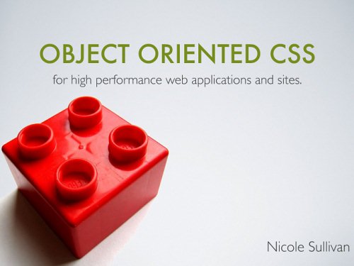
Object Oriented CSS is Nicole Sulivan’s attempt to create a framework that would allow developers to write fast, maintainable, standards-based, modular front end code.
Modular CSS, in a broad sense, is CSS that can be broken down into chunks that work independently to create design components that can themselves be reused independently. This might mean separating your style into multiple sheets, such as layout.css, type.css, and color.css. Or it might mean creating a collection of universal CSS classes for form layout that you can apply to any form on your website, rather than have to style each form individually. CMS’, frameworks, layout grids and other tools all help you create more modular Web pages.
Modular CSS offers these benefits (depending on which techniques and tools you use):
- Smaller file sizes. When all of the content across your website is styled with only a handful of CSS classes, rather than an array of CSS IDs that only work on particular pieces of content on particular pages, your style sheets will have many fewer redundant lines of code.
- Reduced development time. Using frameworks, standard classes and other modular CSS tools keeps you from having to re-invent the wheel every time you start a new website. By using your own or other developers’ tried and true CSS classes, you spend less time testing and tweaking in different browsers.
- Reduced maintenance time. When your style sheets include broad, reusable classes that work anywhere on your website, you don’t have to come up with new styles when you add new content. Also, when your CSS is lean and well organized, you spend less time tracking down problems in your style sheets when browser bugs pop up.
- Easier maintenance for others. In addition to making maintenance less time-consuming for you, well-organized CSS and smartly named classes also make maintenance easier for developers who weren’t involved in the initial development of the style sheets. They’ll be able to find what they need and use it more easily. CMS’ and frameworks also allow people who are not as familiar with your website to update it easily, without screwing anything up.
- More design flexibility. Frameworks and layout grids make it easy, for instance, to switch between different types of layout on different pages or to plug in different types of content on a single page.
- More consistent design. By reusing the same classes and avoiding location-specific styling, you ensure that all elements of the same type look the same throughout the website. CMS’ and frameworks provide even more insurance against design inconsistency.
Learn more about modular CSS techniques:
- Object-Oriented CSS
- Making Modular Layout Systems
- Definitive List of CSS Frameworks: Pick Your Style
Efficient
Modern CSS-based websites should be efficient in two ways:
- Efficient for you to develop,
- Efficient for the server and browser to display to users.
As Web developers, we can all agree that efficiency on the development side is a good thing. If you can save time while still producing high-quality work, then why wouldn’t you adopt more efficient CSS development practices? But creating pages that perform efficiently for users is sometimes not given enough attention. Even though connection speeds are getting faster and faster, page load times are still very important to users. In fact, as connection speeds increase, users might expect all pages to load very quickly, so making sure your website can keep up is important. Shaving just a couple of seconds off the loading time can make a big difference.
We’ve already discussed how modular CSS reduces development and maintenance time and makes your workflow a lot faster and more efficient. A myriad of tools are out there to help you write CSS quickly, which we’ll cover in part 2 of this article. You can also streamline your CSS development process by using many of the new effects offered by CSS 3, which cut down on your time spent creating graphics and coding usability enhancements.
Some CSS 3 techniques also improve performance and speed. For instance, traditional rounded-corner techniques require multiple images and DIVs for just one box. Using CSS 3 to create rounded corners requires no images, thus reducing the number of HTTP calls to the server and making the page load faster. No images also reduces the number of bytes the user has to download and speeds up page loading. CSS 3 rounded-corners also do not require multiple nested DIVs, which reduces page file size and speeds up page loading again. Simply switching to CSS 3 for rounded corners can give your website a tremendous performance boost, especially if you have many boxes with rounded corners on each page.
Writing clean CSS that takes advantage of shorthand properties, grouped selectors and other efficient syntax is of course just as important as ever for improving performance. Many of the more advanced tricks for making CSS-based pages load faster are also not new but are increasing in usage and importance. For instance, the CSS Sprites technique, whereby a single file holds many small images that are each revealed using the CSS background-position property, was first described by Dave Shea in 2004 but has been improved and added to a great deal since then. Many large enterprise websites now rely heavily on the technique to minimize HTTP requests. And it can improve efficiency for those of us working on smaller websites, too. CSS compression techniques are also increasingly common, and many automated tools make compressing and optimizing your CSS a breeze, as you’ll also learn in part 2 of this article.
Learn more about CSS efficiency:
- 7 Principles of Clean and Optimized CSS Code
- Simplifying CSS Selectors
- Best Practices for Speeding Up Your Website
- The Mystery Of CSS Sprites: Techniques, Tools And Tutorials
- 35 CSS Lifesavers For Efficient Web Design
Rich Typography
Rich typography may seem out of place with the four concepts we have just covered. But we’re not talking about any particular style of typography or fonts, but rather the broader concept of creating readable yet unique-looking text by applying tried and true typographic principles using the newest technologies. Typography is one of the most rapidly evolving areas of Web design right now. And boy, does it need to evolve! While Web designers have had few limits on what they could do graphically with their designs, their limits with typography have been glaring and frustrating.
Until recently, Web designers were limited to working with the fonts on their end users’ machines. Image replacement tricks and clever technologies such as sIFR have opened new possibilities in the past few years, but none of these is terribly easy to work with. In the past year, we’ve finally made great strides in what is possible for type on the Web because of the growing support for CSS 3’s @font-face property, as well as new easy-to-use technologies and services like Cufón and Typekit.
The @font-face rule allows you to link to a font on your server, called a “Web font,” just as you link to images. So you are no longer limited to working with the fonts that most people have installed on their machines. You can now take advantage of the beautiful, unique fonts that you have been dying to use.
@font-face in action: Teehanlax.com
Craigmod
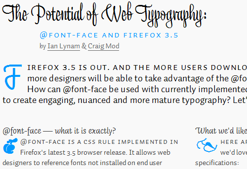
The three screenshots above are all examples of what @font-face can do.
The main problem with @font-face, aside from the ever-present issue of browser compatibility, is that most font licenses—even those of free fonts—do not allow you to serve the fonts over the Web. That’s where @font-face services such as Typekit, Fontdeck and Kernest are stepping in. They work with type foundries to license select fonts for Web design on a “rental” basis. These subscription-based services let you rent fonts for your website, giving you a much wider range of fonts to work with, while avoiding licensing issues.

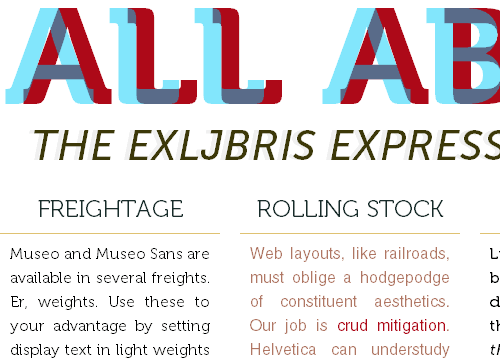
For A Beautiful Web uses the Typekit font embedding service for the website name, introductory text and headings.
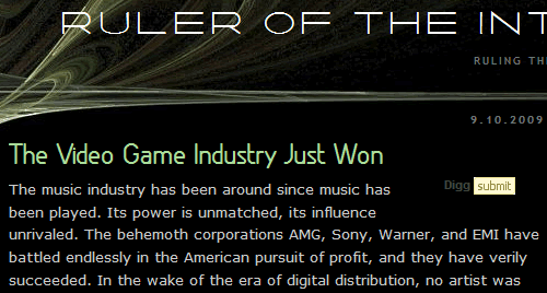
Ruler of the Interwebs uses the Kernest font embedding service for the website name and headings.
We still have a long way to go, but the new possibilities make typography more important to Web design than ever before. To make your design truly stand out, use these modern typographic techniques, which we’ll cover in even greater detail in Part 2.
See these resources on current CSS typography techniques:
- Beautiful Fonts With @font-face
- Why Web Font Services Are the Future of Fonts on the Web
- The Direction Forward with Web Fonts
- Roundup of Font Embedding and Replacement Techniques
Summary
We’ve looked at five characteristics of modern CSS websites:
- Progressively enhanced,
- Adaptive to diverse users,
- Modular,
- Efficient,
- Typographically rich.
In part 2 of this article, coming soon, we’ll go over the techniques and tools that will help you implement these important characteristics on your CSS-based Web pages.
 (al)
(al)

