10 Pre-Press Tips For Perfect Print Publishing

Email Newsletter
Weekly tips on front-end & UX.
Trusted by 182,000+ folks.
 Register for Free


 Custom Web Forms for Angular, React, & Vue. Your backend.
 Celebrating 10 million developers
A lot of designers think CMYK is the way to go when designing for print. We will, of course, always use CMYK-based ink, but this does not mean you have to work with CMYK files. You can work with RGB images to perfectly optimize your print colors and save a great deal of time in the process.
Be sure to check out the following articles:
- The Ultimate Round-Up of Print Design Tutorials
- Creative Print Typography Layouts
- Business Card Design: Better Than A Plain Ol’ Business Card
- Beautiful Brochures and Booklets
1. Use RGB Color Mode For Photoshop Images
For several of the following tips to work, you will have to create and save all of your Photoshop images and artwork in RGB color mode. If you’re a veteran designer, you probably think this goes against what you’ve been taught, which is to use CMYK color mode. Well, technology has come a long way, and nowadays RGB color mode is better because it produces a wider range of colors and allows you to use one image for several media, including print and Web.

Think of it this way: RGB colors (red, green, and blue) are created with light. That’s why your computer monitor and TV use RGB colors to produce its fantastic range of colors. CMYK colors (cyan, magenta, yellow and key, or black), on the other hand, are created by putting ink to paper. “Ink-on-paper colors” will never be as bright or saturated as the colors on your computer screen or TV, no matter how much ink you add to the paper. So, to get the widest range of colors possible, you need to save all of your Photoshop files in RGB color mode. Most of the time, you won’t even have to think about it, because almost every photographer will supply you with RGB images. All you have to do is keep them in that mode.
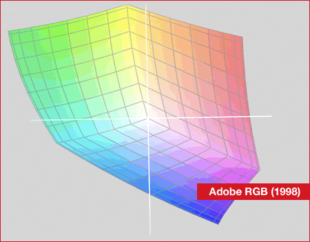
A 3-D map showing the range of the Adobe RGB (1998) color space, the sRGB (or small RGB) color space and the common newspaper CMYK color space. sRGB’s range is much smaller than Adobe RGB’s. Working in the Adobe RGB color space would result in much brighter colors. The range of the CMYK color space is much narrower. Especially for this newspaper, the white in CMYK mode isn’t white at all. It’s more of a dirty brown.
2. Specify The Right Color Settings
To successfully use an RGB image in Adobe InDesign, you first need to specify the appropriate color settings. Fortunately, Adobe has made it really easy for you to specify the right settings and quickly apply them across its Creative Suite. This is where Adobe Bridge comes in.
To specify a color setting in Adobe Bridge, choose Edit → Creative Suite Color Settings and then select your region: either “North America Prepress 2,” “Europe Prepress 2” or “Japan Prepress 2.” If your region isn’t displayed in the dialog box, select “Show Expanded List Of Color Settings Files” at the bottom of the dialog box. After clicking “Apply,” the setting you have specified will be applied to Adobe InDesign, Photoshop, Illustrator and Acrobat.
3. Ditch Photoshop EPS Files And Use PSD Files Instead
After your images and artwork have been saved in RGB color mode and you’ve specified the right color settings, it’s time to start designing. Do you still keep a copy of your native Photoshop (PSD) files and save TIFF or EPS versions, which you then import into InDesign? If so, you’re missing out on some valuable opportunities.
If you’ve been using InDesign for a while, you probably already know that it honors transparency effects in PSD files, but that’s not all. When you import PSD files, InDesign also honors clipping paths, spot colors, alpha channels, duotone colors and vector information (such as Smart Objects). You can even access all the layers in a PSD file by selecting “Show Import Options” when you import an image or choosing Object → Object Layer Options after importing an image. With all of these time-saving opportunities, saving all of your Photoshop images in the PSD file format is a no-brainer.
4. Accurately Simulate CMYK While Working In RGB
Keep in mind that even though you’re importing RGB images with bright and saturated colors, InDesign actually shows you what the CMYK equivalent of each image will look like. So, how does InDesign make that color conversion properly? Well, because you’ve specified the appropriate color settings in Adobe Bridge, InDesign will use those settings to accurately display each RGB image when it’s converted to CMYK color mode.
InDesign even goes a step further and shows you exactly how the colors in a layout will appear when printed on a certain type of paper using a specific output device. Simply choose View → Proof Setup → Custom. Then choose an output device from the “Device to Simulate” pop-up menu, and select the “Simulate Paper Color” option. After clicking “Okay,” the color of your pages will change, and your images will appear darker and less saturated. So, to get a good idea of how your layout will appear when printed on coated paper using a sheet-fed printer, choose “U.S. Sheetfed Coated v2.” This feature is great because it gives you an accurate idea of how your colors will appear when they’re printed.
If you use Photoshop, you may be wondering, “Wouldn’t it be nice if Photoshop could do the same trick, so that I can see what happens to my RGB images when they’re converted to CMYK?” Well, of course it can. Just choose View → Proof Colors, and make sure that “Working CMYK” is specified by choosing View → Proof Setup → Working CMYK. When you proof colors, you’re not actually changing the color mode of the image, so you can continue working in RGB color mode while simulating CMYK. This is yet another reason not to convert your Photoshop files to CMYK.

The top part of this image is a “SoftProof” of how this RGB image will appear when printed in a newspaper. The bottom part shows the original sRGB. The dirty color is actually the color of the paper. As you can see, the color of the paper affects all other colors.
5. Selecting the Right CMYK Output Profile For The Job
There are many different kinds of paper, such as recycled and brownish paper for newspapers, glossy paper for magazines, uncoated paper for stationary and bright-white coated paper for high-quality brochures. As you can imagine, each type has different characteristics when it comes to printing. The recycled paper sucks up more ink, and if you don’t take this into account, your beautiful full-color photos will become too dark, and the ink will blur over the paper, creating an ugly brownish effect.
So, how do you optimize artwork for all of these different kinds of papers? Well, that’s the easy part. Standard CMYK inks have been tested on every type of paper to the extreme. The way cyan, magenta, yellow and black are printed on a specific type of paper is documented in an ICC profile. All you need to do is download these free “Color Profiles” and select the right one when you export a PDF using InDesign (Export → Output → Color Conversion & Destination). If you’re not sure what kind of paper your printer will use, simply ask them. Most printers would rather answer a simple question than clean up colors afterward.
The information provided by the color setting that you specified in Adobe Bridge is used by InDesign to determine how to convert RGB images to the CMYK color space when you output a document. By using InDesign instead of Photoshop to make that conversion, you gain the benefits outlined in the following point.
6. Use InDesign Instead Of Photoshop To Make The Final Color Conversion
There are several good reasons to let InDesign do the conversion:
- Images are all converted at the same time instead of one at a time before you import each into InDesign.
- You can reuse the same image for different purposes. For instance, you might want to re-use the image on your website for a brochure, magazine or newspaper. If you let InDesign do the color conversion, it will optimize your RGB images for whatever output device and type of paper you choose.
- You can simulate how the colors in a layout will appear on different kinds of paper using the same RGB images.
When you use Photoshop to convert all of your images to CMYK before importing them into your InDesign layouts, you prevent InDesign from optimizing the color for different output devices and paper types. If you make the conversion to CMYK first and start designing later, you might unwittingly alter the “maximum ink” and other important color-related characteristics that were pre-defined in your Photoshop file when Photoshop converted your RGB image to CMYK.
As a result, when you work on the colors and contrast later, what you see on screen won’t be what you get in print because you have altered the optimal colors.
7. Download All The Profiles
Different CMYK Color Profiles are available for different kind of papers and print processes. Several organizations provide top-of-the-line ICC profiles, all of which can be downloaded for free at the bottom of this page. The most common are:
- Newspaper: ISOnewspaper
- Magazines: ISOWebcoated
- Full Color Offset:
- U.S. Web Coated (SWOP) v2
- ISOCated_v2
- ISOuncoated
- Europe ISOCoated FOGRA27
- (or the new one, FOGRA39)
8. Exporting A Perfect CMYK PDF Using RGB Images
Once you’ve downloaded and installed the ICC profiles, they’ll be available to InDesign. You don’t even need to select the right profile and assign it to your InDesign document. All you have to do is select the right ICC profile when you export the document to PDF (Export → Output → Color Conversion & Destination). Although you don’t need to assign the right CMYK profile, I would recommend it, because it allows InDesign to match the colors when you select the “Proof Colors” command.
After choosing File → Export and specifying Adobe PDF as the file format, select the “Output” category on the left side of the “Export Adobe PDF” dialog box. Choose the appropriate CMYK destination from the “Destination” menu, so that InDesign can optimally convert all RGB images to CMYK. Also, be sure to select “Convert to Destination (Preserve Numbers)” from the “Color Conversion” menu so that the colors you’ve created in InDesign will maintain their original values.
9. Avoiding Errors When Using RGB Images And Spot Colors
You can use RGB images even when producing a high-end brochure that has die-cut embossed areas and spot UV coating. All you have to do is lay everything out in InDesign and then use a spot color to define the areas that will be die-cut, embossed or UV-coated. Make sure that the spot color objects are placed on top of the RGB images and that they are set to overprint: choose Window → Attributes to open the “Attributes” panel and select “Overprint Fill.”
When you export the document to PDF, the RGB images will convert to CMYK, and all of your spot colors will remain unchanged. I recommend that you check the color separations in Adobe Acrobat to make sure that everything that needs to overprint has been set to “Overprint” (Advanced → Print Production → Output Preview).
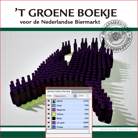
The cover of a brochure for a well-known Dutch beer brand. Adobe InDesign’s “Separations Preview” shows the RGB image in CMYK. Scene 2 shows the parts that will be highlighted using a glossy ultraviolet coating. Scene 3 is the part that will be embossed. Scene 4 shows all of the colors combined. (The combined image looks a bit weird because the UV coating and embossed parts have been given a extra spot color so that the printer can keep them separate from the full-color artwork).
10. Share Your PDF Files With Acrobat.com
Now you have but one problem to solve: getting that high-resolution PDF to your client and the printer. Email won’t work because a high-resolution PDF is usually too big. Most printers offer an FTP website, but many clients don’t know how to use FTP. Fortunately, sending out large files is much easier with Acrobat.com, which is a free Web-based service provided by Adobe.
With this incredibly easy and free service, you get your own online storage where you can upload high-resolution PDF files. You can notify your client and printer via email that a PDF is ready to download. And the email even contains a preview of the PDF. If you don’t want Adobe to email your clients, Acrobat.com lets you create a short URL to include in your own email. You can create an online “vault” if you wish, but no log-in or registration is required by default for your client or printer to access the PDF. You can even share PDF files on your website or blog using the embed code provided.

This email is automatically generated when you upload a PDF to Acrobat.com.
Further Resources
- Adobe ICC profiles (3 RGB and 12 CMYK profiles for worldwide usage)
- ECI Offset 2009 (scroll to ECI Offset 2009)
- Profiles for Newspaper Ads
- Introduction to the ICC profile format
All of the color profiles and tricks in this article can be used throughout the entire Creative Suite: 1, 2, 3 and 4. ICC Profiles can be accessed from the following directories:
- Mac OS X: …/Library/ColorSync/Profiles
- Windows: …Windowssystem32spooldriverscolor
Owning a copy of Adobe Acrobat is not necessary, but the application comes in handy when checking the PDF files that you’ve exported from Adobe InDesign. Adobe Acrobat even lets you see which destination profile you have specified in InDesign by choosing Advanced → Print Production → Output Preview. Quark XPress users can use these same ICC profiles.
Keep in mind that experimenting with color can create undesired results if you’re not sure what you’re doing. I highly recommend speaking with your printer before altering your workflow because he won’t be expecting color-optimized artwork if you’ve never bothered to submit it before. Should you have any doubts about the colors in a design, ordering a color proof on paper is always a good idea. (Illustrations by Frank De Man.)


