The Ails Of Typographic Anti-Aliasing

Email Newsletter
Weekly tips on front-end & UX.
Trusted by 182,000+ folks.


 Celebrating 10 million developers

 Custom Web Forms for Angular, React, & Vue. Your backend.
Enter anti-aliasing: the next best thing to a world of higher-resolution monitors. The concept of anti-aliasing is fairly simple: add semi-transparent pixels along the edges of letterforms to smooth the appearance of the “stair-step” effect.
However, many factors and technologies determine the actual effectiveness of the process: hinting, subpixel rendering, software capabilities and operating system specifications, to name a few. Here, we’ll look at what you as a designer can do to improve the results of anti-aliasing with Photoshop, Flash and CSS. Plus, we’ll explain the constraints of hardware, browsers and operating systems.
Technologies
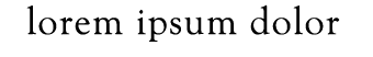
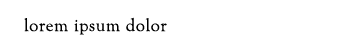
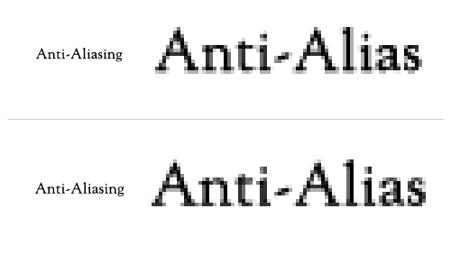
Aliased vs. Anti-Aliased
It takes only a quick glance to realize that anti-aliasing is extremely important to making text legible. With few exceptions, anti-aliased text can dramatically reduce eye strain, not to mention that it renders glyphs much closer to their intended design. Because of this, designers must decide how, not if, anti-aliasing should be used. This decision is based on a number of factors that one has to consider in the process from design to delivery.
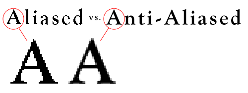
42pt “Goudy Oldstyle Bold”: aliased and anti-aliased versions
Font Hinting
Most text rendering engines rely heavily on hinting to determine exactly which areas of a glyph should be smoothed. Font hinting, or instructing, uses tables of mathematical instructions to align letterforms to the pixel grid and to determine which pixels should be grayscaled. Though most software provides auto-hinting using standardized algorithms, ideally the process would be done manually by the type designer and embedded in the file.
Put simply, these instructions work by modifying the position of structurally important points, such as those found along splines or at the base of stems, and aligning them at pixel boundaries. Intermediate points are then repositioned based on their relationship to the primary points. Using an open-source font editor, such as FontForge, allows you to view and edit a font’s hinting information. See how much work goes into producing a clear glyph; your appreciation of type designers and font engineers will certainly increase.
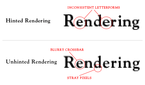
Hinted and unhinted type both have their pros and cons, leaving the designer to choose between legibility and typeface integrity.
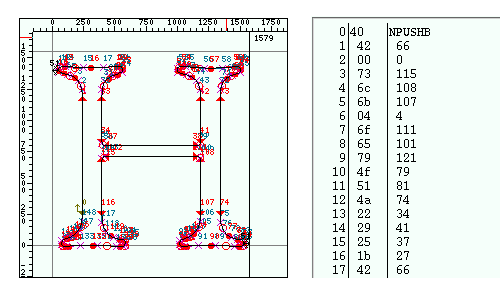
Viewing the hints for Goudy Oldstyle’s “H” using FontForge.
Subpixel Rendering
Every pixel on a standard monitor consists of three components: a red, a green and a blue. The brightness of each of these sub-pixels is controlled independently, and because of their small size, our eyes blend the three into one solid-colored pixel. Typical anti-aliasing sets even values for each of these subpixels, resulting in full grayscale pixels. Subpixel rendering exploits the individuality of each single-colored component and uses it to increase the perceived resolution of the monitor. This allows a pixel to take on visual weight from neighboring pixels, thereby allowing type to be smoothed in smaller increments. Rendering the type in this manner can produce subtle color shifts visible along the edges of glyphs.
Subpixel rendering relies on a perfectly aligned grid of pixels, which makes LCD flat panels the only type of monitor on which this technique works consistently. CRT monitors suffer from inaccuracies and oddly distributed pixels, making subpixel rendering extremely difficult to pull off. Even LCD monitors have variations in their subpixel arrangement that must be accounted for; some monitors are arranged in the order of RGB, while others are ordered BGR.
![]()
Subpixel rendering triples the perceived resolution by setting each color component separately.
![]()
Subpixel rendering produces more desireable results than standard rendering, but adopts color fringes.
Input
As designers and developers, we have limited control over how type is ultimately seen by the end user, but by using the proper delivery method, we can ensure an optimized presentation. That said, we’ll look here at the three most common ways in which text is sent to the user: HTML, images and sIFR. Each of these methods has an ideal use that, when properly implemented, can dramatically increase legibility and thus the overall user experience.
HTML Text
HTML text undoubtedly accounts for the majority of text found on the Web. Until recently, designers had absolutely no control over anti-aliasing with client-side technologies. CSS 3 introduces two new ways to control how HTML text is delivered: font-smooth and @font-face.
font-smooth
Font-smooth allows you to control when smoothing is used but not how it’s used; the anti-aliasing method is still controlled by the user’s environment. This setting is not widely supported yet but may prove useful by allowing us to turn anti-aliasing off at small point sizes — where type often becomes blurry. It may become doubly useful when more complex and non-browser-safe fonts are embedded with the new @font-face rule.
@font-face The @font-face rule is an exciting new feature of CSS 3 that designers have been waiting years for. Although we’ve been able to add obscure typefaces to font stacks for quite some time, a large majority of users don’t have high-end fonts on their local machines and end up with a typical Web-safe font (e.g. Times New Roman substituted for Adobe Garamond Pro). By allowing the browser to import a font file from a URL, we can now serve the user any font we’d like without relying on their font library. This means that we can serve not only more unique fonts but also those that are better hinted and more legible.
Despite the promise this feature holds to create a more beautiful world of online typography, we may still see designers opt for fonts like Verdana, which have been designed and hinted specifically for on-screen viewing. Some of our favorite fonts from the print world just look bad when rendered on the screen, especially at smaller text sizes. Surely we’ll see new industry segments arise as a result of the support of @font-face, including an influx of browser-hinted typefaces made available through services such as typekit.
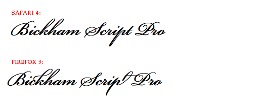
Bickham Script Pro embedded using @font-face and rendered in Safari 4 and Firefox 3. Notice the OpenType swashes and ligatures supported in Firefox 3!
Text as Image
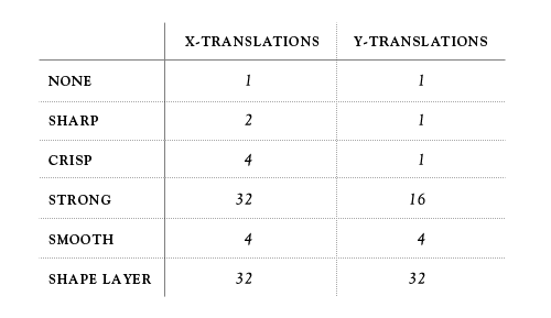
Serving text as an image may have limited uses, but it allows you to fine-tune every letter if necessary. Photoshop provides five pre-set anti-alias settings, which determine pixel values using different algorithms in conjunction with the document’s pixel grid. Unfortunately, none of these settings allow for subpixel rendering, but by using the Free Transform option to nudge the layer’s position, you can effectively force the algorithms into rendering cleaner. Each setting allows a different amount of origins, and some only produce variations when translated along the x-axis. Below is a table of available transformations.
None Aliased text, created using the None setting, has a very limited use and typically looks best between point sizes of 9 and 18. Sizes lower than this range will result in unidentifiable characters, and larger sizes will lead to increased character weight and overly jagged edges. Depending on the font, sometimes two different point sizes will render at the same height, causing a shift in letter spacing, width and x-height. For example, 14pt Arial renders 10 pixels high with an x-height of 8 pixels. Arial at 13pts also sits 10 pixels high but has an x-height of only 7 pixels — a slight but very perceivable difference. When tightly tracked, this setting may also require manual kerning, because some letters will sit pixel to pixel against each other.
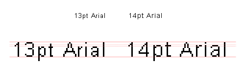
13pt and 14pt Arial render with the same cap height but different x-heights.
Sharp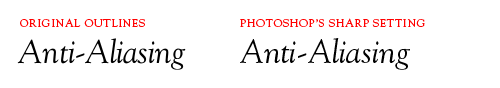 The Sharp setting uses very tight grid-fitting and produces sharp, if not too sharp, type. The plotting of pixels with this setting is very similar to how the None setting plots them but allows for a certain degree of smoothing. In fact, if pixels are set atop one another, you can actually see that a majority of solid pixels carry over from None to Sharp. While the cap height and x-height typically remain the same, you might see an increase in character weight and width. Sharp has a tendency to completely cut subtle shape variations from rendering and sometimes causes inconsistent letterforms, so if typeface integrity is important to you, you may want to try a different setting.
Crisp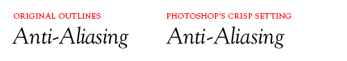 The Crisp setting maintains much of the font’s original weight and curvature but cleans up some of the awkward pixels created by light serifs and thin strokes — which is especially useful for larger point sizes. With the Crisp setting, however, you sacrifice the ability to nudge the layer on the y-axis.
Strong The Strong setting is notorious for adding unnecessary weight to a typeface, but it provides the most freedom with translating the origin, with 32 x-axis variations and 16 on the y-axis. The variety of origins with this setting can come in very handy when working with complex letterforms. Strong may also be useful when working with a typeface that has very thin strokes.
Subtle animation showing the 32 anti-aliasing origins at 36pt, 18pt and 12pt.
Smooth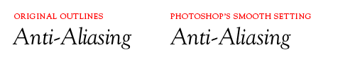 The Smooth setting is the closest to unhinted anti-aliasing and therefore remains truest to the original glyph shape. This algorithm is best used on medium-sized to large type, because it tends to render very light and often blurry at smaller point sizes. If used with an appropriate typeface at a proper size and if the origin is properly adjusted, this setting can produce a beautiful balance between crispness and letterform fidelity.
Shape Layer If Photoshop’s hinted algorithms all produce undesirable results, you may want to attempt using unhinted anti-aliasing by way of converting the type to a shape layer. This allows you access to the original outlines of the font, which draw values based on the percentage of the pixel enclosed in the shape. What you sacrifice in editable type, you make up for in origin transformations: 32 on both the x- and y-axes. Though usually a last resort, don’t rule out the possibility of using a Shape Layer; it can often produce much better results than Photoshop’s algorithms.
Fractional Widths Another, more veiled, setting that sometimes helps with anti-aliasing type at small point sizes is the Fractional Widths option located in the Character palette’s fly-out menu. With this setting turned on, the character spacing is set to varying fractions of pixels. This is ideal for auto-kerned type at large sizes but tends to bump the type either too close together or too far apart at smaller sizes. Turning this option off will round all character spacing to whole pixel values, which may help better space the problematic type. This is a hit-or-miss option, so use it wisely.
Decimal Point Sizes Typophiles might cringe at the idea of using a decimal point size, but when designing for digital media, standard point sizes don’t always conform to the pixel grid. By using decimal point sizes and either the Smooth or Strong anti-alias setting, you can usually bring a blurry typeface back into focus. Please note that I am not condoning the use of vertical or horizontal scale!
Using decimal values can dramatically improve anti-aliasing results, as seen above. Top: 16pt Goudy Oldstyle with Strong Anti-Aliasing. Bottom: 16.5pt Goudy Oldstyle with Strong Anti-Aliasing.
sIFR Text
Using sIFR to replace headers with a block of Flash brings benefits beyond the obvious. Yes, it solves the problem of having to use CSS image replacement techniques to provide a wider array of fonts, but it also allows incredible control over how the type is anti-aliased. Particularly useful are the sharpness and thickness settings, which control the edges of glyphs. (If only Photoshop had these settings!) You can set and tweak a number of settings to fit your implementation; and they can be controlled by passing keyword arguments inside the sifr-config.js file. These settings include:
- sharpness (number)
- A value between -400 and 400, which determines how sharp (positive number) or soft (negative number) the edges of the glyphs will be.
- thickness (number)
- A value between -200 and 200, which sets the thickness of the glyph edges.
- gridFitType (string)
- Possible values are: “none,” “pixel” and “subpixel.” This specifies how prominently the horizontal and vertical lines are fit to the monitor’s pixel grid. “Pixel” and “subpixel” usually produce the best results.
- antiAliasType (string)
- This is set by default to “advanced,” which allows the anti-alias settings above to be applied. It can also be set to “normal,” but this option limits sIFR’s rendering capabilites to accommodate earlier versions of Flash Player and overrides any of the properties above.
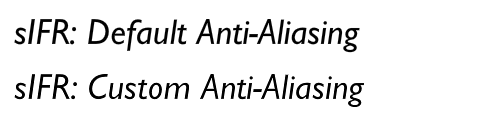
sIFR allows you to precisely customize your anti-alias settings. Notice that the custom setting is slightly thinner and crisper.
Output
Displays
Because very few people have monitors with resolutions higher than 100 pixels per inch (PPI), we have to rely on software to trick our eyes into thinking that the resolution is greater than it really is. Some advances are being made by display manufacturers, but they are still beyond the average Web surfer’s budget.
A typical LCD monitor (which you’re probably reading this on) has a dot pitch of around .20 or .30 millimeters. New technologies, such as the Ferro Liquid Crystal display are touted to reduce that number to .012 millimeters. Bringing this technology to the mainstream would bring tremendous advantages to the world of design and on-screen reading. However, until they become affordable for the average consumer, we’ll be relying on software advances.
Operating System
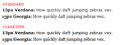
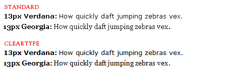
Microsoft and Apple have both delivered technological advances in the world of anti-aliasing, but they have somewhat different approaches. The current versions of both operating systems use anti-aliasing and subpixel rendering. Both vendors have dramatically increased legibility within their operating systems, but controversy has arisen over the aesthetics and legibilty of each. Microsoft’s entry in the competition — which is characterized by tight grid-fitting — is aptly named ClearType. By forcing characters tightly into the pixel grid, ClearType increases contrast along the edges of glyphs and renders more crisply.
Distinctly different is Apple’s Quartz 2D, which puts emphasis on maintaining the shape and integrity of the typeface. This certainly makes sense, given the high proportion of designers who work on Macs. But Quartz rendered type often appears blurry, which can cause eye strain with extended reading.
![]()
Windows Vista and Window XP both use Microsoft’s ClearType rendered either by Windows Presentation Foundation or Graphics Device Interface; both handle text in a very similar fashion, though WPF doesn’t snap horizontally to the pixel grid. Windows XP actually comes defaulted to monochromatic anti-aliasing.
But ClearType can be turned on by going to Control Panel → Appearance and Themes → Display, clicking on the “Appearance” tab, selecting “Effects…” and changing the drop-down from “Standard” to “ClearType.” The operating system itself allows for very little customization of ClearType; you basically choose between on and off. Microsoft’s ClearType Tuner PowerToy, though, allows some control over how it renders. Windows 7 brings a new rendering platform, named DirectWrite, that introduces subpixel positioning and y-direction anti-aliasing. As seen in this presentation, the advances made with DirectWrite are quite impressive and sure to be adopted by other vendors.
Apple’s Quartz 2D now renders type using Core Text, which has recently replaced Apple Type Services. The Quartz 2D displays type much closer to the typeface’s original design, which is similar to how you might expect to see it in print form. While this seems like a good idea from a design perspective, it doesn’t hold up with legibility, at least not on common LCD screens. Quartz text could conceivably appear much better if we were using higher-resolution monitors. Because Apple has complete control over both the operating system and the hardware that it runs on, perhaps a 200 PPI iMac is just around the corner. We can hope!
Browsers
The most current browsers today all inherit the anti-alias settings of the operating system. But with one anomaly. Firefox 3 in Mac OS X seems to inherit the operating system’s settings but also seems to apply more precise grid-fitting and kerning. Perhaps Mozilla is attempting to improve on Quartz’s blurry rendering.
Unfortunately, we have no way to control or even tell how the user’s browser will render text. What we can do is understand the nuances of each browser and make sure that we deliver a suitable presentation across all viewing platforms. Below is a list of browser capabilites and type samples to help you gain some insight into how they handle anti-aliasing.
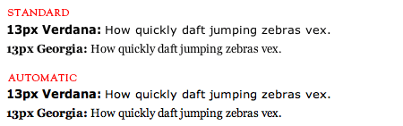
Windows XP and Vista:
- IE6, IE7 and IE8:
- Firefox 2 and 3:
- Safari 4:
- Chrome:

Mac:
- Firefox 2 in OS X:
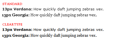
- Firefox 3 in OS X (inherits from operating system but with slightly enhanced kerning — most noticeable in the word “Georgia”):
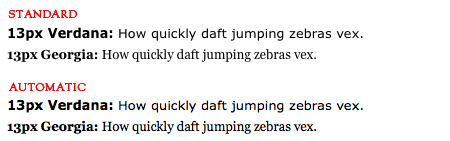
- Safari 4 in OS X:

- Opera:

Conclusion
Though many advances have been made in rendering on-screen typography, most have been aimed at treating the symptoms and not the disease. Until everyone has a 200 PPI monitor sitting on their desk, it will be up to designers and developers to use the proper technologies to ensure legibility without degrading the design of the typeface.
Further Reading
- Mastering Photoshop With Paths
- Pixel Perfection When Rotating, Pasting And Nudging In Photoshop
- The @Font-Face Rule And Useful Web Font Tricks


