The Beauty of London in Design

Email Newsletter
Weekly tips on front-end & UX.
Trusted by 182,000+ folks.
 Celebrating 10 million developers


 Custom Web Forms for Angular, React, & Vue. Your backend.
Here is a look at the visual personality of London, based on visits to the city’s major art museums, attendance at the 2009 London Design Festival, and interviews with artists and designers who call the great city home.
Identity of a City
Street Style
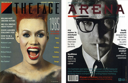
Neville Brody served as Art Director at “The Face” and “Arena”.
London magazines including The Face, i-D, Blitz, and Arena became major influences on international design during the eighties and nineties. The Face was known as a showcase of London street style and experimental graphic design during Neville Brody’s tenure as Art Director from 1982-86. Brody incorporated hand-drawn typefaces and custom graphic symbols into his page layouts. His work for The Face - and later, Arena – put an emphasis on striking photography, the impact of simplicity, and occasionally jarring juxtapositions of text and imagery. Brody is responsible for fonts including Industria (designed for The Face) and Arcadia (designed for Arena).
Geography
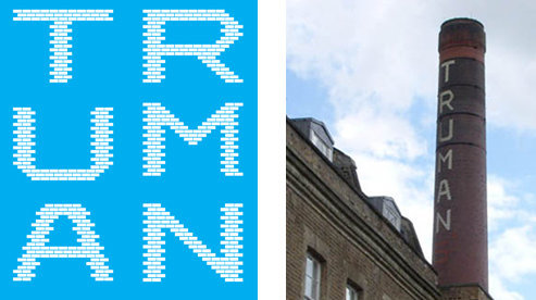
Supermundane’s “Truman” font, based on the bricks of the Truman Brewery tower
One example of a physical representation of London in design is the Truman font designed by illustrator and designer Supermundane, a.k.a. Rob Lowe. The font is based on the iconic tower of the Truman Brewery, located in East London. “The reason I did that was because I couldn’t believe anybody else hadn’t done it,” Mr. Lowe says of the project. “(The tower) is just sittin’ there!”
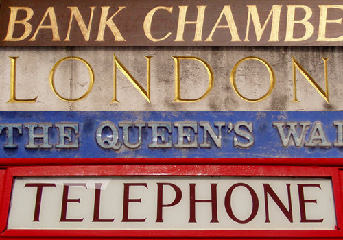
Public street signage around town.
London as an International Hub
London is a metropolis that is proud to be composed of international residents and ideas. The 2009 London Design Festival featured a great diversity of artistic fields (product design, furniture design, digital media) represented by artists from all over the world. The ‘Make Believe’ show presented by Goldsmiths, University of London featured emerging designers who came to London from locales including India, California, Switzerland and Bangkok. All designers seemed to bring their unique cultural perspective to their work; one even boasts of his quadri-lingual skills in his bio.
History
“It’s a city steeped in history and heritage,” says London-based photographer Haider Kikabhoy. It is impossible to review London’s entire art and design legacy here, so two elements of its history have been chosen: a legend from a distant era and a cultural phenomenon from the recent past.
“England’s First Great Native-Born Painter”
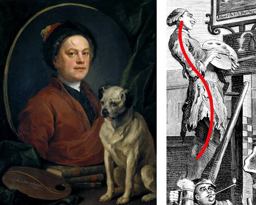
A self portrait by William Hogarth (left) and an example of “the line of beauty” in his work (right)
According to the Tate Britain Museum, William Hogarth is “England’s first great native-born painter.” His depictions of London life tell visual stories about the lives of archetypal characters: the harlot, the apprentice, the drunk. He symbolized his unique theories on artistic beauty with an icon he called ‘the line of beauty,’ a curved, serpentine line which can be seen over the palette in his self portrait (above left) and in compositions of his such as Beer Street (above right). Hogarth incorporated this element in his compositions because he believed that this curved, S-shaped line excited the viewer’s eye with its energetic movement (as opposed to straight lines or right angles).
Hogarth is also considered a pioneer of sequential images and therefore a forefather of the narrative structure used in comic books. One example in Hogarth’s work is his series ‘A Rake’s Progress,’ which includes eight paintings that tell a story when viewed sequentially.
Punk Rock: High Versus Low
The often tense relationship between upper and lower classes has been a dominant theme in English culture for centuries. Many entertainers and designers have relished the act of thumbing their nose at a perceived snobbery amongst royalty and the upper class. No one did it better than the punk rock movement that blossomed in England during the 1970’s. The impact of punk has made an indelible impression on generations of designers that have come since. Acclaimed graphic designer Neville Brody said that punk was “the most influential thing that happened to me in London.”
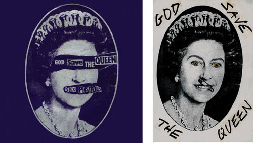
Two Sex Pistols designs by Jamie Reid
Punk design was dominated by D.I.Y. (do it yourself) techniques, outrageous subject matter, collage, photocopied imagery, defaced images, and basically any technique that broke the rules or seized the viewer’s attention. Punk fanzines like Sniffin’ Glue empowered amateur designers and liberated audiences from the limitations of mainstream music media. Jamie Reid’s ‘ransom note’ typography for the Sex Pistols seemed to capture the spirit of the movement.
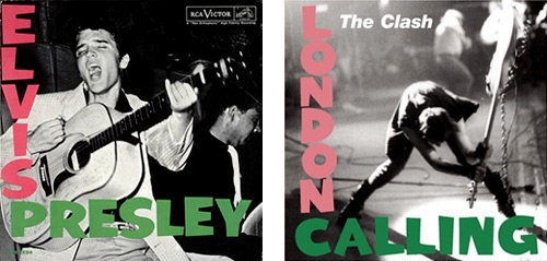
Elvis’ debut record; “London Calling” by The Clash
The cover of The Clash’s London Calling (1979) was partially based on the cover of Elvis Presley’s 1954 debut. The London Calling cover was designed by Ray Lowry with a photograph by Pennie Smith. The typography and colors of the two records are nearly identical, but Elvis is pictured playing his guitar while Clash bassist Paul Simonon is smashing his. The design pays mildly satirical homage to the Presley cover while signaling the change that London Calling represented in music: The Clash had come to destroy their audience’s perception of rock and roll.
Pentagram: London Roots, London Presence
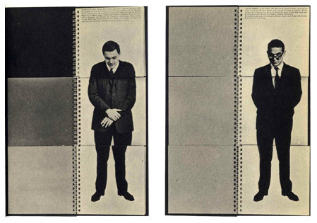
This announcement for the merger of designers Fletcher, Forbes & Gill (1962) features split pages so that photos of the three men can be merged. A different incarnation of this design firm would become Pentagram in 1972
London Roots
Pentagram was formed in London in 1972. The studio began as Fletcher/Forbes/Gill, but after aquiring and losing several members, they tired of altering the name of the firm. Alan Fletcher chose the name Pentagram - a star with five points to symbolize the partners - after reading a book on witchcraft. The acclaimed design firm has since opened offices in New York, San Francisco, Austin and Berlin. Pentagram was the world’s first multidisciplinary studio; its partners work independently but share knowledge, experience, and the legacy of the brand name. The formation of this global organization in London seems to symbolize the city’s thirst for international ideas and its expansive creative curiosity.
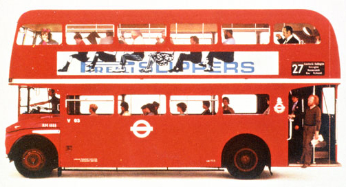
A clever footwear advertisement by Fletcher/Forbes/Gill on the side of a bus
The Influential Career of Alan Fletcher
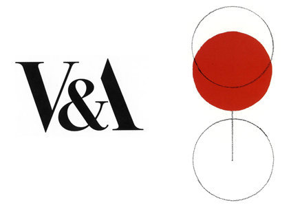
Two designs by Alan Fletcher: his logo for the Victoria & Albert museum (1989), and an illustration of a glass of wine from his classic design book, The Art of Looking Sideways
Graphic design legend Alan Fletcher was one of the founding members of Pentagram in London in 1972. One of the most influential designers in history, he was once called “the most highly regarded graphic designer of his generation” by The Daily Telegraph. Fletcher had a gift for cleverness and simplicity. His illustration of a glass of wine (above) uses only the simplest shapes to convey form and perspective.
Pentagram at the London Design Festival 2009
Logo and identity of the 2009 London Design Festival, designed by Pentagram partner Domenic Lippa
Today, Pentagram’s influence is indelible and ubiquitious. The 2009 London Design Festival included identity and collateral materials designed by Pentagram partner Domenic Lippa as well as a ‘London Posters’ show curated in part by Mr. Lippa at the Victoria & Albert museum – an institution whose logo was designed by Alan Fletcher.
An Eye on the Future
A thorough exploration of the London art and design community in September 2009 has revealed a glimpse at what’s to come. Here is a look at the designers who are leading the way as well as the themes that emerge in their work.
‘London Posters’ at The London Design Festival 2009
Two posters from the ‘London Posters’ exhibit. Designs by Andy Altmann, Why Not Associates (left), and Damon Murray and Stephen Sorrell, FUEL (right).
Some of the brightest talent in today’s London design community was on display at the ‘London Posters’ show in the London Design Festival. The show was curated by Domenic Lippa and Sir John Sorrell, Chairman of the London Design Festival. According to Mr.Lippa, the show was “a reflection of how our capital is seen by some of the country’s most renowned graphic designers… certain themes cropped up frequently - transport, location, structure, heritage and even love.”
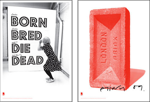
Two posters from the ‘London Posters’ exhibit. Designs by Morag Myerscough, Studio Myerscough (left), and Jonathan Ellery, Browns.
Another element present in the work was the renowned dry British sense of humor. The poster by Morag Myerscough, Studio Myerscough (above left), reads, “London BORN London BRED until I DIE and then I’m DEAD.” Using stark photography and typography, the poster conveys London pride, playful morbidity, and a delight in language and rhyme.
London Goes Green
London hopes to lead the way to a more environmentally sound future. Lord Digby Jones of Birmingham remarked on the issue of climate change during a London event held by British Airways in September. “The answer to this issue is science,” he said, and went on to remark that leading economies of the world like the U.S. and the U.K. made their wealth while polluting the Earth, so we should lead on solving the problem.
Designers at the ‘Make Believe’ show presented by Goldsmiths, University of London sought innovative ways to approach environmental topics. Mina Papathanasiou proposed a structural system to build housing that would function “as a living organism, while re-using and recycling construction materials.” Among her innovations were roof tiles designed to collect rain water for redistribution throughout the housing structure.
Interactivity
Interactivity was another theme that emerged at the London Design Festival. Visitors at the Victoria & Albert museum were invited to draw ceramics and the results were put on display. Children visiting a boutique called Few and Far were invited to participate in a drawing competition affiliated with illustrator Christopher Brown. But the most exciting interactive element of the festival was Kioskiosk (pictured below), created by designer Wayne Hemingway.
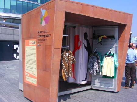
Although Kioskiosk was featured in the ‘Supercontemporary’ show at the Design Museum, its main component is an actual shop where start-up designers sell their wares in a public venue. Hemingway’s goal was to encourage business growth by providing low-rent or free space to designers and entrepreneurs who face difficult economic times and high London rents. This project gives back to British design community by supporting its artists. It also provides an exciting new way for shoppers and art lovers to interact with featured participants like SonoDesign and The Arthouse. Kioskiosk is now on tour.
Seventeen British Artists and Designers You Should Know
This list has been assembled to inspire and inform. It is not an attempt to summarize the entirety of a nation’s visual arts. The selections range in their style, era, and cultural impact. A certain continuum of creativity is evident: Bacon had a profound influence on Hirst, Hockney extolls the virtues of Turner, and so on.
Francis Bacon
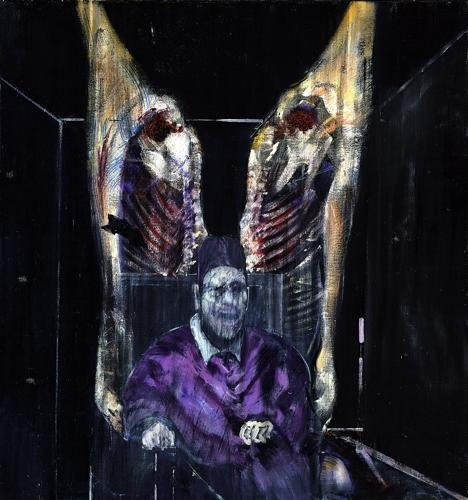
Irish-born painter Francis Bacon worked in London for much of his life and is known for his gruesome, nihilistic imagery. “I would like my pictures to look as if a human being had passed between them like a snail,” Bacon said of his work, “leaving a trail of the human presence and memory trace of the past events as the snail leaves its slime.”
FUEL
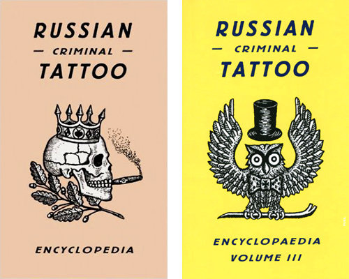
Two books designed and published by FUEL
Since 1991, graphic designers Damon Murray and Stephen Sorrell have worked together as FUEL. The designers split their time between commercial work (album covers for The Thrills, film titles for Lost in Translation) and self-initiated projects like the publication of their own magazine. In an interview with the Design Museum, FUEL cite The Russian Criminal Tattoo Encyclopaedia (on which they served as editors, designers, and publishers) as one of their favorite projects. The series of books serves as an ethnographic study and includes thousands of tattoos accumulated by author and former prison warden Danzig Baldaev.
Damien Hirst
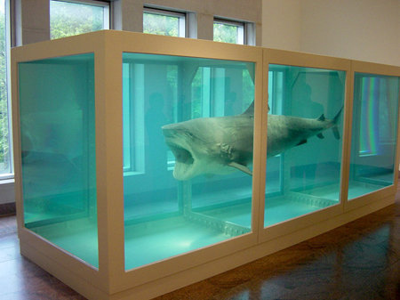
Hirst’s installation piece The Physical Impossibility of Death in the Mind of Someone Living (above) features a 13-foot tiger shark in a glass tank of formaldehyde. The piece shocked the London public during its first display (at the Saatchi Gallery in 1992) and launched Hirst to international fame. The piece is indicative of Hirst’s sense of morbid, outrageous humor.
John Everett Millais
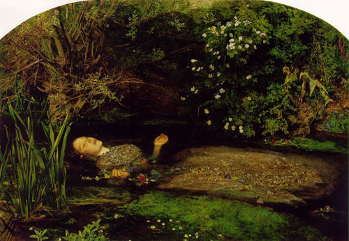
John Everett Millais’ painting Ophelia (1851-52) is an example of the great British tradition of Shakespeare as subject matter for painting. Millais’ dedication to capturing every lush, vivid detail of the wooded scene was so intense that he sat painting by a stream in conditions of great discomfort for nearly five months. Ophelia is pictured holding flowers that she herself listed during her mad scene (Hamlet, Act IV, Scene 5).
Edward Johnston
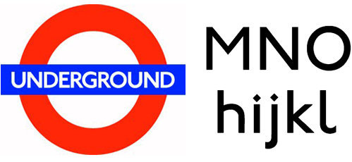
The logo and typeface of the London Underground were designed by Edward Johnston. The logo (or ‘roundel’) has become something of an international symbol for London.
Calligrapher and typographer Edward Johnston is responsible for the logo and font that have graced the London Underground for almost a century. In 1915, Johnston was commissioned to design the font by Frank Pick, the first Chief Executive of London Transport. For his ultra-modern sans-serif font, Johnston looked to a few unlikely sources for inspiration: calligraphy and Classical Roman capitals. The influence of Roman typography is evident in the perfect circle of his capital ‘O’ and the square outline of his capital ’M.’ The diamond-shaped dot (or ‘tittle’) above the lowercase ‘i’ and ‘j’ resembles the dots made on paper by a square-nibbed pen. The result is a font that has become an influential classic due to its modern nature and profound communicative power. Johnston is author of the revered design textbook Writing & Illuminating & Lettering.
J.M.W. Turner
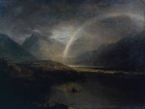
Joseph Mallord William Turner (1775–1851) has been called “Britain’s greatest artist” by The Times and was even dubbed ‘the Shakespeare of landscape’ by Alfred, Lord Tennyson. Turner’s gift for graceful light and sublime color helped him elevate the landscape to an artistic height that had previously been reserved for historical painting.
John Isaacs
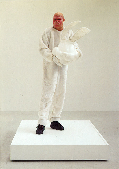
Untitled (What Makes Certain), 1995
John Isaacs has shown work at London’s Saatchi Gallery along with other artists affiliated with the so-called ‘Young British Artists’ that included Damien Hirst in the 1990’s. Isaacs’ work suggests an insidious danger lying in wait just beneath the surface of conventional reality.
Bibliothèque
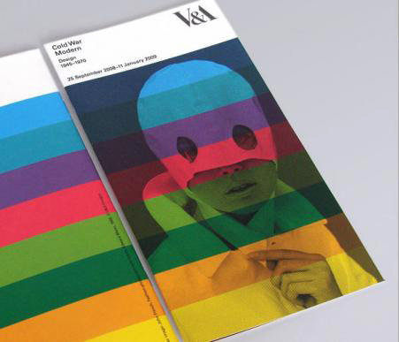
This gallery guide accompanied the Cold War Modern exhibition at the Victoria & Albert Museum. Bibliothèque designed the guide and other exhibition materials.
A glance through the portfolio of graphic design firm Bibliothèque reveals a consistency in the style and quality of their work. Although their clients vary from a manufacturer of electrical components to a company that makes mattresses for babies, Bibliothèque brings an austere simplicity to each project. Another unifying feature of their work is a keen understanding of color: many projects include a limited palette employed in bold compositions.
David Hockney
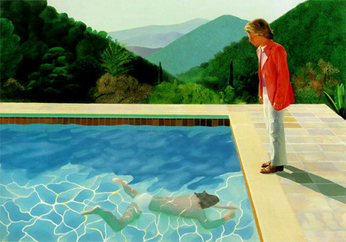
Pool With Two Figures, 1971
David Hockney is “the most enduring British artist” according to The Times. An important contributor to the Pop Art movement, Hockney is an artist known for painting, photography, printmaking, chain-smoking, and conspiracy theories. He was born and educated in England, but some of his most famous works depict the sunny, laid-back lifestyle that he experienced while living in California.
Chris Cunningham
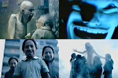
Stills from Aphex Twin’s ‘Come to Daddy’ video, directed by Chris Cunningham
Chris Cunningham is a filmmaker, video artist, and photographer. The twisted, disturbing style of his music videos for Aphex Twin and Squarepusher have made the director infamous, although he claims to find his imagery more “silly” than scary. Robotics and anatomy emerge as themes in Cunningham’s work, and he often works in color palettes that are cold, muted, or spare. Cunningham’s recent experimental short film Rubber Johnny applies inane, childlike humor to spazzed-out scenes of a disabled mutant dancing in darkness. It’s a truly bizarre vision that is exciting for its sheer individuality.
William Blake
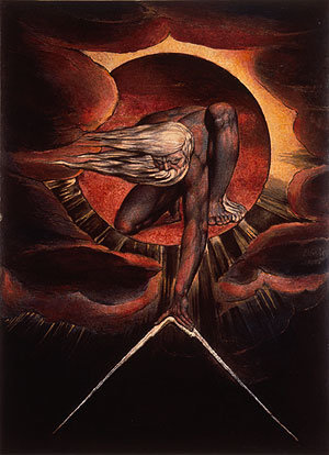
Plate 1 from “Europe a Prophecy, 1824”
According to Andrew Wilton’s Five Centuries of British Painting, William Blake was a “maverick rebel” best known for his historical paintings of narrative subjects from The Bible and Paradise Lost. Although he failed to attract many patrons during his lifetime, Blake is now considered a key figure in histories of both poetry and the visual arts. His work was motivated by grandiose creation myths and also by visions he claimed to have seen of Gods, angels, and other spirits throughout his life. To William Blake, the imagination was ‘the body of God.’
Gilbert & George
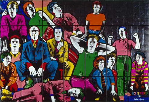
“Existers, 1984”
Since the 1960’s, the duo Gilbert & George have been producing provocative, ambitious work from London’s East End - their home and an area they consider a microcosm of the world at large. Their career has been a subversive exercise in branding; the artists incorporated themselves into their body of work as ‘living sculptures’ and thereby “sacrificed their individual identities to art,” according to the Tate Britain.
Lucian Freud
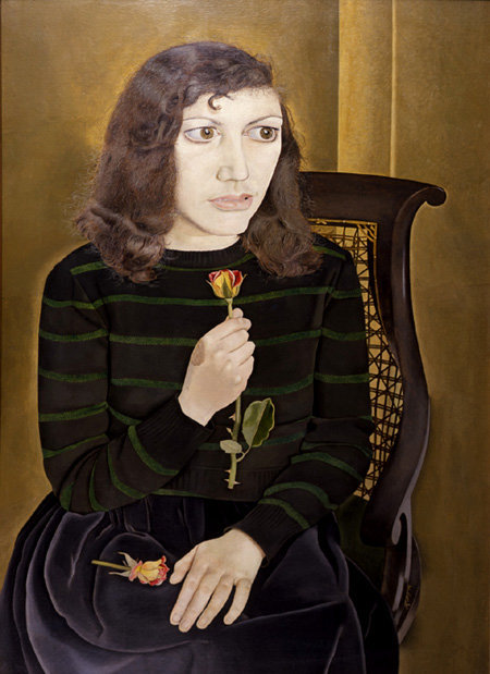
“Girl with Roses, 1948”
Lucian Freud was born to Jewish parents in Germany during the winter of 1922. Eleven years later, Lucian and his family moved to England in order to escape the rise of Nazism. The anxiety and despair of war and the Holocaust would inform some of the painter’s greatest works.
Girl with Roses (above) is a portrait imbued with fear and discomfort. The subject is the painter’s wife, Kitty, who clutches her roses so hard that she appears to have broken one. The sensation of the thorns in her grasp is almost palpable. Her enlarged eyes are wide pools of angst - what does she see that we cannot?
Airside
Airside’s logo for the Pop Art gallery at the Wolverhampton Art Gallery
Airside is a “creative agency working across the disciplines of graphic design, illustration, digital, interactive and moving image.” Airside co-founder Fred Deakin says, “we have a real pride in bouncing around different media.” In early 2009, Airside designed the identity for a Greenpeace initiative called Airplot. Airside shared some of their design process on their blog and the work was featured on notable design sites including Brand New and Logo Design Love.
Clare Leighton
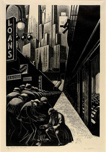
Breadline, New York 1932
Clare Leighton devoted her life to the medium of wood engraving, cultivating a style of great detail and heavy contrast. Born in London, she later moved to America. In Breadline, New York, she captures the grim mood of depression-era Manhattan. The heavy contrast of light and dark mirrors the contrast between the anonymous poor and the shimmering metropolis that looms over them like an alien landscape.
The Vorticists
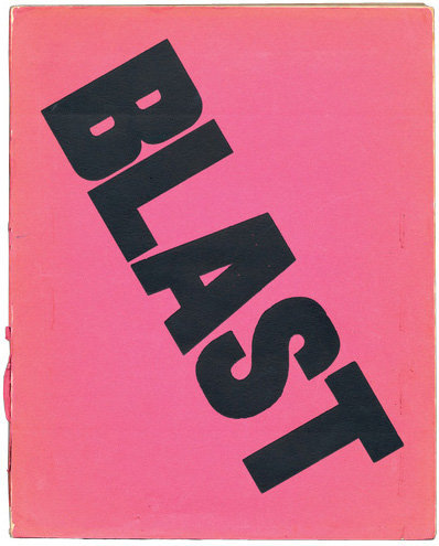
Cover of the first issue of Blast magazine, 1914
Vorticism formed in 1914, spurred partially in response to Futurism. The debut issue of Blast magazine shocked with its bold pink cover and huge, diagonally-set type. Along with publications from other groups, notably Fluxus, it is a precursor to the radical printing techniques and typographic experimentation of the punk ‘zine. Author Richard Hollis remarks in Graphic Design: A Concise History that the pages of Blast “exhanged symmetry for the consciously crude layout of popular advertisements,” thereby solidifying the Vorticists as the first in Britain to exploit typographic form at a time when “tradition remained the most powerful influence in Britian.”
William Morris
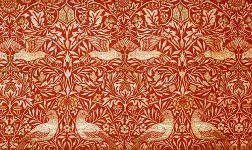
‘Bird’ textile design by William Morris, 1878
William Morris was a central figure in the Arts and Crafts Movement, which was led by artists and designers who romanticized personal crafstmanship while rejecting Victorian-era opulence and an age of mechanical reproduction ushered in by the Industrial Revolution. In 1861, Morris and several colleagues founded a prolific decorative arts firm that produced stained glass, metal work, printed paper, tapestries, decorative carvings, and more. Morris himself was a master of two-dimensional design and his work should prove inspirational to any contemporary graphic designer. In textiles like the one pictured above, Morris searched for the “force, purity, and elegance of the silhouette of the objects represented.” He also sought to return to the “crispness and abundance of beautiful detail which was the especial characteristic of fully developed Medieval Art.”
Further Resources
Be sure to check out the following articles:
- The Heritage Of Berlin Street Art And Graffiti Scene
- Making Your Mark On The Web Is Easier Than You Think
- Learning From The Past: Design Legacies & Arts
- Ways of Seeing The first episode of John Berger’s groundbreaking 1972 BBC television series about the perception of art.
- Alan Fletcher: fifty years of graphic work (and play) A biography of the designer and his career of accolades. Includes images.
- Video: History of Pentagram Current partners of the international design firm provide an oral history.
- Interview: Supermundane Interview with London artist Supermundane. Written by Dan Redding.
- J.M.W. Turner Online Learn more about the great British painter J.M.W. Turner online at Tate Britain.
- Hockney on Turner In this article, ‘The Turner surprise’ from The Times, David Hockney discusses his passion for the work of J.M.W. Turner.
- Pitchfork Interview: Chris Cunningham The music video director discusses his work, his goals, and working with Stanley Kubrick on A.I.


