Designing CSS Buttons: Techniques and Resources

Email Newsletter
Weekly tips on front-end & UX.
Trusted by 182,000+ folks.
 Celebrating 10 million developers


 Custom Web Forms for Angular, React, & Vue. Your backend.
Buttons, whatever their purpose, are important design elements. They could be the end point of a Web form or a call to action. Designers have many reasons to style buttons, including to make them more attractive and to enhance usability. One of the most important reasons, though, is that standard buttons can easily be missed by users because they often look similar to elements in their operating system. Here, we present you several techniques and tutorials to help you learn how to style buttons using CSS. We’ll also address usability.
You may want to take a look at the following related posts:
- Pushing Your Buttons With Practical CSS3
- Mastering CSS, Part 1: Styling Design Elements
- Designing “Read More” And “Continue Reading” Links
- Web Design Elements: Examples And Best Practices
Links vs. buttons
Before we explain how to style buttons, let’s clear up a common misconception: buttons are not links. The main purpose of a link is to navigate between pages and views, whereas buttons allow you to perform an action (such as submit a form).
In one of his articles, Jakob Nielsen writes about command links, which are a blend of links and buttons. But he recommended that command links be limited to actions with minor consequences and to secondary commands. To learn more about primary and secondary commands (and actions), check out Primary and Secondary Actions in Web Forms by Luke Wroblewski. To learn more about the differences between links and buttons, read Creating Usable Links and Buttons at UXBooth.
Basic Styling
The simplest way to style links and buttons is to add background color, padding and borders. Below are examples of the code for the link, button and input (“Submit”) elements.
<a class="button" href="#">Sample button</a>
  <button class="button" id="save">Sample button</button>
  <input class="button" value="Sample Button" type="submit" />
.button {
padding:5px;
background-color: #dcdcdc;
border: 1px solid #666;
color:#000;
text-decoration:none;
}This simple code minimizes the visual differences between links and buttons. And here are the rendered examples of the code above:
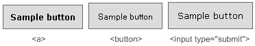
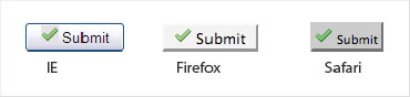
The important thing to note is that these three elements render differently with the same CSS. So, you should style these elements carefully to ensure consistency across your website or application.
Images
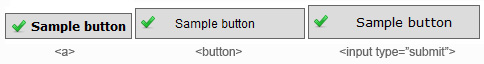
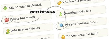
Adding images to buttons can make the buttons more obvious. Sometimes the image itself clearly communicates the purpose of a button; e.g. a loupe icon for searching or a floppy disk icon for saving. The easiest way to add an image to a button is to use a background image and then position it accordingly. Below are our examples with a checkmark icon.
.button {
  padding: 5px 5px 5px 25px;
  border: 1px solid #666;
  color:#000;
  text-decoration:none;
  background: #dcdcdc url(icon.png) no-repeat scroll 5px center;
}
Button States
In addition to their default state, buttons and links can have two other states: hover and active (i.e. pressed). It is important that buttons appear different in different states so that users are clear about what is happening. Any element in a hover state can be styled by invoking the :hover CSS pseudo-class.
a:hover {
  color:#f00;
}
Though very important, the active state is rarely implemented on websites. By showing this state, you ensure that your buttons are responsive and send a visual cue to users that a button has been pressed. This is called isomorphic correspondence, and it is “the relationship between the appearance of a visual form and a comparable human behavior” (Luke Wroblewski, Site-Seeing). The article Pressed Button State With CSS elaborates on the importance of the active state.
a:active {
  color:#f00;
}
There is yet one more state, one that is seen when navigating with the keyboard: the focus state. When the user navigates to a button using the Tab key, it should change appearance, preferably to have the same appearance as the hover state.
a:focus {
color:#f00;
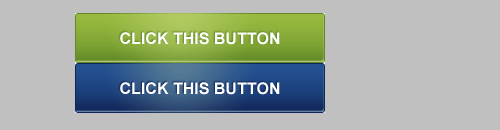
}The examples below shows the common way to style button states. The hover state is a bit lighter than the normal state, while the active state has an inverted gradient that simulates a pressed action. Although you need not limit yourself to this styling, it is a good place to start.
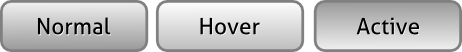
We should talk about how to handle the outline property for the :active and :focus states. Handling this property well is important for the experience of users who employ the keyboard as well as the mouse. In the article Better CSS Outline Suppression,” Patrick Lauke shows how buttons and links behave in different combinations of states and explains why the outline property should be invoked only with the :active state.
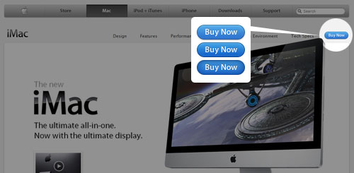
The blue “Buy now” button on Apple.com has a slightly lighter background for the hover state and an inset style for active state. Even the main navigation button on Apple’s website implements all three states.
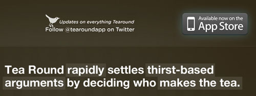
Although it doesn’t implement the active state, this fancy button on Tea Round has a nice fading effect on hover.
The “Read more” button on UX Booth turns green on hover and moves down one pixel in the active state, which simulates the effect of pressing a button.
Useful Reading
The article Rediscovering the Button Element shows the differences between links and buttons and explains how to style buttons easily.
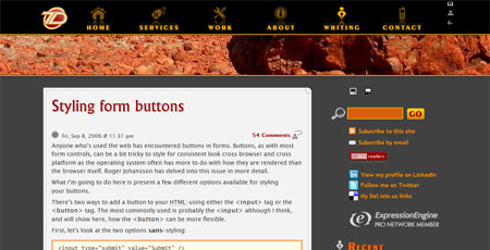
Styling Form Buttons covers the basics of styling buttons, with many examples.
Beautiful CSS Buttons With Icon Set shows how to style buttons using background images. Although not scalable, these are really nice buttons.
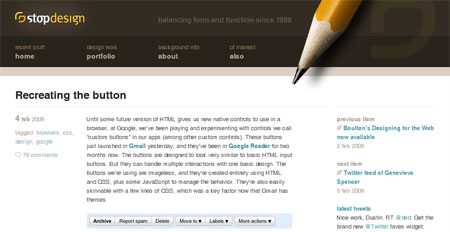
Recreating the Button is a very good article that explains how Google ended up with the buttons that it uses on majority of its websites.
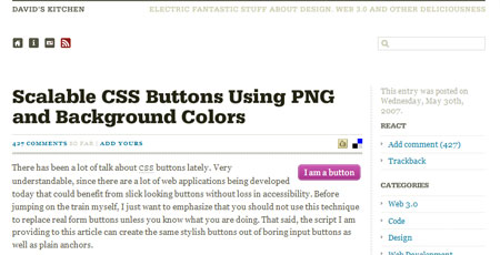
Scalable CSS Buttons Using PNG and Background Colors explains how to create really stunning buttons for all states. Although it uses jQuery, it degrades gracefully if JavaScript is turned off.
Sliding Doors: Flexible Buttons
One important consideration needs to be made when styling buttons: scalability. Scalability in this context means being able to stretch a button to fit text and to reuse images. Unless you want to create a different image for each button, consider the “sliding doors” technique. This technique enables you to create scalable, rich buttons.
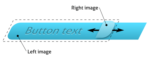
The principle involves making two images slide over each other, allowing the button to stretch to the content. Usually, this is done by nesting a span element within a link. As shown in the image above, each element has its own background image, allowing for the sliding effect. The two code snippets below show the structure and basic styling for this effect.
<a href="#"><span>Typical sliding doors button</span></a>a {
background: transparent url('button_right.png') no-repeat scroll top right;
display: block;
float: left;
/* padding, margins and other styles here */
}
a span {
background: transparent url('button_left.png') no-repeat;
display: block;
/* padding, margins and other styles here */
}The advantages of this technique are that it:
- Is an easy way to create visually rich buttons;
- Ensures accessibility, flexibility and scalability;
- Requires no JavaScript;
- Works in all major browsers.
Useful Reading
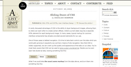
The “Sliding Doors of CSS” article on A List Apart (part 1 and part 2) covers the basics of this technique. Although a bit old, these articles are a must-read for every Web developer.
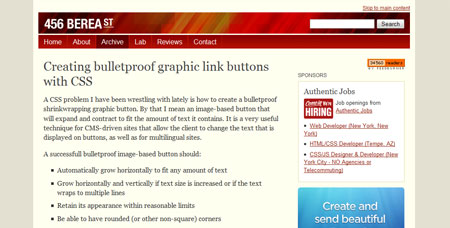
Also a bit old, Creating Bulletproof Graphic Link Buttons With CSS is an excellent article that shows how to create bulletproof, resizable, shrunk-wrap buttons. Also a must-read.
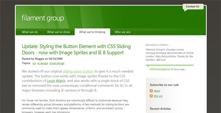
Filament Group has a variety of excellent articles and tutorials. Its second article on CSS buttons, Styling the Button Element With CSS Sliding Doors,” explains how to create buttons by combining techniques. Although it doesn’t support the active state, it can be easily extended.
If you want Wii-like buttons, the article Simple Round CSS Links (Wii Buttons) provides all the necessary resources and explanation on how to style them.
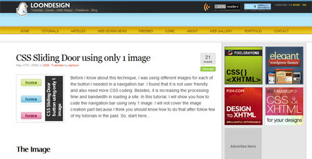
The common way to achieve the CSS sliding doors technique is to use two images. However, the article CSS Sliding Door Using Only One Image shows that it is possible to achieve the same effect with only one image.
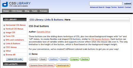
CSS Oval Buttons and CSS Square Buttons from Dynamic Drive are two other articles that show the effectiveness of CSS sliding doors.
CSS Sprites: One Image, Not Many
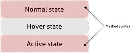
With CSS Sprites, one image file contains multiple graphic elements, usually laid out in a grid. By tiling the image, we show only one Sprite at a time. For buttons, we can include graphics for all three states in a single file. This technique is efficient because it requires fewer resources and the page loads faster. We all know that many requests to the server for multiple small resources can take a long time. This is why CSS Sprites are so handy. They significantly reduces round-trips to the server. They are so powerful that some developers use CSS Sprites for all their graphics. The Holy Sprites round-up on CSS Tricks offers some very creative solutions.
The example below shows the simplest use of CSS Sprites. A single image contains graphics for all three button states. By adjusting the background-position property, we define the exact position of the background image we want. The image we’re choosing to show here corresponds to a background position of top: -30px and left: 0.
a {
  background: white url(buttons.png) 0px 0px no-repeat;
}
a:hover {
  background-position: -30px 0px;
}
a:active {
  background-position: -60px 0px;
}
For general information and resources on CSS Sprites, check out The Mystery of CSS Sprites: Techniques, Tools and Tutorials.”
Useful Reading
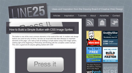
In this easy-to-follow tutorial How to Build a Simple Button with CSS Image Sprites,” Chris Spooner explains how to create a CSS Sprites image in Photoshop and use it with CSS.
Transforming the Button Element With Sliding Doors and Image Sprites shows how to enrich a button element with a combination of sliding doors and image Sprites. It implements the active state in a very interesting way, not by using different images or colors but rather by positioning.
CSS 3: Buttons Of The Future
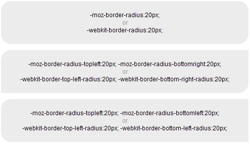
CSS 3 allows us to create visually rich buttons with just a few lines of code. So far, this is the easiest way to create buttons. The downside of CSS 3 is that it is currently supported only by Firefox and Safari. The upside is that buttons styled with CSS 3 degrade gracefully in unsupported browsers. By using the browser-specific properties -moz-border-radius (for Firefox) or -webkit-border-radius (for Safari), you can define the radius of corners. Here are a few examples of what can be done with the border radius property.
For better results, you can combine CSS 3 rounded corners with the background image property. The example below shows a typical button with a gradient image, the first without rounded corners, and the second with.
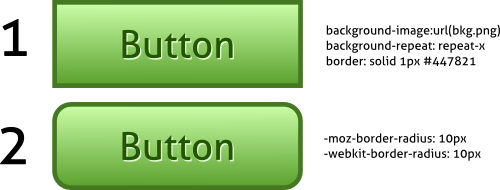
Compared to sliding doors, this technique is far simpler. However, if you want to maintain visual consistency across all browsers, then use sliding doors, because it works in all major browsers, including IE6. To learn more about the capabilities of CSS 3, read CSS 3 Exciting Functions and Features: 30+ Useful Tutorials.” And here are a few good tutorials on styling buttons with CSS 3 features.
Useful Reading
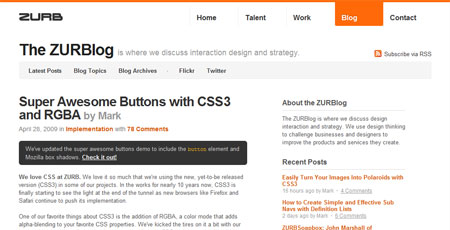
Super Awesome Buttons With CSS 3 and RGBA shows the power of CSS 3 with rounded corners, Mozilla box shadows and RGBA, which is a color mode that adds alpha-blending to your favorite CSS properties. This is one of the best examples of CSS 3 buttons.
Creating buttons without Images Using CSS 3 explains the drawbacks of using images for buttons and shows several options for creating image-less CSS 3 buttons.
Instant Tools: Are They Useful?
Tools exist for creating buttons, such as Easy Button and Menu Maker and My Cool Button, and for creating CSS Sprites, such as CSS Sprite Generator, but the question is, do they really help you create buttons that fit your needs. Although they are configurable and easy to use, your creativity and control over the results are limited, which makes for average-looking buttons. Using one-size-fits-all buttons is not a good idea.
The solution is to use Photoshop (or a free alternative) and the proven techniques described in this article. If you are a beginner with Photoshop, here are several excellent tutorials on creating amazing buttons.
If you don’t know where to start, iPhone-Like Button in Photoshop is the perfect choice. In only 10 to 15 minutes, you will be able to create the kind of buttons seen on the iPhone.

How to Create a Slick and Clean Button in Photoshop is a very detailed tutorial that guides you through 30 simple steps and helps you learn the Photoshop basics. In addition, the article explains how to use these graphics in combination with HTML and CSS to create fully functional CSS buttons.
Buttons And Usability: Instead Of Conclusion
The techniques described above can help you create stunning buttons. However, because they play a critical role in website usability, the buttons should meet some key principles:
- First consider the labeling. Always label buttons with the name of the action that the user is performing. And always make it a verb. A common mistake is to label buttons “Go” for various actions such as searching, sending email and saving. Labels should also be short and to the point; no need to clutter the user interface.
- As mentioned, include all button states (default, hover, active) to provide clear visual cues to the user as to what is happening. Button outlines should remain in the active state only.
- Clearly distinguish between primary and secondary actions. The most important action should be the most prominent. This is usually done by giving primary and secondary actions different colors.
- Pay close attention to consistency. Buttons should be consistent throughout a Web application, both visually and behavior-wise. Use CSS sliding doors for reused buttons or CSS 3 rounded corners to maintain consistency.
- Though obvious, we should note that the entire button area should be clickable.
Creating Usable Links and Buttons explains why users expect buttons sometimes and links other times. It also shows how to choose between the two elements.
How to Design Buttons to Help Improve Usability explains some usability principles that should be considered when designing buttons. It covers the basics of icon usage, appearance, behavior, hierarchy and consistency.
 (al)
(al)

