Dropbox’s Carousel Design Deconstructed

Email Newsletter
Weekly tips on front-end & UX.
Trusted by 182,000+ folks.
 Register for Free
 Celebrating 10 million developers
 Custom Web Forms for Angular, React, & Vue. Your backend.


Many of today’s hottest technology companies, both large and small, are increasingly using the concept of the minimum viable product (MVP) as way to iteratively learn about their customers and develop their product ideas.
By focusing on an integral set of core functionality and corresponding features for product development, these companies can efficiently launch and build on new products. While the concepts are relatively easy to grasp, the many trade-offs considered and decisions made in execution are seldom easy and are often highly debated.
This article looks into the product design process of Dropbox’s Carousel and the product team at UXPin shares our way of thinking about product design, whether you’re in a meeting, whiteboarding, sketching, writing down requirements, or wireframing and prototyping.
The Carousel MVP
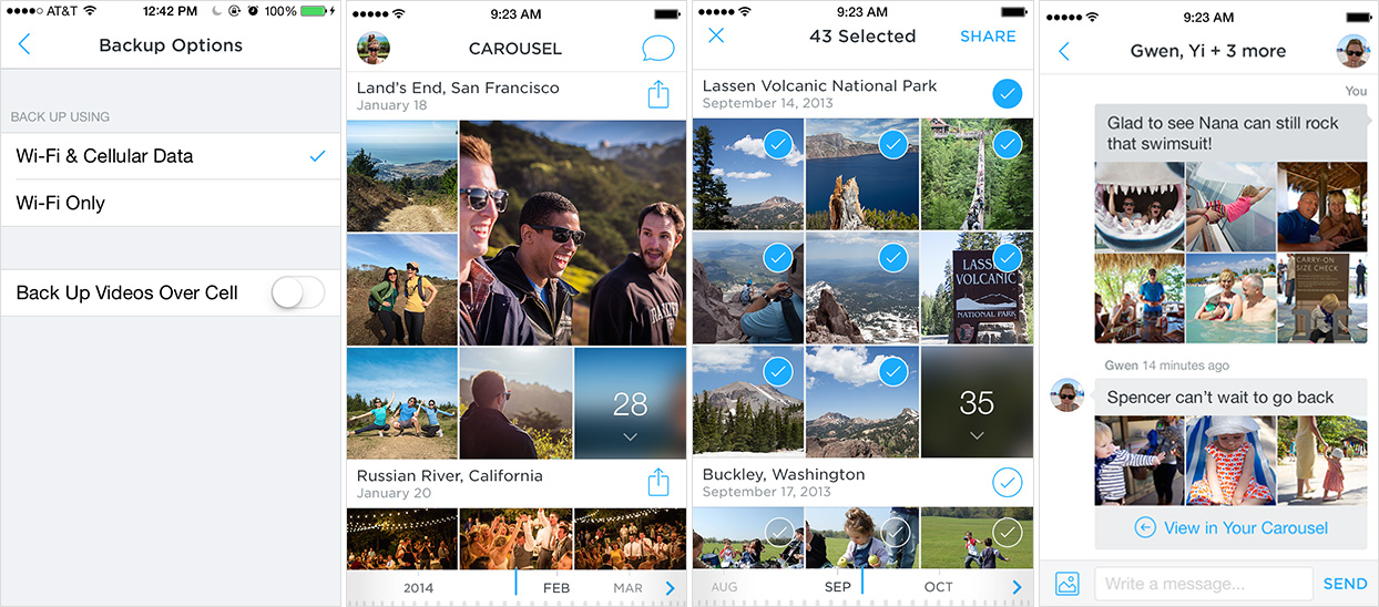
It’s been reported, that Dropbox wants Carousel, its new mobile photo and video gallery app, to be “the go-to place for people to store and access their digital photos [and videos],” to be the “one place for all your memories.” In effect, Carousel allows you to access all of your photos and videos stored in a Dropbox account on any device, unifying them in a single interface that automatically sorts files by time and location.
More specifically, the app launched with several key features:
- Backing up. It integrates directly with Dropbox’s file storage to save all photos and videos taken on your mobile phone.
- Viewing. A cloud-based media gallery displays all of your photos and videos without taking up local storage on your phone.
- Sharing. It offers many ways for you to share photos and videos with others, primarily by sending links to view them in Carousel.
- Discussing. A new chat thread is created for every group of people with whom you share a collection of pictures or videos.
Since launching, Carousel has received polarizing reviews. Amidst this uproar of praise and feature requests, we’ll go over how any product or design team could arrive at the same initial release — a critical exercise, especially in a market as crowded as the one for photo apps. First, we’ll summarize what Carousel is, then break down part of the design process for this MVP, and then compare the UI and UX to existing design patterns such as Apple’s Photos, Instagram, Google+, Camera+, Flickr, Facebook, Picturelife and Dropbox Photos itself.
You can be sure that the product team’s meetings sound little like this:
“Photos are hot.” “People store a lot of photos on Dropbox.” “So, let’s build a mobile gallery.” “Want to copy Apple’s Photos but integrate it with Dropbox?” “Sure, but we also need to copy Facebook Messenger because we’re social, too.” “OK, draw some sketches, make some wireframes, create the final mockups and build a high-fidelity prototype.” “Ready to ship to 275 million users?” “Launch!”
Now that we have an idea of what Carousel is, let’s consider how the team might have gone about designing the app.
Core Users
Carousel clearly targets consumers, both young and old, rather than professionals or enterprises. No question about that. This is clear from the interface and the visual design choices, marked by a youthful montage of two personas, Nora and Owen (yes, they have names), who we see growing up.
Users needs
A lot of decisions need to be made here because the market already has literally hundreds of apps for taking and managing photos. A few of the main use cases for these photo apps are:
- taking photos (i.e. with the camera);
- editing photos (with filters or advanced editing);
- backing up and syncing across devices;
- viewing;
- managing (tagging, arranging, moving, deleting or hiding);
- sharing (privately or publicly);
- discussing (privately or publicly).
Clearly, a lot of user needs could be met by the first version of the product. But where to start? Francine Lee, now a UX researcher at Dropbox, took an initial stab at answering this question with a guerilla usability test on Dropbox’s existing solution, Dropbox photos. I’m going to take her work a few steps further.
Business Goals
In general, Dropbox cares about the growth and monetization of its core business. This is what most companies, hot or not, care about.
Specifically, the company wants to continue growing its overall user base (whether those users come from the main Dropbox app or from Carousel), driving new users to its main service of backing up and syncing files, upselling them on larger plans, and keeping everyone as engaged and happy as possible.

So, how does this overlap with users’ needs and, ultimately, with the solution that needs to be designed and built?
Existing Design Patterns And Their Gaps
Let’s look at relevant products and design patterns that satisfy both user and business needs, as well as identify any gaps that Carousel might fill. If you’re interested in learning more, check out UXPin’s ebook Mobile UI Design Patterns.
We’ll review a few existing mobile photo galleries and other design patterns to understand why Dropbox’s Carousel looks so similar to Apple’s native Photos app as well as Instagram’s direct-messaging feature, which, not coincidentally, is similar to Facebook’s Messenger app. Beyond the fact that Apple has made it nearly impossible for third-party developers to build a better app, we believe that Dropbox has taken this path for many reasons. And we have much inspiration to take from Instagram.
Because Carousel targets the average consumer, we’ll also look at media-gallery applications that target this user base with a strong mobile presence — after all, eyeballs and engagement are going in the direction of mobile. As such, we didn’t look as much into desktop and web-first apps such as iPhoto, Picasa and Unbound or into power-user applications.
Instead, we’ll focus on Apple’s Photos, Instagram, Google+, Camera+, Flickr, Facebook, Picturelife and Dropbox Photos itself. In “The Best Photo Apps for Keeping Your Memories in the Cloud,” The Verge analyzes existing solutions in depth and validates our focus on these types of products in evaluating Carousel’s MVP.
Given that Loom, a popular photo and video gallery app, was acquired by Dropbox within a week after Carousel launched and then decommissioned a month later in May 2014, we did not include it in this discussion. Everpix also recently went out of business, so we cannot mention much about it either. To give you an idea of how competitive this space is, Everpix was giving away a free two-year trial just for downloading the desktop app, uploading some photos and linking it to a smartphone.

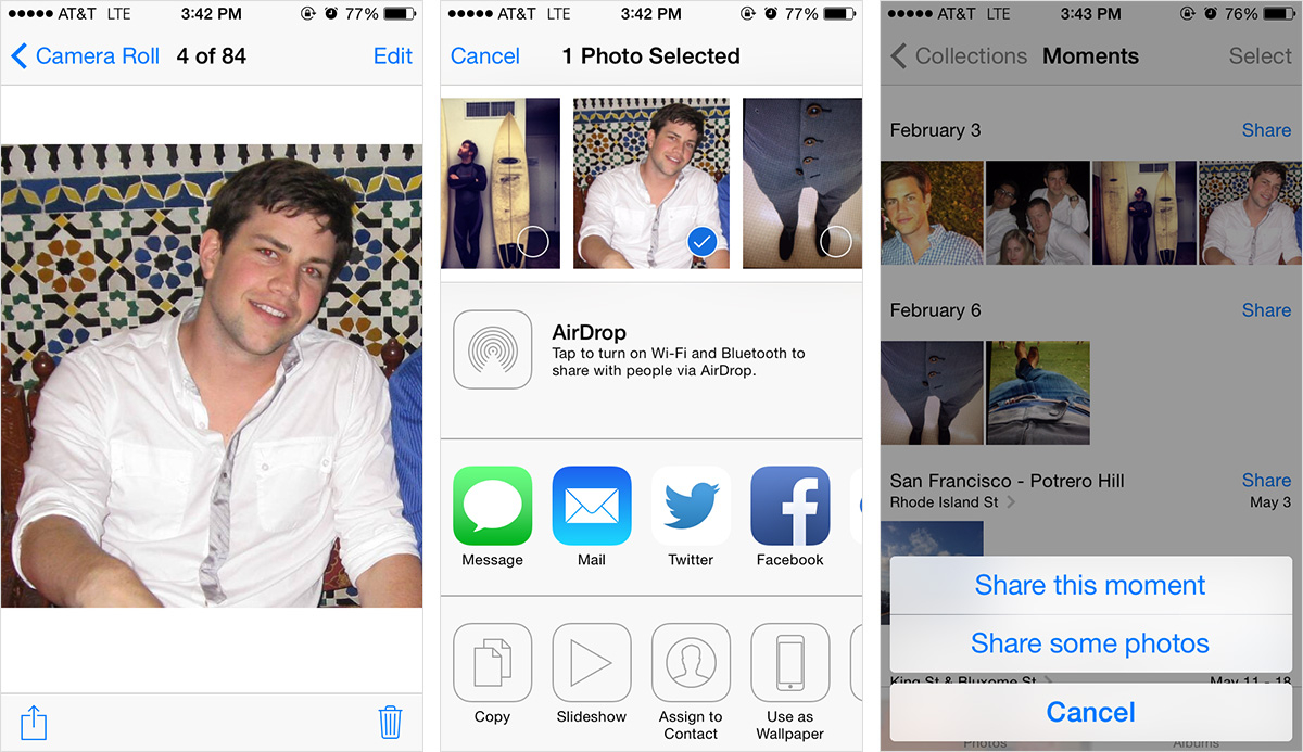
Taking Photos
Below are screenshots of Instagram, Apple’s Camera and Flickr.
They all provide roughly the same functionality (including filters), and all allow users to save copies of photos to their phone’s camera roll, which Dropbox already seamlessly backs up and syncs to the cloud when users opt in. Users don’t need any more options for taking photos, so building this into Carousel’s initial functionality wouldn’t make sense for Dropbox.
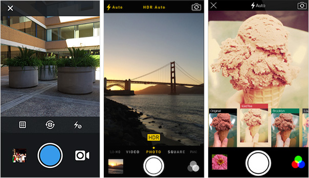
Not only does a camera not belong in Dropbox’s core user experience today, but it wouldn’t complement the myriad of other digital cameras out there. By not building camera functionality into Carousel, Dropbox both minimizes development risks and plays nice with the majority of the market for capturing photos and videos, both apps and hardware alike. It just wants the picture once you’ve taken it.
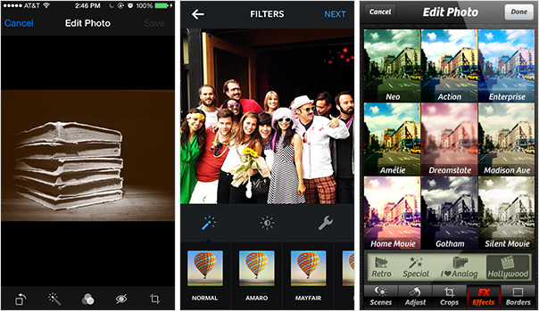
Editing: Filters And Advanced Editing
Below are screenshots of Apple’s Photos, Instagram and Camera+.
As you can see, you’ll also have to consider a myriad of photo- and video-editing options. Enough reasonable solutions seem to be on the market. Again, most of these products allow users to save original and edited copies to their phone’s camera roll, which Dropbox already seamlessly backs up and syncs to the cloud when users opt in.
Because capturing and editing photos are usually a part of the same workflow, Dropbox has the same reason for not providing this in the initial version of Carousel: It just wants the picture once you’ve taken it. In addition to this reason, users also theoretically cannot edit photos until they store them on Dropbox. Because one of Dropbox’s primary objectives with Carousel is to increase the number of photos that new and existing users store on Dropbox, what users do thereafter is less important and is potentially a distraction from saving all of their photos and moving on.
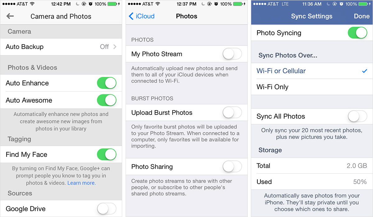
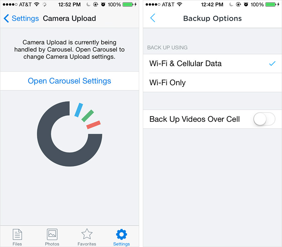
Backing Up And Syncing
Below are screenshots of Google+, Apple’s Photos, Facebook, Dropbox and Carousel.
Unfortunately, most camera and photo-editing apps still require users to save photos to the camera roll before backing up and syncing. This multi-step process of safely backing up photos and videos and then clearing the camera roll to save space is not only time-consuming when done at the last minute, but also stressful because there is always the worry that something hasn’t synced properly. Beyond the potential for improvement in tying together the processes of capturing and backing up media, current cloud solutions have some additional design problems.
On iOS, separating the option to back up the camera roll from the option to upload new photos to the photo stream across all devices could be confusing. In fact, I still barely understand the difference. Google+ also confuses this experience because users might presume they can edit these settings in Google Drive, which they can’t. While Google+ does offer auto-enhance and “Auto Awesome” — whatever that means — users might go over their data limits or their phone’s battery might die from uploading so many videos or photos over cellular data.
Facebook, on the other hand, has learned its lesson here and clearly makes media syncing private until the user does something. It also provides some granularity in the settings so that users can sync in the background with peace of mind. And users have a clear option to use Facebook for cloud storage, like Dropbox — obviously, Dropbox is interested in enabling this by default because this is its core business and product value, unlike Facebook.
Dropbox takes care of these use cases elegantly and, as we’ll see, has completely migrated these settings for photos over to Carousel so that users can get to the right place even if they try to edit these settings in Dropbox’s main app.
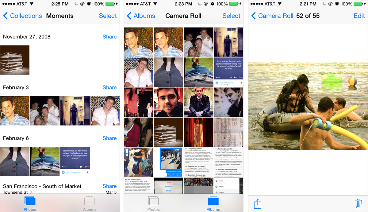
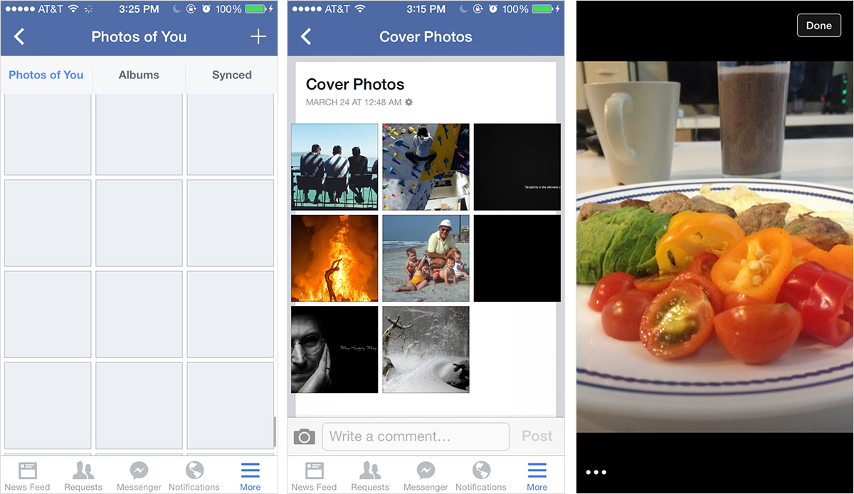
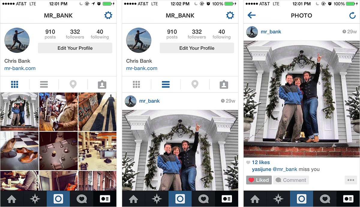
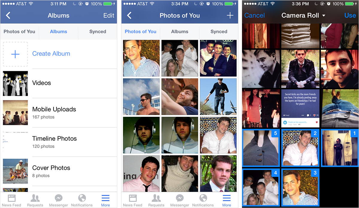
Viewing
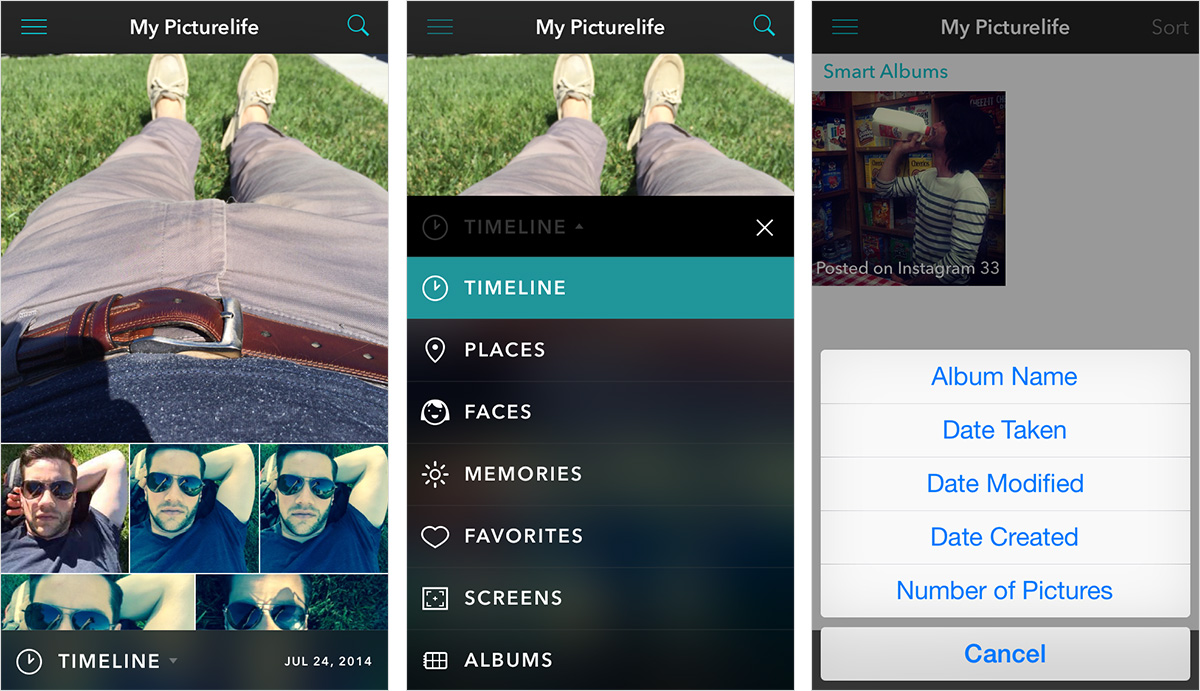
Below are screenshots of Apple’s Photos, Facebook, Instagram and Picturelife.
At a basic level, these apps all present photos and videos according to the time and location in which they were shot (sometimes even the building) and in groups and in enlarged individual views. However, this can get confusing when users toggle between views, especially in Apple’s Photos, which has albums, collections and moments, with little or no visual cue of how they relate to each other or what they even mean in the first place — I, for one, still have no idea. This becomes increasingly problematic when users delete photos from their camera roll periodically to save storage space, because there isn’t an easy way to view backed-up media in iCloud.
Facebook is a much simpler solution but, like many cloud-based galleries, has issues with loading speed when the user scrolls quickly because it’s not a native app. Also, accessing these photos is not as simple as it should be — photos are still a secondary experience. On other other hand, Instagram is a photo-first app, but the viewing functionality is limited and extremely cluttered by supporting data (likes, comments, timestamps, etc.).
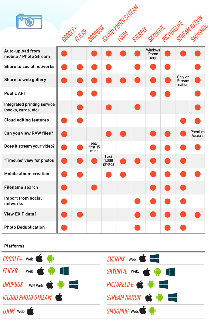
Compared to the alternatives, Picturelife stands apart with its sheer breadth of options for viewing the media not only in your phone’s camera roll but in 10 popular galleries and social networks, including Dropbox, Facebook, Flickr, Foursquare, Google+, Instagram, Shutterfly, Smugmug, Tumblr and Twitter. Switch easily between timeline, places, faces, memories, favorites, screenshots and albums. Within each album, sort by album name, date taken, date modified, date created or number of pictures. Most importantly, users can use free-form search to find what they’re looking for.
The primary drawback to so many options is that getting lost in the myriad of photos you’ve taken is easy. Moreover, by syncing so many galleries and networks, many of which have reposted images, users will likely see many duplicates. Nevertheless, this product probably enables you to find any image more quickly than any other solution to date.
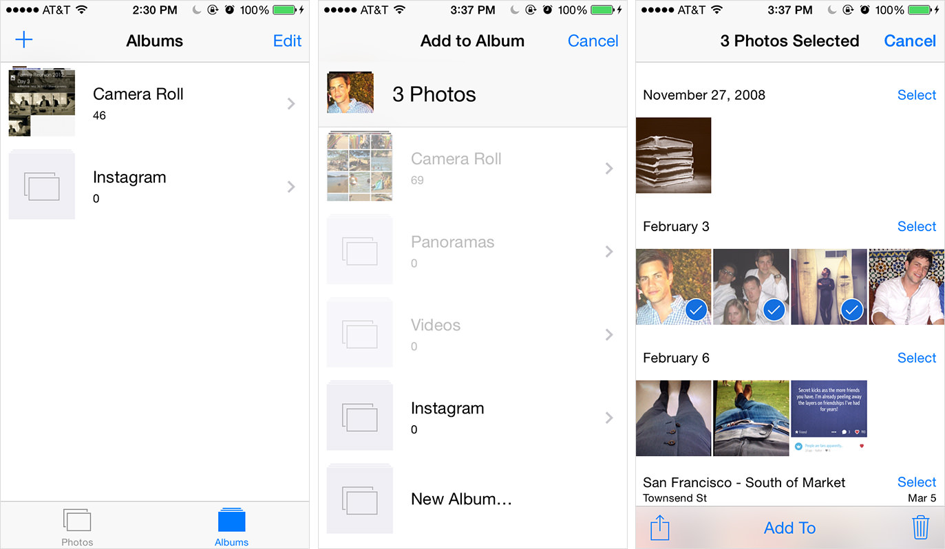
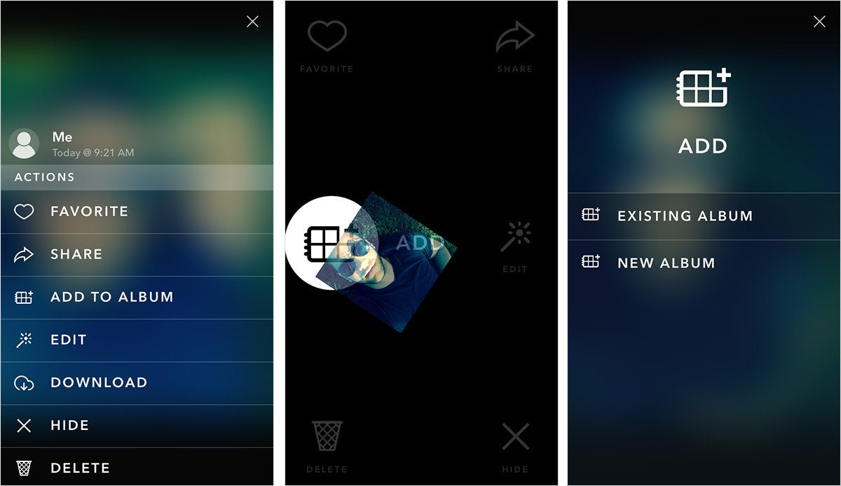
Managing
Below are screenshots of Apple’s Photos, Facebook and Picturelife.
This is where many media galleries and camera apps diverge. Management workflows (tagging, arranging, moving, deleting, hiding) are incredibly diverse, and each app seems to prioritize its own variation. At a basic level, most apps enable users to move media between folders, to use a preset viewing filter to stay organized automatically and to delete photos. These actions can typically be done at the level of picture, selected group or album. However, apps vary widely in how they enable users to hide media, duplicate media, save copies and originals, export to other applications, comment, change meta data, unduplicate, and even link media galleries and social networks.
Apple’s Photos, for instance, enables users to easily select one or more media files and move them between albums or delete them. Likewise, entire albums may be deleted. And a subset of Apple’s photo stream can sync locally, and third-party apps may store copies in Photos as well. However, you can’t manage these accounts from Photos directly. Any other advanced functionality for managing media doesn’t exist. It’s pretty basic.
Facebook provides similar functionality. However, slightly more can be done on a mobile phone, including tagging people, liking media files, and viewing all cloud-stored album-organized media that include tags of the user or that are synced from a phone. While the experience of viewing all synced media in the mobile app is sluggish, the user at least isn’t limited to the local storage on their mobile device. In any case, Facebook is still a limited solution.
Picturelife, by contrast, seems to have it all. Users can either touch and hold an image to see resizing options via drag-and-drop gestures or use a standard vertical menu to favorite photos, add them to albums, hide, delete, comment and more. The flexibility of the viewing options makes managing photos and videos effortless. However, a big drawback is that users can’t select multiple images to add them to a new album or to move them.
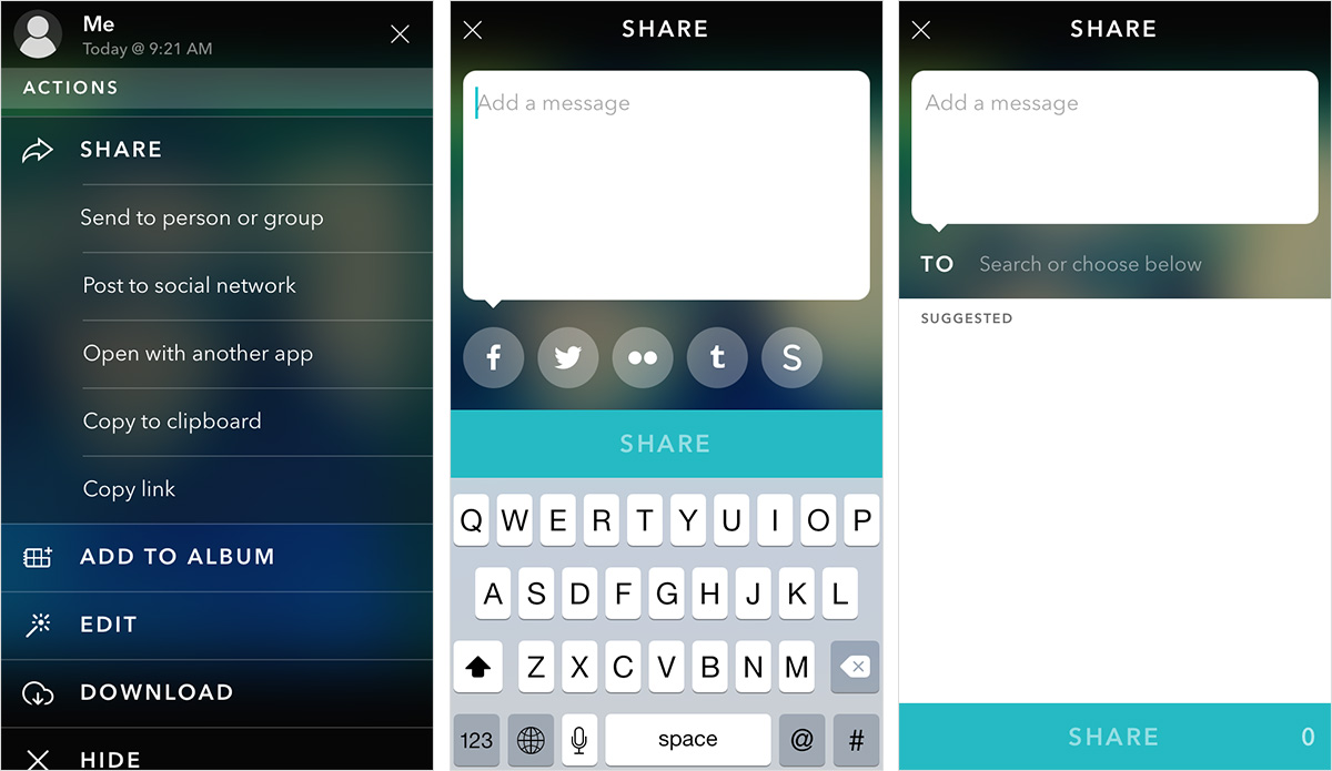
Sharing (Private And Public)
Below are screenshots of Google+, Apple’s Photos and Picturelife.
Sharing a single piece or a group of media publicly is baked into every photo and video application we looked at. Whether they share directly from their photo gallery of choice or save to their camera roll in order to share later on another platform, users have options. That being said, how users add, remove and view media before sharing, how they engage with it once shared, where exactly they may share and how they add and remove people to share with vary widely. More importantly, in recent years certain applications give users the option to share media privately with a select audience — a common activity in chat and email clients.
Google+ is designed rather well to let users switch seamlessly between sharing a single photo, a selection of photos or an entire album, whether through Google+ itself or by saving directly to the phone’s camera roll. However, users will be sharing photos on Google’s network with “public” recipients as the default. If they want to send to individual recipients, they get a very limited subset of contacts to scroll through — and only within Google’s network — or a search box or preorganized list of contacts, which likely isn’t updated or properly maintained, especially compared to Facebook’s smart lists. Facebook is similar to Google in that it primarily lets you share media publicly with varying degrees of privacy. While Facebook Messenger’s integration of the camera roll into the private chatting experience is nice, users have no real way to send photos from a Facebook album directly to a private audience in chat.
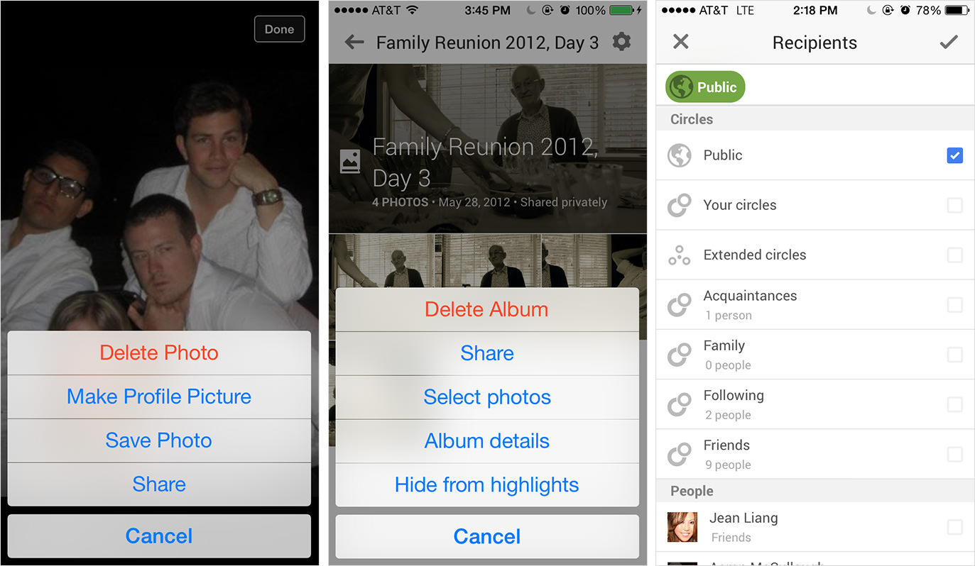
Apple offers far greater flexibility with sharing on almost any social network, as well as through SMS and email. However, users get little assistance with selecting recipients and no additional organization of this sharing history, especially if they’ve ever shared across more than one channel. Users are also generally forced to share media publicly on social websites but can share privately through more traditionally private channels such as SMS and email.
Picturelife, on the other hand, provides clear flexibility in sending media to a person or group through the phone’s address book or posting to one or more popular social networks. Each option is emphasized equally, so the user can decide how they want to share their photos and videos. Oddly enough for a mobile solution, the way of selecting contacts is extremely sluggish and seems to only offer email options and no SMS option.
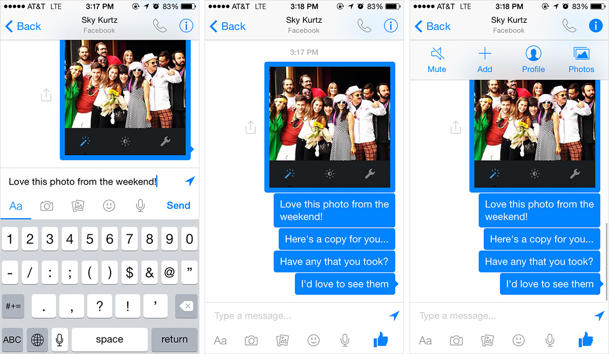
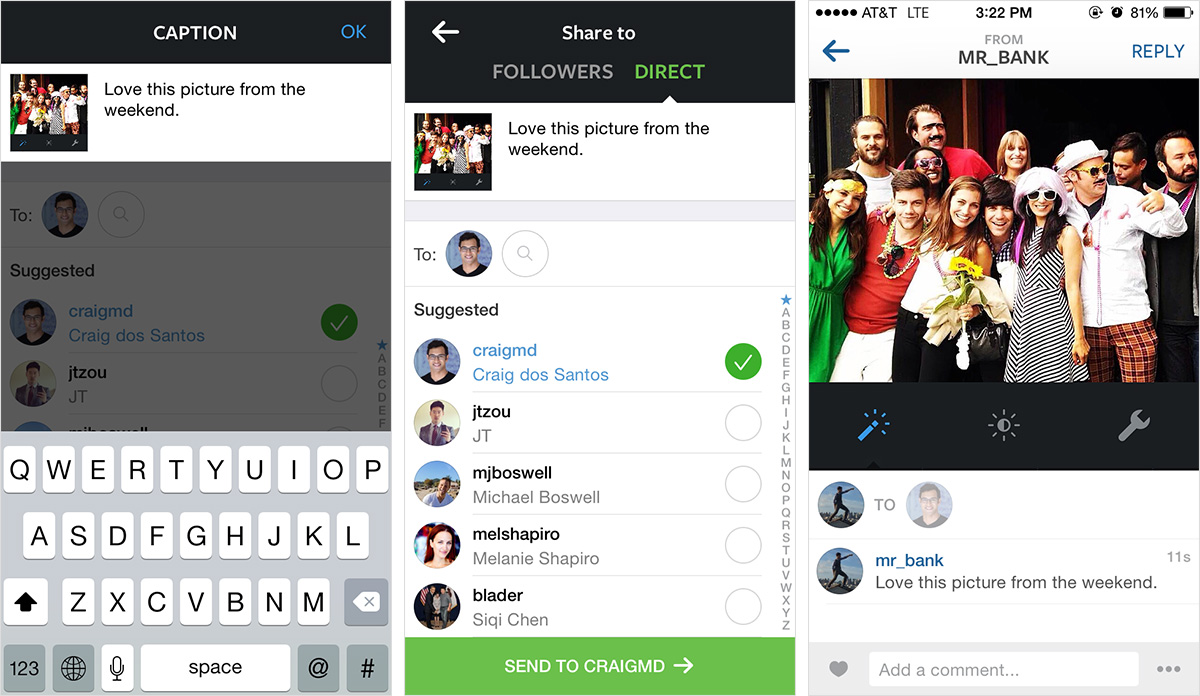
Discussing (Private And Public)
Below are screenshots of Apple’s Photos, Facebook and Instagram.
While all of the limitations on posting publicly are due to the sharing limitations mentioned above, the designs to support private discussion are rather distinct from the designs for public discussion and seem to vary widely based on the product’s priorities.
For example, on iOS, users can share multiple photos at once and include anyone in their address book (which is usually anyone with an email address or phone number), but they can’t add more people to the conversation on the fly or reply to a subset of recipients in a separate conversation or view their full media history in a consolidated display (because photos and videos are kept separate).

Meanwhile, Facebook allows users to add new recipients, effectively creating a new chat. Additionally, Facebook more clearly displays the various ways users can communicate with recipients, not just by text, photo and video, but with audio and emojis; and the option to choose an existing photo or video or create a new one is obvious at a glance. However, users can only chat with people they’re connected with on Facebook, not anyone in their address book.
Instagram, on the other hand, makes it very easy to switch between private and public discussions. When users post to their followers to have a public discussion, they can also post to popular websites such as Facebook, Twitter, Tumblr and Flickr to continue the conversation there. Alternatively, they can send a direct message to anyone they’re connected with on Instagram. Again, they’re limited to the social network itself, but this is a dramatic improvement over many of the social alternatives.
Time To Focus And Design Carousel
Now that we thoroughly understand Carousel’s core users, their general needs, Dropbox’s business needs and what exists on the market, it’s time to get something done.
Primary User Requirements
In a Wired article covering Carousel’s launch, Gentry Underwood, CEO and cofounder of Mailbox (which was acquired by Dropbox) and lead designer of Carousel, detailed some of the key requirements that his team prioritized.
Below is a list of some of them, as well as some requirements highlighted in media coverage of Carousel’s launch and from our evaluation of existing products and design patterns in part 1.
Back Up All Photos And Videos
The app has to save not only the photos that users want to see in the gallery, but also ones they don’t want to see yet but might want to at a later date. Not to mention, this takes up more storage, which is ideal for Dropbox’s business. Most photo apps allow you only to delete photos, not hide them. “It’s a 100% destructive thing,” Underwood says. And the permanence of deleting photos requires a heavy two-step process of hitting the trash button and confirming the action. Underwood claims that this leads to users not deleting media and, ultimately, to sloppy media galleries with misfires, blurry selfies and many imperfect versions of the same shot.
Display All Photos And videos
According to Underwood, another big problem with media gallery apps is that they seem to start from the last time you bought a smartphone. This is especially true for stock apps like Apple’s Photos. However, even with photo stream and other apps that sync a portion of your photos locally while saving the rest in the cloud, users can never see their entire media history — they have to go to their computer or the web for that.
Show The Best Photos And Videos
The most obvious solution for this is to make it easy to manually hide undesired media, presumably with some quick swiping action. However, the app could also surface media that users would most likely want to see, like ones with faces or, more importantly, smiling faces. Beyond finding the best media, the app could also highlight one or more thumbnails of media that seem most interesting.
Enable Quick Navigation
Media should be automatically sorted in events based on common attributes such as time and location. The groupings should also show just a sample of the photos from that event in order to save space while navigating through a long list. Finally, users should have multiple ways to scroll through media (for example, slowly or quickly).
Feel native
Making it seem like everything is stored locally would set this application apart from the competition. After all, that snappy feeling is what makes Apple’s Photos more appealing than Facebook, Flickr, Instagram, Dropbox and the like. Among other things, fine-tuning the caching and other back-end tricks could help dramatically. But some clever perceptual tricks could also be done. For example, multiple thumbnails of each media file could be saved at various resolutions and be dynamically deployed based on how fast the user is scrolling through the gallery. Faster scrolling would trigger lower-resolution thumbnails so that they load instantly and make the app feel native. Moreover, adding, moving, changing and deleting media files from Carousel or Dropbox should happen lightning-fast.
Enable Public And Private Sharing
Users should be able to share videos and photos with others easily without having to use platforms with storage limitations, such as email. Also, they should be able to easily select between public sharing (i.e. on social networks) and private sharing through email, SMS and private in-app chat. “Carousel’s sharing tools can be utilized through any email address or phone number, whether the recipient has a Dropbox account or not,” says Underwood.
Enable Public And Private Discussion
Although in-app discussion is an option when media is shared privately, as mentioned above, it’s not necessary. However, allowing for focused discussion on a set of photos — particularly after an event, when users want to congregate and compare photos — can be valuable. As an alternative to Facebook Messenger, SMS and email, where many other conversations go on, offering a dedicated set of chat threads for users’ personal media and nothing else would be beneficial. It would also be a great way to acquire new users for Dropbox.
What Do Users Get?
Basically, users get a camera roll for Dropbox. As Federico Viticci from MacStories eloquently puts it, the app is a clean and imaginative “alternative Camera Roll and Photo Stream based on Dropbox storage with built-in sharing for individual or group conversations.”
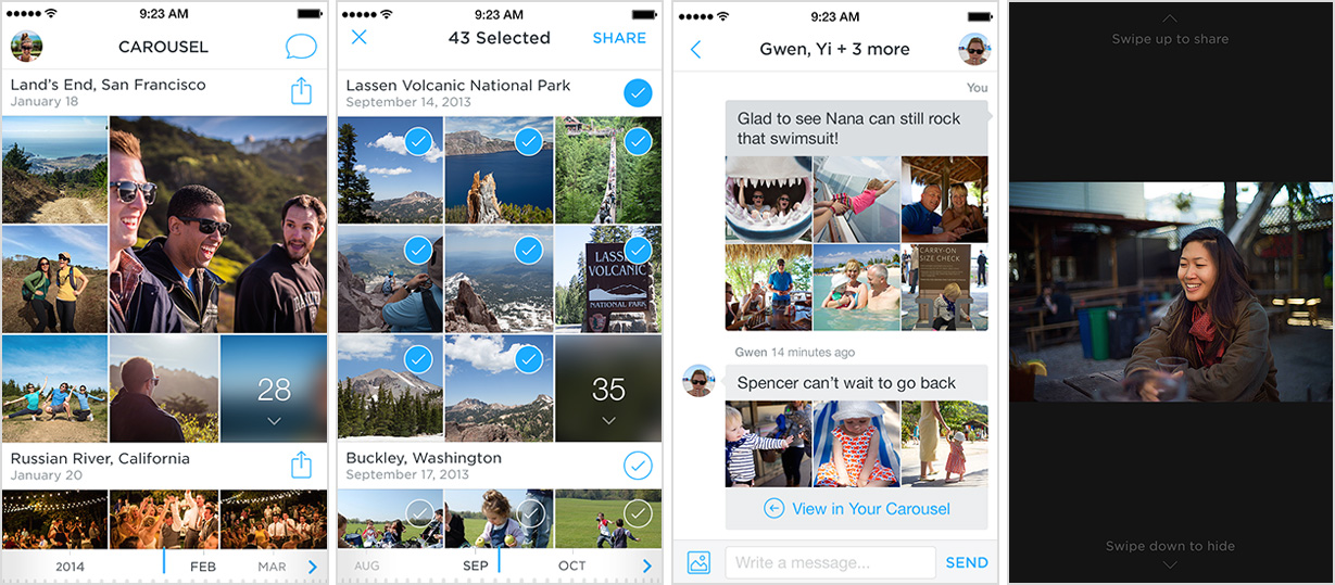
Carousel’s MVP is effectively two things for most users: a Dropbox uploader for backing up local photos and videos, and an enhanced version of Apple’s native Photos app, with improved viewing, sharing and discussion functionality. The app doesn’t let users take, edit or manage photos, other than hiding them (or deleting them, if they can find that feature), or view in anything other than chronological order.
For now, if users want to take and edit photos, then their mobile camera, Instagram or Camera+ are great options. To organize photos into folders, they’ll need to use Dropbox directly. And to view them in anything other than chronological order, they would sync Dropbox with a more advanced media gallery such as iPhoto, Picasa or Unbound. You will understand Carousel’s MVP much more easily by testing it out than by listening to me explain it ad nauseam. Below are four screenshots of what you can expect. To help you along, MacStories thoughtfully runs through what you can expect in your first experience.
Results And Learning
Mills Baker, a product design analyst at Mokriya, paints a rather dismal picture of Carousel in “Designer Duds: Losing Our Seat at the Table”:
"It’s honestly hard to determine what should be interesting about it, even in theory; it takes mostly standard approaches to organization, display, and sharing, and seems to do little to distinguish itself from the default iOS Photos app + iCloud Photo Sharing, let alone apps and services like Instagram, VSCO Cam, Snapchat, iMessage, Facebook Messenger, and so on.
To get an idea of why Mills feels so strongly about Carousel’s shortcomings, let’s look at the results since its launch.”
Rankings
Since topping the charts on and around launch day, Carousel has steadily lost attention, now ranking 456th in the “Photo and Video” category of Apple’s App Store and falling off in the overall rankings across all categories. It has basically been buried in the crowded photo and video app market, and Dropbox will need to make some non-trivial changes in subsequent iterations to make it bounce back to the top.
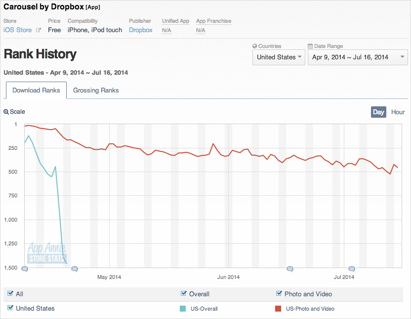
Upon launching in April 2014, the app certainly didn’t increase downloads of Dropbox’s main app, suggesting that Carousel’s main impact was on revenue or engagement, if anything.
Downloads
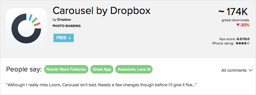
As of 16 July 2014, Carousel appears to have been downloaded 174,000 times globally. If Dropbox currently has 300 million users, then it has managed to get a paltry .06% of its total customer base to adopt Carousel. Clearly, it needs to make some improvements to increase adoption.
Ratings
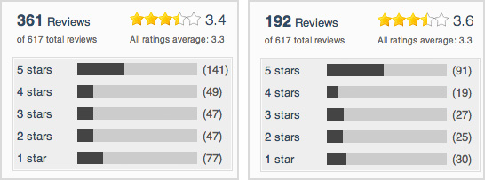
If we look at reviews in Apple’s App Store, non-target users almost unanimously consider Carousel to be a failure. “Not what I wanted,” “MASSIVE oversight” and “Completely useless” smatter the reviews section — all valid complaints if people are using it professionally. Meanwhile, average consumers like Owen and Nora have mixed reviews, ranging from “Amazing app!!!! This app is the best way to back up and privately share my photos on iOS!!!” to “Bring back Loom! Complete downgrade from Loom… Sad.”
While it wasn’t a runaway success upon launch, Carousel drew user reviews in the US and internationally that at least skew favorably. In fact, the reviews are as good as the ones for Dropbox and even Mailbox, both excellent standards for any productivity app.
While these reviews make it difficult to dispute Baker about the lackluster adoption of Carousel upon launch, 174,000 downloads is more than enough to learn about how people use Carousel, what needs to be improved and how well various features help Dropbox achieve its business goals.
In-App Purchases
While these statistics are highly coveted and, thus, kept very private, you can at least generalize that Carousel is achieving its primary objective of upselling existing users to premium accounts. However, many details suggest that Dropbox will need to make some major improvements to scale downloads and usage for new and existing users.
With Dropbox charging roughly ten times the price of Google’s popular cloud storage alternative, Drive, it will be interesting to see how much price has stunted adoption of and engagement with Carousel. If we’re being realistic, anyone who wasn’t born yesterday would know that Carousel requires Dropbox’s Pro Plan to work reliably. Dropbox will certainly have to address this as companies continue to compete on price in building up their cloud-based apps on top of virtually free cloud storage.

Looking Forward To The Next Iteration
As expected, this MVP is far from being a full photo and video manager. It lacks some features that hold users back from adopting it, including:
- better meta data and a better organizational structure for navigating photos,
- more granular syncing options to reduce clutter,
- a web viewer for making sharing easier,
- lower pricing.
However, if you look closely at everything Dropbox has done with Carousel, it has been extremely disciplined in prioritizing many of the most important features for its business and its users. It has drawn from the best relevant design patterns that I could find, many of which are not to be found in the closest alternatives, including Apple’s Photos and Instagram Direct. And while most mobile photos galleries aren’t that complex, Dropbox has managed to edit out features that are less important, such as a camera, editing features, heavy organization options, chat outside of sharing, and friend lists.
It still has a ton of work to do on the web and mobile. Considering how much people wish Loom was still around, many of its features will probably be included. Additionally, well-designed and robust apps such as Picturelife offer a great deal of inspiration for a dramatically simplified alternative to Carousel.
And while Dropbox might have done better to wait for what Rand Fishkin, cofounder of Moz, calls an EVP — an exceptional viable product — Carousel has a promising future. Dropbox just needs to tweak what it’s got to get more people to download and use the app.
Further Reading
- 10 Requirements For Making Home Page Carousels
- An Exploration Of Carousel Usage On Mobile E-Commerce Websites
- It’s Crazy Powerful. It’s Magical. Already Know How To Use It.
- Building User Trust In UX Design


