5 Useful Coding Solutions For Designers And Developers

Email Newsletter
Weekly tips on front-end & UX.
Trusted by 200,000+ folks.


This post is the the next installment of posts featuring “Useful Coding Solutions for Designers and Developers”, a series of posts focusing on unique and creative CSS/JavaScript-techniques being implemented by talented professionals in our industry. A key talent that any Web designer must acquire is the ability to observe, understand and build on other people’s designs. This is a great way to develop the skills and techniques necessary to produce effective websites.
With that in mind, let’s look at some clever techniques developed and used by top professionals in the Web design industry. We can use their examples to develop our own alternative solutions.
1. Designing a Slick CSS Timeline
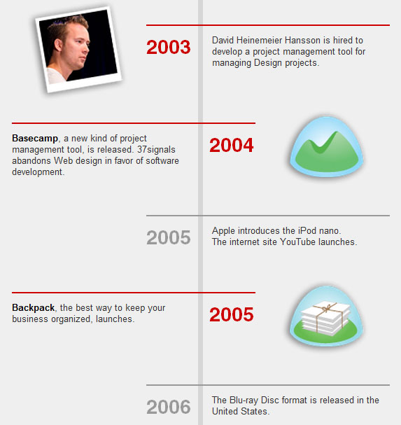
Designing a timeline is one of the tasks that frequently need to be solved when it comes to the design of portfolios. Some designers present the timeline as an image, others use plain text or use a good old table. We found an interesting CSS-based solution of a timeline over at 37Signals.com. While timelines are usually designed horizontally, this one is vertical, zig-zagging down each time slot.
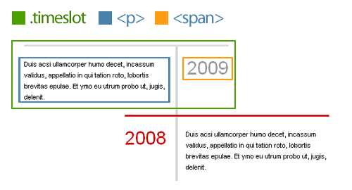
How is this done?
To achieve this zig-zag effect, we will be floating each row. By assigning an “even” class, we are able to specify a different style for the right-aligned time slots, controlling their colors and alignment.
See the demo.
Here is the HTML:
<div class="timeslot">
  <span>2009</span>
  <p>Duis acsi ullamcorper humo decet, incassum validus, appellatio in qui tation roto, lobortis brevitas epulae. Et ymo eu utrum probo ut, jugis, delenit.
  </p>
  </div>
  <div class="timeslot even">
  <span>2008</span>
  <p>Duis acsi ullamcorper humo decet, incassum validus, appellatio in qui tation roto, lobortis brevitas epulae. Et ymo eu utrum probo ut, jugis, delenit.
  </p>
</div>
And here is the CSS:
The default timeslot will float left and have a 100-pixel padding to the right. This leaves room for the year (<span>) to sit to its right. I also used absolute positioning for the year so that I could easily switch from left to right without worrying about colliding float issues.
Add a class of even to each even row, so that we get it right-aligned in red and the year positioned to the left.
.timeslot {
  width: 235px;
  float: left;
  margin: 0 0 10px;
  padding: 10px 100px 0 0;
  border-top: 3px solid #ddd;
  position: relative;
}
.timeslot span {
  position: absolute;
  right: 0;
  top: 27px;
  font-size: 3em;
  color: #999;
}
.even {
  float: right;
  padding: 10px 0 0 100px;
  border-color: #ca0000;
}
.even span {
  left: 0;
  color: #ca0000;
}
2. Custom Page Styling, CSS Drop Caps and Footnotes
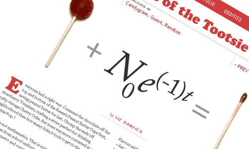
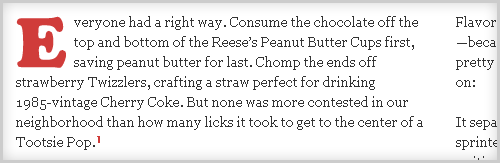
One website that is truly unique is Jason Santa Maria’s. What’s impressive about Jason’s website is that each article and blog post is entirely unique, with its design tailored to the content. Looking at a recent article, “Mathematics of the Tootsie Pop,” we’ll go over a few techniques that stand out for us.
1. Custom Page Styling in WordPress
The first question that came to mind when visiting Jason’s blog was, “How did he give each post a unique design?” You can achieve this simply by referencing a custom style sheet to override the website’s default style. By using a combination of custom fields in WordPress and understanding CSS specificity, you can freely give each post a design of its own. So, how is this done?
Step 1. Customize post with custom style sheet
Start by creating a new style sheet, and name the file to match your post’s title. With a good understanding of CSS specificity, you can customize the look and feel of the post.
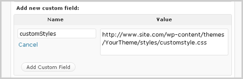
Step 2. Create custom field values
Log in to your WordPress admin area, and go to the edit page for the post. Scroll down to the “Custom Field” area, and enter a new custom field name called “customStyles”. Then, for the value of that custom field, enter the full URL of your custom style sheet.
Step 3. Call the custom style sheet
Open up the header.php file in your custom theme, and above your <title> tag, add the following:
<?php $customStyles = get_post_meta($post->ID, "customStyles", true);
if (!empty($customStyles)) { ?>
<link rel="stylesheet" href="<?php echo $customStyles; ?>" type="text/css" media="screen" />
<?php } ?>
In this step, we’re checking if a custom field of “customStyles” exists. If it does, then it will inject the value within the href of the style sheet reference.
Custom field tutorials:
- Custom Fields Hacks For WordPress
- WordPress Custom Fields, Part I: The Basics
- WordPress Custom Fields, Part II: Tips and Tricks
CSS specificity tutorials:
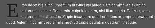
2. Creating Drop Caps
Drop caps are commonly seen in print design, but with the recent rise in popularity of Web typography, this technique seems to be becoming more common. We have various ways of achieving this technique.
Here is the HTML you would use:
<p><span class="dropCap">E</span>ros decet bis eligo jumentum brevitas vel abigo iusto commoveo ex abigo, euismod ulciscor. Bene enim vulputate enim, nisl illum patria. Enim te, verto euismod in nisl lucidus. Capio incassum quadrum nunc ex proprius praesent et quod. Autem in commoveo similis nostrud turpis paulatim quadrum, tristique. </p>Plain-text drop caps
Plain-text drop caps can be achieved with just a few lines of CSS. Until Web typography advances, and the @font-face standard becomes more widely supported, this is probably the easiest way to achieve drop caps. See demo.
Here is the CSS:
.dropCap {
  float: left;
  font-size: 5em;
  line-height: 0.9em;
  padding: 0 5px 0 0;
  font-family: Georgia, "Times New Roman", Times, serif;
}
To jazz up your plain text, check out the following tutorials on enhancement:
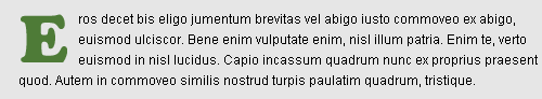
Text-replacement drop caps
Here, we are simply substituting an image for a letter, using a combination of text-indent and background image. See demo.
Here is the CSS:
.dropCap {
  text-indent: -99999px;
  background: url(drop_cap_e.gif) no-repeat left 5px;
  height: 50px; width: 55px;
  float: left;
  display: block;
}
While this technique is perfect for Jason’s post (because he uses only one drop cap), if you plan to use multiple drop caps, you should look into using CSS sprites. Mark Boulton offers a great example of this technique.
jQuery-based Drop Caps
A few years ago, Karl Swedberg of LearningjQuery.com introduced an awesome way to incorporate drop caps using jQuery. Please notice that using jQuery for presentational purposes may be not a good idea and contradicts the strict separation between the presentation and behaviour layers, but it does solve the problem nevertheless. You may want to check out Karl Swedberg’s drop-cap plugin that does a better job of keeping the presentation and behavior layers separate by simply wrapping a span around the first letter (with appropriate classes). That way you can style the letter however you like with CSS. Also check out the tutorials below:

3. Footnotes
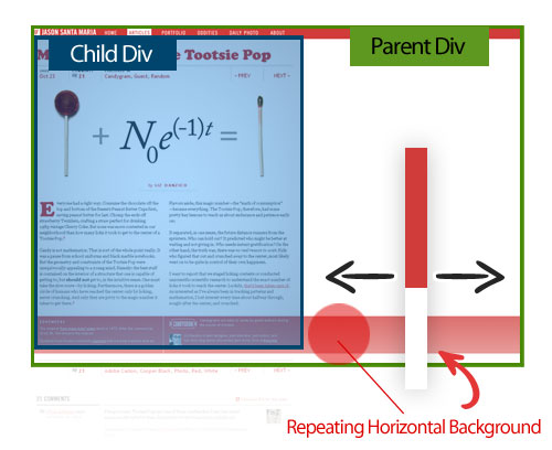
Footnotes are another interesting part of Jason’s post. The red stripe that bleeds across the page really accents the footnotes well here.
That bleeding red stripe can be achieved by nesting two DIV tags: the parent DIV, which contains a repeating background image (positioned at the bottom), and a second DIV, which is the actual fixed container where the content lies. This way, the red stripe follows the end of the content and aligns perfectly with the footnotes.
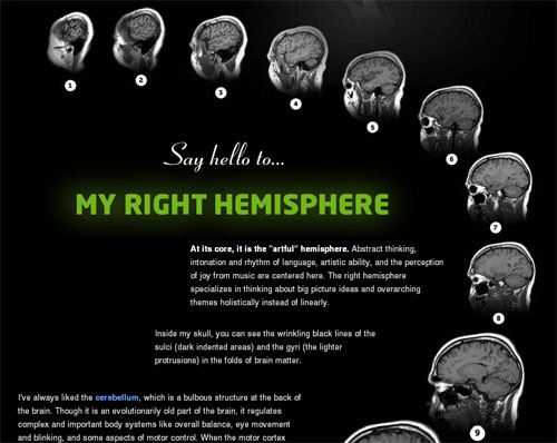
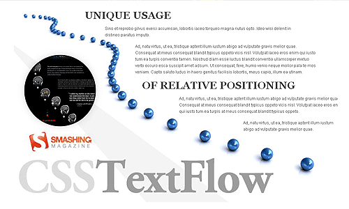
3. Text Flow
Like Jason Santa Maria, Dustin Curtis has his own way of giving each post a unique style. In the example below, you can see the interesting way in which the text flows down the page beside the pictures of the MRI. This technique is quite simple to do and is a good use of relative positioning.
How is this done? The text flow seen in Dustin’s design can be achieved by giving each text block a relative position, a fixed width and fixed coordinates. His post has a mix of large backgrounds, text replacement and relatively positioned text blocks.
Sample HTML:
<p class="small"
  style=" position: relative;top: 260px;width: 430px;left: 290px;">
    <strong>At its core, it is the "artful" hemisphere.</strong> Abstract thinking, intonation
    and rhythm of language, artistic ability, and the perception of joy from music are centered here.
    The right hemisphere specializes in thinking about big picture ideas and overarching themes holistically
    instead of linearly.
</p>
Although inline styles are typically not recommended, this would be a rare exception. Create a global class name for the default styling of all text blocks (margin, padding, text size, color, etc.), and use inline styling for the page-specific design (coordinates, width, etc.). See demo.
CSS:
.textflow {
  font-size: 1.2em;
  color: #2d2d2d;
  margin: 20px 0;
  padding: 5px 0;
  position: relative;
}
HTML:
<div class="textflow" style="width:300px; left: 680px;">
  <p>Ad, natu virtus, ut ea, tristique aptent illum iustum abigo ad vulputate gravis melior quae.</p>
</div>
CSS positioning tutorials:
- CSS Positioning
- Absolute, Relative, Fixed Positioning: How Do They Differ?
- Stopping the CSS positioning panic (Part 1)
- Mastering CSS Coding: Getting Started
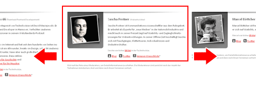
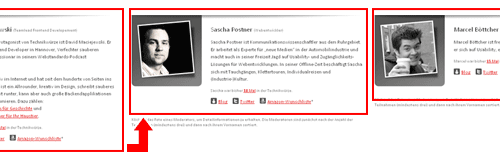
4. Combo Carousel Breakdown
Over at Technikwürze, we have found a carousel with a combination of animation effects. This is no ordinary carousel. For this example, rather than go over specific techniques, we’ll discuss the logic behind this unique carousel.

How is this done? As you can see, when clicking on a member’s thumbnail, three primary animations are triggered:
- The member bio slides in horizontally,
- The profile image slides in vertically,
- The grid of member photos updates, and the height of the container adjusts.
To begin, the full member profiles are floated so that they appear side by side. We use overflow: hidden; to mask the non-active profiles. Here is a visual demo of this carousel’s logic:

1. Horizontal animation
Each time a thumbnail is clicked, jQuery calculates how far the profiles need to slide over. This is the classic horizontal-sliding carousel effect.
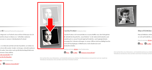
2. Vertical animation
Once the active profile slides into position, the image for the profile slides down. To begin, all profile images are position -190px above the frame. When jQuery detects that the horizontal animation has been triggered, it slides the profile image down.
3. Vertical animation
During the transition to the active profile, its height is calculated and the container is adjusted. This way, the container stays snug and does not leave any excess white space at the bottom.
Carousel tutorials and plug-ins:
- jQuery Infinite Carousel
- Create a Simple Infinite Carousel with jQuery
- Create a Simple Infinite Carousel with jQuery
- Coda-Slider
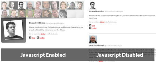
Graceful Degradation
The team at Technikwürze also implemented a fall-back option for this carousel. With a smart use of CSS, it crafted this page so that anything JavaScript-driven is tucked away. The resulting page is clean and accessible to all users.
5. Beautiful Typographic CSS-Based Ratings
Over at Web Appstorm, we have an interesting way of showing ratings with CSS. This CSS-based system can be achieved using absolute positioning and an image of the maximum rating.
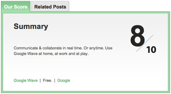
How is this done? Here is the HTML and CSS:
<span class="the_score">8</span>
<img class="ten" src="https://web.appstorm.net/wp-content/themes/appstorm_v2/images/ten.gif" alt="">
.tabdiv .the_score {
font-family: "Myriad Pro", Helvetica, Arial, sans-serif;
font-size: 110px;
line-height: 110px;
font-weight: bold;
position: absolute;
top: 30px;
right: 100px;
color: #262626;
text-align: center;
letter-spacing: -17px;
}
.tabdiv .ten {
position: absolute;
top: 80px;
right: 45px;
}
How is this done? As you can see, when clicking on a member’s thumbnail, three primary animations are triggered:
- The member bio slides in horizontally,
- The profile image slides in vertically,
- The grid of member photos updates, and the height of the container adjusts.
To begin, the full member profiles are floated so that they appear side by side. We use overflow: hidden; to mask the non-active profiles. Here is a visual demo of this carousel’s logic:
1. Horizontal animation
Each time a thumbnail is clicked, jQuery calculates how far the profiles need to slide over. This is the classic horizontal-sliding carousel effect.
2. Vertical animation
Once the active profile slides into position, the image for the profile slides down. To begin, all profile images are position -190px above the frame. When jQuery detects that the horizontal animation has been triggered, it slides the profile image down.
3. Vertical animation
During the transition to the active profile, its height is calculated and the container is adjusted. This way, the container stays snug and does not leave any excess white space at the bottom.
Carousel tutorials and plug-ins:
- jQuery Infinite Carousel
- Create a Simple Infinite Carousel with jQuery
- Create a Simple Infinite Carousel with jQuery
- Coda-Slider
Graceful Degradation
The team at Technikwürze also implemented a fall-back option for this carousel. With a smart use of CSS, it crafted this page so that anything JavaScript-driven is tucked away. The resulting page is clean and accessible to all users.
5. Beautiful Typographic CSS-Based Ratings
Over at Web Appstorm, we have an interesting way of showing ratings with CSS. This CSS-based system can be achieved using absolute positioning and an image of the maximum rating.
How is this done? Here is the HTML and CSS:
<span class="the_score">8</span>
<img class="ten" src="https://web.appstorm.net/wp-content/themes/appstorm_v2/images/ten.gif" alt="">
.tabdiv .the_score {
font-family: "Myriad Pro", Helvetica, Arial, sans-serif;
font-size: 110px;
line-height: 110px;
font-weight: bold;
position: absolute;
top: 30px;
right: 100px;
color: #262626;
text-align: center;
letter-spacing: -17px;
}
.tabdiv .ten {
position: absolute;
top: 80px;
right: 45px;
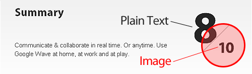
}Alternative Solution
If you would like the maximum rating to vary, you can achieve this effect using the following alternative method.
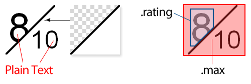
HTML:
<div class="ratingblock">
  <span class="rating">8</span>
  <span class="max">10</span>
</div>
CSS:
As you can see, .max is absolute positioned, has a transparent background and is layered above .rating. That way, if you need to adjust the maximum rating, you can do so without modifying any images.
.ratingblock{
  position: relative;
  height: 100px;
}
.ratingblock .rating {
  font-size: 8em;
  padding: 0 5px;
}
.ratingblock .max{
  display: block;
  background: url(rating_bg.gif) no-repeat;
  position: absolute;
  top: 0; left: 0;
  font-size: 5em;
  width: 50px;
  height: 60px;
  padding: 40px 0 0 50px;
}
Final Thoughts
By examining the techniques others have used to achieve unique and inspirational results, we expand our foundation in Web design. It’s a great way to learn and push ourselves to ever-higher levels. Stay hungry and keep learning!
 (al)
(al)

