69 Sexy Portfolio Designs To Inspire You

Email Newsletter
Weekly tips on front-end & UX.
Trusted by 182,000+ folks.
 Register for Free
 Custom Web Forms for Angular, React, & Vue. Your backend.


 Celebrating 10 million developers
 In this post you can see a collection of 69 new, ingenious and beautiful portfolio designs that will hopefully become a decent inspiration source for you. The collection includes both Flash and HTML websites, however all the designs are stuck to the balance of visual attractiveness and usability. Notice that every screenshot is clickable and leads to the website itself.
Today designing a unique, compelling portfolio has become a crucial task for designers, studios, companies and everyone whose business is on the Web. Not only does it help one stand out among the numerous competitors, but it is also a great tool for self-expression and demonstration of skills.
Now designers face new challenges in attracting the capricious web audience – a plain web page with a project list on it is out of date and boring, while fancy Flash websites with intricate navigation are annoying. Fortunately, despite all difficulties beautiful and artistic designs are appearing in an endless stream. Designers skillfully use all the benefits of the digital age and create websites that are rich in effects and eye-popping yet simple and accessible.
You may also want to check out the following Smashing Magazine articles:
- 30 Fresh And Inspirational Portfolios With A Twist
- 50 Fresh Portfolio Websites For Your Inspiration
- Retiring The Portfolio Screenshot
- Showcase of Case Studies in Design Portfolios
In this post you can see a collection of 69 new, ingenious and beautiful portfolio designs that will hopefully become a decent inspiration source for you. The collection includes both Flash and HTML websites, however all the designs are stuck to the balance of visual attractiveness and usability. Notice that every screenshot is clickable and leads to the website itself.
69 Exquisite Portfolio Website Designs
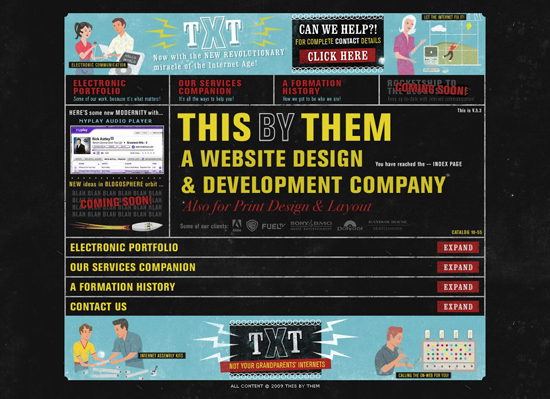
This By Them The portfolio of This By Them is done in cool retro style. Just look at these awesome graphics and regard for details! Neat accordion slideshow pattern enables to navigate the site at ease.
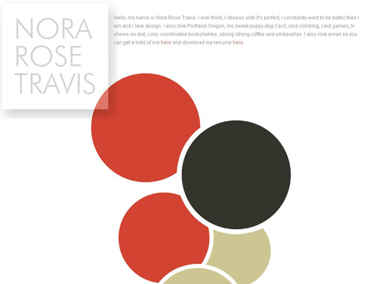
Nora Rose Travis Creative idea, contemporary style, exquisite implementation of clever JavaScript & CSS hooks make the portfolio of Nora Rose Travis look magical. And now a trick (not for the faint of heart!): open this design in IE6. See? Internet Explorer kills the design magic.
Carlos Cabrera This design successfully combines features of portfolio and online store. It provides easy accessibility and navigation; plus, featured works floating in the background deliver additional efficiency and visual appeal.

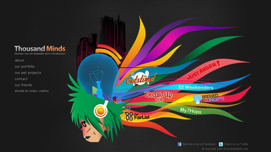
ThousandMinds A super stylish dark web design with enjoyable navigation.

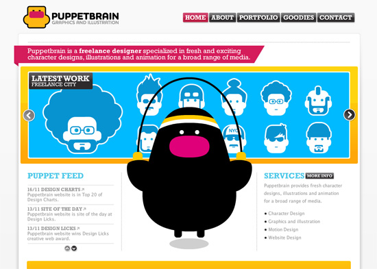
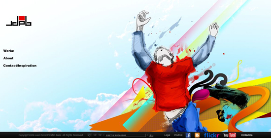
Puppetbrain A funky old-school design with a funny curious character running all through the website.
Huan David Perafan Baez A beautiful Flash website with horizontal navigation and amazing uninterrupted illustration in the background. The preloader is impressive here as well.

Somos la pera limonera


N E P O M U K


Johnny does


Richie Qilayout


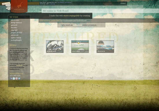
Nick Hand The portfolio of Alaska-based designer Nick Hand looks awesome with its vintage grunge background, sleek transition effects and transparent areas wrapped in dotted lines. Great example of one-page portfolio design.
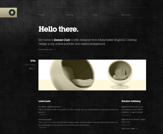
Corking Design This beautifully dark website belongs to Daniel Cork, a web designer from Manchester, England. Nifty texture, elegant logo and typography implemented in this design are really striking.
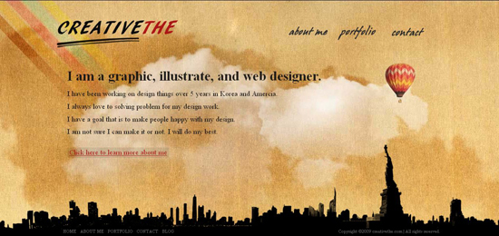
CreativeThe Each section of this single-page portfolio has its own background texture and graphic elements that are interwoven very smoothly. Urban graphics at the bottom of the page unites all section designs and contains navigation bar and copyright info. Such design technique can be rarely seen today; it’s really beautiful and unconventional.
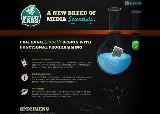
Mutant Labs Mutant Labs studio claims to be a new breed of media scientists. Well, the scientific experiment on their portfolio style was a success - we’ve got an original and tasty design.
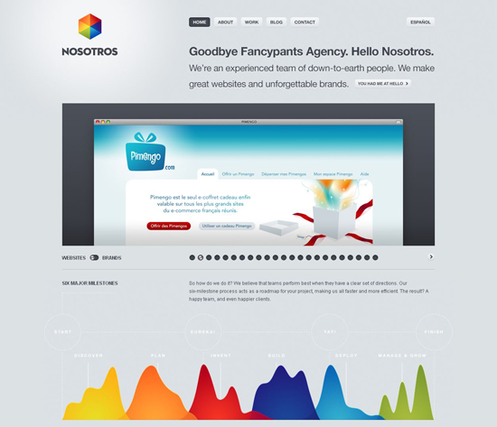
Nosotros Beside clean and simple layout, the portfolio of the creative agency Nosotros provides prominent data visualization and infographics.
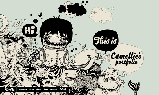
Camellie While many websites in our collection integrate several elements that make up a beautiful design, Camellie’s portfolio highlights the only element that dominates the overall design theme. Splendid, original illustration is the very spice that makes this site look awesome.
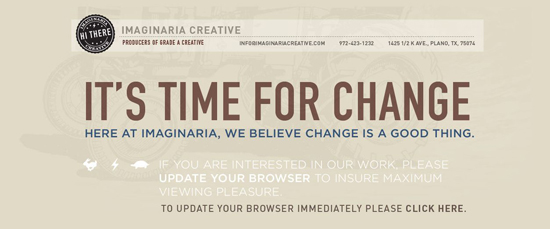
Imaginaria Creative Beautiful textures, large typography in the backgrounds, warm colors and smooth transparency result in an exquisite website design.
Mika Mäkinen Although this website is Flash based, it won’t confuse you with cluttered interface and complicated navigation. Instead, it is straightforward and beautiful. Among the major features of Mcinen.net are liquid resolution, large-scale layout and wonderful photographic background on the main page. Excellent work!

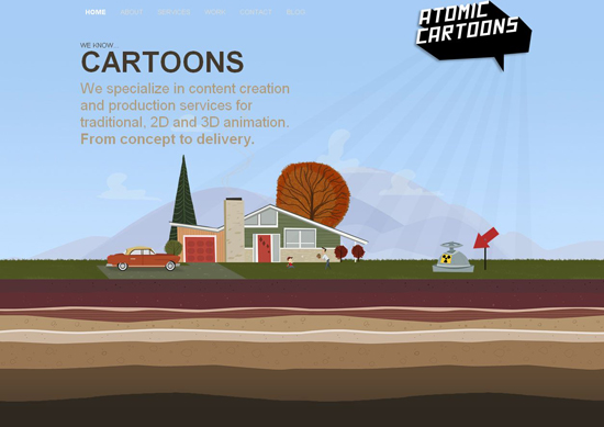
Atomic Cartoons Inc. Wonderful single-page portfolio with vertical navigation. Atomic Cartoons did justice to themselves by featuring amusing illustrations throughout the website.
Toy.ny This “toy” is really worth “playing” with. Sober colors and unobtrusive, minimal Flash animation which beautifully renders the typo, provide an enjoyable visual and content exploration experience.
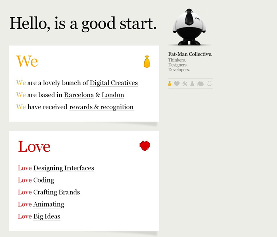
Fat-Man Collective The portfolio of Fat-Man Collective is really something. The way this “lovely bunch of digital creatives” combines simple navigation, amusing Flash effects and original content presentation will win your sympathy immediately.
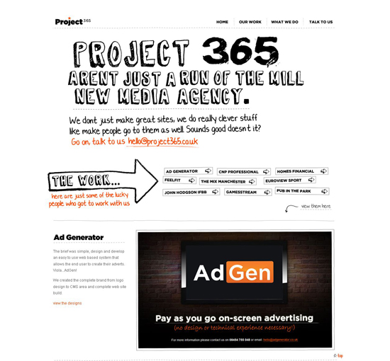
Project 365 Light and clean one-page portfolio of Project 365 looks fresh and positive, mostly due to lovely doodle typo used in this design.
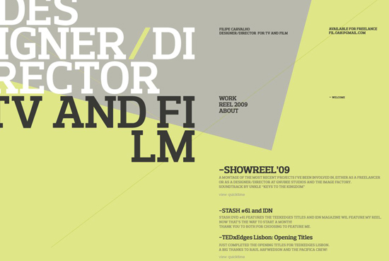
Filipe Carvalho Classy typography and good color management is what makes this portfolio design stand out.
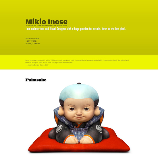
Mikio Inose The portfolio of the Japanese interface designer Mikio Inose has a sleek, Apple styled design. Bright colors and wide space in the header, non-standard fonts in the post titles and one-column layout make this design unique.
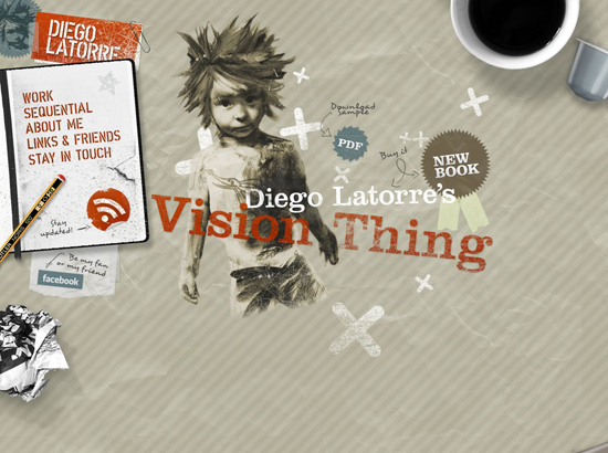
Diego Latorre Sexy design of Diego Latorre’s portfolio won’t leave you cold. Here everything from textures to the smallest graphic element is about details. Nothing left hanging here, great work indeed.
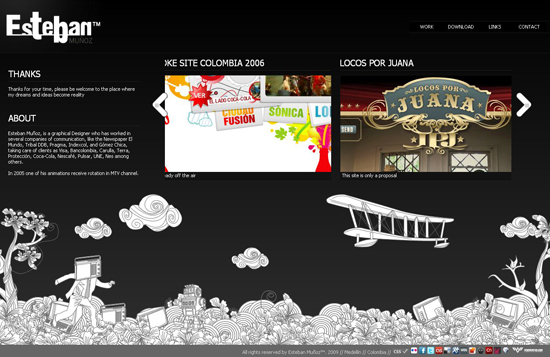
Esteban Muñoz Neat black-and-white portfolio design is featured by original line-art illustration that sticks to your mouse cursor and can be moved around the bottom of the page.
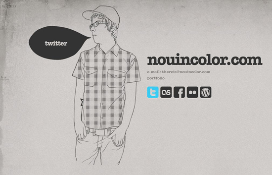
Nouincolor Style, laconism, individuality.
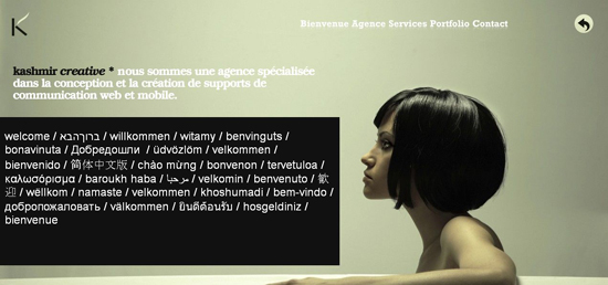
Kashmir Creative The portfolio of Belgium business communication agency Kashmir Creative looks stylish and contemporary. Much of this is due to the choice of colors and a professional photo filling up the background of the site.
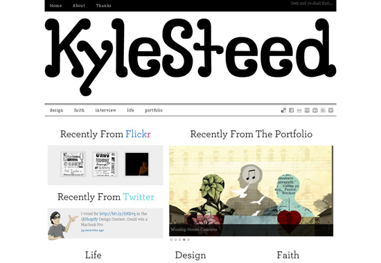
Kyle Steed The header of Kyle Steed’s portfolio is beautified by his own hand drawn font “Steed”.
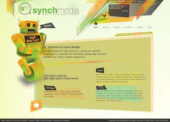
Synch Media A cool robot illustration and all this cheerful geometry make this design look positive and fresh.
![]()
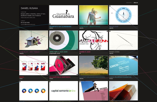
Daniel Kusaka Although personal portfolio of Brazilian graphic designer Daniel Kusaka is based on Flash, it loads fast and provides good content accessibility. Colorful clues chaotically stretched about the project gallery, as well as good work with thumbnail lighting, make this design look topnotch.
Garbadge.ro You may be confused with the navigation of this website at first, but you will quickly figure out how to get to the work gallery and the personal stuff of designer George Petrescu. This Flash-like motioned grid is developed by means of fancy jQuery.
Pirolab Again, lots of awesome visual effects here and no Flash!
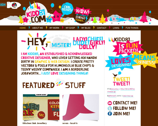
Kidd81 A big fun in this one. No doubt, this cartoonish, childlike design took some really adult skills to be done.
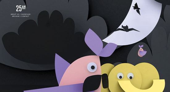
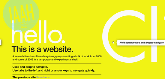
IAAH This design is everything but ordinary. As the guys from IAAH say, this site is meant to challenge the concept of space and how it is perceived within the browser window. Experimental layout may frustrate the advocates of simplicity and usability standards, but if you enjoy approaches that push the boundaries of web design, portfolio site of Iamalwayshungry studio will appeal to you.
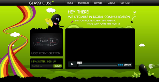
Glasshouse The portfolio of Cape Town based digital communication studio Glasshouse is beautiful, original and well developed.
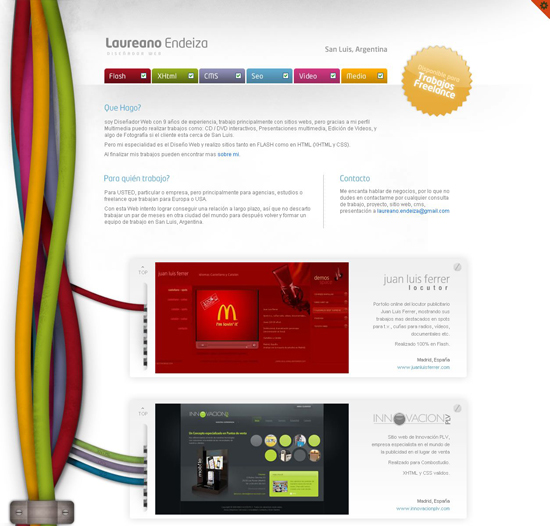
Laureano Endeiza This portfolio design offers a wide range of various options – you can switch between several design themes, filter displayed portfolio categories and read the site both in English and Spanish. Great!
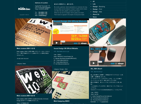
Nide.inc If grid layouts are classics of web design, this Japanese website is avant-garde, without fail.


MopStudio The border between originality and weirdness is rather fuzzy here. Perhaps it will take us, Western culture representatives, a few years to understand the delicate philosophy of Japanese web design.


