Designing Websites For Kids: Trends And Best Practices

Email Newsletter
Weekly tips on front-end & UX.
Trusted by 182,000+ folks.


 Custom Web Forms for Angular, React, & Vue. Your backend.
 Celebrating 10 million developers
Websites designed for children have been largely overlooked in Web design articles and roundups, but there are many beautiful and interesting design elements and layouts presented on children’s websites that are worthy of discussion and analysis. There are also a number of best practices that are exclusive to Web design for children’s sites — practices that should usually not be attempted on a typical website.
You may want to take a look at related articles:
- Best Practices For Web Design For Kids
- Designing For Kids Is Not Child’s Play
- Designing Web Interfaces For Kids
- A Dad’s Plea To Developers Of iPad Apps For Children
This article will showcase a number of popular commercial websites targeted towards children with an analysis of trends, elements and techniques used to help keep children interested and stimulated.
Design That Stimulates The Senses
Humans are mentally stimulated by a number of factors, and this is especially true with children. Successful children’s websites implement a number of elements and design principles that create an environment suited for a child’s personality and interests.
Bright, Vivid Colors
Bright colors will easily capture and hold a child’s attention for long periods of time. Although color choice is a primary factor in designing any type of website, this is especially true when designing a website for children since colors make a big impression on children’s young minds. Color choices and combinations that would likely be rejected or laughed at when designing a typical website may be welcomed on a website for children.
How many of the color combinations used in the screenshots below would succeed on a website aimed at an adult audience? Not many. So, when designing a site aimed at kids, use bright, vivid colors that will visually stimulate in an unforgettable way.
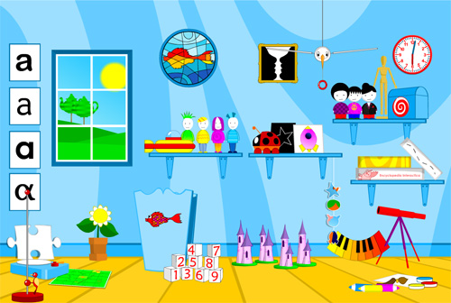
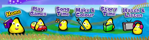
Herman’s Homepage
A Happy Mood
Kids will remember and return to a website if their experience is a happy one. Elements can be incorporated into the design to ensure that a cheerful, positive mood is presented.
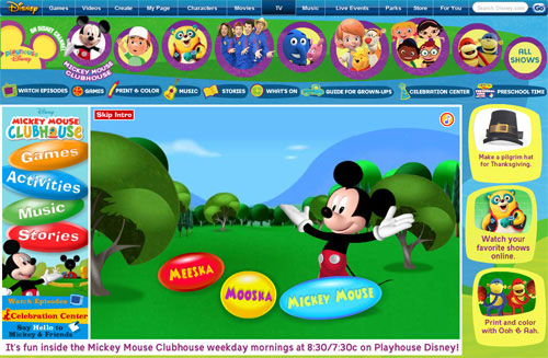
Mickey Mouse Clubhouse creates a happy mood by making Mickey himself a visual focal point on the page. His happy face and body language help enhance this happy feeling, creating a welcome atmosphere.
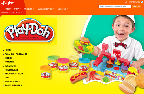
The Play-Doh website creates a happy mood using a beaming child as the focal point.
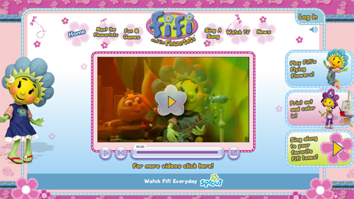
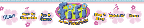
The Fifi and the Flowertots website has a large smiling Flowertot character in visual focus, creating a happy mood.
Elements From Nature
Children are stimulated by recognizable elements that they can relate to. Because children’s experiences in life are limited, some of the things they are most familiar with are found in nature. Natural elements such as trees, water, snow, and animals are used in the websites shown below. In many cases, these elements are overemphasized through size or simplicity of design.
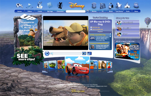
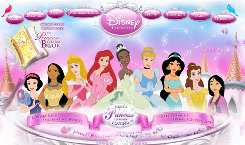
The Disney website alters its theme depending on what product is being promoted. In this screenshot, they use a Grand Canyon-like landscape to create a memorable visual experience.
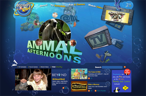
Discovery Kids uses an underwater theme.
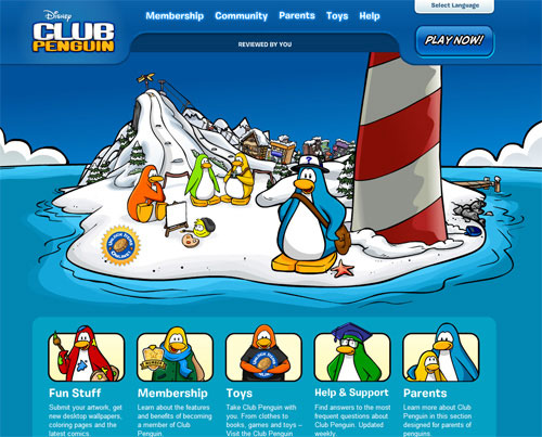
Club Penguin presents an arctic theme.
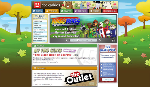
CBC Kids uses a seasonal theme based on simplistic, eye-catching graphics.
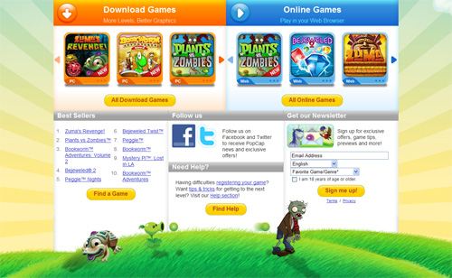
PopCap Games uses a grassy landscape in front of large rays of sun.
Larger-Than-Life Design
Large design elements have proved to be effective in all types of Web design, demonstrated by the fact that large typography, large buttons, and large call-to-action areas have become commonplace in modern design. Because children are naturally drawn to simple, obvious, and recognizable objects, websites designed for children will increase their effectiveness through the use of large design elements.
Animated Characters
Large, animated, speaking characters are a fascinating and captivating way to grab and hold a child’s attention. Many sites designed for children use this element effectively.

Depth in Design
Children like to let their imaginations run wild in a world that looks and feels real. This kind of atmosphere can be created through depth in design elements. This might include extruded shapes, shadows, landscapes, beveled effects, shiny gradients, or floating objects. Often, many of these elements are present in cartoon-like displays, as shown below.
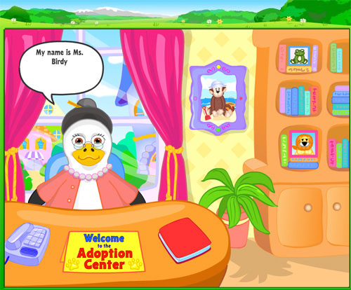
The Webkinz “Adoption Center” uses shadows, a life-like character, and other 3-dimensional elements to create a design that has depth.
Poisson Rouge creates a deep, realistic atmosphere using a window that looks outside at the sun, along with a number of other 3-dimensional elements.
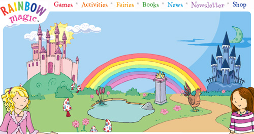
Rainbow Magic creates depth in their design through a Flash-animated landscape scene that moves as the user hovers over different elements.
Navigation and Call-to-Action Areas That Stand Out
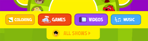
In any website design, navigation and call-to-action areas should be focal points. Children’s website designers can oversimplify these areas so that children can navigate easily. Text-based navigation on children’s websites would not be as effective as large buttons and graphics, because they would lack visual focus on a page.
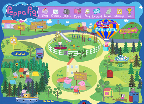
Peppa Pig has a horizontal navigation bar that includes large icons and easy-to-read descriptions for each item.
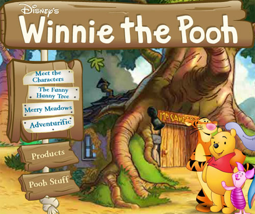
The Winnie The Pooh website incorporates their navigation bar into their “forest” theme, using large wooden graphical elements that won’t be overlooked by the user.
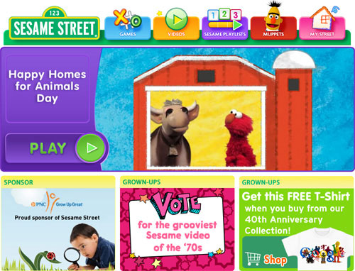
Sesame Street has an easy-to-locate horizontal navigation bar, along with large call-to-action areas.
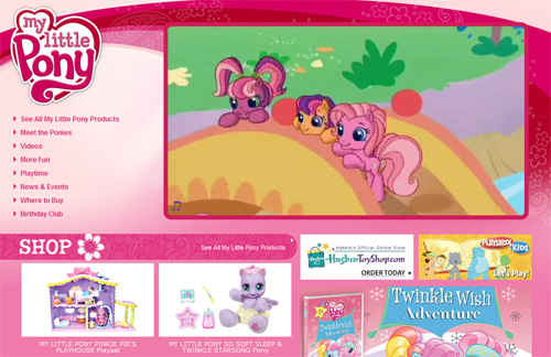
My Little Pony uses text-based navigation, creating a less-graphical experience, which allows focus on the content elements. This might be ideal in some situations, but on a children’s website a graphic-based navigation bar is more likely to be effective.
User Interaction
Probably one of the most important ways for a children’s website to succeed is to include elements that allow a child to interact with the site in some way. Children don’t want to do intense reading or research; they want to play and be entertained.
On a typical website, certain design elements are viewed as distracting, unusable, and cumbersome. On a child’s website, those same elements are viewed as an effective means of attracting users.
Interaction Through Animation and Sound
Effects and experiences created with Adobe Flash are discouraged in typical modern Web design, but on children’s sites there is almost no other option. It’s true that JavaScript animation and effects have come a long way because of the many JavaScript libraries available, but the ease with which complex animations can be created with Flash makes this method the first choice for many commercial websites designed for kids.
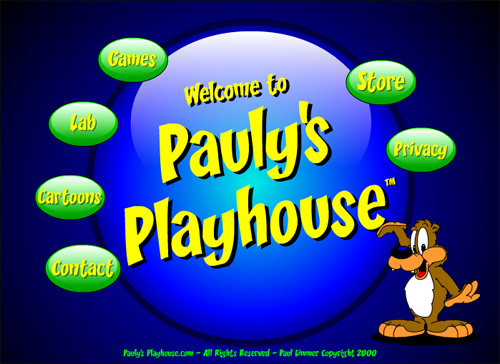
The Pauly’s Playhouse site, like most of the websites featured in this article, is built entirely in Flash.
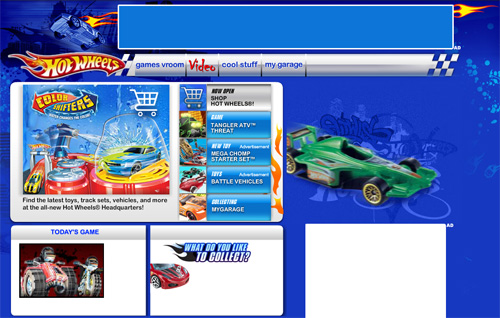
The Hot Wheels website includes an animated “car of the day” that zooms onto the screen when the page loads, creating visual interaction.
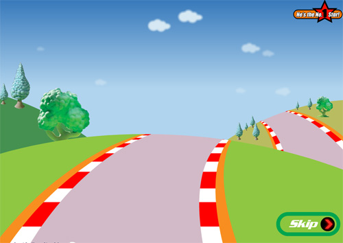
Roary the Racing Car has a brief “flash intro” with a “skip” button. This is an old-school trend in typical Web design, but is an effective means of catering to a child-based audience. The intro animates through a road until the characters appear on the horizon. This helps the user feel as though they’re personally entering Roary’s animated world.
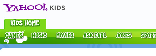
The Yahoo! Kids navigation bar is created with Flash and makes sound effects and animates when its items are hovered over. This trend is very common on many of the sites featured in this article.
Interaction Through Video
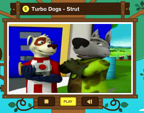
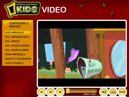
Television is known to captivate child audiences for hours, which is why “Saturday morning cartoons” have for decades been a lucrative part of the broadcast schedules for many TV Networks. Similarly, video on a child’s website adds a fun, interactive, and educational aspect to a site’s content.
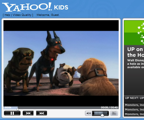
National Geographic Kids - Videos
Interaction Through Games
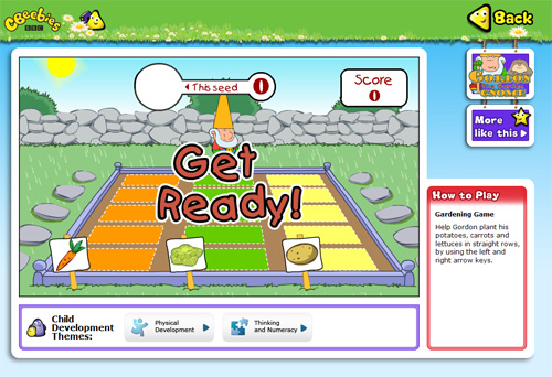
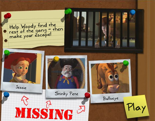
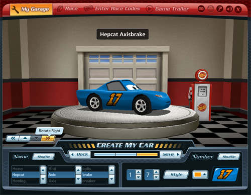
What child does not enjoy playing games? One of the most effective ways to entertain, educate or otherwise occupy a child on a website is to include a “games” section. Almost all the websites researched for this article include games that educate, stimulate, and allow direct interaction, while also incorporating many of the design elements already discussed. Below are some examples.
CBeebies - Gordon the Garden Gnome
Toy Story - Woody’s Big Escape
Disney Pixar’s World of Cars allows users to create, share, and race their own custom cars.
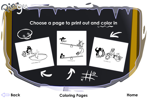
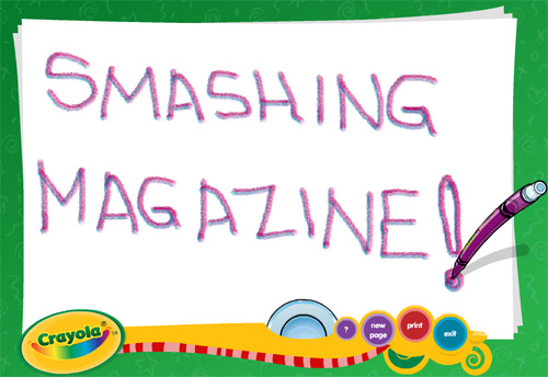
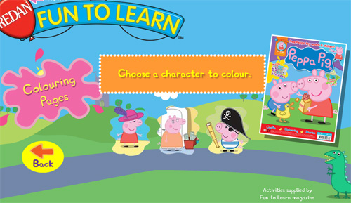
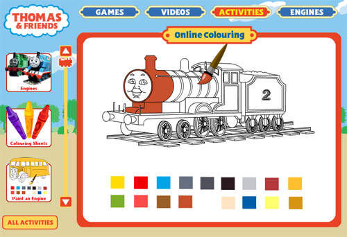
Printable Elements
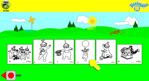
Kids like to have something tangible to take with them, to help them remember their experience. Printable pictures and colouring pages allow kids to have a keepsake of their experience, while giving website owners an opportunity to enhance and promote their brand outside of the computer screen. Below are some examples of printable colouring pages on kids’ websites.
Pingu Coloring Pages
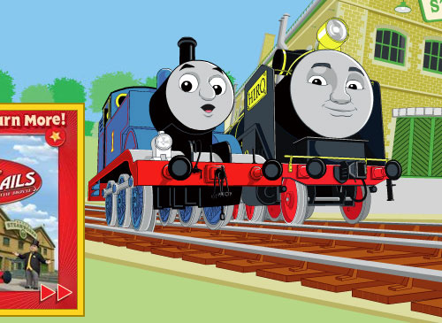
Thomas and Friends Online Colouring
Unconventional Methods
We’ve already discussed a number of elements that, in modern typical Web design, are now considered unconventional. Sound, animation, and large obtrusive graphics are often frowned upon in typical Web design. On children’s websites, these elements help the user experience. Other unconventional elements and design choices are discussed below.
Changing the Cursor
This is absolutely viewed as a bad practice in standard Web design, but can be a fun, effective way of adding a playful element to a kids’ website theme. This can be done using dynamic HTML, but is more often done via Flash.
The cursor on the Discovery Kids website turns into a snapping bear trap graphic.
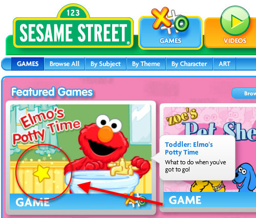
The cursor on the Sesame Street website is followed by a yellow star when it hovers over standard HTML elements, and turns into a yellow star surrounded by smaller animated stars when the cursor is moved over clickable Flash elements.
Talking Navigation
Sometimes a navigation bar will produce sound effects, but in other cases, the navigation links will sound out what they represent in a cheerful voice.
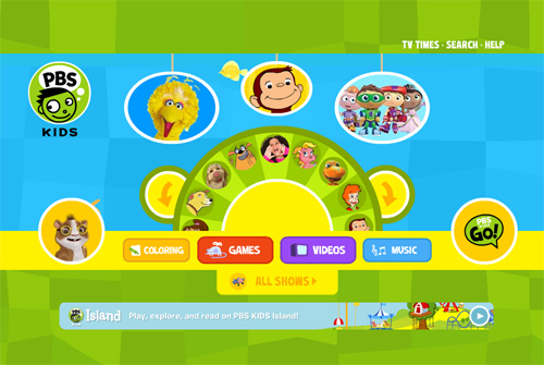
The PBS KIDS navigation bar speaks using children’s voices, when the user hovers over it.
The CBeebies navigation bar uses a voice to sound out the destination of each navigation item.
The Bob the Builder navigation bar speaks to the user on mouseover.

The Fifi and the Flowertots features a speaking navigation bar.
Breaking the Grid
While traditional modern Web design techniques have embraced the benefits and aesthetics of grid-based design, kids’ websites can break free from an overly structured layout to create a unique world that a child will enjoy experiencing.
This is not to suggest that using a grid as the basis of the design is wrong. It may be beneficial to start with a grid, then design elements outside the grid in a controlled manner. This flexibility in design and layout is demonstrated on a number of the sites already discussed, but is also evident in the navigation bars of the examples below.
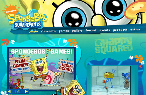
The navigation bar on the Spongebob Squarepants website is slanted, going against convention in typical grid-based Web design.
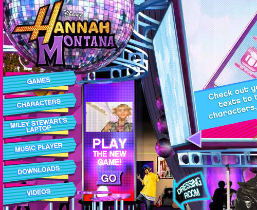
The Hannah Montana website features navigation bar graphics that break the grid.
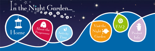
The In the Night Garden website features a very unusual navigation bar design that bears little resemblance to that found in a conventionally-structured design.
Below are some examples of websites that utilize a more rigid, grid-based format, and as a result are not as unique, memorable, or captivating as some of those already considered in this article.
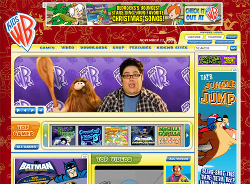
Kids WB is rigid, and not as memorable.
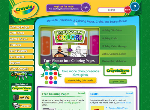
The Crayola website is somewhat old-school with its grid format and vertical navigation.
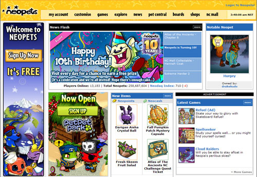
Neopets is also designed on a more structured grid.
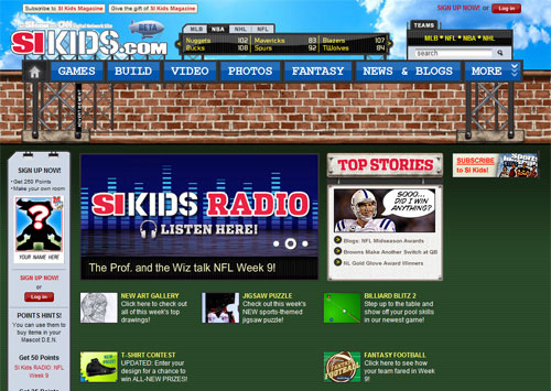
Granted, in some cases a stronger grid-based design would be necessary if the audience was an older child audience, as is the case with SI Kids, shown below.
Taking Responsibility
If you are attempting to reach the minds and hearts of young, impressionable people through an online experience, you are entrusted with a weighty responsibility. Children are mentally fragile, and easily affected by what they see, hear, and touch. There are certain factors that need to be addressed on every children’s website, to ensure no harm is being brought to the children.
Promoting Education
Games and other interactive elements should be created not just to promote your company’s brand and identity, but to help educate and train young minds in a beneficial and positive way. Promoting education through games and activities will show that your company cares about the user and how their online experience might affect them in the future.
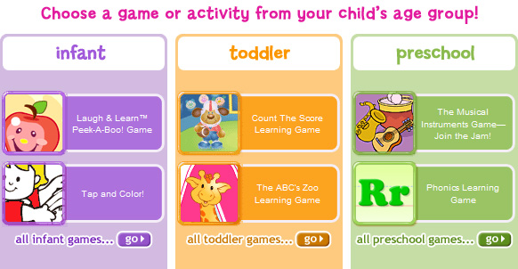
Online Learning Games from Fisher Price include games that vary according to age group.
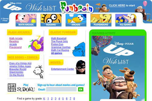
Funbrain promotes itself as “The Internet’s #1 Education Site for K-8 Kids and Teachers.”
Information for Parents
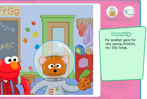
Parents will be keeping a close eye on their children’s internet habits. Many children’s sites are aware of this, so they include information that is geared towards parents. Sometimes this is in the form of a tip, as is the case with the Sesame Street games website, or simply a navigation item that points to a parent’s section.
Sesame Street Games includes a “Parent Tip” box.
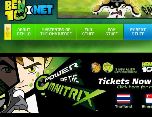
BEN 10 has a “Parent Stuff” link in their primary navigation bar.
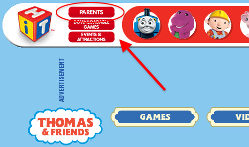
Thomas the Tank Engine includes a “parents” link.
Usability Testing
Finally, one of the best ways to help build a successful online experience for children is through watching children navigate and interact with your site’s games and other unique features. Not all companies will have the budget for extensive testing, but almost all will have the ability to do at least a minimal amount of testing — even if it’s with just one child. This will allow you to see the site through a child’s eyes and make any necessary modifications, the same as would be done in any usability tests.
Companies like Disney, Sesame Street, and PBS, of course, have been studying the behaviour of children for years, so many of the examples showcased above could be utilized to form the basis for a successful children’s website, even if no usability testing is done.
Conclusion
Here is a summary of both conventional and unconventional best practices for designing a website for kids:
Conventional Best Practices
- Create elements that are large and visually memorable
- Use bright, vivid colors that stimulate the senses
- Incorporate elements from nature
- Create depth in the design
- Add navigational elements that are large and easy to find
- Use video
- Include printable elements
- Break the grid
- Make modifications based on usability testing
Unconventional Best Practices
- Create a happy, playful mood
- Use animated characters
- Use graphic-heavy navigation bars
- Use Flash animation abundantly
- Embed motions and sounds that trigger on page load
- Include a “games” section
- Change the cursor to contribute to the theme
- Add voices to navigation rollovers
- Be accountable to both children and parents
A Web designer who has worked on a children’s website would likely say that it was one of the most fun and interesting projects they’ve had the privilege of working on. If you ever have the opportunity to create a user experience that is geared towards children, be sure to follow some of the proven methods demonstrated on many of the sites discussed here, and your website will have a good chance to be a big hit with children.


