Incredible Black and White Typography
I love the use of different colors in design. Designs that use vibrant colors really attract my attention. I’ve definitely done my part in showcasing colorful designs.
Today, we will be focusing on black and white. In the world of design, black and white definitely have their place. Using black and white can definitely add a touch of class as well as a classical element to a design. Just take for instance, black and white movies. Because of the lack of color, these movies automatically generate a classic feel.
White
When using white in design, it signifies purity, innocence, minimalism, as well as a very clean feeling. White definitely goes well with any other color.
Black
On the other hand, black just always stands out. The reverse "print", as some would call it, is very popular in newspaper ads because they attract the most attention. Black is bold, elegant, mysterious, sophisticated, but it can also convey a conservative feeling as well.
“If everything isn’t black and white, I say, why not?”
- John Wayne
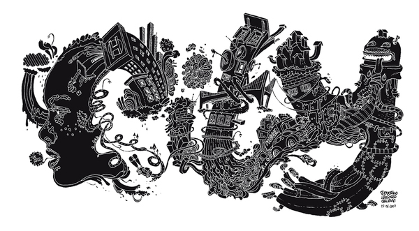
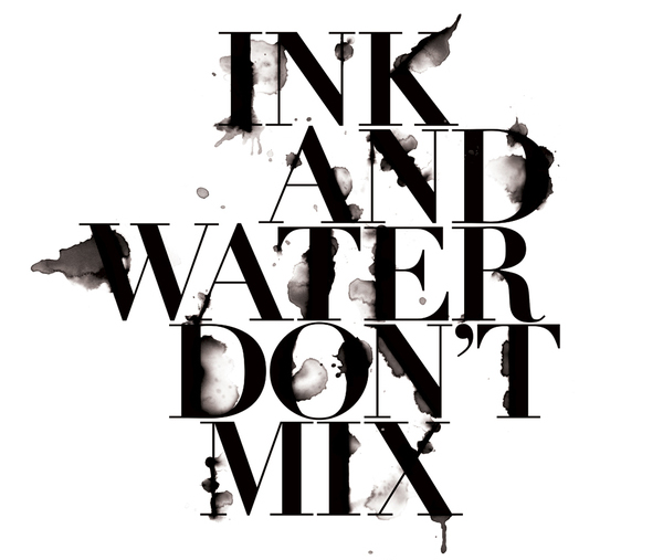
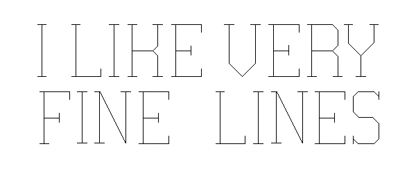
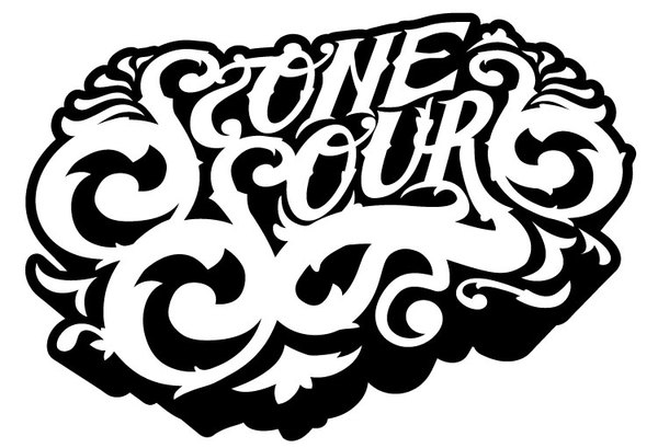
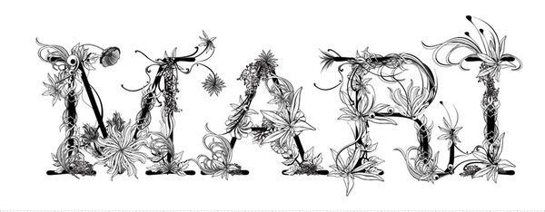
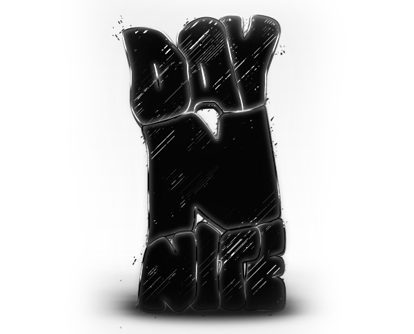
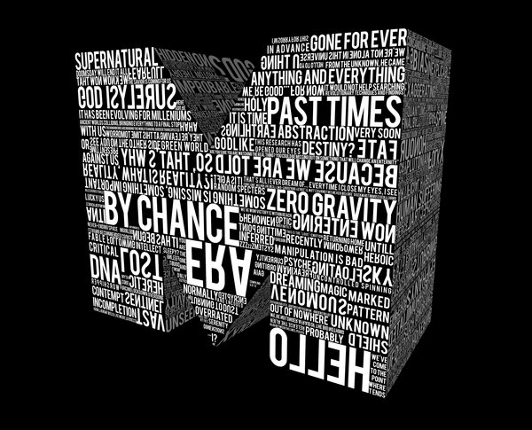
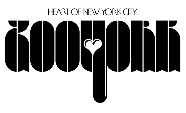
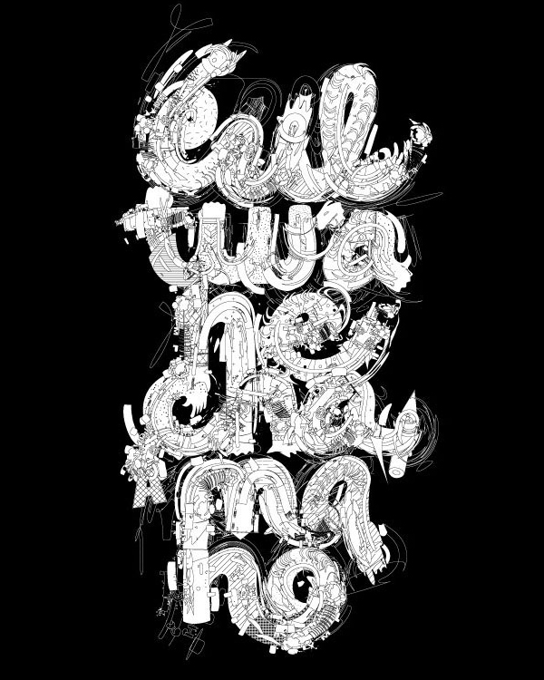
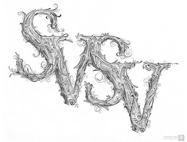
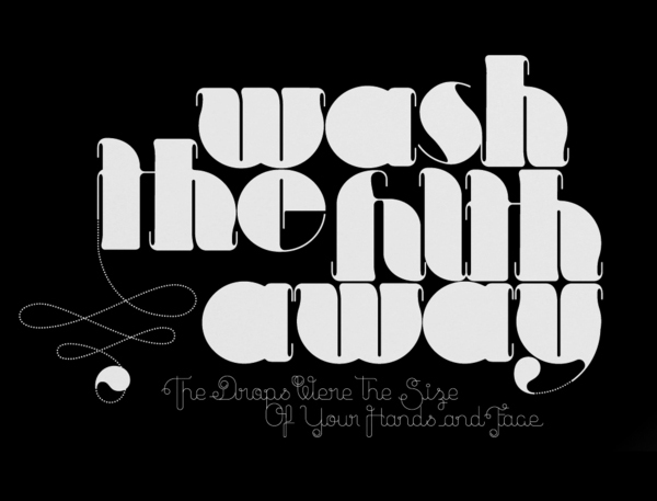
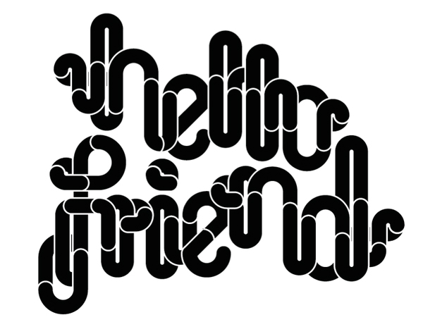
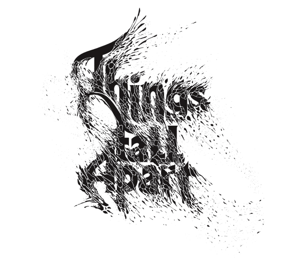
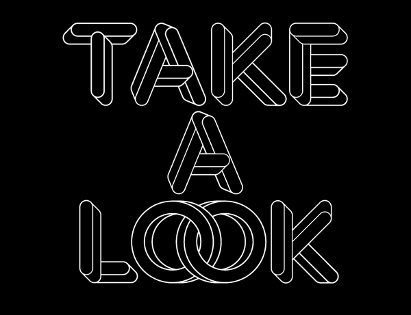
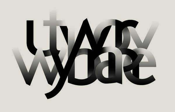
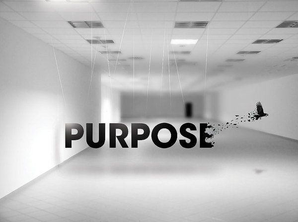
Let’s take a look at 50 incredible examples of black and white typography.
Note: Please click on the images to see them in their websites and to learn more about their artists.
In the words of Stefan Kanfer,
“There’s something strange and powerful about black-and-white imagery.”
So what are your thoughts about these typography pieces? Which ones are your favorite and why? Please make sure that you join in on the discussion and leave your thoughts below.
Well, thanks for viewing and if you liked this post, please stumble and bump it. You can follow me on twitter here.


Simon B
December 4th, 2009 2:12 pmThese truly are ‘incredible’, thank you :o)
Bluefaqs
December 4th, 2009 2:18 pmNice list! I was hoping that you were going to post today. Keep up the great work!
.-= Bluefaqs´s latest Blog Entry – 15 WordPress Plugins To Enhance Your Comment Section =-.
Josh Star
December 4th, 2009 2:18 pmAn excellent showcase of some very beautiful designs. Black and white does add a vintage feel and it adds a very sophisticated and elegant tone. Some of these designs are also reservedly modernistic Great stuff!
typegoodness
December 4th, 2009 2:42 pmWhat a great selection of type. Very nice article.
.-= typegoodness´s latest Blog Entry – Orbitron =-.
Jordan Austin
December 4th, 2009 3:00 pmWow, seriously awesome post. You really did a lot of work to to bring these all together. I honestly cannot decide which one I love the best. And I’m so glad you found a lot that I’ve never seen before.
Great work Jad!
Joppa Design Peeps
December 4th, 2009 3:04 pmWas very inspiring. Super sweet stuff. Loved it. Did I mention it was good stuff? Thanks for sharing!
vikas ghodke
December 4th, 2009 3:09 pmWoow thanks for such a beautiful collection..
.-= vikas ghodke´s latest Blog Entry – 65 Light Graffiti For Inspiration =-.
devildesigner
December 4th, 2009 3:14 pmI just love it when both the form AND function of type is explored…add a twist such as black and white and you have just gone and made my grey day! well done and thanks!
Edgar Leijs
December 4th, 2009 3:24 pmYou made a great showcase… love typo and black & white…
Jad Limcaco
December 4th, 2009 3:28 pm@Simon B – You’re welcome mate!
@Bluefaqs – Your wish came true. :)
@Josh Star – Thanks Josh. I agree with you. That’s why black and white is always in style.
@typegoodness – I checked out your site and it’s awesome! I’m definitely going to be a regular visitor. By the way, your favorite should be SOLID cause I made that one. :)
@Joppa Design Peeps – You forgot to mention that it was good stuff.
@Jordan Austin – Lot’s of work to gather these but it’s worth it. Thank you for your compliments.
@vikas ghodke – You’re welcome!
@devildesigner – Happy to make your day! :)
Iniwoo
December 4th, 2009 3:30 pmGreat collection ;)
Added this post in our weekly ‘Best of Web’.
Designzzz
December 4th, 2009 3:56 pmVery well done good share!!!
.-= Designzzz´s latest Blog Entry – 50 Most Beautiful Trees Photography =-.
KASTORYANO
December 4th, 2009 4:37 pmWonderful post I love typography. Great inspiration.
Egils Grikis
December 4th, 2009 4:37 pmIt is simply incredible! Looking on these great compositions you even are forgetting the headline Black & White. They are so rich and colorful! Our imagination plays with them… Thank you for great moments!
.-= Egils Grikis´s latest Blog Entry – balsamstudio new identity, website =-.
Jad Limcaco
December 21st, 2009 1:58 pmI agree. I don’t think color is always necessary in design. Black and White designs that are executed properly are often “timeless.”
Site Reviver
December 4th, 2009 4:40 pmAwesome collection. Very nice effort :)
.-= Site Reviver´s latest Blog Entry – Windows 7 Continued =-.
Arian Xhezairi
December 4th, 2009 5:53 pmI wanted to fav one over another, but I realized it’s impossible since nearly each of them was as terribly beautiful as the others.
Thanks for the inspiring collection Jad.
.-= Arian Xhezairi´s latest Blog Entry – PoentaStudios: 22 Advanced CSS Text Effects And Web Typography Tips http://bit.ly/4HvZYw (RT @iBlend: RT @1stwebdesigner) =-.
Adit Gupta
December 4th, 2009 10:15 pmPretty awesome collection!! :)
Petrus
December 5th, 2009 2:43 amBeautiful showcase of B&W Typo. Very interesting and good for inspiration. Thank you for this work.
Sakib
December 5th, 2009 4:00 amwow! in your post, i found some are really really so so cool. truly incredible.
.-= Sakib´s latest Blog Entry – 100 Must-Read Articles For Entrepreneurs =-.
Bea Litao
December 5th, 2009 4:56 amProbably one of the best collections out there! Black and white sure does bring out the important context there is in typography. Not saying color doesn’t. It’s just more striking this way.
Thanks for posting!
Jad Limcaco
December 21st, 2009 2:12 pmI agree. With color, a lot of times, we get distracted, but black and white typography simply makes the type to really stand out.
nFormas design
December 5th, 2009 7:36 amNice collection and a great Inspiration! Thanks!
.-= nFormas design´s latest Blog Entry – YOUPIX – Criatividade Digital =-.
Richie
December 5th, 2009 7:38 amAwesome collection.
.-= Richie´s latest Blog Entry – Stunning works of art by German designer, Loïc Sattler =-.
IVAN
December 5th, 2009 8:08 amamazing ! .. great collection ♥
.-= IVAN´s latest Blog Entry – Saturday inspiration #10 [Scenes] =-.
eric washburn
December 5th, 2009 2:47 pmbeautiful displays of Black & White Typography!
Fenson
December 5th, 2009 2:54 pmB&W will never go out of style. Great collection.
Manz
December 5th, 2009 3:06 pm“The reverse “print”, as some would call it, is very popular in newspaper ads because they attract the most attention” – true. However, the consideration of how the negative space is used with the black is important. Just because you have white on black doesn’t automatically make it interesting enough to grab attention – the expression of the idea needs to be good also.
There are some amazing examples in the post. “Ink and Water Don’t mix” is very cool. Not sure you could reverse it and have the same impact though. That’s a post on it own… and one I plan to write soon ;) Might bookmark this article as something I can reference and link to. Would that be OK?
.-= Manz´s latest Blog Entry – A Convenient Truth (Part 2) =-.
Jad Limcaco
December 21st, 2009 2:14 pmGreat point Manz. Thank you for bringing that up.
I agree, with reverse “print,” you definitely have want to have better letter-spacing as well as a generous amount of padding.
Mike Jones
December 5th, 2009 3:30 pmGreat collection—love it!
kailoon
December 5th, 2009 3:42 pmNice round up :) Thanks!
michu
December 5th, 2009 5:39 pmMy favorite was the one in the clouds, excellent collection mate! thanks for sharing! CHAO
Thomas
December 6th, 2009 6:14 amThis is the best design article I’ve read in ages!!
j000
December 6th, 2009 7:09 amThanks for sharing. Retweeted, mooed, floated, and blended :)
.-= j000´s latest Blog Entry – 19 Sites with Attractive Headers and Footers =-.
Jad Limcaco
December 21st, 2009 2:14 pmThanks for doing so. :D
Danillo
December 6th, 2009 10:12 amGreat list. Very inspiring!
Thanks for sharing.
Stay with God! =)
loswl
December 6th, 2009 5:57 pmvery nice collection, Typography is so cool and art form by itself :)
.-= loswl´s latest Blog Entry – The Lord’s Purpose Prevails =-.
web design maidstone
December 6th, 2009 11:28 pmwow somw great examples, gotta love mono!
Design Ideas
December 7th, 2009 1:55 amAmazing typography examples
LukeSF
December 7th, 2009 3:18 amI definitely remember seeing some of those in color… And i couldnt stop thinking that designs were simply inverted for B&W… yet, great collection!
Jad Limcaco
December 21st, 2009 2:15 pmActually, I found all of this in black and white. Anyway, if you see the colored links, shoot them over to me. I’d like to see it.
Torrie Foster
December 7th, 2009 7:31 amI’d have to say, black and white typography is absolutely gorgeous. Each and every one of these designs are very unique and really draws attention to my eyes. They all seem so classy, which is what I love about them.
.-= Torrie Foster´s latest Blog Entry – TorrieFoster: @mgoldst I love your website and your work that you do. Awesome! =-.
Jad Limcaco
December 21st, 2009 2:15 pmBlack and White definitely brings a touch of class to a design if executed correctly.
TJ
December 7th, 2009 11:53 amGreat post, so inspiring!
gzstudio
December 7th, 2009 1:29 pmThese are all very nice. I’m a big fan of Black and White design but its quite rare to see such a variations like this. For me I prefer the one with only pure black and white (no grey) with the exception of “paper cut” and “black mood” which are very nicely done.
DesignBeep.
December 8th, 2009 2:42 amthanks for the collection..i like the 3rd one so much
Aslam A Memon
December 8th, 2009 4:29 amawesome collection!
you might like this one as well
http://aslam-memon.blogspot.com/2009/06/that-sorry-seems-to-be-hardest-word.html
thanx
RM - InBoundMarketingPR
December 8th, 2009 9:13 amWhat a wonderful collection of black & whites… These do stand out more because of their simplistic but beautiful coloring contrast!
Thank you so much for the share!
.-= RM – InBoundMarketingPR´s latest Blog Entry – Alternative Energy and Smart Grid- and More =-.
DaniloH.
December 8th, 2009 2:14 pmVery nice Post!
Bonito pra kct!
Stannmusic
December 12th, 2009 1:11 pmI love all of these typography, the Bring Me the Horizon logo looks great I have it on a t-shirt! Keep up that good work!
.-= Stannmusic´s latest Blog Entry – Punk rock Christmas =-.
Jad Limcaco
December 21st, 2009 2:16 pmThat’s cool. Must be a nice shirt then. ;)
ibrahim abu touq
March 29th, 2010 9:25 amReally amazing!
Oko
May 14th, 2010 6:19 amGreat inspiration. Thx!
Felone
March 5th, 2011 2:58 amThis is so inspiring work, it makes me speachless. Huge respects to the creator :D
Will Poremski
May 4th, 2011 12:12 amGreat article. It’s very unfortunate that over the last one decade, the travel industry has already been able to to deal with terrorism, SARS, tsunamis, influenza, swine flu, and the first ever real global downturn. Through it all the industry has really proven to be powerful, resilient and also dynamic, locating new tips on how to deal with adversity. There are always fresh challenges and opportunities to which the business must all over again adapt and behave.
Clauds
May 4th, 2012 9:44 pmI love the collection, and your comments about black and white, and its true, they give class and elegance because they make you think of classics, and thats whats classics are about, class and elegance.