Out of This World Typography

Email Newsletter
Weekly tips on front-end & UX.
Trusted by 182,000+ folks.
 Register for Free


 Custom Web Forms for Angular, React, & Vue. Your backend.
 Celebrating 10 million developers
Today, we will be showcasing outer space typography. This is probably my favorite style of design. There is so much that you can do with the outer space, galaxy style. While it is not really appropriate to use in most client projects, it is a very fun effect to implement on your own personal projects.
Because I really enjoy this design style, this will be a two series post. Be sure to check out the following articles:
- 32 Stunning Outer Space Science Fiction Photoshop Tutorials
- Stunning Space Photography
- Space Wallpapers and Nebula Wallpapers
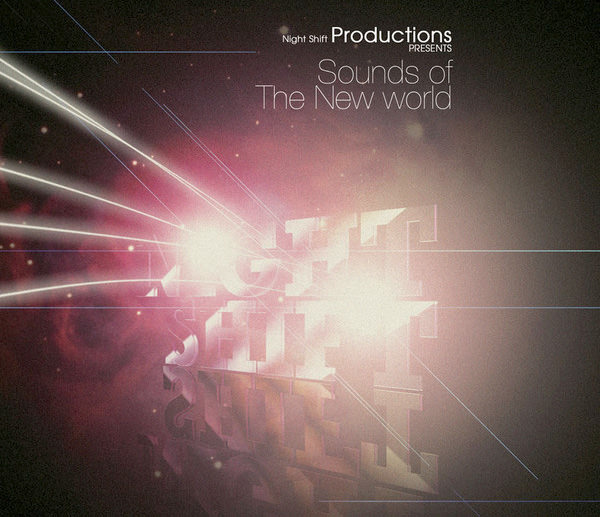
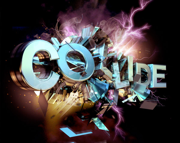
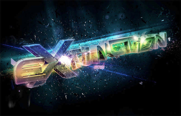
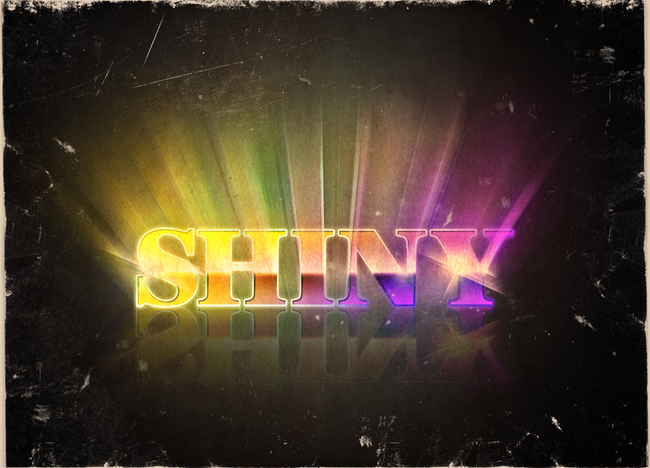
It’s amazing what artists are able to create using this design style. By the way, this style allows for lots of creativity. Planets, galaxies, nebulas, comets, asteroids, lighting effects, textures, shiny objects, and a lot more elements are at your disposal to use. Some of the designs are very clean and simple, while some use a lot of different effects. Also, the use of vibrant, bright, and bold colors are very common. The reason why the designs look really good is because of the contrast. Most of the designs feature a dark, space background while using very bright colors for the text and lighting effects.
Let’s go ahead and view 50 stunning, outer space typography creations that are definitely out of this world.
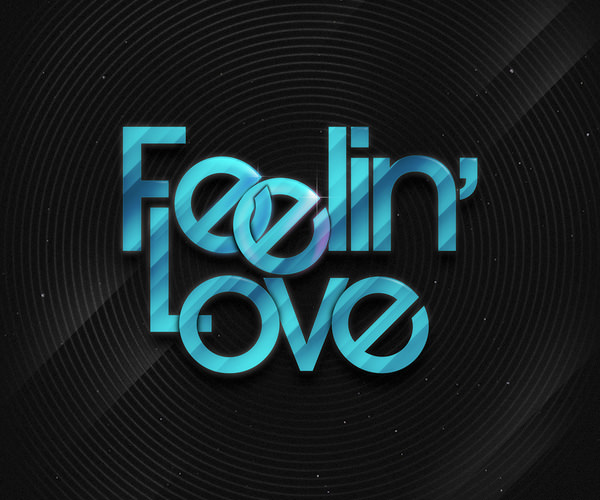
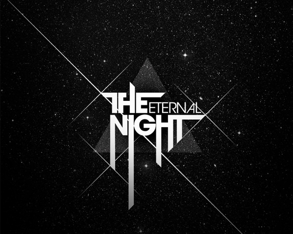
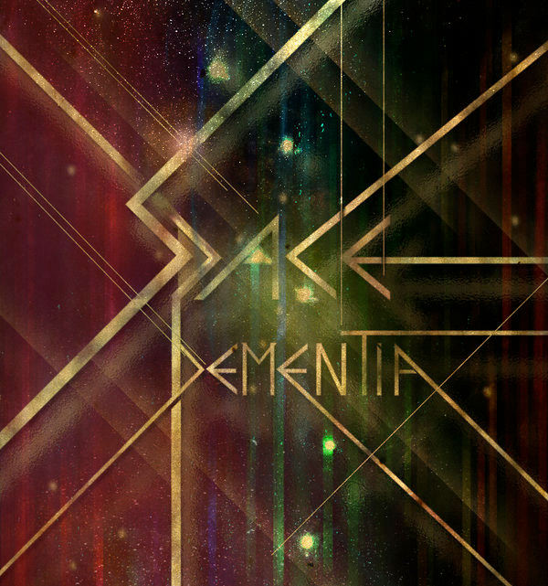
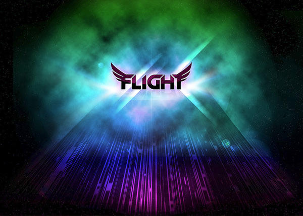
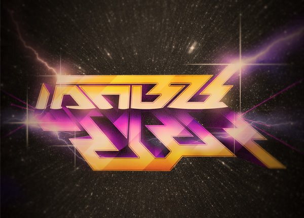
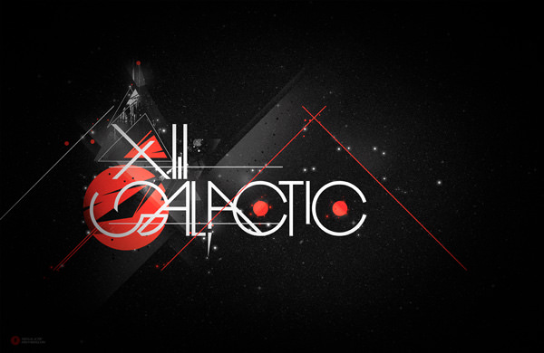
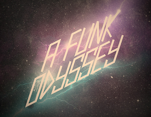
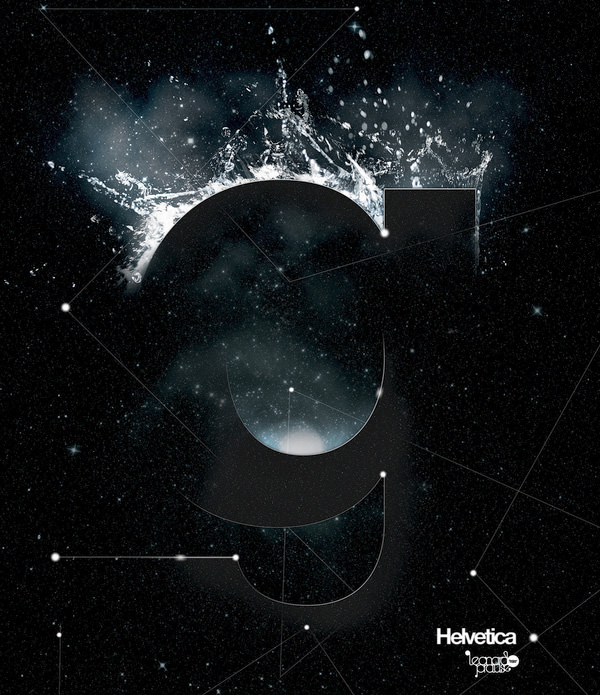
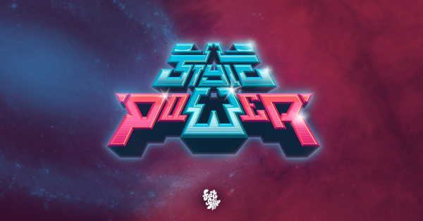
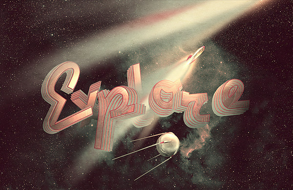
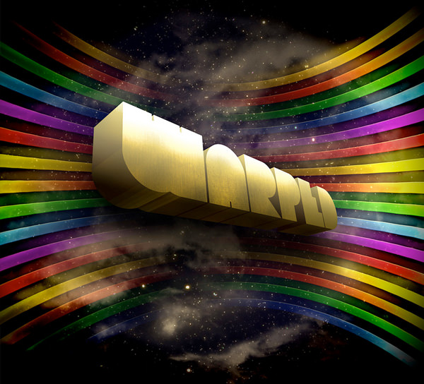
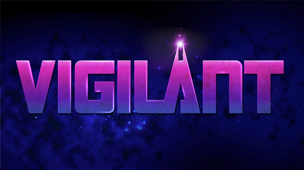
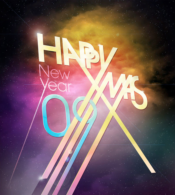
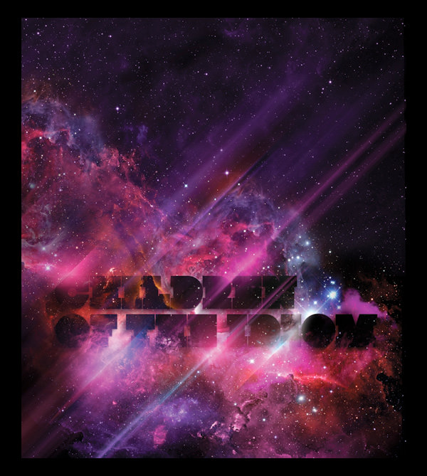
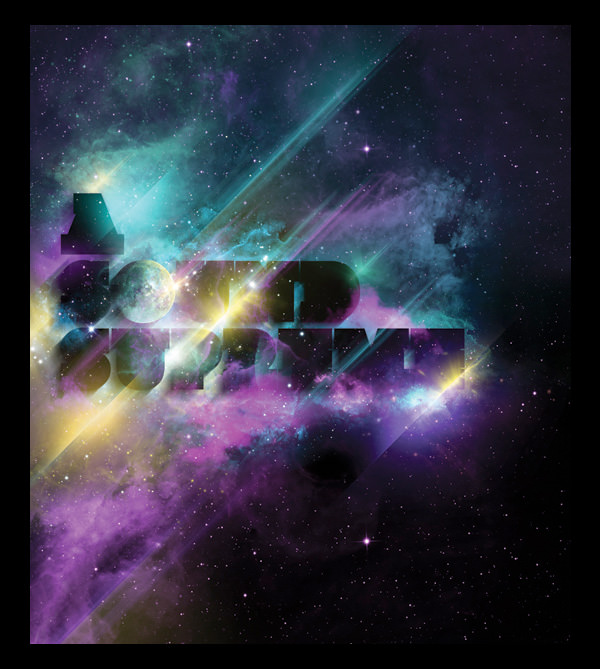
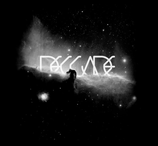
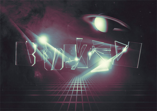
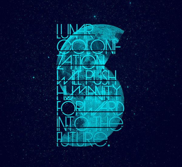
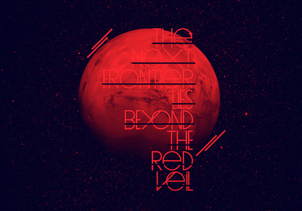
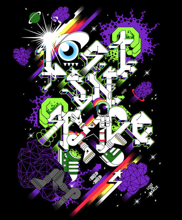
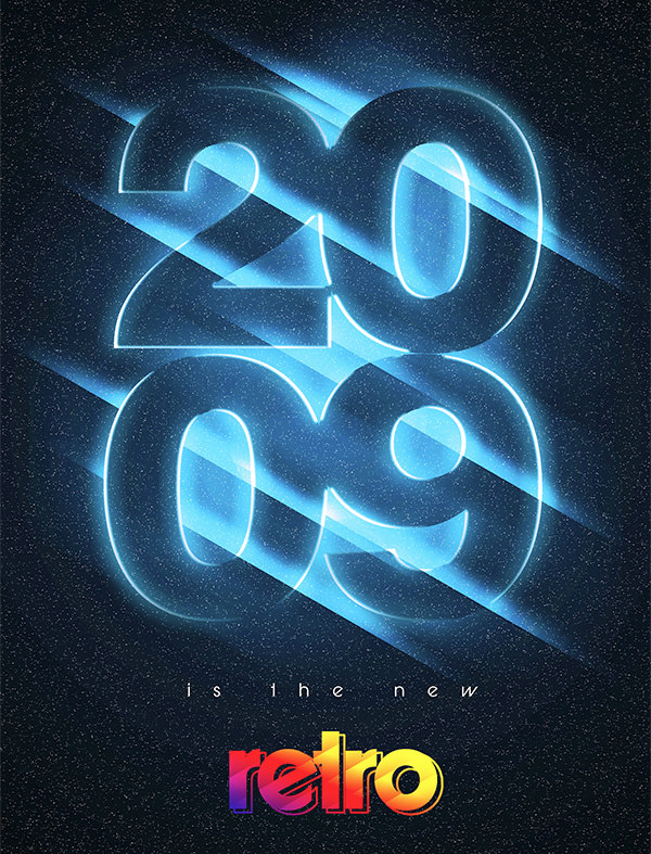
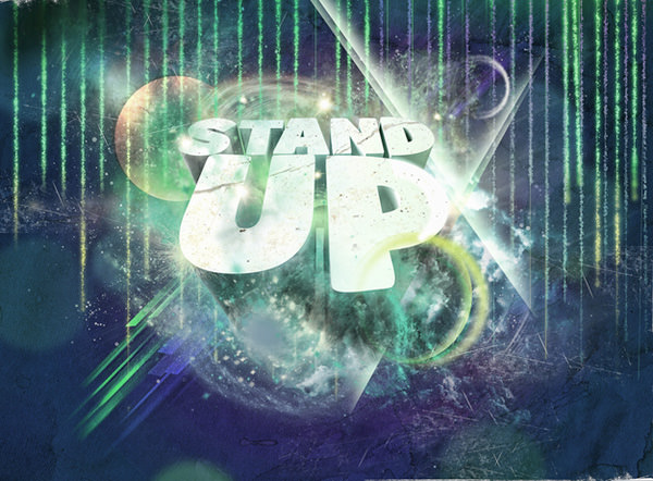
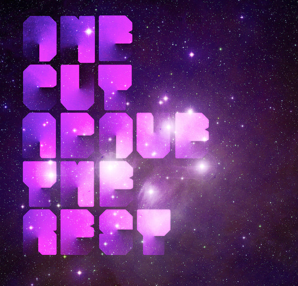
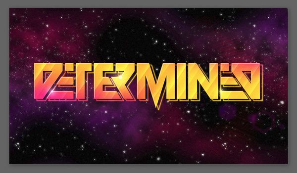
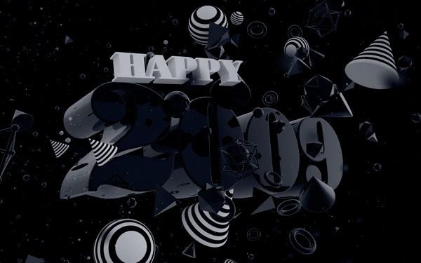
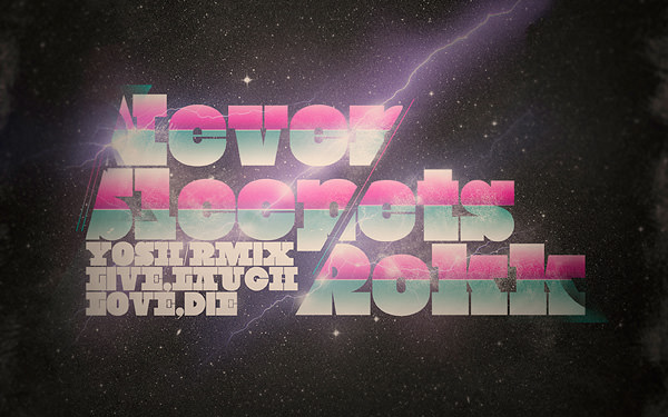
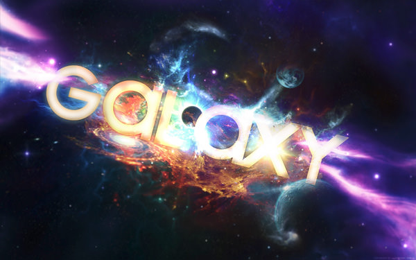
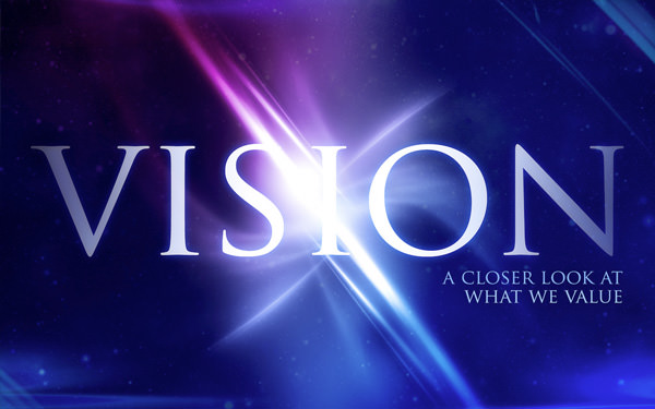
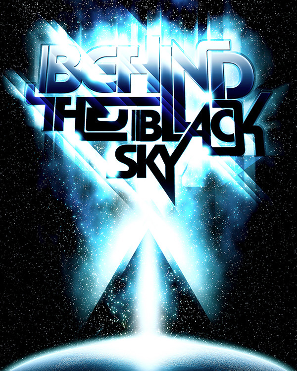
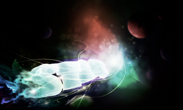
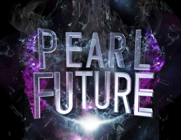
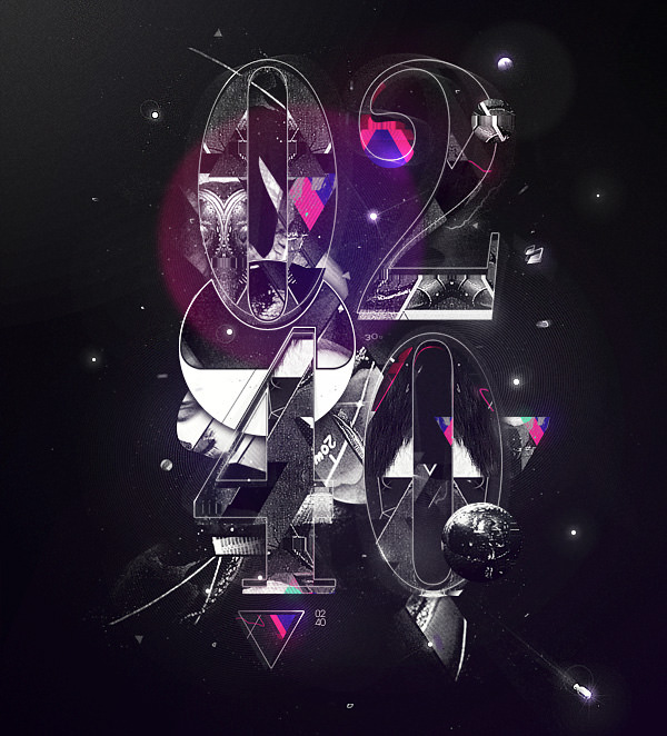
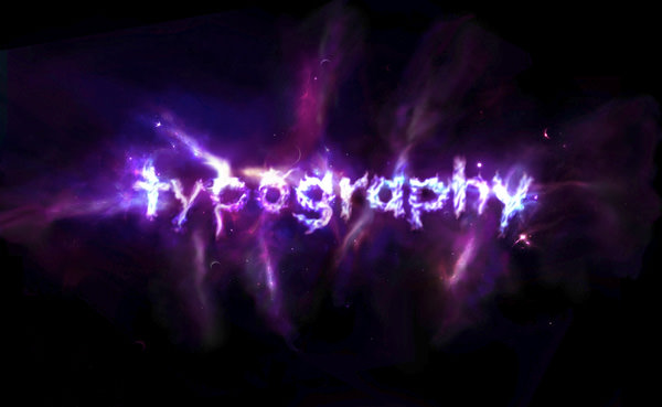
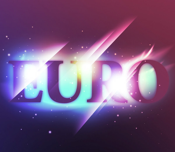
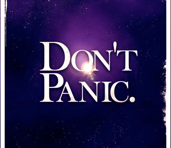
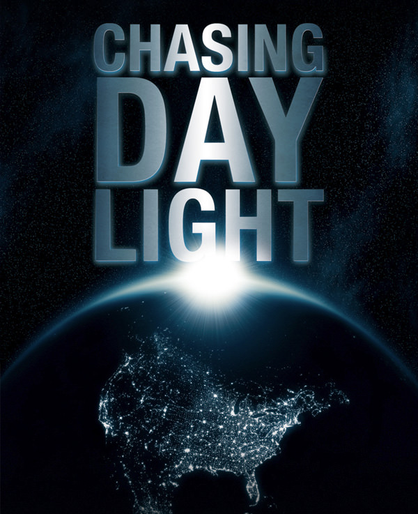
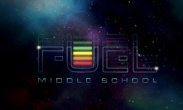
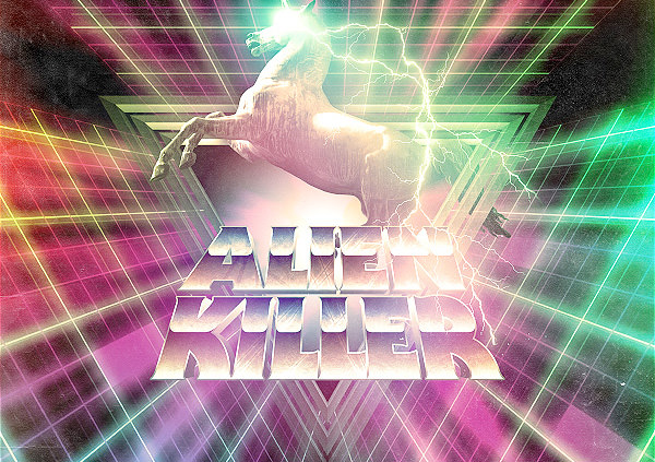
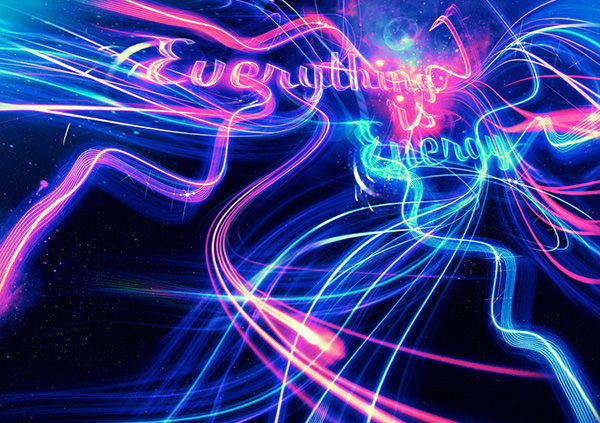
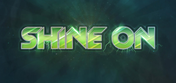
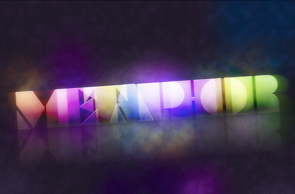
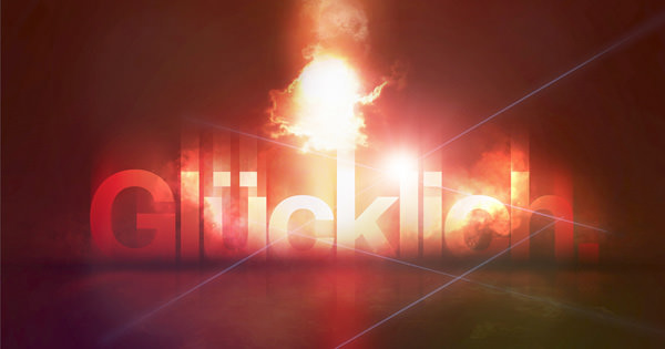
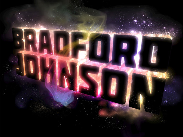
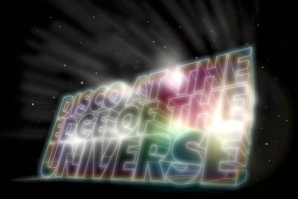
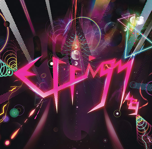
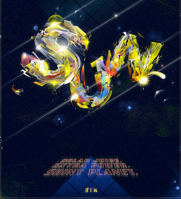
Part I: Out of This World Typography
Note: Please click on the images to see them in their websites and to learn more about their artists.
So what are your thoughts about the outer space design style? Do you like it or do you hate it? Which ones are your favorite and why? Please make sure that you join in on the discussion and leave your thoughts below.
By the way, 3 of the designs above were created by me. Can you guess which ones? The first person to leave a comment with the right response will get a Google Wave invite, if you want it. :)
Well, thanks for viewing and if you liked this post, please stumble, moo, blend, float, digg and bump it. I would really appreciate it you retweeted it as well so more people can see it. You can follow me on twitter here.


