Showcase Of Modern Navigation Design Trends

Email Newsletter
Weekly tips on front-end & UX.
Trusted by 182,000+ folks.
 Register for Free


 Celebrating 10 million developers
 Custom Web Forms for Angular, React, & Vue. Your backend.
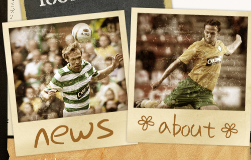
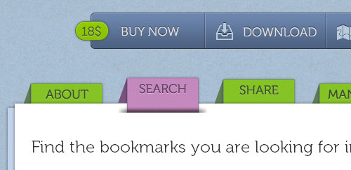 The design of a navigation menu has to be outstanding in order to sustain the user’s interest. As the adage goes, “Content is king,” but getting to the content requires navigation. In this post, we’ll be explore some of the more recent trends in navigation design. We’ll look at the aesthetics that recur in today’s best Web designs. The focus here is on the visual direction that leading designers are taking.
You should also read the following related posts:
* Navigation Menus: Trends and Examples
* 50 Beautiful And User-Friendly Navigation Menus
* CSS-Based Navigation Menus: Modern Solutions
* Breadcrumbs In Web Design: Examples And Best Practices
The design of a navigation menu has to be outstanding in order to sustain the user’s interest. As the adage goes, “Content is king,” but getting to the content requires navigation. In this post, we’ll be explore some of the more recent trends in navigation design. We’ll look at the aesthetics that recur in today’s best Web designs. The focus here is on the visual direction that leading designers are taking.
You should also read the following related posts:
* Navigation Menus: Trends and Examples
* 50 Beautiful And User-Friendly Navigation Menus
* CSS-Based Navigation Menus: Modern Solutions
* Breadcrumbs In Web Design: Examples And Best PracticesThe navigation menu is perhaps a website’s single most important component. Navigation gives you a window onto the website designer’s creative ability to produce a functional yet visually impressive element that’s fundamental to most websites. Because of their value to websites, navigation menus are customarily placed in the most visible location of the page, and thus can make a significant impact on the visitor’s first impression.
The design of a navigation menu has to be outstanding in order to sustain the user’s interest. As the adage goes, “Content is king,” but getting to the content requires navigation. In this post, we’ll be explore some of the more recent trends in navigation design. We’ll look at the aesthetics that recur in today’s best Web designs. The focus here is on the visual direction that leading designers are taking.
You should also read the following related posts:
- Navigation Menus: Trends and Examples
- 50 Beautiful And User-Friendly Navigation Menus
- CSS-Based Navigation Menus: Modern Solutions
- Breadcrumbs In Web Design: Examples And Best Practices
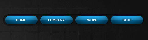
3-D Navigation
Lately, we’ve seen a trend towards design elements that sit on a higher z-plane; that is, they appear closer than other elements on the page. This trend is commonly applied, no surprise, to navigation menus.
Delibar
The content area on the Delibar website looks like a pile of two pieces of paper, with the navigation items holding them together. It also features a subtle JavaScript effect that smoothly moves them up when you hover over them.
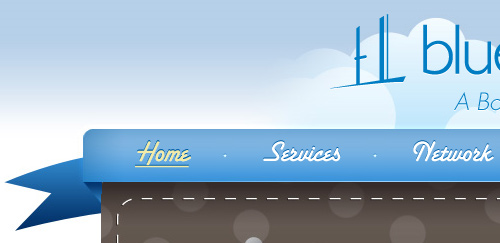
Blue Door Baby
The Blue Door Baby navigation bar is styled like a ribbon that is laid over top of the feature area. The menu items are text-image replacements that have a subtle inset-text effect. (Learn how to create the inset-text effect).
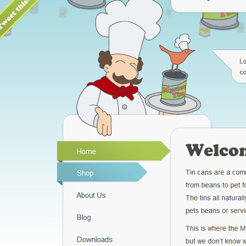
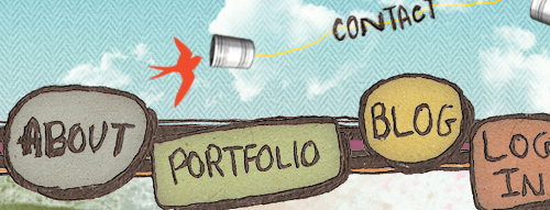
Mystery Tin
The Mystery Tin navigation menu is arranged vertically. The active menu item has a background that wraps around the side of the content area. Similarly, hovering over a menu item shows a smaller 3-D ribbon.
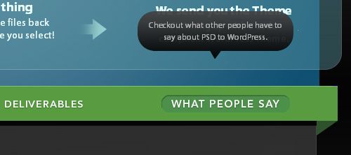
psdtowp
The navigation menu bar on this website is designed to look like it’s on a higher plane. Additionally, mousing over a menu item shows a speech bubble with a description of the item.
Harry Bissett
Harry Bissett’s navigation is made to look like it’s popping off the page.
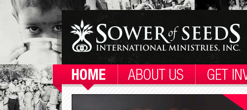
Sower of Seeds
The navigation bar on Sower of Seeds looks like it wraps around the content area, making it stand out for the user.
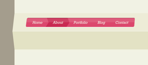
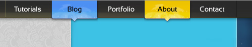
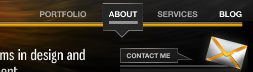
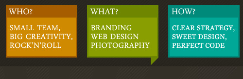
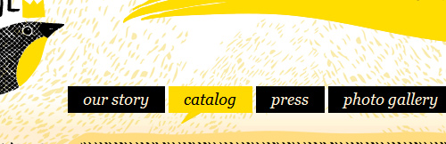
Speech Balloons
Designing menu items in the shape of speech balloons, or speech bubbles, appears to be another popular trend. It’s a great way to break out of the conventional rectangular menu.
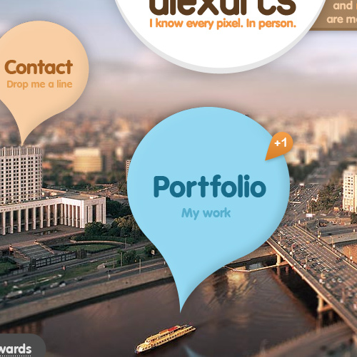
Alexarts
Alexarts features a background of a city waterfront. Navigation menu items are in large speech bubbles that point to different elements of the scene. Hovering over a navigation bubble propels it slightly upward, a subtle indication that it is interactive and is the current target.
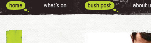
Bush Theatre
Bush Theatre uses thought bubbles instead of speech balloons, which in comic books denote the subject’s thoughts.
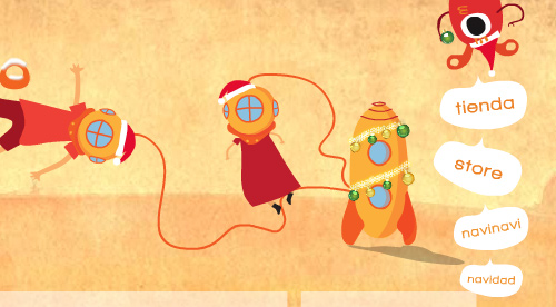
Tienda
This colorful illustrated website depicts a scene of an alien and kids connected to a rocket ship. The vertical secondary menu is creatively integrated into the illustration: they’re spoken by the alien protruding from the top-right of the page.
Rob Alan
Irregularly shaped speech balloons make for a distinguished look on Rob Alan’s website. The speech bubble opens a groove in the main content area, which visually connects them.
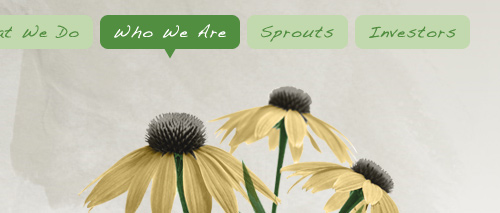
SproutBox
The active item in the SproutBox menu is highlighted with a darker green, and the corners of the rectangular speech bubble are rounded. Placing your mouse over an inactive menu item displays a similarly shaped speech bubble.
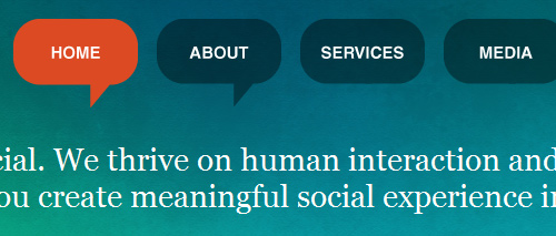
Kingpin Social
Kingpin Social’s primary navigation menu is hard to miss, with its big size, rounded corners and copious padding. The active menu item is highlighted with a speech balloon.
Contrast
The Contrast website features rectangular speech balloons that have a sketched look. The speech balloon is repeated throughout the design, denoting a clickable element (such as the “Archives” link on the side and the “Read More” link for blog posts).
Design Spartan
Design Spartan’s primary navigation bar highlights the current page with a colorful and textured round-cornered speech bubble, which pops out because it’s set against a dark background. Each menu item has a different color, making each section of the website easily discernible.
Definitely Dubai
The Definitely Dubai design features rounded rectangles; drop-shadows give them depth. The active page is highlighted with a white rounded speech bubble.
Robin James Yu
Speech bubbles are usually rounded, but Robin James Yu opts for rectangles on his portfolio. Speech bubbles recur throughout the design, including for the box of recent tweets in the footer and a more traditional elliptical speech bubble saying “Hi” on the home page.
GIANT Creative
Bright colors against a dark background and a generous size makes GIANT Creative’s navigation stand out from the rest of the text. Hovering over a menu item reveals the speech bubble’s pointer.
Yellow Bird Project
The navigation menu on Yellow Bird Project’s seems simple and conventional at first, until you hover over it. Hovering over an item reveals the tip of the balloon, a simple enough technique but one that makes the menu slightly more engaging than before.
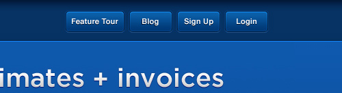
Rounded Corners
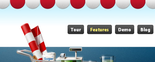
Rounded corners are often used to soften sharp rectangles. The trend has carried over from call to action buttons to menu items, whose appearance as buttons is meant to entice users to click on them.
Ballpark
Ballpark’s navigation menu in the top-right uses CSS background text replacement to add round-cornered buttons to the text.
NOSOTROS
The round-cornered navigation buttons of NOSTROS have pressed and unpressed states, which borrows the functionality of actual buttons. Additionally, JavaScript is used to smoothly animate the transition from unpressed to pressed state.
New Look Media
New Look Media’s blue navigation buttons are striking because of the dark background.
LemonStand
LemonStand’s primary navigation features rounded dark-gray buttons with a slight gradient.
MetaLab
Rounded corners with graphic icons to the left are featured in this popular website’s menu bar.
Vistrac
Vistrac’s rounded buttons can only be seen in modern versions of Web browsers such as Firefox, Safari, Google Chrome and Opera because the developers have implemented the working draft specifications of the CSS 3 border-radius property. In other Web browsers (i.e. IE 8 and lower: the browser that’s hindering the progress of Web design), the menu items appear as normal rectangles.
gugafit
gugafit’s navigation buttons change to green on hover. The active item is given a dark-blue pressed look.

PeepNote
PeepNote has beige rounded buttons, with the active menu item in blue. It also uses the CSS 3 text-shadow property to add drop-shadows in most modern Web browsers.
Viljami Salminen
Web designer Viljami Salimen gives the active items in his navigation menu a rounded button look.
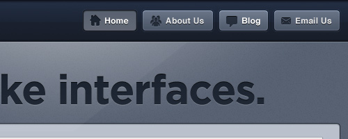
Icons In Navigation
Elaborate and highly visual designs are now widespread because bandwidth is no longer much of a concern. Over a year ago, we noted that visually appealing icons are increasingly being used, and this trend has continued. Icons not only are eye candy but help create visual recognition for users. Having said that, one should keep in mind that it’s always important to keep the loading time as short as possible, thus making the page as responsive as possible. In general, it’s more important than additional visual clues; however, used properly and moderately, the latter can assist users in their scanning process and make the content of the page easier to perceive and navigate.
Adii Rockstar
Adii Rockstar has a blog whose navigation is fixed to the bottom of the page. The menu items are complemented by icons above the text, making for a beautiful navigation scheme. In addition, the text is given the CSS 3 text-shadow property for depth (at least in browsers that have implemented the current draft of the W3C’s CSS 3 specifications for the Text module).
Sourcebits
Sourcebits uses small icons for its menu and sub-menu items. They add intricacy to the navigation.
Carsonified
Carsonified uses icons to indicate the active menu item; and upon hovering over an inactive menu item, its icon is revealed.
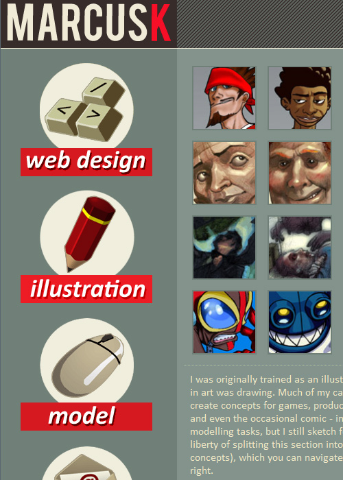
marcusK
The portfolio of marcusK has a large navigation menu laid out vertically along the left, making it a big part of the design and difficult to miss. Large icons are featured above menu text, reflecting the vivid character of the design.
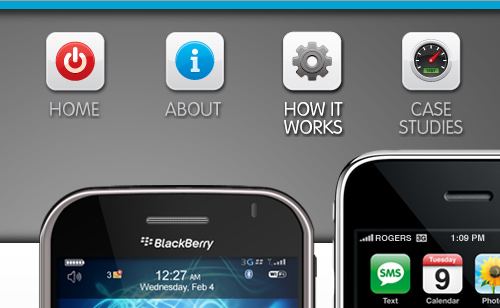
MobileMySite.com
The company behind this website specializes in creating mobile versions of websites, so the designer made the navigation look similar to the iPhone’s UI, making it seem familiar to first-time visitors.
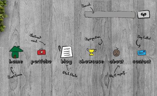
mesonprojekt
Karl Francisco Fernandes’ portfolio has a hand-drawn-themed navigation menu. Icons make the menu items more visual, giving the website a distinguished look.
Dreamling.ca
The Dreamling.ca website displays icons and text that look hand-sketched with a black ink pen. It gives the design a personable quality.
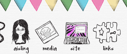
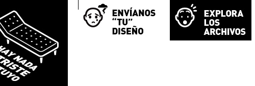
nadamastriste
nadamastrite’s website is eye-catching because of the cartoonish heads that represent menu items by emotions (e.g. sadness, surprise, puzzlement, anger).
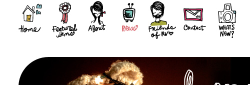
RedVelvetart.com
This website features hand-drawn elements, and the navigation menu continues that theme with hand-drawn and -sketched icons above the text.
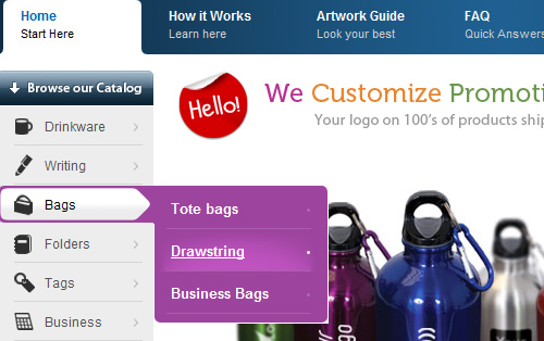
Custom Toronto
Custom Toronto has a vertically oriented secondary navigation menu, containing sub-menu items. Icons help users quickly locate product categories.
JavaScript Animation
With JavaScript frameworks making it easier for Web designers to create animated page elements using just a few lines of code, designers have been using JavaScript lately for more aesthetic than functional purposes.
Andreas Hinkel
The primary navigation of Andreas Hinkel is large and presented as polaroids. When hovered over, the menu item rises.
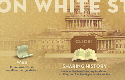
Jon White Studio
Jon White Studio’s navigation menu is visual and the focus of the page. Hovering over a menu item pops up a card with the word “Click,” calling the user to action.
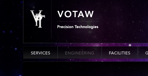
Votaw
Votaw’s navigation is a simple design (text-image replacement) with a JavaScript effect: upon hover, the text fades slightly. The effect is subtle but makes an impression.
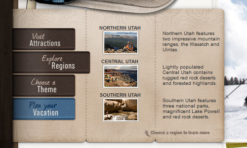
Utah.travel
The items in Utah.travel’s vertical navigation menu pop out to the right when hovered over. Sub-menu items reveal a brochure map in the background.
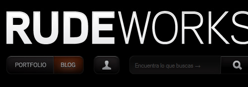
RUDEWORKS
The beauty of RUDEWORKS’ navigation menu is its simplicity. Noticing it at first glance may be difficult because of the menu’s low contrast with the background. When a menu item is hovered over, it fades to dark red.
MULTIWAYS
The primary menu of MULTIWAYS has a simple effect: a blue bar follows your mouse as you hover over items.
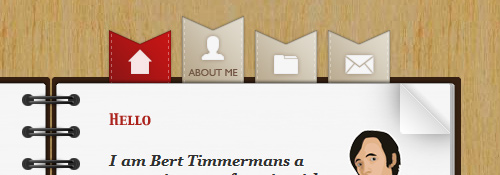
Bert Timmermans
Bert Timmbermans’ portfolio website is laid out like a notebook, with the primary navigation menu designed like ribbon bookmarks. The menu has only icons; when you mouse over an item, it animates to reveal the text.
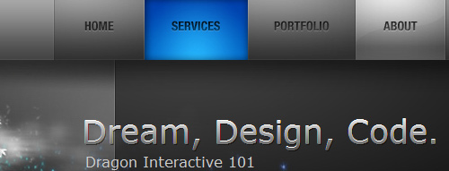
Dragon Interactive
Dragon Interactive’s primary menu items smoothly transition to a colorful state when hovered over. (Learn how to create a similar effect using jQuery on a tutorial I wrote.)
Unusual Shapes
Because most websites have straight edges and sharp corners, irregular shapes give you a chance to break from the norm. One current trend is to give menus an amorphous shape to make them really stick out.
Booma
Booma has roughly sketched items in a random alignment for its main navigation, making it different from what you see on most other websites.
Kutztown University
The main menu for Kutztown University is unusual in many ways. First, it’s positioned in the middle of the page, towards the bottom, whereas primary menus are typically located higher up. The alignment of menu items is staggered, not the usual left aligned. Finally, the lettering of the menu item text is randomized.
Yorkdale
Irregular shapes and variable alignment of menu items give this website design a memorable look. The design fits the theme, too.
The Crazy Love Campaign
The menu bar of this website is slightly tilted and not perfectly horizontal.
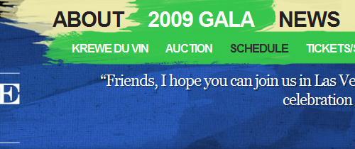
Carnivale du Vin 2009
The navigation menu on the Carnivale du Vin website is shaped like brushstrokes. Hovering over certain items reveals sub-menus, making it look like the artist has swiped a brush across the page.
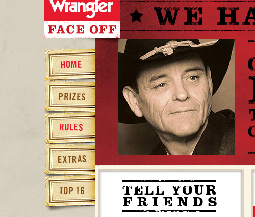
Wrangler Face Off
This website’s vertical primary menu items are designed as tickets that stick out of the side, shuffled up.
HTO
HTO’s navigation bar is a strip of aged paper angled down and clipped to the background photograph.
smriyaz.com
smiriyaz.com shuffles its primary menu items, and the text is written vertically.
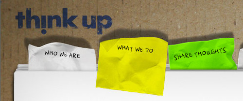
Think Up
Think Up’s menu items are crumpled post-it notes, and the navigation follows the tabbed navigation user interface design pattern. Hovering over an item changes the color, and clicking on it brings it forward on the z-plane.
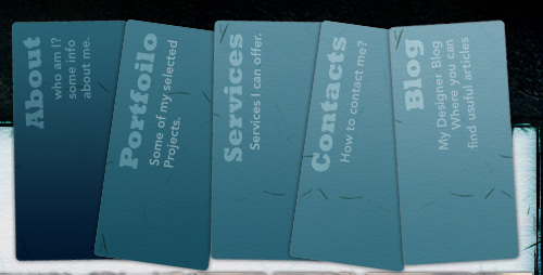
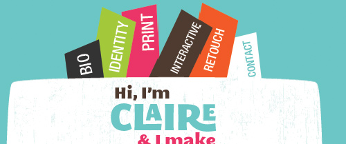
f claire baxter
The menu items on this website stick out like bookmarks. The vertically written text and the varied color and size all help the website stand out.
Inner Metro Green
This menu bar has an irregular shape, contributing to the disorganized grunge theme of the website.
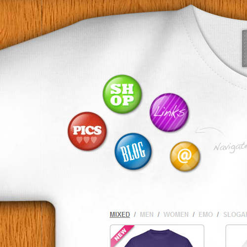
Custom Tshirts UK
The navigation items on this website are flare buttons pinned to the corner of a t-shirt background.
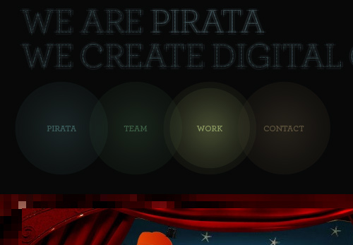
Pirata London
Pirata London has a unique and beautiful navigation menu: overlapping and semi-transparent ellipses. The text is given the CSS 3 text-shadow property for a bit of drop-shadow.
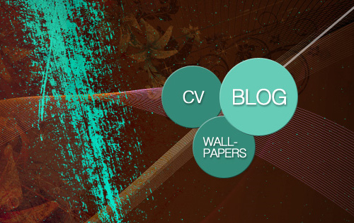
koraykibar.com
The navigation bar of this website is oriented vertically as stacked ellipses, an unconventional structure that uses a single image with
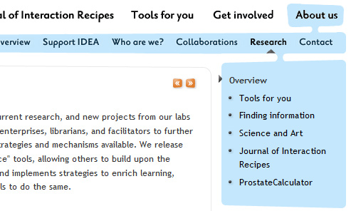
Idea.org
Idea.org’s primary menu has an odd shape: sub-menus seem to drip from their parents.
Paging For Primary Navigation
Some websites have dropped the standard list of primary menu links. You’ll often see magazine-style (or blogazine) websites do this, to give users an interactive experience, similar to flipping through the pages of a magazine or book.
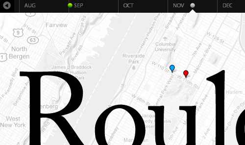
Jack Cheng
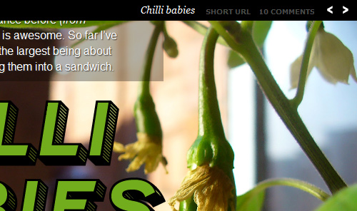
Jack Cheng opts for individually styled blog posts, and his navigation bar is a chronological timeline of posts. Each post appears as a dot, and hovering over one reveals more information in a speech bubble.
gregorywood.co.uk
Gregory Wood also custom-styles his blog posts so that you can flip through them using the left and right arrows. To help users get to important pages, he has small icon links for the home, about, RSS and contact pages at the top-left.
The Rich And Powerful
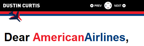
Dustin Curtis’s custom-styled blogazine posts can be navigated using the “Next” and “Previous” controls that are centered in the masthead.
72nd Ave.
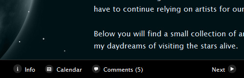
This website features custom-styled posts that you can navigate using the “Next” and “Previous” links in the bottom-right.
 (al)
(al)

