Modern Art Movements To Inspire Your Logo Design

Email Newsletter
Weekly tips on front-end & UX.
Trusted by 182,000+ folks.
 Register for Free


 Custom Web Forms for Angular, React, & Vue. Your backend.
 Celebrating 10 million developers
You may be surprised by how easily these colors, shapes and strokes can be adapted to logo design. Have a look, see how logo design works and maybe even draw inspiration for your own creativity.
Bauhaus
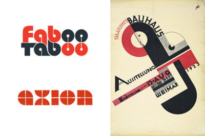
In 1919, the Bauhaus school was founded in Weimar Germany. More of a lifestyle than a school, Bauhaus was based on the static rules of Art Deco. One basic idea of the Bauhaus was to remove everything superfluous and break a design down to its essential elements. This static minimalism changed everything and can still be found in design today, such as in the logos of Faboo Taboo and Axion.
From an artistic standpoint, Bauhaus shares elements with Russia’s constructiveness movement in its simplicity and boldness. According to the aesthetic, designs should be simple, daring, bold and uncomplicated. These designs stick out in your mind because of their lack of ornamentation and beautiful, brutal simplicity. Red and black are favored colors; some goofing around in Illustrator should yield the right washed-out shades. For inspiration, look at Wes Anderson’s films, especially The Royal Tenenbaums, which make extensive use of Bauhaus’ Futura font and have a modernist aesthetic.
Art Deco
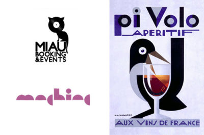
Art Deco began parallel to Bauhaus in the 1920s but originated in Paris. Both schools share an elegance of form, sparsity of material and strength of color. Art Deco is distinguished for its stylized representation of shapes Art Deco artists seemed to use the geometric rules of architecture. One of those artists was A. M. Cassandre, who became popular for his logo design for Yves Saint Laurent. His poster design Pivolo is highly representative of Art Deco. The aesthetic has been adopted by Miau and Machine for their corporate identities.
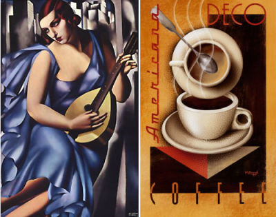
Principal elements here are a celebration of geometry and a near–fetishization of the machine. Pay particular attention to big sweeping curves, which have a luxurious quality to them. Art Deco reached its nadir in the 1920s and shares that era’s opulence and wastefulness. Designs share the Bauhaus school’s fascination with form but celebrates form as a means to a “new” aesthetic, rather than trying to reconcile it with function. Art Deco’s most lasting influences can be found in grandiose architecture and industrial design, so look to New York City’s Rockefeller Center, Chicago’s Mather Tower and the paintings of Tamara de Lempicka.
Blaxploitation
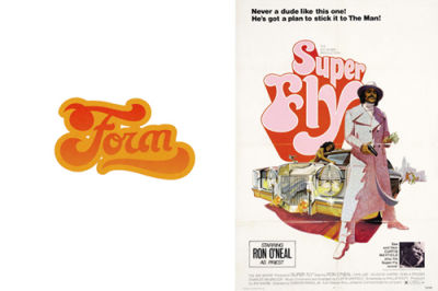
Blaxploitation was an American movie genre that had its heydey in the 1970s, with movies like Coffy, Foxy Brown and Shaft. Accompanied by funky music by such artists as Isaac Hayes and Curtis Mayfield, the movies brought a new lifestyle to the black community, one that encouraged black empowerment and love, backed by soulful, funky beats. This culture can be found not just in movies but in music and fashion and even diverse logo designs, such as this one by Form.
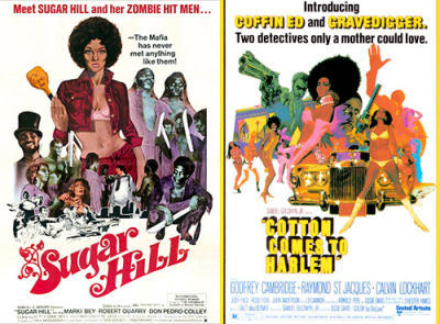
The blaxploitation aesthetic seen here was typical of 1970s poster design. It featured large sweeping letters that favored aesthetic and form over readability: a stark contrast to European designs of the same era, which favored minimalism and functionality. In your own designs, use bright lively colors for the base, and add a washed-out effect to deafen the colors and give it that vintage look
Dadaism
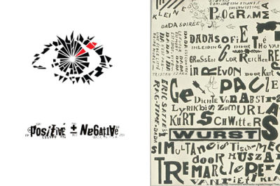
Dadaism, also known as Dada, was founded in 1916 by diverse artists in Switzerland and Germany. The idea was to explicitly reject “conventional” art and genres. To put it bluntly: destroy and rebuild! This provocative aesthetic was a revolt against art by the artists themselves. This irony still exerts a big influence on design and art. These two logos evoke Dadaism in all respects by destroying something and rebuilding it completely new.
What is Dada? Dada is adad? Dada? Adadadaa? What is Dada? Dada is nonsense, an unstable, poorly defined morass of liberalism and irrationality. Dada is deconstruction run wild, and Dadaists do not worry about what is or is not Dada. Dadaists originally theorized that such a world that could descend into the mindless violence of World War I ought to have an art that reflected this state of irrationality. Is art not an imitation of life? What is life but death? Dada questioned all established convention and the very origins of design. Why is an eye an eye? What makes an eye? At what point do we stop recognizing an eye as an eye? Why is a “G” a “G” and a “6” a “6”? This deconstruction and arduous critical examination is what yields a truly Dada result. But what is a result? Who is to say what your result is? I have to go lie down now.
Hard–Edge Painting
Hard–Edge painting was a contemporary art genre popular in the 1960s, best represented by the American artist Frank Stella. As the name implies, the genre is about planned, simple forms and stripes that contribute to an overall colorful picture. This polychromism and color intensity, as done by Frank Stella, can be found in diverse logo designs today, such as Optik: Split Stitch Division.
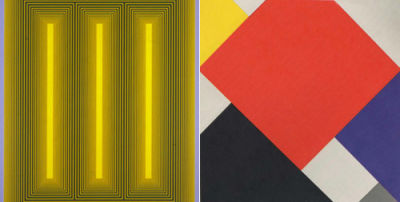
Harsh angles in art, as a semiotic shorthand for conflict, has existed for centuries, but only during the 20th century did it assume its status as an artistic tool in the new abstract painting schools. Stella, among others, adopted Hard–Edge as a reactionary style against east–coast America’s abstract expressionism in the 1960s. Where abstractionists preached free expression of emotion and impulse as an art, the hard–edgers practiced a highly impersonal, extremely purposeful style of painting. The alienation of the viewer forces a critical appraisal of the work, similar to Brecht’s “Verfremdungseffekt,” or distancing effect. To force such an effect, the designer must put design above purpose. Design for the sake of art is a nearly foreign concept because it violates the rule that corporate design must raise awareness of the brand. Design that puts art first alienates the consumer, who then approaches the work with a critical eye, as they would for a Hard–Edge painting.
Light Painting
Pablo Picasso and photographer Gjon Mili might be the first Light painters in history. Picasso’s self–portrait in 1949 opened new doors in the world of modern art. To create this special effect in this Light painting, Picasso chose a dark room and diverse light sources, along with the help of the longer exposure time of photo cameras. By moving the light, Picasso created mind–blowing images, which could serve as great inspiration for logos. Use lines side by side to build objects, letters and even words.
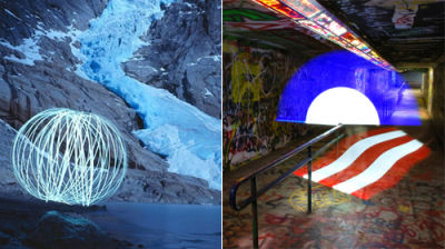
Light painting is like graffiti and theater mashed up. The spirit is of street art, with the freedom to make anything a canvas. The ephemeral nature of the execution comes from performance art: while the process can be documented, it can never really be accurately recreated. The aesthetic elements are easy enough to emulate in Illustrator, but the real appeal comes from channeling the spirit of Light painting. While it would take some effort, animating a static logo would make it a real attention-getter.
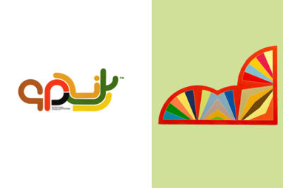
African Art
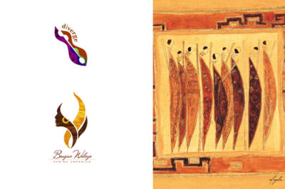
Early African artists created beautiful sculptures, mostly out of wood. That canvas did them little service, because the climate and elements made the sculptures susceptible to termites and other vermin. This makes any African art older than 150 years very rare. The art was influenced by native African myths, celebrations and rituals. The world of ancestors and gods is kept alive in this artwork. That’s why artists mainly used masks and figures, which protected people against diseases and evil spirits. The artistic approach is deeply spiritual, and its forms can be applied to logos and corporate designs.
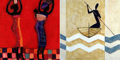
To channel the aesthetic of African tribal art, use heavy abstraction to create simple, effective shapes that catch the eye. Abstraction and bright colors are key. Conversely, you could scale back the abstraction and use natural, familiar shapes that evoke African art. Something as familiar as a woman’s profile can take on additional layers of meaning when they are given colors and patterns common to African culture.
Art Nouveau
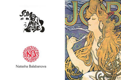
Art Nouveau is an artistic movement from the late–19th and early–20th century. The school originated in Europe, particularly Germany, where it was interpreted differently, depending on the area. Broad similarities remained, though: decoratively curved lines and floral ornamentation. Both are timeless elements that can be found in many designs today.
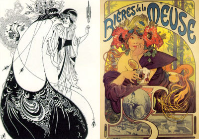
Art Nouveau at its peak was not merely a style but a way of life, encompassing architecture, clothing, painting, sculpture, even furniture. For your own logo, you can bring in the incredibly intricate details and textures and the thick full–bodied line work. The movement borrowed heavily from Japanese woodcut design in its ornamentation and execution, so the work of Hokusai and Utamaro will give you some thematic elements. Art Nouveau originated partially as a rejection of Gothic revivalism’s cluttered pattern work, so remember not to go overboard with your ornate floral decorations and patterns.
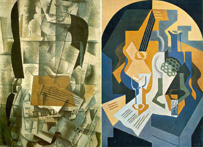
Cubism
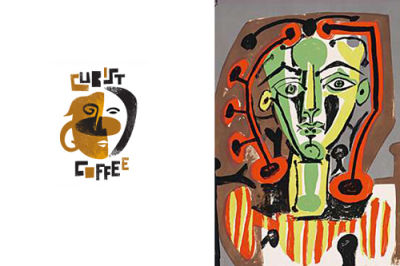
Along with Georges Braque, Pablo Picasso might be one of the most popular modern artists in this genre, which he turned into a milestone in visual art at the beginning of the 20th century. Like Dada, Cubism was a particular critique of traditional art forms. Abstract perspectives were added, inspired by distant epochs and primitive cultures. Cubism was a new attempt to create harmony and unity in two dimensions. The “Cubist Coffee House” is obviously an heir to this movement.
Cubists were originally interested in the power that simple designs could exert in art, in contrast to Europe’s traditional ornamental art. Perhaps the most radical element to remain conscious of is the absence of “perspective.” One challenge will be to find your inspiration; Cubist Coffee mashes up a face with a coffee cup: an effective decision. One of the most controversial elements of early Cubism was some of the grotesque faces that evoked African masks. These exaggerated features were a hallmark of Cubism. Moreover, the interplay between elements—a core aspect of Synthetic Cubism—will further strengthen your logo’s association with this style. Your aim is a sort of detachedness in technique, resulting in grotesque, exaggerated forms.
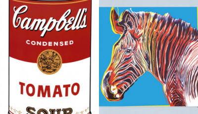
Pop Art by Roy Lichtenstein
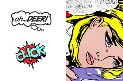
Aside from Andy Warhol, Roy Lichtenstein was the most popular representative of the genre known as Pop Art, which originated in the 1980s. His style, reminiscent of classic newspaper comics, was truly groundbreaking. In the early 1960s, Lichtenstein began to experiment with this form, which unexpectedly exploded into a full–blown movement. The “lowbrow” style makes for a distinctive image and is a good way for a company to get attention.
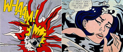
Lichtenstein’s Pop Art was different from Warhol’s in that it celebrated the commercial designer and focused on art that we’re already familiar with and ignore. These are works we automatically recognize and take for granted. And just what are we as a society taking for granted? This critical examination of everyday art and design in the vein of Duchamp solicits more than a nod of recognition. The simple, fast and effective communication practiced by commercial designers and artists is strongly codified, and these logos channel these conscious and unconscious levels. A familiar “Click” logo is made more powerful and memorable by comic art’s ubiquity among consumers.
Pop Art by Andy Warhol
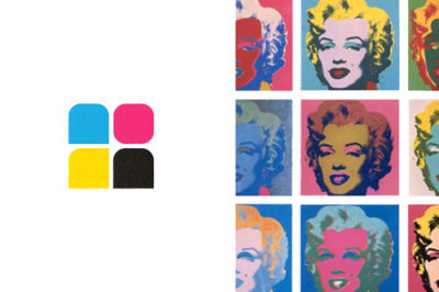
No one has missed Andy Warhol’s polychromatic Marilyn Monroe portraits. For years, Warhol created variations on the theme that influenced not only art but the fashion world in innumerable ways. We can’t be surprised that this style is still an inspiration for simple, effective corporate designs.
Warhol famously refused to analyze his own works in public. He suggested that any meaning of his work should be obvious from the outset. The Marilyn Diptych was originally thought to be a commentary on the life and death of the actress, though the more colorful “life” half is remembered better. Don’t just create simple color squares; choose instead subtle variations. Something as minor as a rounded corner or adjustment in shape can speak volumes to your audience, though it’s ultimately up to them to figure out what it means.
Tibetan Art
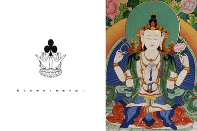
Tibetan art is a great source of inspiration. The centuries–old culture of Tibet has its own icon, such as the Mudra hand gesture, which represents happiness and shows respect to the gods. The lotus flowers represent purity and fertility and represents also the “Chakra,” which consists of the seven elements in Tibetan myth. A semiotic approach to logo design implementing Tibetan designs and motifs will show your company’s deeper appreciation of spiritual matters.
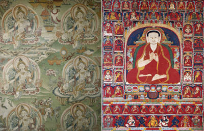
Tibetan spiritualism is renowned worldwide, and you’d be remiss not to tap into this goldmine of deities, myths and symbols. Traditional Tibetan art is rife with angry gods and harsh brutal symbols, so reconcile it with modern Buddhist understanding by reducing the elements to their most recognizable aspects. For example, lotus flowers (representing purity) and the various Mudra hand gestures are extremely well–known elements of Buddhism and Tibet in particular. Use these elements as you would use Western symbols, to communicate your design.
Summary
- When creating your designs, look anywhere and everywhere for inspiration.
- The further you look from your industry, the more original your designs will be.
- Don’t be afraid of where you draw inspiration from. Paul Rand said it best: “Don’t try to be original. Try to be good.”
- Modern art can provide a lifetime’s worth of inspiration for design.
- For a more original design, draw on abstract elements from various images; such as the color from one image, line work from another and composition from yet another.
Other Resources
Literally hundreds of renowned movements fall under the umbrella of modern art. Learning about these movements is not just fun but brings new life and perspectives to your work.
- Pop Art Survey A Smashing Magazine survey of famous pop artists, and a great place to get started with reference material.
- Bauhaus Survey A Smashing Magazine survey of the Bauhaus movement, and a great place to get started with reference material
- Vital Tips for Effective Logo Design If you’re just getting started with logo design, this post is a great starting point to turn your favorite modern art piece into a quality logo.
- About Art – What Do We Really Mean
- Get Creative With Collage: Trends and Inspiration
- Eight Inspiring Stories Of ASCII Art


