The Case Against Vertical Navigation

Email Newsletter
Weekly tips on front-end & UX.
Trusted by 182,000+ folks.
 Register for Free
 Custom Web Forms for Angular, React, & Vue. Your backend.


 Celebrating 10 million developers
In a recent article about unusable and superficial beer and alcohol websites, I made the claim that using left-hand vertical navigation is an out-of-date method in modern web design. In the comments, a few people wondered why I said this. I was surprised that it got any attention at all, because it was a brief comment in the article, and didn’t constitute a substantial part of the argument I had put forth. Nonetheless, I decided to write an article describing what I feel is a solid case against using vertical navigation in modern web design.
Naturally there are exceptions to every rule, and I’ll discuss those briefly at the end. But first I’m going to present five reasons why vertical navigation should not be used and why designers and architects should almost always construct their sites with horizontal navigation in mind.
It should be noted here that when I refer to “vertical navigation”, I’m talking about the top-level, primary means of navigating a website. This would not include left or right sidebars that have secondary links and call-to-action areas that are perfectly acceptable in many circumstances.
It Discourages Information Architecture
Approximately eight to ten years ago when vertical navigation bars were much more prevalent, websites were created using a fairly simple process: The client gave the designer x number of pages, with page titles and content for each. The designer created a one-level-deep website with all pages linked to from the home page. In many cases, the only way to accommodate such a structure would be by means of a left-hand vertical navigation bar. Below is an example of a site created in that manner.

Believe it or not, I designed the Thora website in the spring of 2001. It was one of the first sites I ever designed, and it hasn’t changed since — aside from a few small text updates. It was created using the exact method I described above, without any thought given to the purpose of the site, potential goals, or other architecture-related factors. Looking at the site now, it’s not really clear what this company does. Are they manufacturers? Are they a repair facility?
Only after reading some of the content on the site do we see that they manufacture, install, repair and otherwise service various types of industrial equipment. But those facts could have been communicated more clearly by including a simpler navigation bar with links like “Manufacturing”, “Repair”, and “Installation” — instead of the overly-specific “Wet Process Systems”, “Tanks”, and “Air Management”. This would then allow for a more aesthetically-pleasing horizontal bar that would serve to facilitate a more organized structure that’s not just one level deep.
Design Should be Based on Careful Content Analysis
Today’s web professionals have recognized the need for proper information architecture. Thus, before design work begins, a site’s content should be carefully analyzed so that the resulting design will produce a logical hierarchical structure that is readable, usable, and helps maximize conversions and click-through rates.
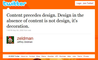
Jeffrey Zeldman on content analysis before design.
A site that uses a left-hand vertical navigation bar doesn’t require site architecture or related usability analysis because, as mentioned, sites built in that manner will often lack depth and fail to make their purpose clear.
The specifics and ramifications of advanced information architecture are certainly beyond the scope of this article, but advanced knowledge in such areas is not necessary in order to recognize the drawbacks and limitations posed by vertical navigation. A basic understanding of what makes a website successful in today’s market is all that’s needed in order to see the advantages of a simple, clear, and usable horizontal navigation bar.
It Wastes Prime Screen Real Estate
As discussed in the previous section, design in today’s market needs to be based on strong information architecture. The navigation paths taken by users should have clearly defined goals and outcomes. A vertical navigation bar that sits to the left of a page’s content on every screen wastes valuable space that could be used for more important things. Yes, it’s true that you want navigation to be easy to find, but you also don’t want navigation to unnecessarily crowd the left side of the page, which studies have shown will draw a user’s eyes more often.
In an online world where content is king, we don’t want our users to be fixated on pretty navigation bars — unless they’re navigating. But once they have started to navigate, we want their attention drawn to call-to-action areas and to primary content that will help them accomplish their goal on the website and help us make conversions.
Recognizing its Limitations
Examine the design and style of many of the sites showcased in CSS galleries, and you’ll notice a strong trend towards simplified horizontal navigation while allowing content areas to have strong visual focus. Below are a few screenshots from sites that would be drastically different if they had not designed their site based on horizontal navigation.
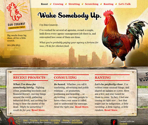
Although the Dan Conaway website (above) has a few usability issues, the use of a horizontal navigation bar allows focus to be placed on the page’s content area and on the call-to-action sections (“Recent Projects”, “Consulting”, and “Ranting”). On this site, the user is drawn to these larger elements, while still being able to find the primary navigation bar at the top of the page.
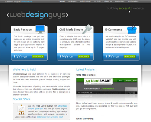
The WebDesignGuys website (above) puts strong visual focus on the most important aspects of their business — their products and services. Immediately the user is visually and textually informed that this company provides affordable design, CMS and E-Commerce development.
Meanwhile, functions like browsing their portfolio or contacting them are available through the simple and non-obtrusive horizontal navigation bar at the top of the page. How would this site’s architecture and design be affected if they had opted for vertical navigation?
It Doesn’t Conform to Real-Life Reading
This is a problem related to the previous section on visual focus, and is probably debatable. There aren’t many areas in life where a person is asked to read something that has a “left hand menu” that resembles what we find on websites that feature vertical navigation. In general, people are accustomed to reading content that spans the entire width of the reading area, or else is broken up into boxes or columns within the reading area. In either case, the content is vertically sandwiched between a header and footer. Books and magazines are a good example of this.

The magazine spread shown above displays its main content and photos between a simple header (“book review”) and footer (page numbering, etc). Although print design and layout are significantly different from that of web, modern web design and layout techniques are increasingly utilizing principles found in print design. The concept of a “header” and “footer” is simply a natural part of that current tendency.
Readers Aren’t Used to a Left-Side Menu
This header-footer tendency is a way of conforming to the user’s desire to read a web page in a familiar magazine format, rather than in a bizarre format that places a common distracting element on the left side of the page (i.e. vertical navigation).
Don’t misunderstand what I’m saying here. I’m not saying that a site will be more usable if it follows print magazine layout methods; I’m saying that the vertical navigation bar is an unusual and unique element in web design that doesn’t conform to anything in the real world outside of the web, and thus can be a hindrance to a site’s usability.
Of course, as I pointed out, this issue is debatable. But I strongly feel that the current tendency towards horizontal navigation is partly due to the realization of many web designers and site architects that stronger focus on content will help create more readable and usable web pages.
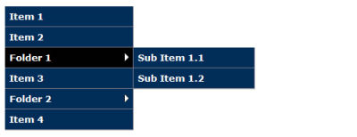
Fly-Outs Aren’t as Usable as Drop-Downs
In whatever direction your navigation points, any sub-menus that you include in your navigation will point in the other direction. That is, if you opt for horizontal navigation, sub-menus will drop vertically, and vice-versa. Sub-menus are generally more usable as drop-downs than they are as fly-outs, the latter of which would occur in a vertical navigation bar.
Vertical Navigation Example with Fly-Out Menus
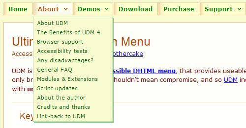
A site visitor’s natural tendency is to find common navigation elements near the top, and if there are sub-menus, they would drop down. Drop-down menus are more natural to use, are more common (therefore are easier to figure out), and do not clutter the middle-left side of the page where the user’s eyes are more likely to be focused.
Drop-Down and Fly-Out Indicators
Also, a properly designed sub-menu system will include a visual indicator of the sub-menus. For horizontal navigation, a downward-pointing arrow, or triangle, is the most common method, and a right-pointing triangle would be used for vertical. While the downward-pointing arrow for drop-downs is universally understood and generally does not provide many usability issues, the right-pointing arrow indicating fly-out menus is not be as easily understood.
A right-pointing arrow on a website does not usually identify fly-outs. In fact, a right-pointing arrow is often used for call-to-action buttons, sliding content areas, and external links. Look at the screen shot below from CNN’s website:
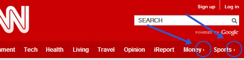
The “money” and “sports” links in CNN’s horizontal navigation bar (above) have small triangles pointing to the right, which I’ve indicated with blue arrows and circles. These triangles are evidently placed to tell us that those links point to differently-branded sections of CNN.com, indicating that these links are not directly related to CNN.
If these links were in a left-hand vertical navigation bar, the user would most likely think they pointed to fly-out menus — which would cause confusion when the fly-outs didn’t work. I think a Wikipedia-style external link indicator would be better in either case, but the method chosen by CNN works better in a horizontal bar because no one is expecting a fly-out menu in a horizontal bar.
What does this all mean? If a site is ever going to incorporate sub-menus into its navigation, a vertical menu might cause momentary confusion, whereas horizontal navigation would provide a smoother user experience.
It’s Not as Successful, According to Studies
In a study called Eyetrack III: What We Saw When We Looked Through Their Eyes, results showed that top navigation performed better than left-side navigation. Interestingly, according to the results, even right-side navigation had better success than left navigation.
Below is a quote from the published report on the study:
"While testing several homepage designs, we varied the placement of a navigation element: top (under the flag or logo), left column, and right column." "Navigation placed at the top of a homepage performed best -- that is, it was seen by the highest percentage of test subjects and looked at for the longest duration."
Left-Side Navigation Virtually Ignored
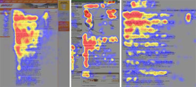
Related to this are the studies that have demonstrated the “F-Shaped” pattern for reading web content, shown below.
F-Shaped Pattern for Reading Web Content
Even though two of the screenshots above show sites that have left-hand navigation, those elements on the pages did not draw the users’ eyes as often. In fact, the top sections of the pages were more successful in drawing the eyes than were the left sidebars. Therefore, expanding the content area to fill the left side of the screen is usually a better approach, since the user’s eyes aren’t going to bother with the navigation bar anyways.
The Few Benefits Are Negligible
Those who would argue in favour of vertical navigation (or at least put it on equal ground with horizontal), usually argue for reasons that are not very strong. One reason to vouch for vertical navigation is that it allows the use of longer link names, even allowing the text for a single link to span multiple lines. So, you could have short link names like “Home”, “About”, and “Contact” as well as long ones like “Wet Process Systems” and Elderly Woman Behind the Counter in a Small Town. Those last two would be difficult, if not impossible, to attempt to incorporate into horizontal navigation, but are quite feasible in vertical.
Another reason vertical navigation might be chosen is that it simplifies the ability to update primary navigation links. In other words, if you have a horizontal navigation bar with five primary links spanning the width of the site, you would have to restructure the entire navigation bar in order to add a new link. On the other hand, with vertical navigation, adding a new link is quite simple.
The mock images shown below illustrate this apparent benefit to vertical navigation:
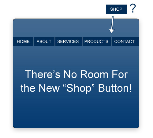
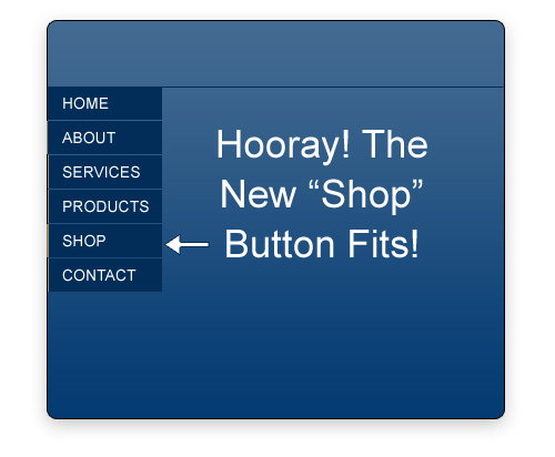
The truth is, those two benefits (namely, the flexibility to use longer link names, and the ability to easily increase the number of primary links) may be indicators that a site lacks purpose, is poorly organized, and was designed without much thought given to content or site goals. Boasting about the maintainability of a vertical navigation bar is not a valid benefit if it is accompanied by a vague purpose and poor structure.
In most cases, the long-term benefits of using horizontal navigation will largely outweigh the potential benefits of vertical, making such benefits easy to disregard.
Exceptions to the Rule
If this article constitutes a “rule” that you should never use vertical navigation, then some exceptions to that rule would potentially be:
- An information-heavy site that will often require changes to the primary links
- A site whose primary links must have long names
- A site that uses both horizontal and vertical navigation
- An e-commerce site with a vertical display of product categories and sub-categories
- A minimalist design
- A client who insists on it
There may be other compelling reasons to use vertical navigation, possibly related to design choices or space limitations in the top section of the site, but they would be rare instances.
Of course, the fact that I’ve listed 6 reasons why vertical navigation could be justified doesn’t mean it necessarily should be used in all of those circumstances. In most of those cases, horizontal navigation could still provide a viable solution if the navigation section is designed and coded with flexibility in mind, and if drop-down menus (or even mega drop-down menus are incorporated.
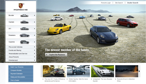
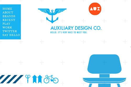
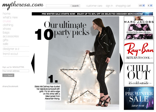
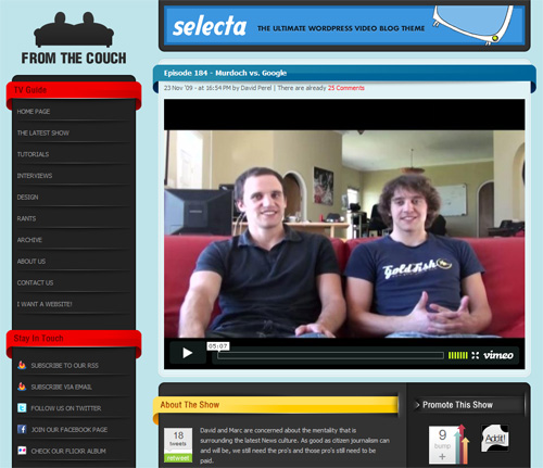
Effective Use of Vertical Navigation
As discussed, there will be situations where vertical navigation will be chosen — and it has been used nicely on a lot of current websites. Below is a showcase of some sites that utilize a form of vertical navigation in a respectable way. Most, if not all, of these sites fall under one of the “exceptions” mentioned in the previous section, while they ensure that content has primary focus in the user experience.


![Resource Design [rede]](https://archive.smashing.media/assets/344dbf88-fdf9-42bb-adb4-46f01eedd629/084e2ce3-3b30-4fca-b98c-5ab35c4b8793/rede.jpg)


Conclusion
Zeldman said it best: “Content Precedes Design”. If site architects and designers keep that formula in mind, they will have a greater chance of producing a successful user experience.
Often when a website is redesigned, the switch will be made from vertical to horizontal navigation, but rarely does it occur the other way around.
In fact, designers and architects are increasingly creating user experiences focused so strongly on content that navigation starts to become indistinguishable from content. This type of seamless experience is more effectively created when a horizontal navigation bar is used because horizontal navigation does not intrude on the content area and it’s still easily accessible visually and otherwise.
More often than not, a horizontal navigation bar will be a clean, effective, and user–friendly choice that can help a site reach its goals without hindrance to the user experience.
Further Reading
- Showcase Of Beautiful Vertical Navigation Designs
- Showcase of Interesting Navigation Designs
- Horizontal Navigation Menus: Trends, Patterns and Best Practices
- Navigation Menus: Trends and Examples
 (lu, il)

