45 Powerful CSS/JavaScript–Techniques

Email Newsletter
Weekly tips on front-end & UX.
Trusted by 200,000+ folks.


 Flexible CMS. Headless & API 1st
CSS and JavaScript are extremely powerful tools for designers and developers. However, sometimes it’s difficult to come up with the one excellent idea that would solve a problem that you are facing right now. Good news: almost every day designers and developers come up with fresh and clever CSS tricks and techniques and share them with other developers online.
We are aware that many readers are tired of “lists” floating around in the Web, but we are confident that the vast majority of our visitors will benefit from this post format and will find at least some of the techniques featured in this post useful.
Interesting CSS Techniques
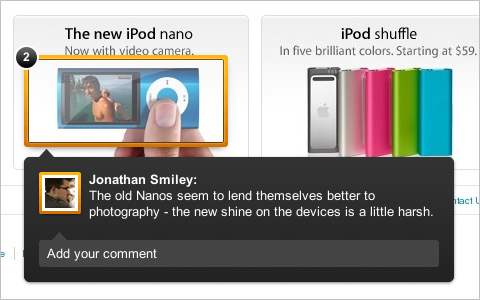
Building the New Visual Annotations These note overlays are composed of two main elements, an overlay with the shine and a border with the transparency. A very interesting, yet simple technique by the ZURB Design Agency, designers who have written a series of articles on Smashing Magazine as well.
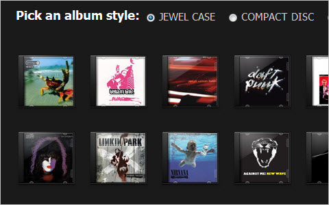
Sexy Music Album Overlays This aticle shows how to style your music streams and provides you some graphics to do so.
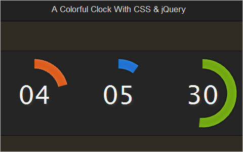
A Colorful Clock With CSS and jQuery This tutorial describes how one can create a clock using basic CSS and JavaScript.
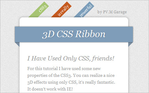
How To Create Depth And Nice 3D Ribbons Only Using CSS3 We will use box–shadow to create a drop–shadow with RGBa, a color model that allows an optimized contrast with any kind of backgrounds. RGBa is the standard RGB model (0,0,0 – 255,255,255) and it adds the last option (a) for the opacity. We can use this model also for other properties and it works with the new browser.
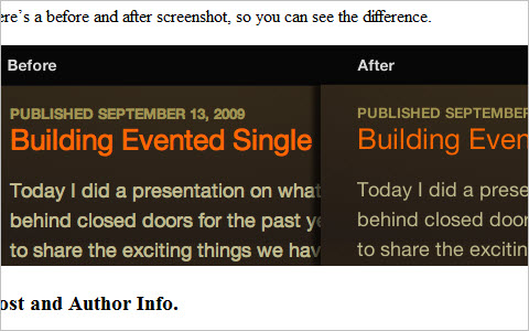
Advanced Event Timeline With PHP, CSS and jQuery This Advanced Event Timeline is used with the help of PHP, MySQL, CSS and jQuery. The result: a nice time line with clickable events. Adding new ones is going to be as easy as inserting a row in the database.
CSS Navigation Menus
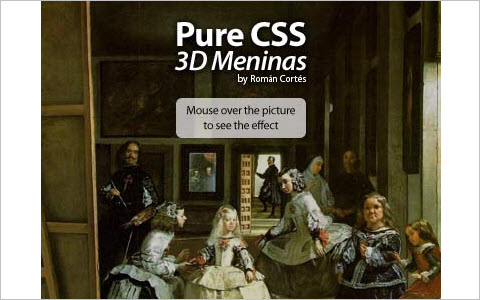
CSS 3D Meninas “I’ve took the classic paint The Maids of Honour (Las Meninas) and created a CSS pseudo–3D / Parallax effect. It is pure CSS, no JavaScript or Flash is involved. It has been tested and is working on Internet Explorer 8, Firefox 3, Opera 9, Safari 3, Chrome 4 and Konqueror 3.5, and it validates, too.
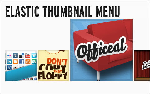
Sproing! - Make An Elastic Thumbnail Menu “In an ongoing attempt to offer alternative methods to spruce up menus, I’ve pieced together an elastic thumbnail menu. It magnifies menu items when they are hovered over and menu items expand upwards.
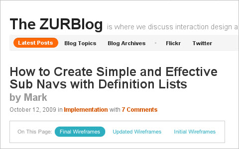
How to Create Simple and Effective Sub Navs with Definition Lists
“When we need simple and effective on–page navigation, to either jump to content on the page or flip to another view, we use the dl element. Its sub elements, the dt and dd, make it very easy for us to create inline links with a clear label. Here we’re going to share with you a fast, lightweight method for how we’ll use CSS to do it.”
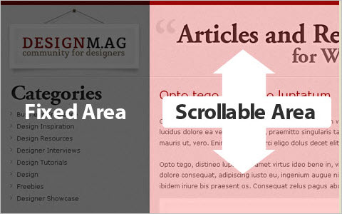
Sticky SideNav Layout with CSS Learn how to create a fixed sidenav layout for your blog or website. Having a fixed sidenav comes in handy when dealing with blog style websites where the content is extremely tall and there is a need for good amount of scrolling. The fixed navigation allows the user to cruise through the content without scrolling back up to the top to navigate through the rest of the site.
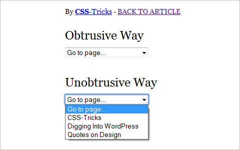
Unobtrusive Dropdown Page Changer Using a <select> dropdown menu to create navigation isn’t as common as it once was, but it’s still around. It got ripped on pretty good for being an inaccessible / obtrusive. Indeed a lot of the scripts you’ll find out there for creating a menu like this are this way. Bummer. Let’s make one that works with or without JavaScript.
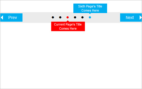
CSS Navigation: No JavaScript, jQuery or Image Required, Free CSS Navigation / Pagination with Tooltip CSS–based navigation / pagination bar without JavaScript. There is a tooltip on hover for the ’previous’ and ’next’ page’s bullets that makes navigation easier.
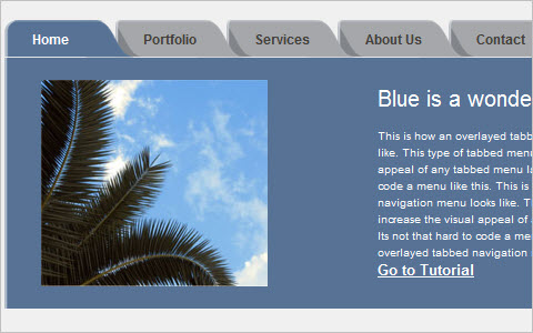
How to Code an Overlapping Tabbed Main Menu Main navigation menu is that part of a website design that makes the whole site look lively and complete. But the most common type of navigation menu style still being used a lot is the tabbed navigation menu. Here is a tutorial on how to code an overlapping tabbed menu.
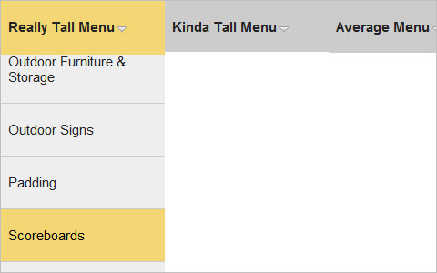
Solution For Very Long Dropdown Menus “I like to be confident with post titles, but the reality in this case is a possible solution for very long dropdowns. The problem with long dropdowns is that the dropdown itself can go below the “fold” of the website. That is, below the visible area of the browser window. So in order to access those menu items down below, you need to scroll your browser window. For those of us with scroll wheels of some kind on our mice (mouses?), it’s not a big deal. For those without, those lower menu items are totally inaccessible, because to use the browser scrollbar means mousing off the menu (and probably having it close).”
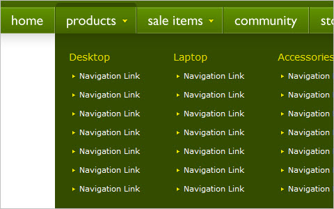
Mega Drop Down Menu w/ CSS and jQuery When used properly, mega drop down menus can be quite efficient for large scale websites. Let’s experiment with different ways of implementing this technique. A tutorial by Soh Tanaka, Smashing Magazine’s regular author.
CSS Typography and Body Copy
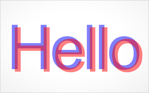
How to Create a Cool Anaglyphic Text Effect with CSS Anaglyphs are those amazing 3D images that are created by offsetting two of the red, green and blue channels, and are viewed with those nerdy looking 3D glasses with different coloured lenses. I don’t know if this effect works for real, as I’ve unfortunately misplaced my 3D specs, but it’s a pretty cool text effect nevertheless! Let’s take a look at how a similar style can be created for sprucing up your web designs, while taking into consideration semantics and avoiding the repetition of any markup.
Typographic work planner Enter this, a little HTML/CSS typographic work planner. By using some super–semantic HTML and a dash of CSS you can craft a beautiful looking yet incredibly simple work planner for you and your staff.
Thinning Text in Webkit (Safari) Safari has a not–so–lovely way of bulking up text using sub–pixel rendering. On previous versions of Safari, this was fixed with a text–shadow declaration, but since Snow Leopard that method no longer works. Fortunately, there is an alternative.
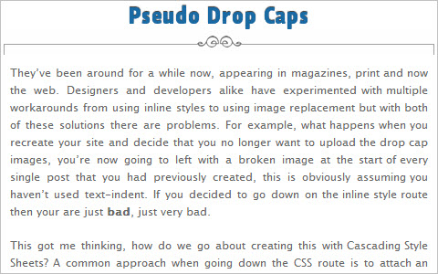
Pseudo Drop Caps, they’ve been around for a while now, appearing in magazines, print and now the web. Designers and developers alike have experimented with multiple workarounds from using inline styles to using image replacement but with both of these solutions there are problems. For example, what happens when you recreate your site and decide that you no longer want to upload the drop cap images, you’re now going to left with a broken image at the start of every single post that you had previously created, this is obviously assuming you haven’t used text–indent. If you decided to go down on the inline style route then your are just bad, just very bad.
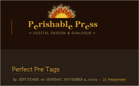
How to Create Perfect Pre Tags If you operate a website that features lots of code examples, you know how important it is to spend some quality time styling the <pre> element. When left unstyled, wild <pre> tags will mangle your preformatted content and destroy your site’s layout. Different browsers treat the <pre> tag quite differently, varying greatly in their default handling of font–sizing, scrollbar–rendering, and word–wrapping. Indeed, getting your preformatted code to look consistent, usable, and stylish across browsers is no easy task, but it certainly can be done. This article explains everything you need to create proper <pre> tags.
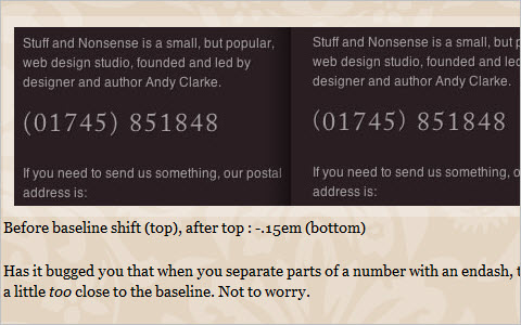
Improve your web typography with baseline shift The baseline is an invisible line onto which all type characters sit, although of course some characters (including ‘j’, ‘p’, ‘g’ and ‘y’) have descenders that hang below the baseline. Baseline shift involves moving characters up or down in relation to the baseline and using it effectively can make a huge difference to the professional look of your type. Although baseline shift has traditionally been a part of using tools like InDesign or Quark, there are ways to accomplish the same results using CSS.
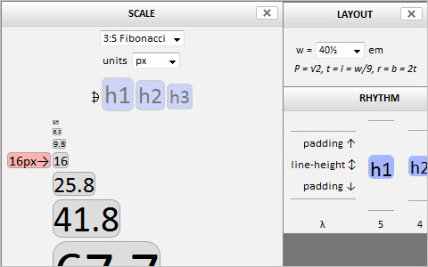
Typograph - Scale and Rhythm This page is both an essay and a tool. It sets out to explore how two, intertwined concepts, often playful but sometimes cheeky, can be encouraged to dance in web pages. Drag the colored boxes along the scale to throw these words anew. For the most part, this text is just a libretto for the performance you are about to play upon it.
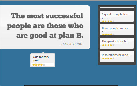
Fancy Quotes With jQuery, AJAX and CSS Learn how to create a fancy quote rating system that will display a number of famous quotes and will enable site visitors to rate their favorites.
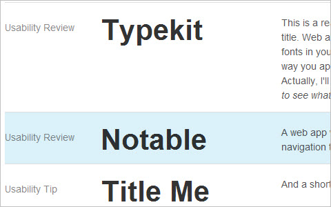
How To Create Simple, Stylish and Swappable Image Captions Most image caption solutions require a lot of excessive HTML, make it difficult to redesign or don’t communicate clearly that they belong to an image. Let’s see what we can do to address these problems.
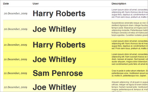
Styling photo captions with CSS Sure, some photos are self–explanatory, but most photos are best served with text captions. It’s true for traditional media like newspapers and magazines, and just as true for blog posts and web articles. Here’s a quick tip on using photo captions and styling them nicely with the magic of CSS.
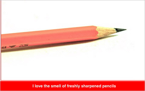
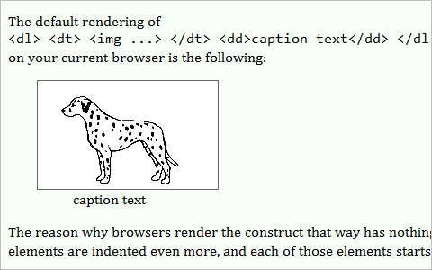
Image captions on Web pages This document suggests three ways of presenting an image with a caption in HTML. Styling in CSS is also discussed.
Styling Post Headings That Stick Out “Recently, I’ve noticed a trend in blog post headings where it sticks out of its base layout. I would like to share this technique for those who would like to give their post headings a new style. One tip to keep in mind when designing this is to make sure it fits your target audience screen resolution size. Note that this technique may vary depending on your design. My goal is for you to grasp the main concept in this tutorial so you can experiment and apply it to your own projects.”
Using ellipsis with HTML and CSS If the text is too wide to fit into a container, a nice solution can be to have ellipsis to show there’s more information available. While not currently part of the official HTML specifications, it is possible to have ellipsis defined in CSS and it works for Internet Explorer, Safari, Chrome and Opera. It doesn’t work for Firefox but there’s a workaround that can be done with jQuery.
CSS Lists
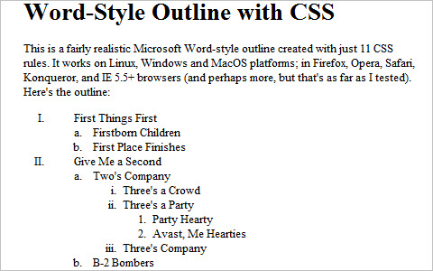
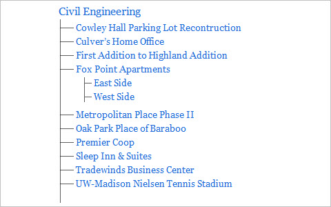
Create a Microsoft Word-Style Outline with CSS As you can see, the browser doesn’t bother to vary the indentation style much, or change the list type from roman numerals to alphabetical characters and so on… all the things we’re so used to seeing because Microsoft Word and other writing programs do them by default. So let’s use a bit of CSS ingenuity to make a Microsoft Word–styled outline using ordered lists!
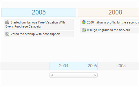
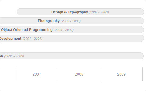
Pure CSS Timeline “I wanted to build a CSS timeline for the “About” section of my site while using some clean and simple markup. I wanted to avoid using images as much as possible, so I spent a few minutes prototyping some options and came up with a solution using unordered lists. The result is a simple and clean looking timeline with some very straight forward markup. In this article I’ll share my approach to creating a timeline out of CSS and HTML which results in a nice looking, simple timeline.”
Automatic numbering with CSS Counters When writing documents, it is often useful to number sections and have a table of contents. You can number these by hand, directly in the markup, but this can be time consuming if the order changes and you have to edit all the numbers. CSS2.1 gives us a automated way to generate numbers using CSS counters, and this article will walk you through how to use them. One word of note before we start is that CSS counters are not yet implemented in IE, although they are on the roadmap for IE8.
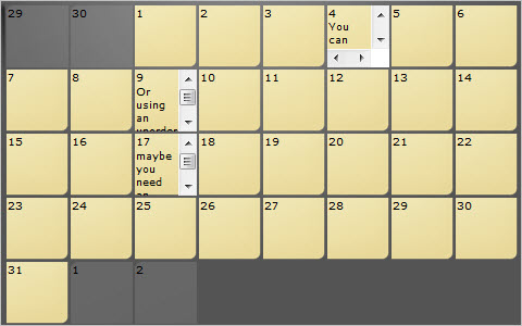
Elastic Calendar Styling with CSS A traditional calendar is a grid of numbered boxes on a page. As a web designer, you might go right for a table, and I wouldn’t fault you for that. Tables, though, can sometimes be tough to muscle into shape. The CSS purist in me gets pissed when I set the width of a table (or a cell) and it decides it knows better and grows or shrinks as it sees fit. You can tackle calendar styling with pure CSS, and I feel it makes just as much sense semantically as a table does. What is a calender, if not an ordered list of days? By using CSS, we can even do some cool things like do all our sizing with ems so our calendar layout will be elastic. That is, grow in both width and height when text is resized in browsers, while greatly increasing accessibility.
Style a List with One Pixel A one–pixel background image can be a pretty versatile thing. With repeat–x it can be a horizontal line, repeat–y makes a vertical line, and repeat makes it a fill color. Just as a little fun proof of concept, we can use that to create a depth–chart looking unordered list.
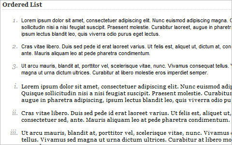
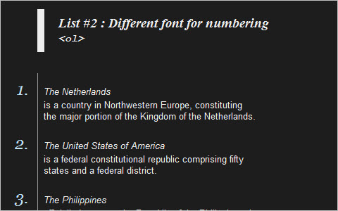
Style Your Ordered List By default, most browsers display the ordered list numbers same font style as the body text. Here is a quick CSS tutorial on how you can use the ordered list (ol) and paragraph (p) element to design a stylish numbered list.
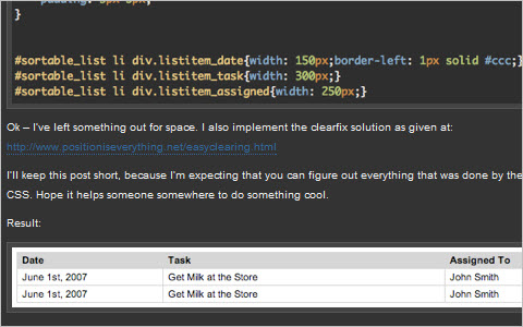
Simulating a Table Using an Unordered List Your first question immediately might be, “why would I want to simulate a table with a list, why not just use a table?” With the raise in popularity of AJAX sortable list elements, using list items to represent a multiple column data table can allow for easy sorting of various more “tabley” information. So let’s get started.
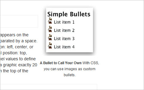
8 different ways to beautifully style your HTML lists with CSS “The use of HTML lists (<ol> for an ordered list, <ul> for an unordered list) is very common these days. Today, we’re going to look a little bit further than creating regular lists, by showing 8 different ways to beautifully style your HTML lists with CSS. We’ll use some pure CSS techniques to make a bored list look awesome (and even have some extra functionality).”
Quick Tip – Simplify List Margins with CSS.
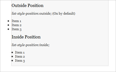
Have you ever set default margins for a layout, and then had to go back and manually adjust all of your lists? By default, list item markers have a negative positioning in relationship to the list item itself. This means that zero–ing out margins automatically leads to an overflow if the list is contained inside anything else. Wouldn’t it be easier to put the list item marker at the same starting point as other elements instead? Lucky for us, there’s a style to help do just that. Let’s see what can be done with the list–style–position property.
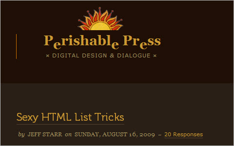
Sexy HTML List Tricks Behold the ubiquitous list elements, <ul> and <ol>. These two sexy elements help millions of websites display lists of information in clean, semantic fashion. Without them, we’d be crawling around like filthy cavemen, eating dirt and howling at the moon. But these list elements aren’t just sexy, they are also extremely flexible, enabling us humble designers to create robust list configurations that are semantically versatile and highly customizable.
Clickable <li> I originally coded the markup to be a table, but discovered a problem when I tried to make the whole row clickable. I ended up with a list of articles instead.
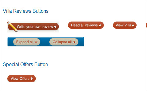
CSS Buttons
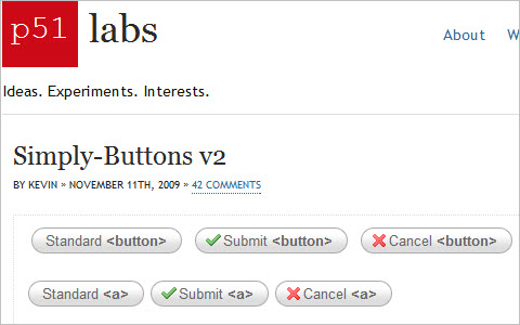
SimplyB–uttons v2 This technique presents buttons of the size that always fits the content. There are 3 states: inactive, active and hover. The technique works in all major browsers and doesn’t require JavaScript.
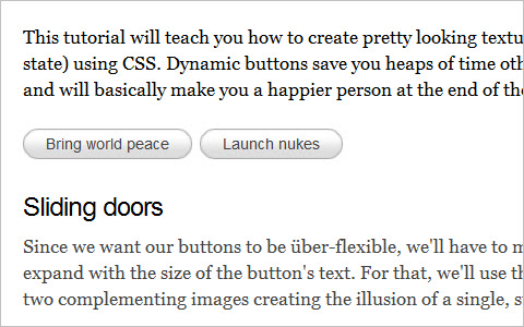
How to make sexy buttons with CSS This tutorial will teach you how to create pretty looking textual buttons (with alternate pressed state) using CSS. Dynamic buttons save you heaps of time otherwise spent creating graphics and will basically make you a happier person at the end of the day.
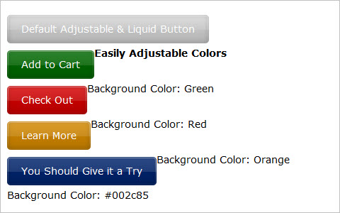
Liquid and Color Adjustable CSS Buttons When working on a large site with multiple buttons, it can be quite tedious to make all the buttons in Photoshop. Making future adjustments on the verbiage and colors can be also be time consuming. By having dynamic buttons, this scenario is much easier to handle, and by having liquid and color adjustable buttons with CSS, we are able to change the verbiage and colors in a flash.
Create a Button with Hover and Active States using CSS Sprites
Too many designers neglect the click state (active–property in CSS) in web design, either because they’re unaware of it, underestimate the importance of it or are plain lazy. It’s a simple effect that improves usability by giving the user some feedback as to what they’ve clicked on but can also add depth to a design.
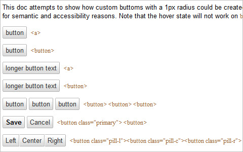
Recreating the button “I thought it would be interesting to provide a portion of the background on buttons here, and discuss some of the iterations we’ve been through so far to get to the current state.”
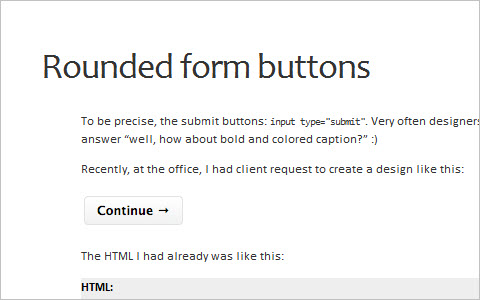
Rounded Form Buttons
Google’s Imageless Buttons An interesting discussion about various buttons design techniques to reconstruct Google’s imageless buttons.
Stay Tuned!
This is the first part of our large round–up of fresh CSS/JavaScript–techniques. Don’t forget to follow us on Twitter for similar articles and a stream of useful resources. Please also let us know what we should change or improve in our future posts!
You may also be interested in the following related posts:
- Learning JavaScript: Essentials And Guidelines
- Seven JavaScript Things I Wish I Knew Much Earlier In My Career
- CSS: Innovative Techniques and Practical Solutions
- New CSS Features In 2022
 (lu, il)

