Progress Trackers in Web Design: Examples and Best Practices
When designing a large website, especially one that contains a store, you may be required to design a system for ordering online, or a multi-step process of another sort. Walking users through this process by making it easy and intuitive is key to helping increase conversion rates. Any frustration along the way may cause them to leave and pursue other options. Progress trackers are designed to help users through a multi-step process and it is vital that such trackers be well designed in order to keep users informed about what section they are currently on, what section they have completed, and what tasks remain.
In this article we will look at various uses of progress trackers and see how they’ve been implemented, what they are doing well, and what they are not doing well.
What are Progress Trackers?
You may not be familiar with the term ‘progress tracker’, also called a ‘progress indicator’ — but chances are good that you have encountered one at one time or another. They are used in online stores when placing an order, signing up to an online product or service, or even when booking a holiday online. Progress trackers guide the user through a number of steps in order to complete a specified process.

An example of a progress tracker at Game
The Difference Between Progress Trackers and Breadcrumbs
As we have detailed previously in Breadcrumbs In Web Design: Examples And Best Practices, breadcrumbs are a way of enhancing navigation by revealing a user’s current location. Initially, breadcrumbs and progress trackers may seem very similar and in many ways they are, however, there are significant differences.
Breadcrumbs show you only where you have been (or what sections are above the current section in the application’s hierarchy), whereas progress trackers indicate a set path that a user follows to complete a specific task. Progress trackers show you not only where you are currently located, but also what steps you have previously taken, and what steps you are about to take.
![]()
Example of breadcrumbs at Coolspotters
Progress trackers are best used when there is a specific goal to achieve. They are synonymous with conversion and are used as a way of improving usability — which is key when optimizing conversion rates. Conversion is all about selling online so you will see a progress tracker in some form in almost every online store.
Now that we’ve reviewed what a progress tracker is, let’s look at situations that would require or even benefit from the implementation of a well-designed progress tracker.
Uses of Progress Trackers
As mentioned previously, progress trackers can be used in a variety of contexts. The following three are the most common.
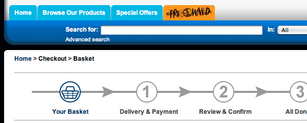
1. Online Ordering
By far the most common application of progress trackers is in conjunction with online purchasing, since this usually involves multiple steps.
![]()
The progress tracker used by HMV.
![]()
The progress tracker used at Etsy.
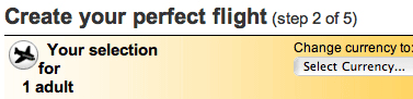
2. Feature Tour Guides
Progress trackers are also used to guide users through the features of online products and services, as demonstrated in the following examples:
![]()
Progress tracker as used by Search Inside Video.
![]()
Flickr’s tour page provides a look at the features of their service.
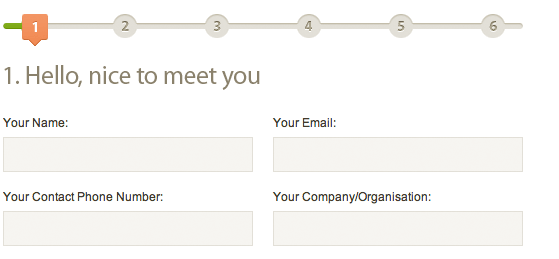
3. Multi-Step Forms
If a form requires a lot of user input, it may be best to split the form into multiple steps.
![]()
Livestream’s progress tracker design.

The progress tracker used on Buffalo’s Project Planner form
Best Practices in Progress Tracker Design
Indicating a Logical Progression
Most progress trackers are designed to display the steps from left to right. In most lands, people read from left to right, so it makes sense that progress trackers follow that pattern. That isn’t enough though — there has to be something that informs the user that they are performing a multi-step process.
![]()
Blockbuster have included both arrows and numbers in their progress tracker, thus clearly communicating a logical progression.
Keeping the User Informed of their Location
One key aspect of good progress tracker design is keeping the user informed of where the user is in the process. This complements the logical progression because the user will know where they are in relation to where they have been, and what sections are to follow.
![]()
Mr and Mrs Smith indicates the user’s current location by clearly highlighting the current step and turning the arrow downwards.
Positioning
Since progress trackers are a form of navigation, it is best to place them below the primary and secondary navigation (such as breadcrumbs) and above the content that the progress tracker relates to. Also, while a progress tracker can act as a page title, it is best to place the title of the current section underneath the progress tracker, to reinforce the current location.

Gamestation places their progress tracker clearly below the primary and secondary navigation.
Implementations of Progress Trackers
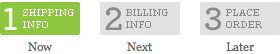
Plain Text
Below is an example of a plain text progress tracker on Media Temple’s website. One benefit of a plain text progress tracker is that it can be edited easily.
Sprite-Based
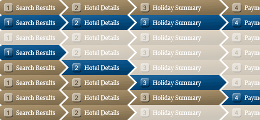
Sovereign uses the popular CSS sprites technique to build their progress tracker and reduce HTTP requests going through the online booking process.
Design Mistakes to Avoid
Indistinguishable from Breadcrumbs
TypePad’s Design Assistant can be very easily confused with a breadcrumb navigation system.
Not Enough Information
easyJet‘s old progress tracker on their booking path was poorly executed. Although it gave you the total number of steps in the process, it didn’t indicate which steps you’ve completed or which were remaining.
Their new progress tracker, launched within the last few weeks, is a big improvement, indicating current location, past steps, and steps to come. They now also make good use of the page title which has descriptive wording to complement the current progress tracker label.
No Sense of Progression
daniblack incorrectly uses a tab system for their progress tracker. The problem with this is that tabs don’t offer any visual representation of progress. The addition of numbers or arrows would give at least some sort of indication of progression in this example.
Progress Tracker Showcase
Now that we know what a progress tracker is, how it is used, and the best approach to its design, let’s look at a number of well-designed progress trackers currently in use.
Battle.net uses the method of incrementally filling a bar as you progress through the steps in their sign-up form.
Amazon has a shopping trolley travelling across their progress tracker, leaving an orange line marking where it has been.
John Lewis uses an image of a truck travelling along their progress tracker.
Comet ticks off sections that have already been completed.
Boots‘ Progress tracker spans the width of the page.
Web MD uses a progress bar and percentage values as a way of tracking progress on their health check questionnaires.
Golfsmith uses a combination of numbers and a progress bar with an arrow.
lookfantastic uses icons to visually enhance their progress tracker.
Related posts
You may be interested in the following related posts:


Design Informer
January 15th, 2010 2:54 amGreat extensive collection! Will definitely be useful for some of my projects at work. I will be going back here for some tracker inspiration. Nice tips as well.
Design Informer
January 15th, 2010 10:38 amOh, and I would like to add that the article would have been even better with actual, coded examples and how-to’s. Still though, nice post Tom!
Jonathan
January 15th, 2010 3:04 amNice collection!
Ron
January 15th, 2010 3:09 amI think most of these recommendations should be known to every webdesigner anyway. But thank you for the showcase of some progress trackers, this provides some good inspiration.
Myrnalyn Castillo
January 15th, 2010 3:18 amGreat tips and examples! I definitely bookmarked this post for future reference!
DesignFellow
January 15th, 2010 3:37 amGood collection. I’m planning a web app now.. It’s a great help for me.Keep up :)
Calum Brodie
January 15th, 2010 3:52 amHi, I’ve added our a link to our own Checkout Progress UI. It’s vertical so a little different from those above while still following your ebst practive rules.
http://img42.imageshack.us/img42/7987/navprogress.gif
Site still under construction so mind the bugs!
Eddy
January 15th, 2010 4:01 amThis not really related to this specific article but to all your articles including showcases. I’m wondering you go about finding all examples? Do you tell more people to go around the internet and look for examples or do you do it yourself? How long does it take you? Do you just browse normally and write down what you happen to find over a long period of time, or do you just search every page only for the purpose of the showcase during a few hours? I’m asking because I plan to do a couple of showcases myself for my uni course. Thanks!
shobo
January 15th, 2010 4:07 amHello. What is the name of “Buffalo’s Project Planner” script? I would like something like that but I don’t know how to search for it. Thank you very much.
Jonny Pioww
January 15th, 2010 4:07 amThank you for a refreshingly original article, excellent.
ptarmigan
January 15th, 2010 4:26 amvery nice collection… that gives a lot of inspiration :)
thank you!
FreakSoap
January 15th, 2010 4:55 amI think, i’m too much siting on SM. I just cannot find anything so much amazing and wonderful like at begin when i was just “OMFG!!oneone111 THATS AWESOME” i need break lol. So i will finally read SM book that i already got from few weeks:D
Chriss
January 15th, 2010 5:37 amWhat a timing !
I´m just in the middle of creating a store progress, thanks a lot !
awesh
January 15th, 2010 6:43 amWOW.. thanks a lot.. i was looking for the same article.. :)
Marvin
January 15th, 2010 7:17 amThanks for the post Tom. I too am in the middle of a project where the client wanted a progress bar/tracker so this is great. By the way…Inspect Element is a superb blog…
DesignerDad
January 15th, 2010 7:23 amIf a progress tracker truly represents a linear process, then I think visually you really need to ensure that it doesn’t appear to be another set of links. The examples above that gray out future steps, and that actually use the word “step” seem to do the best job IMO.
Amy Klemer
January 15th, 2010 7:25 amPerfect timing. I was just sitting down to design a form with several progressions. This is also a great tool to show the client. Thanks!
Webdawson
January 15th, 2010 7:53 amGreat Post – nice examples! Here is another css progressbar:
http://www.kollermedia.at/archive/2008/03/31/easy-css-progress-bar/
GrandK
January 15th, 2010 7:59 amGreat post! In my society (french!), we used to call progress trackers “petit poucet”, like in the fairy tale http://en.wikipedia.org/wiki/Hop_o%27_My_Thumb … beacause of the analogy of bread pieces/informations links. “Progress tracker” is definitely more pro! :) Thanks!
Adam
January 15th, 2010 8:05 amHow could you not include – http://www.pizzanews.co.uk/wp-content/uploads/2009/11/dominos_pizza_tracker.jpg
Eddy
January 15th, 2010 9:44 amThat is a great solution, however it’s not really a regular progress tracker as it doesn’t show you what you’ve done and what’s left for you to do, but rather what the chef is doing. Nevertheless, it could be mentioned at the end since it’s so nice :D
Giles Van Gruisen
January 15th, 2010 7:02 pmGood call. When I saw the title, the first thing I did was go to the article, and cmd+f search for “Dominos.”
Man, that’s some good pizza.
Web4half.com
January 15th, 2010 8:55 amThanks for sharing
You have a great list. I just can’t stop drooling.
Prashant
January 15th, 2010 9:19 amHow about the progress indicators of delicious: http://www.flickr.com/photos/jannejanne/3404496232/in/pool-uipatternfactory/
Gonzalo González Mora
January 15th, 2010 9:28 amOne important aspect that is missing in the article which I learned from Luke Wroblewski’s book “Web Form Design: Filling in the Blanks” (great book, by the way, it’s a must-read for any web designer) is not setting false expectations in what regards the number of steps.
Many websites set a few number of steps, but when you actually go through the form a 3-step form turns into a 6-step (or more) one. For example, in the “Payment” step, instead of being one page, you first have to choose a method of payment, then you’re redirected to another site (i.e. Paypal), then you have to login in that site, after that you have to review the payment and make the purchase, and only then you’re taken back to the original “3-step” form. This turns a step into four. Another example (in the book), is selecting the shipping address. If the address was not added before, you have to add it and then select it, this step suddenly becomes two.
Amazon did that, and then did removed the number of steps and just show “areas” in the form process (types of information that you’ll need to provide, as Luke states), avoiding setting false expectations which can frustrate the user.
Shawn M
January 15th, 2010 9:34 amAnother application of the progress tracker that I find useful is for carousels. I find it nice to know for example, how many images there are in the carousel while I am clicking through them. Great showcase!
Steven Davis
January 15th, 2010 2:15 pmI think Sovereign could save a lot of bandwidth by trimming down their sprite. They’re repeating several of the same state. You should only use/need 1 instance of each state.
everydaypanos
January 15th, 2010 2:23 pmAnother great example of progress tracker that is actually simple.
https://anamo.eu/checkout/shipping
Frederick Luna
January 15th, 2010 2:50 pmthanks a lot Tom for this great post!
TraiaN
January 15th, 2010 5:58 pmHere’s a nice statistic on progress bars:
http://www.pitstopmedia.com/sem/checkout-progress-bar-survey
Eko Setiawan | camp26
January 15th, 2010 9:54 pmHi, this great article for me…I am new to the term Progress Tracker, I’ve often seen at some sites, but did not know the term.
Thanks…
Murtaza Imran
January 16th, 2010 2:18 amvery informational post
Ionut
January 16th, 2010 3:37 amJust these days I’m working on a website with trackers. Really good timing for my lack of inspiration. Great collection. Thanks!
pxdev
January 16th, 2010 8:09 amnice post
BEBEN
January 16th, 2010 11:28 amwell…well
its a great info … btw what for is this…:D
bright as yellow
January 16th, 2010 5:07 pmThanks for the article! Before reading it I didn’t know the difference between breadcrumbs and progress trackers. I also enjoyed the showcase; the tracker for lookfantastic was my favorite.
manyu
January 16th, 2010 7:46 pmThis is really useful, especially for wordpress designers, i just used one of them,this is my blog
CommerceStyle.com
January 16th, 2010 8:14 pmGreat article. Thanks!
Florian
January 18th, 2010 12:36 amI like that case study. Especially the convergence between easyJet’s old and new progress tracker impressed me. Seems like you planned that article, didn’t you? :) Great one!
Paul Versteeg
January 18th, 2010 1:37 amGreat examples!
Any ideas for progress indicators that branche of in different tracks?
If a user selects a certain option that provides an extra step, should you show this option in advance?
Any help or insight would be appreciated!
gr,
Paul
pasxal
January 18th, 2010 5:18 amGreat article and loads of examples!
altruista
January 18th, 2010 9:25 amGreat overview article. It would have been nice to see some information on when to use small vs. large progress trackers and suggestions on how to choose wording for each step of the tracker. Possibly also include suggested lengths of progress trackers.
Alessandra
January 19th, 2010 8:58 amGreat article, very useful.
Brett
January 19th, 2010 11:58 amAwesome article. I really wish more sites would start incorporating progress trackers in multi part forms.
aaa
January 21st, 2010 1:52 amAwesome article. I really wish more sites would start incorporating progress trackers in multi part forms.
Gabriel
January 29th, 2010 11:46 amThanks for this awesome article. The information in this thing is priceless. Smashing Mag is the best hands down!
Miguel
February 6th, 2010 6:29 pm[Offtopic: by the way, did you already get your copy of the brand new Smashing Book?]
No.
Aravind
February 8th, 2010 2:37 amNice….
CONCHETUMARE
February 11th, 2010 8:44 amQUE PASA CON EL CHORISO NITROKING ERMANO
likto
March 28th, 2010 8:46 pmnice article, thank you very much :)
Ebbie
May 13th, 2010 1:03 amPerfect, just what I was looking for – thank you. Saved me hours…
Nadeem
June 1st, 2010 3:28 amThese are great, but they go from one end directly to the other. What if in between step 2 and 3, you may need to add a couple additional steps between. For example, step 2 selects user, step 3 contacts user. What if you dont find the user in step 2, and you need to add a couple extra steps in between step 2 and 3. How can you show that changed additional progress tracker?
I tried a few things, but nothing looks good… Any help would be appreciated.
JimmyLees
June 3rd, 2010 3:40 amGreat Post!!!
I might use it on this site canvas4life.co.uk/
Adam Jackson
June 3rd, 2010 3:46 amSome good websites on there; I particularly like Ikea. My top three sites (from a design perspective) are,http://www.mypure.co.uk, http://www.wantthelook.com and http://www.nativeskatestore.co.uk
Danman
July 19th, 2010 6:15 pmVery good and useful information. Thanks.
enomsoft
August 12th, 2010 2:53 amNice. Useful information.
abbaskhan
October 9th, 2010 6:21 amhi….I want the coding for tracking visitor details…..reply with a solution for this soon…i’m waiting for this
android86
April 12th, 2011 2:12 pmpeople might if you are polite and say please :)
onecrazydiamond
October 17th, 2010 12:14 pmHmm… I really hoped to see some vertical tracker examples… :(
andy
October 29th, 2010 6:57 amso many good ones to choose from. nice work – I think the sprite based holiday one might work for my site holidaystotenerife
Puma
November 5th, 2010 6:47 pmso many good ones to choose from. nice work – I think the sprite based holiday one might work for my site holidaystotenerife
ecco
November 5th, 2010 6:48 pmNice. Useful information.
Mike
November 17th, 2010 7:50 pmI saw a good example of a step by step cart at notebooks.thegoodguys.com.au/
Malcom Reynolds
December 7th, 2010 8:00 amThat was really useful. Thanks very much. I am currently making a website, and the timing of finding this post was nothing short of impeccable.
new jordons
December 7th, 2010 6:39 pmThat was really useful
John S.
December 20th, 2010 8:55 pmHi,
I have seen on a couple of sites where they have a main progress bar showing about 4-5 main steps and then a separate progress bar for the 3 step checkout process. I think they figured it would minimize any exits once they are in the purchase phase since the progress bar doubled as navigation allowing the user to go back.
There were Back buttons in the purchase pages to go back but that’s really the only way to exit the purchase process. It makes sense but I think there can be arguments for either showing the full progress bar all the way through or showing just the checkout progress bar in the purchase pages.
Anyone have thoughts on this technique?
JOAG
December 23rd, 2010 2:49 amWe were advised to implement breadcrumb navigation and progress tracking by our search engine optimisation consultant. Although we went ahead with the breadcrumb navigation we did not implement progress tracking as we could not see the point in doing both.
Your blog has been very informative and l like the visual examples used, certainly something we will have to discuss with our website designer.
burberry
January 3rd, 2011 12:04 amGreat article. Thank you to tell us more useful information. I am looking forward to reading more of your articles in the future.
Bevers
February 4th, 2011 9:19 amJust what I was looking for. Thanks for such a great collection!
Michelle
February 24th, 2011 3:04 pmMy site has a vertical tabbed checkout which can be expanded to see the contents when each step is complete. I read about this and thought that it was a good practice. But I find that there are an awful lot of people starting the form and leaving the page. It comes with the CMS but i guess i can research on how to change it.
Can i get some views on if this is because of the actual navigation of the form or something else? I thought may be they are looking to check the delivery price and thats why they start the form. But you can check the price without starting the form.
site: tinytoys.com.au
Graham
May 10th, 2011 7:01 amI’ve seen an increasing number of these systems recently, but not all of them work very well. Quite a lot of them show you where you are in the checkout process, but don’t allow you to go back and edit information you may have entered incorrectly. One of my regular online stores – http://www.graingergames.co.uk – doesn’t use this at the minute, but will hopefully be incorporating it in their new site. It should be more commonplace in e-commerce by now.
Karlsson
June 14th, 2011 7:02 amThis is a great roundup! Thanks so much for sharing. It seems that keeping the user informed of the steps left helps to increase conversion. From what we have tested at http://www.clockdiscount.com/ this seems to be the best for increasing conversion rates.
I’d love to know what is the ideal number of steps for a checkout process though.
Cheers,
Karlsson
Digital Thermometer
June 21st, 2011 4:39 pmThis is my job, and i am so sorry
David
July 6th, 2011 11:05 pmAn excellent blog!I like it.but The meaning of the last paragraph a bit puzzled.It’s always good to have passions in life to keep yourself from going down the negative path and work towards staying positive.I really enjoyed this. You can look your article comments. This information has really been helpful for most of the readers. I really appreciate the way you have written about this. I will really like to read more on this from you. I know your expertise on this. I must say we should have an online discussion on this. Writing only comments will close the discussion straight away! And will restrict the benefits from this information baidu.com
mofei
July 19th, 2011 5:43 pmgood
Beric
July 25th, 2011 5:30 amNice selection you collected. But what to use on a single page checkout? We are redesigning fabfive24.com and thinking to incorporate the single page checkout instead of the 3 or 4-way checkout. Any Idea´s?
canada goose
August 3rd, 2011 6:35 pmgood post ,i like
gary
August 22nd, 2011 5:19 pmvery interesting tracker showcase, if we don’t have a tracker showcase in the canvashandbagshop, will people buy the product?
Serena-zeng
September 16th, 2011 6:46 pmI am very interested in sports ,such as golf clubs and basketball.http//:www.1000golf.com.this seems to be a good place which worth your coming.
supra
September 23rd, 2011 3:05 amIf it is not swept Arsenal in Virginia Baker (microblogging) Matt Hasselbeck Jersey battle injuries in thehttp://www.nfljerseysraiders.com/ accident, Hernandez does not know when to back the team will behttp://www.nfljerseysraiders.com/ the main front of the battle flag. Away to Bolton’s game, the Mike Williams Jersey small pea competitors seize the chance of injury, the first time thehttp://www.nfljerseysraiders.com/ new season debut as the main players, Mexico Sidney Rice Jersey Lightning quickly
Fenna
December 14th, 2011 2:49 amVery nice article! Thanks for that! I was looking for the right name for this process for a long time, untill I finally found out that it’s called “progress indicator or progress tracker” (thanks to the book of Luke Wroblewski “Web Form Design: Filling in the Blanks”).
What do you think of the possibility to jump between steps within a progress tracker? Do you think this is usefull and adds value? I personaly think it does. I experience too often that it’s not possible and find it very annoying when I, for example, want to recheck my details in the first step and I need to press previous a lot of times because I can’t jump to step 1 immediatly (and then I need to fill in the next steps again sometimes!).
Next to that, would you display a different state (visually) of the step the user already completed and returns to this step?
Thanks in advance!
Raina
February 1st, 2012 4:31 pmThis is a great article! Excellent content and examples of what works and what doesnt!