Design And Build HTML Newsletter Without Losing Your Mind

Email Newsletter
Weekly tips on front-end & UX.
Trusted by 182,000+ folks.


 Celebrating 10 million developers
 Custom Web Forms for Angular, React, & Vue. Your backend.
“We really love this new website you’ve built! Now we’d like to send out an email to all of our customers, friends and anyone, and it should look exactly like the website except with a spinning mailbox at the bottom, and have my photo, and my cat’s photo…” Ever had that conversation with a client?
You’ve built plenty of websites in your time and could knock off a blog template in your sleep, but HTML email? Seriously? HTML email has the reputation (often well deserved) of being a horrible design medium.
The mere mention of it sends some designers into physical shock (try it if you ever get stuck in a tedious conversation about XHTML vs. HTML 5). The truth remains that businesses and individuals the world over send and receive email in HTML format by default every day, and many of them genuinely prefer it to plain text.
So designers have a choice. We can stick our fingers in our ears, cover our eyes and hope it all goes away or we can learn to make the best of a challenging design medium and produce something that raises the quality level a bit.
If you’d like to get started right now, here are the cheat notes to get you on the right track. Read on for more detail, examples and resources.
- Respect your reader. Don’t waste their time or attention.
- Ask nicely first.
- Focus on relevance.
- Design with a goal in mind, so that you’ll know if it worked.
- Make unsubscribing easy.
- Code like it’s 1999 (literally) and use inline CSS.
- Always include a plain text version.
- Don’t assume that images will be viewed.
- Follow the law.
- Test everything before sending, because you can’t take it back.
1. Respect Your Reader. Don’t Waste Their Time or Attention.
The email inbox is a noisy busy place for a newsletter to land. Hundreds of other emails are already on the pile, with folders, calendars and notes on all sides. The typical user is probably not waiting with bated breath for your email to arrive.
So when your email does arrive, make sure it doesn’t waste their time. Get to the point quickly, instead of burying the value under a mountain of greetings and headers and hilarious photos. Figure out why someone would want your email, and then tell them what that is right away.
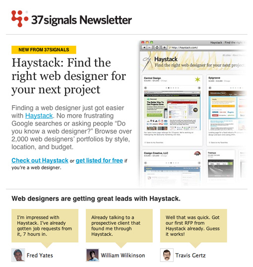
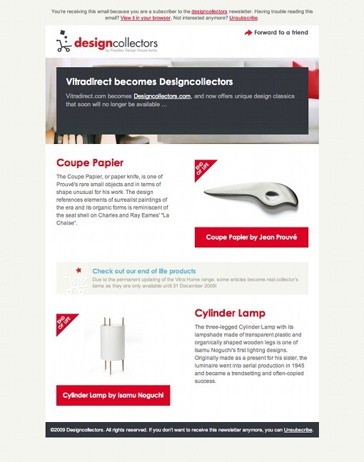
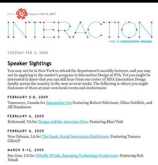
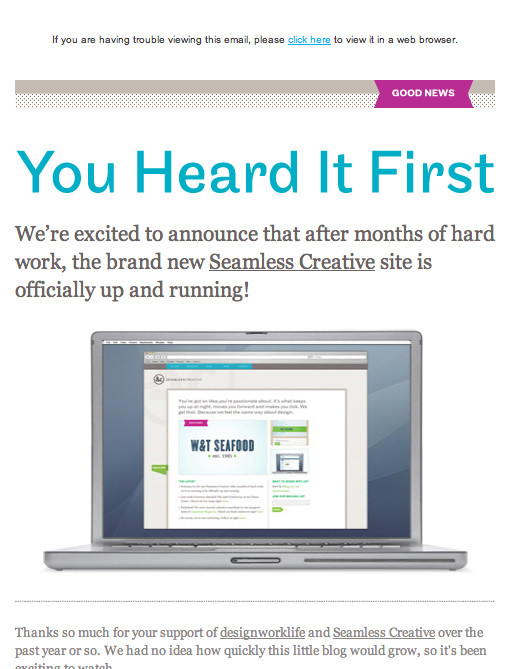
One excellent example of getting to the point is the recent Haystack announcement. No need to guess what Haystack is for when you read the top of this email:
2. Ask Nicely First
When you are excited about something, you want to tell everyone. Clients often assume that everyone they have ever met, and many they have not, would love nothing more than to receive their latest news. Of course, this is not the case, and laws are in place to back them up.
If you are using an external email service, it will have its own policies on what permission you need in order to email people. Know which policies apply to you and your clients before you send. Explicit permission is best: ask people directly if they would like to receive emails about your topic. If you can show an example of what they’ll get and let them know how often they’ll get it, all the better.
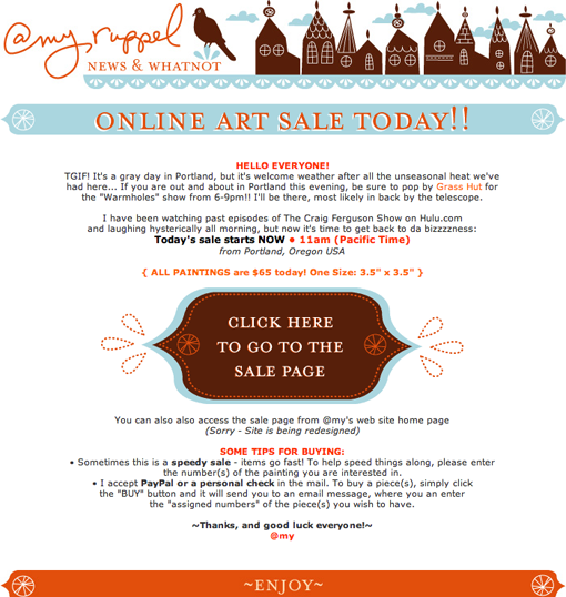
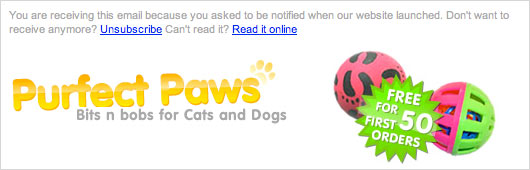
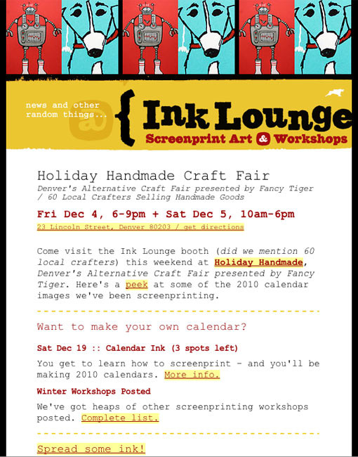
People might forget actually asking to receive your email, particularly if they don’t send emails very often or signed up as a result of entering a competition. A short message at the top of your email will help people remember and make them more likely to read on. Here’s an example of a well–executed permission reminder:
In this case, the recipient gets an explicit reminder of the time and the place they gave their permission. Following up soon after the sign–up also ensures that the recipient doesn’t forget.
In 2006, Return Path conducted a survey that showed that “knowing and trusting the sender” was the biggest factor in whether recipients opened an email, so avoiding complaints of spam isn’t good enough.
3. Focus on Relevance
Even if you have met your legal obligations and have the explicit permission of your recipients, they don’t necessarily want to read your emails. Have you ever agreed to receive “special discounts” on an item, only to be bombarded by endless advertisements for different items from the same company? Sending valuable, relevant information to your subscribers is vital. You might not want to send information to everyone on your list just because you can. Consider carefully whether the information is useful to them and what they expect from you.
ISPs and email providers now consider relevance in their definition of spam, giving you even more incentive to focus on relevance.
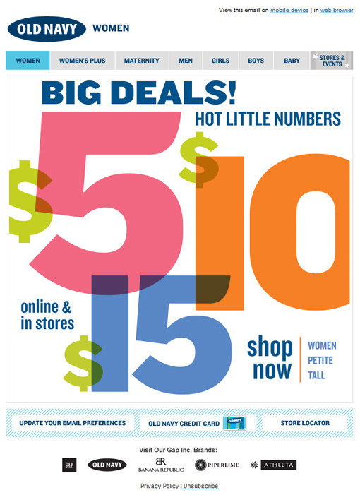
4. Design With a Goal in Mind, So That You’ll Know If It Worked
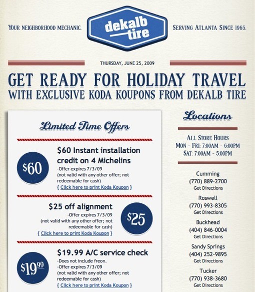
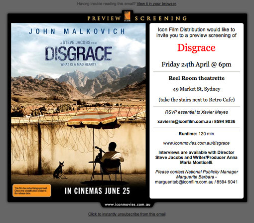
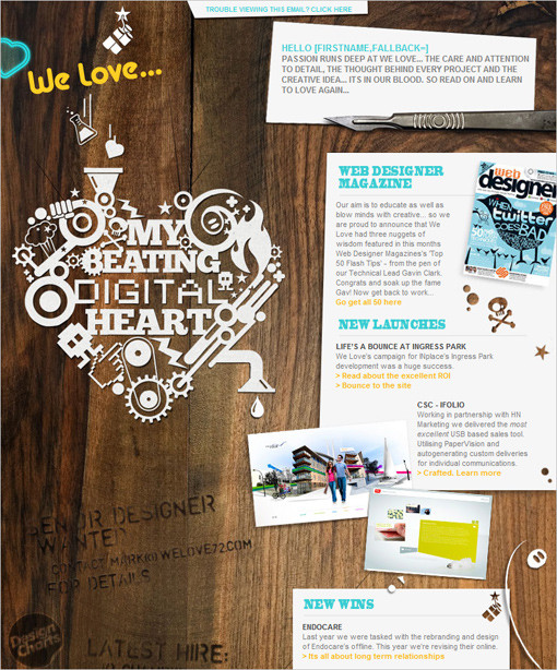
Approach newsletter design as you would a website. Know why you’re sending the email and what result you want to achieve. We’ll cover this in more detail in the planning section below. The email below makes it very obvious what action its authors would like their subscribers to take:
Sit down with your client or boss and ask them plainly, “What is the one thing you want people to do when they get this email?” You might have to force them to pick only one to begin with! Designing to meet 10 different goals is hard, but you can design to support just 1 or 2. As we’ll discuss later, you can measure whether you’ve reached your goal in plenty of ways.
5. Make Unsubscribing Easy
We’re all tempted to hide the dull disclaimers and terms and conditions in Tiny Gray Font Land at the bottom of the page, but putting the “Unsubscribe” link there is a bad idea. There’s no point in emailing people who are not interested in your content any more. If your content is no longer relevant to them, let them unsubscribe easily. Making it hard will likely only lead to complaints of spam and leave people with a bad impression of your company.
Much better to make it clear and prominent; that way, if they decide in future that they would like to receive the information you’re offering, they will be confident in signing up.
It doesn’t have to be boring either. One of my favorites is, “You can unsubscribe instantly, but if you do we may scream, cry and then call you at 2:00 am begging you to come back. It’s your choice.” Not appropriate for every client, but you can have fun with more casual emails.
6. Code Like It’s 1999 (Literally) and Use Inline CSS
While most of us have put down our tools of trade from the browser wars, the fight goes on in the jungles of the email client, like those soldiers who don’t find out about the peace treaty until decades later.
Instead of a handful of browsers, we find more than a dozen major email clients, with HTML and CSS rendering ranging from great to appalling. So, to get decent results across a lot of clients, we’re back to using structural tables. Joy! Read on for tips and tricks to make coding the HTML and CSS in your design a not entirely frustrating experience.
Some email clients strip CSS out of the head but leave style blocks in the body (as invalid as this is). Gmail goes further and strips out all CSS from the head and body but leaves inline styling.
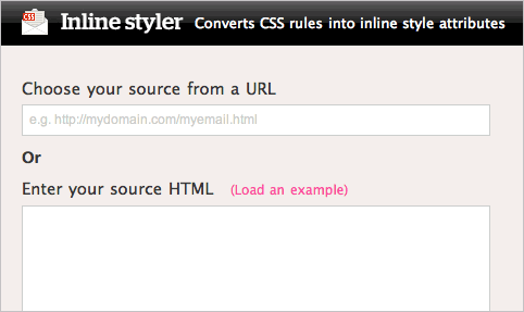
So, once you’ve completed your design, you will need to go through and add inline styles to your elements. Some email services help you with this; or you could use Premailer. You can also use some nifty tools for CSS inline styling, such as The Automatic CSS Inliner Tool or Inline Styler] — the latter converts CSS rules into inline style attributes.
7. Always Include a Plain Text Version
Some people just don’t like HTML in their emails. They might be using older systems, or their system is locked down and they just can’t view HTML. Provide a plain text alternative to every email, so that the reader’s own email server or program can choose which version to display.
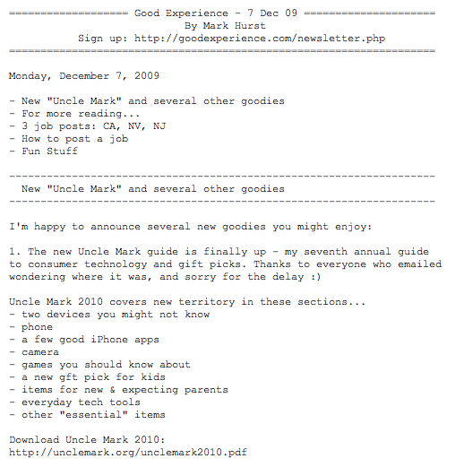
Again, your email service probably provides that capability. Plain text can be hard to read, so spend some time making it scannable and useful. Here is a recent example from Mark Hurst at Good Experience:
8. Don’t Assume That Images Will Be Viewed
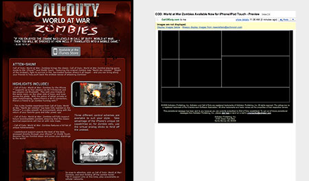
If you have used Outlook or Gmail, you’ve seen that “Images in this email are not displayed” message many times. In many of the major email clients, your images will not be shown by default. Readers have to click a link or button to download and display them. Here is a recent email we saw. On the left is the intended design (well, the top half of it), and on the right is how it appears in Gmail by default. Not exactly clear!
You may be able to work around this with some types of embedded images, but they have their own issues, too. No matter how perfect your images are, they may have no impact, or even a negative impact, on the success of your email.
If your client insists on a pixel–perfect design, an all–image email may seem like a good option. But if images are not shown to the user, and they see no text, all they’ll get is a big fat annoying blank message. Always ensure that your email has HTML text as well as plain text. Many people might not realize they can choose to show images, and some just won’t bother. So you can’t assume that people will actually see your images at all. For a full rundown on what the default settings of each email client are, check out current conditions in image blocking.
How do you work around this? Here are a few ideas:
- Avoid images for important content such as headlines, links and calls to action.
- Add a prominent text–based link to a Web version of your newsletter.
- Get recipients to add you to their address book or whitelist.
- Use the
altattribute for all images to give Gmail users a better experience. - Specify height and width for images to ensure that the blank placeholders don’t throw your design off.
- Test your design with images turned off before sending.
9. Follow the Law
Review any relevant commercial email regulations for your country. The best known of course are the US CAN–SPAM laws, but there are many others.
You might need to include a physical building address in your email or include something like “[advertisement]” in your subject line. Many email marketing tools help you build templates with these required elements, to ensure your client does not send out emails without them.
Even though you may not be at risk for the largest CAN-SPAM fine ever, you could easily get into trouble with your email service if recipients complain and you have not adhered to the law. Legitimate providers have little tolerance for people who send emails that don’t meet legal requirements and could close your account or blacklist your server.
10. Test Everything Before Sending, Because You Can’t Take It Back
While reviewing current email client standards is a great start, nothing beats actually testing a newsletter in as many clients as possible. Several services help with design and spam testing, and the service you use may already have this built in. Make sure every link is working and that any personalization appears as expected. We always spot problems two seconds after hitting “Send,” so send some test emails to people who can give you feedback, and save yourself the despair of sender’s regret.
Tips, Tricks And Resources To Build Your Email
Though harder to find than general advice on Web design, plenty of help is available online for building a successful newsletter. Over at the excellent 24 Ways, Dave Greiner has a great list of technical tips and tricks that is worth reading in full (the comments, too). Here are a few of the best tips:
- Use tables for structure, instead of CSS.
- Nested tables are more reliable than padding and margins.
- Avoid CSS shorthand. (Use full definitions.)
- Don’t use PNG images because Lotus Notes 6 and 7 do not show them.
- Explicitly set a margin for every paragraph, because the defaults vary a lot.
Read the “Rock Solid HTML Emails” article for all of the tips and follow-up comments. Your next step should be to bookmark the following links and save a bunch of time (and maybe your hairline, too).
HTML email templates and design galleries:
- Free email templates from SendPulse
- Themeforest templates
- Free templates from MailChimp
- Campaign Monitor gallery of great designs
- Beautiful Email Newsletters Gallery
- Inspirational Newsletter Designs: Flickr Set A collection of beautiful and creative layouts collected by Damian Madray.
Campaign Monitor’s research on HTML rendering in email clients:
Testing tool:
When you’re sick of dealing with problems…
Planning for Email Newsletters
We’ve covered some of the big design and technical factors that make HTML email a unique challenge, and this might be all you need. Designing is not about lumping together HTML, CSS and a few images, though. It’s about solving problems, and email newsletters require planning, just like websites. Building an email is technically tricky but not impossible.
Building a newsletter that actually achieves its purpose is a different thing entirely. Your client (or boss) is paying you not so much to “design” as to help them sell more products, get more donations or win back clients.
If you don’t understand what an email is for, you won’t be able to give it the best design, unless it’s by accident. Here are a few questions to ask your client before putting mouse to pixel.
- Who are you sending these emails to?
- What is your main reason for sending these emails? (To drive sales? Build a relationship with subscribers? Start conversations?)
- What type of emails are you planning to send?
- What type of content do you want to send?
- How often do you want to send emails?
- Would you like to match the emails to an existing visual design?
- Do you have examples of other emails that you like?
With answers in hand, you can set some measurable goals. One measurable goal might be to “Get 10% of subscribers to click through to the sales page,” or “Get the email forwarded to at least 100 new people this month.”
Keeping these goals at the front of your mind as you layout the newsletter changes the way you design. Suddenly you have something to help prioritize the content and a standard for deciding what stays in and what’s left out.
The work really begins once you actually send the email and can start measuring results against previous efforts.
Measuring the Success of Your Newsletter
Once you’ve set one or more goals, you’ll need to set up tools and processes to determine whether those goals have been met.
These might include sales figures from a particular department, reports from your email service provider or analytics from the website. If you use a specialized email sending service (such as Campaign Monitor, which is the one I use), you’ll get plenty of information in your reports.
Some common metrics:
- Open rates = How many of those who received your email actually read it.
- Click rates = How many of those who opened the email clicked a link.
- Forwards = If your software has a “Send to friend” function, you can see how many people used it.
- Unsubscribes = How many people have unsubscribed from your newsletter.
- Conversion rate = How many of those who clicked through to your website went on to buy your product, download a trial or perform some other trackable action. Software such as Google Analytics can be used to record such actions and connect them to their source, including if it was your email campaign.
Statistics from one campaign are hard to interpret. For example, what is a good click–through rate for your particular audience? That’s very hard to know. When you send your next newsletter out to that same audience, you’ll have something to compare it to, and you’ll know whether you’re getting better.
You can use those statistics and metrics to persuade your client to listen to your proposals. If a picture is worth a thousand words, then a graph showing a solid climb in click–through rates is worth at least 3,000 words and a cup of coffee.
Make a change, test the result, make another change and then test again. If your software supports A/B testing, then you can easily compare two subject lines or pieces of content in a single campaign and save yourself a lot of time.
Learn More About Email Marketing
Once you have the newsletter down, you may be interested in learning more about how email marketing works. Adding email marketing as a service to your own Web design business or freelancing skill set could really pay off. Convincing clients to pay a fair rate for design can be tough, but email marketing is much more easily measurable. If you can show your client that they are making x amount of money from each email, charging them accordingly isn’t so hard.
Here are some of my favorite email marketing websites to get you started:
- BeRelevant! Blog
- Email Marketing Voodoo
- The Retail Email Blog
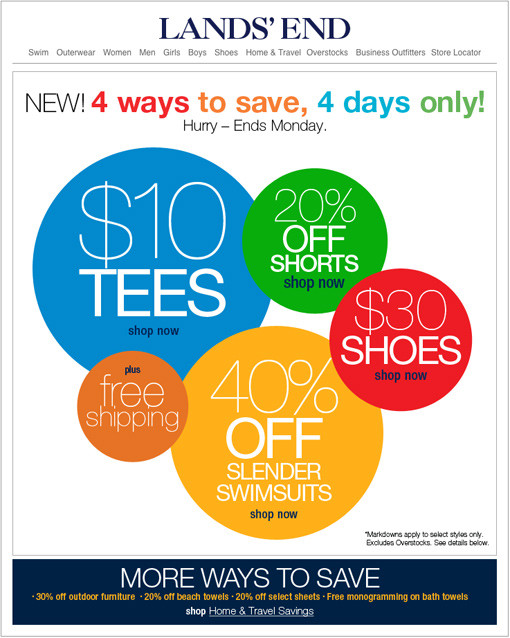
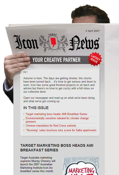
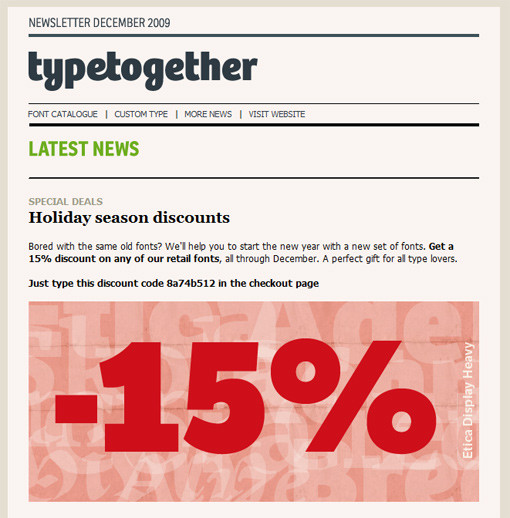
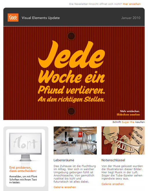
Instant Inspiration For Your Email Campaigns
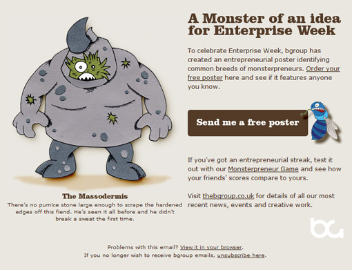
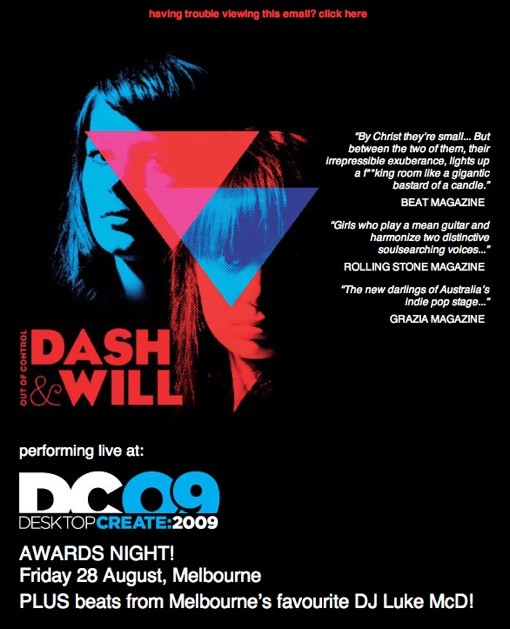
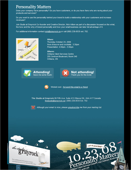
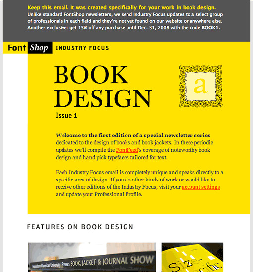
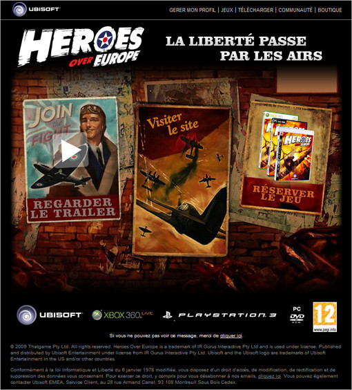
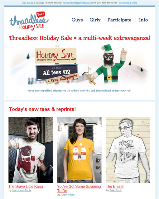
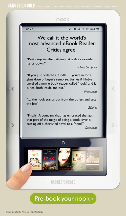
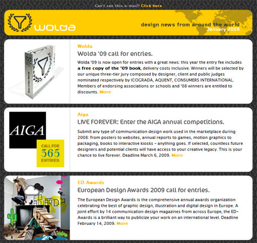
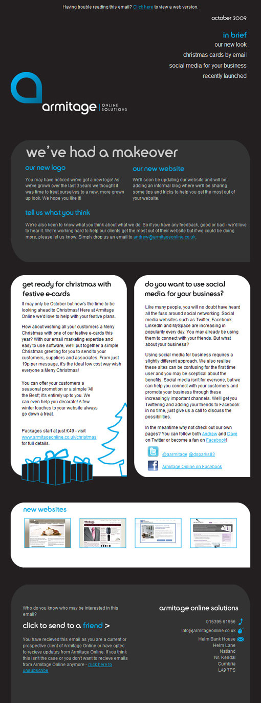
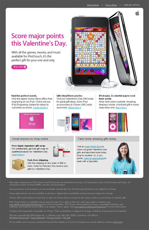
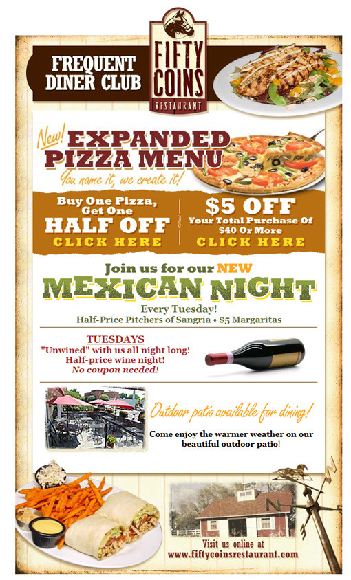
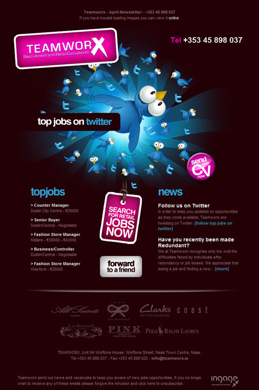
Here are just a few top–class HTML email designs, selected from the Campaign Monitor customer gallery and other sources. Use these to spark your own ideas; but remember, they belong to the original designers and clients and so are not for copying. Click each image to view the gallery entry and full email. Please notice that some of the designs featured below were selected not by the authors of this article, but by the Smashing Editorial team.


Get Out There And Do It
The next time your client asks you to design an email newsletter, you’ll have all the tools required to do a great job. Even if you don’t personally like HTML email, you’ll be in a position to give every one of their subscribers a helpful and readable newsletter.
Either we step up and get it done or the marketing team, armed with a CD of 10,000 clip–art images, will do the job for us… and we all know how that ends up. If you have any questions or comments, leave a comment below; I’ll address as many as I can.
Further Reading on SmashingMag:
- Email Newsletter Design: Guidelines And Examples
- Typographic Patterns In HTML Email Newsletter Design
- What 22 Billion Newsletters Tell Us About Designing For Mobile Email
- Useful Web Design E-Mail Newsletters


