35 Beautiful E-Commerce Websites

Advertisement

Despite any financial recession and economic stress, online purchasing continues to grow. Expansion of the market and evolving technology that simplifies our daily lives help to set the pace of e-commerce design. Customers want the shopping process to be quick and easy, and merchants want to increase sales by making their stores attractive and popular. Thus, e-commerce design tends to combine a look and usability that is at once unique and eye-catching. In this post, we showcase 35 attractive online store designs.

One of the trends we observed from this collection is a minimalist design style. Small details and accents (e.g. unobtrusive background patterns, icons, pictograms and typography) reflect a brand’s spirit and match the character of its products. Some websites, though, are unconventional, rich in visual effects. Please note that the selection of stores featured in this showcase was based more on design aesthetics than usability. But we made sure that the websites included here provide at least an easy shopping experience, even for foreign visitors.

Showcase of Beautiful Online Store Designs

Blik
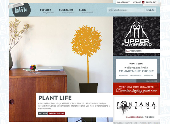
Blik manufactures whimsical removable graphics to spice up the walls of your home. Even though the “About” info gets a bit lost in the large product preview in the center, getting an idea of what Blik is all about doesn’t take longer than a couple of seconds. Aside from the stylish look, the easy shopping experience is what makes this design exquisite: all products are categorized by tags, the thumbnails are big, product descriptions are detailed and supported by decal outlines, and quick tips are placed here and there for maximum assurance. Vintage-looking faded colors and rotating logo add considerably to the elegance.

blik

Fred Perry
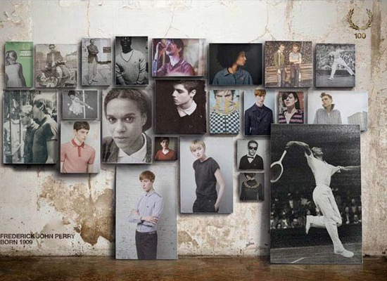
Fred Perry’s e-commerce store has a contemporary and elegant look, conveying key features of the brand very well. The stylish grayscale color scheme, along with sparse text in Helvetica font, make an impact. The design naturally combines Flash and JavaScript. The mini-cart window, the readable layout of the shopping cart and checkout pages, the usable navigation and informative product descriptions all up to a slick and friendly shopping experience.

fred-perry

Nectar
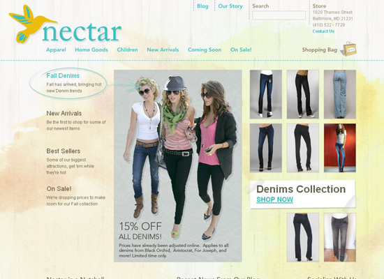
The website for clothing and accessories boutique Nectar was designed by Sunrise Design studio. The website’s structure allows you to browse goods and make purchases with ease. A muted palette and slipshod watercolor strokes in the background give the layout a positive feel. By the way, if you visit the designers’ portfolio page, you’ll see that painted styles must be their passion.

nectar

Tommy Hilfiger
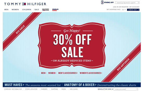
Another giant brand: Tommy Hilfiger. This design relies on simplicity, a comfortable shopping experience and its corporate identity.

tommy-hilfiger

Seibei
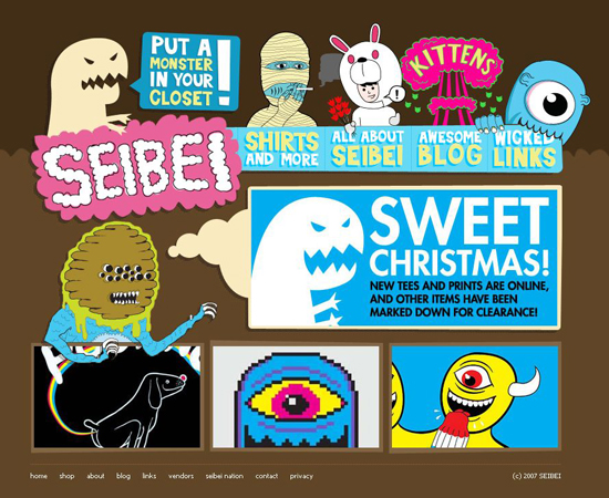
Now, that’s a design you will not forget! The site has a very simple, even minimal navigation combined with a striking “cartoonish” design. Product pages are clean and straightforward. Nice and unique design solution.

seibei

Bellyshades
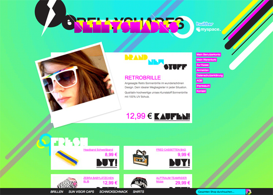
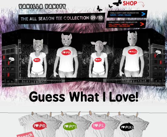
The design of German club-wear and accessories store Bellyshades stands out for sure. The vibrant acid colors, insane typography and animals that stand in for shopping carts will leave you anything but cold.

bellyshades

Ten Little Monkeys
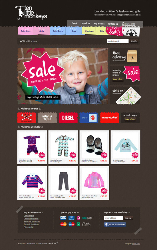
This design has a very strong visual appeal; vibrant colors work well on the dark background, the navigation is colorful yet intuitive (notice how the section for girls and boys are distinguished). Also, the choice of typography is appropriate for the shop’s main objective: selling branded children’s fashion and gifts.

kinky-micks

DogCollars.ca
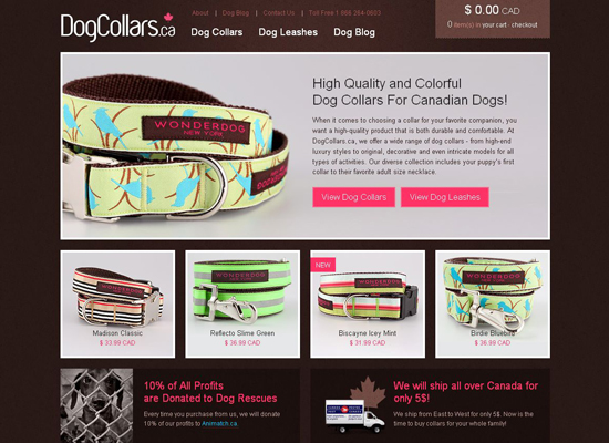
Here’s another beautiful e-commerce website: DogCollars.ca. It’s a simple HTML website with a neat grid-based layout, a warm chocolate color and big high-quality thumbnails. The design is minimalist but not plain, and it delivers a satisfying shopping experience.

dog-collars

’47
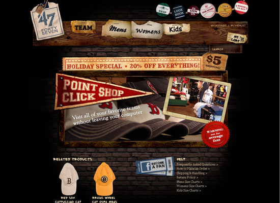
Premium sports apparel brand ’47 has an interesting history: “This is a classic story. It’s the American dream come to life…” Thus, the company emphasizes the individuality of its brand in its store design and associates that brand with a community. The website combines jQuery and Flash, which slows the loading speed, but given its objective, this is not critical. Creative visualization and a well-implemented shopping mechanism make for a wonderful e-commerce design.

'47

Storyville Coffee Company
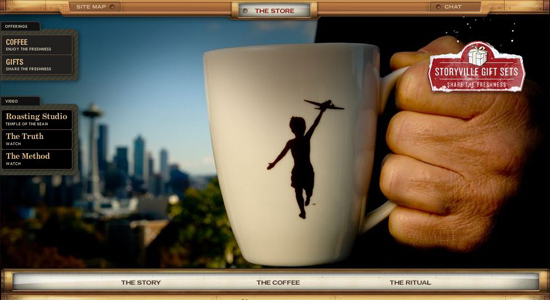
Creating an e-commerce Flash platform, let alone a good one, is challenging. In addition to the Converse store profiled above, our showcase includes another fully Flash-based online store: Storyville Coffee Company. This one sports a pleasant coffee theme (appropriately enough), an original table-like product viewing area and an easy shopping process.

storyville

Narwhal Co.
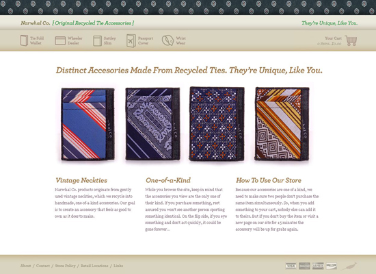
Accessories made from recycled ties? Yes! Narwhal Co. produces original jazzy merchandise from recycled ties, including wallets, wrist wear, covers and cases.  The tie theme in the website’s header and footer, the stylish icons and the inventive product slideshow on the main page give this design a special flavor.

narwhal

The Famous 4th Street Cookie
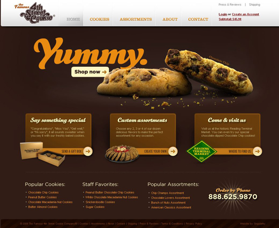
Beautiful typography and high-quality images make this a tasty design.

famous-cookies

Via Snella
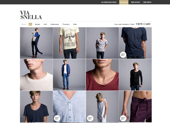
The website of Swedish male fashion brand Via Snella is clean both in design and usability. The store itself is not very big, so the product gallery is not cluttered with the superfluous navigation bars, announcements and slideshows that are typical of large comprehensive online stores. Instead, the background of the fancy product thumbnail grid is made up of a classic black and white scheme, along with austere typography and plenty of white space.

via-snella

Twelve South
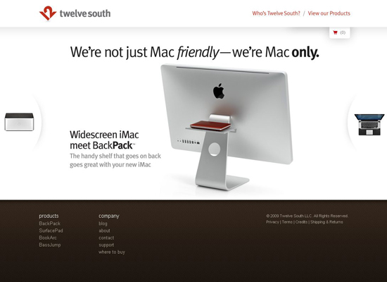
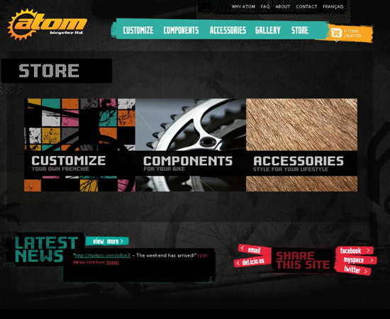
Twelve South creates accessories exclusively for Apple computers. No wonder Apple’s style can be felt both visually and in the functionality, which is a compliment enough to Twelve South’s store design.

twelve-south

Godiva
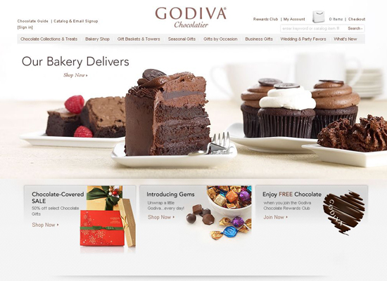
High-quality food photography against a light minimalist background is quite effective for Godiva Chocolatier’s store design. Seeing those yummies on the main page is all it takes to hook you. Tons of products are available here, but the sophisticated navigation system and clean layout make shopping a comfortable experience. The shopping cart and checkout pages adhere to principal usability standards.

godiva

Marc Hansen’s Comic Book
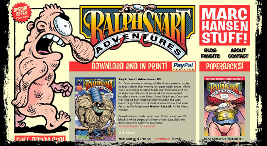
An original, striking and beautiful design that perfectly sets the atmosphere and communicate the style of the designer and his main product – a comic book.

ralph-snart-comics

Vanilla Vanity
Now, that’s a weird web design. The products offered in the shop are just as weird, by the way. An original, unique design which deserves a spot in this showcase.

vanilla-vanity

Atom Bicycles
A very simple, clean and stylish design with unusual navigation and good-looking product pages.

atom-bicycles

Converse
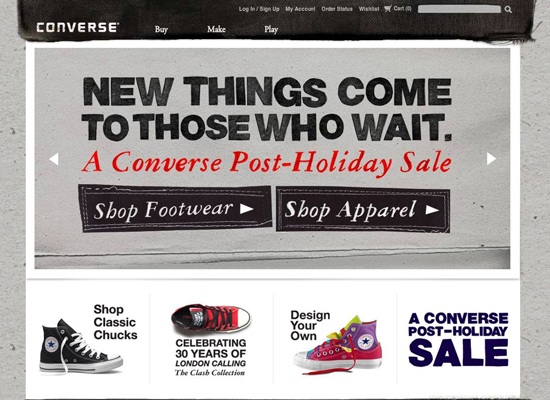
One would expect a great design from top-class brand Converse. Our expectations are met. Despite being entirely Flash-based, Converse’s online store is quick to load and easy to navigate. We see no heavy graphics or fancy Flash transitions here. Converse’s brand is communicated well by means of simple effects, including concrete and jeans textures, hand-drawn product selection frames and grungy graphics. The buying process is similar to the famous sneakers themselves: comfortable and painless.

converse

Steve & Co.
Aside from its refined and clean appearance, the website for leather accessories store Steve & Co. is remarkably usable. For instance, the whole shopping process requires little jumping around: you can browse and preview products, add them to the cart and review purchases without reloading the page.

steve&co

iWorkwear.nl
This design has plenty of white space, making the black and yellow scheme especially appealing. There is no visual appeal, but the site works very nicely and it is very user-friendly. Even if you don’t speak Dutch, getting your bearings on iWorkwear.nl is easy because of the intuitive placement and highlighting of elements. A transparent table of brands sold in the right sidebar helps us easily find clothing without having to use the main navigation panel, which is in Dutch.

iworkwear.nl

Sony Style USA
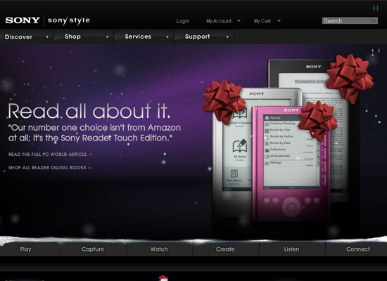
Sony Style USA is a pearl in our collection. It would be hard to find a more comprehensive, sophisticated and seamlessly designed e-commerce website. If you are looking to buy a laptop, you can read exhaustive product overviews, compare and browse reviews of similar products and even configure the computer you’ve selected, all without leaving the website. Even with the variety of products, the store is well organized and easy to navigate. The dark and light colors, along with the Flash and jQuery, perfectly fit this online store.

sony-style

Abel & Cole
The spirit of a small, environmentally friendly neighborhood grocery store is well reflected in this design by means of charming sketches and hand-drawn typography.

abel&cole

Hollister Co.
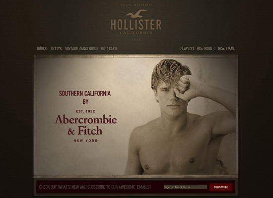
Hollister Co. sells Southern California-inspired casual wear. The store has a cool vintage style. Products are displayed horizontally; hover over an item to see its price and available colors without leaving the page. How usable! Warm sand colors and sepia-toned beach photos reflect the “SoCal” spirit of the brand. And we sure like those “Dudes” and “Bettys” categories!

hollister

Gargyle
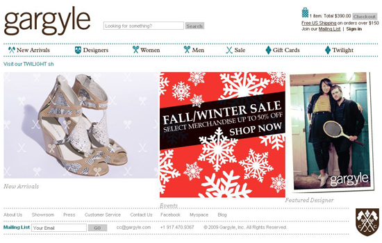
Gargyle online warehouse website is simple yet cute. Blue dotted lines and lovely icons wonderfully reflect the old country-club lifestyle that Gargyle that aspires to.

gargyle

Giraffe
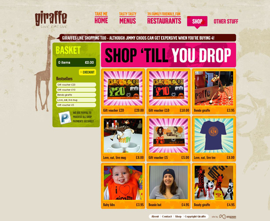
A colorful design for young families and children. The design perfectly sets the atmosphere for the shopping experience. Notice how well PayPal-payment is communicated.

giraffe

farfetch.com
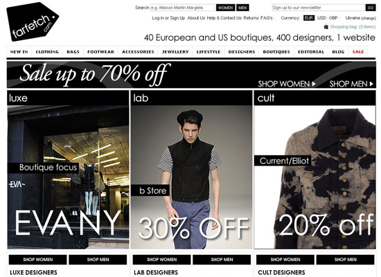
Well-known fashion boutique farfetch.com has an elegant black-and-white design. Nothing gets in the way of a pleasing shopping experience here. The auto-detection of your location and currency are stylish features.

farfetch

Winestore
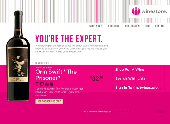
Everything here is about elegance, style and creativity. Vibrant pink against a white background makes for a vivid yet clean website. Beautiful typography and the “bar code” header complement the company’s image well. Pictograms with information about the wines’ color, body and flavor are a smart addition.

winestore

Ork Posters!
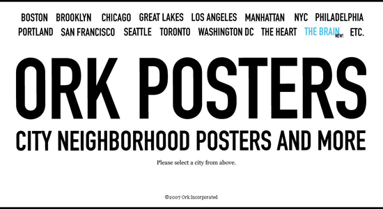
This one will interest all those who love typography, print design and data visualization. Ork Posters is the brainchild of Jenny Beorkrem, whose original typographic neighborhood posters quickly became a success. The online store is nothing short of a manifesto of typography love.

ork-posters

laPatate
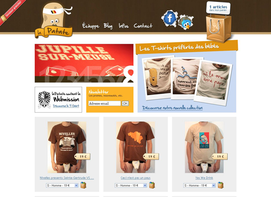
Belgian t-shirt store laPatate has a creative and funny design (the men’s tee samples enjoy the lion’s share of laughs). The website is available in French only, but clear cart icons and a standard check-out page make for an intuitive shopping environment.

lapatate

Snupped
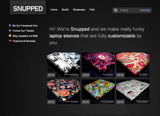
Snupped is a nice dark-themed store that sells laptop sleeves. You can buy pre-made sleeves or build your own design, configuring the size and choosing from a number of funky patterns. The products are not tagged or grouped into categories, but this is hardly an oversight given the store’s small size.

snupped

Cellarthief
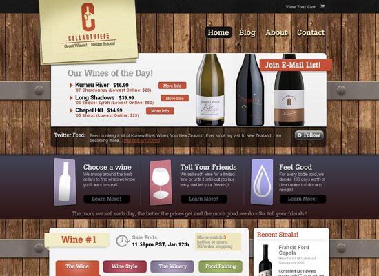
Cellarthief is a beautiful online wine store that sells only three wines at a time. The Apple.com-inspired content blocks against the real-looking wood background shows how the classic spirit of the wine industry is fused with modern design values.

cellarthief

Harry Winston
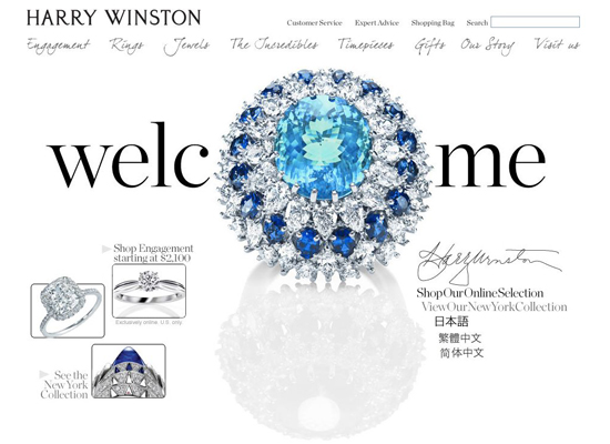
A lot of glamour, shine and luxury is in this one. Harry Winston’s jewelry store features an amazing design with images that mix typography and jewelry.

harry-winston

Olive & Myrtle
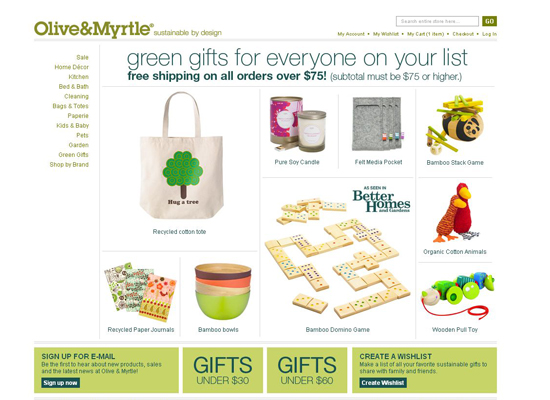
Olive & Myrtle produces beautiful sustainably developed goodies. A clear layout, soft natural colors and subtle typography make this website look modern and eco-friendly.

olive&myrtle

Hokey Croquis

hokey-croquis

CuCuu
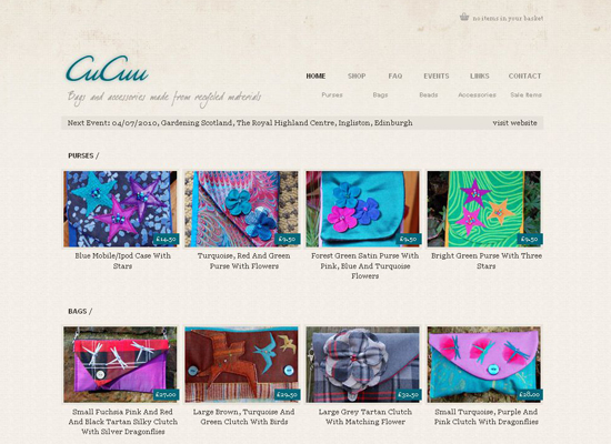
CuCuu is a charming little store that sells bags and accessories made from recycled materials. The design is minimalist and the shopping experience simple.

cucuu

Teez
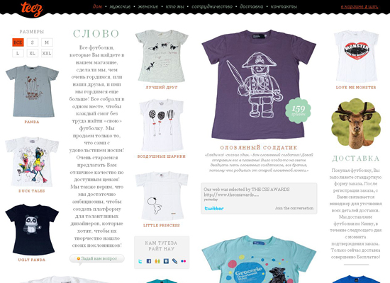
Rules and standards are made to be broken from time to time. You don’t have to speak Russian to tell that the design of Ukrainian t-shirt store Teez is far from ordinary. A chaotic mash of text and images is obviously a new trend in Web design. Despite all of this, the shop looks and feels pretty darn awesome. Take a minute to explore the website and you’ll see how easy it is to shop there. Off-the-chart creativity!

teez

Kinki Micks
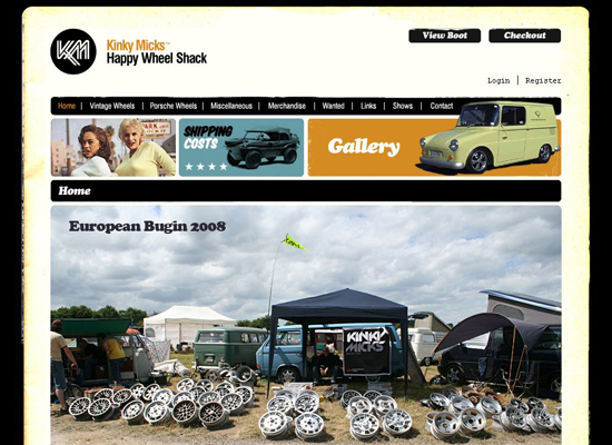
This small store sells exclusive car wheels and vintage riding accessories. The design has a simple retro style that perfectly fits the company’s profile.

kinky-micks

Red Is White
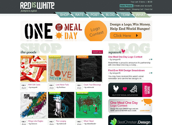
Red Is White’s design is bright, and the shopping process is pretty solid (the power of inspirational Web design in practice!). A carefully arranged grid, unobtrusive colors and a smooth corduroy-looking texture make the website visually eye-catching, yet they do not eclipse the products. The way the t-shirt thumbnails are displayed is quite handy: just roll over an image of a print to see how it looks on a model.

red-is-white

Related posts

You may be interested in the following related posts:

(al)

Julia May is a freelance writer now working with FlashMint, the top-class provider of Flash templates.

  1. 1

    I can’t be the only one who thought that the logo on the “Wine Store” site was the Rebel Legion at first glance?

    +3
    • 2

      I scanned through this post and missed it… but after you pointed it out and I went back I was shocked!! That’s so hilarious!

      0
    • 3

      Larry Marburger

      March 1st, 2010 7:32 am

      Having worked on the site, I can tell you it was a running joke. Another design shop created their branding and I think it was accidental (or at least subconscious), but the Winestore guys are well aware and embrace their geek culture.

      0
  2. 4

    The bottom navigation on the Hilfiger site is screwy for me, but still a nice looking site.

    0
    • 5

      The most I liked about Hilfiger site is how fast you can checkout. you should really try it out. real cool. about look yeh, they should do something.. I agree

      0
  3. 6

    They’re beautiful.

    0
  4. 7

    I really get impressed for the way you show us all these great stuff. I really like the way you research things in order to share with us. Thanks!

    0
  5. 8

    Chris Luckhardt

    January 22nd, 2010 9:24 am

    Fantastic collection! I’m starting to build an eCommerce website with Drupal, so this article will come in handy.

    0
  6. 9

    Excellent article! I posted a similar one just yesterday!

    20 Gorgeous Examples of E-Commerce Done Right
    http://designshack.co.uk/articles/inspiration/20-gorgeous-examples-of-e-commerce-done-right

    0
  7. 10

    Looks like Teez stole the JavaScript they use to layout their page directly from SpaceCollective:

    spacecollective.org/gallery/

    vs.

    teez.com.ua/

    View Source and click the layout JavaScript files.

    0
    • 11

      Thanks for noticing! Got that from coder freelancer not the guy who made the rest of the coding for this project. We should re-write that as soon as possible. Crap! We were inspired by Spacecollective layout and similar to that, that is true, still we didnt know the javascript was the same:( We are designers company:-) Thank you one more time.

      0
    • 12

      John, we fixed that. Replaced with our own script. Look like working even faster:) Not very pleasant situation, hope we reacted enough quickly.

      0
    • 14

      We are not responsible for what these guys are selling. Contact them through site. But this kind of re-sell is popular in Ukraine and Russia. This site do not say its exlusive designs, its a re-selling mostly. It’s eastern Europe reality

      0
  8. 15

    Inspiring collection, thank you.

    0
  9. 16

    These are attractive designs, but I don’t really see how they’re ‘effective’. Where ‘effective’ counts in e-commerce is within the objective metrics such as conversion rate, AOV, etc., so who’s to say if these are any more effective than more conventional designs.

    +1
  10. 18

    “Effective.”

    What’s the criteria? Are they making money hand over fist? For all we know half these sites could be out of business one year from now, which renders the prettiness of their site designs moot.

    When designing for e-commerce you need to consider a lot more than the aesthetics or high-level navigation of a site. You look at the most effective e-commerce sites out there, and they do vigorous A/B or multivariate testing to ensure that people can get the information they need to make decisions about purchases, and then can actually purchase those. You can catch a lot of problems by usability testing sites before launch. Other problems will simply be mitigated by following established e-commerce design patterns. Of course, good prices, high value, quality products, and market demand help tremendously.

    In my opinion, some of the designs showcased above, while pretty, do a disservice to their businesses. Fred Perry – why the splash page? Are you not confident enough in your overall branding? Kinky Micks – what the hell is a “boot” in the context of your shopping experience? Harry Winston – all your text is rendered as graphics. Do you expect people to find you in Google? Also, what if I want to find a diamond ring by carat, cut, clarity, or color? Etc. Etc.

    Others look great and seems to offer a good shopping experience.

    But how do we know unless we can see inside their books?

    +2
  11. 22

    I must say HQ photos DO matter for e-retailer. A lot.

    +1
  12. 23

    Good points Kris. Also, I think target audience is greatly overlooked. You can call these inspired and trendy (except for the disco era retro throwback german site) but I don’t think they all follow what is most important: design is nothing without function when it comes to commerce. You can be as flashy and bright as you want, but if you don’t consider SEO, standards compliancy, usability, and target audience, your ecommerce site is worthless and depending on the customer demographic, you might be driving customers away. You wouldn’t believe how many are still using old browsers. Their money is just as valuable as someone running chrome. If you’re flashy site is broken in ie7, you’re losing money.

    +1
  13. 24

    Fantastic list of beautiful E-Commerce Websites.

    Thanks for sharing this!

    0
  14. 25

    Also, I think Bonobos.com should be on this list. Company was SUPER successful going on-line only and their website (design and usability) is by far one of the best. I always show my clients that are interested in E-Commerce that this is the way an E-Commerce site should be run.

    Also know the CEO of furniturebox.se personally and he tells me they are the 3-4th largest furniture store in SE by only selling online. Site is super easy to use and good use of imagery.

    -3
  15. 26

    This is a great list of e-commerce sites. Thanks for sharing. You should also check out http://www.canvaspop.com. They are another great e-commerce site that I have come across lately.

    -1
  16. 27

    Great list, I actually designed Ten Little Monkeys, really appreciate the mention as i’m sure they will.

    The design is largely based on the target market and their “little monkeys” it has been tweaked to make it more effective and they do ok in terms of sales.

    Thanks again,
    Darren

    -1
  17. 28

    Ya this is just another list of sites that half way look good….

    Please do not assume that these sites actually make a profit, are usable, have a good checkout funnel, great cart system, valuable seo, great site architecture, functional navigation and so on……

    To be brutaly honest you should kill the first 2 paragraphs and just have a line or 2 that says 35 eccomerce site that the author thinks is beautiful.

    Next time pick 5 of these sites and do a in-depth review on each site in the post.

    I am so so so tired of lists….

    -1
  18. 30

    Maybe next time you should talk about products pages rather than the homepage.

    It’s usually less impressive design-wise but for sure at least as much important.

    0
  19. 31

    I do hope that I’m not speaking some sort of design heresy here, but I have to say that to my eyes, half these sites feel and look unusable. The jewellery site, for example, may be a stunning example of macro photography used in an ecommerce situation, but the visual effect of the site is that each page is cluttered and the shapes lead the eye into ‘reading’ unfortunate words (look at the Gifts page – the first thing you *see* is ‘Goo’, you have to hunt for the ‘ifts’).

    The Hilfiger site, while it may be simple, doesn’t work – at least not in Safari on my Mac, where the garment choice rollovers update pictures for other products and not the one you’re interested in. It may be pretty when the page loads, but it’s hardly effective for the buyer.

    Perhaps it depends on one’s cultural background – I’m British, so perhaps my tastes are different in some sort of wholesale way to those from other areas in the world – and of course my impressions are wholly subjective, but I have to say that few of these examples really appealed to me, except perhaps Twelve South, which I loved. Maybe I’m a Mac and nearly all these examples are PCs!!!

    Having said all that, I love reading all the articles on SM… I’ve followed the site for about a year now and am constantly being inspired by it in my work.

    0
  20. 32

    Hello

    How about this original design: redgoblin.ro/?lang=en

    0
  21. 33

    Why does Hollister, a clothing company, have a picture of an unclothed guy on their homepage??

    0
  22. 34

    Stunning design, thanks for the compilation

    0
  23. 35

    Daniel Nordstrom

    January 23rd, 2010 1:43 pm

    Very nice post. Would be interesting to know which ecommerce solution they use. :)

    Personally, I like the simplicity of shoeguru.ca as well. It was mentioned in the article one of the previous commenters wrote, http://designshack.co.uk/articles/inspiration/20-gorgeous-examples-of-e-commerce-done-right.


    Daniel Nordstrom

    -1
  24. 36

    always provide inspiration in providing articles
    not one that the web has become an inspiration too

    -1
  25. 37

    This is why I have you as a favorite on my toolbar! You consistently gather beautiful design work that inspires! Thanks!

    -3
  26. 38

    Lisa [@soapboxdesign]

    January 24th, 2010 2:52 am

    My fav is http://www.simplygifts.com.au/ – but thats a lot to do with the things for sale :)

    -3
  27. 39

    Some very nice samples here, it’s also nice to see what e-commerce platforms they are using, nice to know which ones aren’t that hard to customise. some can be a real pain.

    another link i found lately is http://www.hardtofind.com.au it has some nice illustration work ;-)

    -1
  28. 40

    some are very unique and out of the box.

    thanks for sharing

    -1
  29. 41

    Id like to see more examples of unconventional ecommerce design, such as http://www.lazerian.co.uk/ – the way this is done is very clever, plus i want one of those dogs!! http://blog.lazerian.co.uk/?p=479

    -1
  30. 42
  31. 43

    And what do you think about this one?:
    http://www.tatatio.it
    Thanks!!!

    -1
  32. 44

    Really excellent e commerce themes. Thank you for this sharing. Free e commerce themes before I read his article I would like to read. celilcan.com/blog/Post/270/Ucretsiz-alisveris-scripti-temalari.aspx

    -3
  33. 45

    There sure are some beautiful e-commerce themes going on there! I found another one that I really really like which I think deserves a place on this list dubli.com

    -1
  34. 46

    Yes, beautiful and most make about $100 a year in sales. Don’t get me wrong, I think eye candy is nice, but the vast majority of ‘beautiful’ sites are those that don’t have enough business savvy behind them to make money. And in the end, what is the point of eCommerce if not to make money?

    -1
  35. 47

    This Hollister Site does look like a “somewhat rip off” of the Abercrombie & Fitch website. Specially when it comes to cart design and product showcase!

    To the one who thinks that why is there a clothless guy on the home page; guess just because A&F also have it!

    https://www.hollisterco.com/

    &
    http://abercrombie.com/

    0
    • 48

      Abercrombie & Fitch, Hollister, and abercrombie (the kids brand) are all owned by the same company, so it would make sense that their web presence is similar. They used to have a brand called Ruehl but closed it due to poor performance.

      0
  36. 49

    http://teez.com.ua/medved-vsupermarkete.html vs. http://www.threadless.com/product/1883/Bear_Market

    I’d really like to know what’s the story behind copying the designs.

    -1
    • 50

      I suppose you are referring to the T-shirt design and not the web design as these are no where near the same. These two retailers buy products from the same manufacturer and just happen to show the same shirt design on their pages. I see absolutely nothing wrong with that. Thousands of websites show the same product on their pages. It’s what they sell. It can’t be helped.

      -1
  37. 51

    Good list of ecommerce sites. There also is a good ecommerce gallery called CartCraze that is updated daily. http://cartcraze.com

    -1
  38. 52

    Check out http://www.meadowweb.com blew my mind first time..
    In the grunge theme but matches their goods really good

    -1
  39. 53

    The design of http://narwhalcompany.com/ is both beautiful and practical in terms of showcasing their unique goods. Go to the page b/c it must be experienced — the still life of the home page just doesn’t do it justice!

    -1
  40. 54

    I would like to add the brand new

    http://store.valentino.com

    have a look at the ZOOM of the product… impressive.

    L.

    -1
  41. 55

    i donot see design from indonesia..

    but i really like http://www.steveandco.com/

    I am not so creative like you are !

    0
    • 56

      This Steveandco is without a doubt one of the most effective.

      It is really good! Quite better than the one mentioned above!

      0
  42. 57

    I love these posts, great inspiration and it’s nice to see design from other sectors of web design other than portfolios or company sites.

    Has anyone seen the http://www.iheartmugs.com site? Very simple but a clever idea!

    0
  43. 58

    Some really nice designs. Wonder how much it cost them to do these. Probably done by some high end designers. Here’s a nice magento site on a budget: kimmyshop.com

    0
  44. 59

    Great post. Just started getting into Magento development and the flexability I think really allows for the ‘creative freedom’ where other platforms don’t. I personally think that the Admin needs some work (for the community edition) and some stuff just isn’t that intuitive. Either way, awesome platform, awesome designs: check out GreenSewn.com

    0
  45. 60

    Magento has really changed the face of online shopping. Its good to see some very nice designs. These guys in the UK have a growing portfolio: http://www.2bebrave.com/magento-commerce-showcase.html

    0
  46. 61

    The Beer Soap Company

    January 27th, 2010 6:59 am

    My fave is http://www.thebeersoapcompany.com, but then again I may be biased;)

    The collection of sites is really great though, I found a lot of sites I did not know about today. I love the colors, the content. Thanks for the great post.

    0
  47. 62

    I enjoyed this list. Each of the sites communicates the brand convincingly. I bet each site has a very high add to cart rate but I wouldn’t be surprised if many of them also have a very high cart abandonment rate. Maybe it’s a little less sexy, but it’s the most complicated aspect of ecommerce design — how to efficiently collect 30 pieces of information from the user and complete the sale. Of the sites on your list I thought that ’47 did this best. Does the next list focus on sites that do it right from add-to-cart to order confirmation?

    0
  48. 63
  49. 64

    Thank you for this very inspiring list!

    Although aesthetically they represent their brands (and presumably target markets) well, I would be keen to see how they convert in terms of sales.

    0
  50. 65

    One Word – WOW – unquestionable graphical brilliance at its best – again – WOW. My store JAMROCA is pretty within foetus stage (graphically) at the moment…

    0
  51. 66

    does anyone know what is the font used by bellyshades.de, the german electro acid coloured website….? thanks.

    0
  52. 67

    I’d also like to show you http://www.wristwatches.co.uk using the Magento solution with heavy customisation……some really nice features with simplistic navigation……get to any page in a max of 3 clicks….

    0
  53. 68

    I personally love getyubo.com/ which I believe is running on Bigcommerce. Such amazing use of color and simplicity – similar to what Apple does.

    0
  54. 69

    Great job! Excellent collection)) very useful!
    mantolama

    -1
  55. 70

    brilliant design. The simple ones inspired me for my future projects Thanx smashingmag for this.

    0
  56. 71

    im looking for nice and free ecommerce software, can anyone suggest something?

    0
  57. 72

    Just wanted to drop a line to let you know that your information and posts are “right on target.” Love the great job you guys do! Two thumbs up!

    0
  58. 73

    Very nice websites but could we have the names of the software used to design them or the compagnies names ? It will be useful.
    Thanks

    0
  59. 74

    Does anyone know what kind of Shopping Carts these people are using?

    0
  60. 75

    oh sexy websites, blik is cool for sure.

    ours should so be on this list, for real.

    http://www.endemicworld.com

    0
  61. 76

    the banner 47 site is horrible to navigate

    homageclothing.com should be up there

    0
  62. 77

    absolutely love the fred perry one and godiva is just absolute pleasure just staring at the screen, also loving dia-boutique.com

    0
  63. 78
  64. 79

    they should save the pretty pictures for magazine ads. I just want to shop.

    0
  65. 80

    It would really be great if the next list can name all of the designers and the software they used to design the site. If you have this, please post it. It’s helpful for those of us looking for web designers.
    This is a nice list…

    Thanks & God Bless!

    0
  66. 81

    I would like to add this site estore.opalclocks.com is this fine collection of ecommerce design.

    Site her has a very simple and elegant feel through out the site.

    0
  67. 82
  68. 83

    Nice collection of diverse sites.

    0
  69. 84

    Spider Office Chairs

    September 17th, 2010 1:38 am

    Great post. I like Ten Little Monkeys most. I would like to make my own Spider Office Chairs just like that. How can I do it? Can anyone suggest me for it.

    0
  70. 85

    Lots of good eCommerce website displayed here, interesting to see the creativity behind the sites.

    My fav is definitely: http://www.maplesyrupworld.com/ for simplicity, warmth and easy of use.

    +1
  71. 86

    This is a wonderful post although there were a few sites that weren’t that impressive in terms of design.

    Sony is a beautiful website, I’m excited to see that after all these years they can stay on top of demands. I included them in my recent Top 10 E-Commerce sites at: smack3.com/top-10-e-commerce-websites-4th-quarter-2010/

    Again, great post and keep’em comin’ You’re awesome Smashing Magazine!

    -2
  72. 87

    I am looking for a talented e commerce website developer. Anyone have any suggestions?

    0
  73. 89

    Excellent collection of the e commerce sites,
    really u doing a very great job good keep it up. thanks for the information

    +1
  74. 90

    awesome post. thx you.

    0
  75. 91

    What a fabulous post! Thanks so much for these, they will really help when I come to tweak and redesign my store in the future… see modcosmetics.co.uk

    0
  76. 92

    Hi,
    I am Exciting ADS. This blog give such vast information. Explain the fact of choice of chooses. This blog give such a great facts about shopping.
    I like to thank for give such a grand facts.
    Thanks
    Exciting ADS

    +1
  77. 93

    most of people don’t know how to design a website.
    cause I need to scroll like hell to read everything. it’s not a good design.
    they should allow us to read one by one and make a small menu bar which can be placed bottom of the article which briefly describes what’s that and a small pic.
    maybe can use javascript or css to describe them. like whenever someone hover the mouse pointer on it, the small image might be increased in size.

    0
  78. 94

    Terry Shelton

    March 27th, 2011 7:27 am

    Great job on this post. The sites you reviewed are very nice. I enjoyed this article very much.

    0
  79. 96

    Marcel Wasserman

    April 18th, 2011 10:26 pm

    I LOVE the Storyville Coffee Company site! If I can make a recommendation, http://crazysexycool.co.za/ is a tots cool site.

    0
  80. 97

    Wow. A cool bunch of websites in here. I was thinking of writing some kind of article like this one, might borrow a few from your list.

    0
  81. 98

    I have been with this site now for a few months, using it for eCommerce websites-now.net/

    0
  82. 99

    this is the way I like, E-Commerce website design should be easy but COOL, bluewiseonline.com

    0
  83. 100

    I love the collection, thanks for your effort. Thanks,

    0
  84. 101

    It would really be great if the next list can name all of the designers and the software they used to design the site. If you have this, please post it. It’s helpful for those of us looking for web designers.
    This is a nice list…

    0
  85. 102

    I find the content of this article interesting. I have grabbed enough ideas to build the ecommerce website I am contracted to build. I want to say thank you for gathering all these information that has saved me the stress of spending hours on the net searching for ideas.

    Patrick Enyia
    Senior Webmaster
    websolutionx.com

    0
  86. 103

    Charles Compton

    October 16th, 2011 8:33 pm

    Wanted to point out a new ecommerce site that’s launched recently – pretty clean design

    midtownrow.com

    0
  87. 104

    Not much info about gamification in eCommerce
    Here is a nice post about it :
    http://thejuniorpm.blogspot.com/2011/10/gamification-in-ecommerce.html

    Cheers!

    0
  88. 105

    My Problam is css with htnl layout design so plz suggest me.
    thanks & Regards

    0
  89. 106

    I like the valuable information you provide in your articles. I’ll bookmark your blog and check again here regularly. I am quite sure I’ll learn many new stuff right here! Best of luck for the next!

    0
  90. 107

    Norman Psychwell

    February 13th, 2012 9:33 pm

    It’s an outrage that BlamTees.com wasn’t mentioned. Their designs aren’t available on other sites like Threadless either. Regardless, all in all, the list was pretty top notch, you listed some of my favorite sites, and other interesting ones that I have never heard of. Also LOL about Hollister ripping off Abercrombie, when they’re the same company. Hilarious comments like that one are the reason I read these comments in the first place.

    +1
  91. 108

    Thanks for the amazing list, I really loved the ’47 design.

    +1
  1. 1

    I can’t be the only one who thought that the logo on the “Wine Store” site was the Rebel Legion at first glance?

    +3
  2. 2

    “Effective.”

    What’s the criteria? Are they making money hand over fist? For all we know half these sites could be out of business one year from now, which renders the prettiness of their site designs moot.

    When designing for e-commerce you need to consider a lot more than the aesthetics or high-level navigation of a site. You look at the most effective e-commerce sites out there, and they do vigorous A/B or multivariate testing to ensure that people can get the information they need to make decisions about purchases, and then can actually purchase those. You can catch a lot of problems by usability testing sites before launch. Other problems will simply be mitigated by following established e-commerce design patterns. Of course, good prices, high value, quality products, and market demand help tremendously.

    In my opinion, some of the designs showcased above, while pretty, do a disservice to their businesses. Fred Perry – why the splash page? Are you not confident enough in your overall branding? Kinky Micks – what the hell is a “boot” in the context of your shopping experience? Harry Winston – all your text is rendered as graphics. Do you expect people to find you in Google? Also, what if I want to find a diamond ring by carat, cut, clarity, or color? Etc. Etc.

    Others look great and seems to offer a good shopping experience.

    But how do we know unless we can see inside their books?

    +2
  3. 3

    Smashing Editorial

    January 22nd, 2010 11:46 am

    Kris, you are right. The title was updated.

    +2
  4. 4

    I must say HQ photos DO matter for e-retailer. A lot.

    +1
  5. 5

    These are attractive designs, but I don’t really see how they’re ‘effective’. Where ‘effective’ counts in e-commerce is within the objective metrics such as conversion rate, AOV, etc., so who’s to say if these are any more effective than more conventional designs.

    +1
  6. 6

    Good points Kris. Also, I think target audience is greatly overlooked. You can call these inspired and trendy (except for the disco era retro throwback german site) but I don’t think they all follow what is most important: design is nothing without function when it comes to commerce. You can be as flashy and bright as you want, but if you don’t consider SEO, standards compliancy, usability, and target audience, your ecommerce site is worthless and depending on the customer demographic, you might be driving customers away. You wouldn’t believe how many are still using old browsers. Their money is just as valuable as someone running chrome. If you’re flashy site is broken in ie7, you’re losing money.

    +1
  7. 7

    Lots of good eCommerce website displayed here, interesting to see the creativity behind the sites.

    My fav is definitely: http://www.maplesyrupworld.com/ for simplicity, warmth and easy of use.

    +1
  8. 8
  9. 9

    Excellent collection of the e commerce sites,
    really u doing a very great job good keep it up. thanks for the information

    +1
  10. 10

    Hi,
    I am Exciting ADS. This blog give such vast information. Explain the fact of choice of chooses. This blog give such a great facts about shopping.
    I like to thank for give such a grand facts.
    Thanks
    Exciting ADS

    +1
  11. 11

    Norman Psychwell

    February 13th, 2012 9:33 pm

    It’s an outrage that BlamTees.com wasn’t mentioned. Their designs aren’t available on other sites like Threadless either. Regardless, all in all, the list was pretty top notch, you listed some of my favorite sites, and other interesting ones that I have never heard of. Also LOL about Hollister ripping off Abercrombie, when they’re the same company. Hilarious comments like that one are the reason I read these comments in the first place.

    +1
  12. 12

    Thanks for the amazing list, I really loved the ’47 design.

    +1
  13. 13

    they beautiful and colorfull.Im impressed there way they are creative about their work.

    +1

Leave a Comment

Yay! You've decided to leave a comment. That's fantastic! Please keep in mind that comments are moderated and rel="nofollow" is in use. So, please do not use a spammy keyword or a domain as your name, or it will be deleted. Let's have a personal and meaningful conversation instead. Thanks for dropping by!

↑ Back to top