Color Theory For Designers, Part 2: Understanding Concepts And Color Terminology

Email Newsletter
Weekly tips on front-end & UX.
Trusted by 182,000+ folks.
 Register for Free
 Custom Web Forms for Angular, React, & Vue. Your backend.

 Celebrating 10 million developers
A thorough working knowledge of concepts like chroma, value, and saturation is key to creating your own awesome color palettes (which we’ll get to in Part 3). [Content update: August 2017]
In Part 1: The Meaning of Color of this color theory series, we covered the meanings of different colors. Here, we’ll go over the basics of what affects a given color, such as adding gray, white, or black to the pure hue, and its effect on a design (with examples).
How To Create Your Own Color Schemes
Let’s talk about creating your own color schemes, from scratch, covering the traditional color scheme patterns (monochrome, analogous, complementary, etc.), and others. Read a related article →
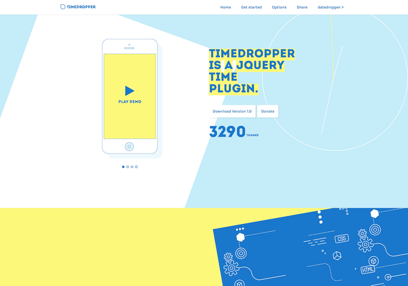
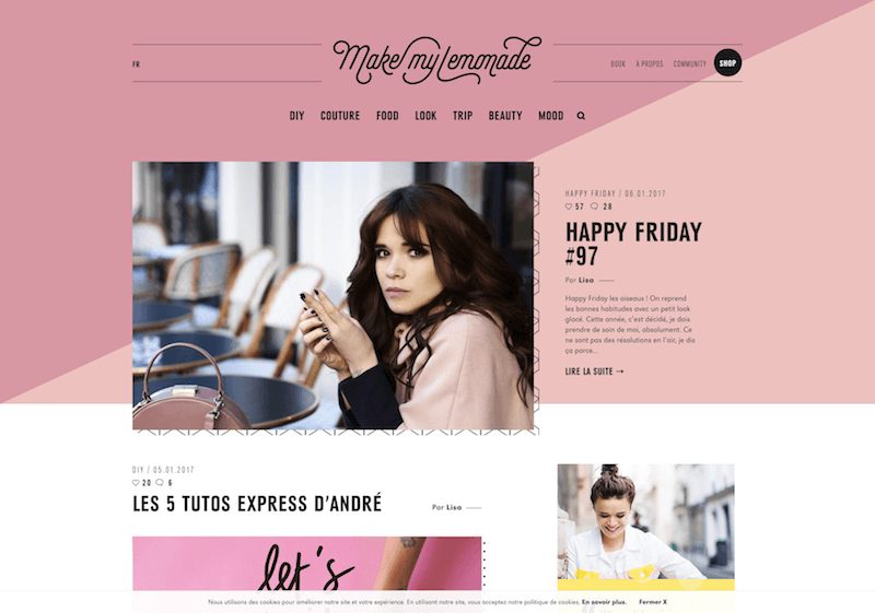
Hue
Hue is the most basic of color terms and denotes an object’s color. When we say “blue,” “green,” or “red,” we’re talking about hue. The hues you use in your designs convey important messages to your website’s visitors. Read Part 1 of this series for the meanings conveyed by various hues.
Examples

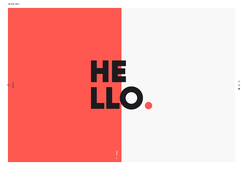
Chroma
Chroma refers to the purity of a color. A hue with high chroma has no black, white, or gray added to it. Conversely, adding white, black, or gray reduces its chroma. It’s similar to saturation but not quite the same. Chroma can be thought of as the brightness of a color in comparison to white.
In design, avoid using hues that have a similar (but not identical) chroma. Opt instead for hues with chromas that are either exactly the same or at least a few steps away from each other.
Examples


Saturation
Saturation refers to how a hue appears under particular lighting conditions. Think of saturation in terms of weak vs. strong or pale vs. pure hues.
In design, colors with similar saturation levels make for more cohesive-looking designs. As with chroma, colors with similar but not identical saturations can have a jarring effect on visitors.
Examples

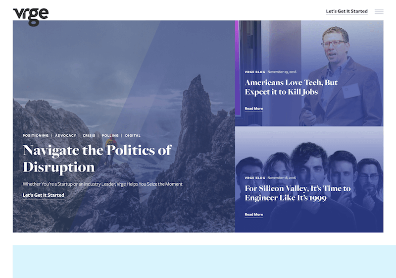
Value
Value could also be called “lightness.” It refers to how light or dark a color is. Lighter colors have higher values. For example, orange has a higher value than navy blue or dark purple. Black has the lowest value of any hue, and white the highest.
When applying color values to your designs, favor colors with different values, especially ones with high chroma. High contrast values generally result in more aesthetically pleasing designs.
Examples

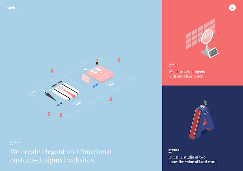
Tones
Tones are created when gray is added to a hue. Tones are generally duller or softer-looking than pure hues.
Tones are sometimes easier to use in designs. More gray can lend a certain vintage feel to websites. Depending on the hues, they can also add a sophisticated or elegant look.
Examples

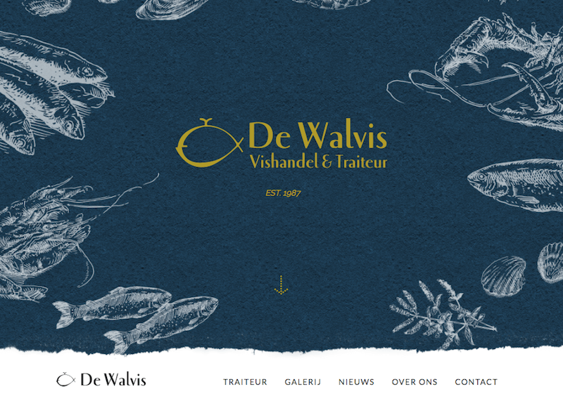
Shades
A shade is created when black is added to a hue, making it darker. The word is often incorrectly used to describe tint or tone, but technically shade only applies to hues made darker by the addition of black.
In design, very dark shades are sometimes used instead of black and can serve as neutrals. Combining shades with tints or lighter neutrals is best to avoid too dark and heavy a look.
Examples

Tints
A tint is formed when white is added to a hue, lightening it. Very light tints are sometimes called pastels, but any pure hue with white added to it is technically a tint, even if the color is still quite bright.
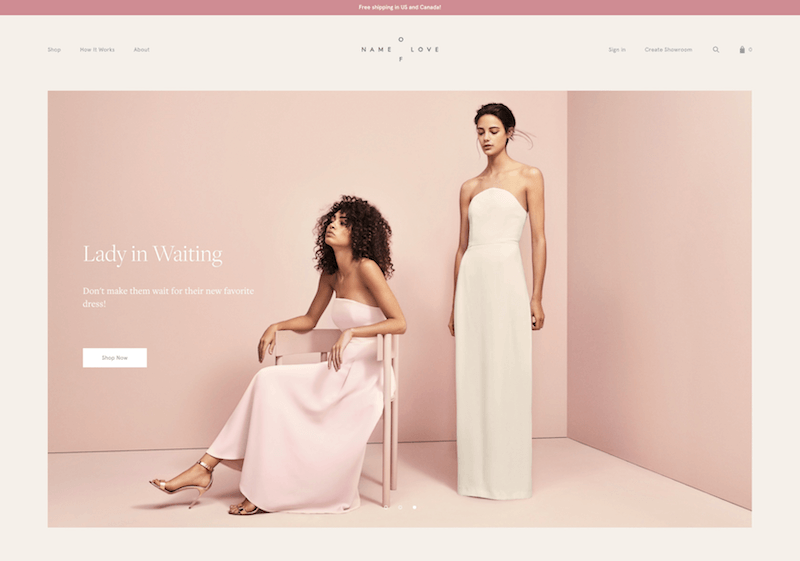
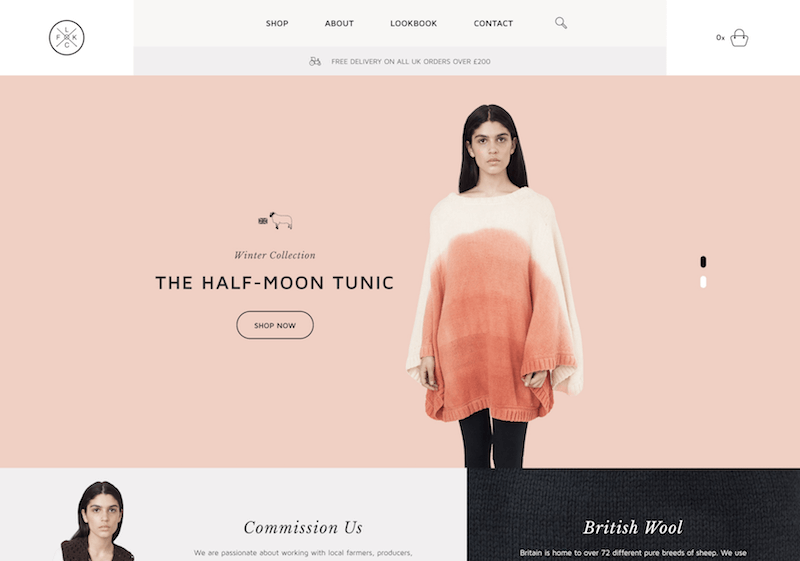
Tints are often used to create feminine or lighter designs. Pastel tints are especially used to make designs more feminine, though there are plenty of instances of other pastel sites with a more masculine or gender-neutral look. They also work well in vintage designs and are popular on websites targeted at parents of babies and toddlers.
Examples
Conclusion
While you don’t necessarily have to remember all of these technical terms, you should be familiar with the actual concepts, especially if you want to master part 3 of this series (in which we create our own color schemes). To that end, here’s a cheat sheet to jog your memory:
- Hue is color (blue, green, red, etc.).
- Chroma is the purity of a color (a high chroma has no added black, white or gray).
- Saturation refers to how strong or weak a color is (high saturation being strong).
- Value refers to how light or dark a color is (light having a high value).
- Tones are created by adding gray to a color, making it duller than the original.
- Shades are created by adding black to a color, making it darker than the original.
- Tints are created by adding white to a color, making it lighter than the original.
Further Resources
- A Simple Web Developer’s Guide To Color
- The Code Side Of Color
- Glossary of Color Terms - An excellent reference from Color Cube.
- Pulling off bright colors in web design - A quick guide to using bright, saturated colors in your designs.
- Elements of Design: Value and Color - An excellent lesson in color from the University of Saskatchewan.
- Color - An article from Design Notes about color and how we perceive it.
The Whole Series
- Color Theory for Designers, Part 1: The Meaning of Color
- Color Theory for Designers, Part 2: Understanding Concepts And Terminology
- Color Theory for Designers, Part 3: Creating Your Own Color Palettes


