Color Theory for Designers, Part 3: How To Create Your Own Color Schemes

Email Newsletter
Weekly tips on front-end & UX.
Trusted by 182,000+ folks.

 Custom Web Forms for Angular, React, & Vue. Your backend.
 Celebrating 10 million developers


While this information is important, I’m sure a lot of people were wondering when we were going to get into the nitty-gritty of actually creating some color schemes.
That’s where Part 3 comes in. Here I’ll be talking about methods for creating your own color schemes, from scratch. I’ll cover the traditional color scheme patterns (monochrome, analogous, complementary, etc.) as well as how to create custom schemes that aren’t based strictly on any one pattern. By the end of this article, you’ll have the tools and skills to start creating beautiful color palettes for your own design projects. The best way to improve your skills is to practice, so why not set yourself a goal of creating a new color scheme every day?
Further Reading on SmashingMag:
- Hex Color – The Code Side Of Color
- A Simple Web Developer’s Guide To Color
- Everything About Color Contrast And Why You Should Rethink It
A Quick Review
Let’s start with a quick review of what was covered in parts 1 and 2. In part 1, we talked about how all colors have inherent meanings, which can vary depending on the country or culture. These meanings have a direct impact on the way your visitors perceive your site, sometimes consciously and sometimes subconsciously. The colors you choose can work for or against the brand identity you’re trying to create.
In part 2, we covered color terminology: hue (what color something is, like blue or red); chroma (how pure a color is, the lack of white, black or gray added to it); saturation (the strength or weakness of a color); value (how light or dark a color is); tone (created by adding gray to a pure hue); shade (created by adding black to a pure hue); and tint (created by adding white to a hue). These are important terms to know as we move forward and create our own color schemes.
Traditional Color Scheme Types
There are a number of predefined color scheme standards that make creating new schemes easier, especially for beginners. Below are the traditional schemes, with a few examples for each.
Monochromatic
Monochromatic color schemes are made up of different tones, shades and tints within a specific hue. These are the simplest color schemes to create, as they’re all taken from the same hue, making it harder to create a jarring or ugly scheme (though both are still possible).
Monochromatic schemes are easy to create, but can also be boring when done poorly. Adding in a strong neutral like white or black can help keep things interesting.
Examples:
Here are three examples of monochrome color schemes. For the most part with these schemes, the first color (if we look at this from left to right) would likely be used for headlines. The second color would be used for body text or possibly the background. The third color would likely be used for the background (or body text if color #2 was used as the background). And the last two colors would be used as accents or within graphics.


Analogous
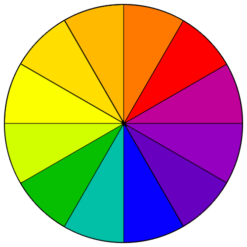
Analogous color schemes are the next easiest to create. Analogous schemes are created by using three colors that are next to each other on the 12-spoke color wheel. Traditionally, analogous color schemes all have the same chroma level, but by using tones, shades, and tints we can add interest to these schemes and adapt them to our needs for designing websites.
Examples:


Complementary
Complementary schemes are created by combining colors from opposite sides of the color wheel. In their most basic form, these schemes consist of only two colors, but can easily be expanded using tones, tints, and shades.
A word of warning, though: using colors that are exact opposites with the same chroma and/or value right next to each other can be visually jarring (they’ll appear to actually vibrate along their border in the most severe uses). This is best avoided (either by leaving negative space or by adding another, transitional color between them).
Examples:


Split Complementary
Split complementary schemes add more complexity than regular complementary schemes. In this scheme, instead of using colors that are opposites, you use colors on either side of the hue opposite your base hue.
Examples:


Triadic
Triadic schemes are made up of hues equally spaced around the 12-spoke color wheel. This is one of the more diverse color schemes. They can be difficult to do well, but add a lot of visual interest to a design when they are.
Examples:


Double-Complementary (Tetradic)
Tetradic color schemes are probably the most difficult schemes to pull off effectively.
Examples:


Custom
Custom color schemes are the hardest to create. Instead of following the predefined color schemes discussed above, a custom scheme isn’t based on any formal rules. Keep in mind things like chroma, value, and saturation when creating these kinds of color schemes.
Examples:


Creating A Color Scheme
Creating your own color schemes can be a bit intimidating. But it’s not as complicated as many people think. And there are quite a few tricks you can employ to create great color palettes right from the start.

We’ve been over the different types of color schemes above. Now, let’s try creating a few of our own. There are plenty of tools online that will help you create a color scheme, but let’s forget about those for now and just use Photoshop.
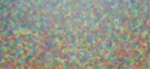
Let’s try breaking away from the color scheme types already mentioned, and create some custom palettes (which is what a set of colors that don’t follow one of the predefined traditional patterns are technically called). While it’s important to know the ways that different colors interact and how traditional schemes are created, for most design projects you’ll likely create palettes that don’t strictly adhere to any predefined patterns.
So, for the purposes of our project here, we’ll create three color palettes each for two different websites. Our hypothetical clients are a fitness app and a high-end women’s subscription box service.
We’ll start with a basic monochromatic scheme, just to get a feel for each. While I mentioned that traditional color scheme patterns aren’t used as often in design, monochromatic color schemes are the exception to that rule. You’ll likely find yourself using monochromatic schemes on a fairly regular basis.

For our subscription box site, here’s a traditional monochromatic scheme, with light gray added in as a neutral.

For our fitness app, we’ve gone with a color scheme made up of shades and tints of gray.

This is almost a split-complementary color scheme, but we’ve used yellow (which is complementary to purple) and a muted red along with gray.

Adding a couple shades of red to the gray color scheme adds a lot of visual interest and the potential for creating extra emphasis on certain parts within your designs.

Sometimes your color palettes will grow and evolve as you add more colors. Here, we’ve gotten rid of the purple and yellow, and instead kept the muted red and added in some blues. It’s a cleaner, more modern palette that better fits the brand.

While this color scheme at first glance looks like another standard gray and red palette, if you look more closely you’ll see that the grays are actually tones of blue. Blue and red make up two thirds of a tetradic color scheme, but work just fine together without yellow, especially when the red is kept pure but the blue is toned down to the point of almost being gray.
Why Shades, Tones, and Tints Are Important
As you can see from the color schemes above, using tints, tones, and shades in your color schemes is vital. Pure hues all have similar values and saturation levels. This leads to a color scheme that is both overwhelming and boring at the same time.
When you mix in tones, shades, and tints, you expand the basic 12-spoke color wheel into an infinite number of colors for use in your designs. One of the simplest ways to create a professional looking color scheme is to take a few tones, tints, and shades of a given color (avoiding the pure hue), and then add in another pure hue (or close to pure) that’s at least three spaces away on the color wheel (part of a tetradic, triatic, or split-complementary color scheme) as an accent color. This adds visual interest to your color scheme while still retaining a sense of balance.
Adding in Some Neutrals
Neutrals are another important part of creating a color scheme. Gray, black, white, brown, tan, and off-white are generally considered neutral colors. Browns, tans, and off-whites tend to make color schemes feel warmer (as they’re really all just tones, shades, and tints of orange and yellow). Gray will take on a warm or cool impression depending on surrounding colors. Black and white can also look either warm or cool depending on the surrounding colors.
Black and white are the easiest neutrals to add into just about any color scheme. To add a bit more visual interest, though, considering using a very light or very dark shade of gray in place of white or black.
Adding browns, tans, and off-white hues are a bit trickier, but with some practice you’ll find adding them gets easier. For browns, consider using a very dark, chocolate brown in place of black. A pale off-white can be used in place of white or light gray in many cases. And tan can be used in place of gray, as well (create a tone by adding some gray to make it even easier).
Using Photos for Color Schemes
One of my personal favorite ways to create a color scheme is to use a photograph. There are automated tools online that can do this automatically for you (the Adobe Capture CC mobile app is one of them, and my personal favorite), or you can do it in Photoshop yourself.
Using Adobe Capture, you can upload an image or use your camera. This is great for times when you might be inspired by a physical object. You can also grab an image from your Creative Cloud account, the market, or Adobe Stock. If you’re stumped for what colors you want to use in a website design, try searching for related words on Adobe Stock. Sometimes this can result in finding color schemes that you might not have thought of on your own.
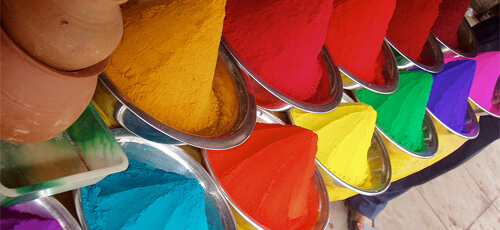
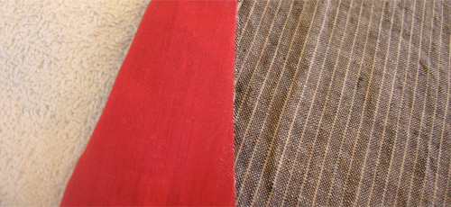
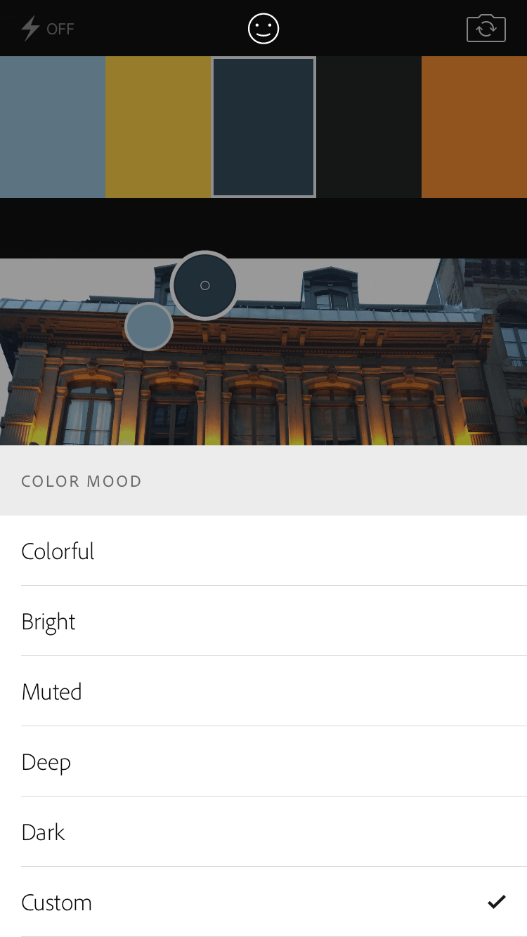
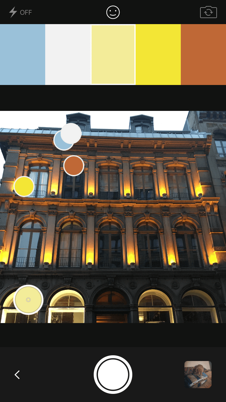
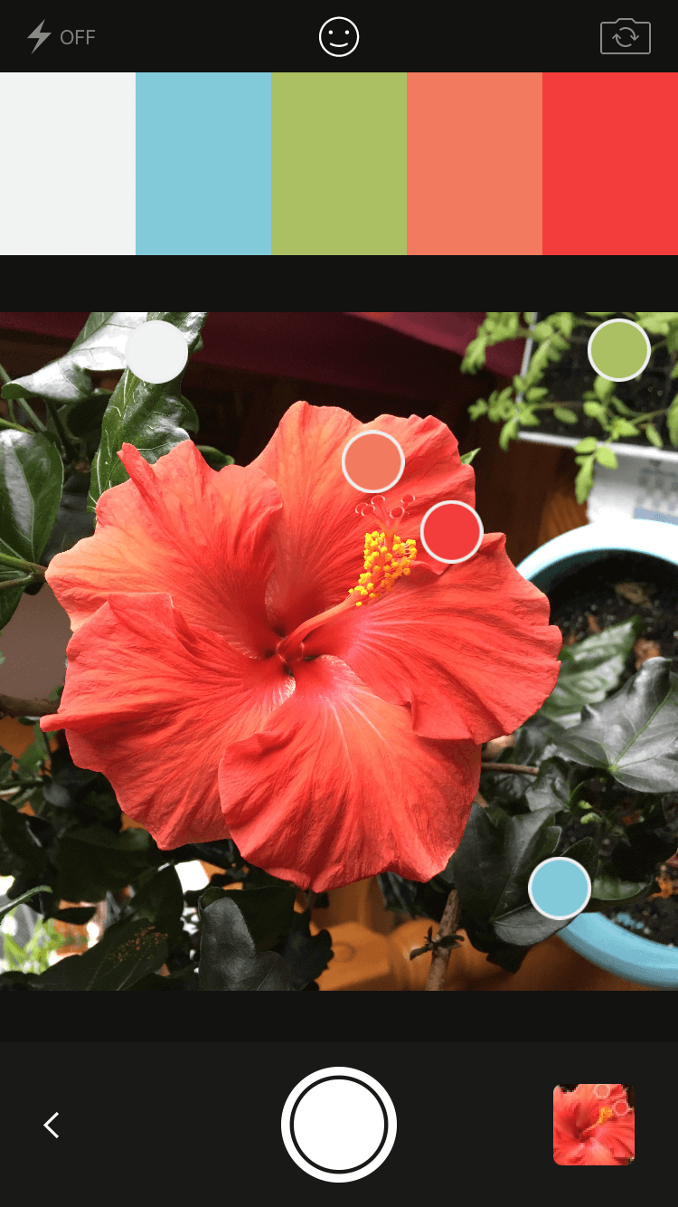
The great thing about Adobe Capture is that you can easily import your color palettes to Illustrator or Photoshop (or just view the hex codes to find the correct colors for any other program you’re using). Find a photo you like on Adobe Stock (or take one yourself), one that you think evokes the feeling of the design you want to create. I took this one:
Here’s the original color scheme that Capture gives us when using this image:
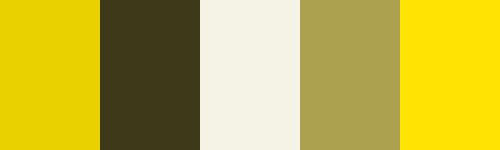
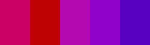
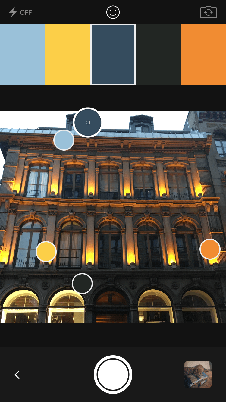
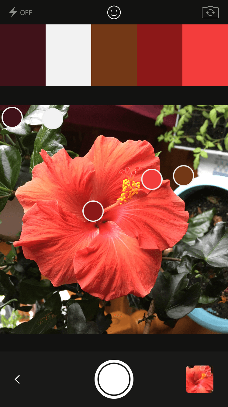
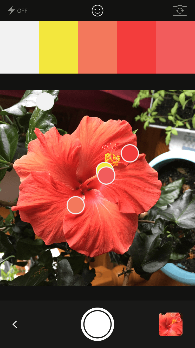
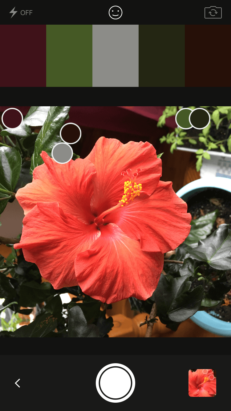
One of the coolest features Capture has for creating color schemes from images is their “Select a Mood” option (this is a carry-over from the old Adobe Kuler app). Included here are Colorful, Bright, Muted, Deep, and Dark. These are the schemes we get when using each of those moods with the same photo:
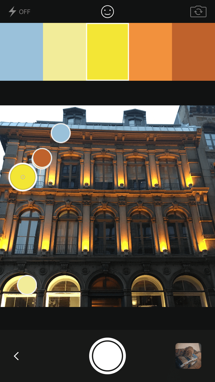
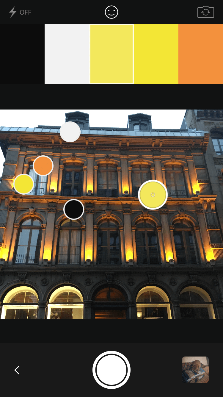
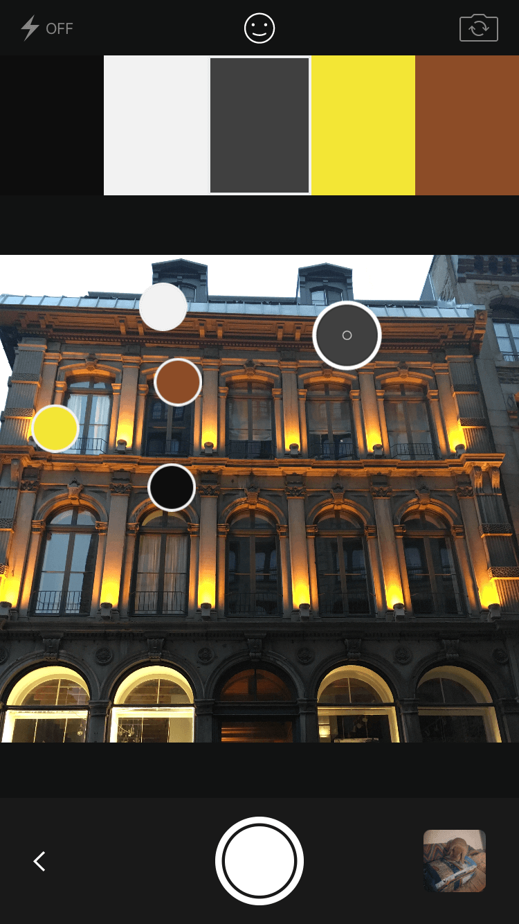
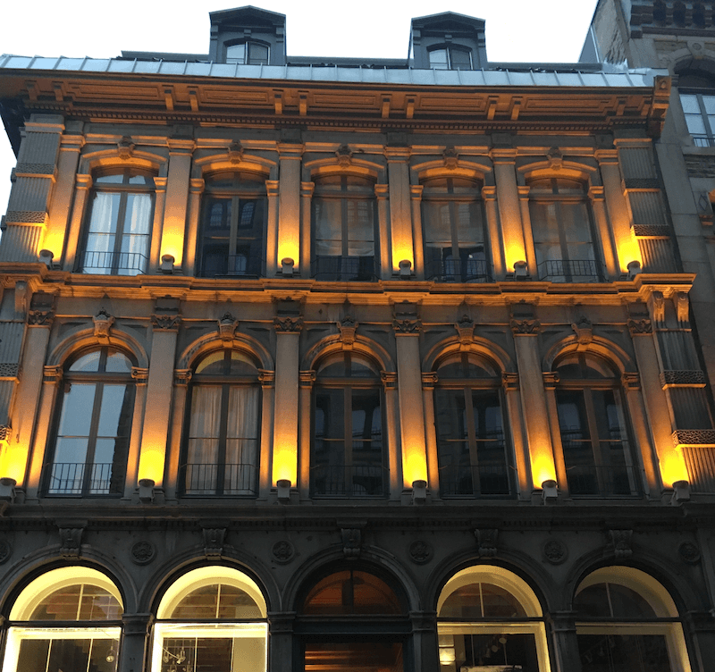
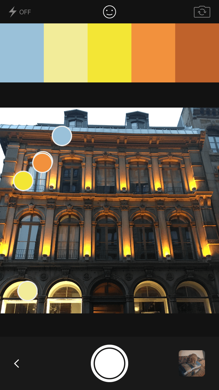
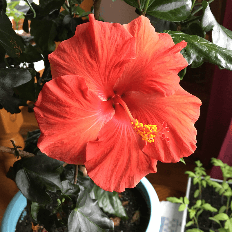
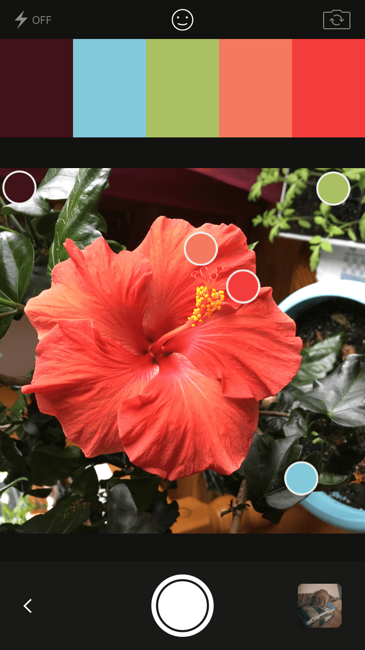
Let’s try another one, something more colorful this time. Here’s the original image we’ll work with:
And here are the five color schemes that Capture gives us from this image:
There are some great palette generator apps out there if Capture isn’t your thing, including the Canva Color Palette Generator, Coolors (which also has an Adobe add-on and an iOS app), and Paletton.
The Easiest Color Schemes
We’ve touched on this a bit before, but adding a bright accent color into an otherwise-neutral palette is one of the easiest color schemes to create. It’s also one of the most striking, visually. If you’re unsure of your skills in regard to creating custom schemes, try starting out with these types of palettes.
Here are a few examples to give you an idea of what I’m talking about:


You can use tones of any color instead of gray or brown in this type of scheme, just keep it very close to the gray end of the spectrum for the most fool-proof results. As a general rule, cool grays and pure grays are best for more modern designs. For traditional designs, warmer grays and browns often work better.
How Many Colors?
You’ll notice that throughout this post we’ve used color schemes with five separate colors. Five is a good number that gives plenty of options for illustrating the concepts here, and it’s a workable number in a design. But feel free to have more or fewer colors in your own schemes.

A lot of websites might only use three colors in their designs. Others use only two. And some might use eight or ten (which is a lot trickier than using fewer colors). Experiment and use as many or as few colors as you need to for your design. But you may want to start with a palette of five colors, and then add or subtract as you see fit and as you progress through the design process.
The easiest way to add a color is to start with one of the predefined, traditional color schemes and then work out from there. That at least gives you a bit of direction as far as which other colors to consider.
10 Sites With Great Color Schemes
To give you more inspiration, here are ten websites that have excellent color schemes. Some of the schemes below might look a bit odd at first glance but seeing how they’re actually used shows the wide range of possibilities color schemes can present.
Big Top

Scheme:

Secret Key

Scheme:

TCM Summer Under The Stars
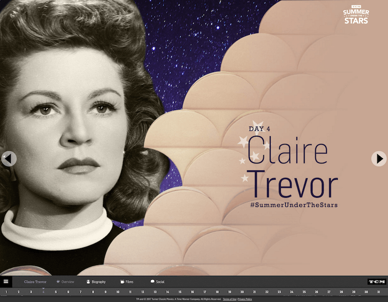
Scheme:

Like There Is No Tomorrow

Scheme:

Lorenzo Verzini

Scheme:

Quotery

Scheme:

Nearly Impossible

Alchemy Digital

Scheme:

Mailchimp

Scheme:

Fight For UX

Scheme:

Conclusion
We’ve really only just touched on color theory in this series. There are color consultants who have literally spent years refining their ability to choose colors that are appropriate to any situation and that can complement any brand.
The best way to learn to create beautiful color schemes is to practice. Create a scheme on a daily basis. You can use automated tools to do this at first (like Capture’s tool for creating schemes from images), or just open up Photoshop or Sketch and start.
If you see a particularly beautiful or striking color in your daily life, try creating a scheme around it. And take advantage of all the sites out there that let you upload your color schemes and organize them for later reference. This makes all those color schemes more practical and easier to use in the future.
Further Resources
Here are some additional resources that should help you in creating your own color schemes, as well as some links with more information about traditional color schemes.
The Whole Series
- Color Theory for Designers, Part 1: The Meaning of Color
- Color Theory For Designers, Part 2: Understanding Concepts And Terminology
- Color Theory for Designers, Part 3: How To Create Your Own Color Schemes And Palettes


