Applying Mathematics To Web Design

Email Newsletter
Weekly tips on front-end & UX.
Trusted by 182,000+ folks.
 Register for Free


 Custom Web Forms for Angular, React, & Vue. Your backend.
 Celebrating 10 million developers
“Mathematics is beautiful.” This may sound absurd to people who wince at numbers and equations. But some of the most beautiful things in nature and our universe exhibit mathematical properties, from the smallest seashell to the biggest whirlpool galaxies. In fact, one of the greatest ancient philosophers, Aristotle, said: “The mathematical sciences particularly exhibit order, symmetry and limitation; and these are the greatest forms of the beautiful.”
Because of its beautiful nature, mathematics has been a part of art and architectural design for ages. But it has not been exploited much for website design. This is probably because many of us regard mathematics as being antithetical to creativity. On the contrary, mathematics can be a tool to produce creative designs. That said, you don’t have to rely on math for every design. The point is that you should regard it as your friend, not a foe. For illustrative purposes, we created a couple of web designs that present mathematical principles discussed in this article. We are also giving away a couple of PSDs that you can use right away in your next design.
Further Reading on SmashingMag:
- A Quick Look Into The Math Of Animations With JavaScript
- 35 Phenomenal Fractal Art Pictures
- Black and White Fractals That Capture Creativity
Layouts featured in this post were created specifically for the purpose of this article. During the design process we made sure that all of the designs shown in this article are essentially mathematical in nature; that is, they exhibit order, symmetry and limitation. We also have followed the Web design algorithm in this process — the designs have distinct themes, styles and elements. To keep things simple and clear, we tried to stick to minimalist designs and also preferred single-page layouts. Obviously, examples in this article are supposed to serve as a simple foundation for your designs and not as the finished designs.
Golden Ratio and Golden Rectangle
The golden ratio, also known as the divine proportion, is an irrational mathematical constant with a value of approximately 1.618033987. If the ratio of the sum of the quantities to the larger quantity is equal to the ratio of the larger quantity to the smaller one, then the quantities are said to have a golden ratio.
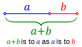
We already published a very detailed article “Applying Divine Proportion To Web Design” that explains how to use the golden ratio in Web design. In today’s article, we’ll look at how to use golden rectangles in Web design. A golden rectangle is one whose side lengths have the golden ratio 1:(one-to-phi); that is, 1:1.618.
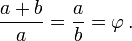
The construction of a golden rectangle is very easy and straightforward. First, construct a simple square. Then draw a line from the midpoint of one side of the square to an opposite corner and use that line as the radius to draw an arc that defines the height of the rectangle. Finally, complete the golden rectangle and you are done.
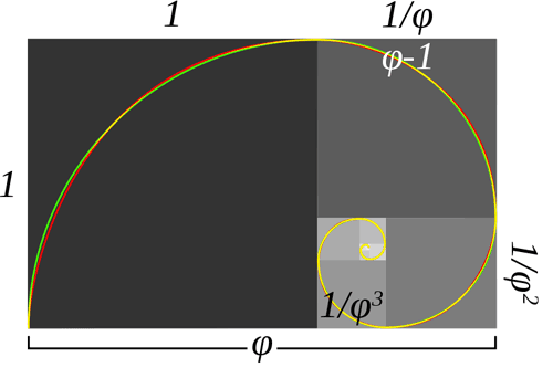
 A method to construct a golden rectangle. The square is outlined in red. The resulting dimensions are in the ratio 1:Phi, the golden ratio.
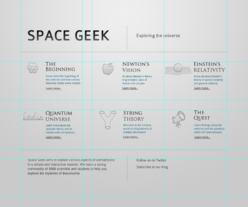
As an example, consider the minimalist design below. It has six golden rectangles in it, three rectangles per line. The rectangles have the dimensions of 299 x 185 pixels. Thus, the sides of these rectangles adhere approximately to the golden ratio; that is, 299⁄185 = 1.616. Notice how the large amount of white space surrounding Golden rectangles creates a calm and simple atmosphere in which the navigation options can breathe and serve their purpose. Although the layout uses only few colors and all blocks are positioned very similarly, the navigation options are obvious.
However, it may be quite difficult to add a new Golden block while keeping the consistency of the design. Probably the only reasonable design solution here would be to add the block on the third line and use the rest of the horizontal space for other, more or less prominent features (if necessary). You can click on the image below to see the enlarged version.
Possible Applications
The golden rectangle design is well suited for photo galleries, portfolios and product-oriented websites. The golden rectangles can also be arranged in other mathematically sound ways to generate beautiful designs. In particular, you may want to use them for blocks that display images or ads in your sidebar. Of course, the pure collection of golden rectangles doesn’t make for a professional, nice-looking design. You also need to work closely with grids, alignment, proximity and emphasis to achieve the main goals of your design. For instance, an interesting design solution would be a CSS/jQuery-based fluid grid design based on golden rectangles, however we do not cover this technique in this article.
Download the PSD-layout
We prepared a sample PSD layout that is designed according to the Golden Ratio and Golden Rectangle. Please feel free to use it in any way and please send the link to this article to your colleagues if you want to spread the word.
Fibonacci Design
As the name says, Fibonacci designs are designs based on the Fibonacci sequence of numbers. By definition, the first two Fibonacci numbers are 0 and 1, and each remaining number is the sum of the previous two. Some sources omit the initial 0, instead beginning the sequence with two 1s. So the first two Fibonacci numbers are given, and each remaining number is the sum of the previous two. The higher the Fibonacci sequence gets, the closer its numbers relate to each other according to the Golden Ratio. A Fibonacci sequence goes like this:
0, 1, 1, 2, 3, 5, 8, 13, 21, 34, 55, 89, 144…
In music, Fibonacci numbers are sometimes used to determine tunings, and in visual art to determine the length or size of content and formal elements. Jürgen Schmidhuber his methodology for Fibonacci-based designs on his blog. However, if you examine the design he created, you are likely to find it rigid and a bit difficult to read and navigate. Indeed, you need to get a bit creative with math rather than following the rules blindly — maths gives us a guide that we can apply, however it’s rather about implementing sites with maths than implementing maths with our designs.
 _Approximate and true golden spirals. The green spiral is made from quarter-circles tangent to the interior of each square, while the red spiral is a Golden Spiral, a special type of logarithmic spiral. Overlapping portions appear yellow. The length of the side of one square divided by that of the next smaller square is the Golden ratio. Source_
The main idea behind such designs is to use Fibonacci when deciding on the dimensions for content area or sidebar. Both Golden ratio and Fibonacci let designers rely on sound, common ratios for page containers or blocks within page containers.
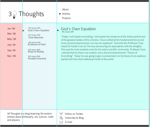
In general, layouts are quite easy to build using the Fibonacci sequence. You pick a certain base width first — for instance, 90px. Then, when determining the size of your containers, you multiply the base width with the numbers from the Fibonacci series. Depending on the calculations you get, you need to use them for your page blocks. Let’s take a look at an example. Below is a minimalist typography blog based on Fibonacci Web design.
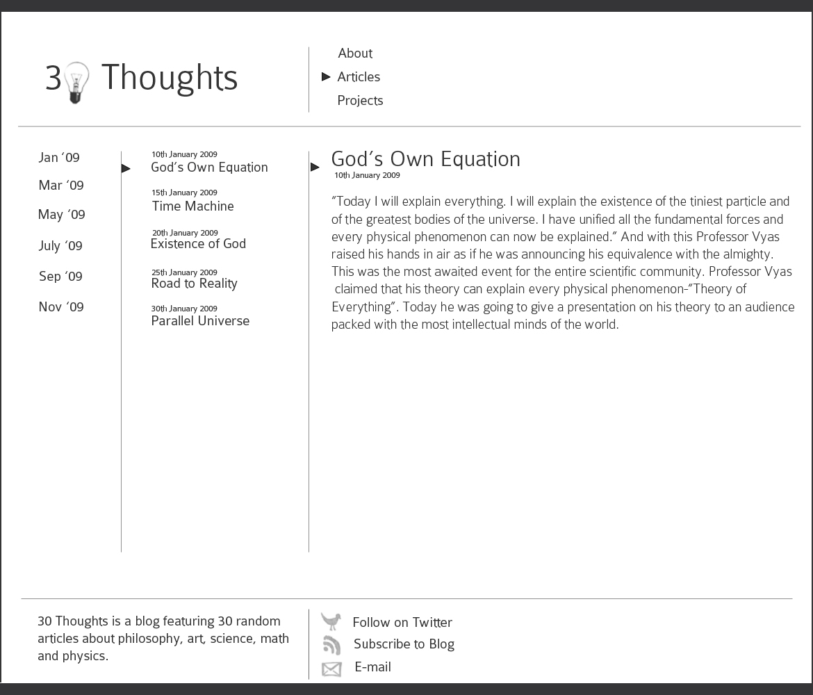
You can see that the page is divided into three columns. Each column corresponds to a Fibonacci number. For this design, we used a base width of 90 pixels. This base width is then multiplied by a Fibonacci number to get the total width for a particular column. For example, the first column has a width of 180 pixels (90 x 2); the second column has a width of 270 pixels (90 x 3); and the third column has a width of 720 pixels (90 x 8). The font size also corresponds to a Fibonacci number. The blog heading has a size of 55px; the article’s heading is 34px; and the content is 21px.
The downside of layouts based on the Fibonacci sequence is that it’s difficult to use it if you are given certain fixed width layout dimensions (e.g. 1000px). In this situation it’s easier to use the Golden ratio, as you would simply multiply 1000px with 0.618 and get 618px which would be the ideal width for your content block. However, if you try to achieve the same result with the Fibonacci sequence itself, you first need to figure out the sequence to the 1000 range.
According to the Fibonacci sequence calculator, the sequence would be …,610, 987, 1597…. Indeed, 987 is a good fit and you can start picking the widths for smaller blocks using the previous numbers in the sequence. But if your fixed width layout is smaller or lager, you would need to use some approximate values which would again result in pure guessing. The problem may also occur in liquid or elastic designs to some extent, but you have much more design freedom there.
Possible Applications
A Fibonacci design is best suited to blogs and magazine layouts. You can arrange the layout in different ways according to Fibonacci numbers. The article “Nombre d’or, suite de Fibonacci et autres grilles de mise en page pour le design web” (in French) explains in more depth the application of Fibonacci numbers to Web design. Again, notice that you need to be creative when using Fibonacci sequence in your designs, otherwise your designs will turn out to be too rigid and hence difficult to use and navigate.
Download the PSD-layout
We prepared a sample PSD layout that is designed according to the Fibonacci sequence. Please feel free to use it in any way and please send the link to this article to your colleagues if you want to spread the word.
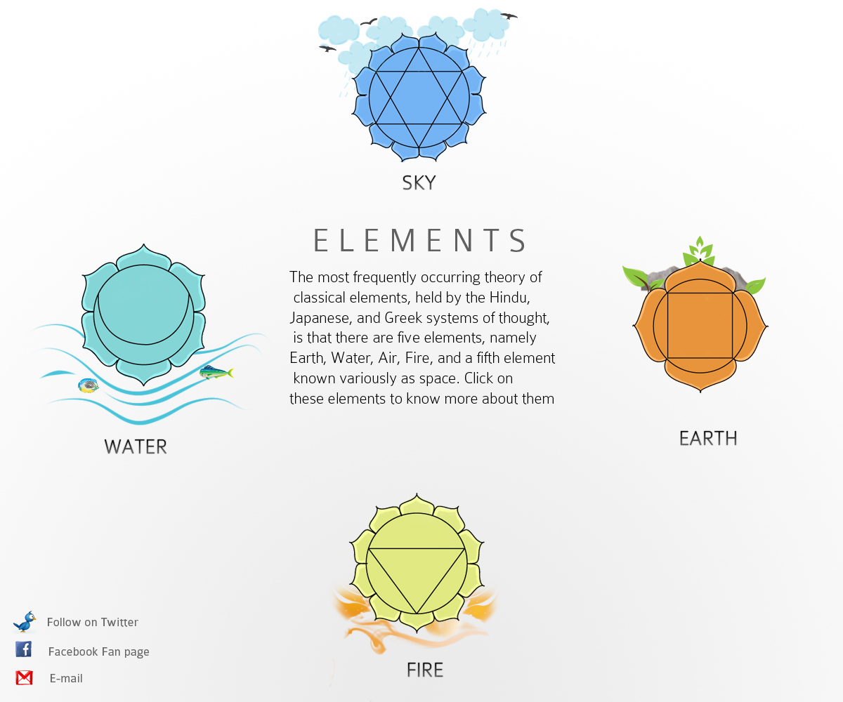
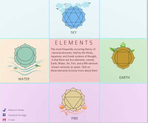
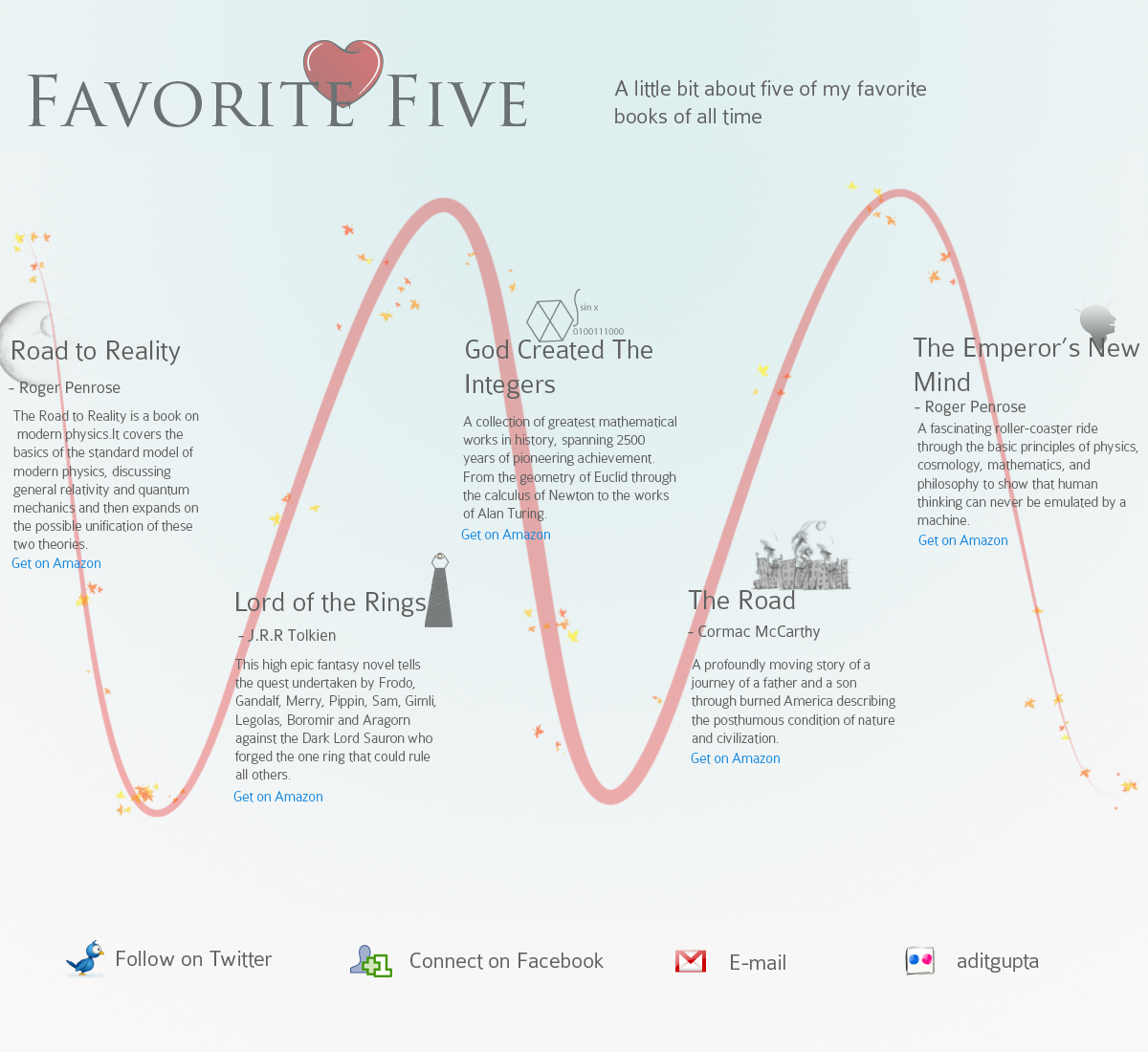
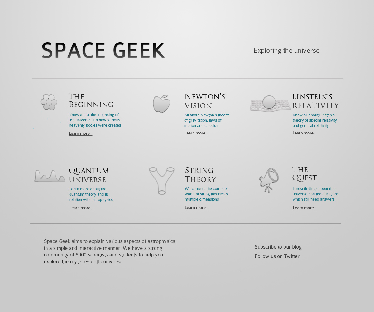
Five Elements, Or Kundli Design
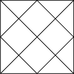
Another interesting layout technique comes from the Indian horoscopes which are also called Kundli. Basically, a Kundli is a very simple figure can be made in just three steps. Draw a square, and then cross the two diagonals. Join the mid-points on each side of the square to get the Kundli figure. You’ll notice four right-angle rhomboids in the figure. These are the basis for our Web design.
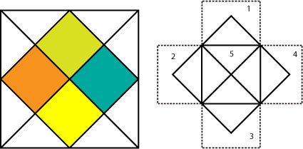
The design below, then, is based on the Kundli geometric layout. You’ll notice that the chakras in the design also have mathematical properties.
This is a single-page layout. Clicking on an element reveals more information about it, as shown in the figure below. You could also include some simple jQuery animations or jQuery tooltips that would reveal more information on demand. A further step would be a sliding web page where animation is used to display different content blocks; you may also want to change the background images of the single content areas to make them a bit more distinctive.
In the following figure, you can see that our design is just a simple three-column layout: a header, three columns and a footer. Not complex at all.
Possible Applications
This design is best for displaying product information and portfolios. You can spice it up with JavaScript animation frameworks. For example, you can apply color transformations to the chakras by using Raphael library, or you can add freestyle animations using jsAnim library. You can have a tree sprout when the user clicks on the Earth element, or you can show sea creatures swimming in the water element. The sky is the limit when it comes to animation using these JavaScript libraries.
Download the PSD-layout
We prepared a sample PSD layout that is designed according to the Kundli design. Please feel free to use it in any way and please send the link to this article to your colleagues if you want to spread the word.
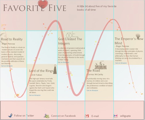
Sine Wave Design
When it comes to mathmatics, you do not need to stick to well-known Golden Ratio or Fibonacci sequence. You can also experiment with formulas from physics, chemistry and other sciences by using more general formulas and values in your designs.
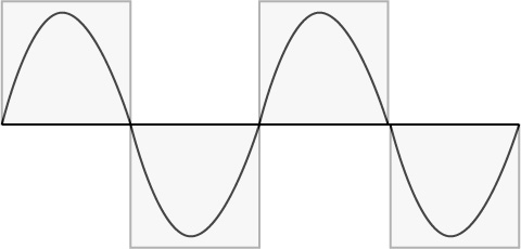
For instance, let’s consider the sine wave, or sinusoid, a mathematical function that describes a smooth repetitive oscillation. We used a simple sine wave pattern as the basis for a simple and original Web design and create a single-page layout. Of course, you can use the same approach for other designs such as graphics or infographics.
The layout is again very simple, consisting of a header, five columns and a footer. You can use a jQuery tooltip to make the design more interactive.
Possible Applications
This wave pattern occurs often in nature, including ocean waves, sound waves, and light waves. Also, a rough sinusoidal pattern can be seen in plotting average daily temperatures for each day of the year, although the graph may resemble an inverted cosine wave. You can also use it to display a timeline of events. It could even be developed to include horizontal navigation. You can make it more interactive with the jQuery highlighter plug-in, which highlights each element (i.e. DIV) so that the user can focus on the content.
Download the PSD-layout
We prepared a sample PSD layout that is designed according to the Sine Wave design. Please feel free to use it in any way and please send the link to this article to your colleagues if you want to spread the word.
Other Techniques
Rule of Thirds This rule states that an image should be imagined to be divided into nine equal parts by two equally spaced horizontal lines and two equally spaced vertical lines, and that important compositional elements should be placed along these lines or their intersections. It can also be expressed as a simplified mathematical approach that divides any layout into thirds, left to right and top to bottom.
Musical Logic The rhythmic or thematic structure of musical compositions can be applied to distances between elements in a layout, like ABA, ABAC, etc. Learn more about music and mathematics in this Wikipedia article.
Useful Links and Resources
Wikipedia articles
Articles
- Mathematics in Art and Architecture
- Create Awesome Geometrical Designs, Myoats
- Photographer Loves Math, Graphs Her Images
- Typograph: Scale and Rhythm
- Michael Paunker - Art and Math
Books
We hope you’ve enjoyed this article on mathematics and Web design. Hopefully you now see mathematics not as a hindrance to creativity, but as a friend. Embrace it!
 (al)
(al)

