Forms On Mobile Devices: Modern Solutions

Email Newsletter
Weekly tips on front-end & UX.
Trusted by 182,000+ folks.

 Custom Web Forms for Angular, React, & Vue. Your backend.

 Celebrating 10 million developers
Mobile forms tend to have significantly more constraints than their desktop cousins: screens are smaller; connections are slower; text entry is trickier; the list goes on. So, limiting the number of forms in your mobile applications and websites is generally a good idea. When you do want input from users on mobile devices, radio buttons, checkboxes, select menus and lists tend to work much better than open text fields.
But constraints breed innovation, and mobile forms are no different. The limitations of mobile devices have forced developers and designers to find new ways to allow users to input data faster and more easily. Thanks to the modern solutions covered in this article, the mobile space may not be a place to avoid forms much longer. Instead, it may become the place to encourage them.
You may also want to check out the following Smashing Magazine articles:
- Guidelines For Mobile Web Development
- Designing A Better Mobile Checkout Process
- Mobile And Accessibility: Why You Should Care And What You Can Do About It
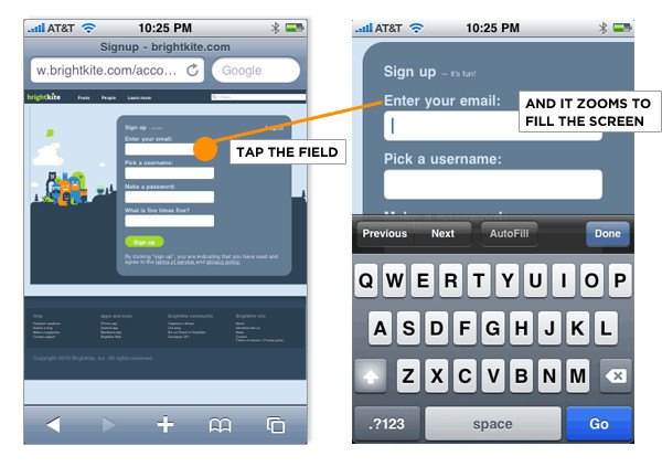
Field Zoom
In many mobile Web browsers, when a user selects a form’s input field, the “field zoom” feature expands it to fill the screen’s viewable area. This makes an otherwise tiny field large enough for people to actually see the data they are entering. Given that many form errors are caused by people not seeing their inputs well enough to correct misspellings, the usability of this feature is clear.
The Safari browser on Apple’s iPhone makes use of field zoom together with a “form assistant.” The form assistant displays “Previous,” “Next,” “AutoFill” and “Done” buttons below the magnified input field, giving people an easy way to move through and complete a form. No need to worry if an input field is off screen: the user just hits “Next” and won’t miss it!
However, not everyone will know about the form assistant or know how to hide the keyboard. So, make sure the controls on the Web page still allow them to complete the form. Excessive spacing around the “Submit” button can tuck it behind the keyboard.
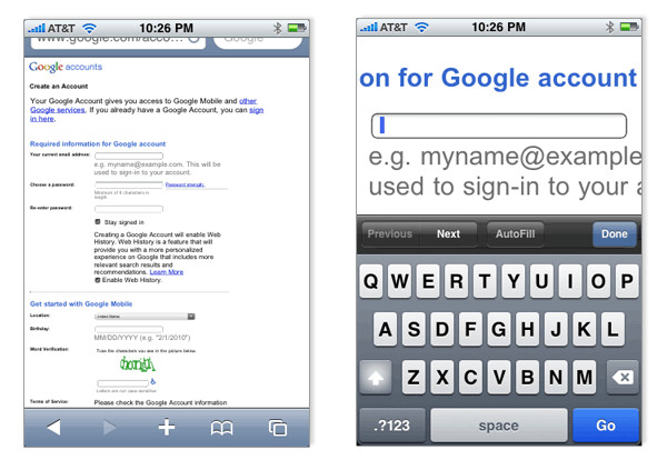
Field zoom is another great reason to top-align input field labels in forms. As you can see on Google’s registration form (screenshot below), left-aligned labels disappear when input fields are expanded to fill the screen. With no visible label, the user can easily forget what question they have to answer. Long input fields also suffer a bit with field zoom.
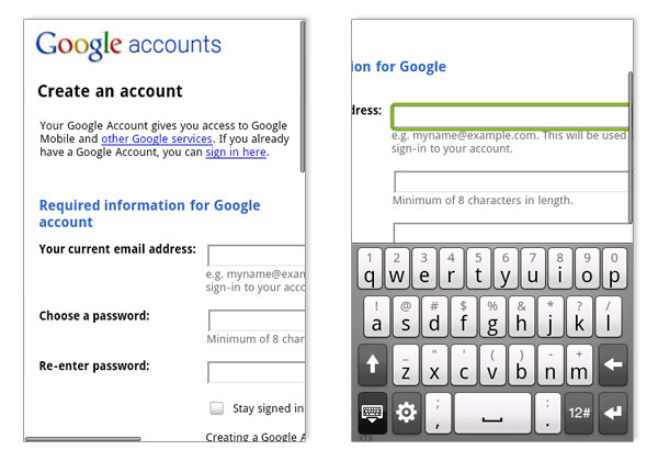
Mobile browsers that don’t have field zoom also run into issues with left- and right-aligned input field labels. Anyone using such a form on Google’s Android OS (below) faces the problem of disappearing labels. The screen simply does not have enough room for both the input field and its corresponding label. Top-aligned labels avoid this issue.
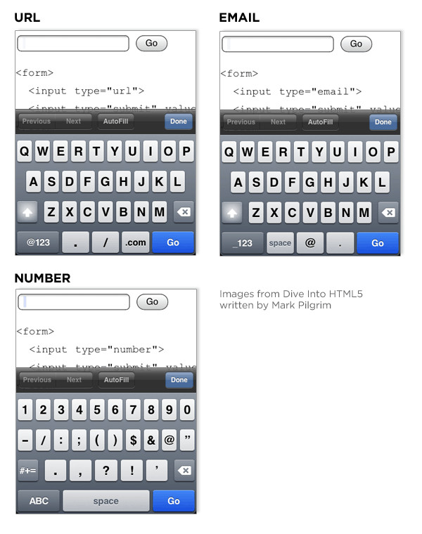
Input Formats
Some mobile Web browsers recognize specific input types (part of the developing HTML5 standard) and adjust their input modes accordingly. For example, specifying an input of the type url brings up a virtual alphanumeric keyboard with “.”, “/”, and “.com” keys. Specifying an input of the type email brings up a virtual alphanumeric keyboard with “.” and “@” keys. Specifying an input of the type number brings up a virtual numeric keyboard.
These input-specific keyboards make entering the particular type of data required by each input field much easier. Even browsers without virtual keyboards benefit from the use of number, because users would not have to switch to number mode to enter numeric data.
Password-Masking
Most password input fields in forms instantly obscure all characters that a user enters to keep sensitive information hidden from prying eyes. Automatic masking of passwords may provide the appearance of security, but it can also create usability issues when people are left staring at a row of bullets that they hope (but can’t verify) is their password.
Many mobile devices address this issue by displaying the most recent character the user has entered, and then obscuring that character as a bullet only after a brief delay. This technique has made its way onto the desktop, as illustrated in this password-masking solution from ZURB.
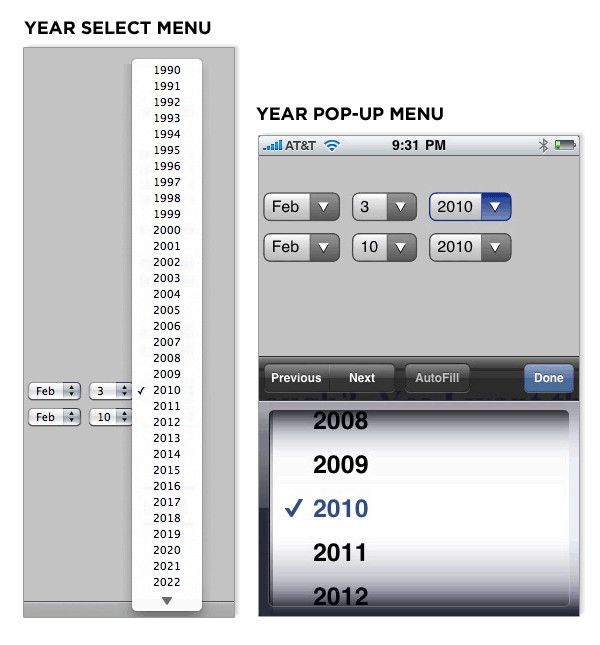
Pop-Up Menu Controls
Drop-down select menus are one of the hardest input types to use. First, you have to click on the menu to open it. Then, you have to maneuver through a potentially long list of small targets. Once you find the value you want, you need position your cursor on the right target and select it. To top it off, many implementations of drop-down menus on the Web require you to keep your cursor on the menu while navigating the list, or else the menu closes!
Even dexterous users often miss them and need to start over. Couple this interactive challenge with the small screens of mobile devices and the need for a different solution for select menus becomes quite obvious.
For drop-down select menus on Web forms, Apple’s iPhone presents users with a pop-up menu control. This control displays the options in the menu in a contained list that can be scrolled at various speeds though drag, nudge and flick gestures. The large touch targets also make it easy to select the right value once you’ve found it.
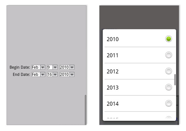
Similarly, Google’s Android provides a larger touch target for select menu options. When the user taps a drop-down select menu on an Android device, a scrollable list of menu options appears in a dialog window over the Web page.
Compound Menu Controls
Pop-up menu controls can be applied to compound inputs as well. So, instead of requiring three separate input fields for the month, day and year of a requested date, one date field can bring up a set of pop-up menus that allow people to scroll through three lists at once to find the right date. This approach can be applied to other kinds of compound inputs as well, such as height in feet and inches.
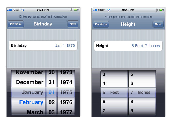
Google’s Android has a compound input field solution, though it makes use of visible interface elements to move through a list instead of relying on gesture-based scrolling alone.
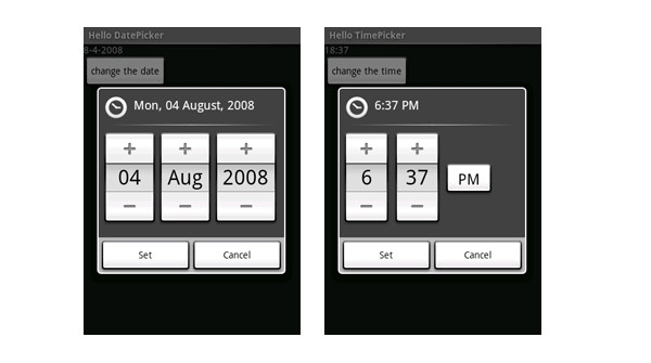
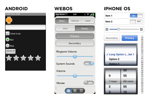
Native Input Controls
In addition to having compound menu controls, most mobile operating systems have several other custom input controls available to application developers. Sliders, split buttons, rating widgets and scrubbers are just a few of the components worth considering in place of standard form controls to make inputting easier for users.
Orientation
Because people like to hold mobile devices both horizontally and vertically in their hands, mobile forms should adjust accordingly to take advantage of the changing screen space. The compose email form on Google’s Android does just that.
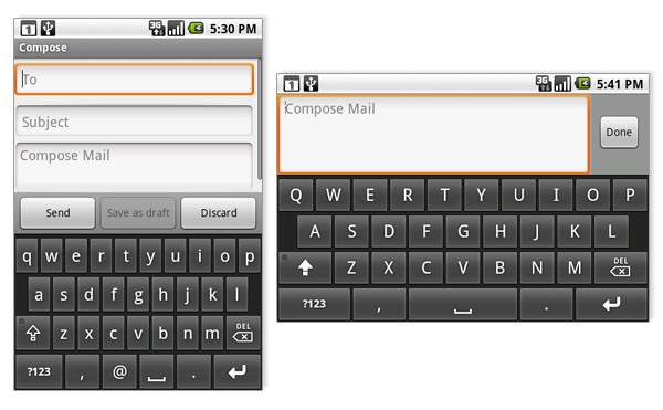
When held vertically, the screen shows three input fields with several action buttons. In the horizontal position, the email body input takes over the screen, and one action button is shown on the right. This layout maximizes the screen space available for the message content.
Voice Input
Google’s Nexus One phone allows people to use voice input for any text field in an application. Users can swipe the virtual keyboard to switch the phone to audio input mode, or they can use the microphone button. The video below demonstrates both of these options in action. With effective voice input, typing any characters into the mobile device becomes a thing of the past.
What’s Next?
Mobile is growing exceptionally fast, and as more designers and developers focus on the space, we’ll hopefully see even further innovation in mobile forms. After all, anything that makes inputting (both on mobile and desktop devices) faster and easier will do a lot of good for both companies and their customers.
About the Author
Luke Wroblewski is an internationally recognized digital product design leader and the author of two popular Web design books. You can follow Luke on Twitter @lukewdesign or by using RSS.
Smashing Magazine readers can get a special 20% off discount on Luke’s latest book: Web Form Design Filling in the Blanks. Just use discount code MIX to order.
 (al)
(al)

