Graphics Package Standards and Practices
By Melinda Rainsberger
The term “graphics package” stands for the animated logos, text backgrounds, idents, screen bugs and lower thirds that make up the branding of a television show, television station or documentary. The are used to re-affirm what the viewer is watching. Especially with the growing number of reality and web shows these sorts of animated graphics are being used more and more frequently. Workers in the television industry may be more familar with these concepts than movie and web animators, but the concepts are the same and can be used on a number of different video projects.
Most importantly, graphics packages must have a cohesive look to all their parts and be easy to use. Frequently, graphics packages are used by outside firms and videographers. This means that the designer/ animator may not always be there to make sure that their work is being used properly. Following some simple rules–and creating simple rules–will ensure that the graphics package is used to its full effects.
For this article, we will use a fictional cooking show and cable network. Cooking shows are in abundance on television and the web. They have strong graphic packages and use lots of fun food imagery.
Screen Size
Before starting your project, find out your screen size. Is it standard or hi-def? Is this for the web or broadcast?
Different screen dimensions will require different layouts. If your client is unsure, design for the largest size. Most video editing programs can resize video. Design your main elements within the standard-def dimensions and you’ll have an easy time changing layouts at the last minute. You can always re-size for video to be smaller, but larger sizes would require a redesign.
Title Safe
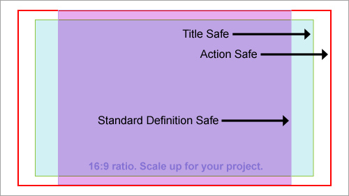
Even hi-definition televisions cut off a little bit of the image. Most animation and video programs have a frame they can load in over your footage to show you where your image will be cut off by most televisions. This is analogous to the bleed area in a print document. You can put imagery there, but you should keep titles, text and main elements inside the safe area.
Template
Example
Titles
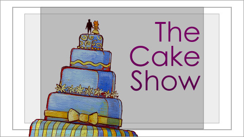
For movies and television shows, titles are a necessity. For television, it must be easy to transition from other programing, commercials, etc. For movies and the web, the titles need only transition from black. Consider how you transition into the movie or show: is it a cross-dissolve fade, wipe or some sort of irising?
Cross Dissolve
Wipe
Combination
Exporting with an alpha channel will let you mix the video and animation in more complex ways.
Lower Thirds
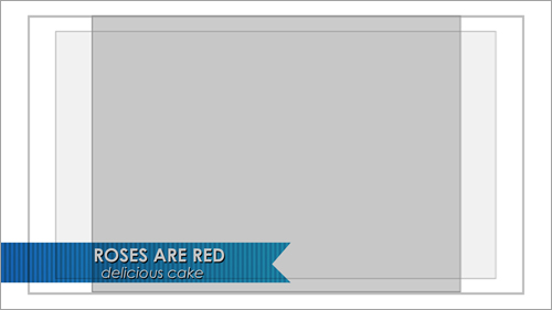
This is the text box displayed on the lower-third portion of the screen. This is used to indicate the speaker’s name and position. The text can hug the edge pretty tightly. For LCD and plasma screens, you have a little more space for text, but it will only be a couple millimeters.
It is best to render out a test piece of video with the box and text together and watch it on a standard television screen. This will give you an idea of what the layout will look like. Lower thirds should be legible, but not overtake the screen or be so small you cannot read the speaker’s information.
For the final files, you will render out the video with an alpha channel and no text. This will allow the editor/director to make last minute name and title changes with out tediously re-rendering everything out again. Make the file at least 30 seconds long; this will give the editor enough animation to hold a very long title or fade in a subtitle.
Final File to Deliver
End Visual Result
Bugs / Tags
A “bug” or a “tag” is the logo in the lower, right-hand corner of the screen. This is often used by television channels to brand their programmer. Sometimes, it is used in informercials or in kiosk displays. Rarely is it used for a specific television show or in movies or anything for theatrical release.
Blow-Up of a Bug
Final Result
SM Article :: Full Bug from Melinda Rainsberger on Vimeo.
As a designer, you may design a television station’s bug or a show’s identity. Rarely would you design the identity of both the channel and its programming.
Idents
Another television term, this is the animation of the show’s logo that’s seen in-between the actual programming. This is like the title, but much shorter. It may have a lead-in or lead-out for other video elements. They have an area for new text messages, but it still has the logo and alot of the branding.
Backdrops
Backdrops are full-screen animations that have a great deal of blank space. This is so the videographer can put important information into the project as they need to. For newscasts, this might be the weekend calendar update. For a documentary, this would be the larger pieces of text used to give a historical or narrative context. For a how-to web show, this might be the backdrop for the ‘headers’ to the different sections or the steps in a process. For a competition reality show, this might be the contestant break-down card. Its uses are varied, and it’s basically a piece with many uses, whatever they may be, whenever the videographer needs to explain extra information.
Final File to Deliver
End Visual Result
The Lesser-Known “Donut”
A donut is a tasty treat. A “donut” in the video sense is less tastey. I encountered this term once-upon-a-time while working for a video producer. He used to work for a large cable company, I suspect this term is an old-school cable/ television word. Look it up online, you’ll find very little reference to it.
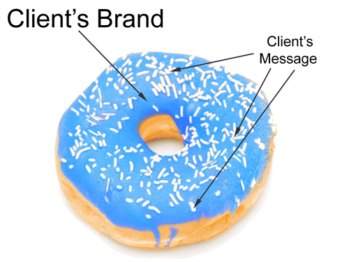
A donut is a little like an animated backdrop, except it is so un-branded as to be re-usable for a number of projects. (Like the blue screen in an informercial.) Mostly, videographers use this term interchangeably with ‘animated backdrop’. They do want it to be too specific, and very paired down so they can use it in a number of ways.
If we were to continue with our baking analogy: text backgrounds are like slices of bread (you can put anything on them), donuts can have flavor (but are pretty bland on their own), idents are like cookies (they are tasty and individualized), and titles are like cakes (elaborate and full).”
Donuts are like the themes you get in iDVD, iMovie or any website template. They are easily re-brandable.
Fonts
When creating your graphics package, keep in mind that there will be components the user/ video producer is expected to type in. You could make every single lower third and text card–if you want to have your hair fall out! Video productions have lots of little changes, especially to text. These changes need to be made quickly and sometimes within a couple hours of the final deadline. So, you as the designer or animator will not be typing in the final names and information. When handing off your graphics package, indicate:
- What font they should use
- What size of font they should use. (Try not to have more than 3-4 sizes)
- Indicate the color the text should be, and if it should have a drop shadow.
- Indicate if the text should be left, center or right justified.
Stick to fonts common to Macs and PCs. Keep your rules simple and easy to understand. Complicated rules will be ignored or misunderstood.
Some clients will be used to graphics packages, some will not. Consider leaving time in the production for a sit-down training session with clients new to video or animation.


 Register!
 Flexible CMS. Headless & API 1st


