Showcase of Academic and Higher Education Websites

Advertisement

College and university websites have a lot of roles to fill. They need to provide information for prospective students (both new and transfer), parents of students and prospective students, current students, and alumni. In many cases, they’re also the gateway to the school’s intranet and the public face for both academics and athletics. They often need to include reams of information in a way that makes everything easy to find. It’s a huge challenge.

And the truth is: most college and university websites are horribly designed. Either they look like they were designed fifteen years ago and then forgotten about, or they’re so overloaded with information that it’s almost impossible to find what you’re looking for.

But not every college or university website is horrible. There are some excellent sites out there, and below are some of them. If you know others, please share them in the comments to this post!

General Colleges & Universities

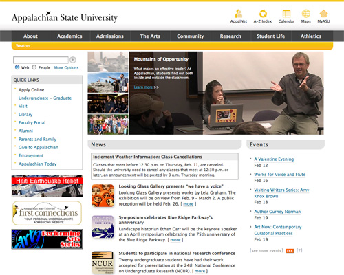
Appalachian State University
Appalachian State University has a simple color scheme and makes great use of icons in their header.

Screenshot

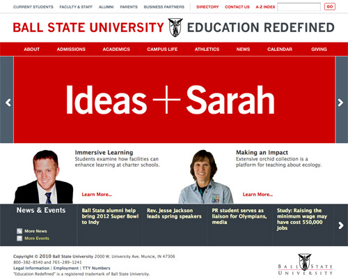
Ball State University
Ball State University uses a sophisticated color scheme and typography combined with plenty of negative space.

Screenshot

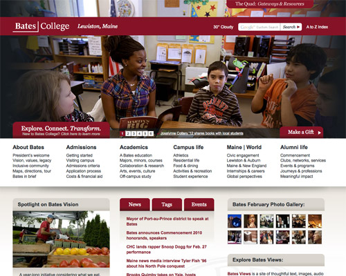
Bates College
The bold header and grid-based layout work well on the Bates College site.

Screenshot

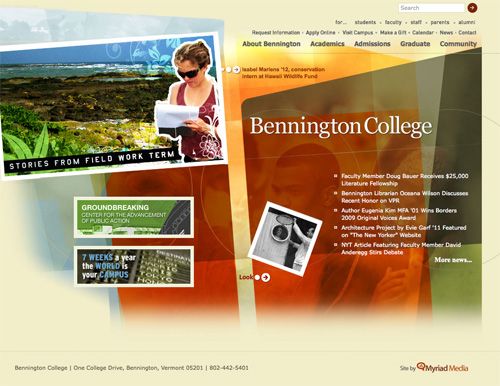
Bennington College
Bennington College uses a unique layout and design.

Screenshot

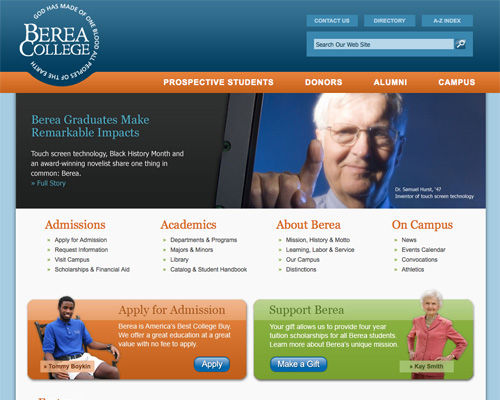
Berea College
Berea College uses a clean layout, and the cutout in the navigation bar for the logo really sets it apart.

Screenshot

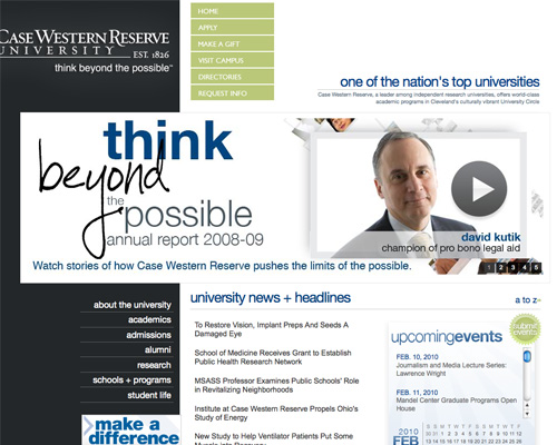
Case Western Reserve University
Case Western Reserve University uses a unique layout and color options.

Screenshot

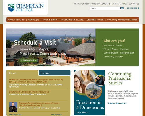
Champlain College
Champlain College uses a sophisticated, muted color scheme and excellent typography.

Screenshot

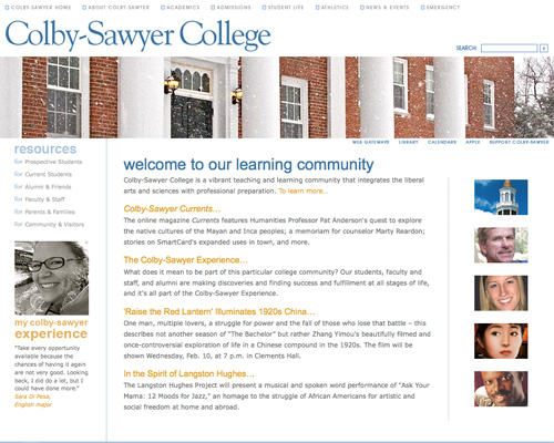
Colby-Sawyer College
Colby-Sawyer College has a simple layout with plenty of negative space.

Screenshot

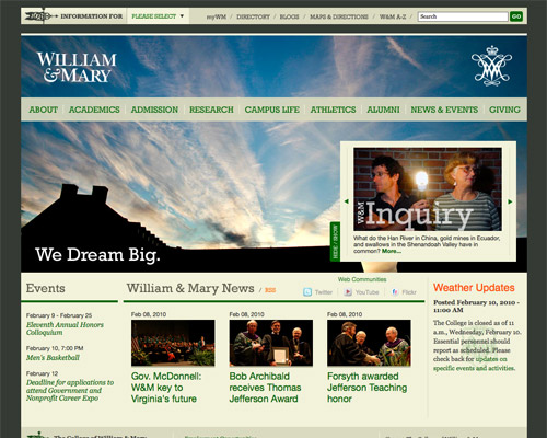
William & Mary
The bold header image and excellent typography set the William & Mary site apart.

Screenshot

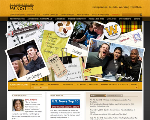
The College of Wooster
The College of Wooster uses an interactive, animated header.

Screenshot

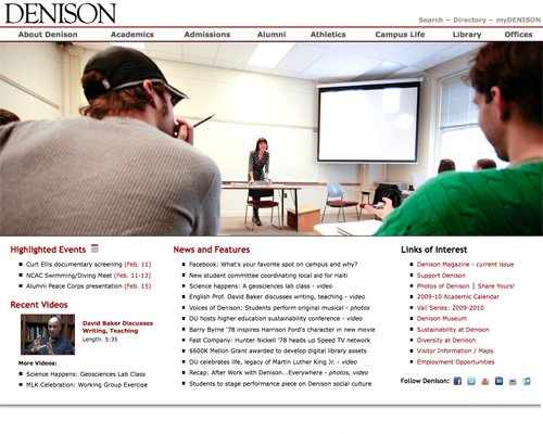
Denison University
Denison’s website makes great use of negative space and a simple layout.

Screenshot

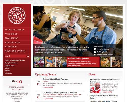
Dickinson College
Dickinson College’s site has a great color scheme and a subtle background image.

Screenshot

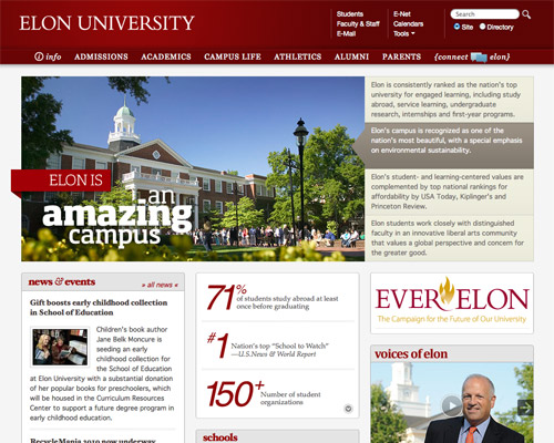
Elon University
Elon University’s site includes a lot of details that make the site look really polished.

Screenshot

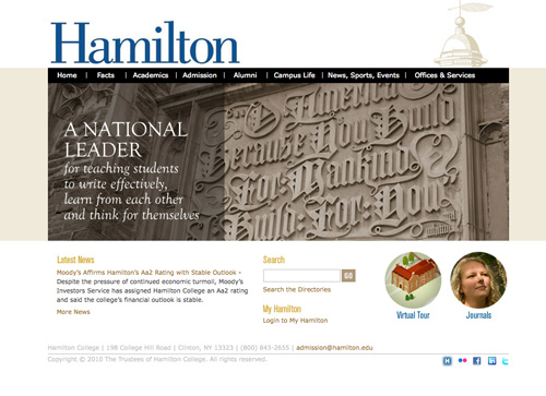
Hamilton College
Hamilton uses a simple color scheme and straight-forward navigation.

Screenshot

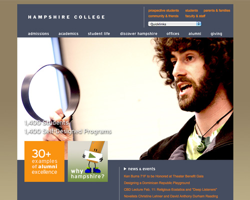
Hampshire College
Hampshire College uses a unique, sophisticated color scheme and typography.

Screenshot

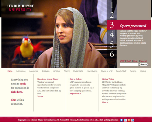
Lenoir-Rhyne University
Lenoir-Rhyne University has a clean layout and bold header slideshow.

Screenshot

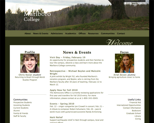
Marlboro College
Marlboro College makes good use of a simple layout and color scheme.

Screenshot

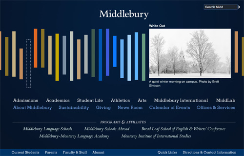
Middlebury College
Middlebury College has a completely unique layout with excellent typography.

Screenshot

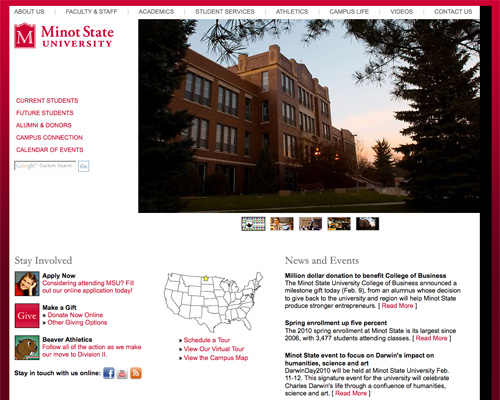
Minot State University
Minot State University uses plenty of negative space and clean typography.

Screenshot

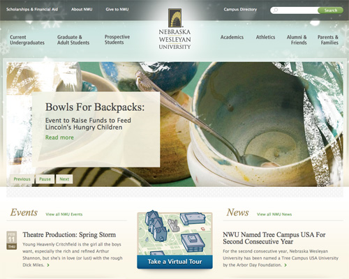
Nebraska Wesleyan University
Nebraska Wesleyan has one of the best-looking college sites out there, with a fantastic background image and excellent typography.

Screenshot

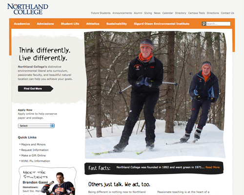
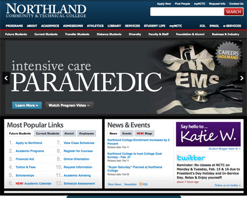
Northland College
Northland College uses unique typography and grunge elements to stand out.

Screenshot

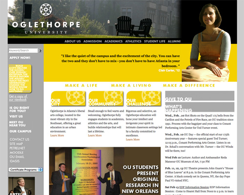
Oglethorpe University
Oglethorpe University uses a modern color scheme and typography.

Screenshot

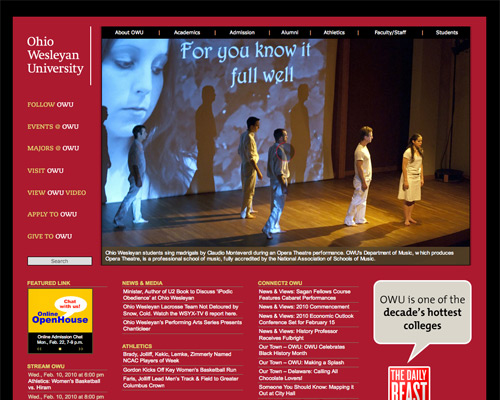
Ohio Wesleyan University
Ohio Wesleyan uses a bold color scheme and graphics.

Screenshot

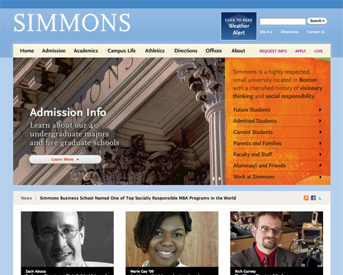
Simmons College
Simmons College uses a clean, grid-based layout and sophisticated color scheme.

Screenshot

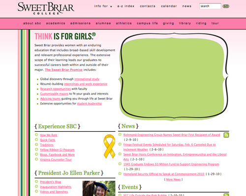
Sweet Briar College
Sweet Briar College steps outside of the norm for a college website and uses a more relaxed, feminine design (appropriate for a women’s college).

Screenshot

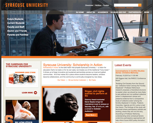
Syracuse University
Syracuse University has a fantastic grid layout and modern color scheme.

Screenshot

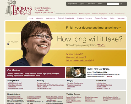
Thomas Edison State College
Thomas Edison State College has a great illustration in their header and a sophisticated color scheme.

Screenshot

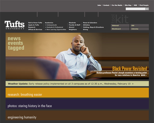
Tufts University
Tufts has a unique layout and excellent typography.

Screenshot

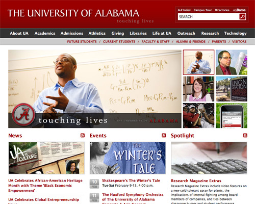
The University of Alabama
The University of Alabama uses a grid layout and plenty of negative space.

Screenshot

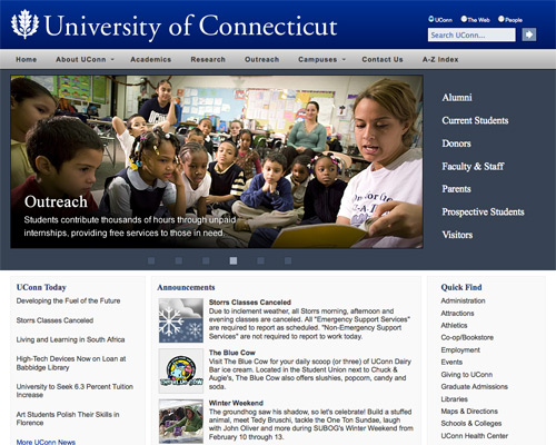
University of Connecticut
The University of Connecticut’s site has a simple layout and navigation.

Screenshot

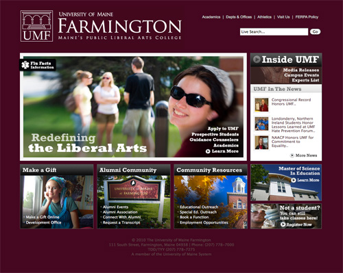
University of Maine Farmington
The University of Maine Farmington’s website uses a basic grid layout and great typography.

Screenshot

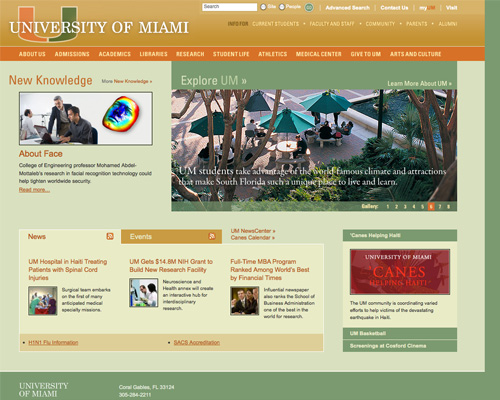
University of Miami
The University of Miami uses a muted color scheme and simple, horizontal navigation.

Screenshot

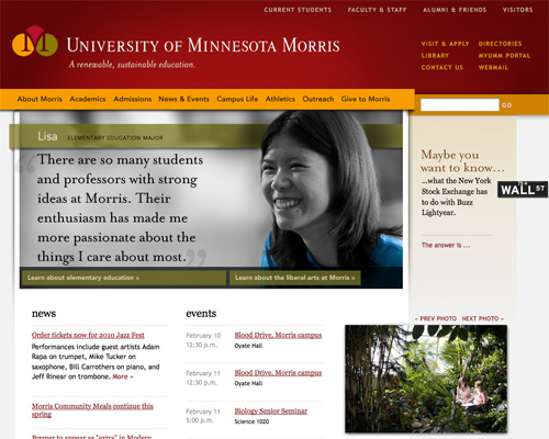
University of Minnesota Morris
The University of Minnesota Morris’s site incorporates a number of small details that give the site its polished look.

Screenshot

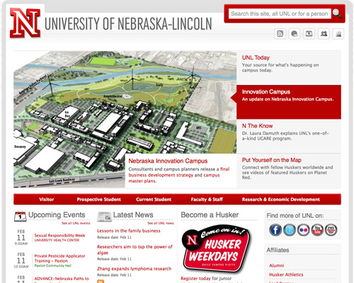
University of Nebraska-Lincoln
A simple color scheme and clean, grid-based layout give the University of Nebraska-Lincoln’s website a polished and sophisticated look.

Screenshot

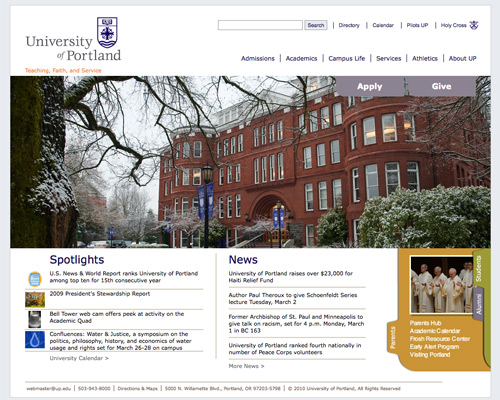
University of Portland
The University of Portland uses a simple layout and color scheme with plenty of negative space.

Screenshot

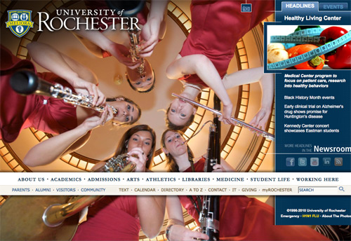
University of Rochester
The large background image and non-standard navigation set the University of Rochester’s website apart.

Screenshot

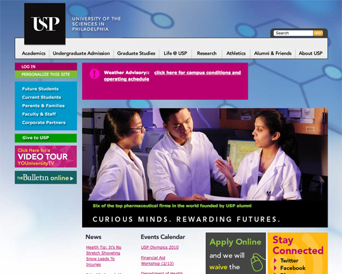
University of the Sciences in Philadelphia
The University of Sciences in Philadelphia uses a fantastic bright color scheme and clean typography.

Screenshot

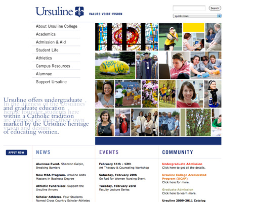
Ursuline College
Ursuline College has a simple layout, good typography, and lots of negative space.

Screenshot

Vancouver Island University
Vancouver Island University uses a grid layout and fantastic, monochromatic color scheme.

Screenshot

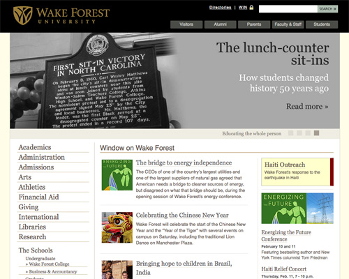
Wake Forest University
Wake Forest University’s site has clean typography and a simple layout.

Screenshot

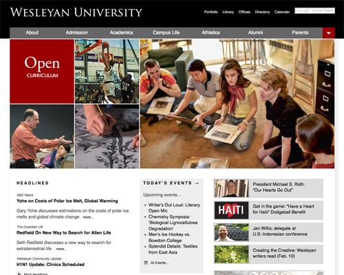
Wesleyan University
Wesleyan University uses a grid layout and sophisticated color scheme.

Screenshot

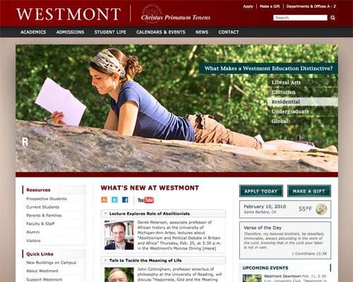
Westmont
Westmont utilizes a slideshow header and great color scheme.

Screenshot

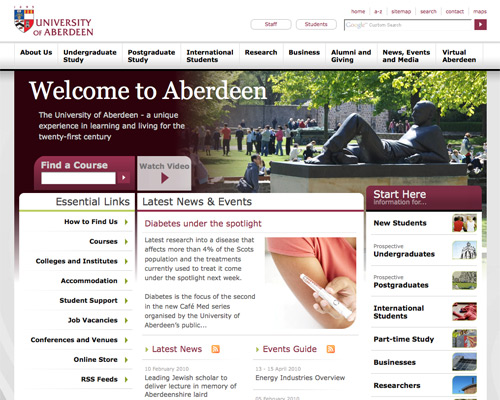
University of Aberdeen
The University of Aberdeen has a fantastic grid layout.

Screenshot

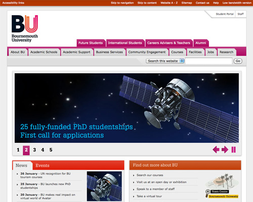
Bournemouth University
Bournemouth University uses bright accent colors and tabbed navigation.

Screenshot

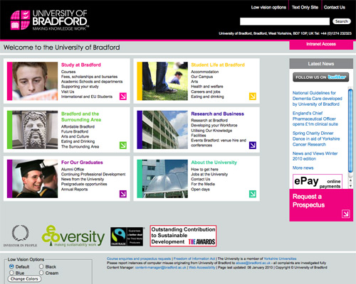
University of Bradford
The University of Bradford uses bright accent colors and a grid layout to stand out.

Screenshot

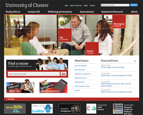
University of Chester
The University of Chester uses an obvious grid layout, an animated header, and simple navigation.

Screenshot

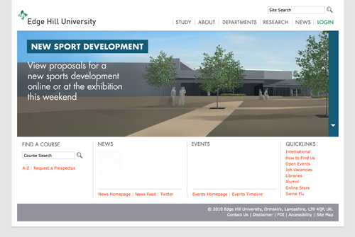
Edge Hill University
Edge Hill University has a header slideshow, minimalist color palette, and lots of negative space.

Screenshot

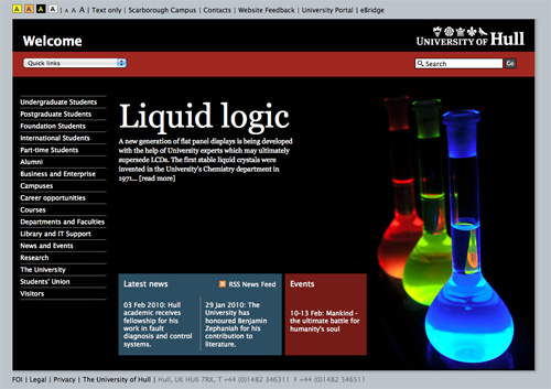
University of Hull
The University of Hull has a unique layout, simple navigation, and great accessibility features.

Screenshot

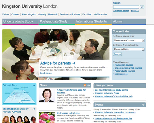
Kingston University London
The Kingston University London’s website uses bright accent colors and simple navigation.

Screenshot

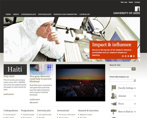
University of Leeds
The University of Leeds has a simple layout, minimalist aesthetic, and good typography. They also make excellent use of icons to simplify navigation.

Screenshot

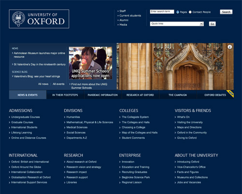
University of Oxford
Oxford uses a simple color scheme and clean layout and makes good use of negative space.

Screenshot

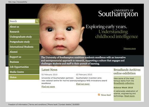
University of Southampton
The University of Southampton has a bold header and simple color scheme.

Screenshot

Community Colleges

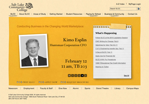
Salt Lake Community College
Salt Lake Community College uses photorealistic and grunge elements, combined with a unique layout.

Screenshot

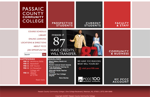
Passaic County Community College
Passaic County Community college uses an obvious grid layout and a great color scheme.

Screenshot

Anoka-Ramsey Community College
Anoka-Ramsey Community College has a unique color scheme and a good use of negative space.

Screenshot

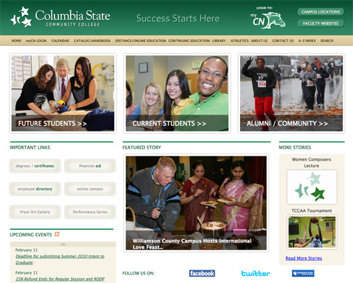
Columbia State Community College
Columbia State Community College has a simple layout and color scheme with clean typography.

Screenshot

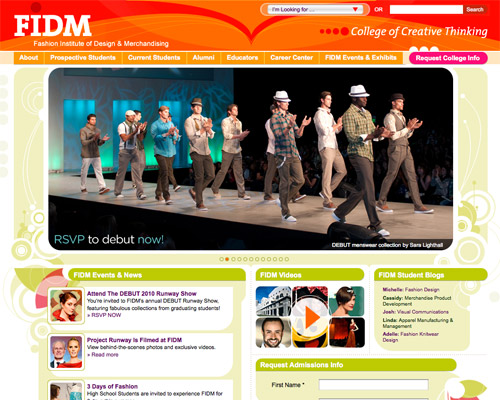
Fashion Institute of Design & Merchandising
FIDM uses an excellent bright color scheme and a prominent slideshow.

Screenshot

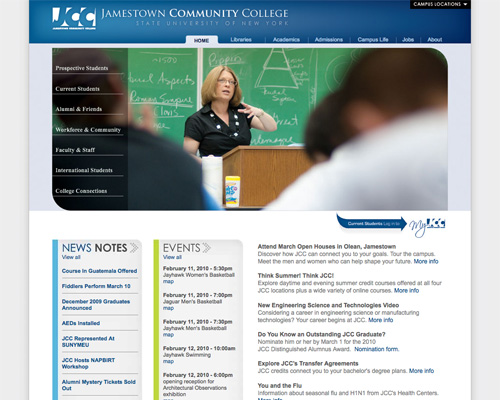
Jamestown Community College
Jamestown Community College’s site has a simple layout and navigation.

Screenshot

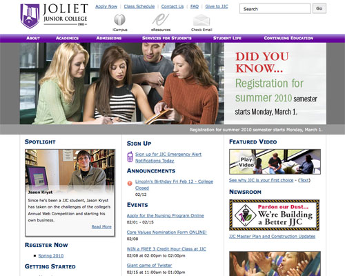
Joliet Junior College
Joliet Junior College has a simple layout with a good use of icons.

Screenshot

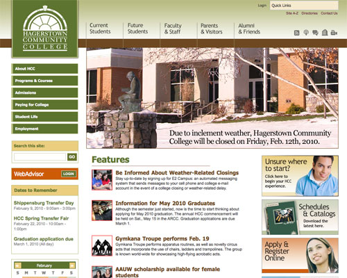
Hagerstown Community College
Hagerstown Community College has a good color scheme, clean typography, and simple navigation.

Screenshot

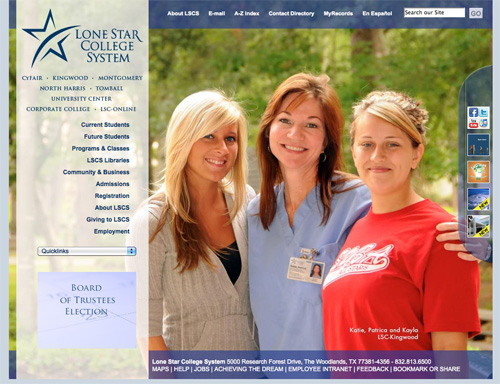
Lone Star College System
Lone Star College System makes good use of transparency.

Screenshot

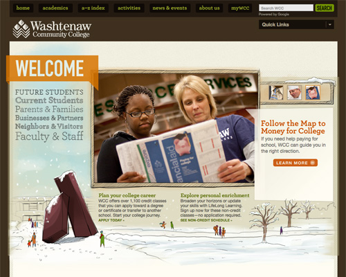
Washtenaw Community College
Washtenaw Community College has great hand-drawn elements, and a unique layout and color scheme.

Screenshot

Northland Community & Technical College
Northland Community & Technical College has a sophisticated layout and color scheme.

Screenshot

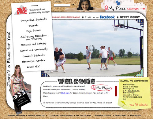
Northwest Iowa Community College
The Northest Iowa Community College site uses a mix of collage, photorealistic, and hand-drawn elements.

Screenshot

Art and Design Colleges & Universities

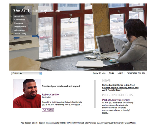
The Art Institute of Boston
The Art Institute of Boston combines a simple layout with bold header graphics.

Screenshot

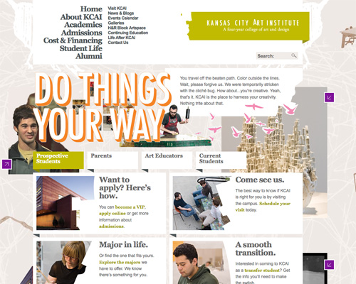
Kansas City Art Institute
The Kansas City Art Institute uses bright colors, a collage-style background, and loose grid layout.

Screenshot

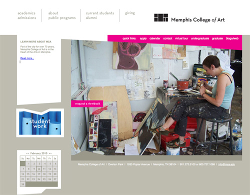
Memphis College of Art
The Memphis College of Art site uses bright bright pink accents combined with a simple design and clean typography.

Screenshot

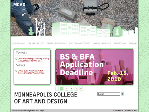
Minneapolis College of Art & Design
The patterned background, animated header, and clean typography set the site of the Minneapolis College of Art and Design apart.

Screenshot

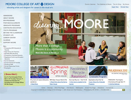
Moore College of Art & Design
Bold graphics and a textured background makes the Moore College of Art & Design site stand out.

Screenshot

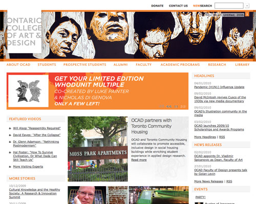
The Ontario College of Art & Design
The Ontario College of Art & Design uses a grid layout and modern orange and white color scheme.

Screenshot

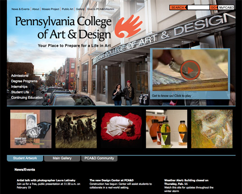
Pennsylvania College of Art & Design
The Pennsylvania College of Art & Design uses a modern color scheme and bold header.

Screenshot

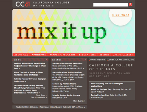
California College of the Arts
The California College of Arts uses a unique color scheme and animated header.

Screenshot

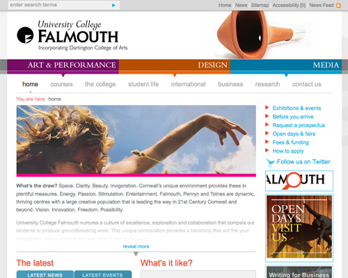
University College Falmouth
University College Falmouth’s site has bright accent colors, lots of negative space, and simple layout and navigation.

Screenshot

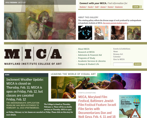
Maryland Institute College of Art
MICA uses a grid layout, muted color scheme, and excellent typography.

Screenshot

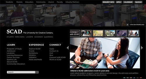
SCAD
SCAD’s minimalist light-on-dark design sets it apart.

Screenshot

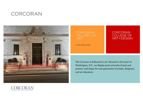
Corcoran College of Art & Design
Corcoran’s mix of minimalist grid design and bold colors is fantastic.

Screenshot

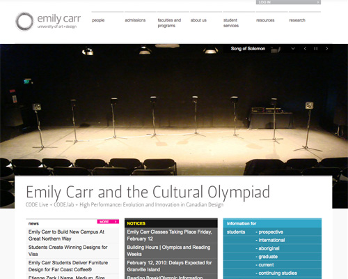
Emily Carr University of Art & Design
Emily Carr University of Art & Design has a wonderful minimalist layout and clean typography mixed with bold accent colors.

Screenshot

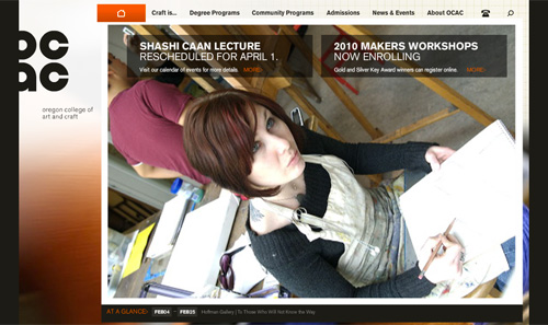
Oregon College of Art & Craft
Bold background, great typography, excellent navigation.

Screenshot

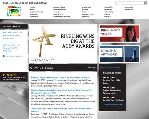
Ringling College of Art & Design
The grid layout and bold background give the website of Ringling College of Art & Design a unique look.

Screenshot

Other Institutions, Colleges & Universities

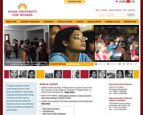
Asian University for Women
The Asian University for Women’s site has an excellent gold and maroon color scheme and plenty of negative space.

Screenshot

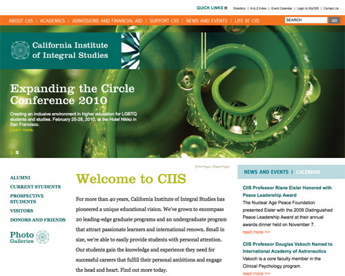
California Institute of Integral Studies
The bold typography and great color scheme of the California Institute of Integral Studies sets it apart.

Screenshot

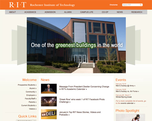
Rochester Institute of Technology
The orange and cream color scheme, simple navigation and clean typography make the Rochester Institute of Technology’s site unique.

Screenshot

Conclusion

While the vast majority of college and university websites out there are in need of serious overhaul, there are some fine examples of sites if you look hard enough. If designing a site for a college or university, remember that simplicity and negative space are both important, regardless of the amount of information a site needs to contain.

Cameron Chapman is a professional Web and graphic designer with over 6 years of experience. She writes for a number of blogs, including her own, Cameron Chapman On Writing. She’s also the author of The Smashing Idea Book: From Inspiration to Application.

  1. 101

    Add The University of Queensland to the list, it’s just undergone a re-design. http://www.uq.edu.au/

    0
  2. 102

    Great list! I would also suggest Middlesex University http://www.mdx.ac.uk

    0
  3. 103

    I knew i saw a layout like Middlebury College.

    Compare to:
    leoburnett.com/#/showcase

    0
  4. 104

    Nice List…Thanks

    0
  5. 105

    #20 Nebraska Wesleyan University – Great color scheme !

    0
  6. 106
  7. 107

    excellent collections!!!

    0
  8. 108

    Oscar Geurts Amsterdam

    March 22nd, 2010 5:53 am

    I am impressed with the list of references.
    But I do think this list is based upon attractiveness of graphic design.
    Non of these seem to have a real user-cnetric design.

    I’d like to submit http://www.INHolland.nl as well as http://www.Utwente.nl.

    best regards,

    Oscar

    0
  9. 109

    I’d love for to hear the thoughts on the website I was part of making for New York Law School ( http://www.nyls.edu )

    Thanks,
    AC

    0
  10. 110
  11. 111

    I think http://www.vsup.cz/ is a very good example, and rather original than most from the list.

    0
  12. 112

    I would have loved to see Boston University http://www.bu.edu/ their site uses a different approach than most of the educational sites I have seen so far.

    0
    • 113

      I agree. I work here at BU for their IS&T department and feel we have excelled in creating a beautiful website that incorporates our brand identity. Also check out our new TechHelp website: bu.edu/tech

      0
  13. 114

    Great List. How about Purdue? Boiler UP!
    http://www.purdue.edu

    0
  14. 115
  15. 116

    Fantastic Showcase…some great inspiration!

    0
  16. 117

    Since it hasn’t been posted yet, you can’t forget about the largest (and best) school in Florida, UCF! Redesigned a couple years back.

    http://www.ucf.edu

    0
  17. 118

    you have done really hard work to find but you still miss some but then there are so many education website, but more then half i have never seen, thanks for putting so much time for making this gallery

    0
  18. 119

    Shameless plug for the Barcelona Graduate School of Economics website, where I am the Communications Coordinator. (My predecessor designed the website.) http://www.barcelonagse.eu

    0
  19. 120

    good collection,

    0
  20. 121

    oh, thank god, im be scratching my head ideas for education website.

    thank u sir. +9999

    0
  21. 122

    I was excited by the concept of this article because it’s refreshing to see well designed education sites – and there are some lovely ones listed here – however I think they get lost amongst the noise. This list could really have been paired down to 6 or 7 examples with a bit more commentary on each design and have been far more powerful.

    0
  22. 123

    great post and here is link to my university to
    http://www.dtu.dk

    0
  23. 124

    Andrew S. Roberts

    March 23rd, 2010 3:23 am

    Great post, I may be a little bias, but here is one that should definitely be included: http://www.iupui.edu/

    0
  24. 125

    Raymon Schouwenaar

    March 23rd, 2010 5:09 am

    You miss some Dutch School

    School of Graphic design, Media management etc.
    “Grafisch Lyceum Rotterdam”
    http://www.glr.nl

    0
  25. 126

    This is a great collection! I would like to add my Alma Mater, Full Sail University, to the list. Full Sail has an amazing website that was designed and developed in-house!

    http://www.fullsail.edu

    0
  26. 127

    Just adding one to the list:
    http://www.gnomonschool.com

    0
  27. 128

    For me, some of those designs count among the best website designs I have come across. And ironically enough, the non-art-and-design colleges seems to have done better :)

    +2
  28. 129

    What an inspiring list – thanks! I just want to add University of Victoria http://www.uvic.ca. Their redesign took silver in the Best Institutional Homepage category in last year’s CCAE Prix d’Excellence awards.

    0
  29. 130

    i ve never seen a such great selection of beautiful university sites. especially in germany – they often just suck in design and behaviour.

    but: great inspirations – there is hope… thanks!

    0
  30. 131

    It’s good to see colleges and universities spend more time working on their websites.

    I would like to add Rio Salado College – http://www.riosalado.edu. They have a clean design.

    0
  31. 132

    http://www.nus.edu.sg as well as http://www.nyp.edu.sg

    They’re both higher education websites.

    0
  32. 133

    Leigh Baker Ronco

    March 24th, 2010 1:57 am

    Cameron,
    Thank you so much for including the Colby-Sawyer College site in your beautiful collection. You’ve made my whole month!
    Cheers,
    Leigh

    0
  33. 134

    Why I couldn’t find Stanford website amongue the list?

    0
  34. 135

    Why is Boston University not there???!!! T_T
    http://www.bu.edu

    0
  35. 136

    This is a great collection, thank you for posting! I would like to add Iliff School of Theology to the list. http://www.iliff.edu

    0
  36. 137

    Two great websites that I came across recently. They’re great from the perspective of student experience (usability):

    http://www.nwcu.edu/

    http://www.cornellemba.com/

    0
  37. 138

    hey I wanna download this article, so I could discuss it with my friends and spread it, send it to their emails this is awesome very informative, I soon realize that you don’t have to close the boundaries in designing your web page even if it involves academic, and piratically this sites is truly an eye candy! I wish you could also write about the benefits of publishing a well “designed web site”. Either in the field of advertising or industrial. Keep it going.

    0
  38. 139

    Does anyone else feel that 80% of these Education websites are terrible? And thats just talking about the design. Userability wise through deifferent browsers I’ve seen big issues.

    Don’t get me wrong, some sites are original and engaging. But the others eeem to follow each others styles and blandness. Much Like tomato soup. Its boring on its own, but through in some spices and veg it can become bareable…

    0
  39. 140

    thnx

    nice review!

    Another really nice website from the Netherlands

    http://www.hu.nl
    International: http://international.hu.nl

    0
  40. 141

    Thank you Thank you Thank you!

    I spent a large chunk of my day 3 weeks ago trying to find nice academic sites for a design project for a uni! Found this just in the nick of time! I couldn’t find too many!

    Here are a couple of Australian ones I liked: http://www.swinburne.edu.au and http://www.curtin.edu.au

    0
  41. 142

    This is a Vacational Education Centre of Tartu, Estonia i think that school page looks amazing.
    http://khk.tartu.ee/

    0
  42. 143

    A “unique layout and design”… maybe. But in this case form definitely came before function. As a student at Bennington College I can say that the website is next to useless when it comes to usability. Likewise, while exploring many of the sites on this list, I found that the idea of reflecting a college’s avant-garde nature was given precedence, instead of building something genuinely useful to students, faculty, and staff. In my opinion, a list like this prompts an important discussion about the balance between beauty and function.

    0
  43. 144

    My wife and I are helping to redesign a College site and have found some good organizational ideas from Depaul’s School of Music: http://music.depaul.edu/

    0
  44. 145

    Check out Georgia Southern University’s new look!
    http://www.georgiasouthern.edu/

    0
  45. 146

    Good or bad, it’s very instructive seeing so many higher ed websites to browse in one place. And of course it goes without saying that high quality, high impact images with relevant content will make or break even a poorly designed site. The sites that attract the eye will always be tied to the images.

    0
  46. 147

    Great review!

    0
  47. 148

    Check this one out: http://www.devine.be .

    It’s from a school in Kortrijk (West Flanders, Belgium) where they educate digital design and media.

    0
  48. 149

    Sterling Hamilton

    March 30th, 2010 9:04 am

    http://www.unr.edu/home/

    UNR has a variety of technologies behind their site.
    Journalists have access to WordPress – sections on on campus living use CakePHP.
    jQuery is being used throughout the site.

    0
  49. 150

    Great post!

    0
  50. 151

    Nice idea, but this post would have a far greater impact if it were a list of the top x institution websites, with a better criteria for why you think so.

    Also remember that pretty homepages are great, but the real success of a website is in how the university organises its content and presents it throughout the site.

    0
  51. 152

    You guys forgot about School of Visual Art’s Interaction site: interactiondesign.sva.edu/ courtesy of the Heads of State > https://www.theheadsofstate.com.

    0
  52. 153

    This college’s website allows students to view classes, add them to a shopping chart and register for them. Check out San Jacinto College, http://www.sanjac.edu.

    0
  53. 154

    Manzoor kottayil

    April 6th, 2010 1:11 am

    Excellent review………Keep writing

    0
  54. 155

    Another college website, but for a special education college in spain, http://www.lapanderola.com

    0
  55. 156

    “The University of Sciences in Philadelphia uses a fantastic bright color scheme and clean typography.” …. Are you really really sure ?! ;)

    0
  56. 157

    Stockholm School of Economics in Sweden. http://www.hhs.se

    0
  57. 158

    thank you!

    +1
  58. 159

    Stephen Gates

    May 20th, 2010 6:39 am

    You guys need to do some homework before you post these articles and say things like Middlebury design called “a completely unique layout with excellent typography” by Smashing Magazine. You’re right that it was a complete unique layout when I designed it two years ago and it was called The Luxury Collection.com. See for yourself…

    The Luxury Collection
    https://www.starwoodhotels.com/luxury/search/explore_collection.html

    Middlebury College
    http://www.middlebury.edu/#story251166

    0
  59. 160

    inyattawetrust

    May 31st, 2010 7:42 am

    A website i designed for an MBA school in Paris. hope you like it :)
    http://www.enpcmbaparis.com

    0
  60. 161

    Medical Justice

    May 31st, 2010 7:25 pm

    I just encountered a unique navigation header in the website “The Wurtman Lab” at http://wurtmanlab.mit.edu/publications.php

    The actual lab, at the Massachusetts Institute of Technology, does research in neuroscience. On their website, the navigation depicts a molecule crossing the blood-brain barrier. It is clever and fun, and reflects the subject matter of the site.

    0
  61. 162

    I liked a handful of these sites, but felt many of them fell short. I would have enjoyed more of an explanation of what made these site so great and how the author came about to include them. Here are some from level8 design studio that I think killed it.
    http://www.hhi.harvard.edu/
    http://www.hunap.harvard.edu/
    http://www.ethics.harvard.edu/

    0
  62. 163

    Great resource! Well done Smashing!

    0
  63. 164

    This article is very useful for me, I’ve learn a lot from this article.

    0
  64. 165

    Great & timely article for a project I’m working on –

    Berea College’s home page is great, but the design totally breaks down as soon as you click to see a subpage. They’ve lost that great color scheme and any of the unique design elements from the home page are gone – it almost looks like you’ve clicked somewhere you shouldn’t be, or like you’ve reached an intranet site.

    0
  65. 166

    Wesley Theological Seminary just redid their website and it is quite nice http://www.wesleyseminary.edu

    0
  66. 167

    Berea College’s recent redesign was actually led by a sophomore computer science student. Which is excellent, seeing as it was showcased here.

    0
  67. 168

    I liked some of the designs but many of them were boring and uninspiring. Having said that, most of them are better than most.

    This is the website at my college which at best looks like it was designed 15 years ago and it looks like a student designed it. Pitiful. I almost cried when I saw it, and when I checked the source and found table-based code, I nearly had a fit. I would offer to design and build a complete new site for them but I wouldn’t have the time over the next 3 years that I’m there for. So sad. http://www.penwith.ac.uk/

    0
    • 169

      I take offense to your comment: “it looks like a student designed it”. I’m currently a student, and I’ve designed many user-friendly and attractive web sites. And I’m definitely not the only one. I was the lead designer on http://www.berea.edu/

      Also, that web site definitely does not look like it was designed “15 years ago at best”. Here was Yahoo!, 15 years ago: http://web.archive.org/web/19961017235908/http://www2.yahoo.com/

      0
      • 170

        It does look like designed 10 years ago maybe not 15( i wasn’t browsing 15 years ago… ). I think it’s rather ugly. On the other hand, your design is well formatted ( equally spaced and easy to read ) but not attractive yet. I can say you are on the right direction to be a good web designer.

        0
  68. 171

    Does anybody know who designed the University of Leeds and University of Hull websites?
    Thanks!
    Marina

    0
  69. 172

    This is a great resource. I work in the higher education marketing industry so I know how bad websites can be. They go from the early 2000s design to the overkill design. A lot of these sites are clean and progress the student to the next step quite well. I would like to submit, http://www.regisdegrees.com/ and http://www.online-lcu.com/.

    -1
  70. 173

    I’ve been looking for a resource like this for a while. Thanks. In my search for well-designed college sites, one good one I found was Biola University) – watchmovieshindi.com

    +1
  71. 174

    Sessions College has a simple yet effective design that’s based off the color scheme of their logo. http://www.sessions.edu/

    I like websites that are aesthetically pleasing but I also enjoy a website that is user friendly and functions well.

    Just my two cents ;)

    0
  72. 175

    Have you seen the Parsons liquid menu? I entered the school because of that menu.
    http://www.newschool.edu/parsons/

    0
  73. 176

    You might add http://www.qcollege.ca which was redesigned this year.

    0
  74. 177

    For those drupal designers out there I found some good CMS designed sites: onlinemsw.bu.edu and http://www.purdueonlineprograms.com.

    0
  75. 178

    Nice collections. Thank for posting it. I would like to add http://www.educatenepal.com to this list.

    0
  76. 179

    Great resource! Nice resourceful collection, good inspiration for future sites. thanks a lot for putting them at one place.

    0
  77. 180

    I’m blown away by the SCA site. Anyone know what Interactive Agency designed it?

    0
  78. 181

    I love the Hampshire College website, simple, clean and great use of colors. The Middlebury college one is kind of obnoxious. I definitely like strong colors on a website. Another college website I am a fan of is http://www.burlington.edu

    0
  79. 182

    I’m a little biased, but I’m surprised College of the Atlantic didn’t make the list

    0
  80. 183

    Thanks for the great collection of academic and higher education websites! There is a lot of talent out there creating these amazing sites.

    I would like to submit The University of the Arts in Philadelphia. Their site is frequently updated and currently has a great sliding background with student artwork.

    http://uarts.edu/

    0
  81. 184

    Thanks for this excellent list!

    I’d like to add the recently relaunched site for Roger Williams University

    The site was designed and developed by OHO Interactive

    0
  82. 185

    This is a spam comment!

    0

  1. 1

    For me, some of those designs count among the best website designs I have come across. And ironically enough, the non-art-and-design colleges seems to have done better :)

    +2
  2. 2

    I would also add Full Sail University (entertainment, media, and arts school) – http://www.fullsail.edu.

    +1
  3. 3

    thank you!

    +1
  4. 4

    I’ve been looking for a resource like this for a while. Thanks. In my search for well-designed college sites, one good one I found was Biola University) – watchmovieshindi.com

    +1

Leave a Comment

Yay! You've decided to leave a comment. That's fantastic! Please keep in mind that comments are moderated and rel="nofollow" is in use. So, please do not use a spammy keyword or a domain as your name, or it will be deleted. Let's have a personal and meaningful conversation instead. Thanks for dropping by!

↑ Back to top