Maps In Modern Web Design: Showcase and Examples
Geo-location was a hot topic in 2009. With so many applications on GPS-enabled smartphones, more maps than ever were accessible to the average person. But how can Web designers and developers take advantage of an increasingly location-aware user base? This article explores existing trends, conventions and the possible future of interactive maps online.
The Fundamentals Of Online Maps
When most people think of maps on the Internet, Google, MapQuest and TomTom might come to mind. These are the giants in the industry, but they are far from the most creative. These companies provide maps as a service. As you’ll see from the mapping applications featured throughout this article, Google doesn’t own the market. There is still plenty of room for creative map innovation.
This isn’t a lesson in cartography, but understanding the purposes that maps can serve in modern Web design is important. Three main areas seem to represent the majority of tasks:
- Navigation and directions,
- Show relationships and trends geographically,
- Show points of interest.
Interactive Maps
The expansion of Web technology over the past decade has opened a number of doors to presenting data online. One of the most rapidly improving tools for interactive presentation is the map.
Interactive maps on the Internet present data most effectively when they invite action from the user. Showing relationships between data is easier when the user has the power to change the visuals. These are advantages that traditional print maps do not have. If a print map is not clear initially, a person can do very little to make sense of it. With online interactive maps, the simple action of moving sliders around reveals relationships between data and content.
Panning and zooming are fundamental to the interactive map. These actions enable the user to focus their browser on the amount of information that they’re comfortable with.
No Legend Required
On traditional print maps, the legend serves as a translator for the symbols used. Contextual windows eliminate the need for legends in many online maps. Instead of having to refer to an explanation of the symbol in the margins, the user simply clicks on a point to find out more about it. The results in fewer steps and less eye movement to accomplish the same goal. To illustrate just how intuitive this kind of action has become to Web users, try out the “America’s Best Adventures” map below:

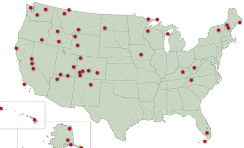
Clicking a dot brings up a contextual window.
Legends are still needed in certain cases. Heat maps, for example, display intensity by shade of color, and users usually require a reference bar to make sense of the information. Contextual menus do not make legends obsolete across the board, just for simple “points of interest.”
Common Types Of Map Navigation
Other than panning and scrolling, there are a number of interesting ways to present digital maps. Below are some the of the most common among modern interactive maps. Keep in mind that mixing and matching most of these methods is possible; one does not necessarily preclude use of others.
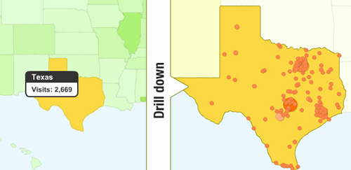
Drill-Down
When the user has to move through various levels of specificity of data, a drill-down style of navigation is commonly offered. The drill-down clearly groups information of magnitudes ranging anywhere from the “big picture” down to an individual case.
Google Analytics presents a drill-down style for its world maps. By clicking on a specific country, the map reorients itself to mute other countries, and then does the same at the state and city level. This allows the user to control the specificity of data without being overwhelmed.
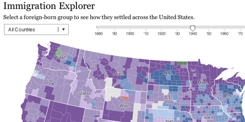
Timeline
A timeline slider shows progress over time on a map. The slider doesn’t necessarily have to represent time itself. The main purpose is to show the correlation between the slider’s metric and the map’s content.
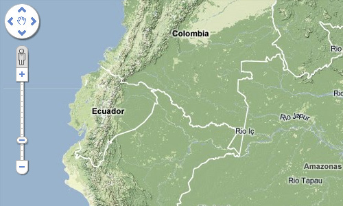
Zoom
This is different from the drill-down method because with zooming, the map is typically not rebuilt or reorganized for each level of magnification. With zooming, the map allows information to be examined more closely, rather than regroups data for a smaller area.
Some data may not be visible until a certain level of magnification is reached. This keeps broader views from being cluttered by details that have little relevance at that scale. An example of this is street names, which are hidden from view at the magnification shown below.
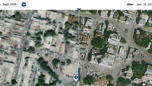
Before and After
Like the timeline approach, this one shows multiple states of the same location. The difference is that the before-and-after method shows only two states. This style has been showing up much more frequently lately, particularly with satellite imagery.
After the recent Haiti disaster, the New York Times used composite images taken from space to create an interactive map that showed the destruction. The result was a striking before-and-after illustration of the earthquake’s destruction of Port-au-Prince.
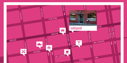
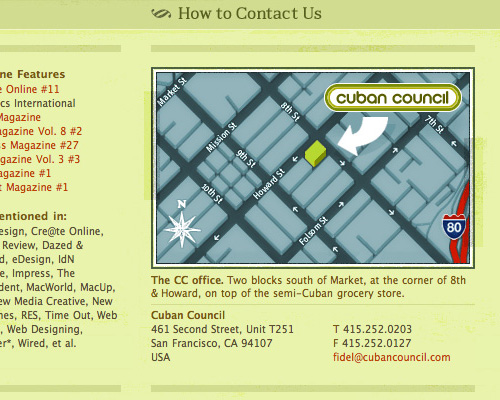
Point of Interest
In a point-of-interest map design, everything but the target area falls into the background. This allows the user to focus instantly on the relevant points of interest. Additional information can be conveyed by the relative sizes of the markers, making it easy to discern relationships between locations without clutter.
Odopod takes this idea a step further on its contact page by offering a photo of its office’s front. Finding the right building is now much easier.
Maps As Informational Tool
The Internet and digitization of information represents an interesting improvement to print maps. Used in conjunction with surveys and user feedback, maps can become an almost real-time representation of information. With this method, comparing two metrics side by side is simply a matter of selecting the desired ranges.
The maps on National Geographic’s website illustrate how interactive maps can be used to show worldwide trends from collected data. The Earth Pulse map, for instance, has a menu on the side that allows users to display information based on metrics such as population, meat consumption and deforestation.
From the Political World
Location gives context to current events. It’s no surprise, then, that news organizations are visualizing world events with some of the Web’s most innovative maps.
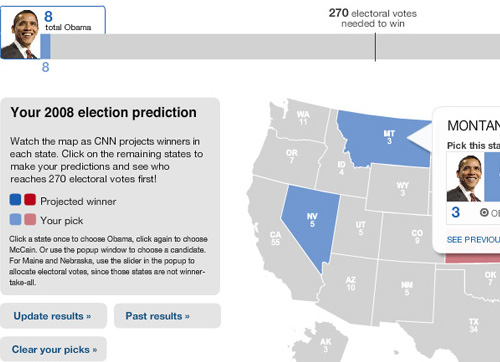
Perhaps the most heavily mapped period of time was the 2008 US presidential election. Interactive maps were created daily to show voter opinion. Anytime a poll was released, you could be sure that an interactive map would soon follow. Because the information was tied to constantly updated data, a static map would have become irrelevant within hours.
In the heat of the race, CNN released a tool that allowed users to assign votes and project which candidate would ultimately win. The map thus not only presented information, but became a tool for generating information.
Once the election was over, the country’s voting patterns were mapped as well. One of the more interesting versions was the Washington Post’s map broken down by county. The map used Flash to give a full 360-degree view of election trends. The results of an entire campaign were summed up effectively in a single graphic.
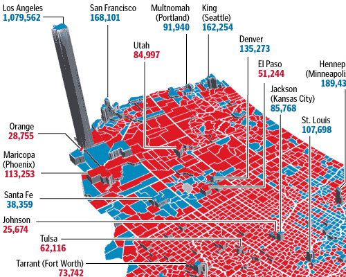
This is where maps tend to overlap with (or even become) infographics. The difference is in presentation and design. In the Washington Post’s map, the information was directly tied to a particular area. The data, then, would be relevant only to the context in which it was collected. A 30-year-old female voter in California is not the same as a 30-year-old female voter in New York.
Unconventional Maps
While the majority of maps in this article are of physical locations, don’t feel that you have to stick to that. Geographical maps are not the only kind of maps out there. Maps can also be used to explore more abstract information, not unlike static infographics. GOOD illustrates this with its “Roadmap to Harmony” presentation. The result is both logical and inspiringly creative.

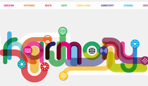
“Roadmap to Harmony” breaks the mold of location-based maps.
The Future of Location
Most of the maps we’ve looked at are of physical locations and buildings. The future of interactive maps will have to accommodate the role of people, too, and people are a bit more mobile than bricks and roads.
Services like Foursquare and Gowalla are making sure that maps and location are a part of the daily lives of smartphone users. Twitter is rapidly expanding its API to include location data. Where you are at any given moment has remarkable implications. This could lead to websites that collect such data and turn it into maps that show movement and trends.
Mapping Action from Location
Consider how many people checked in at this year’s SXSWi conference. The entire conference was mapped thanks to the location-based badges of attendees. This was more than just about individuals sporadically updating their location; it was an demonstration of how an entire event’s “personality” could be mapped based on the actions of its participants. With so many attendees checking into each event, the data could be used to determine everything from eating habits to panel interest.

People-Centric Maps
Relying on GPS only to locate buildings may soon be a thing of the past. We may begin to see contact pages of website designers that have a “Find me here now” section, complete with GPS coordinates? NFL player Chad Ochocinco has already taken this level of interaction to a whole new level. And nothing is to stop the average person from jumping onboard, too (privacy concerns notwithstanding).
A Showcase of Maps in Web Design
We’ve covered a lot of ground today. The showcase below compiles more examples of maps for your inspiration. Thanks to Pattern Tap for making the process of searching by design element relatively painless (even though it doesn’t yet have a map section). Many of the examples below were scavenged from there and other locations.

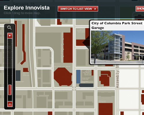
Interactive map for the future development of Innovista, a massive project of the University of South Carolina.

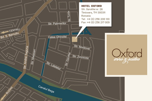
Hotel Oxford puts its location in context.

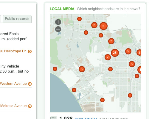
EveryBlock displays city news as point-of-interest markers.

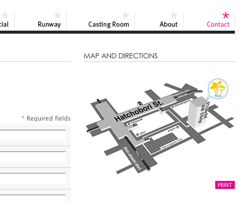
An exaggerated rendering of building location.

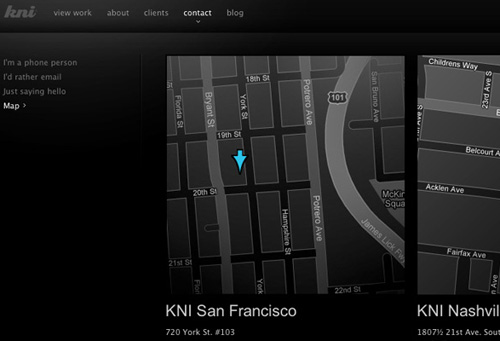
KNI uses maps to show studio locations.

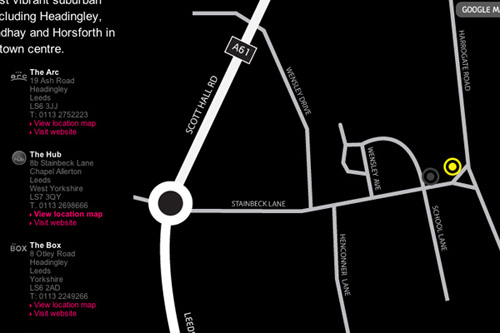
Even if not perhaps to scale, Victoria Star’s map provides all the information you would need to find the company.

A rough guide to finding bars.

This one explores the routes of famous expeditions.

A jQuery-powered map of open school-teacher positions.

An interactive map of the fictional World of Warcraft.
Build Your Own
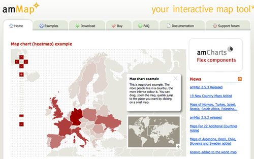
Looking to generate your own map for a project? While JavaScript and HTML5 have come a long way, Flash-based alternatives like amMaps still offer some of the most robust solutions for interactive mapping. Almost every map mentioned in this article could be built using this (or a similar) system.
If you’re looking for a non-Flash alternative, Carsonified recently published a great case study on using jQuery for interactive mapping, which explains the process. Know of any other Internet-based mapping systems out there that designers should know about? Share a link in the comments below.
(al)


Yoosuf
April 6th, 2010 3:41 amits awesome and very useful stuff, thanks for sharing as a collection.
Callum Chapman
April 6th, 2010 3:41 amWonderful post. I love some of those modern map designs! :D
Mari
April 6th, 2010 8:02 amI’m too
Glesga Boy
April 6th, 2010 3:49 amGreat Article, well researched,
Can you advise of any good resources for tutorials on producing interactive maps?
Cheers GB,
pascal
April 6th, 2010 4:00 amIt’s just a shame there is so little open source mapping solutions available today. The future seems bright for SVG, but I wish there was a great open source mapping (world and level country) available!
Roger
April 7th, 2010 12:39 amI’ve tried to create an interactive worldmap in SVG. Aside from the problem that IE doesn’t support SVG (yet) and Google’s SVG-plugin is not working well enough, it turned out that the map I used completely stalled my PC, while the same map worked flawlessly in Flash.
LC
April 6th, 2010 4:24 amFrom a user point of view (and for most usage) I really prefer when it’s Google Map that is used. The navigation is the best. And from a developper point of view, their api is really top notch and getting better and better.
God, it is getting difficult to avoid the beast.
Chris
April 6th, 2010 6:05 amI like maps.
boynton
April 6th, 2010 6:08 amThat’s what I need!!
twiit
April 6th, 2010 6:08 amafrica has no maps
sam (@duregger)
April 6th, 2010 6:16 amhrrrrmmm…. yeah, open source maps would be beneficial. wondering about a mapping system that ties a person in an organization to a specific place. I’m sure Google Maps API could figure this out, but it’s not as sexy as a well designed map.
anyone have any alternatives? or other online mapping options?
Nauglamir
April 6th, 2010 6:30 amThanks for this article. I found it very useful, specially the build your own part…
Julius
April 6th, 2010 6:38 amSome great maps! There is a cool geo game – http://www.mapduel.com.
Sam
April 6th, 2010 7:14 amGreat Maps. Thank you for the article
Jason Rudland
April 6th, 2010 7:28 amThis is a great example of how to do web design properly (in my opinion!) Clever ways to provide functionality that enhances the user’s experience.
Martin Hermosilla
April 6th, 2010 7:32 amI have other map uses, I put locations for earthquakes, first on chile then worldwide:
http://www.sismos.cl/
http://global.sismos.cl/
Regards,
-Martin
Evan
April 6th, 2010 7:44 amInteresting collection, but dead wrong on the “no legends” bit. Interactivity is no excuse for not providing sufficient information to the user. If your map doesn’t immediately make sense *before someone clicks*, you’re confounding rather than informing your user.
You can get away with no legend if the map is self-explanatory, like the National Geographic map you link to, or if it’s using conventional symbols, or if it’s clearly labeled on the map itself. But you should *never* make your user click on points just to figure out what the map is showing.
Zach Dunn
April 6th, 2010 7:59 amLike you said, the map needs to be self-explanatory enough to prevent a “mystery meat” usability issue. I would argue that with enough visual cue or context, this would not be a concern. If you had a map titled “Famous Landmarks” with a series of dots, you know exactly what is going on. A legend would only repeat the context. As another example in visual cues, Google Maps doesn’t need to explain what a pin represents.
If you have a map with a lot of information, you will probably still need to include a legend (like the travel map from GOOD) to be effective — there’s no getting around that. My point is that legends are no longer a rigidly required piece of the map experience.
Jack Lucky
April 6th, 2010 8:08 am“No Legend/Key required” is best way to make useless map.
Apart from that, it is useful article. I find a nice chart/map website having lot of maps – http://chartsbin.com/
Jason
April 6th, 2010 8:08 amNice article.
I checked out the One Mighty Roar website and would like to point out the blatant design rip off from Fantasy Interactives website. Shame shame…
Zach Dunn
April 6th, 2010 9:44 amFantasy interactive was one of several inspirations in our ongoing redesign. We’ve recognized in the last few weeks that there’s an unintended similarity (both in background arrangement and font hierarchy) between several of the elements. We actually have a redesign rolling out soon to fix this up.
Mark Harrower
April 6th, 2010 8:28 amThanks for a great collection of maps and services.
I do worry, however, this new wave of online maps covers only about 1/3 of the cartographic waterfront and that folks think the only reason we make maps is to locate point features (e.g., where to buy a $4 latte) or make state-level choropleth maps (e.g., election maps). Both are fine, but are the lowest hanging fruit. Where are the dozen other common and really powerful thematic map types that you might see in any cartography textbook (e.g., cartograms, flow maps, dot density)? Where are the multivariate maps that cartographers have been making for 100+ years that tell rich, nuanced stories? It’s to this end that we’re building indiemapper http://indiemapper.com …yes, a shameless plug…to try to reintroduce some of that cartographic diversity.
John Crumpton
July 12th, 2012 12:12 pmThanks Mark – indiemapper is great!
If you add locations to Google maps first, export the KML file then upload it to indiemapper it will then export a layered SVG map! Great for noflash mapping in HTML5.
Johansrk
April 6th, 2010 9:25 amI just made a jquery map 2 days ago of Denmark
Lauren
April 6th, 2010 11:15 amWow, great post! I had been struggling with an appropriate method to create our sales map on our website and plan to pump up the interactivity, but right now it seems to do the trick.
http://www.amientertainment.com/sales
Wondering how to tackle the international map though!
Thanks!
Chris Sanders
April 6th, 2010 11:51 amIt’s fun to see how people are always evolving information, especially when it comes to map design. Thanks for the article.
iluvhatemail
April 6th, 2010 12:03 pmI made an interactive map of the tokyo subway from my trip there. Will most definitely use the same idea in the future. http://www.buytokyo.com
rayw
April 6th, 2010 2:40 pmstumbled upon amMaps a few weeks ago – awesome XML to flash interface. highly customizable, pre-made maps w/ options to purchase to further customize. highly vouch for personal or professional use.
Bruno
April 6th, 2010 3:17 pmGreat post, I love maps and being able to summarize so much information on 1 single map.
In addition, I’ve found a great website to create animated maps for websites and powerpoint presentations. It’s called RichMaps (www.richmaps.com) and it enables you to enter your own data and customize your map. Pretty easy and cheap.
jacoboliva
April 6th, 2010 10:45 pmSince I have been in this business of web designing for a few years.Hence I can very well understand the importance of these kind of creative ideas…and thus I truly appreciate the imagination behind the birth of these concepts…Great Job!
Wedding Marquee Hire Tunbridge
Jamie McDonnell
April 7th, 2010 1:27 amNice post, thanks for sharing ;)
Here is a great one that you forgot:
http://www.360cities.net/map
Panoramic images from around the world – some beautiful pictures there!
Happy mapping all.
J
parag
April 7th, 2010 2:50 amIt is really nice. Great article buddy… good research
Mapman
April 7th, 2010 4:55 amAmazing progress within a half-decade, but the missing element that matters to all humans is ‘time’. Timelines only give you a moment in time, there is no chronological context – you can’t see complete time. Intel and crisis mappers are using GeoTime to solve this problem. http://www.geotime.com
Zach Dunn
April 7th, 2010 8:35 amEven though I don’t entirely know what I’m looking at, that seems wildly fascinating. Thanks for the link!
Martin Rasmussen
April 7th, 2010 5:07 amGreat article!
So much cool stuff..
But I miss one. The map at http://www.ungarbejde.dk – It’s easy to manage a large number of cities, when it’s splitted up in areas.
Nick Milon
April 7th, 2010 5:09 amGreat article on current online map trends !
May be the following educational example of of online maps is also interesting for your readers :
http://www.geognos.com/geo/en/cc/au.html
(try to see points of interest – capital, cities, neighboring countries etc., of a the country by using the selector box on page top, or click on the photos)
Avron Polakow
April 7th, 2010 5:31 amCheck my site for some very different map apps including: moving objects, a map atlas, map editing, adding and coloring map objects, exporting to Google maps, importing shape files, etc:
http://www.avronp.com/
(under the GIS directory)
Andrew Turner
April 7th, 2010 6:22 amIt’s definitely a new wave of interactive mapping and digital storytelling.
GeoCommons (http://maker.geocommons.com) lets anyone build maps for visualization and analytics by walking them through the process and guiding based on the data they want to layer together.
There is also an API (http://geocommons.com/help/GeoCommons_API) for developers to build into their own applications and sites.
TSSVeloso
April 7th, 2010 8:20 amWhat an amazing post! Besides the great explanation, the showcase you’ve put together is wonderful!
Keep up the great work!
@TSSVeloso
Todd Bagley
April 7th, 2010 8:27 amGood article. The comments are somewhat troubling. I see more and more crying for an “open source” solutions and fewer people contributing to creating that solution. There seems to have been a fundamental shift to “Would some PROFESSIONAL do the hard work and give it away so I can plug it into a solution I want to make money with”. Sad days…
Zach Dunn
April 7th, 2010 8:34 amI’m a huge advocate for open source in most situations.
When you get into extremely niche markets (like mapping), it tends to be the paid solutions that have developed the best option. I don’t mean to discourage open source initiatives, just that haven’t come across any that have a comparable experience yet. I look forward to the day when someone releases the WordPress of cartography though!
Brian
April 7th, 2010 9:54 amIts here… its called OpenStreetMap (www.openstreetmap.org).
Or, you can use OpenLayers (http://www.openlayers.com/) and create your own tiles, or use nice tiles such as those found at MapBox (http://mapbox.com/).
This is all for Street Maps, however. Info-map style projects I usually do in Flash.
Mirko
April 7th, 2010 10:27 amhere’s some more realtime earthquake/volcano map stuff. built on google maps api for flash. (and some flex too…)
http://www.realtimetools.de
Russell
April 7th, 2010 1:11 pmImages aren’t showing in Chrome or IE 8 . . .
Chris
April 7th, 2010 6:00 pmA nice roundup — thanks for the post! Some of you map enthusiasts might be interested in a new _free_ thematic mapping web service I created: http://www.plugandplaymaps.com/ I hope this doesn’t count as an advert — the service was something I created as one way to make mapping more readily available to anyone with a story to tell… and it’s free…
The aim is to help you create engaging and informative maps _with legends_ on your website from your data without having to be a programmer or cartographer or GIS expert. There’s a WYSIWYG Designer that lets you point to your data file and then design the map to display your data how you want it; it shows you the map and builds a short script that you copy and paste into your web page to embed the map.
Works with data in many formats: spreadsheets, google docs, kml files, shapefiles, dbf files, and more; when your data changes, the map instantly changes with it. Offers lots of ways to display your data to get your story across: scaled colors, scaled sizes, continuous values or automatic classes, tooltips, popup windows, icons, pie charts, lines, polygons, selectable features with statistics… there are many, many options, almost all of them available from the easy Designer via drop-down lists, checkboxes, etc. Lots of sensible defaults, with lots of options to customize. Built-in data for countries and U.S. states. More features in development.
Would love to have you try it out and post successes, ideas, or problems to the forum on the website. Give it a try and show off your results.
Nahid
April 7th, 2010 6:39 pmWow superb! keep up good work
Chris
April 7th, 2010 6:39 pmSigh! I guess rules are rules, but really, my post that just got removed was from the heart… I created the service to spread the joy of making really cool maps, really easily… It’s the free tool I always wished I had even though I am a pointy-headed academic GIS guru… it shouldn’t be so hard to make engaging interactive thematic maps (and legends!). People should only have to worry about their data and the story they want to tell with it, and I put the service out there to make that possible. It’s a shame that I can’t share that with your readers, many of whom seem to be asking for that very thing…
Chris
April 8th, 2010 7:04 amHere’s a very interesting kind of interactive map that let’s you explore complex what-if scenarios with a very simple and clever device – the “swingometer”:
http://www.guardian.co.uk/politics/interactive/2010/apr/05/general-election-map-swingometer
Nigel Allan
April 9th, 2010 1:32 pmGreat article!
My favourite online tool for creating vector based maps that I can edit is: http://www.aquarius.geomar.de/.
Webrunner
April 10th, 2010 6:12 amDon’t forget to have a look at mapicons collection. A huge collection of marker icons for your Google Maps. http://code.google.com/p/google-maps-icons/
Gerry
April 13th, 2010 4:09 amAny idea how the “America’s Best Adventures” map is created?
Jim
April 13th, 2010 5:25 amSuprised there was no mention of conceptual maps, such as tag-cloud-type maps, like http://cloudmap.calcresult.com
&
http://www.calcresult.com/cloudmaps/current.html
Justin Carroll
April 13th, 2010 5:59 pmQuit tempting me to play WOW again. :)
Zeesh
April 22nd, 2010 3:55 amNice and informative post!
Alison Wetton
April 28th, 2010 3:12 amGreat article. I need to produce a map in a current project and this has been an exremely useful read! Thanks.
silent
May 1st, 2010 8:06 amnice post here
My Little World
rosiewrose
May 2nd, 2010 8:46 pmThank you, thank you!
Jason Rudland
May 4th, 2010 5:02 amAn excellent post – thank you.
Andy
May 6th, 2010 5:47 pmWhat’s the latest trend and/or best way to list all the towns/cities/counties throughout a few states for areas that a company commonly services? It seems like a comma separated format would be the most space conscious, but it isn’t very appealing.
zach
May 20th, 2010 10:11 amI am surprised no one has mentioned umapper.com. It is a killer app. to design your own interactive maps..and it is free!
deannaaquiar
July 12th, 2010 6:45 pmCandy for the GIS student! I cant wait to share with my class at DOI
Ted
September 9th, 2010 6:55 pmGreat Topic. I was searching for similar tools before, and found a web based map software which is very easy to use — no XML or Flash needed. Check out imapbuilder.net.
I mainly use it with CMS based sites such as Joomla and Wodpress. But you can use it to create maps of different countries and integrate with any PHP or HTML based pages easily.
Rinus Deurloo
October 31st, 2010 12:41 pmWe just released a jquery based thematic web maps editor (http://studio.everimap.com/) and an API for creating one’s own thematic webmaps (http://api.everimap.com/). Both are very easy to use.
Chris
November 20th, 2010 11:11 pmI built a tool that allows you to create state intensity maps very easily. It’s a plug, but I thought it would be a useful resource to add to the list: http://www.flashusamap.com/statistics.php
Brett Widmann
December 10th, 2010 12:17 pmMaps have become very important on sites and in blogs. Thanks for sharing.
KMapper
May 21st, 2011 1:46 pmCool staff.
Am undertaking my final year project and intend to undertake a web app. pliz advice on how to come up with most creative map app.
Leslie
April 9th, 2012 4:31 pmGood article! Can you recommed any book that talks about this topic?
James
April 6th, 2010 6:48 amHow about GTFO?
On topic, great post!